This tutorial presents an outline of the basic series of steps for analyzing a 10x Genomics Gene Expression with Feature Barcoding (antibody) data set in Partek Flow starting with the output of Cell Ranger.
If you are starting with the raw data (FASTQ files), please begin with our Processing CITE-Seq data tutorial, which will take you from raw data to count matrix files.
If you have Cell Hashing data, please see our documentation on Hashtag demultiplexing.
This tutorial includes only one sample, but the same steps will be followed when analyzing multiple samples. For notes on a few aspects specific to a multi-sample analysis, please see our Single Cell RNA-Seq Analysis (Multiple Samples) tutorial.
If you are new to Partek Flow, please see Getting Started with Your Partek Flow Hosted Trial for information about data transfer and import and Creating and Analyzing a Project for information about the Partek Flow user interface.
Data set
The data set for this tutorial is a demonstration data set from 10x Genomics. The sample includes cells from a dissociated Extranodal Marginal Zone B-Cell Tumor (MALT: Mucosa-Associated Lymphoid Tissue) stained with BioLegend TotalSeq-B antibodies. We are starting with the Feature / cell matrix HDF5 (filtered) produced by Cell Ranger.
Importing feature barcoding data
- Click Import data
- Click Single cell data
- Choose the filtered HDF5 file produced by Cell Ranger
- Click Next
- Name the sample (default is the file name)
- Specify the annotation used for the gene expression data (here, we choose hg38 and Ensembl 94)
- Uncheck Report features without counts
- Click Finish (Figure 1)
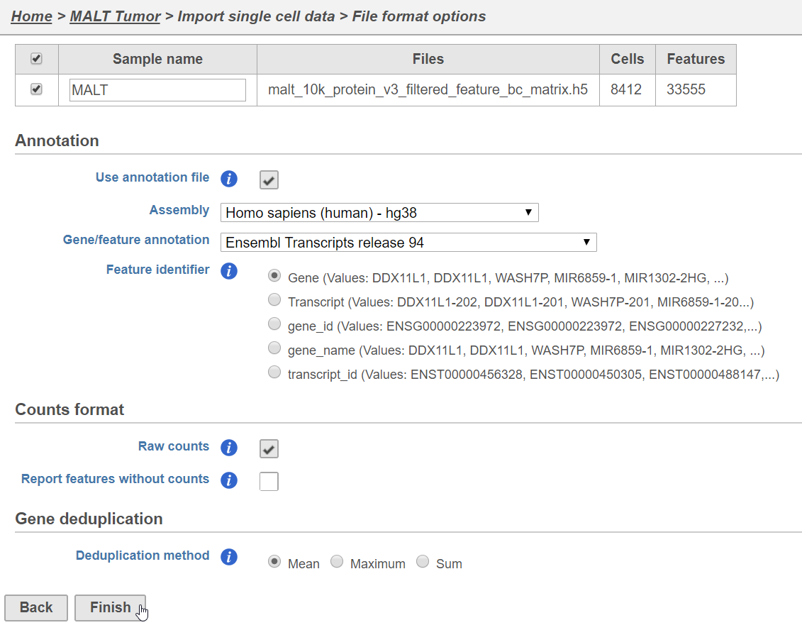
Figure 1. Configuring import of the HDF5 file produced by Cell Ranger 3
A Single cell counts data node will be created after the file has been imported.
Split matrix
The Single cell counts data node contains two different types of data, mRNA measurements and protein measurements. So that we can process these two different types of data separately, we will split the data by data type.
- Click the Single cell counts data node
- Click the Pre-analysis tools section of the toolbox
- Click Split matrix
A rectangle, or task node, will be created for Split matrix along with two output circles, or data nodes, one for each data type (Figure 2). The labels for these data types are determined by features.csv file used when processing the data with Cell Ranger. Here, our data is labeled Gene Expression, for the mRNA data, and Antibody Capture, for the protein data.

Figure 2. Split matrix produces two data nodes, one for each data type
Filter low-quality cells
An important step in analyzing single cell RNA-Seq data is to filter out low-quality cells. A few examples of low-quality cells are doublets, cells damaged during cell isolation, or cells with too few reads to be analyzed. In a CITE-Seq experiment, protein aggregation in the antibody staining reagents can cause a cell to have a very high number of counts; these are low-quality cells are can be excluded. Additionally, if all cells in a data set are expected to show a baseline level of expression for one of the antibodies used, it may be appropriate to filter out cells with very low counts. You can do this in Partek Flow using the Single cell QA/QC task.
We will start with the protein data.
- Click the Antibody Capture data node
- Click the QA/QC section in the toolbox
- Click Single Cell QA/QC
- Choose the assembly and annotation used for the gene expression data (Figure 3) from the drop-down menus
- Click Finish

Figure 3. Configuring Single-cell QA/QC
This produces a Single-cell QA/QC task node (Figure 4).

Figure 4. Single cell QA/QC produces a task node
- Double-click the Single cell QA/QC task node to open the task report
The task report lists the number of counts per cell and the number of detected features per cell in two violin plots. For more information, please see our documentation for the Single cell QA/QC task. For this analysis, we will set a maximum counts threshold to exclude potential protein aggregates and, because we expect every cell to be bound by several antibodies, we will also set a minimum counts threshold.
- Set the Counts filter to Keep cells between 500 and 20000 (Figure 5)

Figure 5. Single cell QA/QC report - Antibody capture
- Click Apply filter to run the Filter cells task
The output is a Filtered single cell counts data node (Figure 6).

Figure 6. Filtered cells output
Next, we can repeat this process for the Gene Expression data node.
- Click the Gene Expression data node
- Click the QA/QC section in the toolbox
- Click Single Cell QA/QC
- Choose the assembly and annotation used for the gene expression data (Figure 3) from the drop-down menus
- Click Finish
This produces a Single-cell QA/QC task node (Figure 7).

Figure 7. Single cell QA/QC produces a task node
- Double-click the Single cell QA/QC task node to open the task report
The task report lists the number of counts per cell, the number of detected features per cell, and the percentage of mitochondrial reads per cell in three violin plots. For this analysis, we will set a maximum counts threshold maximum and minimum thresholds for total counts and detected genes to exclude potential doublets and a maximum mitochondrial reads percentage filter to exclude potential dead or dying cells.
- Set the Counts filter to Keep cells between 1500 and 15000
- Set the Detected genes filter to Keep cells between 400 and 4000
- Set the Mitochondrial counts filter to Keep cells between 0% and 20% (Figure 8)

Figure 8. Filtering low-quality cells by gene expression data
- Click Apply filter to run the Filter cells task
The output is a Filtered single cell counts data node (Figure 9).

Figure 9. There are now two Filtered single cell counts data nodes
Normalization
After excluding low-quality cells, we can normalize the data.
We will start with the protein data. We will normalize this data using Centered log-ratio (CLR). CLR was used to normalize antibody capture protein counts data in the paper that introudced CITE-Seq (Stoeckius et al. 2017) and in subsequent publications on similar assays (Stoeckiius et al. 2018, Mimitou et al. 2018). CLR normalization includes the following steps: Add 1, Divide by Geometric mean, Add 1, log base e.
- Click the Filtered single cell counts data node produced by filtering the Antibody Capture data node
- Click the Normalization and scaling section in the toolbox
- Click Normalization
- Click the green plus next to CLR or drag CLR to the right-hand panel
- Click Finish to run (Figure 10)

Figure 10. Performing CLR normalization
Normalization produces a Normalized counts data node on the Antibody Capture branch of the pipeline.
Next, we can normalize the mRNA data. We will use the recommended normalization method in Partek Flow, which accounts for differences in library size, or the total number of UMI counts, per cell and log transforms the data. To match the CLR normalization used on the Antibody Capture data, we will use a log e transformation instead of the default log 2.
- Click the Filtered single cell counts data node produced by filtering the Gene Expression data node
- Click the Normalization and scaling section in the toolbox
- Click Normalization
- Click the
 button
 - Change the log base from 2 to e
- Click Finish to run (Figure 11)

Figure 11. Choosing CLR normalization
Normalization produces a Normalized counts data node on the Gene Expression branch of the pipeline (Figure 12).

Figure 12. Both Antibody Capture and Gene Expression data has been normalizied
Merge Protein and mRNA data
For quality filtering and normalization, we needed to have the two data types separate as the processing steps were distinct, but for downstream analysis we want to be able to analyze protein and mRNA data together. To bring the two data types back together, we will merge the two normalized counts data nodes.
- Click the Normalized counts data node on the Antibody Capture branch of the pipeline
- Click the Single cell counts data node
- Click the Pre-analysis tools section of the toolbox
- Click Merge matrices
- Click Select data node to launch the data node selector
Data nodes that can be merged with the Antibody Capture branch Normalized counts data node are shown in color (Figure 13).

Figure 13. Choosing a data node to merge
- Click the Normalized counts data node on the Gene Expression branch of the pipeline
A black outline will appear around the chosen data node.
- Click Select
- Click Finish to run the task
The output is a Merged counts data node (Figure 14). This data node will include the normalized counts of our protein and mRNA data. The intersection of cells from the two input data nodes is retained so only cells that passed the quality filter for both protein and mRNA data will be included in the Merged counts data node.
 Figure 14. Merging data types prior to downstream analysis
Collapsing tasks to simplify the pipeline
To simplify the appearance of the pipeline, we can group task nodes into a single collapsed task. Here, we will collapse the filtering and normalization steps.
- Right-click the Split matrix task node
- Choose Collapse tasks from the pop-up dialog (Figure 15)

Figure 15. Choosing the first task node to generate a collapsed task
Tasks that can for the beginning and end of the collapsed section of the pipeline are highlighted in purple (Figure 16). We have chosen the Split matrix task as the start and we can choose Merge matrices as the end of the collapsed section.

Figure 16. Tasks that can be the start or end of a collapsed task are shown in purple
- Click Merge matrices to choose it as the end of the collapsed section
The section of the pipeline that will form the collapsed task is highlighted in green.
- Name the Collapsed task Data processing
- Click Save (Figure 17)
 Figure 17. Naming the collapsed task
The new collapsed task, Data processing, appears as a single rectangle on the task graph (Figure 18).
Figure 17. Naming the collapsed task
The new collapsed task, Data processing, appears as a single rectangle on the task graph (Figure 18).

Figure 18. Collapsed tasks are represented by a single task node
To view the tasks in Data processing, we can expand the collapsed task.
- Double-click Data processing to expand it
When expanded, the collapsed task is shown as a shaded section of the pipeline with a title bar (Figure 19).

Figure 19. Expanding a collapsed task to show its components
To re-collapse the task, you can double click the title bar or click the ![]() icon in the title bar. To remove the collapsed task, you can click the
icon in the title bar. To remove the collapsed task, you can click the ![]() . Please note that this will not remove tasks, just the grouping.
. Please note that this will not remove tasks, just the grouping.
- Double-click the Data processing title bar to re-collapse (Figure 18)
Classify cells using Scatter plot
An alternative method to clustering and UMAP/t-SNE for classifying cells is using a scatter plot to visualize the expression of key marker genes or proteins. This approach is more effective with CITE-Seq data than gene expression data alone as the protein expression data has a better dynamic range and is less sparse.
- Click the Merged counts data node
- Click Exploratory analysis in the toolbox
- Click Scatter plot
- Click Finish to run
- Double-click the Scatter plot task node to open it
- Click 2D to switch to a 2D plot style (Figure 44)

Figure 20. Viewing the 2D scatter plot
Similar to the t-SNE or UMAP scatter plots, each point on the plot is a single cell. The axes are set to features (gene or protein) in the data set by default, but can be set to any attribute or feature. On this plot, we can see that CD3_TotalSeqB is on the x-axis and CD4_TotalSeqB is on the y-axis. We can use our selection and filtering tools to perform a basic classification of CD4 and CD8 T cells.
- Click the Features tab in the Selection / Filtering section of the control panel
- Type CD3 in the ID search bar of the Features tab
- Click CD3_TotalSeqB in the drop-down (Figure 45)

Figure 21. Filtering by values for a feature
- Click
 to add a filter for CD3 protein expression
 - Set the CD3_TotalSeqB filter to <= 2
This will select any cell with <= 2 normalized count for CD3 protein. Selected cells are shown in bold on the plot and, because we have CD3_TotalSeqB on one of our axes, the cutoff point chosen can be easily evaluated (Figure 46).

Figure 22. CD3+ cells are selected and shown in bold on the plot
The selected CD3+ cells are our T cells. We can filter to these cells prior to performing our classification of CD4 and CD8 T cells sub-types.
- Click
 to filter to include only the selected cells
Next, we can switch the x-axis to show CD8 protein expression so that we can perform our classification.
- Click the X axis text box in the Plot setup section of the control panel
- Click CD8a_TotalSeqB from the drop-down list (or type it and then select it if it is not visible)
- Click
 to rescale the axes to the included cells
The x-axis now shows CD8a protein expression (Figure 47).

Figure 23. Switching axes on the scatter plot
We can now use a set of filters to select and classify the CD3+ CD4+ CD8- T cells.
- Type CD4 in the ID search bar of the Features tab
- Click CD4_TotalSeqB in the drop-down
- Click to add a filter for CD4 protein expression
- Set the CD4_TotalSeqB filter to <= 2
- Type CD8a in the ID search bar of the Features tab
- Click CD8a_TotalSeqB in the drop-down
- Click to add a filter for CD8a protein expression
- Set the CD8a_TotalSeqB filter to < 2
This will select the cells in the upper left-hand section of the plot (Figure 48).

Figure 24. Selecting CD3+ CD4+ CD8- cells
- Click Classify selection
- Name the group CD4 T cells
- Click Save
We can now select and classify CD3+ CD4- CD8+ T cells using the filters we have already created.
- Change CD4_TotalSeqB filter to < 1.5
- Change CD8a_TotalSeqB filter to >= 2
This selects the cells in the lower right-hand section of the plot (Figure 49).

Figure 25. Selecting CD3+ CD4- CD8+ cells
- Click Classify selection
- Name the group CD8 T cells
- Click Save
To view our classifications, we can clear the selection and color by classification.
- Click Clear selection
- Choose Classifications from the Color by drop-down menu (Figure 50).

Figure 26. Classified CD4 and CD8 T cells
Alternatively, we could have used the lasso tool ![]() to select the population of interest manually and then classified the selected cells.
to select the population of interest manually and then classified the selected cells.
To apply the classification so that it would be available in downstream tasks like differential analysis, we would click Apply classifications. Classifications that are not applied are not available in downstream analysis tasks, but are saved in a draft state on the task report where they were created. Here, we will not save the classification, but we will see how to do this in a subsequent section of the tutorial.
Dimensional reduction and clustering with protein expression data
For experiments like CITE-Seq where we have many protein markers, we can use dimensional reduction and clustering to identify groups of similar cells based on their overall expression pattern.
In the Merged counts data node, we have two data types. We can choose to use one or both of the data types in our analysis. Here, we will run dimensional reduction and clustering on the protein expression data.
- Click the Merged counts data node
- Click Exploratory analysis in the toolbox
- Click Graph-based clustering
- Click Antibody Capture for Include features where "Feature type" is
- Click Finish to run
If there are fewer than 50 proteins in the data set, all possible PCs (number of proteins - 1) will be used by default and, because using all the PCs will capture all of the variance in the data set, this is equivalent to running clustering on the original data. If you data set has more than 50 proteins and you want to run clustering on full data instead of a subset of PCs, simply set the number of PCs to All in the advanced settings. We will discuss how to pick an optimal number of PCs for data with larger numbers of features, like gene expression data, in a subsequent section of the tutorial.
Once Graph-based clustering has finished running and produced a Clustering result data node, we can visualize the results using UMAP or t-SNE. Both are dimensional reduction techniques that place cells with similar expression close together. An advantage of UMAP over t-SNE is that is preserves more of the global structure of the data. This means that with UMAP, more similar clusters are closer together while dissimilar clusters are further apart. With t-SNE, the relative positions of clusters to each other are often uninformative.
- Click the Clustering result data node
- Click Exploratory analysis in the toolbox
- Click UMAP
- Click Antibody Capture for Include features where "Feature type" is
- Click Finish to run
We can open the UMAP task report to view the clustering result.
- Double-click the UMAP task node
- Click 2D in the plot style section to switch to 2D
Each point on the plot is a cell and the cells are colored by their cluster assignments (Figure 39).

Figure 27. UMAP from protein expression data
Because we merged the gene and protein expression data, we can overlay protein and gene expression values on the plot.
- Choose Expression from the Color by drop-down menu
- Type CD4 in the search box and choose CD4_TotalSeqB from the drop-down (Figure 23)

Figure 28. Coloring by expression
Cells that express high levels of CD4 are colored blue on the plot (Figure ).

Figure 29. Coloring by CD4 protein expression
The cluster of cells expressing high levels of CD4 are likely our CD4 T cells. We can take a closer look at the CD4 T cell cluster to see if any sub-types can be identified using the clustering results and expression information.
- Click
 to activate the lasso tool
 - Draw a lasso around the large blue group of cells at the bottom right of the plot to select them (Figure )
 Figure 30. Selecting the CD4 cluster
- Click to filter to include only the selected cells
- Click to rescale the axes to the included cells
With that, let's take a look at the clustering results from the protein expression data for these cells.
- Choose Graph-based from the Color by drop-down menu

Figure 31. Protein-based clustering results
Again, the colors here indicate the cluster assignment for each cell. Because we ran clustering using only the protein expression data, the cluster assignments are based on each cells protein expression data. To help identify which cell types the clusters correspond to, we generate a group biomarkers table with every clustering result. Biomarkers are genes or proteins that are expressed highly in a clusters when compared with the other clusters. Please note that while the clustering was calculated using only the protein expression data, the biomarkers are drawn from both gene and protein expression data.
The far-left cluster, cluster 8, has several interesting biomarkers. The top biomarker, is CXCL13, a gene expressed by follicular B helper T cells (Tfh cells). Two of the other biomarkers are PD-1 protein, which is expressed in Tfh cells, promotes self-tolerance, and is a target for immunotherapy drugs; and TIGIT protein, another immunotherapy drug target that promotes self-tolerance.
To assess the specificity of these biomarkers to this cluster, we can overlay the expression on the scatter plot.
- Choose Expression from the Color by drop-down menu
- Type PD-1 in the search box and choose PD-1_TotalSeqB from the drop-down
PD-1 expression is highest in cluster 8 with uniformly strong expression throughout (Figure ).

Figure 32. PD-1 expression in helper T cells
- Type PDCD1 in the Expression search box and choose PDCD1 from the drop-down
It is interesting to note that this pattern of PD-1 expression is not easily discernible at the PD-1 gene expression level (PDCD1) (Figure ).

Figure 33. PDCD1 (PD-1) gene expression does not form a clear pattern
- Type CXCL13 in the Expression search box and choose CXCL13 from the drop-down
The Tfh cell marker, CXCL13, is highly and specifically expressed in cluster 8 (Figure ), so we will classify the cells from cluster 8 as Tfh cells.

Figure 34. CXCL13 expression is strong in cluster 8
- Choose Graph-based from the Color by drop-down menu
- Choose Graph-based from the Select by drop-down in the Attributes tab of the Selection / Filtering section of the control panel (Figure )

Figure 35. Choosing to select by cluster
- Click the check box for 8 to select cluster 8 (Figure )
 Figure 36. Selecting a cluster
- Click Classify selection
- Name the cells Tfh cells
- Click Save
We can classify the remaining cells from this CD4+ group as Helper T cells.
- Click
 to invert the selection and select the cells outside of cluster 8
 - Click Classify selection
- Name the cells Helper T cells
- Click Save
To return to the full data set, we can clear our selection and filter.
- Click Clear selection
- Click Clear filters
To visualize our classifications, we can color by Classifications.
- Choose Classifications from the Color by drop-down menu (Figure )
 Figure 37. Coloring by classification
To apply the classification so that it would be available in downstream tasks like differential analysis, we would click Apply classifications. Classifications that are not applied are not available in downstream analysis tasks, but are saved in a draft state on the task report where they were created. Here, we will not save the classification, but we will see how to do this in a subsequent section of the tutorial.
Figure 37. Coloring by classification
To apply the classification so that it would be available in downstream tasks like differential analysis, we would click Apply classifications. Classifications that are not applied are not available in downstream analysis tasks, but are saved in a draft state on the task report where they were created. Here, we will not save the classification, but we will see how to do this in a subsequent section of the tutorial.
Clustering and dimensional reduction with gene expression data
Because principal components are used as the input for both graph-based clustering and UMAP when working with gene expression data, it is important to determine an optimal number of PCs to use in downstream analysis.
Choosing the number of PCs
In this data set, we have two data types. We can choose to run analysis tasks on one or both of the data types. Here, we will run PCA on only the mRNA data to find the optimal number of PCs for the mRNA data.
- Click the Merged counts node
- Click Exploratory analysis in the task menu
- Click PCA
Because we have multiple data types, we can choose which we want to use for the PCA calculation.
- Click Gene Expression for Include features where "Feature type" is
- Click Configure to access the advanced settings
- Click Generate PC quality measures
This will generate a Scree plot, which is useful for determining how many PCs to use in downstream analysis tasks.
- Click Apply
- Click Finish to run (Figure 15)

Figure 38. Configuring PCA to run on the Gene Expression data
A PCA task node will be produced.
- Double-click the PCA task node to open the PCA task report
The PCA task report includes the PCA plot, the Scree plot, the component loadings table, and the PC projections table. To switch between these elements, use the buttons in the upper right-hand corner of the task report  . Each cell is shown as a dot on the PCA scatter plot.
- Click
 to open the Scree plot
The Scree plot lists PCs on the x-axis and the amount of variance explained by each PC on the y-axis, measured in Eigenvalue. The higher the Eigenvalue, the more variance is explained by the PC. Typically, after an initial set of highly informative PCs, the amount of variance explained by analyzing additional PCs is minimal. By identifying the point where the Scree plot levels off, you can choose an optimal number of PCs to use in downstream analysis steps like graph-based clustering and t-SNE.
- Mouse over the Scree plot to identify the point where additional PCs offer little additional information (Figure 16)

Figure 39. Identifying an optimal number of PCs
In this data set, a reasonable cut-off could be set anywhere between around 10 and 30 PCs. We will use 15 in downstream steps.
Cluster by Gene Expression data
After determining the optimal number of PCs, we can proceed to clustering.
- Click the Merged counts data node
- Click Exploratory analysis in the toolbox
- Click Graph-based clustering
- Click Gene Expression for Include features where "Feature type" is
- Click Configure to access the advanced settings
- Set Number of principal components to 15
- Click Apply
- Click Finish to run (Figure 17)

Figure 40. Running Graph-based clustering on the Gene Expression data
Once Graph-based clustering has finished running and produced a Clustering result data node, we can visualize the results using UMAP.
- Click the Clustering result data node
- Click Exploratory analysis in the toolbox
- Click UMAP
- Click Gene Expression for Include features where "Feature type" is
- Click Configure to access the advanced settings
- Set Number of principal components to 15
- Click Apply
- Click Finish to run (Figure 18)

Figure 41. Running UMAP on the Gene Expression data
- Double-click the UMAP task node to open the task report
The UMAP task report includes a scatter plot with the clustering results coloring the points (Figure 19).

Figure 42. UMAP calculated on Gene Expression values. Colored by Graph-based clustering results.
- Click the 2D radio button for Plot style to switch to the 2D UMAP (Figure 20)

Figure 43. Viewing the 2D UMAP
Classify from expression and clustering
- Click to activate the lasso tool
- Draw a lasso around clusters 3, 4, and 6 (Figure 21) to select them

Figure 44. Selecting a group of clusters
- Click to filter to include only the selected cells
- Click to rescale the axes to the included cells (Figure 22)

Figure 45. Zooming to a group of clusters in UMAP
Because we merged the gene and protein expression data, we can visualize a mix of genes and proteins on the gene expression UMAP.
- Choose Expression from the Color by drop-down menu
- Type NKG7 in the search box and choose NKG7 from the drop-down (Figure 23)
 Figure 46. Coloring by NKG7 expression
This will color the plot by NKG7 gene expression, a marker for cytotoxic cells. We can color by two T cell protein markers to distinguish cytotoxic T cells from helper T cells.
Figure 46. Coloring by NKG7 expression
This will color the plot by NKG7 gene expression, a marker for cytotoxic cells. We can color by two T cell protein markers to distinguish cytotoxic T cells from helper T cells.
- Click to color by a second feature (gene or protein)
- Type CD4 and choose CD4_TotalSeqB from the drop-down (Figure 24)

Figure 47. Coloring by a second feature
This will color the plot by NKG7 gene expression and CD4 protein expression, a marker for helper T cells. We can add a third feature.
- Click to color by a third feature (gene or protein)
- Type CD3 and choose CD3_TotalSeqB from the drop-down
This will color the plot by NKG7 gene expression, CD4 protein expression, and CD3 protein expression. Each feature gets a color channel, green, red, or blue. Cells without expression are black and the mix of green, red, and blue is determined by the relative expression of the three genes. Cells expressing both CD4 protein (red) and CD3 protein (blue), but not NKG7 (green) are purple, while cells expressing both NKG7 (green) and CD3 protein (blue) are teal (Figure 25). CD3 is a pan-T cells marker, which helps confirm that this group of clusters is composed of T cells.

Figure 48. UMAP colored by gene and protein expression
In addition to coloring by the expression of genes and proteins, we can select cells by their expression levels.
- Click the Features tab in the Selection / Filtering section of the control panel
- Type NKG7 in the ID search bar of the Features tab
- Click NKG7 to select it
- Click to add a filter for NKG7 expression
By default, any cell that expresses >= 1 normalized count of NKG7 is now selected (Figure 26).

Figure 49. Selecting by NKG7 expression
- Type CD3 in the ID search bar of the Features tab
- Click CD3_TotalSeqB in the drop-down
- Click to add a filter for CD3 protein expression
Now, any cell that expresses >= 1 normalized count for NKG7 gene and CD3 protein is selected. You can also require that a cell not express a gene or protein.
- Type CD4 in the ID search bar of the Features tab
- Click CD4_TotalSeqB in the drop-down
- Click to add a filter for CD4 protein expression
- Set the CD4_TotalSeqB filter to <= 2
We have now selected only cells that express >= 1 normalized count for NKG7 gene and CD3 protein, but also have <= 2 normalized count for CD4 protein (Figure 27).

Figure 50. Filtering using multiple genes and proteins
We can classify these cells. Because they express the pan T cell maker, CD3, and the cytotoxic marker, NKG7, but not the helper T cell marker, CD4, we can classify these cells as Cytotoxic T cells.
- Click Classify selection
- Type Cytotoxic T cells for the name
- Click Save
To classify the helper T cells, we can modify the selection criteria.
- Set NKG7 to =< 1
- Set CD4_TotalSeqB to >= 2
We have now selected the CD4 positive, CD3 positive, NKG7 negative helper T cells (Figure 28).

Figure 51. Modifying the selection criteria lets us select helper T cells
- Click Classify selection
- Type Helper T cells for the name
- Click Save
We can check the results of our classification.
- Click Clear selection
- Select Classifications from the Color by drop-down menu (Figure 29)

Figure 52. Viewing cytotoxic and helper T cell classifications
To return to the full data set, we can clear the filter.
- Click Clear filters
The zoom level will also be reset (Figure 30).

Figure 53. Resetting filters also resets the zoom level
In addition to T-cells, we would expect to see B lymphocytes, at least some of which are malignant, in a MALT tumor sample. We can color the plot by expression of a B cell marker to locate these cells on the UMAP plot.
- Choose Expression from the Color by drop-down menu
- Click
 twice to close the second and third genes
 - Type CD19 in the search box
- Click CD19_TotalSeqB in the drop-down
There are several clusters that show high levels of CD19 protein expression (Figure 31). We can filter to these cells to examine them more closely.

Figure 54. Viewing CD19 protein expression on the UMAP plot
- Click to activate the lasso tool
- Draw a lasso around the CD19 protein-expressing clusters to select them
- Click to filter to include only the selected cells
- Click to rescale the axes to the included cells (Figure 32)

Figure 55. Filtering to CD19 expressing clusters
We can use information from the graph-based clustering results to help us find sub-groups within the CD19 protein-expressing cells.
- Choose Graph-based from the Color by drop-down menu

Figure 56. Viewing B lymphocyte clusters
Cluster 7, shown in pink, lists IL7R and CD3D, genes typically expressed by T cells, as two of its top biomarkers. Biomarkers are genes or proteins that are expressed highly in a clusters when compared with the other clusters. Therefore, the cells in cluster 7 are likely doublets as they express both B cell (CD19) and T cell (CD3D) markers.
- Choose Graph-based from the Select by drop-down in the Attributes tab of the Selection / Filtering section of the control panel
- Click the check box for 7 to select cluster 7
- Click Classify selection (Figure )

Figure 57. Selected cluster 7, a group of potential doublets
- Name the cells Doublets
- Click Save
- Click Clear selection
- Click
 to filter to exclude the selected cells
The biomarkers for clusters 1 and 2 also show an interesting pattern. Cluster 1 lists IGHD as its top biomarker, while cluster 2 lists IGHA1. Both IGHD (Immunoglobulin Heavy Constant Delta) and IGHA1 (Immunoglobulin Heavy Constant Alpha 1) encode classes of the immunoglobulin heavy chain constant region. IGHD is part of IgD, which is expressed by mature B cells, and IGHA1 is part of IgA1, which is expressed by activated B cells. We can color the plot by both of these genes to visualize their expression.
- Click IGHD in the Group biomarkers table
- Hold Ctrl on your keyboard and click IGHA1 in the Group biomarkers table
This will color the plot by IGHD and IGHA1 (Figure 35).

Figure 58. Coloring by two genes from the Group biomarkers table
The clusters on the left show expression of IGHA1 while the larger or the two clusters on the right expresses IGHD. We can use the lasso tool to classify these populations.
- Select the left-hand cluster with IGHA1 expression (Figure 36)

Figure 59. Selecting the IGHA1+ cells
- Click Classify selection
- Name them Activated B cells
- Click Save
- Double-click any white-space on the plot to clear the selection
We can now classify the cluster that expresses IGHD as mature B cells.
- Draw a lasso around the right-hand cluster (Figure 37)

Figure 60. Selecting the IGHD+ mature B cells
- Click Classify selection
- Name them Mature B cells
- Click Save
- Double-click any white-space on the plot to clear the selection
We can visualize our classifications.
- Select Classifications from the Color by drop-down menu
- Click Clear filters to view all cells (Figure 38)

Figure 61. Viewing classifications
To use these classifications in downstream analysis, we can apply the classifications.
- Click Apply classifications
- Click Apply to confirm
This will produce a Classified groups data node.
Filter groups
Because we have classified our cells, we can now filter based on those classifications. This can be used to focus on a single cell type for re-clustering and sub-classification or to exclude cells that are not of interest for downstream analysis.
- Click the Classified groups data node
- Click Filtering
- Click Filter groups
- Set to exclude Classifications is Doublets using the drop-down menus
- Click AND
- Set the second filter to exclude Classifications is N/A using the drop-down menus
- Click Finish to apply the filter (Figure )

Figure 62. Filtering groups to exclude cell types
This produces a Filtered groups data node (Figure ).

Figure 63. Filter groups output
Re-split the matrix
Prior to performing differential analysis, you may want to separate your protein and gene expression data. The split data nodes will both retain cluster and classification information.
- Click the Classified groups data node
- Click Pre-analysis tools
- Click Split matrix
This will produce two data nodes, one for each data type (Figure ).

Figure 64. Split matrix can also re-split the data
Differential analysis and visualization
Once we have classified our cells, we can use this information to perform comparisons between cell types or between experimental groups for a cell type. In this project, we only have a single sample, so we will compare cell types.
Protein expression
- Click the Antibody Capture data node
- Click Differential analysis
- Click GSA
The first step is to choose which attributes we want to consider in the statistical test.
- Check Classifications to include it in the statistical test
- Click Next
Next, we will set up the comparison we want to make. Here, we will compare the Activated and Mature B cells.
- Check Activated B cells in the top panel
- Check Mature B cells in the bottom panel
- Click Add comparison
The comparison should appear in the table.
- Click Finish to run the statistical test (Figure )

Figure 65. Setting up a comparison in the GSA task
The GSA task produces a Feature list data node.
- Double-click the GSA task node to open the task report
The report lists each feature tested, giving p-value, false discovery rate adjusted p-value (FDR step up), and fold change values for each comparison (Figure ).

Figure 66. GSA report for the protein expression data
In addition to the listed information, we can access dot and violin plots for each gene or protein from this table.
- Click
 in the CD25_TotalSeqB row
This opens a violin plot showing CD25 expression for cells in each of the classifications (Figure ).

Figure 67. Violin plot showing CD25 protein expression
Please see the Dot Plot documentation page to learn more about this visualization.
- Click the project name to return to the Analyses tab
To visualize all of the proteins at the same time, we can make a hierarchical clustering heat map.
- Click the Feature list data node
- Click Exploratory analysis in the toolbox
- Click Hierarchical clustering
- Click Finish to run with default settings
- Double-click the Hierarchical clustering task node to open the heat map (Figure )

Figure 68. Heat map prior to customization
The heat map can easily be customized to illustrate our results.
- Click
 to transpose the heat map
 - Set High to 2.8 to match the low range
- Set the Sample dendrogram to By sample attribute Classifications
- Set Attributes to Classifications
- Click
 and set Rotation to 0
 - Uncheck Samples under Show labels
This generates a customized heat map to illustrate how the cell types differ in their protein expression (Figure ).
 Figure 69. Customized heat map illustrating protein expression differences between cell types
Gene expression
We can use a similar approach to analyze the gene expression data.
- Click the Gene Expression data node
- Click Differential analysis
- Click GSA
- Check Classifications to include it in the statistical test
- Click Next
- Check Activated B cells in the top panel
- Check Mature B cells in the bottom panel
- Click Add comparison
- Click Finish to run the statistical test
As before, this will generate a GSA task node and a Feature list data node.
- Double-click the GSA task node to open the task report (Figure )

Figure 70. Results of differential gene expression analysis
Because 19,745 genes have been analyzed, it is useful to use a volcano plot to get an idea about the overall changes.
- Click
 to open a volcano plot
Each gene is shown as a point on the plot with cut-off lines for fold change and p-value or FDR step up set using the control panel on the left (Figure ). The number of genes up and down regulated according to the cut-offs is listed at the bottom of the plot. Mousing over a point shows the gene name and other information.

Figure 71. Volcano plot for Activated vs. Mature B cells
- Click GSA report to return to the full report
We can filter the full set of genes to include only the significantly different genes using the filter panel on the left.
- Click FDR step up
- Type 0.05 for the cutoff and press Enter on your keyboard or click the check box
- Click Fold change
- Set to From -2 to 2 and press Enter on your keyboard or click the check box
The number at the top of the filter will update to show the number of included genes (Figure ).

Figure 72. Filtering GSA results to significant genes
- Click Generate filtered node to create a data node including only these significantly different genes
A task, Differential analysis filter, will run and generate a new Feature list data node. We can get a better idea about the biology underlying these gene expression changes using gene set or pathway enrichment.
- Click the filtered Feature list data node
- Click Biological interpretation in the toolbox
- Click Pathway enrichment
- Make sure that Homo sapiens is selected in the Species drop-down menu
- Click Finish to run
- Double-click the Pathway enrichment task node to open the task report
The pathway enrichment results list KEGG pathways, giving an enrichment score and p-value for each (Figure ).
 Figure 73. Pathway enrichment task report
To get a better idea about the changes in each enriched pathway, we can view an interactive KEGG pathway map.
Figure 73. Pathway enrichment task report
To get a better idea about the changes in each enriched pathway, we can view an interactive KEGG pathway map.
- Click path:hsa04068 in the FoxO signaling pathway row
The KEGG pathway map shows up-regulated genes from the input list in red and down-regulated genes from the input list in green (Figure ).

Figure 74. Interactive KEGG pathway map for FoxO signaling pathway
Final pipeline

Figure 75. View of the final pipeline
Overview
Content Tools