Dot plot is special 2D scatterplot with X-axis is a categorical variable and Y-axis is a numerical variable, typically used to visualize gene expression (RNA-seq or scRNA-seq), with dots representing observations (samples or cells), X-axis showing treatment groups and y-axis showing expression level on an appropriate scale.
In differential analysis report data node, select the dot plot icon ( ![]() ) in the View column to invoke the plot in data viewer. The plot will be displayed in a new browser tab (an example plot is on Figure 1).
) in the View column to invoke the plot in data viewer. The plot will be displayed in a new browser tab (an example plot is on Figure 1).
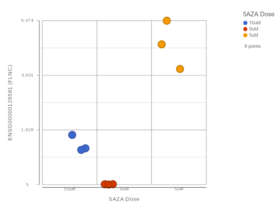
Figure 1. Dot plot (an example). Each dot is a sample. The plot title (ADRBK2) is the gene symbol of the selected gene. Expression levels are on the vertical axis
The chart title is based on the feature (e.g. gene or transcript) that the plot was invoked on. The y-axis is scaled automatically, based on the range of the data, and the units correspond to the input node, i.e. if the data were normalized using transcripts per million (TPM), the y-axis will be in TPM-normalised counts. Dots represent observations (e.g. samples or cells). Hovering the cursor over a sample invokes a popup balloon message shows sample ID and the respective expression value.
The order of the group on the X-axis by default is based on the order in the attribute management page in the Data tab. However, you can manually click on the name of the group on X-axis, drag and drop to change the order (Figure 2)
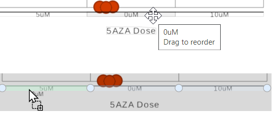
Figure 2. Drag and drop to change the order of the X-axis groups
When you have a lot of observations to display, you can choose to add box-whiskers and/or violin plot on the graph (Figure 3), by turning on/off the options to display the different type of plots in Style card from the configuration panel.
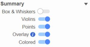
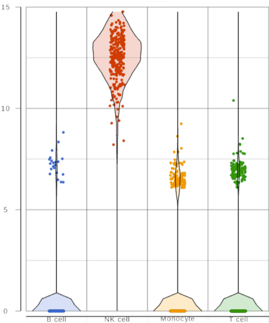 Figure 3. Add Box-Whisker and Violinplot
You can have multiple categorical attributes on an axis, e.g. X-axis represent both cell type and age group (Figure 4). Click on the attribute to drag to change the order of the attributes
Figure 3. Add Box-Whisker and Violinplot
You can have multiple categorical attributes on an axis, e.g. X-axis represent both cell type and age group (Figure 4). Click on the attribute to drag to change the order of the attributes
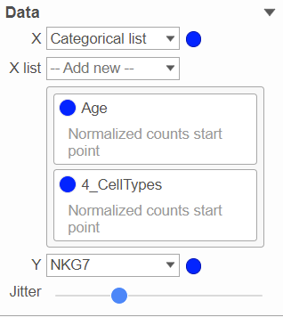
Figure 4. X-axis represent multiple categorical attributes
ghjkl
Click the Export image button to save a PNG, SVG, or PDF image to your computer.
Click the To notebook button to send the image to a page in the Notebook.
ghjkl
ghjkl
ghjkl
Additional Assistance
If you need additional assistance, please visit our support page to submit a help ticket or find phone numbers for regional support.


| Your Rating: |
|
Results: |

|
34 | rates |
Overview
Content Tools
1 Comment
Melissa del Rosario
author: ilukic