The Single-cell QA/QC task in Partek Flow enables you to visualize several useful metrics that will help you include only high-quality cells. To invoke the Single-cell QA/QC task:
- Click a Single cell counts data node
- Click the QA/QC section of the task menu
- Click Single cell QA/QC
By default, all samples are used to perform QA/QC. You can choose to split the sample and perform QA/QC separately for each sample.
If your Single cell counts data node has been annotated with a gene/transcript annotation, the task will run without a task configuration dialog. However, if you imported a single cell counts matrix without specifying a gene/transcript annotation file, you will be prompted to choose the genome assembly and annotation file by the Single cell QA/QC configuration dialog (Figure 1). Note, it is still possible to run the task without specifying an annotation file. If you choose not to specify an annotation file, the detection of mitochondrial counts will not be possible.
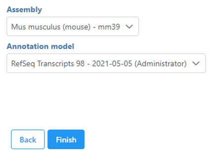
Figure 1. If an annotation was not specified on import, you can choose the assembly and annotation after invoking Single-cell QA/QC
The Single cell QA/QC task report opens in a new data viewer session. Four dot and violin plots showing the value of every cell in the project are displayed on the canvas: counts per cell, detected features per cell, the percentage of mitochondrial counts per cell, and the percentage of ribosomal counts per cell (Figure 2).
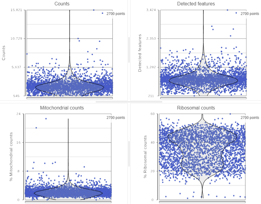
Figure 2. Dot & violin plots showing values of each cell for several quality measures
If your cells do not express any mitochondrial genes or an appropriate annotation file was not specified, the plot for the percentage of mitochondrial counts per cell will be non-informative (Figure 3).
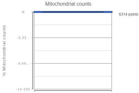 Figure 3. A non-informative percentage of mitochondrial counts plot
Mitochondrial genes are defined as genes located on a mitochondrial chromosome in the gene annotation file. The mitochondrial chromosome is identified in the gene annotation file by having "M" or "MT" in its chromosome name. If the gene annotation file does not follow this naming convention for the mitochondrial chromosome, Partek Flow will not be able to identify any mitochondrial genes. If your single cell RNA-Seq data was processed in another program and the count matrix was imported into Partek Flow, be sure that the annotation field that matches your feature IDs was chosen during import; Partek Flow will be unable to identify any mitochondrial genes if the gene symbols in the imported single cell data and the chosen gene/feature annotation do not match.
Figure 3. A non-informative percentage of mitochondrial counts plot
Mitochondrial genes are defined as genes located on a mitochondrial chromosome in the gene annotation file. The mitochondrial chromosome is identified in the gene annotation file by having "M" or "MT" in its chromosome name. If the gene annotation file does not follow this naming convention for the mitochondrial chromosome, Partek Flow will not be able to identify any mitochondrial genes. If your single cell RNA-Seq data was processed in another program and the count matrix was imported into Partek Flow, be sure that the annotation field that matches your feature IDs was chosen during import; Partek Flow will be unable to identify any mitochondrial genes if the gene symbols in the imported single cell data and the chosen gene/feature annotation do not match.
Ribosomal genes are defined as genes that code for proteins in the large and small ribosomal subunits. Ribosomal genes are identified by searching their gene symbol against a list of 89 L & S ribosomal genes taken from HGNC. The search is case-insensitive and includes all known gene name aliases from HGNC. Identifying ribosomal genes is performed independent of the gene annotation file specified.
Total counts are calculated as the sum of the counts for all features in each cell from the input data node. The number of detected features is calculated as the number of features in each cell with greater than zero counts. The percentage of mitochondrial counts is calculated as the sum of counts for known mitochondrial genes divided by the sum of counts for all features and multiplied by 100. The percentage of ribosomal counts are calculated as the sum of counts for known ribosomal genes divided by the sum of counts for all features and multiplied by 100.
Each point on the plots is a cell. All cells from all samples are shown on the plots. The overlaid violins illustrate the distribution of cell values for the y-axis metric.
The appearance of a plot can be configured by selecting a plot and adjusting the Configure settings in the panel on the left (Figure 4). Here are some suggestions, but feel free to explore the other options available:
- Open Axes and change the Y-axis scale to Logarithmic. This can be helpful to view the range of values better, although it is usually better to keep the Ribosomal counts plot in linear scale.
- Open Style and reduce the Color Opacity using the slider. For data sets with very many cells, it may be helpful to decrease the dot opacity to better visualize the plot density.
- Within Style switch on Summary Box & Whiskers. Inspecting the median, Q1, Q3, upper 90%, and lower 10% quantiles of the distributions can be helpful in deciding appropriate thresholds.
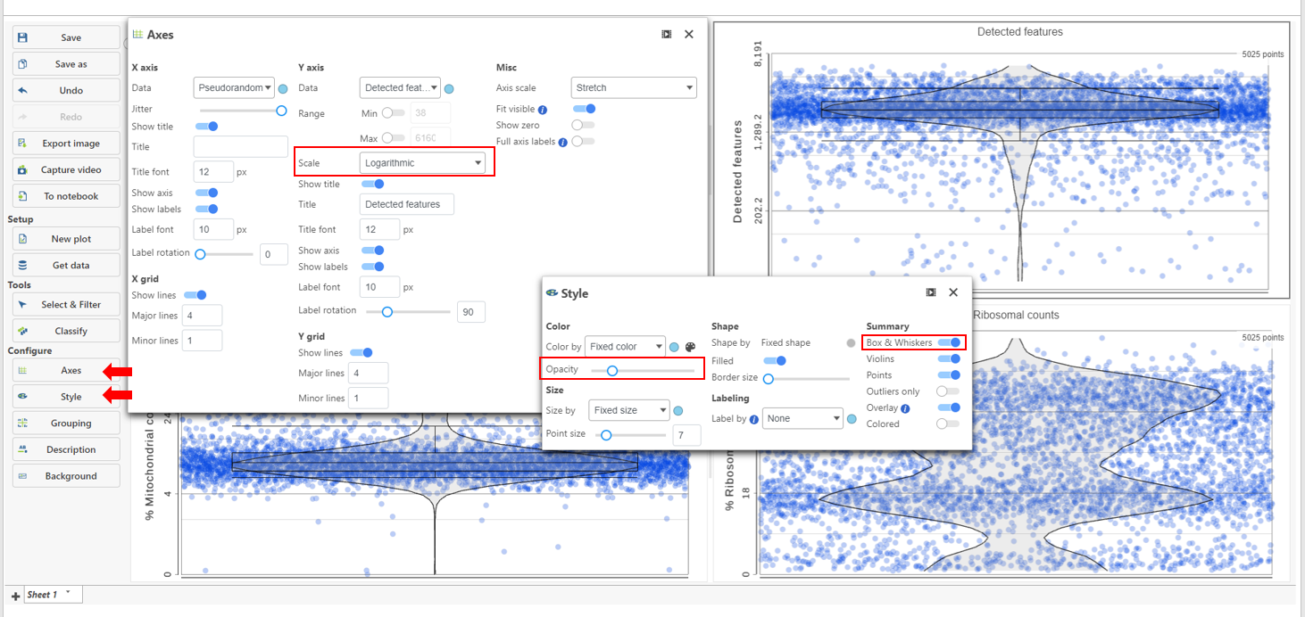 Figure 4. Use the Configuration options on the left customize the appearance of plots
High-quality cells can be selected using Select & Filter, which is pre-loaded with the selection criteria, one for each quality metric (Figure 5).
Figure 4. Use the Configuration options on the left customize the appearance of plots
High-quality cells can be selected using Select & Filter, which is pre-loaded with the selection criteria, one for each quality metric (Figure 5).
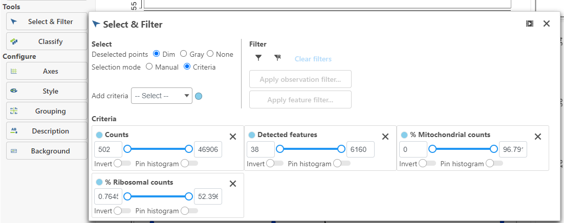 Figure 5. Select & Filter criteria
Hovering the mouse over one of the selection criteria reveals a histogram showing you the frequency distribution of the respective quality metric. The minimum and maximum thresholds can be adjusted by clicking and dragging the sliders or by typing directly into the text boxes for each selection criteria (Figure 6).
Figure 5. Select & Filter criteria
Hovering the mouse over one of the selection criteria reveals a histogram showing you the frequency distribution of the respective quality metric. The minimum and maximum thresholds can be adjusted by clicking and dragging the sliders or by typing directly into the text boxes for each selection criteria (Figure 6).
 Figure 6. Use the sliders and histograms to adjust the selection criteria
Alternatively, Pin histogram to view all of the distributions at one time to determine thresholds with ease (Figure 7).
Figure 6. Use the sliders and histograms to adjust the selection criteria
Alternatively, Pin histogram to view all of the distributions at one time to determine thresholds with ease (Figure 7).
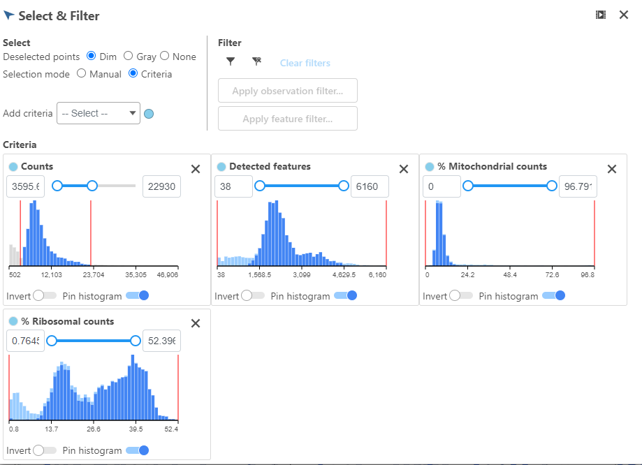 Figure 7. Pin the histogram to view all of the distributions at one time
Adjusting the selection criteria will select and deselect cells in all three plots simultaneously. Depending on your settings, the deselected points will either be dimmed or gray. The filters are additive. Combining multiple filters will include the intersection of the three filters. The number of cells selected is shown in the figure legend of each plot (Figure 8).
Figure 7. Pin the histogram to view all of the distributions at one time
Adjusting the selection criteria will select and deselect cells in all three plots simultaneously. Depending on your settings, the deselected points will either be dimmed or gray. The filters are additive. Combining multiple filters will include the intersection of the three filters. The number of cells selected is shown in the figure legend of each plot (Figure 8).
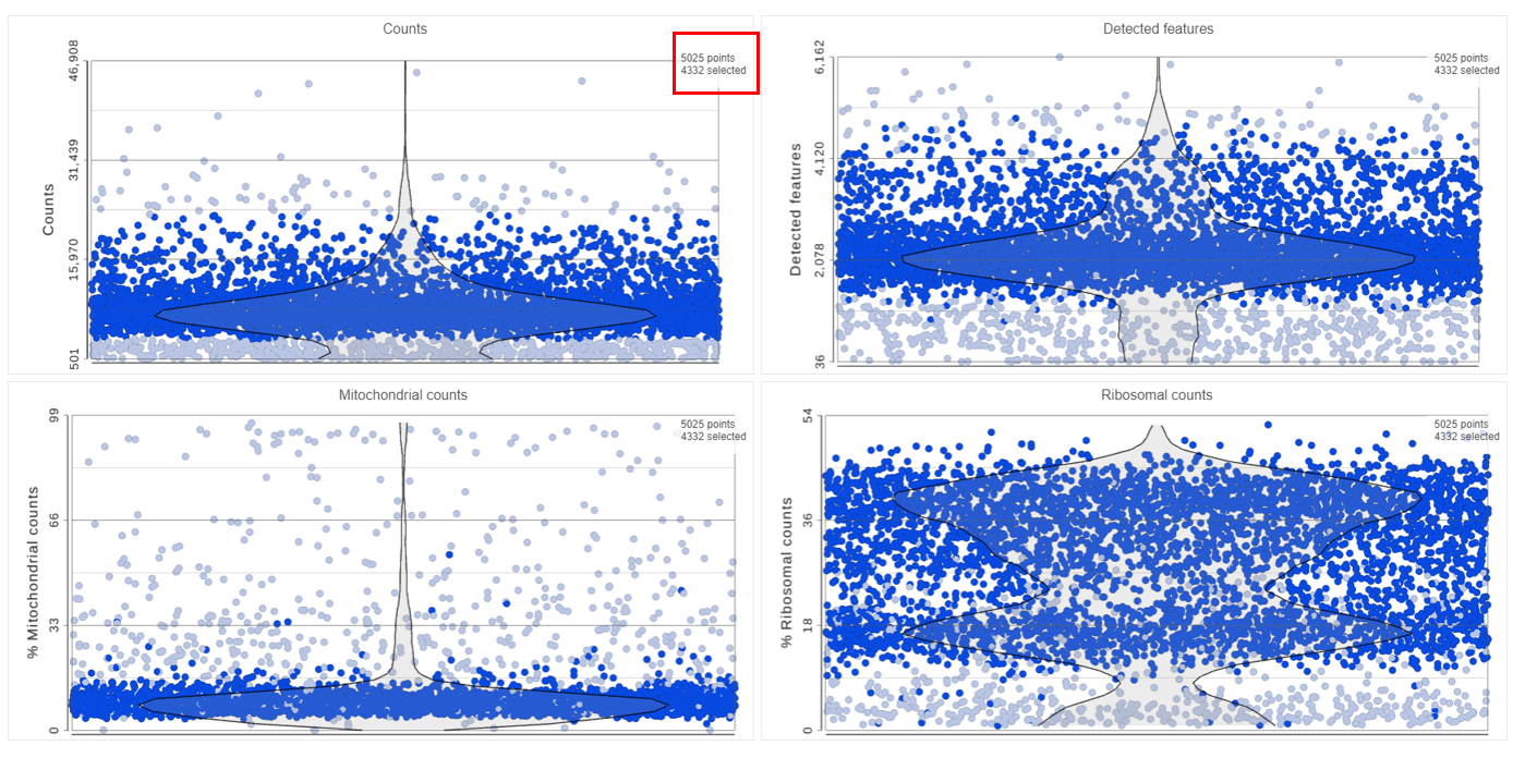 Figure 8. The filters are additive and deselected cells are dimmed
To filter the high-quality cells, click the include selected cells
Figure 8. The filters are additive and deselected cells are dimmed
To filter the high-quality cells, click the include selected cells ![]() icon in Filter in the top right of Select & Filter, and click Apply observation filter... (Figure 9).
icon in Filter in the top right of Select & Filter, and click Apply observation filter... (Figure 9).
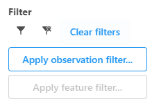 Figure 9. Include the selected points and apply the filter
Select the input data node for the filtering task and click Select (Figure 10).
Figure 9. Include the selected points and apply the filter
Select the input data node for the filtering task and click Select (Figure 10).
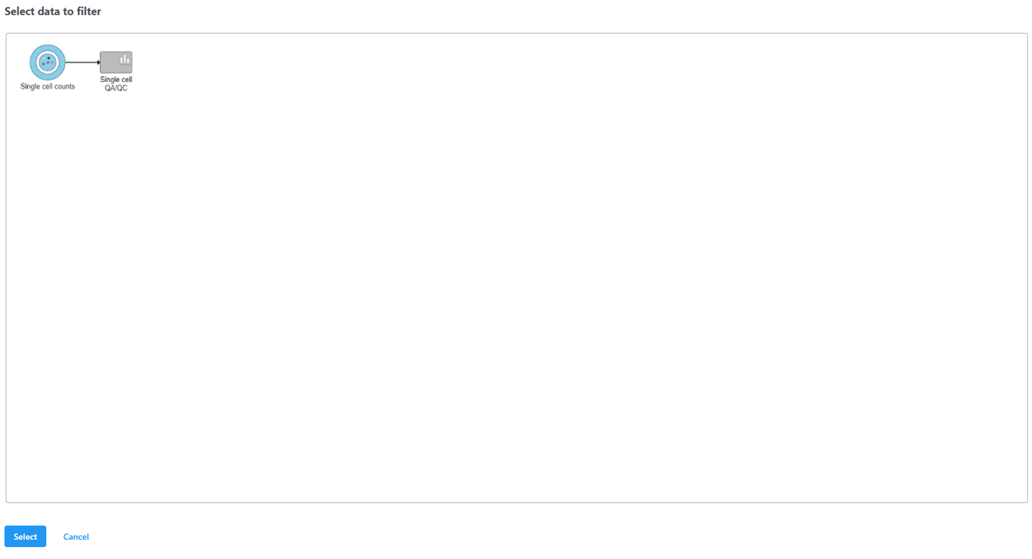 Figure 10. After the Apply filter button is selected, you will be presented with a preview of your pipeline. You need to select the appropriate data node to apply the filtering to
A new data node, Filtered counts, will be generated under the Analyses tab (Figure 11).
Figure 10. After the Apply filter button is selected, you will be presented with a preview of your pipeline. You need to select the appropriate data node to apply the filtering to
A new data node, Filtered counts, will be generated under the Analyses tab (Figure 11).
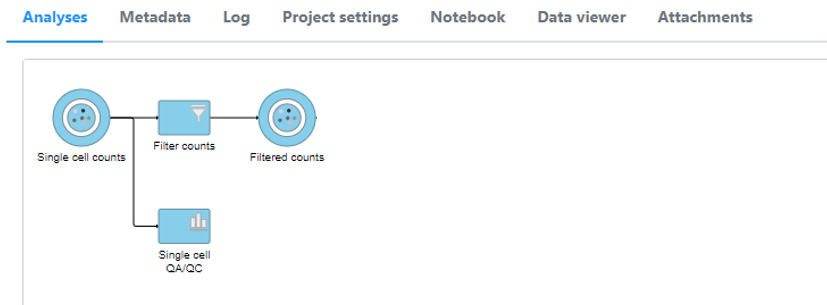
Figure 11. Filter cells task runs from the Single cell QA/QC report
Double click the Filtered counts data node to view the task report. The report includes a summary of the count distribution across all features for each sample; a detailed breakdown of the number of cells included in the filter for each sample; and the minimum and maximum values for each quality metric (expressed genes, total counts, etc) across the included cells for each sample (Figure 12).
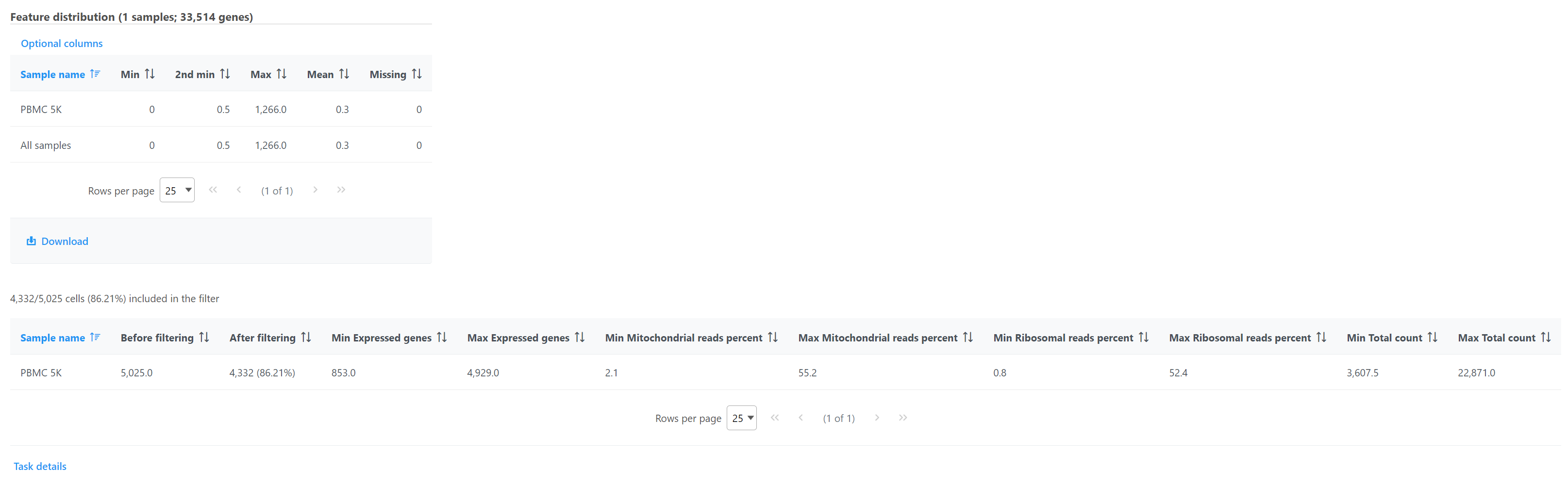 Figure 12. Filtered counts task report
Additional Assistance
If you need additional assistance, please visit our support page to submit a help ticket or find phone numbers for regional support.


| Your Rating: |
|
Results: |

|
29 | rates |
Overview
Content Tools