Filtering cells
An important step in analyzing single cell RNA-Seq data is to filter out low quality cells. A few examples of low-quality cells are doublets, cells damaged during cell isolation, or cells with too few reads to be analyzed.
- Click on the Single cell data node
- Click on the QA/QC section of the task menu
- Click on Single cell QA/QC
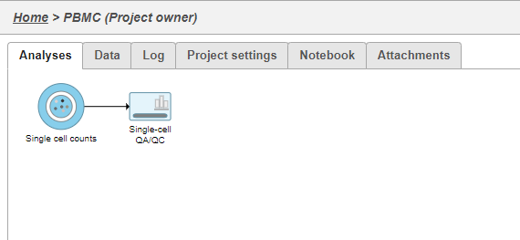
A task node, Single cell QA/QC, is produced. Initially, the node will be semi-transparent to indicate that it has been queued, but not completed. A progress bar will appear on the Single cell QA/QC task node to indicate that the task is running (Figure 1).
- Click the Single cell QA/QC node once it finishes running
- Click Task report in the task menu
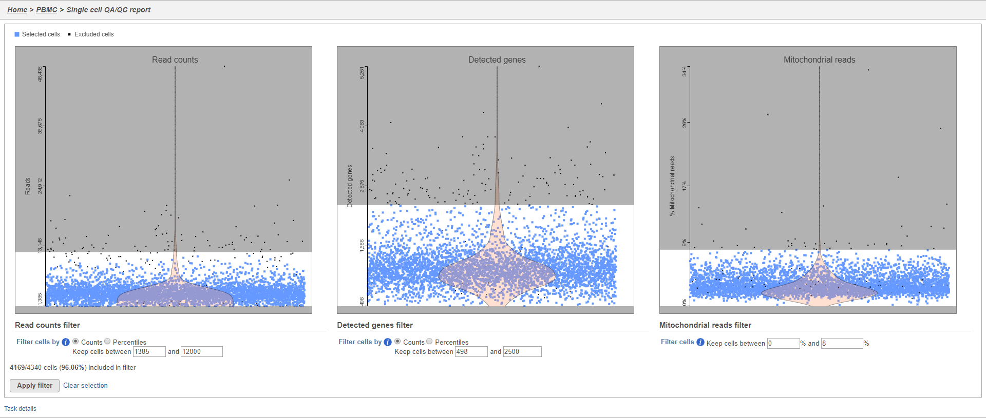
The Single cell QA/QC report includes interactive violin plots showing the value of every cell in the project on several quality measures (Figure 2).
There are three plots: number of UMI counts per cell, number of detected genes per cell, and the percentage of mitochondrial counts per cell.
Each point on the plots is a cell and the violins illustrate the distribution of values for the y-axis metric. Cells can be filtered either by clicking and dragging to select a region on one of the plots or by setting thresholds using the filters below the plots. Here, we will apply a filter for the number of read counts.
The plot will be shaded to reflect the filter. Cells that are excluded will be shown as black dots on both plots.
The UMI counts per cell and number of detected genes per cell are typically used to filter out potential doublets - if a cell as an unusually high number of total UMIs or detected genes, it may be a doublet. The mitochondrial counts percentage can be used to identify cells damaged during cell isolation - if a cell has a high percentage of mitochondrial counts, it is likely damaged or dying and may need to be excluded.
Normalization
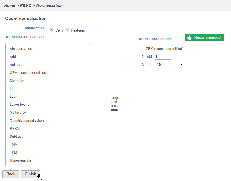
Because different cells will have a different number of total UMIs, it is important to normalize the data prior to downstream analysis. For droplet-based single cell isolation and library preparation methods that use a 3' counting strategy, where only the 3' end of each transcript is captured and sequenced, we recommend the following normalization - 1. CPM (counts per million), 2. Add 1, 3. Log2. This accounts for differences in total UMI counts per cell and log transforms the data, which makes the data easier to visualize.
- Click the Filtered counts node produced by the Filtered counts task
- Click Normalization and scaling in the task menu
- Click Normalization
- Click to add the recommended normalization scheme
This adds CPM (counts per million), Add 1, and Log2 to the Normalization order panel. Normalization steps are performed in descending order.
- Click Finish to apply the normalization (Figure 3)
A new Normalized counts data node will be produced.
For more information on normalizing data in Partek Flow, please see the Normalize Counts section of the user manual.
Filtering genes
A common task in bulk and single-cell RNA-Seq analysis is to filter the data to include only informative genes. Because there is no gold standard for what makes a gene informative or not and ideal gene filtering criteria depend on your experimental design and research question, Partek Flow has a wide variety of flexible filtering options.
- Click the Single cell data node produced by the Filter cells task
- Click Filtering in the task menu
- Click Filter features
There are three categories of filter available - noise reduction, statistics based, and feature list.
The noise reduction filter allows you to exclude genes considered background noise based on a variety of criteria. The statistics based filter is useful for focusing on a certain number or percentile of genes based on a variety of metrics, such as variance. The feature list filter allows you to filter your data set to include or exclude particular genes.
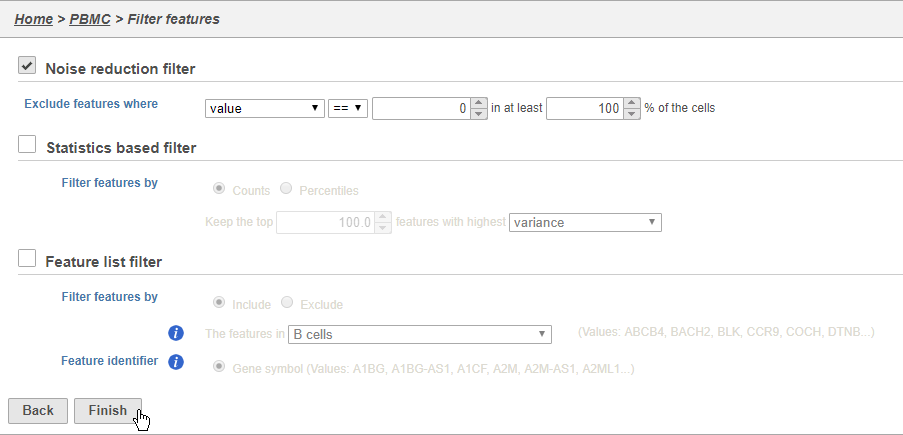
For example, you can use a noise reduction filter to exclude genes that are not expressed by any cell in the data set, but were included in the matrix file.
- Click the Noise reduction filter check box
- Set the Noise reduction filter to Exclude features where value == 0 in 100% of cells using the drop-down menus and text boxes
- Click Finish to apply the filter (Figure 4)
This produces a Filtered counts data node. This will be the starting point for the next stage of analysis - identifying cell types in the data using the interactive t-SNE plot.
Scaling
For some data sets, it may be necessary to remove technical artifacts or batch effects. To do this, you can use the Scaling task in the Normalization and Scaling section. To configure the scaling task, select the cell or sample attribute effects you would like to regress out of the data set. The scaling task is detailed in our Single Cell Scaling white paper. We will not perform scaling for this data set.
PCA
Principal components (PC) analysis (PCA) is an exploratory technique that is used to describe the structure of high dimensional data by reducing its dimensionality. Because PCA is used to reduce the dimensionality of the data prior to clustering as part of a standard single cell analysis workflow, it is useful to examine the results of PCA for your data set prior to clustering.
- Click the Normalized counts node
- Click Exploratory analysis in the task menu
- Click PCA
You can choose Features contribute equally to standardize the genes prior to PCA or allow more variable genes to have a larger effect on the PCA by choosing by variance. By default, we take variance into account and focus on the most variable genes.
If you have multiple samples, you can choose to run PCA for each sample individually or for all samples together using the Split cells by sample option.
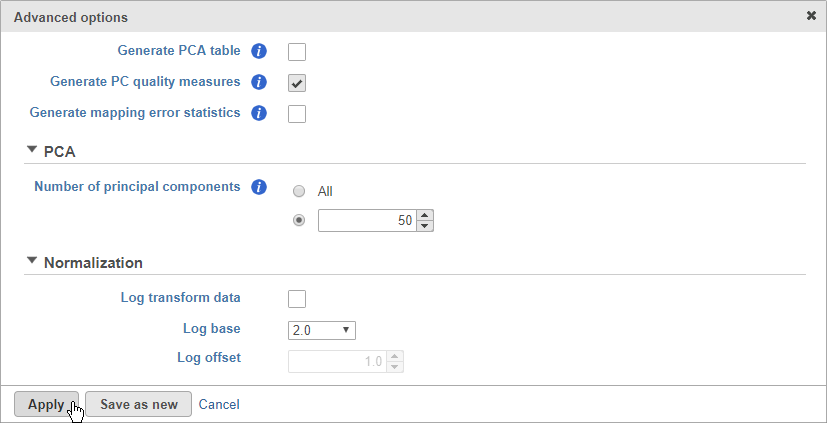
- Click Configure to access the advanced settings
- Click Generate PC quality measures (Figure 5)
This will generate a Scree plot and PC component loadings table, which are useful for determining how many PCs to use for downstream analysis tasks.
- Click Apply
- Click Finish to run
A new PCA task node will be produced.
- Double-click the PCA task node to open the PCA task report
The PCA task report includes the PCA plot, the Scree plot, the component loadings table, and the PC projections table. To switch between these elements, use the buttons in the upper right-hand corner of the task report . Each cell is shown as a dot on the PCA scatter plot.
- Click to open the Scree plot
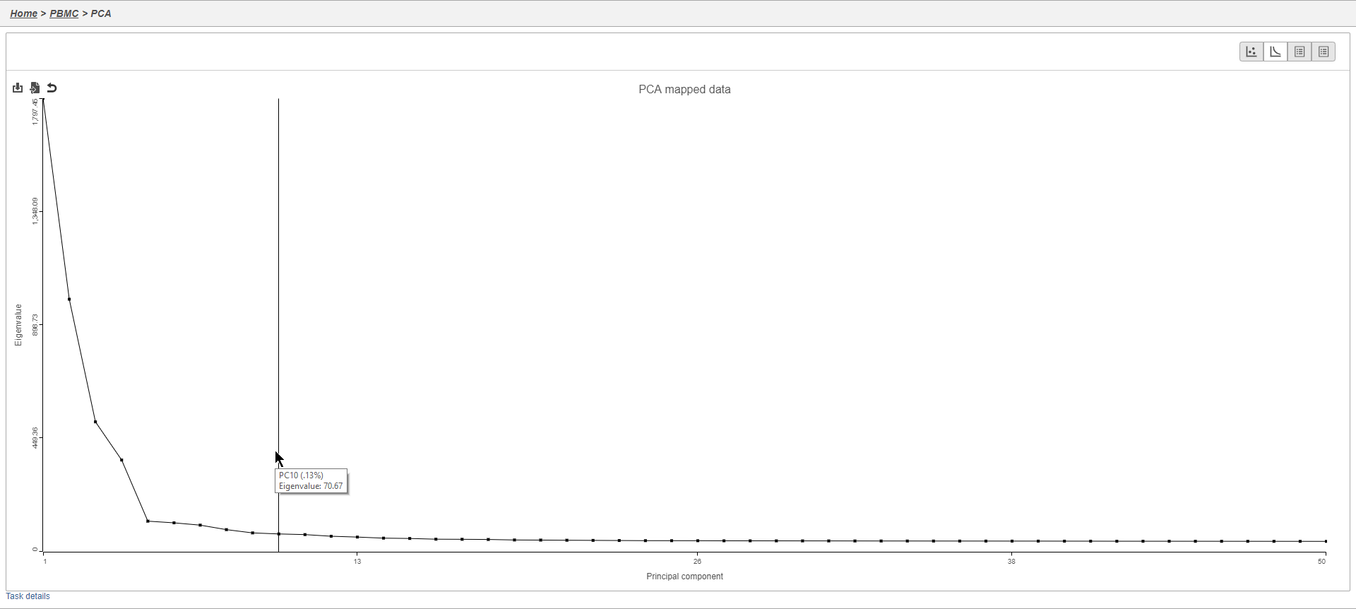
The Scree plot lists PCs on the x-axis and the amount of variance explained by each PC on the y-axis, measured in Eigenvalue. The higher the Eigenvalue, the more variance is explained by the PC. Typically, after an initial set of highly informative PCs, the amount of variance explained by analyzing additional PCs is minimal. By identifying the point where the Scree plot levels off, you can choose an optimal number of PCs to use in downstream analysis steps like graph-based clustering and t-SNE.
- Mouse over the Scree plot to identify the point where additional PCs offer little additional information (Figure 6)
Viewing the genes highly correlated with each PC can be useful when choosing how many PCs to include.
- Click the first to open the Component loadings table
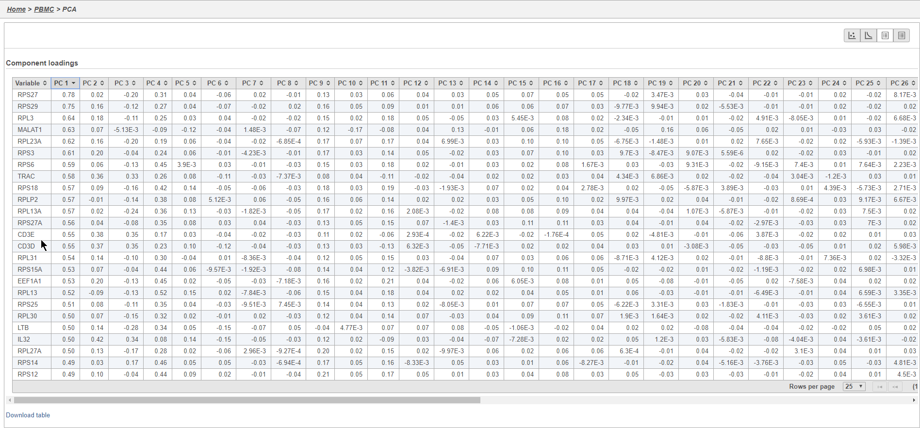
This table lists genes on rows and PCs on columns.
- Click PC1 to sort the genes in descending order by their correlation with PC1
- Click PC1 again to switch to ascending order of correlation with PC1
In this case, we see a few known marker genes are highly correlated with PC1 (Figure 7).
Graph-based clustering
Graph-based clustering identifies groups of similar cells using PC values as the input. By including only the most informative PCs, noise in the data set is excluded, improving the results of clustering.
- Click the Normalized counts data node
- Click Exploratory analysis in the task menu
- Click Graph-based clustering
Clustering can be performed on each sample individually or on all samples together. Here, we are working with a single sample.
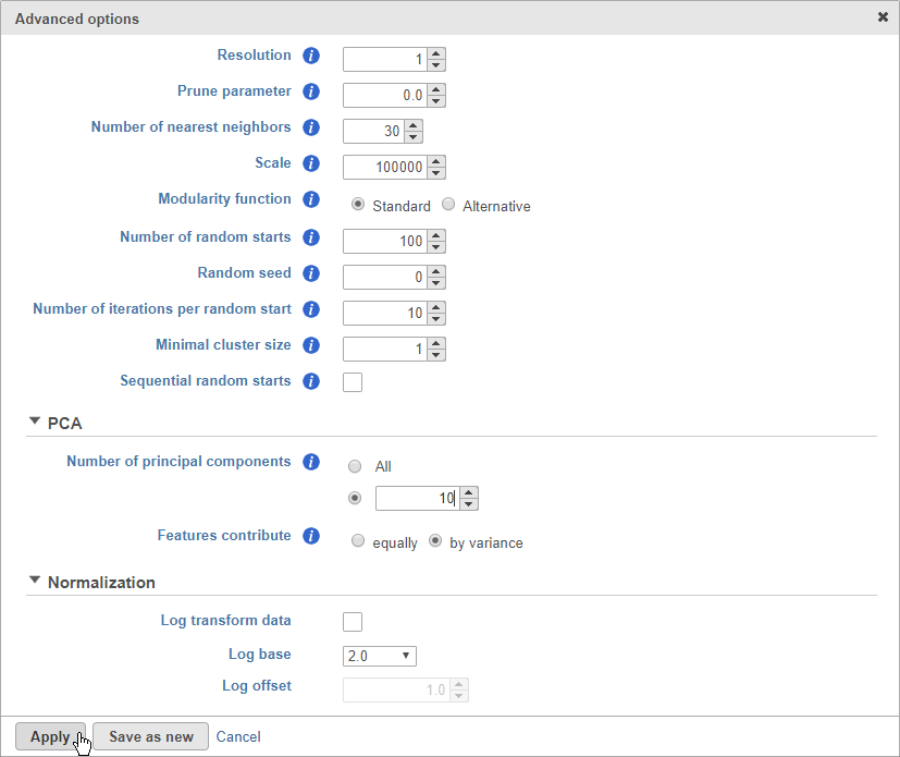
- Click Configure to access the advanced options
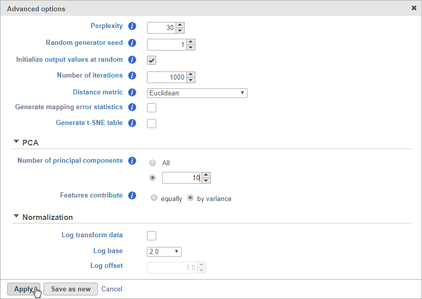
- Set Number of principal components to 10 (Figure 8)
The Number of principal components should be set based on the your examination of the Scree plot and component loadings table. The default value of 100 is likely exhaustive for most data sets, but may introduce noise that reduces the number of clusters that can be distinguished.
- Click Apply
- Click Finish to run
A new Graph-based clustering task node and a Clustering result data node will be generated.
- Double-click the Graph-based clustering task node to open the task report
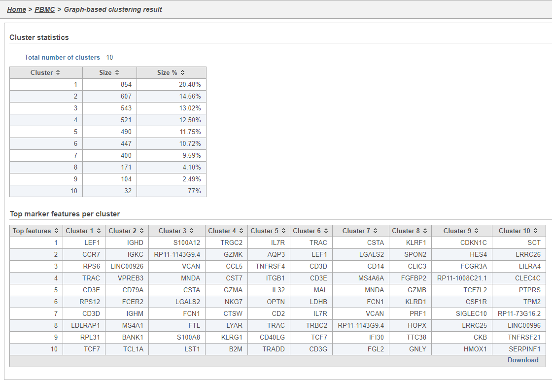
The Graph-based clustering task report lists the number of clusters and what proportion of cells fall into each cluster. It also includes a cluster biomarkers table. This lists the top-10 genes that distinguish each cluster from the others (Figure 9). These are calculated using an ANOVA test comparing the cells in each group to all the other cells, filtering to genes that are 1.5 fold upregulated, and sorting by ascending p-value. This ensures that the top-10 genes of each cluster are highly and disproportionately expressed in that cluster.
t-SNE
t-Distributed Stochastic Neighbor Embedding (t-SNE) is a dimensional reduction technique that prioritizes local relationships to build a low-dimensional representation of the high-dimensional data that places objects that are similar in high-dimensional space close together in the low-dimensional representation. This makes t-SNE well suited for analyzing high-dimensional data when the goal is to identify groups of similar objects, such as cell types in single cell RNA-Seq data.
- Click the Cluster result node
- Click Exploratory analysis in the task menu
- Click t-SNE
If you have multiple samples, you can choose to run t-SNE for each sample individually or for all samples together using the Split cells by sample option. Please note that this option will not be present if you are running t-SNE on a clustering result. For clarity, clustering results run with all samples together must be viewed together and clustering results run by sample must be viewed by sample.
Like Graph-based clustering, t-SNE takes PC values as its input and further reduces the data down to two or three dimensions. For consistency, you should use the same number of PCs as the input for t-SNE that you used for Graph-based clustering.
- Click Configure to access the advanced options
- Set Number of principal components to 10
- Click Apply
- Click Finish to run (Figure 10)
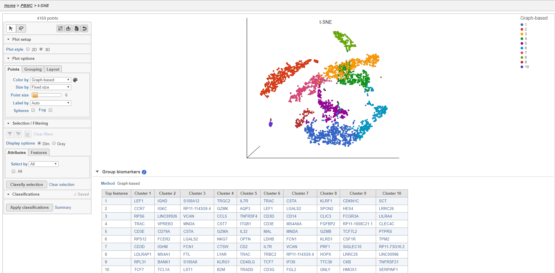
- Double-click the t-SNE task node to open the t-SNE task report (Figure 11)
Plot controls are located in the control panel on the left. You can adjust plot options, perform selection and filtering, and manage cell type classifications using the control panel. Below the scatter plot is the biomarker table that we saw in the the Graph-based clustering results. The table is interactive and clicking a gene in the table will color the plot by that gene (hold Ctrl on your keyboard and click to color by multiple genes in the table).
The t-SNE plot is in 3D by default. You can rotate the 3D plot by left-clicking and dragging your mouse. You can zoom in and out using your mouse wheel. You can pan by right-clicking and dragging your mouse. The 2D t-SNE is also calculated and you can switch between the 2D and 3D plots using the Plot style radio buttons in the control panel. In 3D, you can switch from points to 3D spheres and also add a fog effect to improve depth perception on the plot. To produce an optimal plot, you can also adjust size of the points using the slider.
Coloring the t-SNE scatter plot
You can use the Color by options to explore the data.
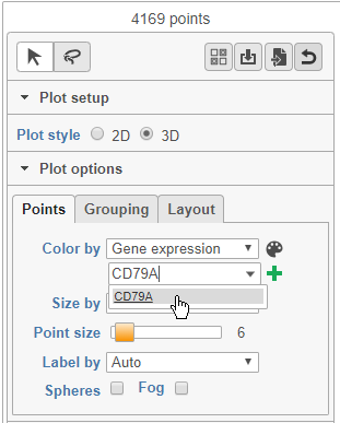
- Choose Gene expression from the Color by drop-down menu
- Type CD79A in the text field and select it (Figure 12)
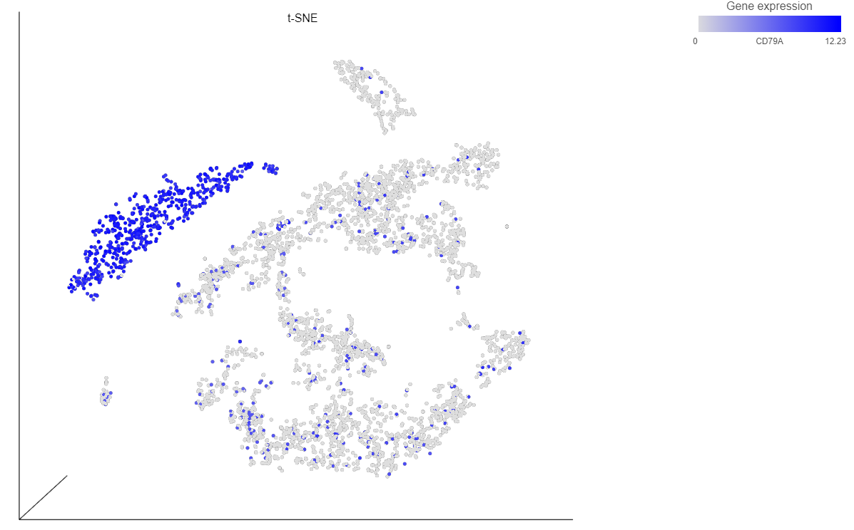
The cells on the plot will be colored based on their expression level of CD79A (Figure 13).
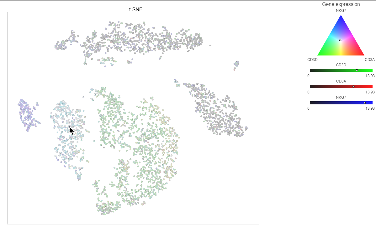
Clicking a cell on the plot shows the expression values of the cell in the legend (Figure 15).
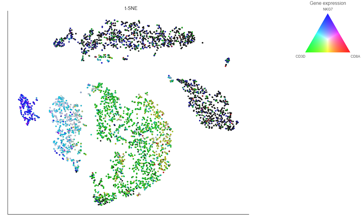
If you want to color by more than three genes at time, for example, by a list of genes that distinguish a particular cell type, like B cells, you can use the color by list option.
- Select List from the Color by drop-down menu
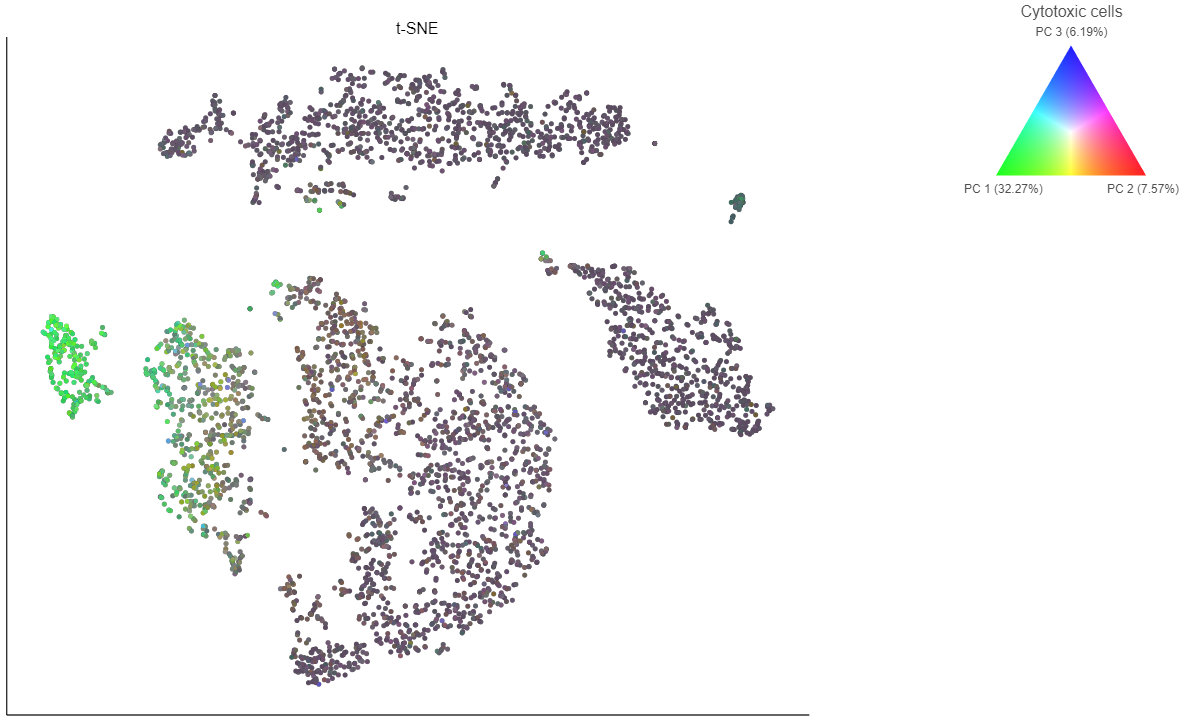
- Choose Cytotoxic cells from the lists drop-down menu
Coloring by a list calculates the first three principal components for the gene list and color the cells on the plot by their values along those three PCs (Figure 16).
In addition to coloring by gene expression and by gene lists, the points can be colored by any cell or sample attribute. Each of the attributes is listed as an option in the Color by drop-down menu.
Selecting cells on the t-SNE scatter plot
Additional Assistance
If you need additional assistance, please visit our support page to submit a help ticket or find phone numbers for regional support.


| Your Rating: |
    
|
Results: |
    
|
6 | rates |
