Analysis of variance (ANOVA) is a very powerful technique for identifying differentially expressed genes in a multi-factor experiment such as this one. In this data set, ANOVA will be used to generate a list of genes that are significantly different between Down syndrome and normal samples with an absolute difference bigger than 1.3 fold.
The ANOVA model should include Type because it is the primary factor of interest. From the exploratory analysis using the PCA plot, we observed that tissue is a large source of variation; therefore, Tissue should be included in the model. In the experiment, multiple samples were taken from the same subject, so Subject must be included in the model. If Subject were excluded from the model, the ANOVA assumption that samples within groups are independent will be violated. Additionally, the PCA scatter plot showed that the Downs syndrome and normal samples separated within tissue type, so the Type*Tissue interaction should be included in the model.
- To invoke the ANOVA dialog, select Detect Differentially Expressed Genes in the Analysis section of the Gene Expression workflow
- In the Experimental Factor(s) panel, select Type, Tissue and Subject by pressing <Ctrl> and left clicking each factor
- Use the Add Factor > button to move the selections to the ANOVA Factor(s) panel
- Select both Type and Tissue by holding <Ctrl> on your keyboard and left clicking each factor
- Select the Add Interaction > button to add a Type * Tissue interaction to the ANOVA Factor(s) panel (Figure 1)
Do NOT select OK or Apply. We will be adding contrasts to this ANOVA model in an upcoming section of the tutorial.
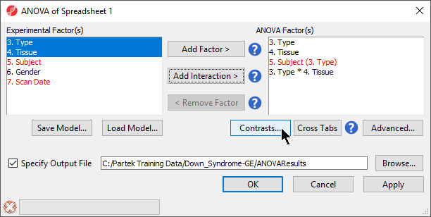
Figure 1. Configuring ANOVA factors and interactions
Random vs. fixed effects – mixed model ANOVA
Most factors in ANOVA are fixed effects, whose levels in a data set represent all the levels of interest. In this study, Type and Tissue are fixed effects. If the levels of a factor in a data set only represent a random sample of all the levels of interest (for example, Subject), the factor is a random effect. The ten subjects in this study represent only a random sample of the global population about which inferences are being made. Random effects are colored red on the spreadsheet and in the ANOVA dialog. When the ANOVA model includes both random and fixed factors, it is a mixed-model ANOVA.
Another way to determine if a factor is random or fixed is to imagine repeating the experiment. Would the same levels of each factor be used again?
- Type – Yes, the same types would be used again - a fixed effect
- Tissue – Yes, the same tissues would be used again - a fixed effect
- Subject - No, the samples would be taken from other subjects- a random effect
You can specify which factors are random and which are fixed when you import your data or after importing by right-clicking on the column corresponding to a categorical variable, selecting Properties, and checking Random Effect. By doing that, the ANOVA will automatically know which factors to treat as random and which factors to treat as fixed.
Nested/Nesting Relationships
The subject factor in the ANOVA model is listed as “5. Subject (3. Type)”, which means that Subject is nested in Type. Partek Genomics Suite can automatically detect this sort of hierarchical design and will adjust the ANOVA calculation accordingly.
Linear Contrasts
By default, an ANOVA only outputs a p-value for each factor/interaction. To get the fold change and ratio between Down syndrome and normal samples, a contrast must be set up.
- Select Contrasts… to invoke the Configure dialog
- Choose 3.Type from the Select Factor/Interaction drop-down list. The levels in this factor are listed on the Candidate Level(s) panel on the left side of the dialog
- Left click to select Down Syndrome from the Candidate Level(s) panel and move it to the Group 1 panel (renamed Down Syndrome) by selecting Add Contrast Level > in the top half of the dialog.
Label 1 will be changed to the subgroup name automatically, but you can also manually specify the label name.
- Select Normal from the Candidate Level(s) panel and move it to the Group 2 panel (renamed Normal)
- The Add Contrast button can now be selected (Figure 2)
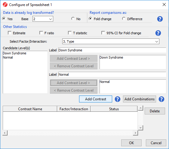
Figure 2. Adding a contrast of Down Syndrome and Normal samples
Because the data is log2 transformed, Partek Genomics Suite will automatically detect this and will automatically select Yes for Data is already log transformed? in the top right-hand corner of the dialog. Partek Genomics Suite will use the geometric mean of the samples in each group to calculate the fold change and mean ratio for the contrast between the Down syndrome and normal samples.
- Select Add Contrast to add the Down Syndrome vs. Normal contrast
- Select OK to apply the configuration
- If successfully added, the Contrasts… button will now read Contrasts Included (Figure 3)
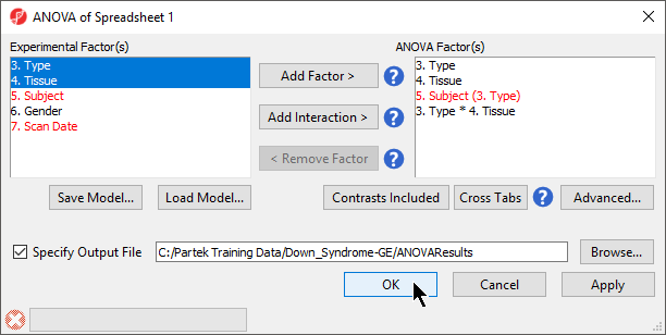
Figure 3. ANOVA configuration with contrasts included
- By default, Specify Output File is checked and gives a name to the output file. If you are trying to determine which factors should be included in the model and you do not wish to save the output file, simply uncheck this box
- Select OK in the ANOVA dialog to compute the 3-way mixed-model ANOVA
Several progress messages will display in the lower left-hand side of the ANOVA dialog while the results are being calculated.
The result will be displayed in a child spreadsheet, ANOVA-3way (ANOVAResults). In this spreadsheet, each row represents a probe set and the columns represent the computation results for that probe set (Figure 4). Although not synonymous, probe set and gene will be treated as synonyms in this tutorial for convenience. By default, the genes are sorted in ascending order by the p-value of the first categorical factor. In this tutorial,Type is the first categorical factor, which means the most highly significant differently expressed gene between Down syndrome and normal samples is at the top of the spreadsheet in row 1.
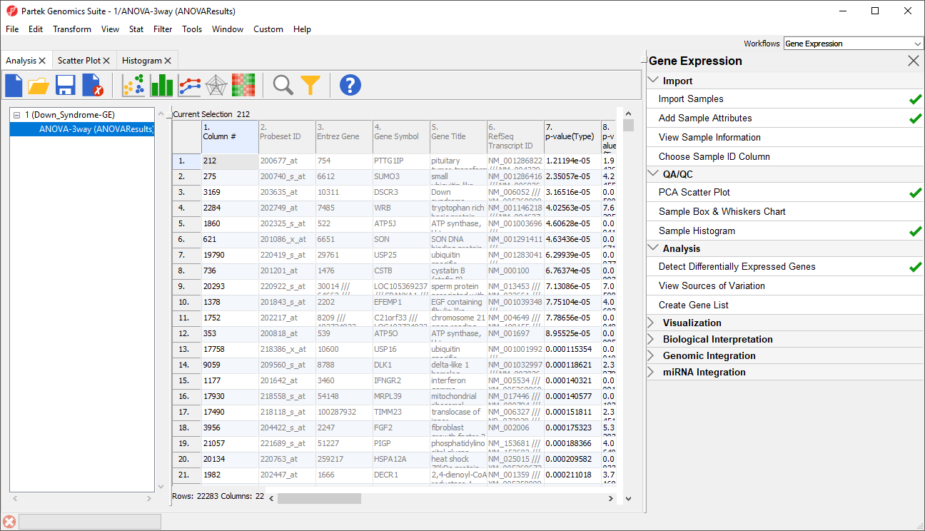
Figure 4. ANOVA spreadsheet
For additional information about ANOVA in Partek Genomics Suite, see Chapter 11 Inferential Statistics in the User’s Manual (Help > User’s Manual).
Visualizing ANOVA results
Deciding which factors to include in the ANOVA may be an iterative process while you decide which factors and interactions are relevant as not all factors have to be included in the model. For example, in this tutorial, Gender and Scan date were not included. The Sources of Variation plot is a way to quantify the relative contribution of each factor in the model towards explaining the variability of the data.
- Select View Sources of Variation from the Analysis section of the Gene Expression workflow with the ANOVA result spreadsheet active
A Sources of Variation tab will appear (Figure 5) with a bar chart showing the signal to noise ratio for each factor accross the whole genome. Sources of variation can also be viewed as a pie chart showing sum or squares by selecting the Pie Chart (Sum of Squares) tab in the upper left-hand side of the Sources of Variation tab.
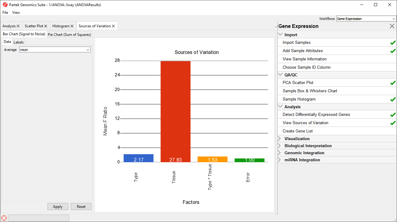
Figure 5. Sources of Variation tab showing a bar chart
This plot presents the mean signal-to-noise ratio of all the genes on the microarray. All the non-random factors in the ANOVA model are listed on the X-axis (including error). The Y-axis represents the mean of the ratios of mean square of all the genes to the mean square error of all the genes. Mean square is ANOVA’s measure of variance. Compare the bar for each signal to the bar for error; if a factor's bar is higher than error's bar, that factor contributed significant variation to the data across all the variables. Notice that this plot is very consistent with the results in the PCA scatter plot. In this data, on average, Tissue is the largest source of variation.
To view the source of variation for each individual gene, right click on a row header in the ANOVA-3way (ANOVAResults) spreadsheet and select Sources of Variation from the pop-up menu. This generates a Sources of Variation tab for the individual gene. View a few Sources of Variation plots from rows at the top of the ANOVA table and a few from the bottom of the table.
Another useful graph is an ANOVA Interaction Plot.
- Right-click on a row header in the ANOVA spreadsheet (Figure 6)
- Select ANOVA Interaction Plot to generate an Interaction Plot tab for that individual gene
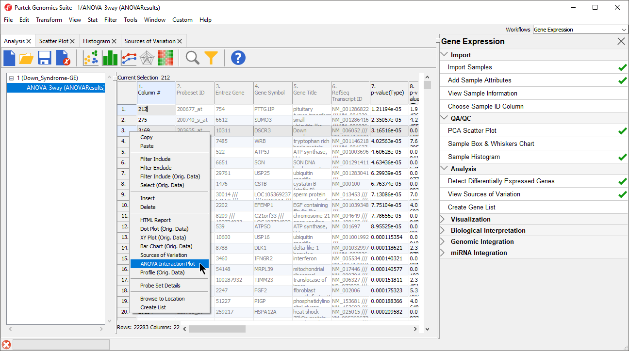
Figure 6. Calling an ANOVA Interaction Plot for a gene
Generate these plots for rows 3 (DSCR3) and 8 (CSTB). If the lines in the interaction plot are not parallel, then there is a chance that there is an interaction between Tissue and Type. Error bars show standard error of the least squared mean. DSCR3 is a good example of this (Figure 7). We can look at the p-values in column 9, p-value(Type * Tissue) to check if this apparent interaction is statistically significant.
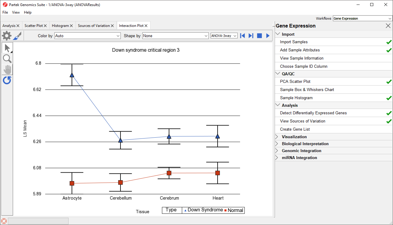
Figure 7. Interaction Plot for DSCR3
We can view the expression levels of a gene for each sample using a dot plot.
- Right click on the gene row header and select Dot Plot (Orig. Data) from the pop-up menu. This generates a Dot Plot tab for the selected gene (Figure 8)
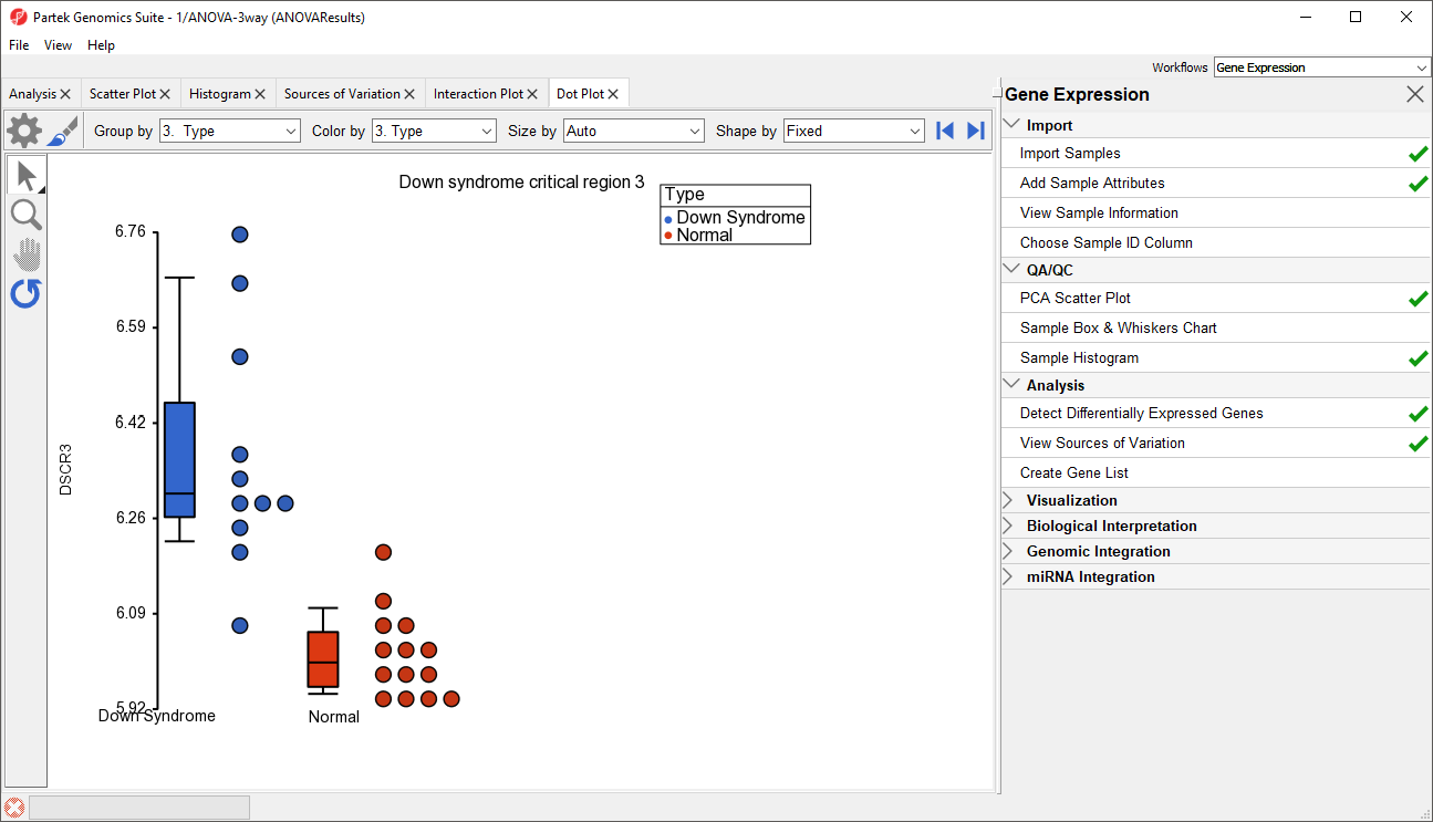
Figure 8. Dot Plot showing DSCR3 expression levels for each sample
In the plot, each dot is a sample of the original data. The Y-axis represents the log2 normalized intensity of the gene and the X-axis represents the different types of samples. The median expression of each group is different from each other in this example. The median of the Down syndrome samples is ~6.3, but the median of the normal samples is ~6.0. The line inside the Box & Whiskers represents the median of the samples in a group. Placing the mouse cursor over a Box & Whiskers plot will show its median and range.
Additional Assistance
If you need additional assistance, please visit our support page to submit a help ticket or find phone numbers for regional support.


| Your Rating: |
|
Results: |

|
36 | rates |
Overview
Content Tools