At this point in analysis, you should explore the data preliminarily. Do the genes you expected to be differentially regulated appear to have larger or smaller intensity values? Do similar samples resemble each other?
The latter question can be explored using Principal Components Analysis (PCA), an excellent method for reducing and visualizing high-dimensional data.
- Select PCA Scatter Plot from the QA/AC section of the Gene Expression workflow
A Scatter Plot tab containing your PCA plot will open (Figure 1).
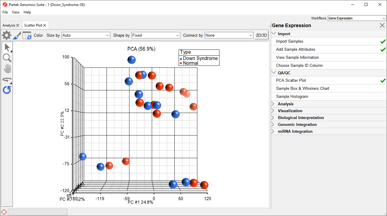
Figure 1. PCA Scatter Plot tab
In the scatter plot, each point represents a chip (sample) and corresponds to a row on the top-level spreadsheet. The color of the dot represents the Type of the sample; red represents a normal sample and blue represents a Down syndrome sample. Points that are close together in the plot have similar intensity values across the probe sets on the whole chip, while points that are far apart in the plot are dissimilar
Left-clicking on any point in the scatter plot selects that point. A dash with an identifying row number will appear on the selected PCA plot point. The spreadsheet in the Analysis tab will also jump to the corresponding row.
While pressing the mouse wheel down, drag the mouse to rotate the plot or select the Rotate Mode icon ( ) on the left side of the Scatter Plot tab. With Rotate Mode selected, press the left mouse button and drag to rotate the plot. Rotating the plot allows you to examine the grouping pattern or outliers of the data on the first three principal components (PCs).
Scrolling the mouse wheel up or down while the cursor is on the PCA plot will zoom in and out or select the Zoom Mode icon ( ) on the left side of the Scatter Plot tab.
Selecting the Reset icon ( ) option on the left side of the Scatter Plot tab will return the PCA plot to its original orientation and zoom.
As you can see from rotating the plot, there is no clear separation between Down syndrome and normal samples in this data since the red and blue samples are not separated in space. However, there are other factors that may separate the data.
- In the Scatter Plot tab, select the Rendering Properties icon (
 ) and configure the plot as shown (Figure 2)
 - Color the points by column 4. Tissue and Size the points by column 3. Type
- Select OK
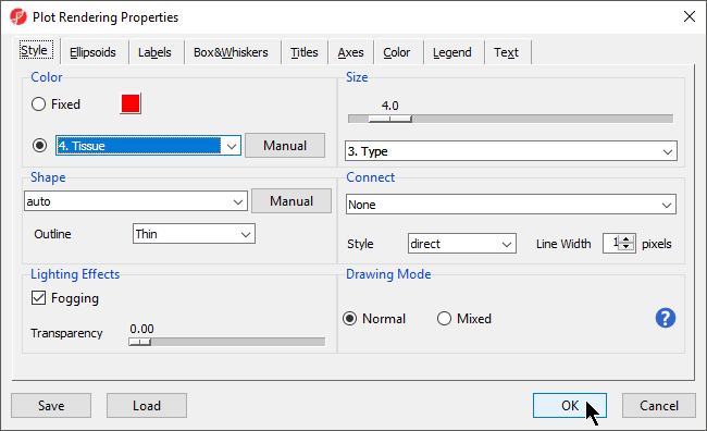
Figure 2. Configuring the PCA scatter plot: Color by Tissue, size by Type
Notice now that the data are clustered by different tissues (Figure 3).
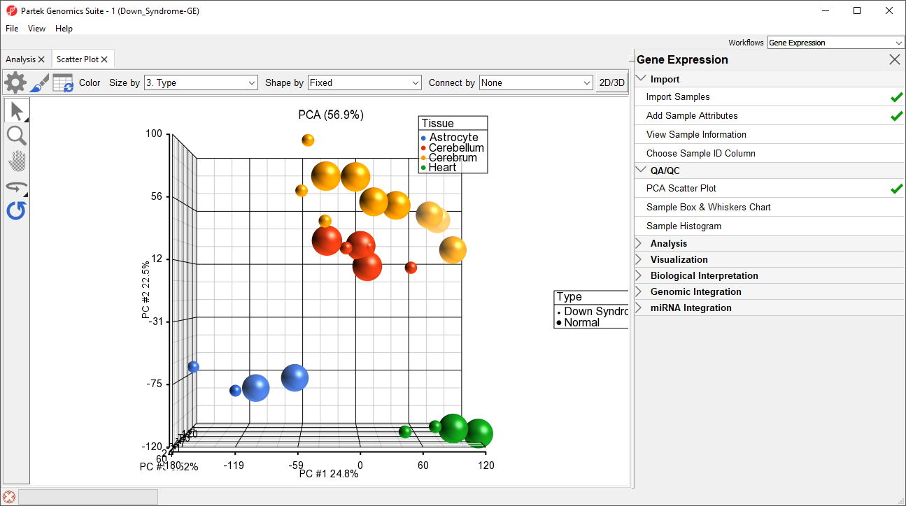
Figure 3. PCA scatter plot configured with color by Tissue, size by Type
Another way to see the cluster pattern is to put an ellipse around the Tissue groups.
- Open the Plot Rendering Properties dialog and select the Ellipsoids tab
- Select Add Ellipse/Ellipsoid
- Select Ellipse in the Add Ellipse/Ellipsoid... dialog
- Double click on Tissue in the Categorical Variable(s) panel to move it to the Grouping Variable(s) panel (Figure 4)
- Select OK to close the Add Ellipse/Ellipsoid... dialog and select OK again to exit the Plot Rendering Properties dialog
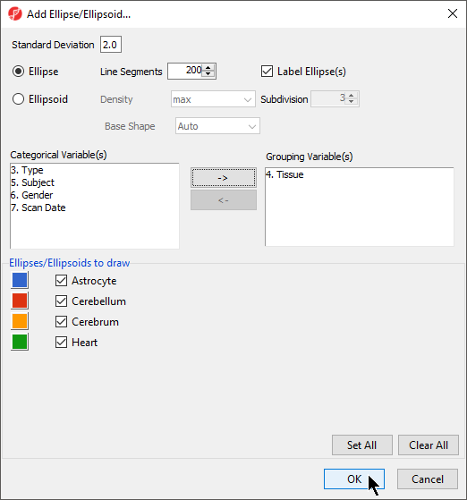
Figure 4. Adding Ellipses to PCA Scatter Plot
By rotating this PCA plot, you can see that the data is separated by tissues, and within some of the tissues, the Down syndrome samples and normal samples are separated. For example, in the Astrocyte and Heart tissues, the Down syndrome samples (small dots) are on the left, and the normal samples (large dots) are on the right (Figure 5).
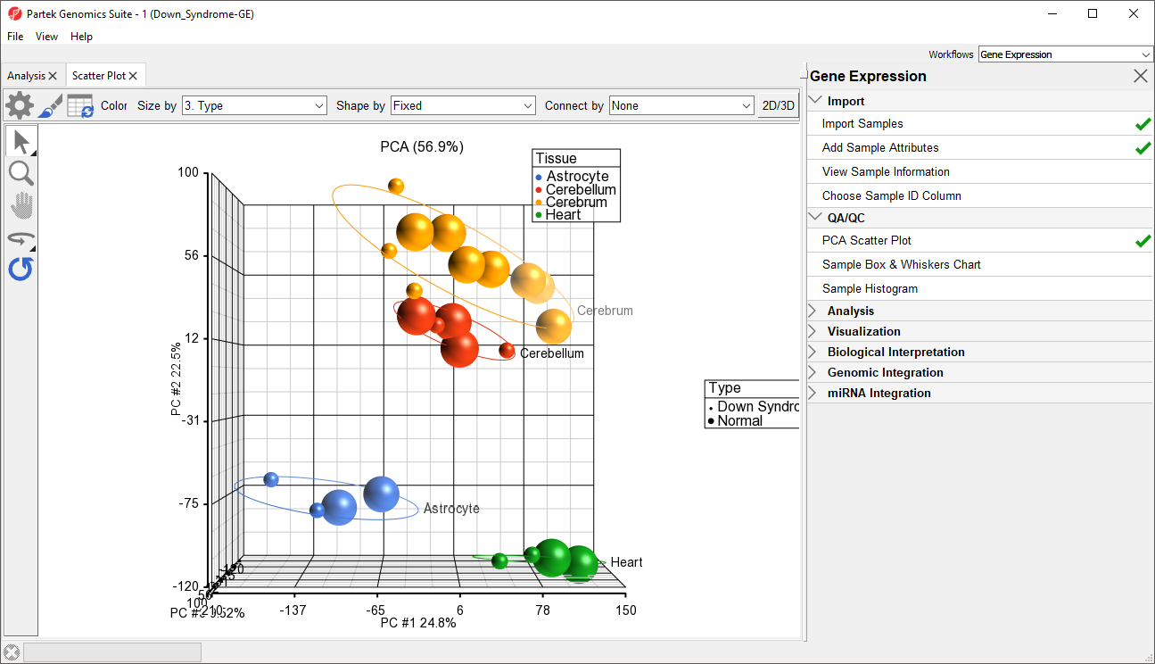
Figure 5. PCA scatter plot with ellipses, rotated to show separation by Type
PCA is an example of exploratory data analysis and is useful for identifying outliers and major effects in the data. From the scatter plot, you can see that the tissue is the biggest source of variation. There are many genes that express differently between the tissues, but not as many genes that express differently between type (Down syndrome and normal) across the whole chip.
The next step is to draw a histogram to examine the samples.
- Select Sample Histogram in the QA/QC section of the Gene Expression workflow to generate the Histogram tab (Figure 6)
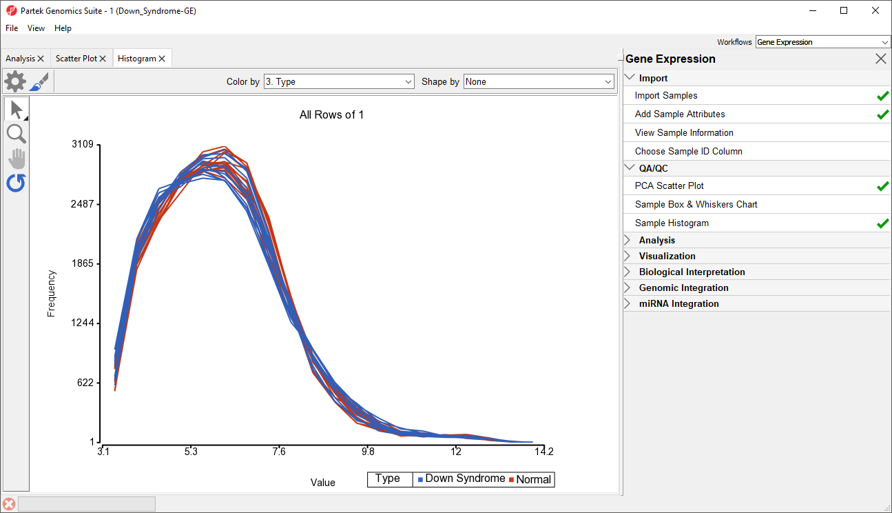
Figure 6. Histogram tab
The histogram plots one line for each of the samples with the intensity of the probes graphed on the X-axis and the frequency of the probe intensity on the Y-axis. This allows you to view the distribution of the intensities to identify any outliers. In this dataset, all the samples follow the same distribution pattern indicating that there are no obvious outliers in the data. As demonstrated with the PCA plot, if you click on any of the lines in the histogram, the corresponding row will be highlighted in the spreadsheet 1 (Down_Syndrome-GE). You can also change the way the histogram displays the data by clicking on the Plot Properties button. Feel free to explore these options on your own.
The decision to discard any samples would be based on information from the PCA plot, sample histogram plot, and QC metrics. To discard a sample and renormalize the data (without the effects of the outlier), start over with importing samples and omit the outlier sample(s) during the .CEL file import.
Additional Assistance
If you need additional assistance, please visit our support page to submit a help ticket or find phone numbers for regional support.


| Your Rating: |
|
Results: |

|
36 | rates |
Overview
Content Tools