Analysis of variance (ANOVA) is a very powerful technique for identifying differentially expressed genes in a multi-factor experiment. In this data set, ANOVA will be used to generate a list of genes that are significantly differentially regulated by each treatment.
Adding factors and interactions
When setting up the ANOVA, the primary factors of interest, Treatment and Time, should be included. We will also include the interaction between Treatment and Time, Treatment * Time, because we are interested in whether different treatments behave differently over time. From our exploratory analysis using PCA, we also know that Batch is a major source of variation and needs to be included. Including Batch as a random factor will allow us to account for the batch effect.
- Select Detect differentially expressed genes from the Analysis section of the Gene Expression workflow
- Select Treatment, Time, and Batch in the Experimental Factor(s) panel
- Select Add Factor > to move the selections to the ANOVA Factor(s) panel
- Select both Treatment and Time in the Experimental Factor(s) panel by holding Ctrl on the keyboard while selecting each
- Select Add Interaction > to add the Treatment * Time interaction to the ANOVA Factor(s) panel (Figure 1)
- Do not select OK or Apply. We still need to add linear contrasts to the ANOVA model
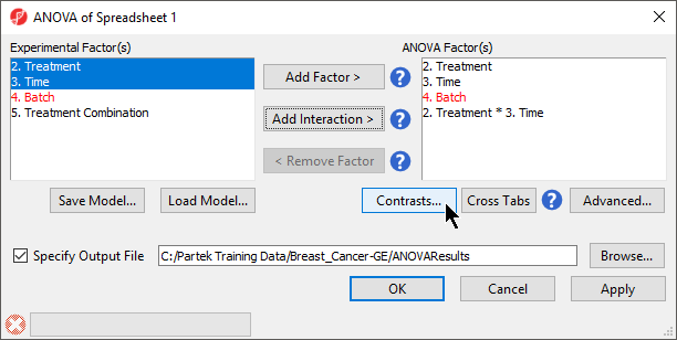 Figure 1. Adding factors and interactions to the ANOVA
Adding linear contrasts
ANOVA will output a p-value and F ratio for each factor or interaction; to get the fold-change and ratio between the different levels of a factor or interaction, linear contrasts, or comparisons, must be added.
- Select Contrasts... in the ANOVA dialog (Figure 1)
- Select Yes for Data is already log transformed?
- Select Treatment * Time from the Select Factor/Interaction drop-down menu
We will add contrasts comparing each of the three treatment groups to the control group.
- Select E2 * 8 and E2 * 48 from the Candidate Level(s) panel
- Select Add Contrast Level > to move them to the top panel (Group 1) on the right-hand side
The Group 1 panel will be renamed after the contents of the panel. We can specify a name for the group.
- Set Label of the top panel to E2
- Select Control * 0 from the Candidate Level(s) panel
- Select Add Contrast Level > to move it to the bottom panel (Group 2) on the right-hand side
- Set Label of the bottom panel to Control
The lower panel (Group 2) is considered the reference level. Because the data is log2 transformed, the geometric mean will be used to calculate the fold change and mean ratio to place both on a linear scale instead of a log scale.
- Select Add Contrast (Figure 2)
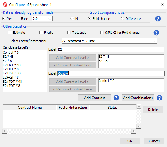
Figure 2. Adding a contrast between E2 vs. Control at all time points.
To examine the time points of each treatment condition separately, we can select Add Combinations instead of Add Contrast. This adds every possible contrast for the levels in the Group 1 and Group 2 panels.
- Select E2 * 8 and E2 * 48 from the Candidate Level(s) panel
- Select Add Contrast Level > to move them to the top panel (Group 1) on the right-hand side
- Select Control * 0 from the Candidate Level(s) panel
- Select Add Contrast Level > to move it to the bottom panel (Group 2) on the right-hand side
- Select Add Combinations to add contrasts for E2 * 8 vs. Control * 0 and E2 * 48 vs. Control * 0 (Figure 3)
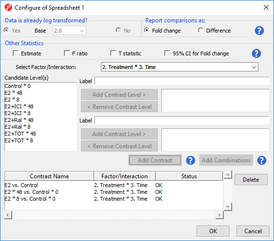
Figure 3. Add Combinations creates contrasts for every combination of levels from the two group panels.
For this tutorial, we will not be considering the time points of each treatment condition individually. We can remove the E2 * 8 vs. Control * 0 and E2 * 48 vs. Control * 0 contrasts.
- Select E2 * 8 vs. Control * 0 and E2 * 48 vs. Control * 0 from the contrasts list
- Select Delete
We will now add contrasts for the other treatment conditions.
- Add contrasts for E2+ICI vs. Control, E2+Ral vs. Control, and E2+TOT vs. Control following the steps outlined for E2 vs. Control
There should now be four contrasts added to the contrasts panel (Figure 4).
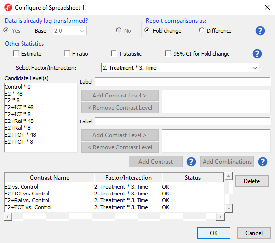
Figure 4. Fully configured contrasts for the tutorial
- Select OK to add the contrasts to the ANVOA model
The Contrasts... button should now read Contrasts Included in the ANOVA dialog.
- Select OK to perform the ANOVA
ANOVA results spreadsheet
The result of the 3-way mixed model ANOVA is displayed in a new spreadsheet, ANOVA-3way (ANOVAResults) that is a child of the Breast_Cancer.txt spreadsheet. In ANOVAResults, each row represents a probe(set)/gene with the columns containing the results of the ANOVA (Figure 5).
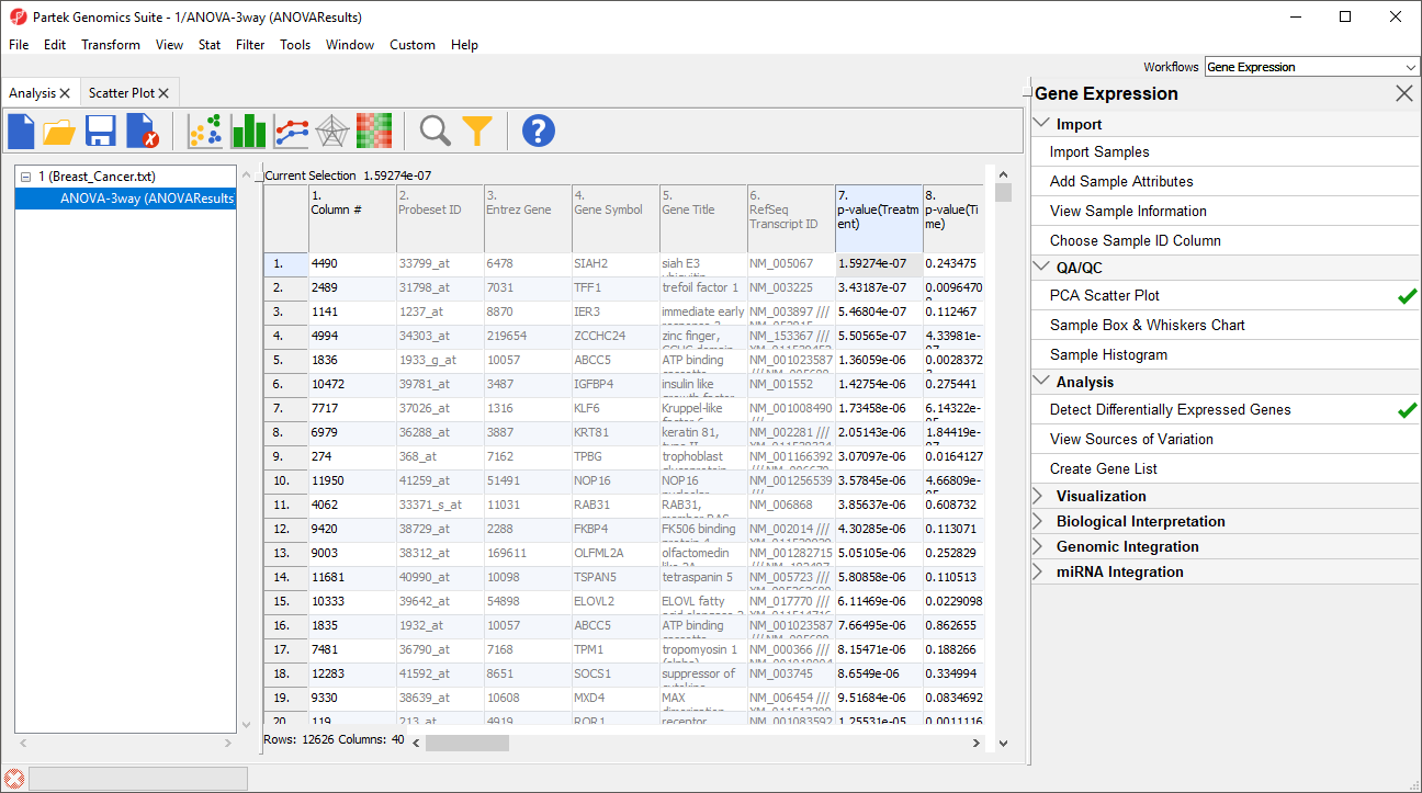 Figure 5. Viewing the ANOVA Results spreadsheet. Probe(sets)/genes are on rows and the ANOVA results are on columns.
By default, the rows are sorted in acending order by the p-value of the first factor, which places the most significantly differentially expressed gene between different treatments at the top of the spreadsheet.
Figure 5. Viewing the ANOVA Results spreadsheet. Probe(sets)/genes are on rows and the ANOVA results are on columns.
By default, the rows are sorted in acending order by the p-value of the first factor, which places the most significantly differentially expressed gene between different treatments at the top of the spreadsheet.
Each factor in the ANOVA adds p-value, F value, and SS value columns. F value is a ratio of signal to noise; high values indicate that the probe(set)/gene explains variation in the data set due to the factor. SS value is the sum of squares.
Each contrast in the ANOVA adds p-value, ratio, and fold-change columns. The p-value is calculated using log space. The ratio and fold change are calculated using linear space.
Viewing the sources of variation
Sources of variation captured in the ANOVA can be viewed for the entire data set or for individual probe(sets)/genes.
- Select View Sources of Variation from the Analysis section of the Gene Expression workflow
The Sources of Variation plot will open in a new tab (Figure 6).
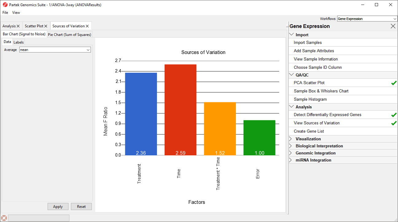
Figure 6. Viewing the sources of variation plot. Non-random factors are included when ANOVA is run using the default REML modle.
This plot presents the signal to noise ratio accross all probe(sets)/genes for each of the non-random factors and interactions in the ANOVA model. The y-axis represents the average mean square or F ratio, the ANOVA measure of variance, for all the probesets. Each bar is a factor and random error is also included. If the factor has a greater mean F ratio than Error, the factor contrinbuted significant variation to the data set.
Note that Batch is not included as a factor. This is beacuse Batch is a random factor and accounted for by the ANOVA model.
The sources of variation for each probe(set)/gene can be viewed individually.
- Right-click on a row header in the ANOVAResults spreadsheet
- Select Sources of Variation from the pop-up menu
The plot will open in a new tab. For additional plots that can be invoked from the ANOVA results spreadsheet, see the Visualizations user guide.
Additional Assistance
If you need additional assistance, please visit our support page to submit a help ticket or find phone numbers for regional support.


| Your Rating: |
|
Results: |

|
43 | rates |
Overview
Content Tools