Principal Components Analysis (PCA) is an excellent method to visualize similarities and differences between the samples in a data set. PCA can be invoked through a workflow, by selecting (![]() ) from the main command bar, or by selecting Scatter Plot from the View section of the main toolbar. We will use a workflow.
) from the main command bar, or by selecting Scatter Plot from the View section of the main toolbar. We will use a workflow.
- Select Gene Expression from the Workflows drop-down menu
- Select PCA Scatter Plot from the QA/QC section of the Gene Expression workflow
The PCA scatter plot will open as a new tab (Figure 1).
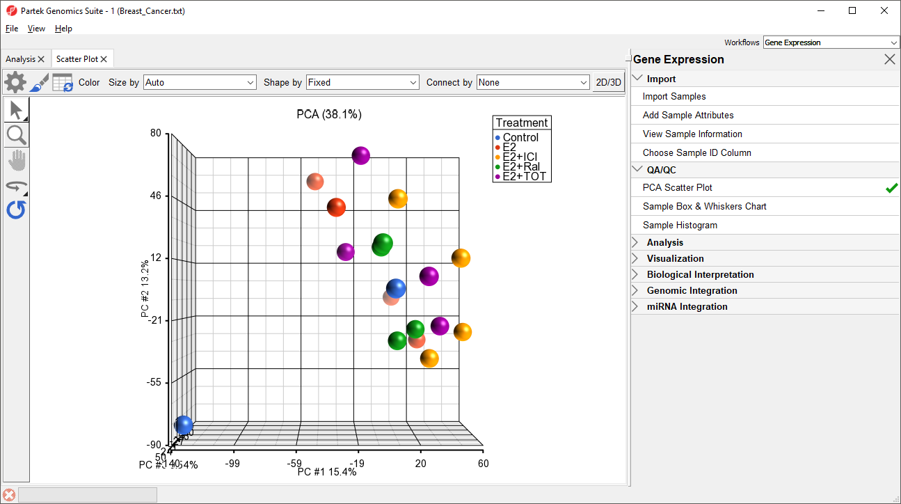
Figure 1. Viewing the PCA scatter plot. Each point is a sample. Samples are colored by treatment.
In this PCA scatter plot, each point represents a sample in the spreadsheet. Points that are close together in the plot are more similar, while points that are far apart in the plot are more dissimilar.
To better view the data, we can rotate the plot.
- Select (
 ) to activate Rotate Mode
 - Click and drag to rotate the plot
Rotating the plot allows us to look for outliers in the data on each of the three principal components (PC1-3). The percentage of the total variation explained by each PC is listed by its axis label. The chart label shows the sum percentage of the total variation explained by the displayed PCs.
We can change the plot properties to better visualize the effects of different variables.
- Select (
 ) to open the ConfigurePlot Properties dialog
 - Set Shape to 4. Batch
- Set Size to 3. Time
- Set Connect to 5. Treatment Combination
- Select OK (Figure 2)
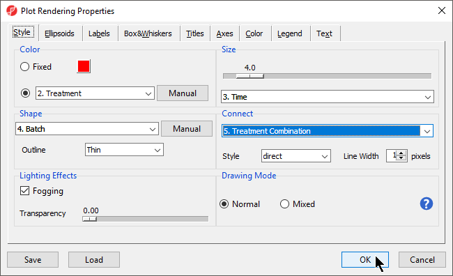
Figure 2. Configuring plot properties to color by treatment, shape by batch, size by time, and connect by treatment combination
The PCA scatter plot now shows information about treament, batch, and time for each sample (Figure 3).
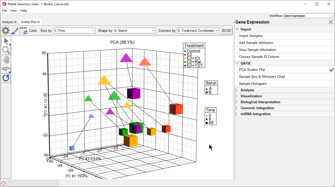 Figure 3. PCA scatter plot showing treatment, batch, and time information for each sample. A batch effect is clearly visible.
PCA is particularly useful for identifying outliers and batch effects in data sets. We can see a batch effect in this dataset as samples separate by batch. To make this more clear, we can add an ellipses by Batch.
Figure 3. PCA scatter plot showing treatment, batch, and time information for each sample. A batch effect is clearly visible.
PCA is particularly useful for identifying outliers and batch effects in data sets. We can see a batch effect in this dataset as samples separate by batch. To make this more clear, we can add an ellipses by Batch.
- Select () to open the ConfigurePlot Properties dialog
- Select Ellipsoids from the tab
- Select Add Ellipse/Ellipsoid
- Select Ellipse
- Select Batch from the Categorical Vairable(s) panel and move it to the Group Variable(s) panel
- Select OK
- Select OK to close the dialog
The ellipses help illustrate that the data is spearated by batches (Figure 4).
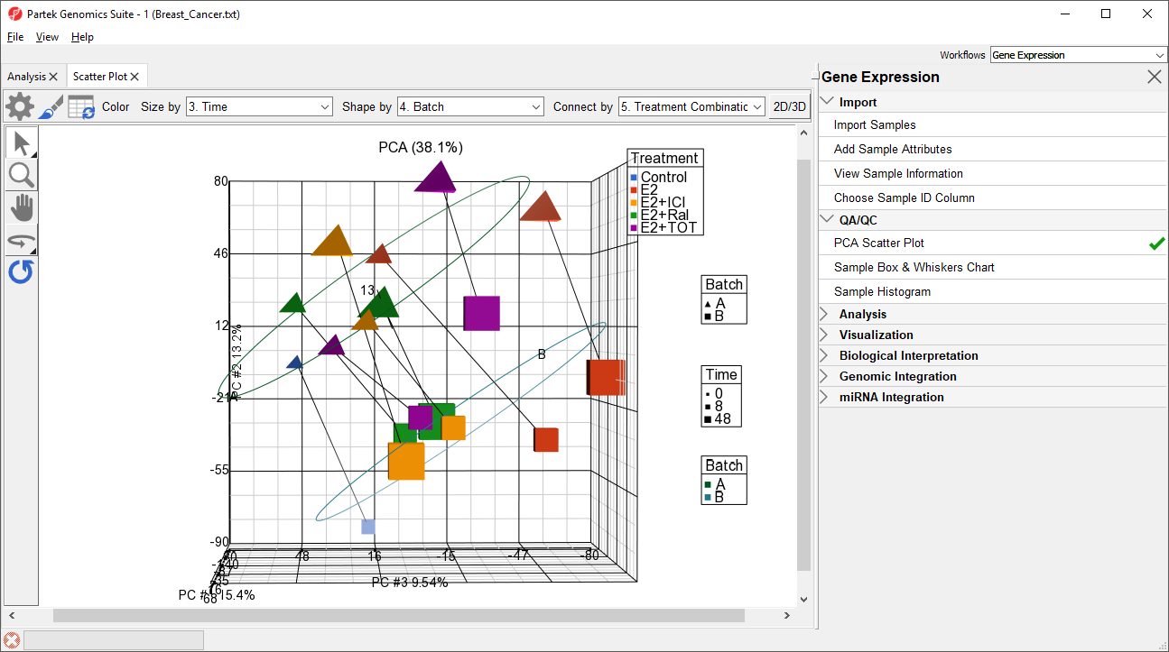
Figure 4. Ellipses around batch groups show that samples separate by batch
Ways to address the batch effect in the data set will be detailed later in this tutorial.
Additional Assistance
If you need additional assistance, please visit our support page to submit a help ticket or find phone numbers for regional support.


| Your Rating: |
|
Results: |

|
44 | rates |
Overview
Content Tools