By including Batch in the ANOVA model, the variability due to the batch effect is accounted for when calculating p-values for the non-random factors. In this sense, the batch effect has already been removed. However, visualizing biological effects can be very difficult if batch effects are present in the original intensity data used to generate visualizations. We can modify the original intensity data to remove the batch effect using the Remove Batch Effect tool.
Using the Remove Batch Effect tool
The Remove Batch Effect tool functions much like ANOVA in reverse, calculating the variation attributed to the factor being removed then adjusting the original intensity values to remove the variation. Once the variation caused by the batch effect has been removed, tools like PCA or clustering can be used to visualize what the data would look like if the batch effect was not present.
- Select the1 (Breast_Cancer.txt) spreadsheet
- Select Stat from the main tool bar
- Select Remove Batch Effect... (Figure 1)
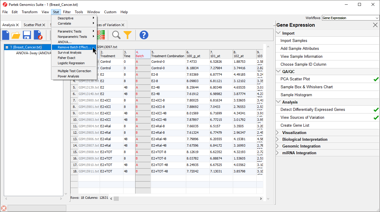
Figure 1. Invoking the Remove Batch Effect tool
The Remove Batch Effects dialog will open. The tool functions by performing an ANOVA then modifying the original intensities values to remove the effects of the specified factor(s).
- Select Treatment, Time, and Batch
- Select Add Factor > to add them to the ANOVA Factor(s) panel
- Select Batch in the ANOVA Factor(s) panel
- Select Add Factor > to add Batch to the Remove Effect(s) of These Factor(s) panel
By default, the results will be displayed in a new spreadsheet. Options to overwrite the current spreadsheet and specify the output file appear in the bottom of the dialog (Figure 2).
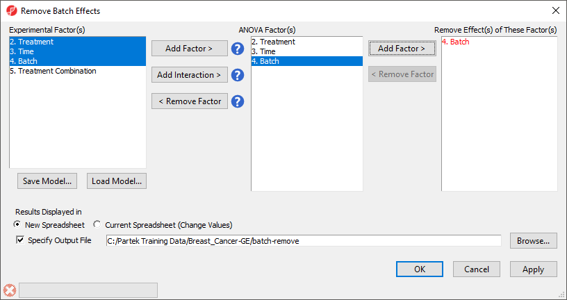
Figure 2. Configuring the Remove Batch Effects tool to remove Batch and create a new spreadsheet
- Select OK
The new spreadsheet, 1-removeresult (batch-remove) will open in the Analysis tab (Figure 3).
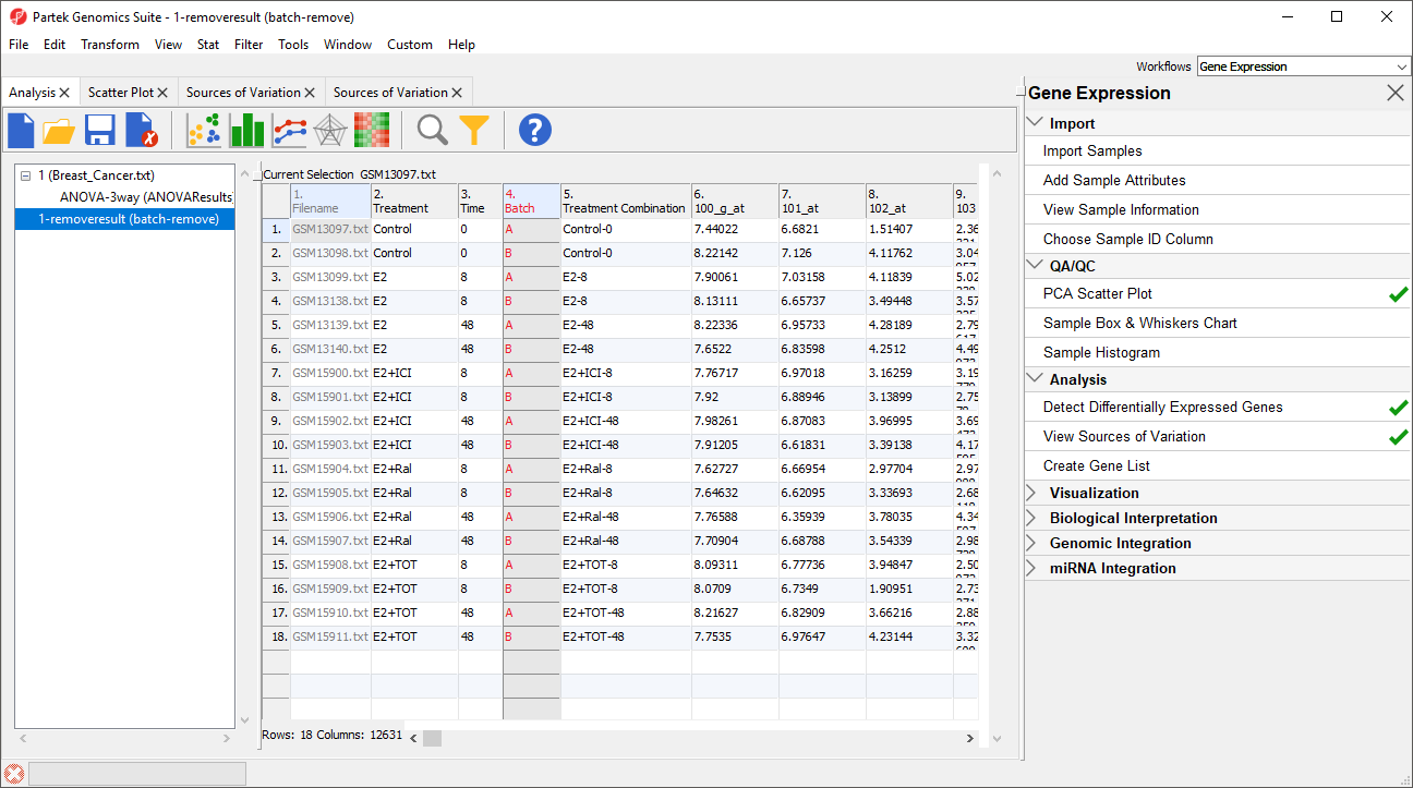 Figure 3. Viewing the new spreadsheet with batch effects removed
Batch effects in PCA
We can visualize the effects of removing the batch effects using PCA.
- Select 1 (Breast_Cancer.txt) from the spreadsheet tree
- Select (
 ) plot the PCA scatter plot
 - Select (
 )
) - Set Drawing Mode to Mixed
- Select the Ellipsoids tab
- Select Add Centroid
- Add Batch to the Grouping Variable(s) panel
- Set the colors of the two centroids as shown (Figure 4) to pink and yellow
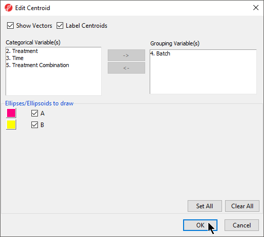
Figure 4. Adding a centroid for Batch
- Select OK to close the Add Centroid...
- Select OK to close the Configure Plot Properties dialog
The two centroids are distinct, showing the batch effect (Figure 5).
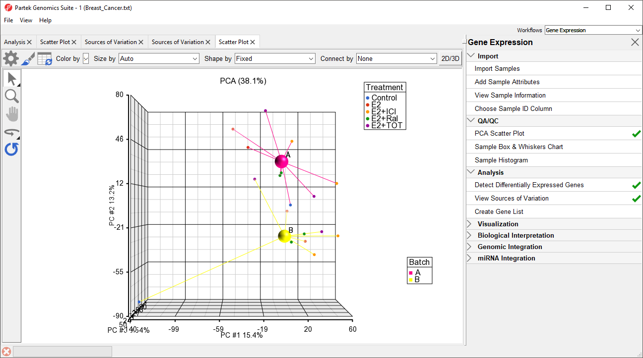
Figure 5. Viewing a batch effect using PCA. The batches are shown as the pink (A) and yellow (B) centroids. The clear separation of the centroids indicates a batch effect
- Repeat the above steps for 1-removeresult (batch-remove)
For 1-removeresult (batch-remove), the centroids of the two batches overlap, showing that the batch effect has been removed (Figure 6).
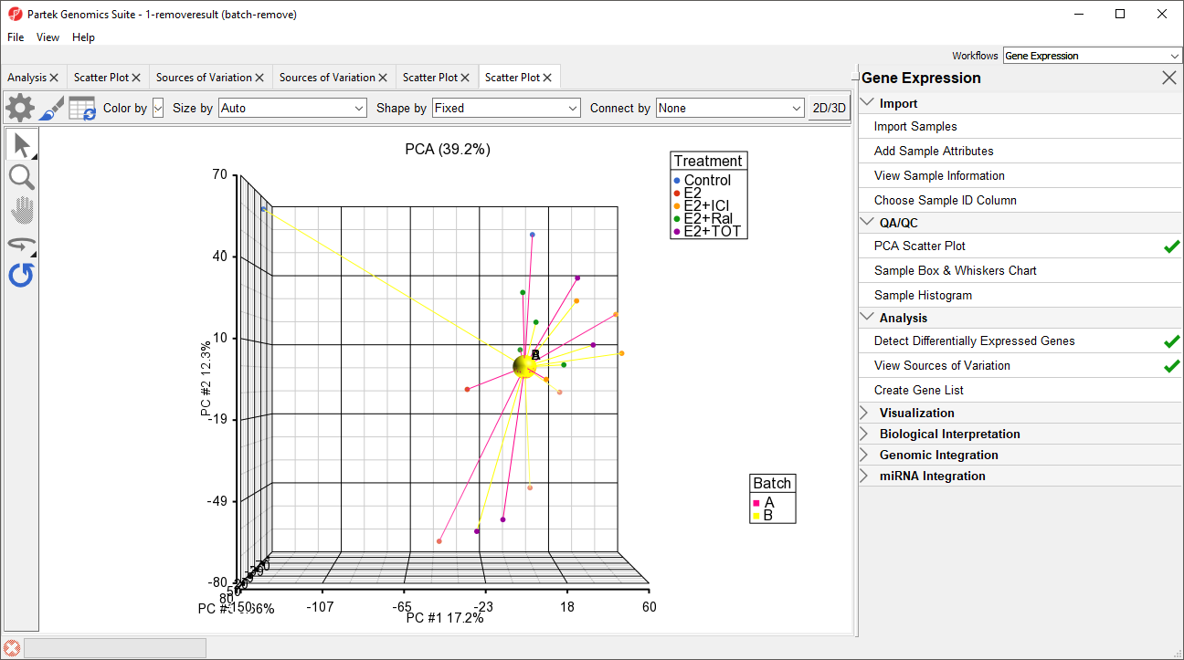
Figure 6. Overlapping centroids for batches A and B show that the batch effect has been removed.
Batch effects in ANOVA results visualizations
Visualization of ANOVA results for single probe(sets)/genes also benefits from batch removal. To illustrate this, we first need to repeat our ANOVA using the new batch-remove intesitiy values spreadsheet.
- Select the Analysis tab
- Select 1-removeresult (batch-remove) in the spreadsheet tree
- Select Stat from the main toolbar
- Select ANOVA...
- Add Treatment, Time, and Batch factors to the ANOVA Factor(s) panel
- Add Treatment * Time interaction to the ANOVA Factor(s) panel
- Select Contrasts...
- Select Treatment from the Select Factor/Interaction drop-down menu
- Select Yes for Data is already log transformed?
- Set up contrasts of treatment vs. control for E2, E2+ICI, E2+Ral, and E2+TOT (Figure 7)
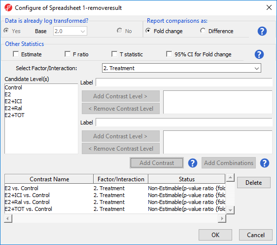
Figure 7. Configuring ANOVA to comparing treatment groups to control
- Select OK to add contrasts
- Change output file name to ANOVAResults_batch-remove
- Select OK to perform the ANOVA
The ANOVAResults_batch-remove spreadsheet will open in the Analysis tab.
- Select the ANOVAResults spreadsheet
- Right-click on the row header for row 2, TFF1
- Select Dot Plot (Orig. Data) (Figure 8)
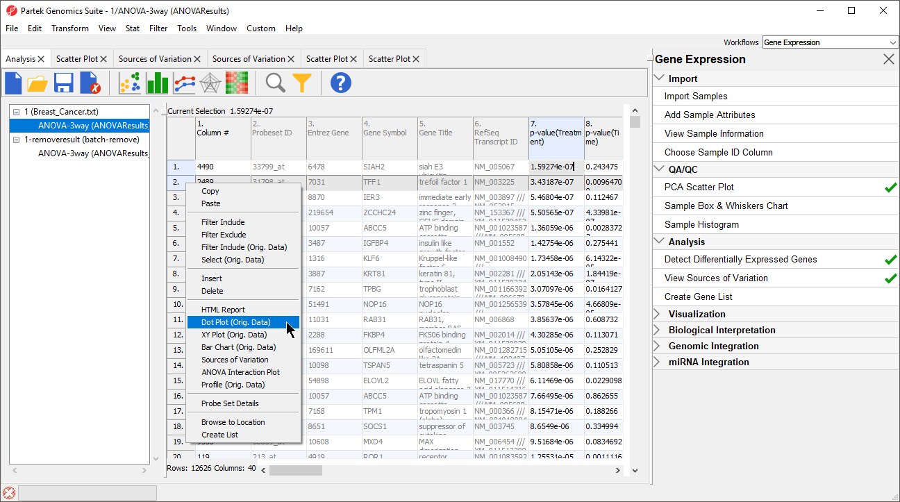
Figure 8. Invoking a dot plot from the ANOVAResults spreadsheet
A dot plot for trefoil factor 1 (TFF1) will open (Figure 9). The dot plot shows gene intensity values (y-axis) for each sample. Samples are grouped by Treatment.
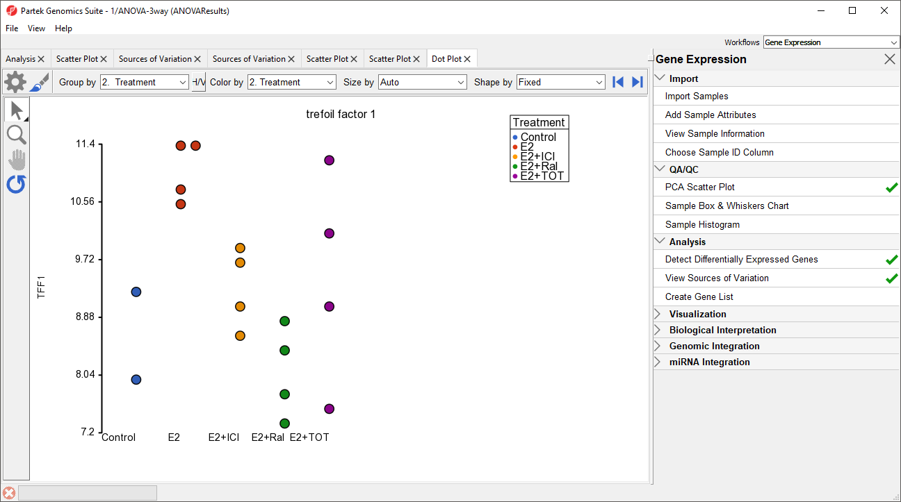
Figure 9. Viewing the dot plot for trefoil factor 1 (TIFF1) across different treatment groups
To visualize the batch effect we will make a few changes to the plot.
- Select H/V to switch the horizontal and vertical axis
- Select ()
- Set Color to Batch
- Set Size to Time
- Set Connect to Treatment Combination (Figure 10)
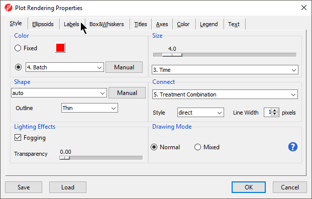
Figure 10. Configuring the dot plot (part 1 of 2)
- Select the Labels tab
- Select Column for In Point Labels
- Select Time from the Column drop-down list (Figure 11)
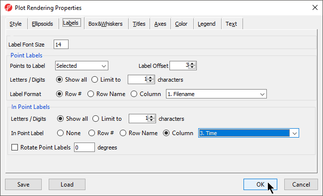
Figure 11. Configuring the dot plot (part 2 of 2)
- Select OK
The dot plot now clearly shows the batch effect (Figure 12). Samples within treatment groups are separated clearly between the two batches shown in blue and red.
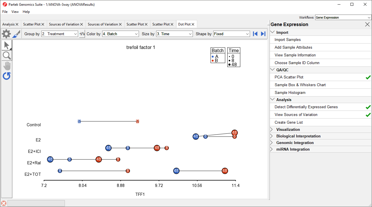 Figure 12. Viewing a dot plot showing a batch effect. Each dot is a sample. The y-axis is treatment combinations; the x-axis is the expression value of the TFF1 gene. Dots are colored by batch, sized by time, connected by treatment combination, and labeled by time.
To view the effects of batch removal, we can view this dot plot for the ANOVAResults_batch-remove spreadsheet.
Figure 12. Viewing a dot plot showing a batch effect. Each dot is a sample. The y-axis is treatment combinations; the x-axis is the expression value of the TFF1 gene. Dots are colored by batch, sized by time, connected by treatment combination, and labeled by time.
To view the effects of batch removal, we can view this dot plot for the ANOVAResults_batch-remove spreadsheet.
- Select the Analysis tab
- Select ANOVA-3way (ANOVAResults_batch-remove) from the spreadsheet tree
- Repeat the steps shown above to create the dot plot for trefoil factor 1
The dot plot invoked from the ANOVAResults_batch-remove) spreadsheet shows that the batch effect has been removed as all the samples no longer clearly separate by color within treatment groups (Figure 13).
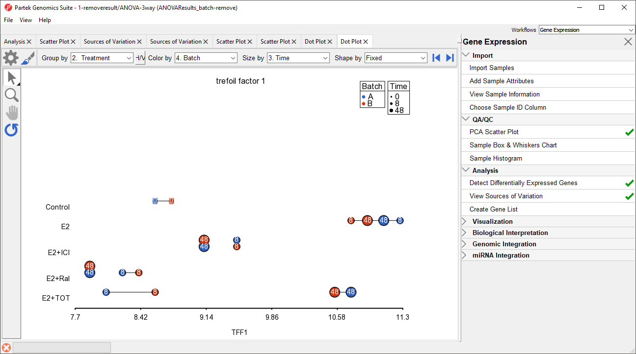
Figure 13. Viewing the dot plot that shows batch effect removal. The plot configuration matches Figure 12.
Additional Assistance
If you need additional assistance, please visit our support page to submit a help ticket or find phone numbers for regional support.


| Your Rating: |
|
Results: |

|
42 | rates |
Overview
Content Tools