Creating a new project and importing the tutorial data set
The tutorial data set is available through Partek® Flow®.
- Click your avatar (Figure 1)
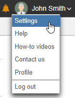
Figure 1. Location of the Settings link on the main page of Partek Flow
- Click Settings
On the System information page, the Download tutorial data section includes pre-loaded data sets used by Partek Flow tutorials (Figure 2).
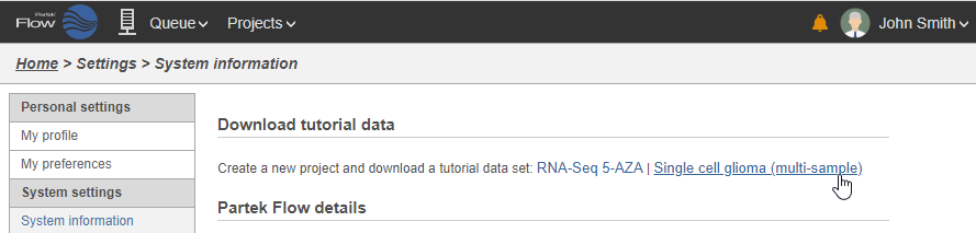
Figure 2. Tutorial data sets available through Partek Flow
- Click Single cell glioma (multi-sample)
The tutorial data set will be downloaded onto your Partek Flow server and a new project, Glioma (multi-sample), will be created. You will be directed to the Data tab of the new project. Because this is a tutorial project, there is no need to click on Import data, as the import is handled automatically (Figure 3).
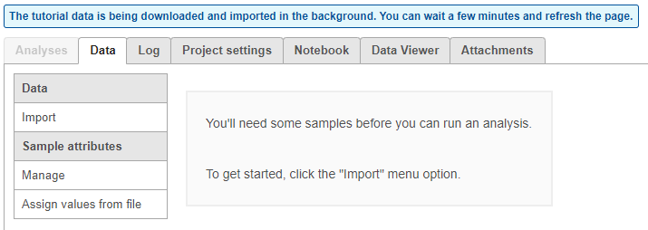
Figure 3. The data tab during tutorial data import
You can wait a few minutes for the download to complete, or check the download progress by selecting Queue then View queued tasks... to view the Queue (Figure 4).
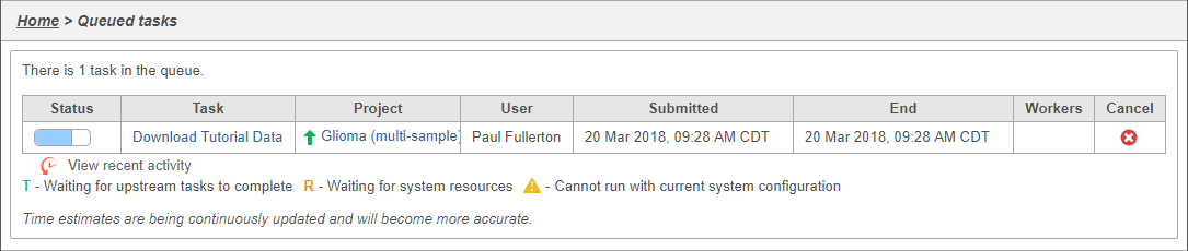
Figure 4. Viewing the queue
Once the download completes, the sample table will appear in the Data tab, with one row per sample (Figure 5).
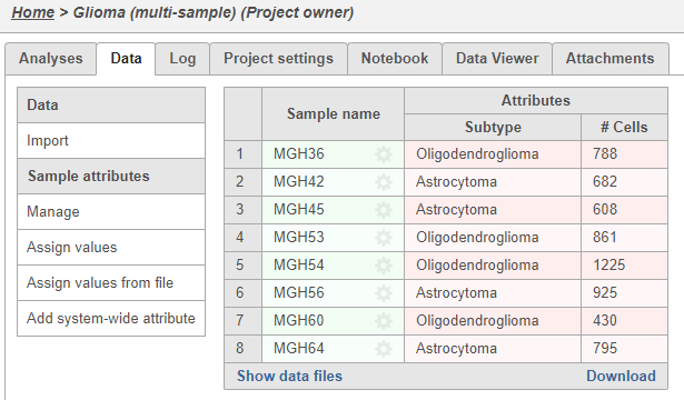
Figure 5. Sample data table listing the name and the number of cells for each sample
The sample table is pre-populated with two sample attributes: # Cells and Subtype. Sample attributes can be added and edited manually by clicking Manage in the Sample attributes menu on the left. If a new attribute is added, click Assign values to assign samples to different groups. Alternatively, you can use the Assign values from a file option to assign sample attributes using a tab-delimited text file. For more information about sample attributes, see here.
For this tutorial, we do not need to edit or change any sample attributes.
Filtering cells in single cell RNA-Seq data
With samples imported and annotated, we can begin analysis.
- Click Analyses to switch to the Analyses tab
For now, the Analyses tab has only a single node, Single cell counts. As you perform the analysis, additional nodes representing tasks and new data will be created, forming a visual representation of your analysis pipeline.
- Click on the Single cell counts node
A context-sensitive menu will appear on the right-hand side of the pipeline (Figure 9). This menu includes tasks that can be performed on the selected counts data node.
An important step in analyzing single cell RNA-Seq data is to filter out low-quality cells. A few examples of low-quality cells are doublets, cells damaged during cell isolation, or cells with too few counts to be analyzed.
- Expand the QA/QC section of the task menu
- Click on Single cell QA/QC (Figure 6)
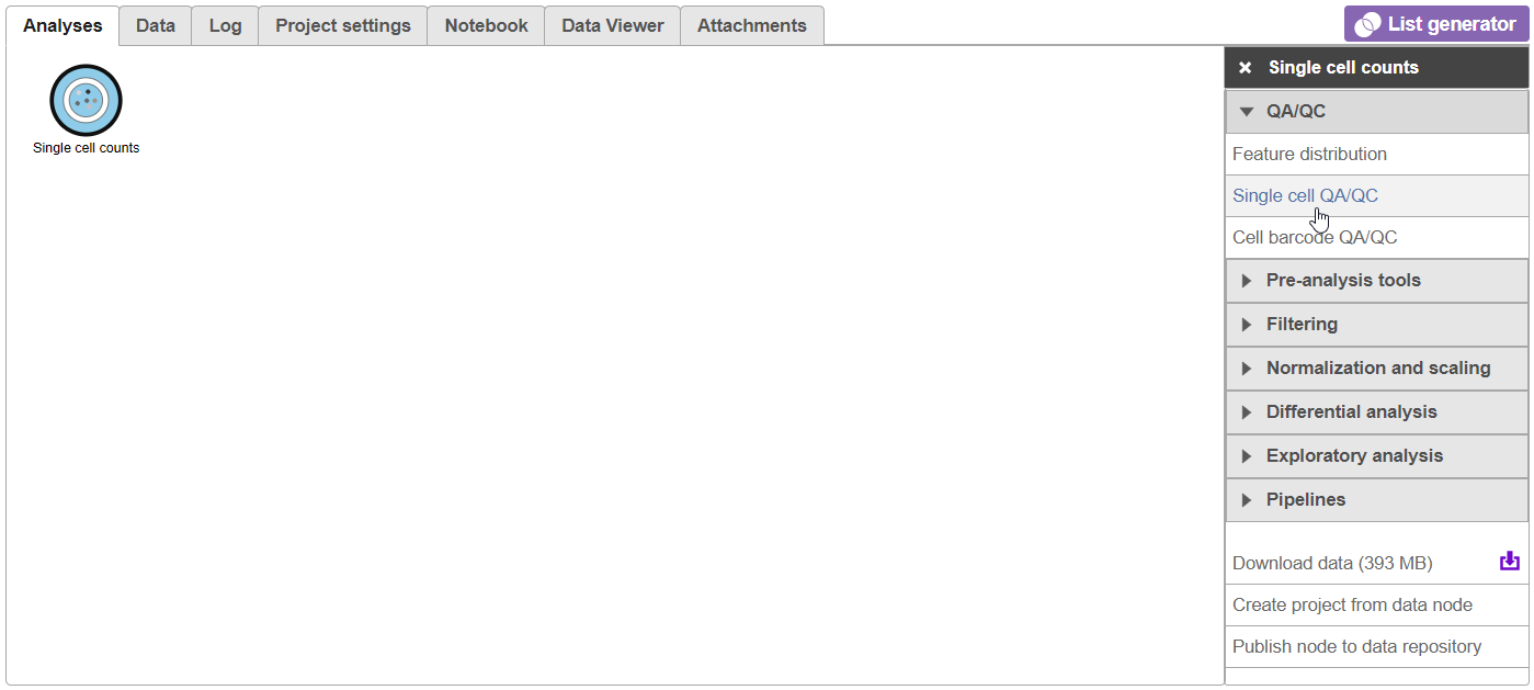
Figure 6. Selecting the Single cell QA/QC task from the task menu
A task node, Single cell QA/QC, is produced. Initially, the node will be semi-transparent to indicate that it has been queued, but not completed. A progress bar will appear on the Single cell QA/QC task node to indicate that the task is running.
- Click the Single cell QA/QC node once it finishes running
- Click Task report on the task menu (Figure 7)
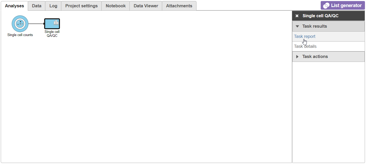
Figure 7. Selecting the task report for any task node opens a report with any tables or charts the task produced
The Single cell QA/QC report opens in a new data viewer session. There are interactive violin plots showing the most commonly used quality metrics for each cell from all samples combined (Figure 8). For this data set, there are two relevant plots: the total count per cell and the number of detected genes per cell. Each point on the plots is a cell and the violins illustrate the distribution of values for the y-axis metric. Typically, there is a third plot showing the percentage of mitochondrial counts per cell, but mitochondrial transcripts were not included in the data set by the study authors, so this plot is not informative for this data set.
- Remove the % mitochondrial counts and the extra text box in the bottom right by clicking Remove plot in the top right corner of each plot (Figure 8).
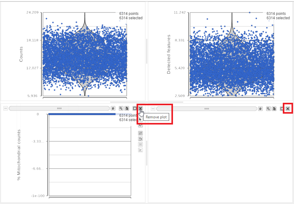
Figure 8. Each cell is shown as a point on the plot. Remove the % mitochondrial counts and empty text box using the X icons
The plots are highly customizable and can be used to explore the quality of cells in different samples.
- Click on Single cell counts in the Get Data icon on the left (Figure 9)
- Click and drag the Sample name attribute onto the Counts plot and drop it onto the X-axis
- Repeat this for the Detected genes plot
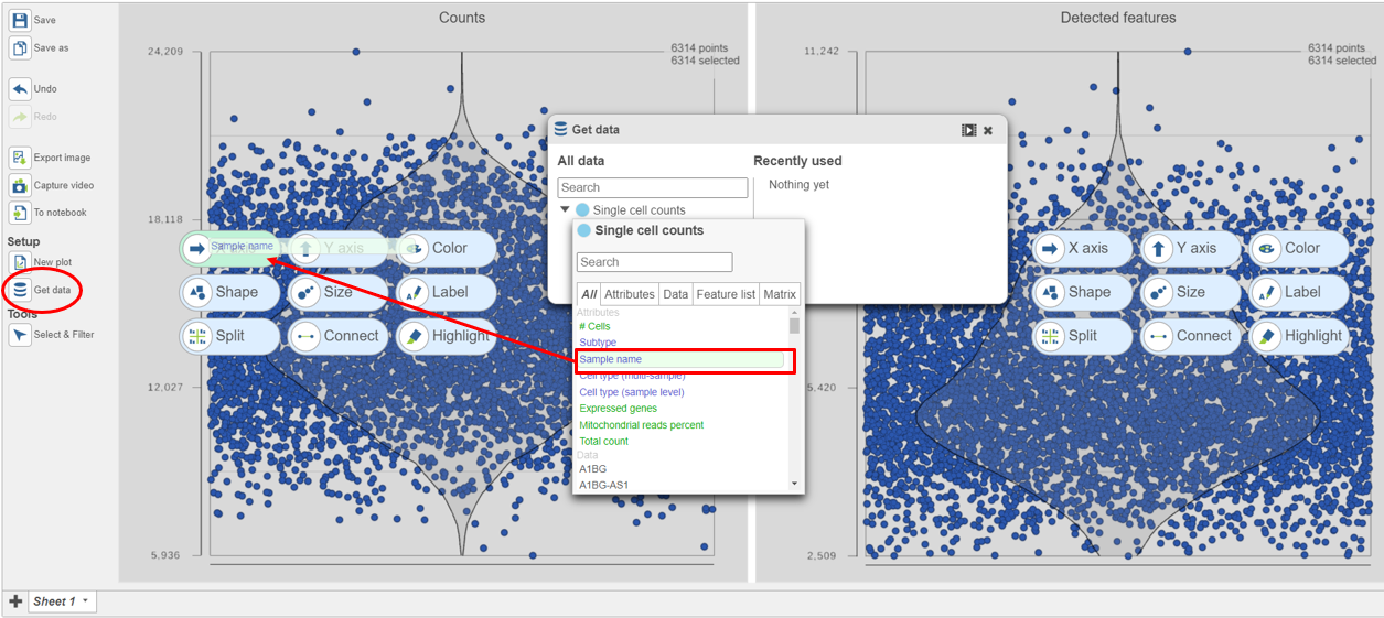 Figure 9. Click and drag the Sample name attribute onto the X-axis for each plot
The cells are now separated into different samples along the x-axis (Figure 10)
Figure 9. Click and drag the Sample name attribute onto the X-axis for each plot
The cells are now separated into different samples along the x-axis (Figure 10)
- Hold Control and left-click to select both plots
- Open the Style icon on the left under Configure
- Under Color, use the slider to reduce the Opacity
- Open the Axis icon on the left
- Adjust the X-rotation on the plots to 90
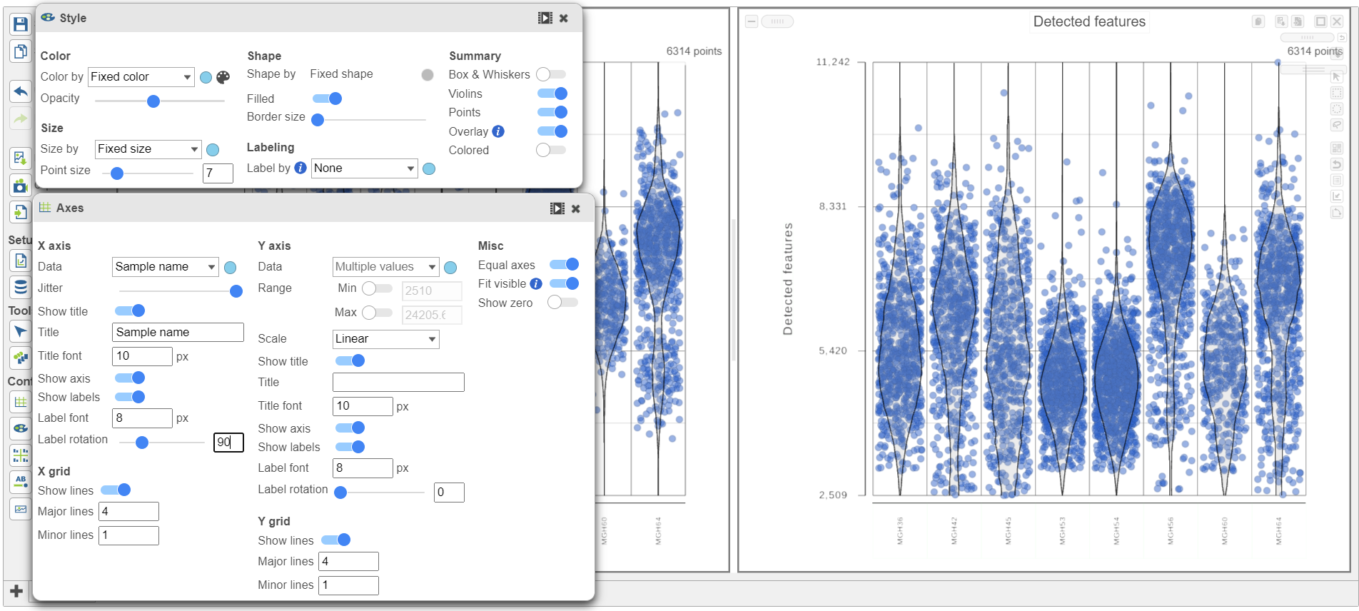 Figure 10. Counts and detected genes plots can be customized to compare cells from different samples
Note how both plots were modified at the same time.
Figure 10. Counts and detected genes plots can be customized to compare cells from different samples
Note how both plots were modified at the same time.
Cells can be selected by setting thresholds using the Select & Filter tool. Here, we will select cells based on the total count
- Open Select & Filter under Tools on the left
- Under Criteria, Click Pin histogram to see the distribution of counts
- Set the Counts thresholds to 8000 and 20500
Selected cells will be in blue and deselected cells will be dimmed (Figure 11).
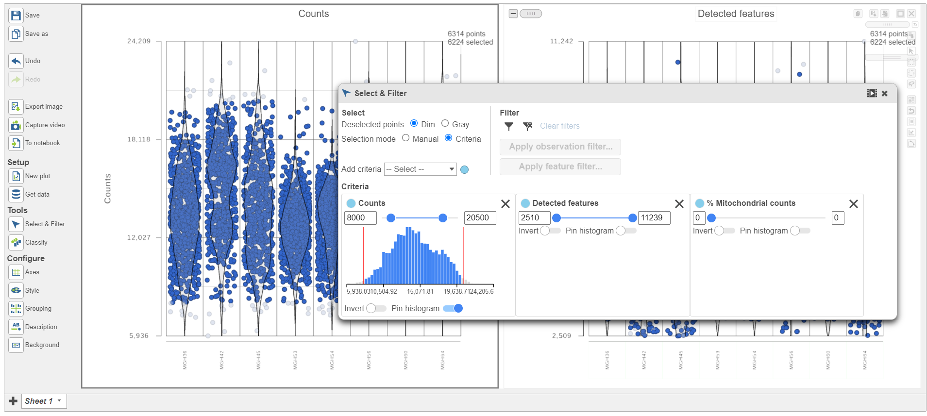
Figure 11. Previewing a filter using the Single cell QA/QC violin plots
Because this data set was already filtered by the study authors to include only high-quality cells, this count filter is sufficient.
- Click
 under Filter to include the selected cells
 - Click Apply observation filter
- Click the Single cell counts data node in the pipeline preview (Figure 12)
- Click Select
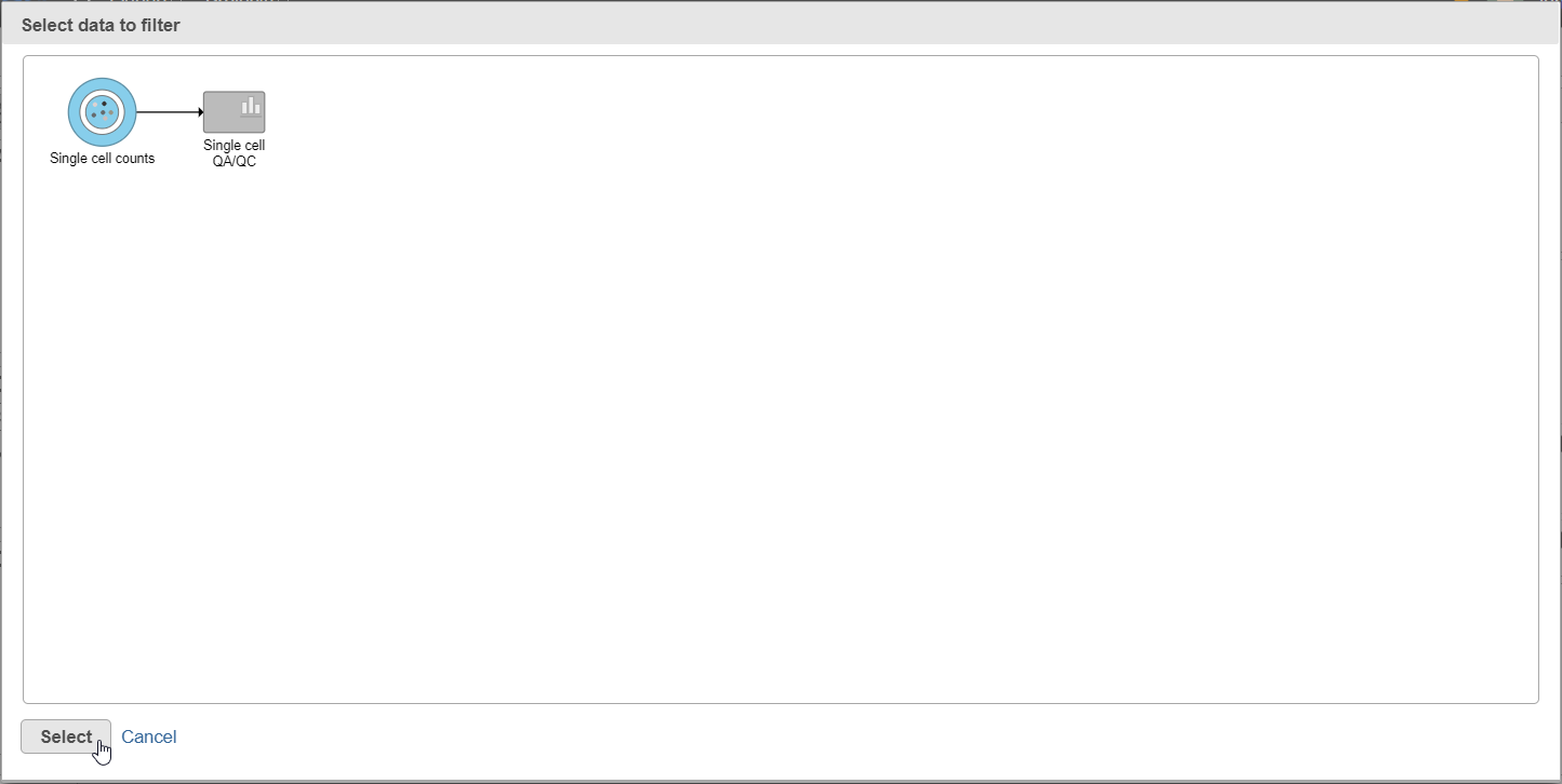 Figure 12. After the Apply filter button is selected, you will be presented with a preview of your pipeline. You need to select the appropriate data node to apply the filtering to
A new task, Filter counts, is added to the Analyses tab. This task produces a new Filter counts data node (Figure 13).
Figure 12. After the Apply filter button is selected, you will be presented with a preview of your pipeline. You need to select the appropriate data node to apply the filtering to
A new task, Filter counts, is added to the Analyses tab. This task produces a new Filter counts data node (Figure 13).
- Click on the Glioma (multi-sample) project name at the top to go back to the Analyses tab
- Your browser may warn you that any unsaved changes to the data viewer session will be lost. Ignore this message and proceed to the Analyses tab
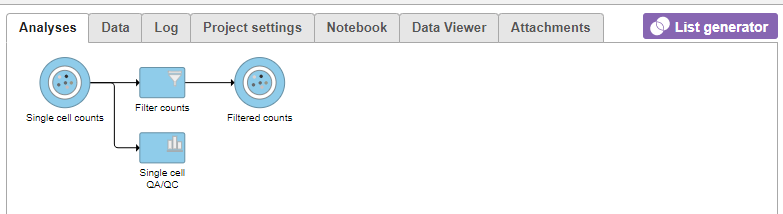
Figure 13. Applying a cell quality filter
Most tasks can be queued up on data nodes that have not yet been generated, so you can wait for filtering step to complete, or proceed to the next section.
Filtering genes in single cell RNA-Seq data
A common task in bulk and single-cell RNA-Seq analysis is to filter the data to include only informative genes. Because there is no gold standard for what makes a gene informative or not, ideal gene filtering criteria depends on your experimental design and research question. Thus, Partek Flow has a wide variety of flexible filtering options.
- Click the Filter counts node produced by the Filter counts task
- Click Filtering in the task menu
- Click Filter features (Figure 14)
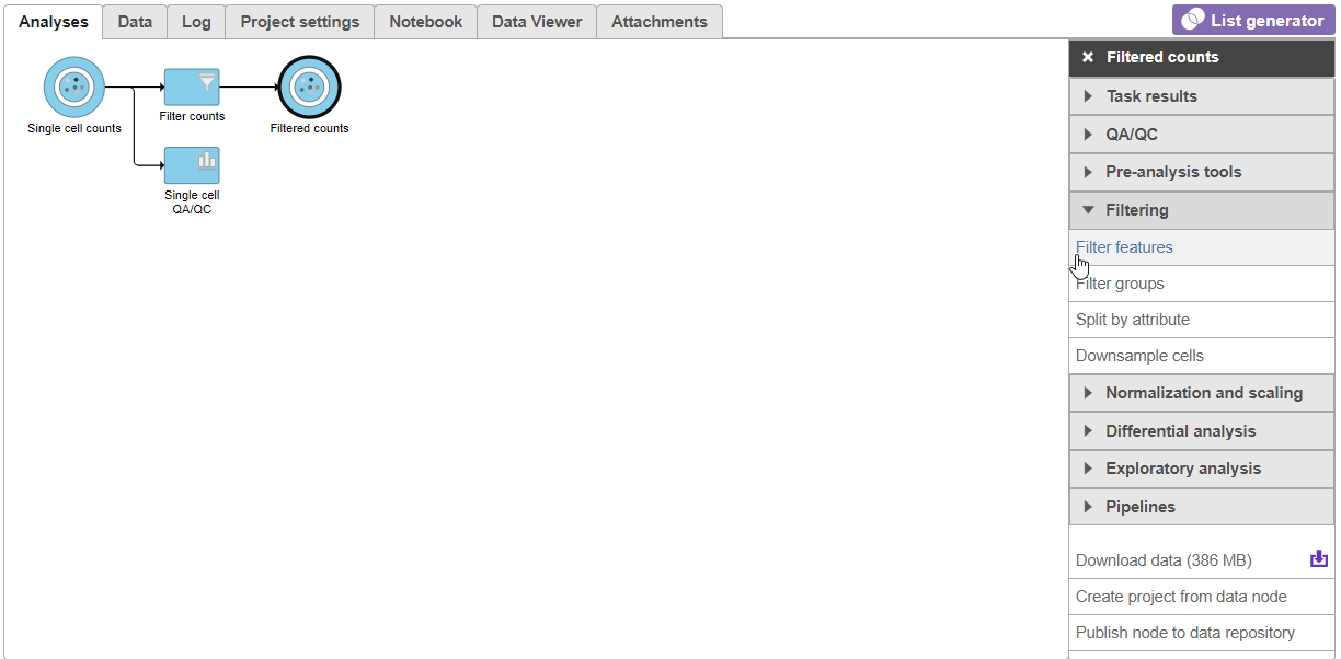
Figure 14. Invoking Filter features
There are four categories of filter available - noise reduction, statistics based, feature metadata, and feature list (Figure 15).
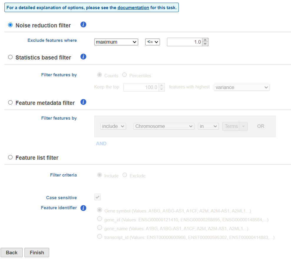 Figure 15. Viewing the filtering options
The noise reduction filter allows you to exclude genes considered background noise based on a variety of criteria. The statistics based filter is useful for focusing on a certain number or percentile of genes based on a variety of metrics, such as variance. The feature list filter allows you to filter your data set to include or exclude particular genes.
Figure 15. Viewing the filtering options
The noise reduction filter allows you to exclude genes considered background noise based on a variety of criteria. The statistics based filter is useful for focusing on a certain number or percentile of genes based on a variety of metrics, such as variance. The feature list filter allows you to filter your data set to include or exclude particular genes.
We will use a noise reduction filter to exclude genes that are not expressed by any cell in the data set but were included in the matrix file.
- Click the Noise reduction filter checkbox
- Set the Noise reduction filter to Exclude features where value <= 0 in 99% of cells using the drop-down menus and text boxes (Figure 16)
- Click Finish to apply the filter
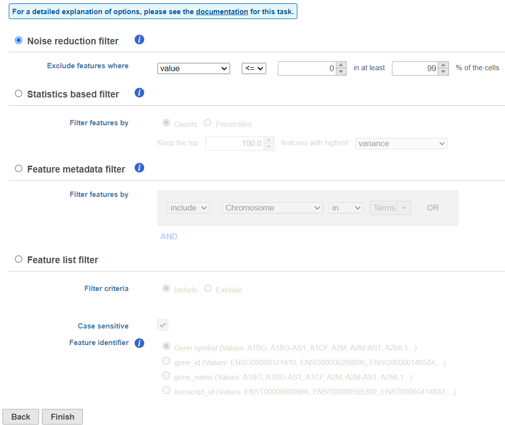
Figure 16. Configuring a noise reduction filter to exclude genes not expressed in the data set
This produces a Filtered counts data node. This will be the starting point for the next stage of analysis - identifying cell types in the data using the interactive t-SNE plot.
Normalizing single cell RNA-Seq data
We are omitting normalization in this tutorial because the data has already been normalized.
The tutorial data set is taken from a published study and has already been normalized using TPM (Transcripts per million), which normalizes for the length of feature and total reads, and transformed as log2(TPM/10+1). This normalization and transformation scheme can be performed in Partek Flow, along with other commonly used RNA-Seq data normalization methods.
For more information on normalizing data in Partek Flow, please see the Normalization section of the user manual.
Additional Assistance
If you need additional assistance, please visit our support page to submit a help ticket or find phone numbers for regional support.


| Your Rating: |
|
Results: |

|
28 | rates |
Overview
Content Tools