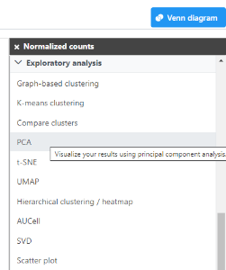
Use Principle Components Analysis (PCA) to reduce dimensions
- Click the Normalized counts data node
- Expand the Exploratory analysis section of the task menu
- Click PCA
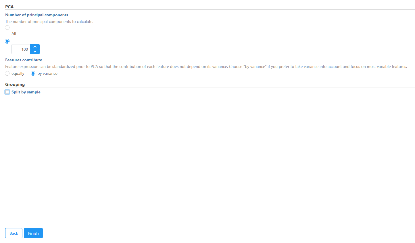
In this tutorial we will modify the PCA task parameters, to not split by sample, to keep the cells from both samples on the PCA output.
- Uncheck (de-select) the Split by sample checkbox under Grouping
- Click Finish
- Double-click the circular PCA node to view the results
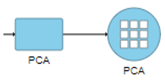
From this PCA node, further exploratory tasks can be performed (e.g. t-SNE, UMAP).
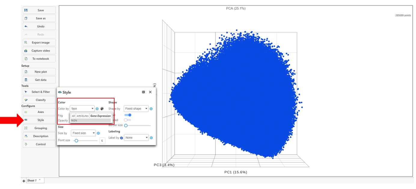
Classify cells based on a marker for expression
- Choose Style under Configure
- Color by and search for fasn by typing the name
- Select FASN from the drop-down
The colors can be customized by selecting the color palette then using the color drop-downs as shown below.
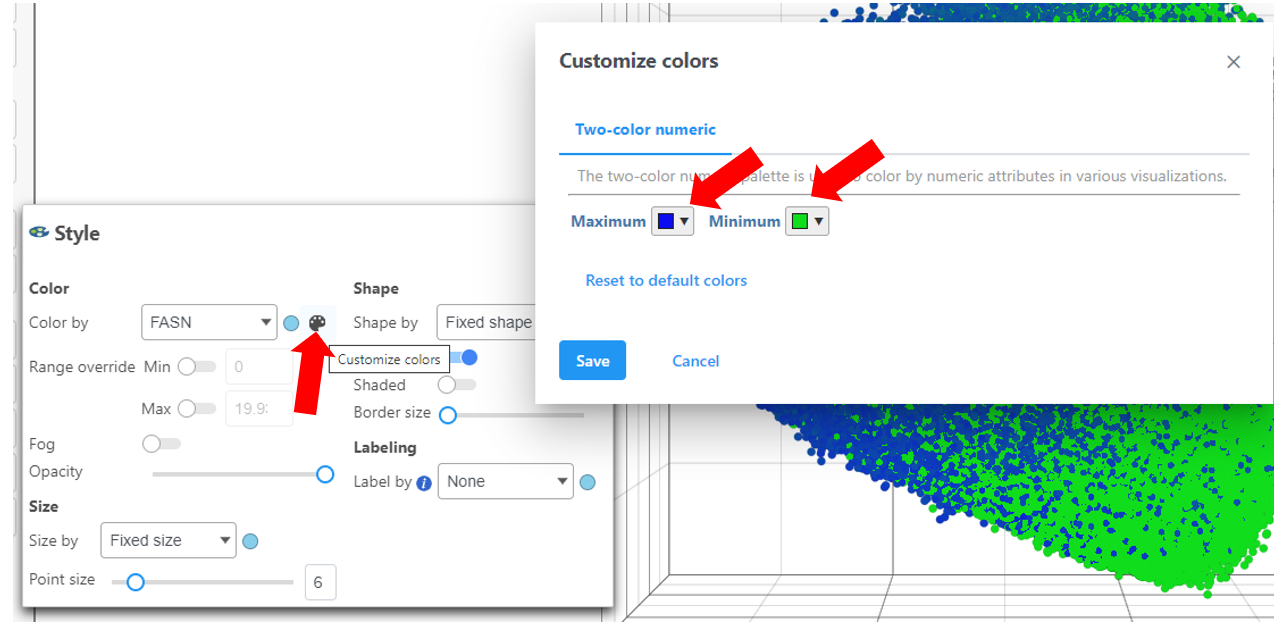
Ensure the colors are distinguishable such as in the image above using a blue and green scale for Maximum and Minimum, respectively.
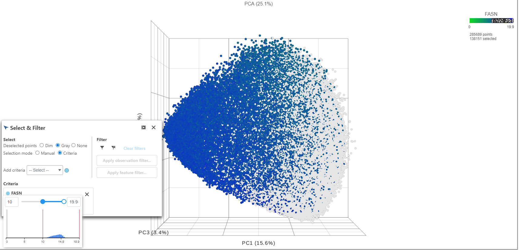
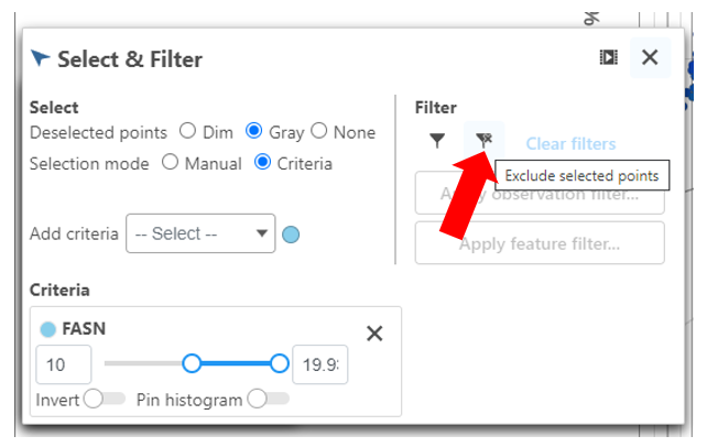
- Click FASN in the legend to make it draggable (pale green background) and continue to drag and drop FASN to Add criteria within the Select & Filter Tool
- Hover over the slider to see the distribution of FASN expression
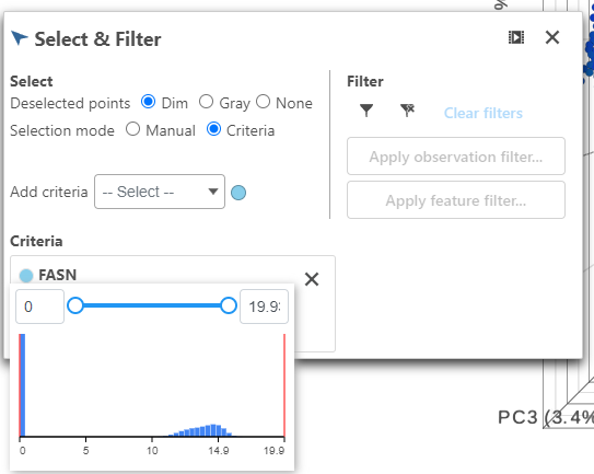
- Drag the slider to select the population of cells expressing high FASN
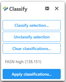
- Click Classify under Tools
- Click Classify selection
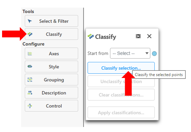
- Give the classification a name "FASN high"
- Under the Select & Filter tool, choose Filter to exclude the selected cells
Exit all Tools and Configure options
- Click the "X" in the right corner
- Use the rectangle selection mode on the PCA to select the points on the image
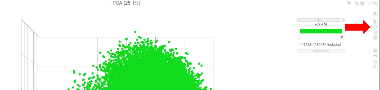
 Figure 1. Selecting method for Pool cells
- Choose Cell type (sample level) from the Pool cells by drop-down list
- Keep the default pool method (Mean)
- Click Finish
The mean expression for each gene will be calculated amongst the glioma cells, for each sample. The Pool cells task will run and generate Glioma and N/A data nodes (Figure 3).

Figure 2. Output of the Pools cells task
The Glioma data node is equivalent to a bulk RNA-Seq gene counts data node and the same analysis steps can be performed on it including PCA and differential expression analysis.
Explore data with PCA
We can use principal components analysis (PCA) to visualize similarities and differences between samples for a cell type.
- Click the Glioma data node
- Click the Exploratory analysis section of the task menu
- Click PCA
- Click Finish in the PCA dialog to run PCA with default settings
- Once the task is complete, double click the PCA node to open the PCA scatter plot
The PCA scatter plot opens in a new data viewer session. The plot shows each sample as a point with more similar samples closer together. Each axis is a principal component. The percentage in parentheses next to each axis label is the percentage of total variance explained by that principal component and the sum is shown next to the plot title.
- Open the Style icon on the left
- Choose Subtype from the Color by drop-down list
- Choose # Cells from the Size by drop-down list
Samples separate by type, indicating that there are differences in gene expression between the malignant cells of the two glioma subtypes (Figure 4).

Figure 3. PCA scatter plot. Samples are spheres. Samples with more similar gene expression are closer together while dissimilar samples are further apart.
Identify differentially expressed genes
Next, we will perform differential expression analysis.
- Click Glioma (multi-sample) to return to the Analyses tab
- Click the Glioma data node
- Expand Statistics in the task menu
- Click Differential analysis in the task menu
- Select GSA
- Check the Subtype attribute (Figure 5)
- Click Next
 Figure 4. Selecting factors to include in the statistical test
Next, we can set up a comparison between astrocytoma and oligodendroglioma subtypes.
Figure 4. Selecting factors to include in the statistical test
Next, we can set up a comparison between astrocytoma and oligodendroglioma subtypes.
- Click Astrocytoma in the top panel
- Click Oligodendroglioma in the bottom panel
- Click Add comparison (Figure 6)
- Filtering is not necessary so click None
 Figure 5. Adding a comparison of astrocytoma and oligodendroglioma subtypes
Adding Astrocytoma vs. Oligodendroglioma will give fold-change and p-value for the comparison. Fold-change will be calculated as astrocytoma (numerator) over oligodendroglioma (denominator).
Figure 5. Adding a comparison of astrocytoma and oligodendroglioma subtypes
Adding Astrocytoma vs. Oligodendroglioma will give fold-change and p-value for the comparison. Fold-change will be calculated as astrocytoma (numerator) over oligodendroglioma (denominator).
- Click Finish to run the GSA
The result of the GSA task is a GSA data node (Figure 7).

Figure 6. GSA task produces a Feature list data node
- Double click the GSA data node
The task report lists every gene considered by the statistical test with results for each comparison (Figure 8).

Figure 7. Viewing the GSA report table
Genes are listed by ascending P-value, so the most significant genes are at the top of the list. Results for all genes can be visualized using a volcano plot.
- Select
 in the top right corner of the table to open the volcano plot for a comparison
The Volcano plot opens in a new data viewer session, in a new tab in the web browser. It shows each gene as a point with cutoff lines set for P-value (y-axis) and fold-change (x-axis). By default, the P-value cutoff is set to 0.05 and the fold-change cutoff is set at |2| (Figure 9).
The plot can be configured using various options in the Configuration card on the left. For example, the Color, Size and Shape cards can be used to change the appearance of the points. The X and Y-axes can be changed in the Data card. The Significance card can be used to set different Fold-change and P-value thresholds for coloring up/down-regulated genes.

Figure 8. Volcano plot for Astrocytoma vs. Oligodendroglioma
- Click the GSA report tab in your browser to return to the feature list
A dot plot is available for each gene.
- Select
 next to SYT4 to open its feature plot (Figure 10)

Figure 9. The dot plot shows one gene at a time
The dot plot opens in a new data viewer session. The plot can be configured using various options in the Configuration card on the left. For example, the Summary card can be used to add violins or box & whisker plots.
- Click GSA report tab to return to the results table
The filter panel is used to filter results to identify significantly differentially regulated genes. Here, we will create a list of genes that have FDR step up < 0.05 and Fold change > 2 or < -2.
- Click FDR step up
- Set it to 0.05 with the drop-down menu set to Less than or equal to
- Press Enter
- Click Fold change
- Set it to -2 to 2 for the excluded range
- Press Enter
- Click
 to apply the filter (Figure 11)
 Figure 10. Applying a filter
You will be returned to the Analyses tab and a new Differential analysis filter task will be added. This will produce a new Filtered feature list data node.
Analyze differentially expressed genes
The Filtered Feature list data node is a good starting point for drawing a hierarchical clustering heatmap and analyzing gene set or pathway enrichment.
- Click the Filtered feature list data node produced by the Differential analysis filter task node
- Expand Exploratory analysis in the task menu
- Click Hierarchical clustering / heatmap
The configuration dialog for Hierarchical clustering includes options for clustering metrics, sample filtering, sample ordering, feature ordering, scaling (normalization) mode, and bubble map settings. For more information about configuring Hierarchical clustering, please consult the Hierarchical Clustering section of the user's manual.
- Click Finish to continue with default settings
- Double click the Hierarchical clustering task node (Figure 12) to open the heatmap

Figure 11. Open the hierarchical clustering heat map by double clicking the task node
The hierarchical clustering heatmap displays samples on rows and genes on columns (Figure 13). The colors are scaled (normalized) expression values represented by the Z-score (standardized) for a heatmap by default.

Figure 12. Heatmap
The plot is interactive and configurable.
- Set the low color (left) in the Heatmap section to green using Color by clicking on the color box (add more color boxes by clicking and/or move the color box setting using drag on the color scale).
- Set zero (middle) in the Heatmap section to black using Color
- Select Subtype from the Annotations drop-down menu
The heatmap should now go from green (low) to black (zero) to red (high) and should have label boxes for the type of each sample (Figure 14).

Figure 13. Configuring the heatmap
The heatmap can be saved as a publication-quality image by clicking the save image icon ![]() or sent to a page in the Notebook tab by clicking
or sent to a page in the Notebook tab by clicking ![]() . For more information about customizing and interacting with the heatmap, please see the Hierarchical Clustering section of the user's manual.
. For more information about customizing and interacting with the heatmap, please see the Hierarchical Clustering section of the user's manual.
- Click Glioma (multi-sample) to return to the Analyses tab
Next, we can use gene set enrichment to identify gene ontology terms that are over-represented in the list of differentially expressed genes between the two glioma subtypes.
- Click the Filtered feature list data node
- Expand Biological interpretation in the task menu
- Click Gene set enrichment analysis
- Select Gene set database
- Select Homo sapiens (human) - hg38 from the Assembly drop-down menu
- Select a gene set database from the drop-down menu. If one isn't available, choose Add gene set database and download one
By default, gene set enrichment uses the GO terms from geneontology.org as the gene set. Custom gene sets can also be imported and analyzed for enrichment.
- Click Finish
Enrichment analysis creates a Gene set enrichment task node (Figure 15).
- Double click the Gene set enrichment task node to open the task report
 Figure 14. Gene set enrichment task node
The GO enrichment task report lists every analyzed gene set, ranked by Enrichment score, with P-value, number of genes in list, and number of genes not in list given for each (Figure 16). Using the default GO database, each gene set name is a link to the geneontology.org web-page for that GO term. Hovering over
Figure 14. Gene set enrichment task node
The GO enrichment task report lists every analyzed gene set, ranked by Enrichment score, with P-value, number of genes in list, and number of genes not in list given for each (Figure 16). Using the default GO database, each gene set name is a link to the geneontology.org web-page for that GO term. Hovering over  shows the numbers of genes in the set in the list, in the set not in the list, in the list not in the set, and not in the list not in the set. You can view the genes in and not in the gene set by selecting
  . For more information about enrichment analysis and using custom gene sets, please see the Gene Set Enrichment section of the user's manual.

Figure 15. Viewing results of Enrichment analysis. Note that this GO enrichment test was performed using the hg38 - 2019_11_01 GO database. Your results may vary of you have used different version
Gene set enrichment analysis, can also be performed using the the KEGG pathway database as the source for its gene sets. Note, to perform these next steps, you need to have the Pathway toolkit enabled.
- Click Glioma (multi-sample) to return to the Analyses tab
- Click the Filtered feature list data node
- Expand Biological interpretation in the task menu
- Click Gene set enrichment
- Select KEGG database
- Verify that the species in the drop-down menu is Homo sapiens
KEGG pathways for any species in the KEGG database can be downloaded and selected using the drop-down menu.
- Click Finish to run enrichment analysis
Pathway enrichment analysis creates a Pathway enrichment task node.
- Double click the Pathway enrichment task node
The results of Pathway enrichment analysis are similar to Gene set enrichment (Figure 18).

Figure 16. Viewing results of Pathway enrichment analysis
Clicking one of the blue pathway names opens a KEGG pathway map that can be colored by fold-change or p-value.
- Click path:hsa03040 (Spliceosome) to open its KEGG pathway map (Figure 19)
 Figure 17. KEGG map for Spliceosome pathway. Colored by fold change for astrocytoma vs. oligodendroglioma.
Here, we can see that several components of the spliceosome pathway are upregulated in astrocytoma vs. oligodendroglioma.
Figure 17. KEGG map for Spliceosome pathway. Colored by fold change for astrocytoma vs. oligodendroglioma.
Here, we can see that several components of the spliceosome pathway are upregulated in astrocytoma vs. oligodendroglioma.
Additional Assistance
If you need additional assistance, please visit our support page to submit a help ticket or find phone numbers for regional support.


| Your Rating: |
|
Results: |

|
0 | rates |
Overview
Content Tools