t-SNE (t-distributed stochastic neighbor embedding) is a visualization method commonly used to analyze single-cell RNA-Seq data. Each cell is shown as a point on the plot and each cell is positioned so that it is close to cells with similar overall gene expression. When working with multiple samples, a t-SNE plot can be drawn for each sample or all samples can be combined into a single plot. Viewing samples individually is the default in Partek® Flow® because sample to sample variation and outlier samples can obscure cell type differences if all samples are plotted together. However, as you will see in this tutorial, in some data sets, cell type differences can be visualized even when samples are combined.
Using the t-SNE plot, cells can be classified based on clustering results and differences in expression of key marker genes.
Multiple single-sample t-SNE plots
Prior to performing t-SNE, it is a good idea to reduce the dimensionality of the data using principal components analysis (PCA).
- Click the Filtered counts data node after the Filter features task
- Select PCA from the Exploratory analysis section of the task menu (Figure 1)
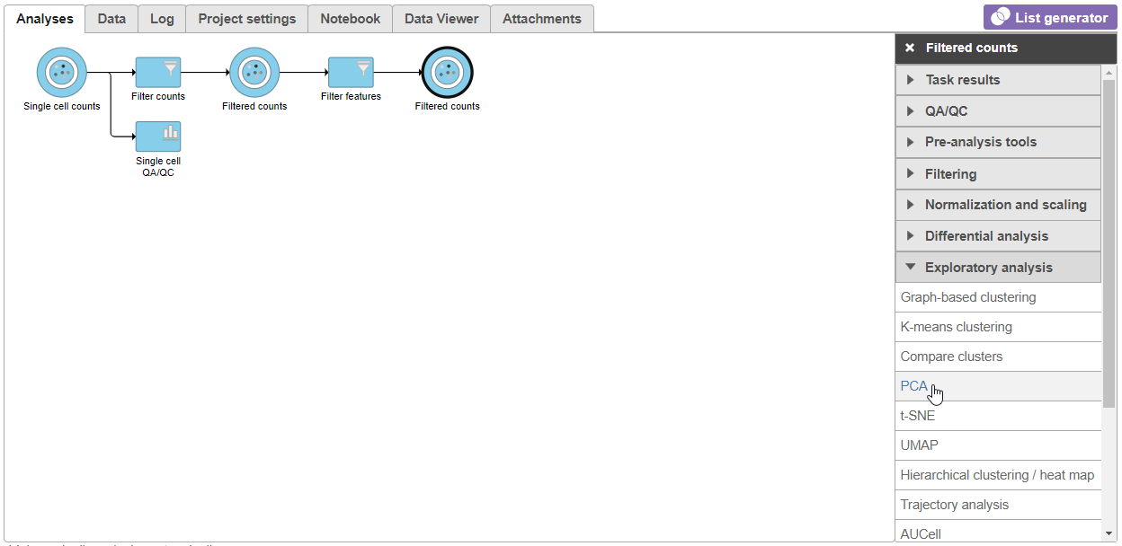 Figure 1. Select the PCA task from the Exploratory analysis menu
- Click Finish to run PCA with default settings (Figure 2)
Note, the default settings include the Split by sample checkbox being selected. This means that the dimensionality reduction will be performed on each sample separately.
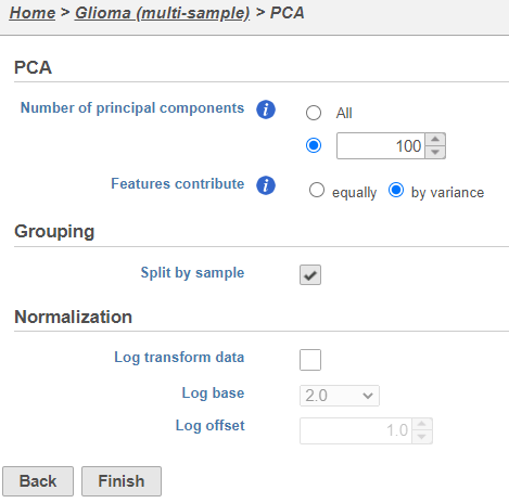 Figure 2. PCA task set up page with default settings
PCA task and data nodes will be generated.
Figure 2. PCA task set up page with default settings
PCA task and data nodes will be generated.
- Click the PCA data node
- Select t-SNE from the Exploratory analysis section of the task menu (Figure 3)
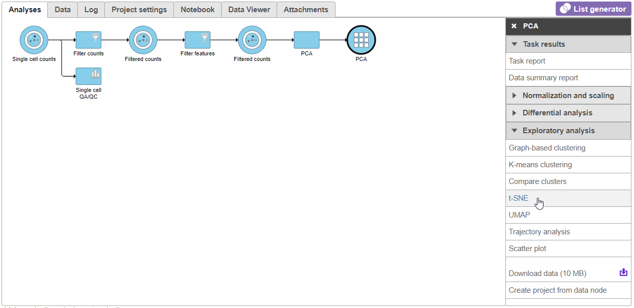
Figure 3. Invoking t-SNE from the task menu
- Click Finish from the t-SNE dialog to run t-SNE with the default settings (Figure 4)
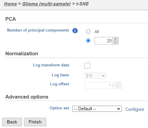 Figure 4. t-SNE task set up with default settings
Because the upstream PCA task was performed separately for each sample, the t-SNE task will also be performed separately for each sample. t-SNE task and data nodes will be generated (Figure 5).
Figure 4. t-SNE task set up with default settings
Because the upstream PCA task was performed separately for each sample, the t-SNE task will also be performed separately for each sample. t-SNE task and data nodes will be generated (Figure 5).
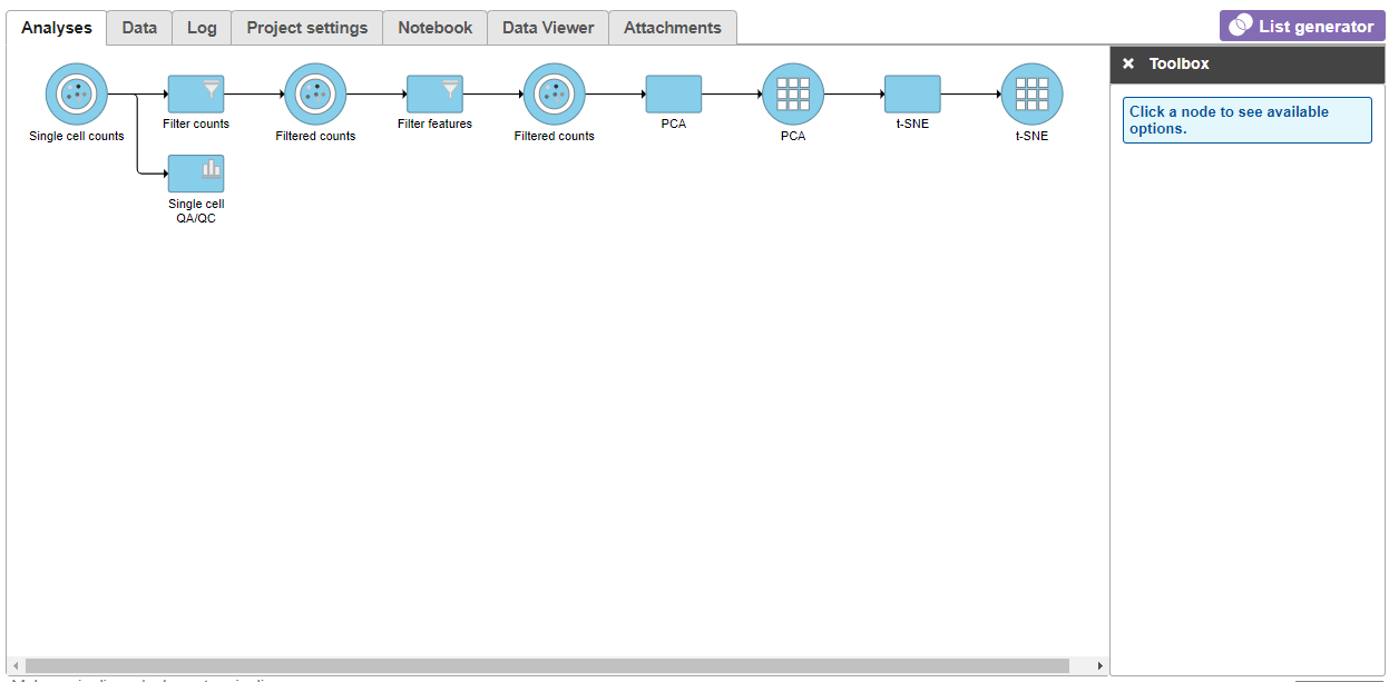
Figure 5. t-SNE task node
Once the t-SNE task has completed, we can view the t-SNE plots
- Click the t-SNE node
- Click Task report from the task menu or double click the t-SNE node
The t-SNE will open in a new data viewer session. The t-SNE plot for the first sample in the data set, MGH36 (Figure 6), will open on the canvas. Please note that the appearance of the t-SNE plot may differ each time it is drawn so your t-SNE plots may look different than those shown in this tutorial. However, the cell-to-cell relationships indicated will be the same.
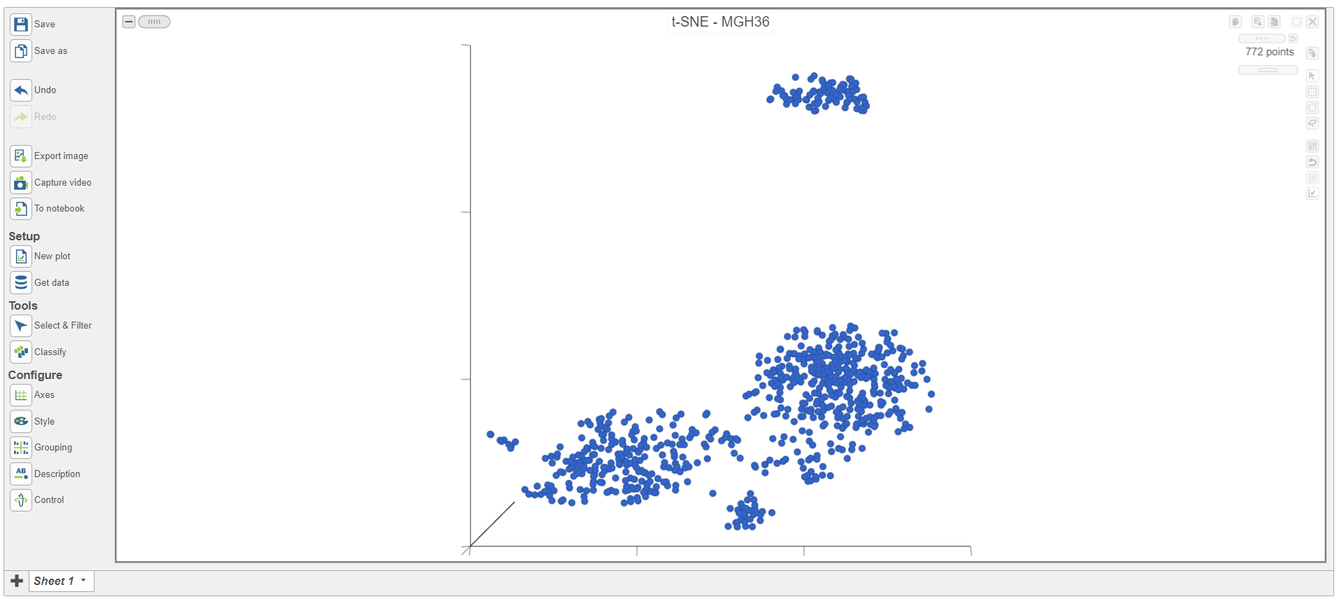
Figure 6. Viewing t-SNE plot of a single sample
The t-SNE plot is in 3D by default. To change the default, click your avatar in the top right > Settings > My Preferences and edit your graphics preferences and change the default scatter plot format from 3D to 2D.
You can rotate the 3D plot by left-clicking and dragging your mouse. You can zoom in and out using your mouse wheel. The 2D t-SNE is also calculated and you can switch between the 2D and 3D plots on the canvas. We will do this later on in the tutorial.
Each sample has its own plot. We can switch between samples.
- Open the Axes icon on the left under Configure (Figure 7)
- Navigate to Misc
- Select the
 icon below the Sample name to go to the next sample
The t-SNE plot has switched to show the next sample, MGH42 (Figure 7).
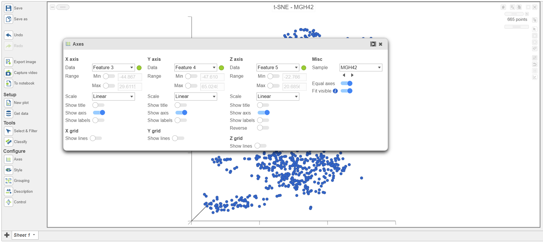
Figure 7. Viewing t-SNE plot of MGH42
The goal of this analysis is to compare malignant cells from two different glioma subtypes, astrocytoma and oligodendroglioma. To do this, we need to identify the malignant cells we want to include and which cells are the normal cells we want to exclude.
The t-SNE plot in Partek Flow offers several options for identifying, selecting, and classifying cells. In this tutorial, we will use the expression of known marker genes to identify cell types.
To visualize the expression of a marker gene, we can color cells on the t-SNE plot by their expression level.
- Select any of the count data nodes from Get data on the left (Single cell counts, or any of the Filtered counts, Figure 8)
- Search for the BCAN gene
- Click and drag the BCAN gene onto the plot and drop it over the Green (feature) option
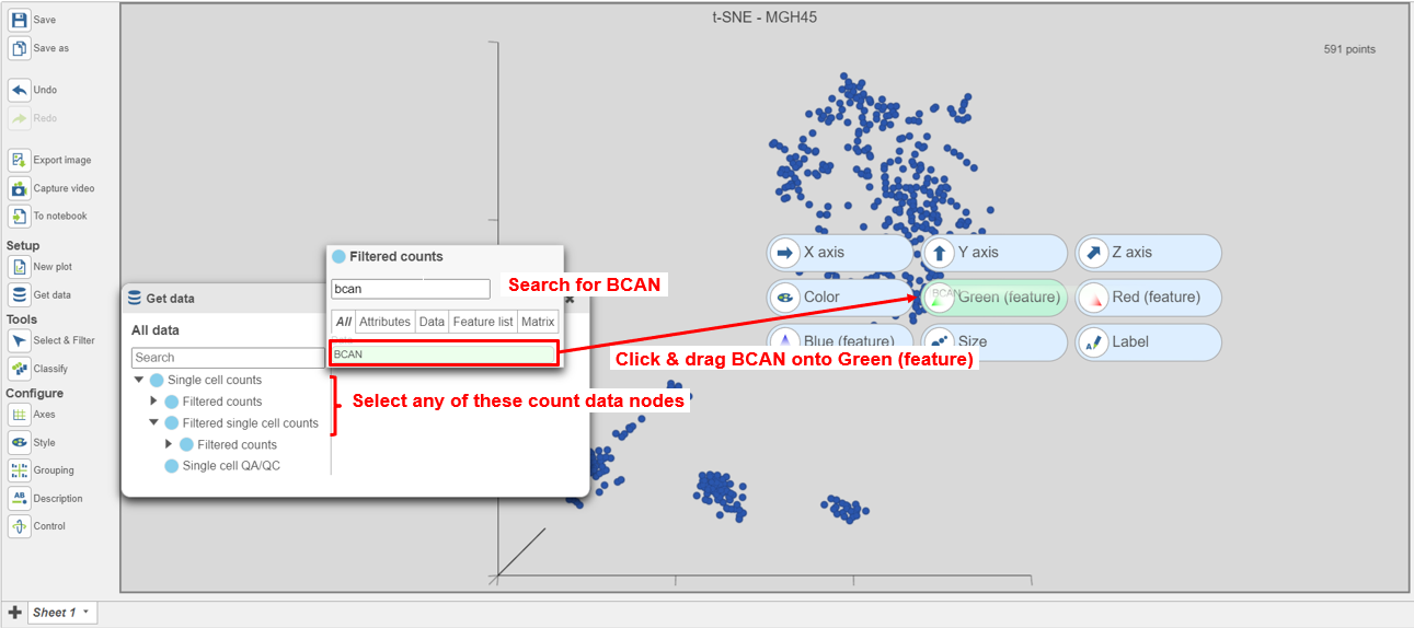
Figure 8. Coloring cells by BCAN expression
The cells will be colored from black to green based on their expression level of BCAN, with cells expressing higher levels more green (Figure 9). BCAN is highly expressed in glioma cells.
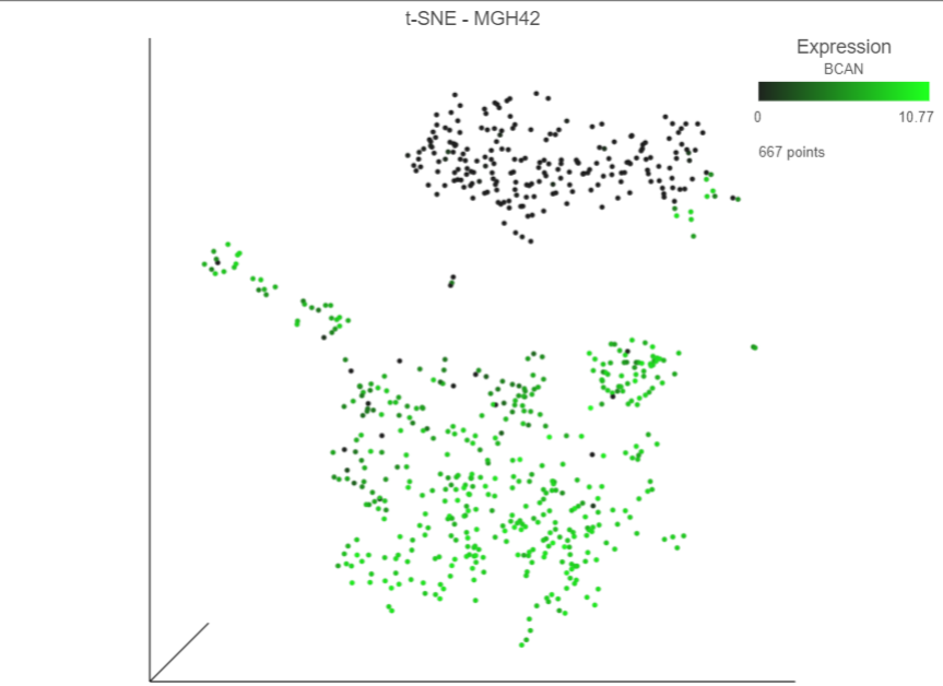
Figure 9. Cells colored by BCAN expression
In Partek Flow, we can color cells by more than one gene. We will now add a second glioma marker gene, GPM6A.
- Select any of the count data nodes from the Data card on the left (Single cell counts, or any of the Filtered counts)
- Search for the GPM6A gene
- Click and drag the GPM6A gene onto the plot and drop it over the Red (feature) option
Cells expressing GPM6A are now colored red and cells expressing BCAN are colored green. Cells expressing both genes are colored yellow, while cells expressing neither are colored black (Figure 10).
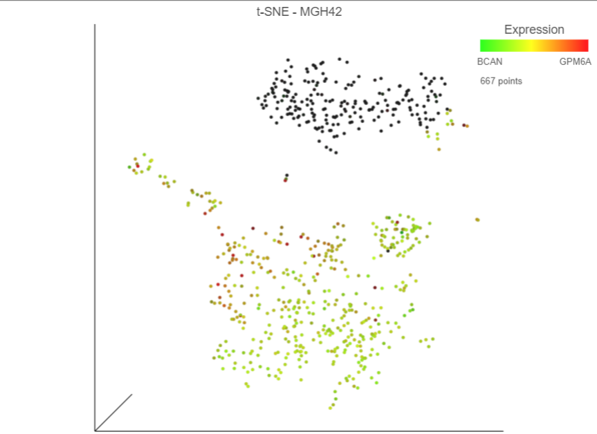
Figure 10. Coloring cells by BCAN and GPM6A
Numerical expression levels for each gene can be viewed for individual cells.
- Switch to pointer mode by clicking
 in the top right corner of the plot
 - Select a cell by pointing and clicking
The expression level for that cell is displayed on the legend for each gene. Expression values can also be viewed by mousing over a cell (Figure 11).
- Deselect the cell by clicking on any blank space on the plot
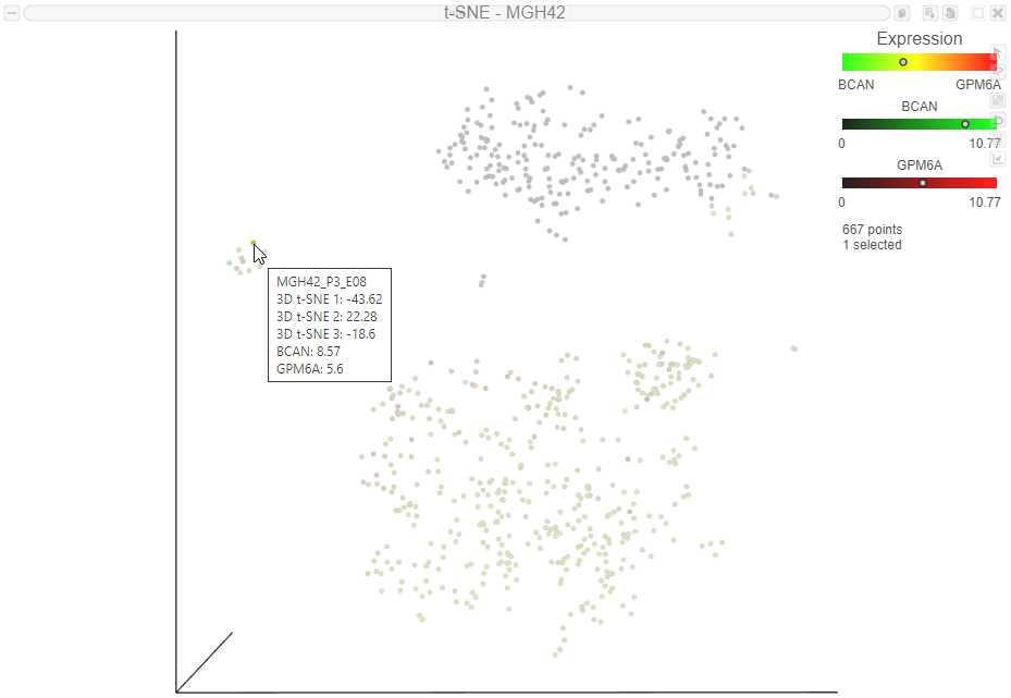
Figure 11. Viewing expression levels for an individual cell. The dots on the legend indicate the expression level of the selected cell. The expression levels also appear in the label when you mouse over a cell
Now that cells are colored by the expression of two glioma cell markers, we can classify any cell that expresses these genes as glioma cells. Because t-SNE groups cells that are similar across the high-dimensional gene expression data, we will consider cells that form a group where the majority of cells express BCAN and/or GPM6A as the same cell type, even if they do not express either marker gene.
- Switch to lasso mode by clicking
 in the top right of the plot
 - Draw the lasso around the cluster of green, red, and yellow cells and click the circle to close the lasso (Figure 12)
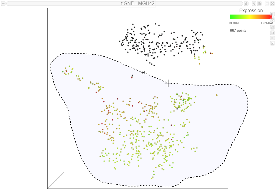
Figure 12. Selecting a group of cells using the 3D lasso tool
Selected cells are shown in bold and unselected cells are dimmed. The number of selected cells is indicated in the figure legend. The cells are plotted on the color scale depending on their relative expression levels of the two marker genes (Figure 13)
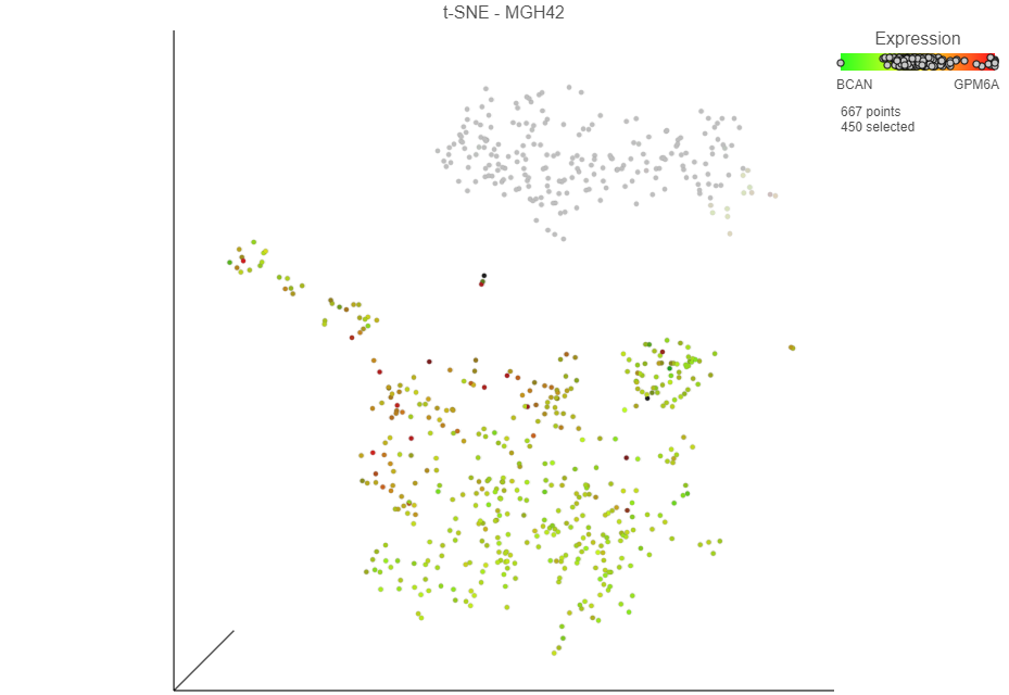
Figure 13. Viewing expression levels for a group of cells
- Click Classify selection in the Classify icon under Tools
A dialog to give the classification a name will appear.
- Name the classification Glioma
- Click Save (Figure 14)

Figure 14. Classifying selection
Once cells have been classified, the classification is added to Classify. The number of cells belonging to the classification is listed. In MGH42, there are 460 glioma cells (Figure 15).
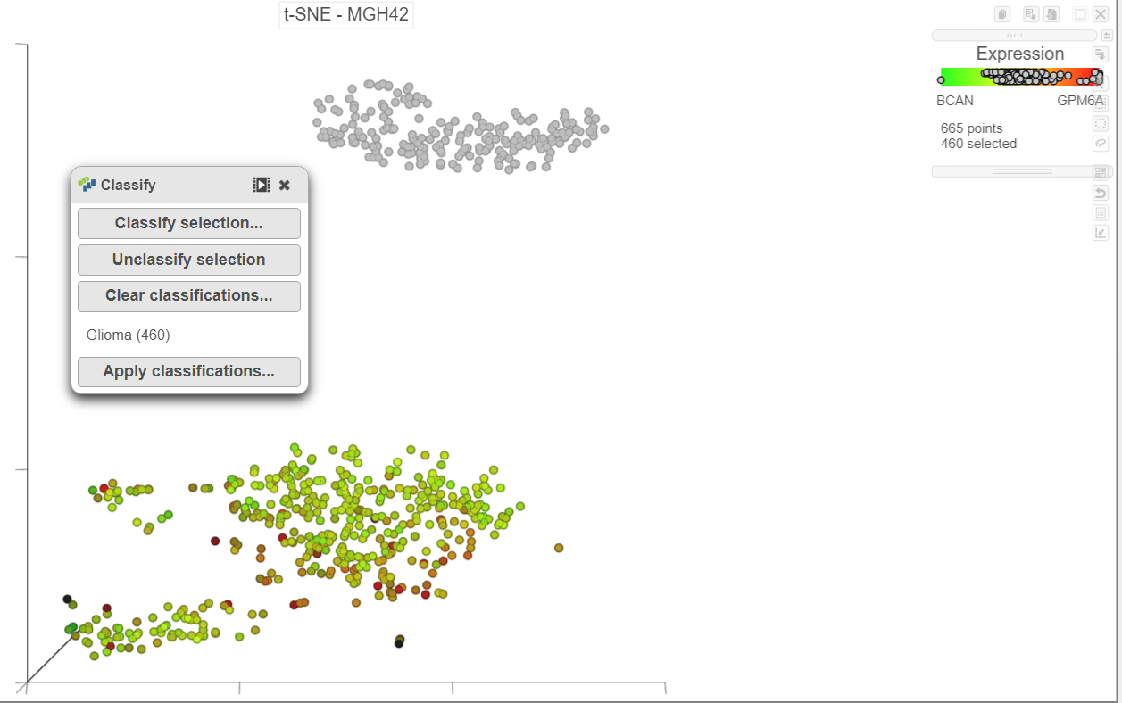 Figure 15. The number of cells in each classification is displayed
Classifications made on the t-SNE plot are retained as a draft as part of the data viewer session. In this tutorial, we will classify malignant cells for each sample before we save and apply the classifications, but if necessary, you can save the data viewer session by clicking the
Figure 15. The number of cells in each classification is displayed
Classifications made on the t-SNE plot are retained as a draft as part of the data viewer session. In this tutorial, we will classify malignant cells for each sample before we save and apply the classifications, but if necessary, you can save the data viewer session by clicking the ![]() Save icon on the left to retain all of the formatting and draft classifications. The data viewer session will be stored under the Data viewer tab and can be re-opened to continue making classifications at a later time.
Save icon on the left to retain all of the formatting and draft classifications. The data viewer session will be stored under the Data viewer tab and can be re-opened to continue making classifications at a later time.
- Switch to pointer mode by clicking in the top right corner of the plot
- Deselect the cells by clicking on any blank space on the plot
- Open Axes and navigate to Sample under Misc
- Select the
 icon below the sample name to go to the next sample, MGH45
 - Rotate the 3D t-SNE plot to get a better view of cells from the green, red, and yellow cluster
- Switch to lasso mode by selecting in the top right corner of the plot
- Draw the lasso around the cluster of colored cells and click the circle to close the lasso (Figure 16)
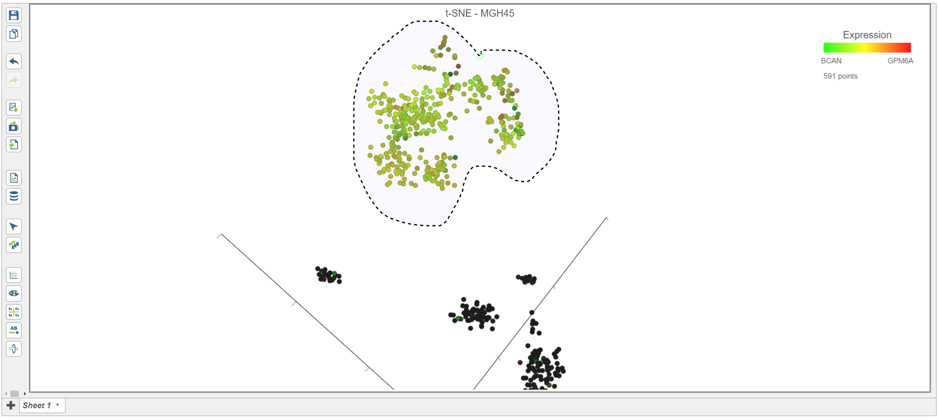
Figure 16. Classifying malignant cells in sample MGH45
- Select Classify selection in the Classify icon
- Type Glioma or select Glioma from the drop-down list (Figure 17)
- Click Save
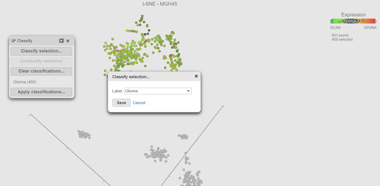
Figure 17. Adding cells in a second sample to an existing classification
- Repeat these steps for each of the 6 remaining samples. Remember to go back to the first sample (MGH36) to classify the glioma cells in that samples too.
There should be 5,322 glioma cells in total across all 8 samples. With the malignant cells in every sample classified, it is time to save the classifications.
- Click Apply classifications in the Classification card on the right
- Click the Filtered counts data node as input data for the classification task (Figure 18)
- Click Select
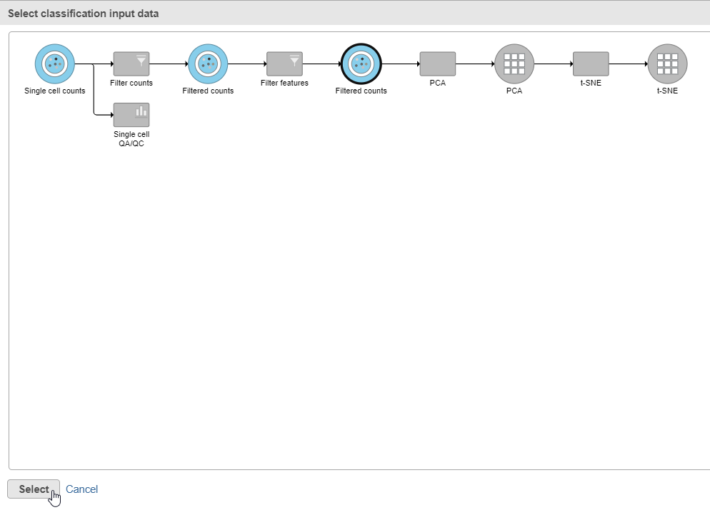 Figure 18. Choose the Filtered counts data node as input for the Classification task
- Name the classification attribute Cell type (sample level) (Figure 19)
- Click Run
- Click OK on the information box that says a classification task has been enqueued
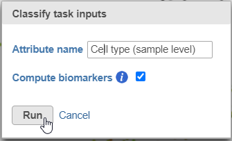 Figure 19. Name the cell-level attribute
A new task, Classify, is added to the Analyses tab. This task produces a new Classify result data node (Figure 20).
Figure 19. Name the cell-level attribute
A new task, Classify, is added to the Analyses tab. This task produces a new Classify result data node (Figure 20).
- Click on the Glioma (multi-sample) project name at the top to go back to the Analyses tab
- Your browser may warn you that any unsaved changes to the data viewer session will be lost. Ignore this message and proceed to the Analyses tab
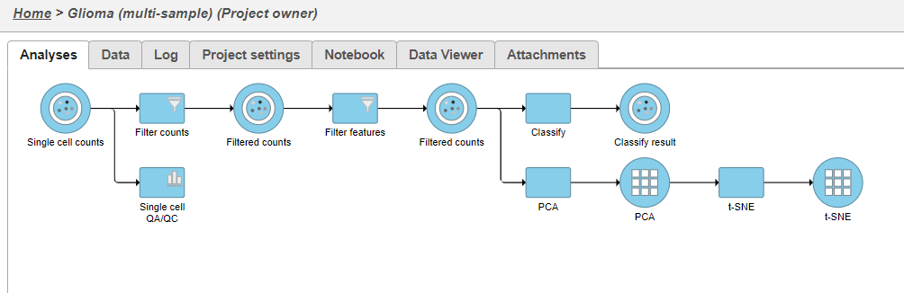
Figure 20. The Classify cells tasks generates a Classified groups data node
- Double-click the new Classify result data node to open the task report (Figure 21)
The Classification summary table shows a breakdown of the number of glioma cells that were classified per sample. The cells that were not classified are labeled N/A.
The Top marker features per label table shows the top 10 upregulated genes in each cell type. In this case, the glioma cells are compared to the N/A cells using ANOVA and the genes are filtered for fold-change >1.5 and sorted by descending fold-change values. To obtain the full list of biomarker genes with p-values and fold-changes, click the Download link in the bottom right of the table.
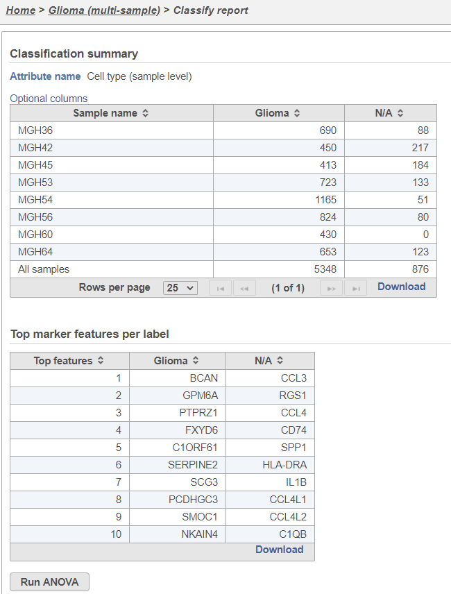 Figure 21. Classification task report
One multi-sample t-SNE plot
For some data sets, cell types can be distinguished when all samples can be visualized together on one t-SNE plot. We will use a t-SNE plot of all samples to classify glioma, microglia, and oligodendrocyte cell types.
- Click on the Glioma (multi-sample) project name at the top to go back to the Analyses tab
- Click the Filtered counts data node after the Filter features task
- Click PCA in the Exploratory analysis section of the task menu
- Uncheck the Split by sample checkbox (Figure 22)
- Click Finish
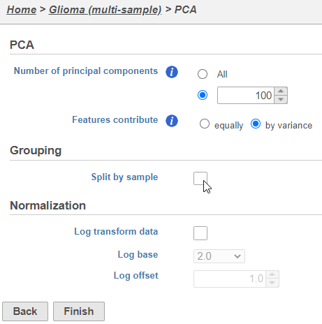
Figure 22. Combine all cells into one plot by unchecking the Split by sample box
The PCA task will run as a new green layer.
- Click the new PCA data node
- Select t-SNE from the Exploratory analysis section of the task menu
- Click Finish to run the t-SNE task with default settings
The t-SNE task will be added to the green layer (Figure 23). Layers are created in Partek Flow when the same task is run on the same data node.
Figure 23. Multi-sample PCA and t-SNE tasks are added as a new layer
Once the task has completed, we can view the plot.
- Double-click the green t-SNE data node to open the t-SNE scatter plot
- Click and drag the 2D scatter plot icon onto the canvas and replace the 3D scatter plot (Figure 24)
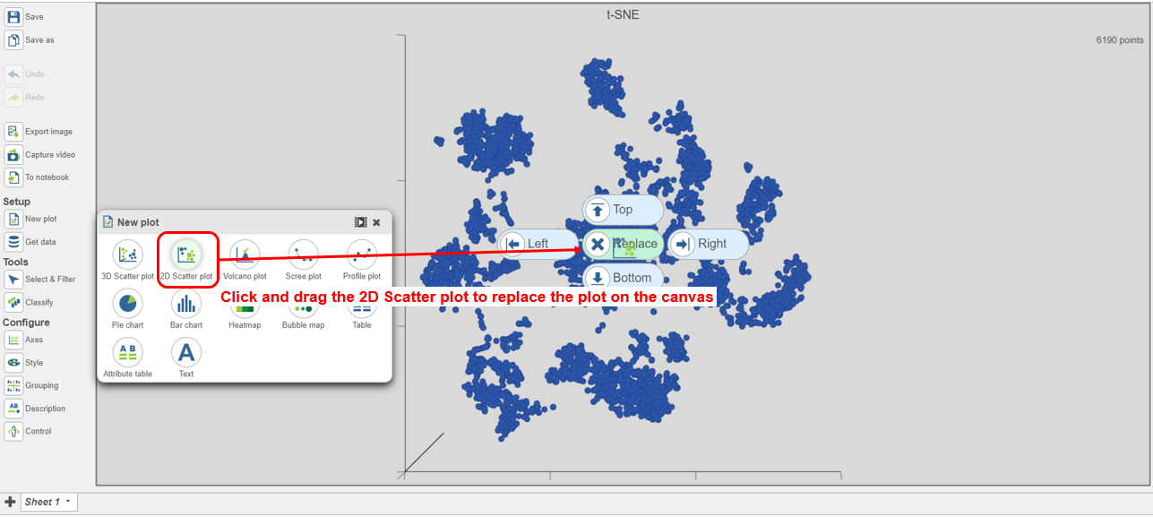
Figure 24. Viewing the multi-sample t-SNE plot
- Search for and select green t-SNE data node (Figure 25)
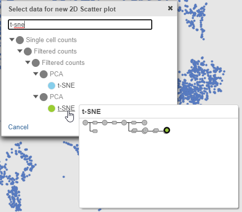 Figure 25. Select the green multi-sample t-SNE data node to draw the 2D t-SNE plot
- In the Style icon, choose Sample name from the Color by drop-down list under Color
Viewing the 2D t-SNE plot, while most cells cluster by sample, there are a few clusters with cells from multiple samples (Figure 26).
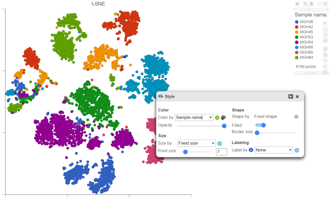
Figure 26. Viewing the multi-sample t-SNE plot in 2D
Using marker genes, BCAN (glioma), CD14 (microglia), and MAG (oligodendrocytes), we can assess whether these multi-sample clusters belong to our known cell types.
- Select any of the count data nodes from the Data card on the left (Single cell counts, or any of the Filtered counts)
- Search for the BCAN gene
- Click and drag the BCAN gene onto the plot and drop it over the Green (feature) option
- Search for the CD14 gene
- Click and drag the CD14 gene onto the plot and drop it over the Red (feature) option
- Search for the MAG gene
- Click and drag the MAG gene onto the plot and drop it over the Blue (feature) option
After coloring by these marker genes, three cell populations are clearly visible (Figure 27).
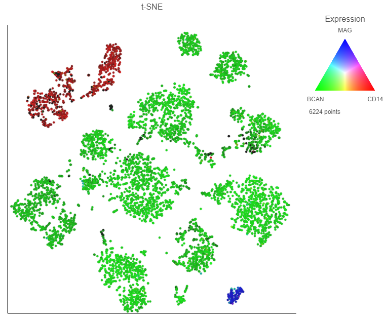
Figure 27. Overlaying marker gene expression on the multi-sample t-SNE plot
The red cells are CD14 positive, indicating that they are the microglia from every sample.
- Switch to lasso mode by clicking the icon in the top right of the plot
- Draw the lasso around the cluster of red cells and click the circle to close the lasso (Figure 28)
- Open the Classify tool and click Classify selection
- Name the classification Microglia
- Click Save
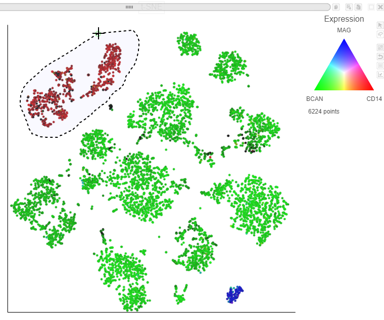
Figure 28. Classifying microglia (red)
The blue cells are MAG positive, indicating that they are the oligodendrocytes from every sample.
- Switch to pointer mode by clicking in the top right corner of the plot
- Deselect the cells by clicking on any blank space on the plot
- Switch to lasso mode again by clicking the icon in the top right of the plot
- Draw the lasso around the cluster of blue cells and click the circle to close the lasso
- Open the Classify tool and click Classify selection
- Name the classification Oligodendrocytes
- Click Save
Finally, we will classify the BCAN expressing cells on the plot as glioma cells from every sample.
- Switch to pointer mode by clicking in the top right corner of the plot
- Deselect the cells by clicking on any blank space on the plot
- Switch to lasso mode again by clicking the icon in the top right of the plot
- Draw the lasso around the cluster of green cells and click the circle to close the lasso
- Open the Classify tool and click Classify selection
- Name the classification Glioma
- Click Save
- Switch to pointer mode by clicking in the top right corner of the plot
- Deselect the cells by clicking on any blank space on the plot
The number of cells classified as microglia, oligodendrocytes, and glioma are shown in Classify (Figure 29)
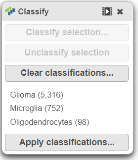 Figure 29. The number of cells for each cell type
- Click Apply classifications in the Classify icon (Figure 30)
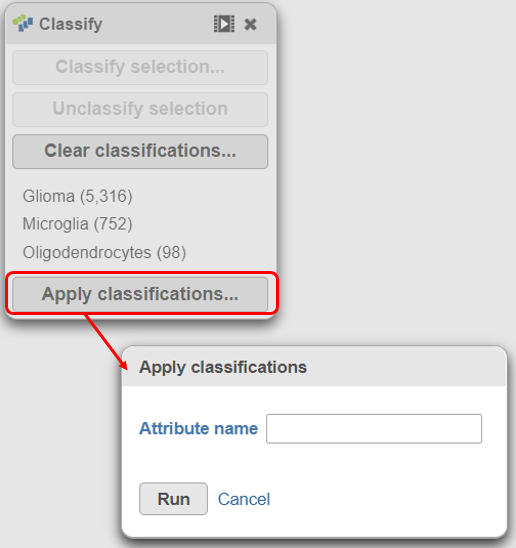 Figure 30. Apply classifications to the data project
- Name the classification attribute Cell type (multi-sample) (Figure 31)
- Click Run
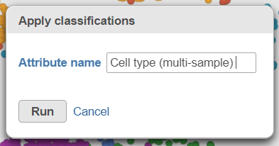 Figure 31. Name the cell-level attribute
A new task, Classify, is added to the Analyses tab. This task produces a new Classify result data node in a green layer (Figure 32).
Figure 31. Name the cell-level attribute
A new task, Classify, is added to the Analyses tab. This task produces a new Classify result data node in a green layer (Figure 32).
- Click on the Glioma (multi-sample) project name at the top to go back to the Analyses tab
- Your browser may warn you that any unsaved changes to the data viewer session will be lost. Ignore this message and proceed to the Analyses tab
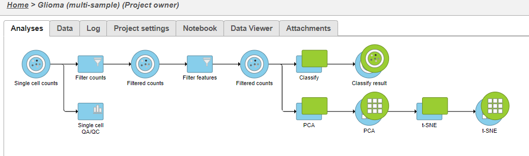
Figure 32. Classify cells tasks from multi-sample t-SNE plot
Additional Assistance
If you need additional assistance, please visit our support page to submit a help ticket or find phone numbers for regional support.


| Your Rating: |
|
Results: |

|
3 | rates |
Overview
Content Tools