Principal components (PC) analysis (PCA) is an exploratory technique that is used to describe the structure of high dimensional data by reducing its dimensionality. It is a linear transformation that converts n original variables (typically: genes or transcripts) into n new variables, which are called PCs, they have three important properties:
- PCs are ordered by the amount of variance explained
- PCs are uncorrelated
- PCs explain all variation in the data
PCA is a principal axis rotation of the original variables that preserves the variation in the data. Therefore, the total variance of the original variables is equal to the total variance of the PCs.
If read quantification (i.e. mapping to a transcript model) was performed by Partek® E/M algorithm, PCA can be invoked on a quantification output data node (Gene counts or Transcript counts) or, after normalisation, on a Normalized counts data node. Select a node on the canvas and then PCA in the Visualization section of the context sensitive menu. The PCA task creates a new task node, and to open it and see the result, do one of the following: select the PCA task node, proceed to the context sensitive menu and go to the Task result; or double-click on the PCA task node.
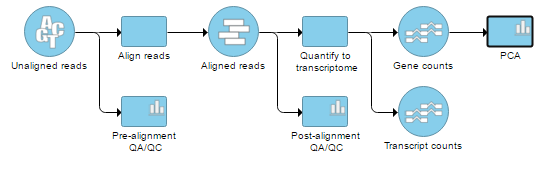 Figure 1. RNA-Seq workflow with principal components analysis (PCA) task invoked on the Gene counts data node
On the other hand, the Cufflinks quantification node is not associated with a detailed report like the Partek E/M nodes, so opening the node by double clicking (or going via the context sensitive menu) brings up the PCA plot directly.
Figure 1. RNA-Seq workflow with principal components analysis (PCA) task invoked on the Gene counts data node
On the other hand, the Cufflinks quantification node is not associated with a detailed report like the Partek E/M nodes, so opening the node by double clicking (or going via the context sensitive menu) brings up the PCA plot directly.
Also note that PCA is available for ERCC assessment; open the QA/QC on ERCC controls task node and push View PCA in the lower left corner.
PCA in Partek® Flow® is using correlation matrix to find the components, which means all the features are standardized to mean of 0 and standard deviation of 1 (the standardization is performed during the computation and does not modify the values in the data node). The results are presented as scatterplot (Figure 2), with each dot on the plot being a sample, while the axes represent the PCs and the axes values correspond to the respective PC values. By default, first three PCs are shown on the X-, Y-, and Z-axis respectively, with the information content of an individual PC is in the parenthesis.
As an exploratory tool, PCA scatterplot is applied to view any groupings in the data set and generate hypotheses based on the outcome, or to spot possible outliers.
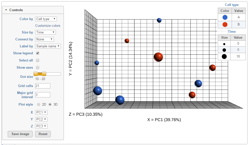 Figure 2. Principal components analysis plot in 3D. Each dot is a sample. The axes show the first three principal components, with the fraction of explained variance in the parenthesis. The legend is on the right, showing effect of coloring and sizing on the appearance of the dots (an example)
To rotate the plot left click & drag. To zoom in or out, use the mouse wheel. Click and drag the legend can move the legend to different location on the viewer.
The plot can be customised by using the controls on the left (Figure 3). Color by shows the sample attributes as listed in the Data tab or you can set it to Fixed to have all the dots of the same color. Size by option works in the same way, but affects the dot sizes.
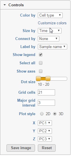 Figure 3. Control panel of principal components analysis plot
Connect by option is particularly useful for dependent study designs, where you can highlight the samples based on the same biological source by the connecting lines. Example on Figure 4 depicts results of a study where each RNA sample was processed by both RNA-seq and gene expression array; the lines connect the same samples.
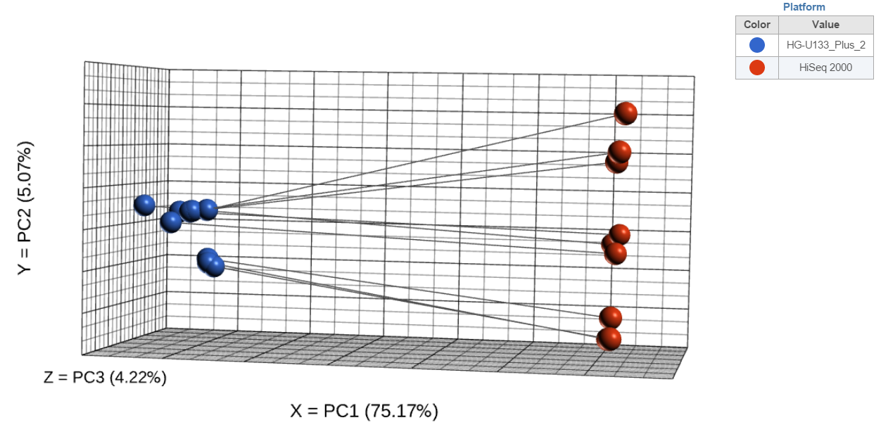 Figure 4. Principal components analysis plot in 3D. Each dot is a sample and samples originating from the same biological source (dependent study design) are connected by lines. The axes show the first three principal components, with the fraction of explained variance in the parenthesis
If you want to change a color, select the Customize colors hyperlink. The resulting dialog (Figure 5) will enable you to replace an existing color by a color of your choice (click on the arrow head
Figure 4. Principal components analysis plot in 3D. Each dot is a sample and samples originating from the same biological source (dependent study design) are connected by lines. The axes show the first three principal components, with the fraction of explained variance in the parenthesis
If you want to change a color, select the Customize colors hyperlink. The resulting dialog (Figure 5) will enable you to replace an existing color by a color of your choice (click on the arrow head to invoke the color mixer) or add more colors (Add color).
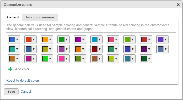 Figure 5. Customize colors dialog (default appearance). General tab (palette) is used for sample coloring and general sample attribute-based coloring in the chromosome view, hierarchical clustering, and general charts and graphs. Two-color numeric tab (palette) is used to color by numeric sample attribute in the hierarchical clustering, principal components analysis, and dot plot views. Save button saves your color preferences
When click on a dot (sample), it will be selected and a label of the sample will be displayed, from the Label by drop-down list to select how to label the selected sample. To select more than one samples, press Ctrl & click.
Figure 5. Customize colors dialog (default appearance). General tab (palette) is used for sample coloring and general sample attribute-based coloring in the chromosome view, hierarchical clustering, and general charts and graphs. Two-color numeric tab (palette) is used to color by numeric sample attribute in the hierarchical clustering, principal components analysis, and dot plot views. Save button saves your color preferences
When click on a dot (sample), it will be selected and a label of the sample will be displayed, from the Label by drop-down list to select how to label the selected sample. To select more than one samples, press Ctrl & click.
Next, Show legend turns the legend on or off. Select all selects all the dots, while Show axis turns the coordinate axis on or off. To change the size of the dots, use the Dot size slider. Grid cells increases or decreases the size of the cells in the plot grid and the Major grid interval specifies the frequency of major grid lines (fat lines). E.g. setting the Major grid interval to 4 highlights every 4th grid line.
You can also reduce the number of dimensions of the plot by switching the Plot style to 2D (Figure 6 is based on the same data as Figure 2, but is plotted in 2D).
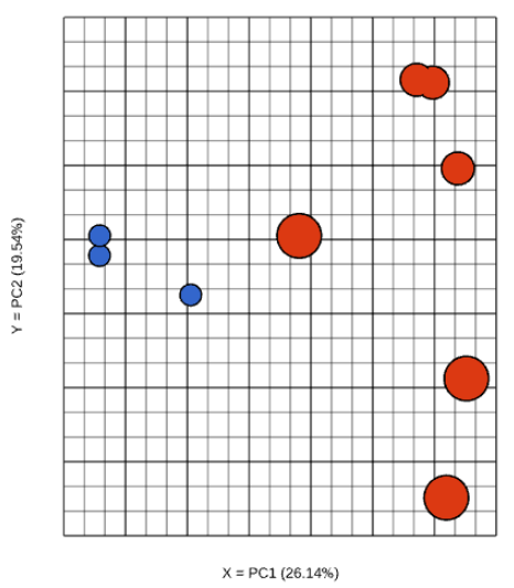 Figure 6. Principal components analysis plot in 2D. Each dot is a sample. The axes show the first two principal components, with the fraction of explained variance in the parenthesis (an example)
Although first three PCs are shown by default, you can plot any of the first nine PCs, by using the X, Y, and Z drop-down lists.
Once you are pleased with the appearance of the dot plot, push Save image button to save it to the local machine. The resulting dialog (Figure 7) controls the resolution of the image file. The image will be saved in .png format, and the default filename is PCA plot.png. Or, if you are not happy with your edits, you can always revert to the initial view by pushing the Reset button.
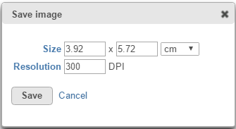 Figure 7. Save image dialog (default settings)
Additional Assistance
If you need additional assistance, please visit our support page to submit a help ticket or find phone numbers for regional support.


| Your Rating: |
|
Results: |

|
1 | rates |
Overview
Content Tools