Page History
...
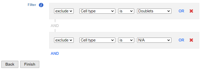
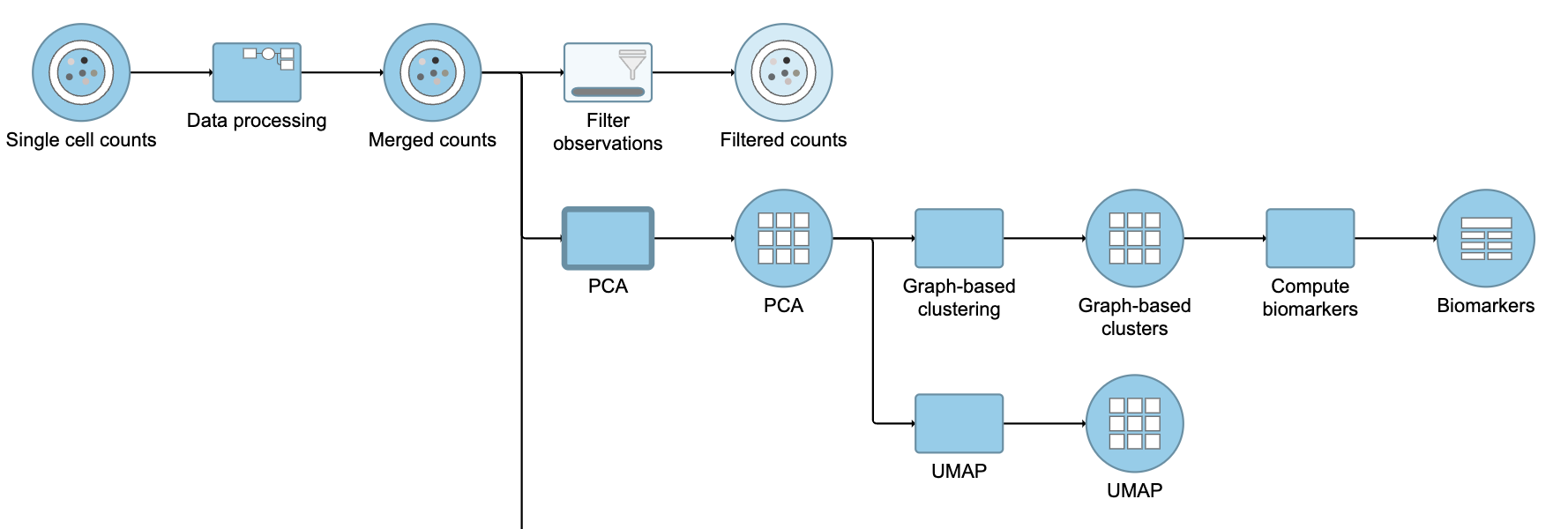
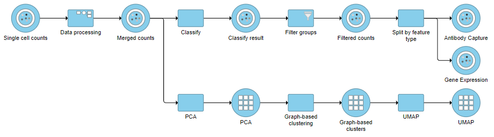
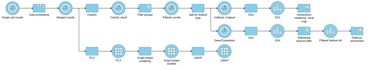
Because we have classified our cells, we can now filter based on those classifications. This can be used to focus on a single cell type for re-clustering and sub-classification or to exclude cells that are not of interest for downstream analysis.
- Click the Classified result Merged counts data node
- Click Filtering
- Click Filter groupscells
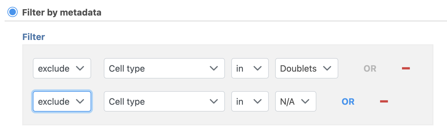
- Set to exclude Cell type is Doublets using the drop-down menus
- Click ANDOR
- Set the second filter to exclude Cell type is N/A using the drop-down menus
- Click Finish to apply the filter (Figure 1)
...
| Numbered figure captions | ||||
|---|---|---|---|---|
| ||||
|
This produces a Filtered counts data node (Figure 2).
...
| Numbered figure captions | ||||
|---|---|---|---|---|
| ||||
|
Re-split the Matrix
...
| Numbered figure captions | ||||
|---|---|---|---|---|
| ||||
|
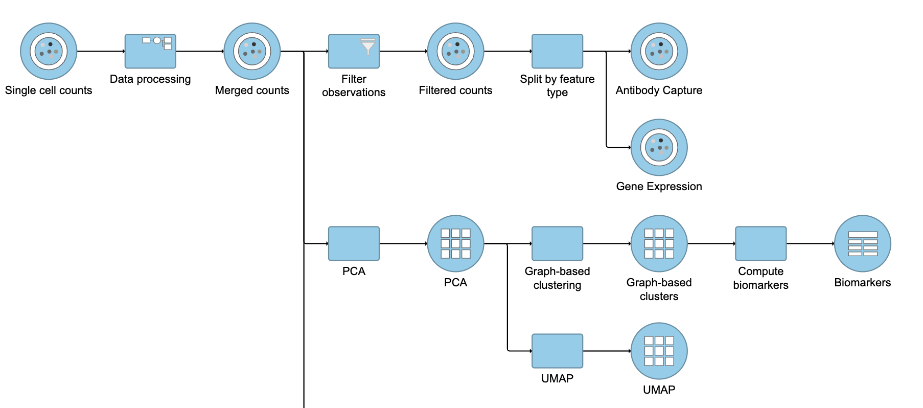
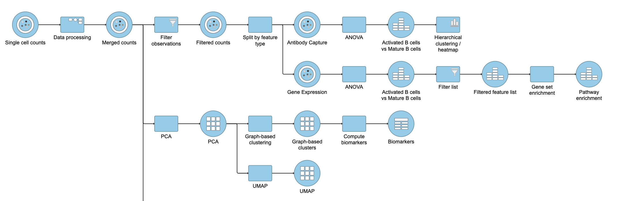
Differential Analysis and Visualization - Protein Data
...
- Click the Antibody Capture data node
- Click Statistics
- Click Differential analysis
- Click GSAANOVA then click Next
The first step is to choose which attributes we want to consider in the statistical test.
- Check Click Cell type to include it in the statistical test
- Click Add factor
- Click Next
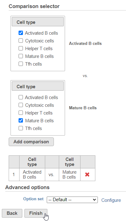
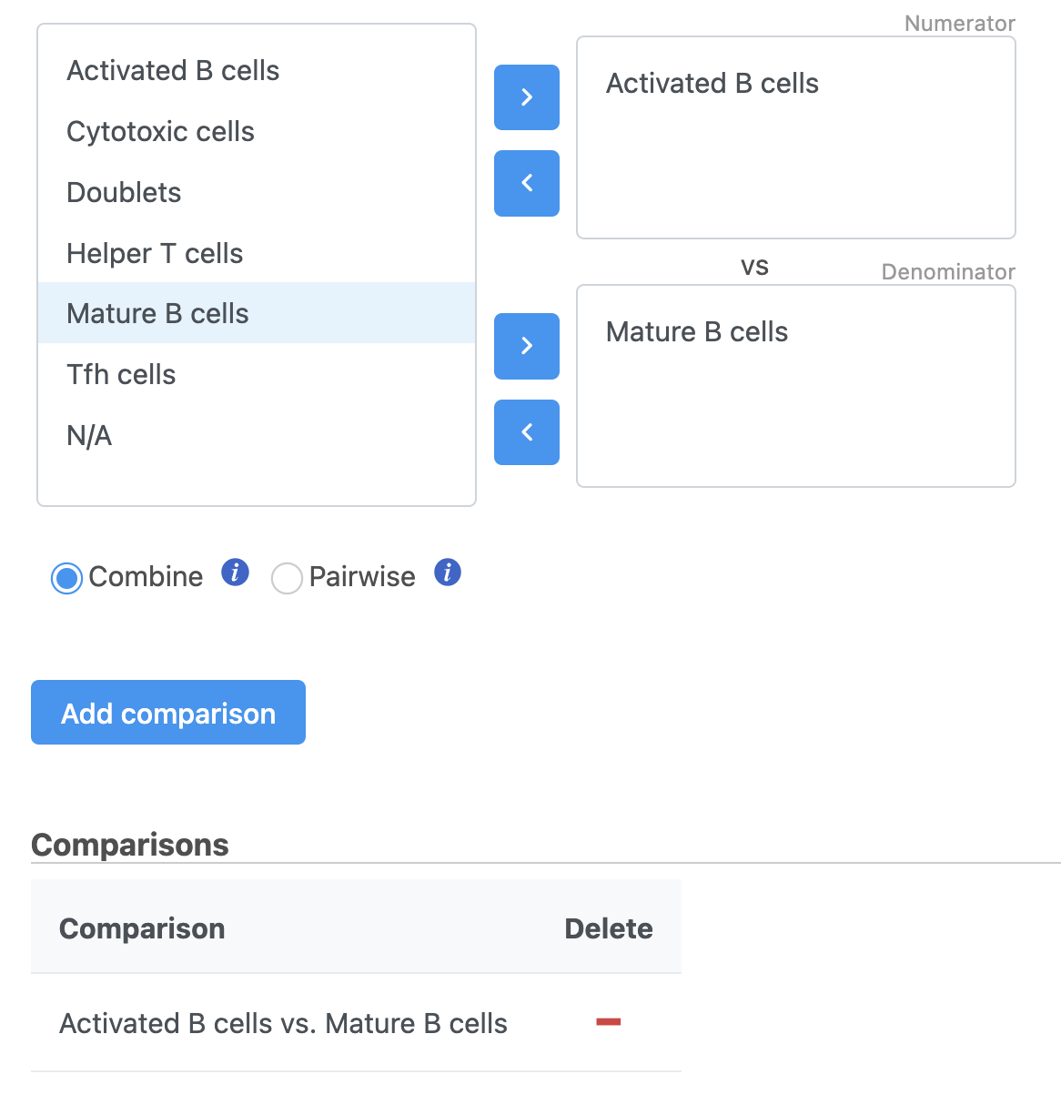
Next, we will set up the comparison we want to make. Here, we will compare the Activated and Mature B cells.
- Check Drag Activated B cells in the top panel
- Check Drag Mature B cells in the bottom panel
- Click Add comparison
...
| Numbered figure captions | ||||
|---|---|---|---|---|
| ||||
|
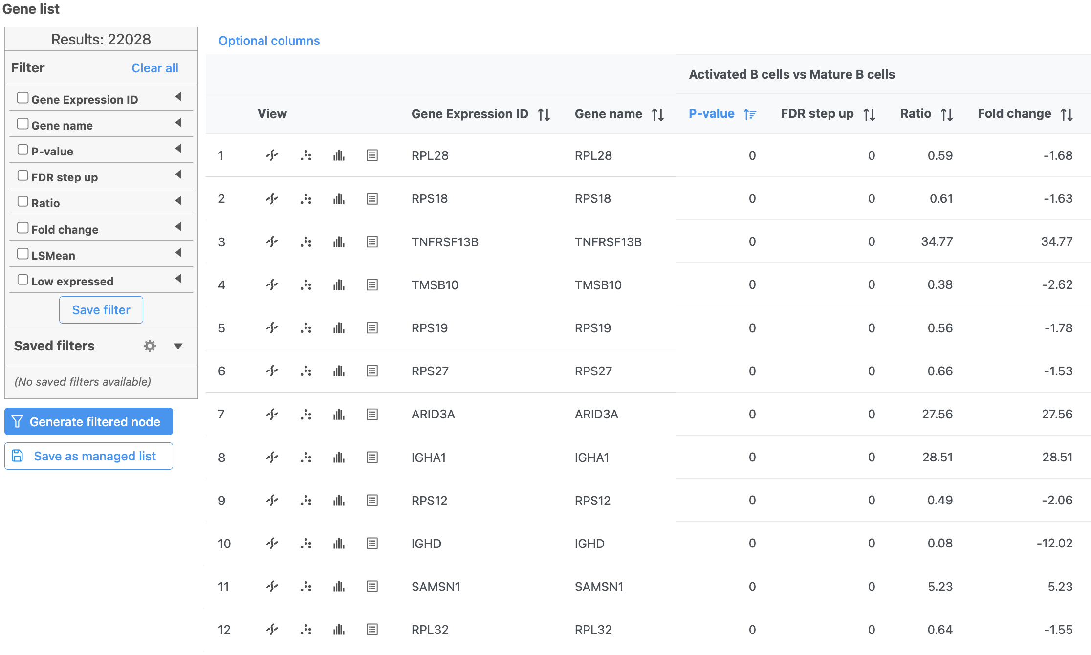
The GSA ANOVA task produces a GSA an ANOVA data node.
- Double-click the GSA ANOVA data node to open the task report
...
| Numbered figure captions | ||||
|---|---|---|---|---|
| ||||
|
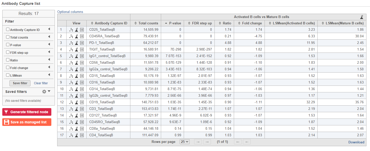
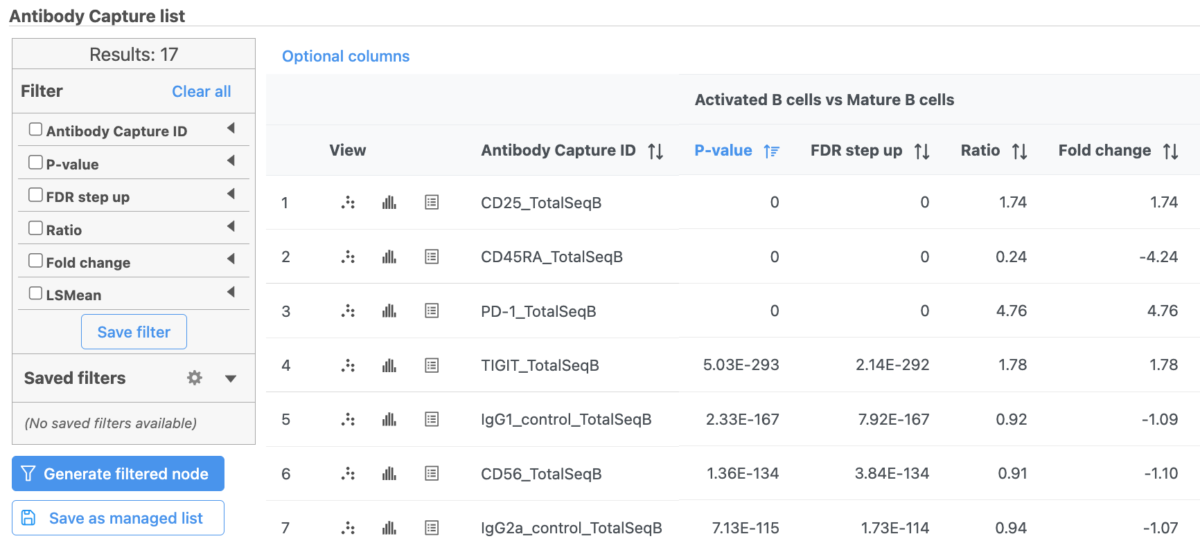
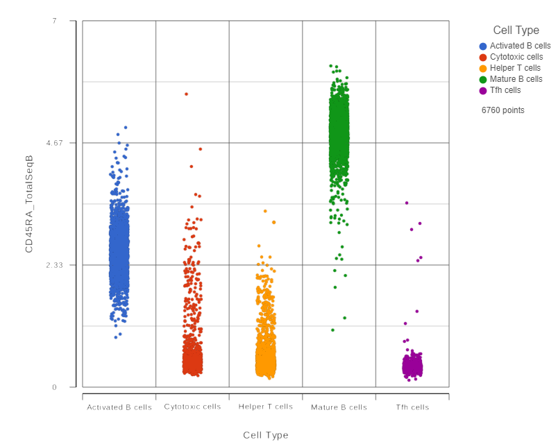
In addition to the listed information, we can access dot and violin plots for each gene or protein from this table.
...
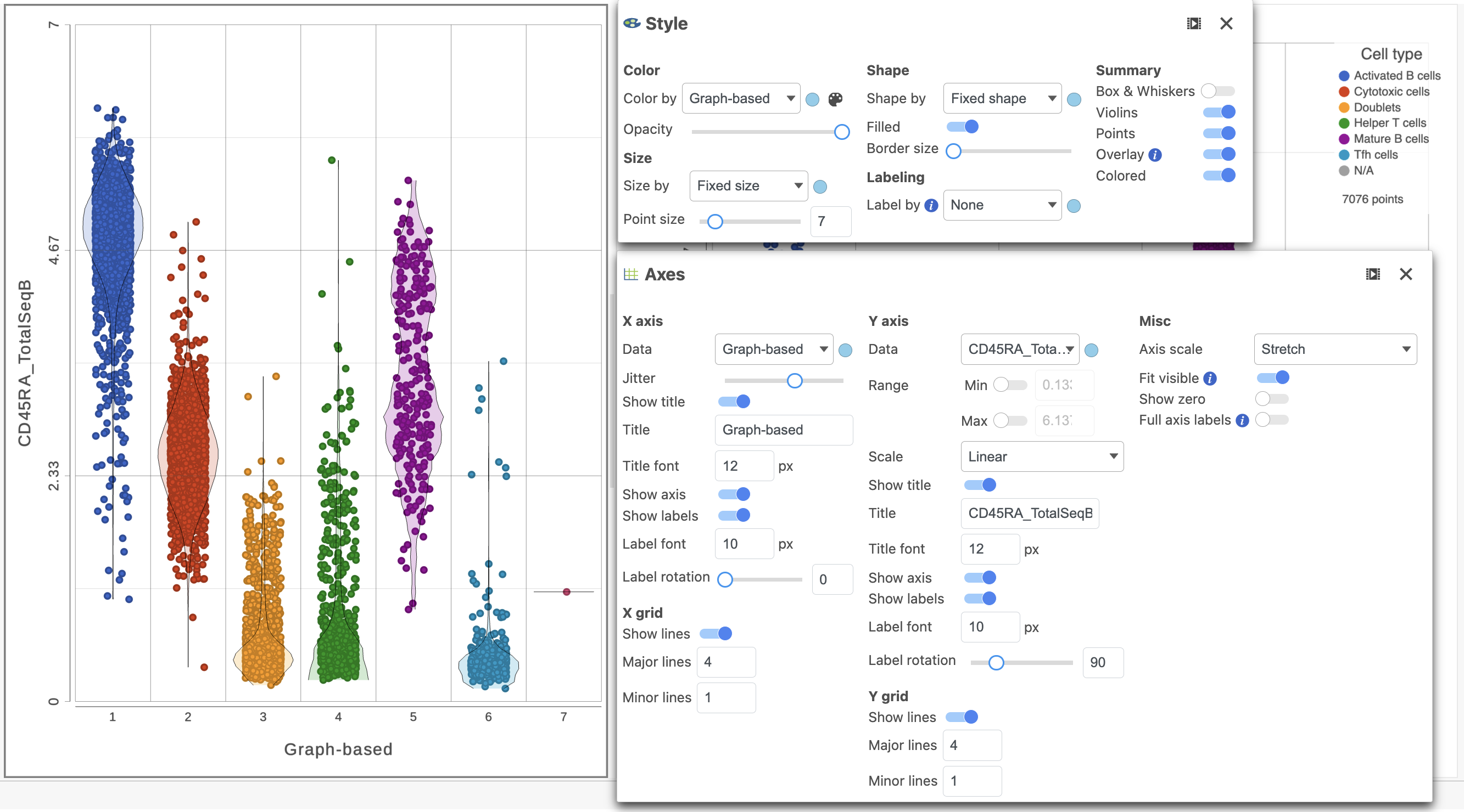
This opens a dot plot in a new data viewer session, showing CD45A expression for cells in each of the classifications (Figure 6). First, we exclude Doublets and N/A cells from the plot:
- Open Select and filter, select Criteria
- Drag "Cell type" from the legend title to the Add criteria box
- Uncheck Doublets and N/A
- Click to include selected points
| Numbered figure captions | ||||
|---|---|---|---|---|
| ||||
|
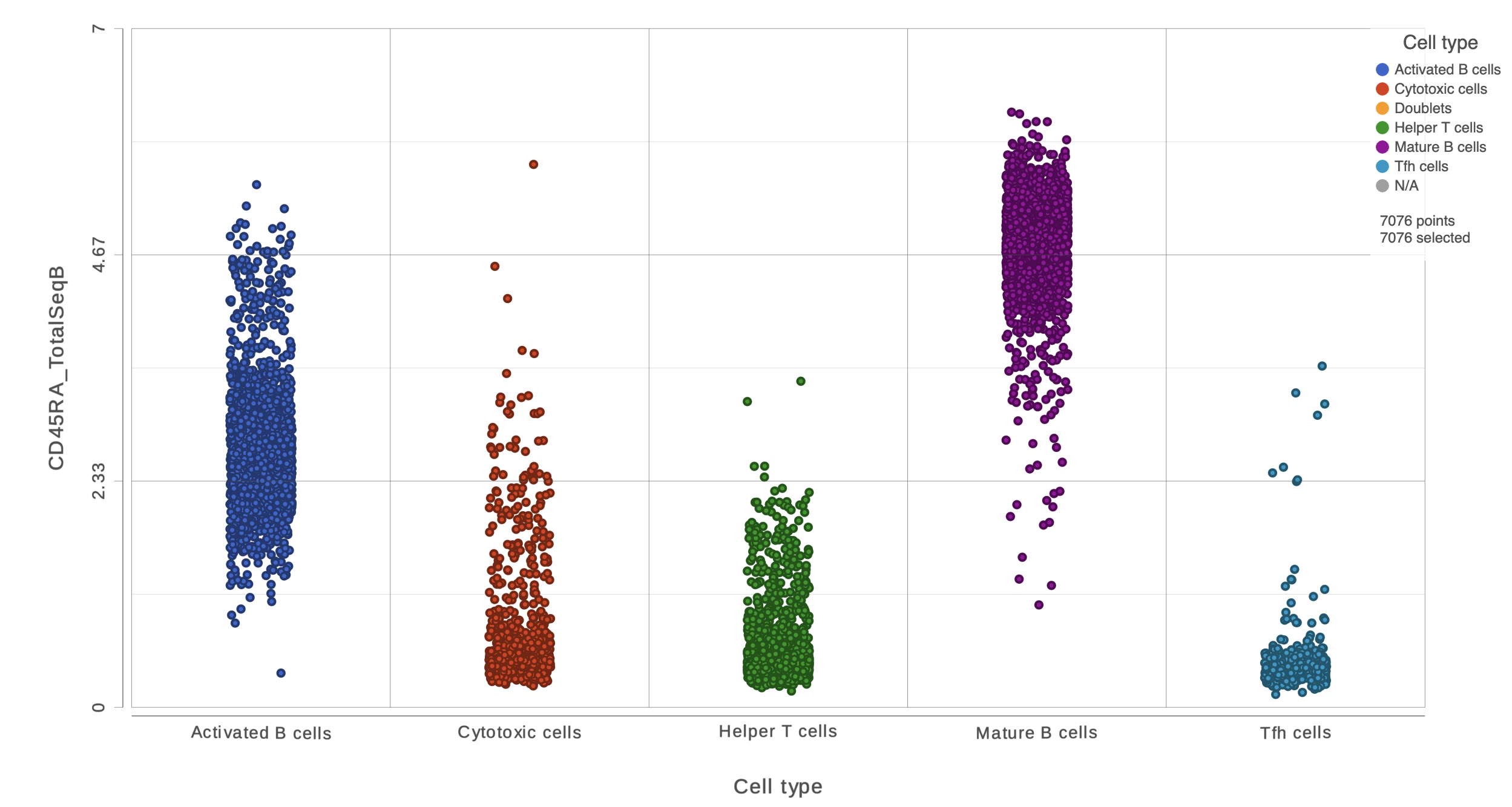
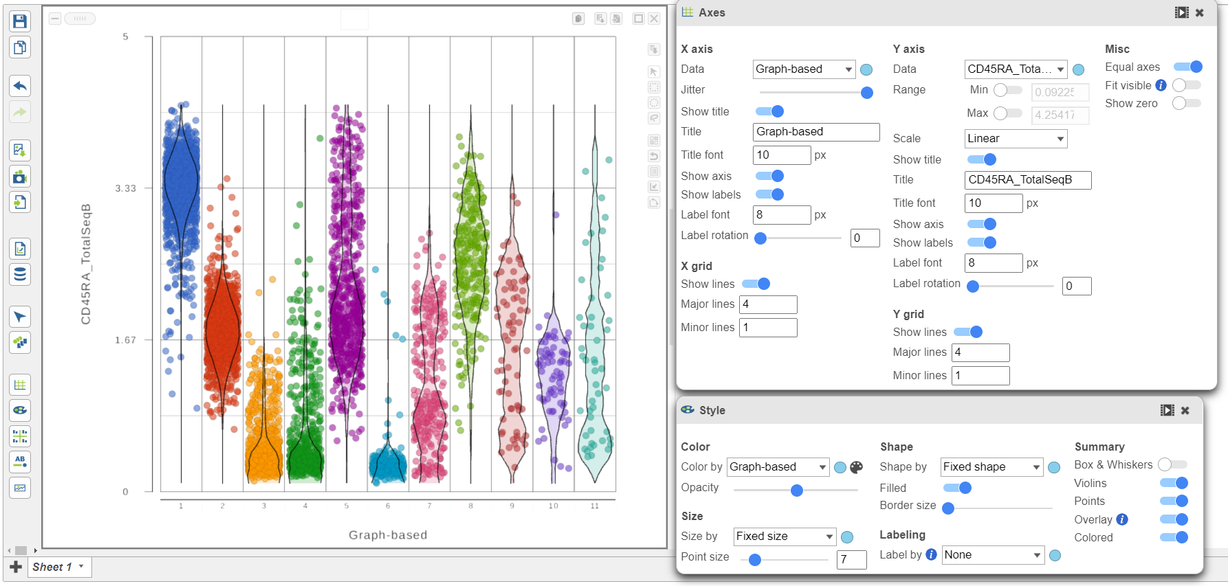
We can use the Configuration panel on the left to edit this plot.
- Open the Style icon
- Switch on Violins under Summary
- Switch on Overlay under Summary
- Switch on Colored under Summary
- Select the Graph-based clustering node in the Color by section
- Color by Graph-based clusters under Color and use the slider to decrease the Opacity
- Open the Axes icon
- Select the Graph-based clustering node in the X axis section
- Change the X axis data to Graph-based clusters
- Use the slider to increase the Jitter on the X axis (Figure 7)
...
| Numbered figure captions | ||||
|---|---|---|---|---|
| ||||
|
- Click the project name to return to the Analyses tab
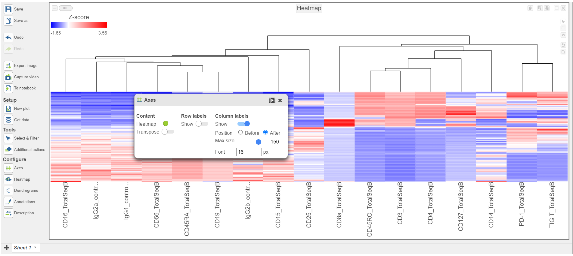
To visualize all of the proteins at the same time, we can make a hierarchical clustering heat map.
- Click the GSA ANOVA data node
- Click Exploratory analysis in the toolbox
- Click Hierarchical clustering/heatmap
- In the Ordering the Cell order section, choose Graph-based clusters from the Cell Assign order drop-down list
- Click Finish to run with the other default settings
- Double-click the Hierarchical clustering task node to open the heatmap
...
| Numbered figure captions | ||||
|---|---|---|---|---|
| ||||
|
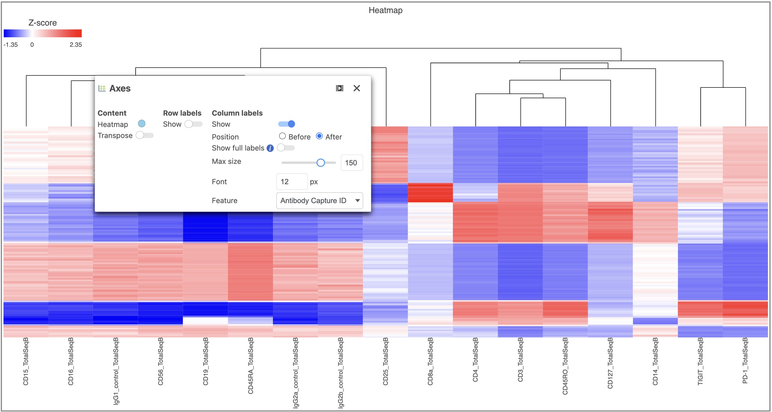
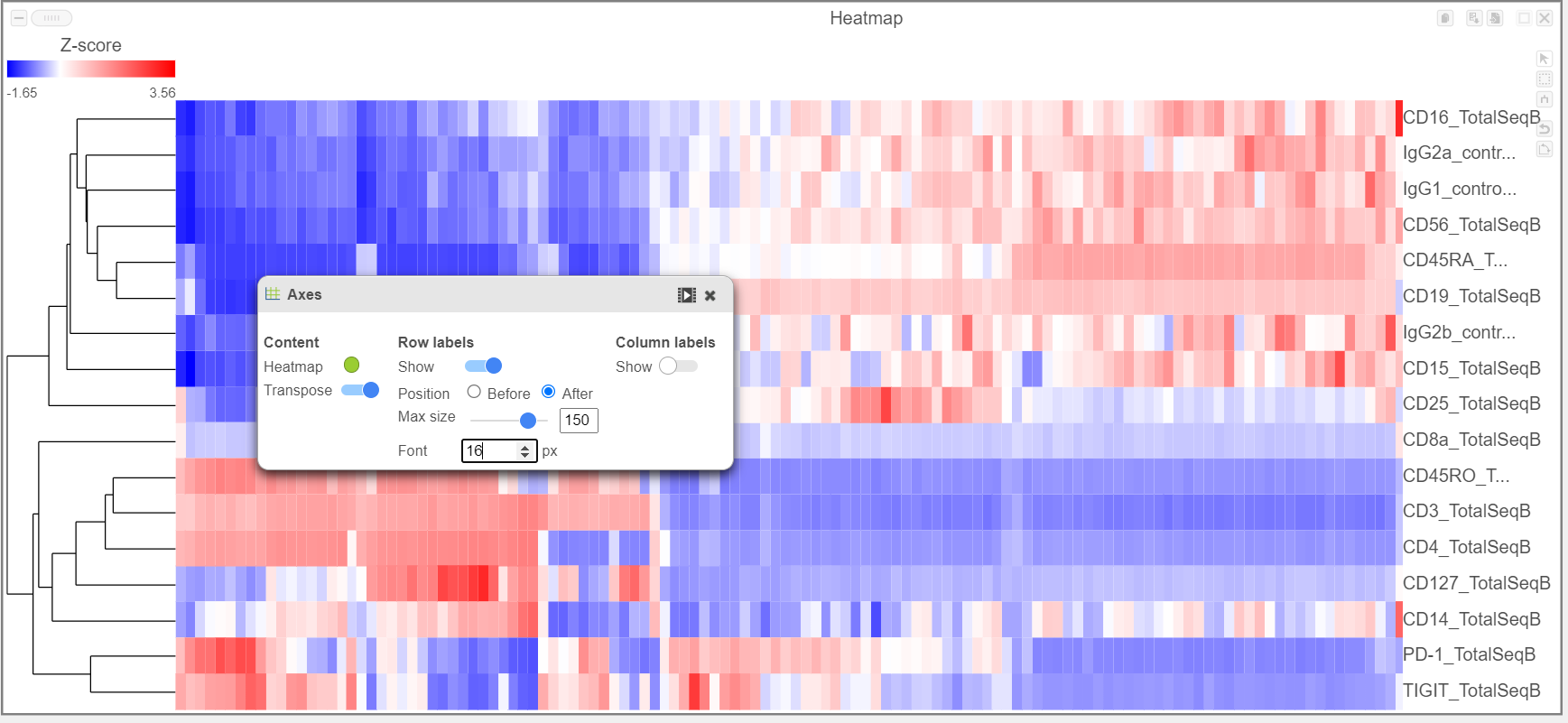
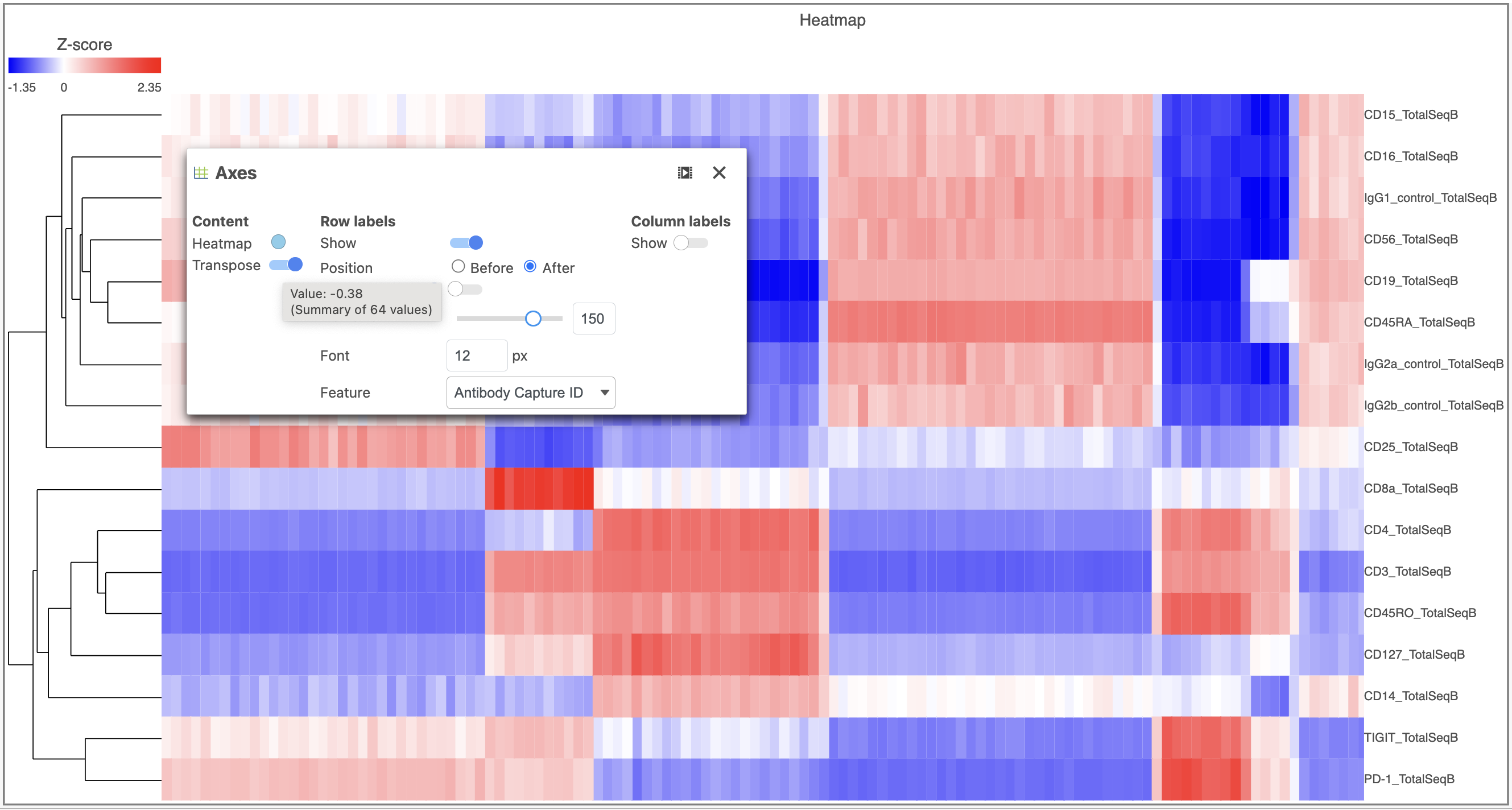
- Activate the Transpose switch which will switch the Row and Column labels, so now the Row labels will be shown (Figure 9)
...
| Numbered figure captions | ||||
|---|---|---|---|---|
| ||||
|
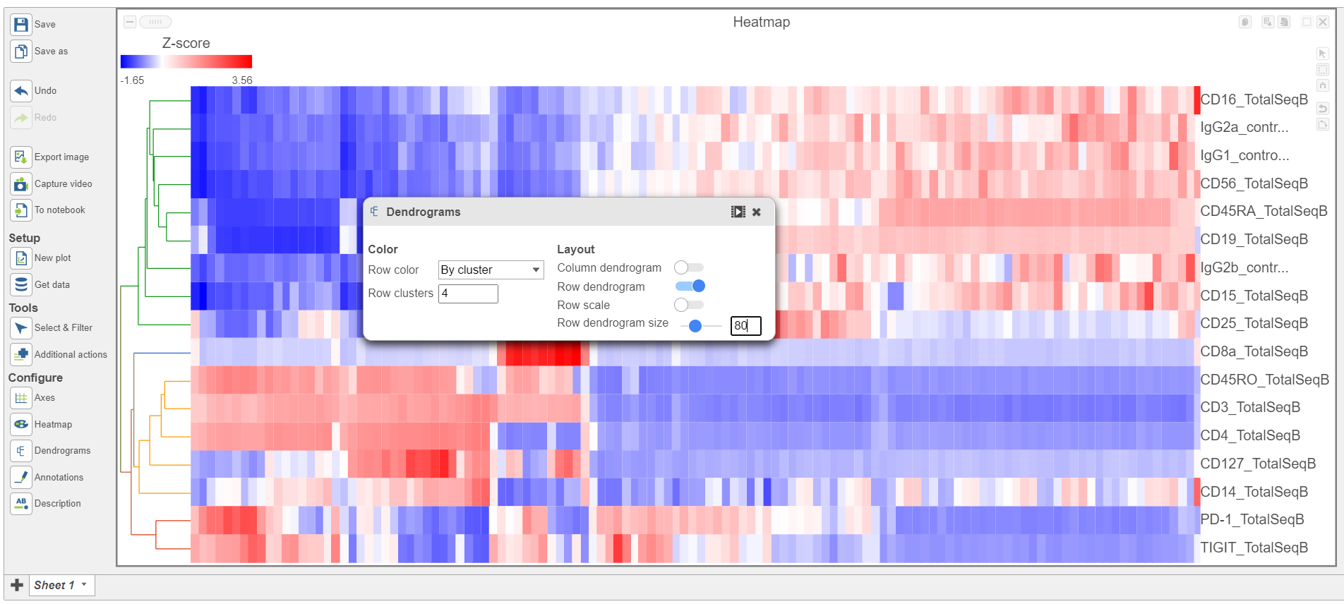
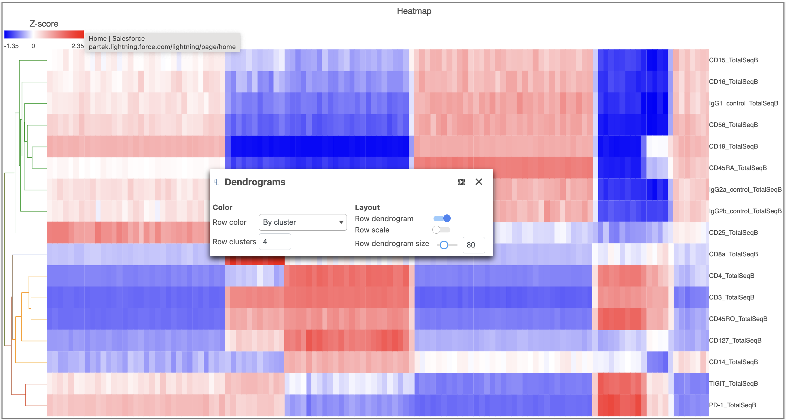
- Open the Dendrograms icon
- Choose Row color By cluster and change Row clusters to 4
- Change Row dendrogram size to 80 (Figure 10)
...
| Numbered figure captions | ||||
|---|---|---|---|---|
| ||||
|
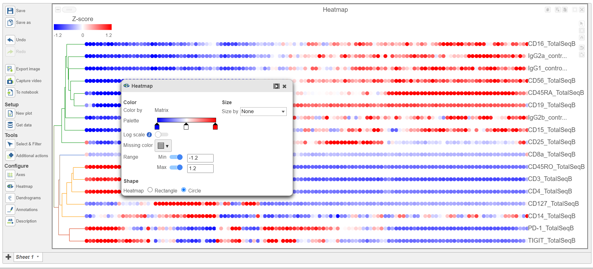
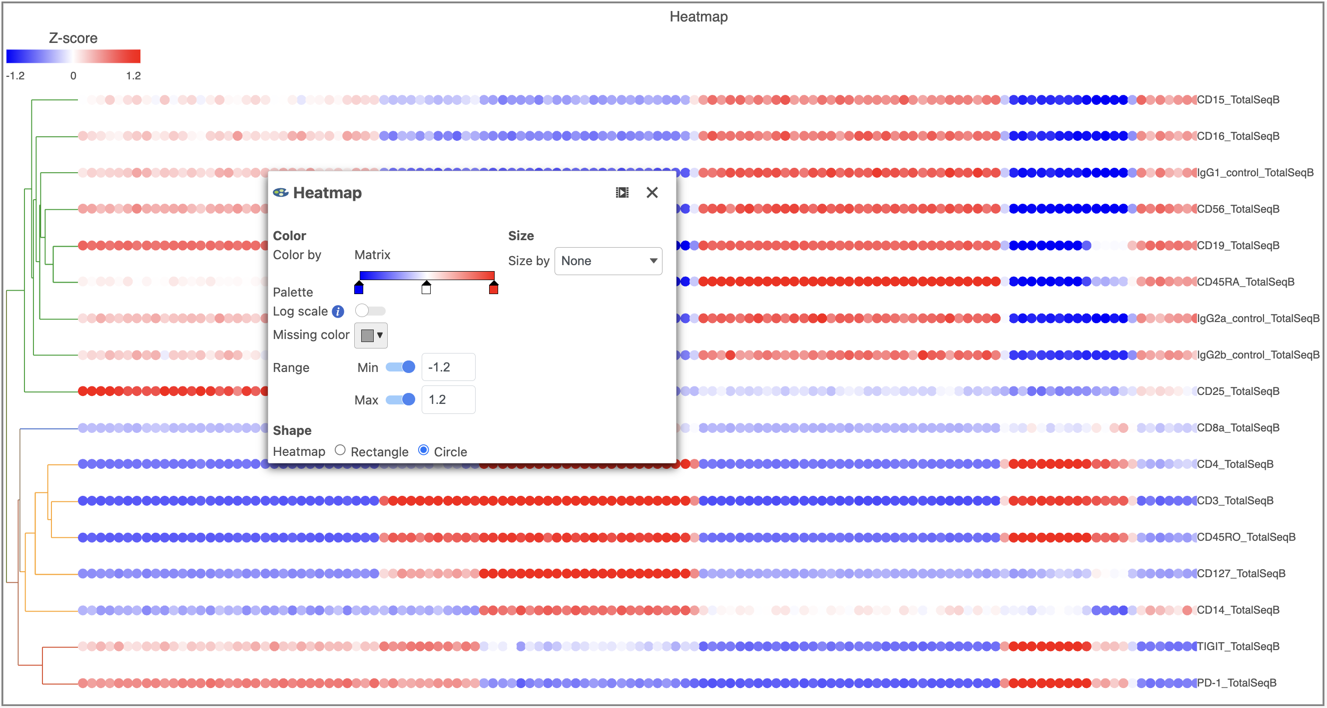
- In the Heatmap icon
- Navigate to Range under Color
- Set the Min and Max to -1.2 and 1.2, respectively
- Change the Shape to Circle (Figure 11)
...
| Numbered figure captions | ||||
|---|---|---|---|---|
| ||||
|
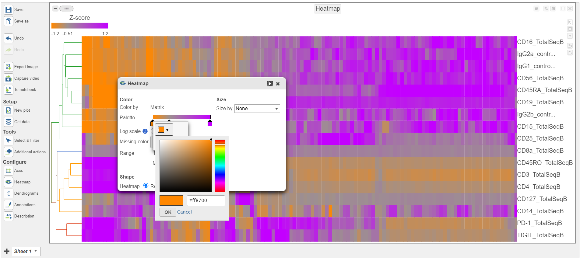
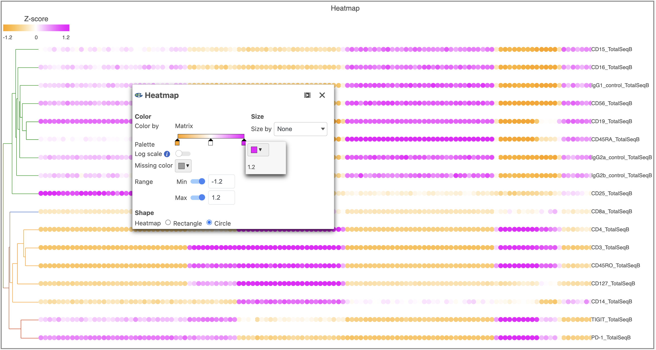
- Switch the Shape back to Rectangle
- Change the Color Palette by clicking on the color squares and selecting colors from the rainbow. Click outside of the selection box to exit this selection. The color options can be dragged alone the Palette to highlight value differences (Figure 12).
...
| Numbered figure captions | ||||
|---|---|---|---|---|
| ||||
|
Feel free to explore the other tool options on the left to customize the plot further.
...
- Click the project name to return to the Analyses tab
- Click the Gene Expression data node
- Click the Antibody Capture data node
- Click Statistics
- Click Differential analysis
- Click GSA
- Check Cell type to include it in the statistical test
- ANOVA then click Next
- Click Cell type
- Click Add factor
- Click Next
- Check Drag Activated B cells in the top panel
- Check Drag Mature B cells in the bottom panel
- Click Add comparison Click comparison
The comparison should appear in the table as Activated B cells vs. Mature B cells.
- Click Finish to run the statistical test
As before, this will generate a GSA an ANOVA task node and a GSA n ANOVA data node.
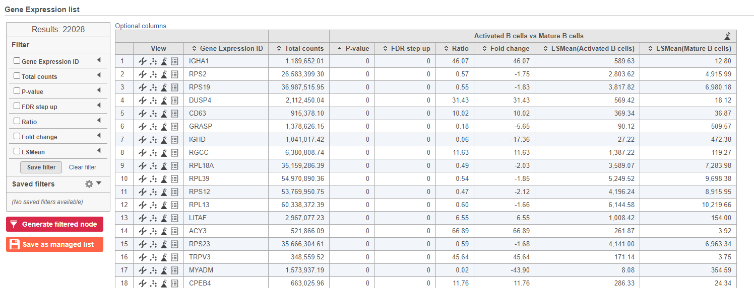
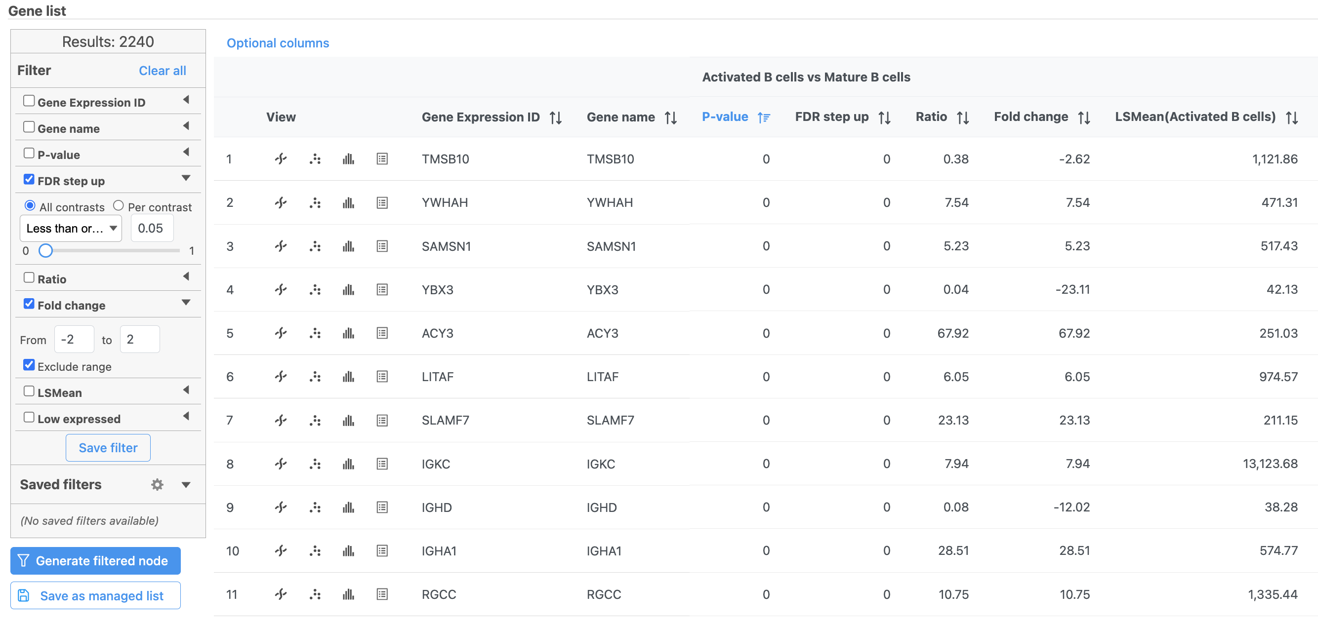
- Double-click the GSA ANOVA task node to open the task report (Figure 13)
...
| Numbered figure captions | ||||
|---|---|---|---|---|
| ||||
|
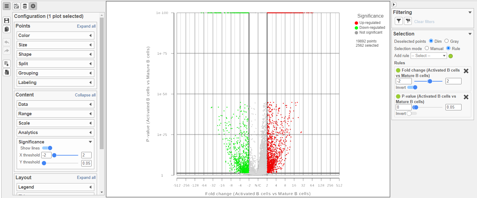
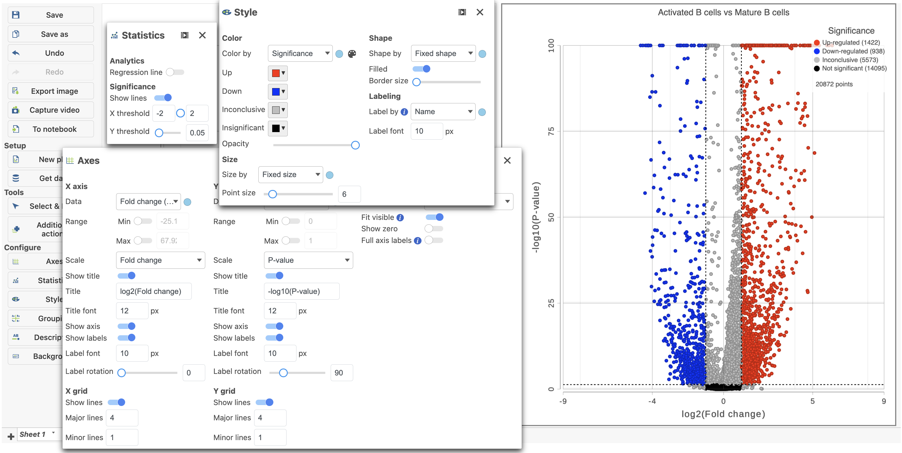
Because more than 20,000 genes have been analyzed, it is useful to use a volcano plot to get an idea about the overall changes.
...
The plot can be configured using various options in the Configuration card on the tools on the left. For example, the Color, Size and Shape cards can the Style icon can be used to change the appearance of the points. The X and Y-axes can be changed in the Data card. The Significance card can the Axes icon. The Statistics icon can be used to set different Fold-change and P-value thresholds for coloring up/down-regulated genes. The in plot controls can be used to transpose ![]() the volcano plot (Figure 14).
the volcano plot (Figure 14).
| Numbered figure captions | ||||
|---|---|---|---|---|
| ||||
|
- Click the GSA ANOVA report tab in your web browser to return to the full report
...
| Numbered figure captions | ||||
|---|---|---|---|---|
| ||||
|

- Click
 to create a new data node including only these significantly different genes
...
| Numbered figure captions | ||||
|---|---|---|---|---|
| ||||
|
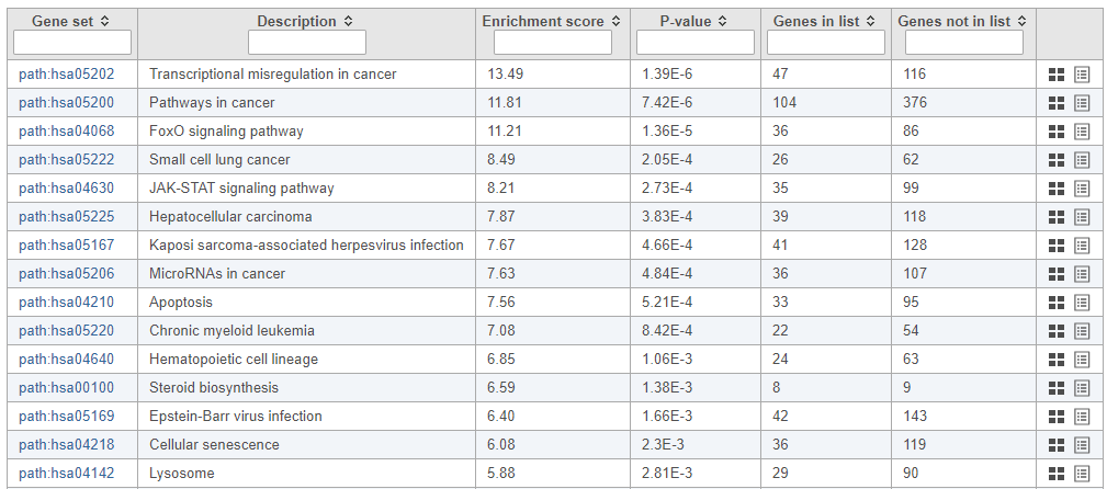
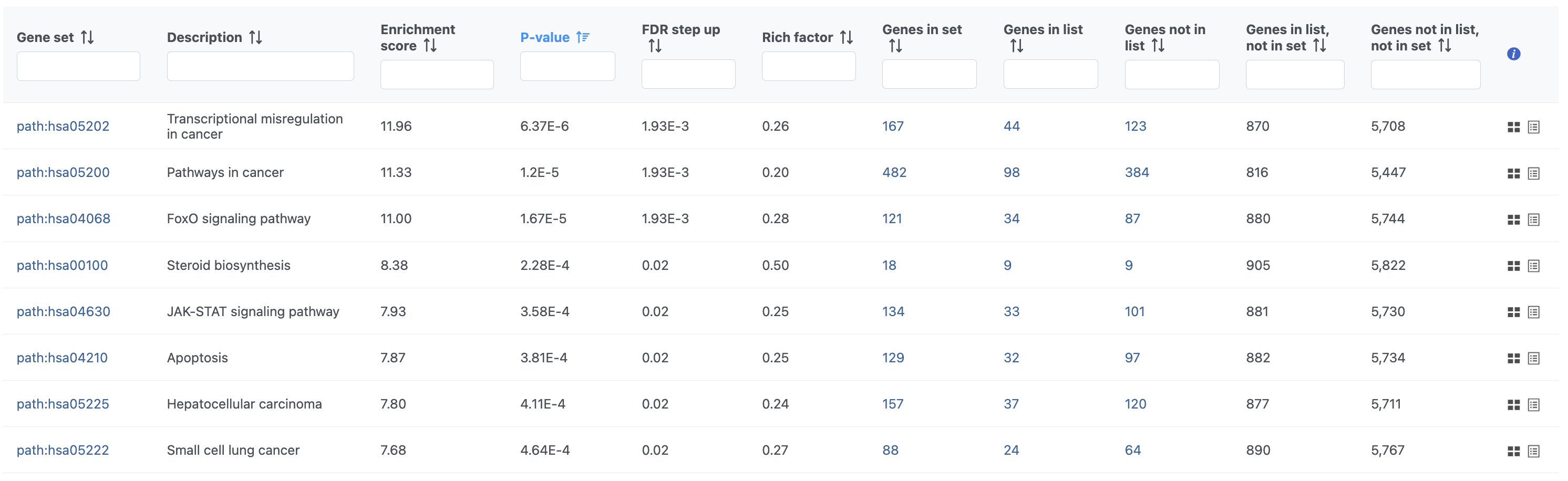
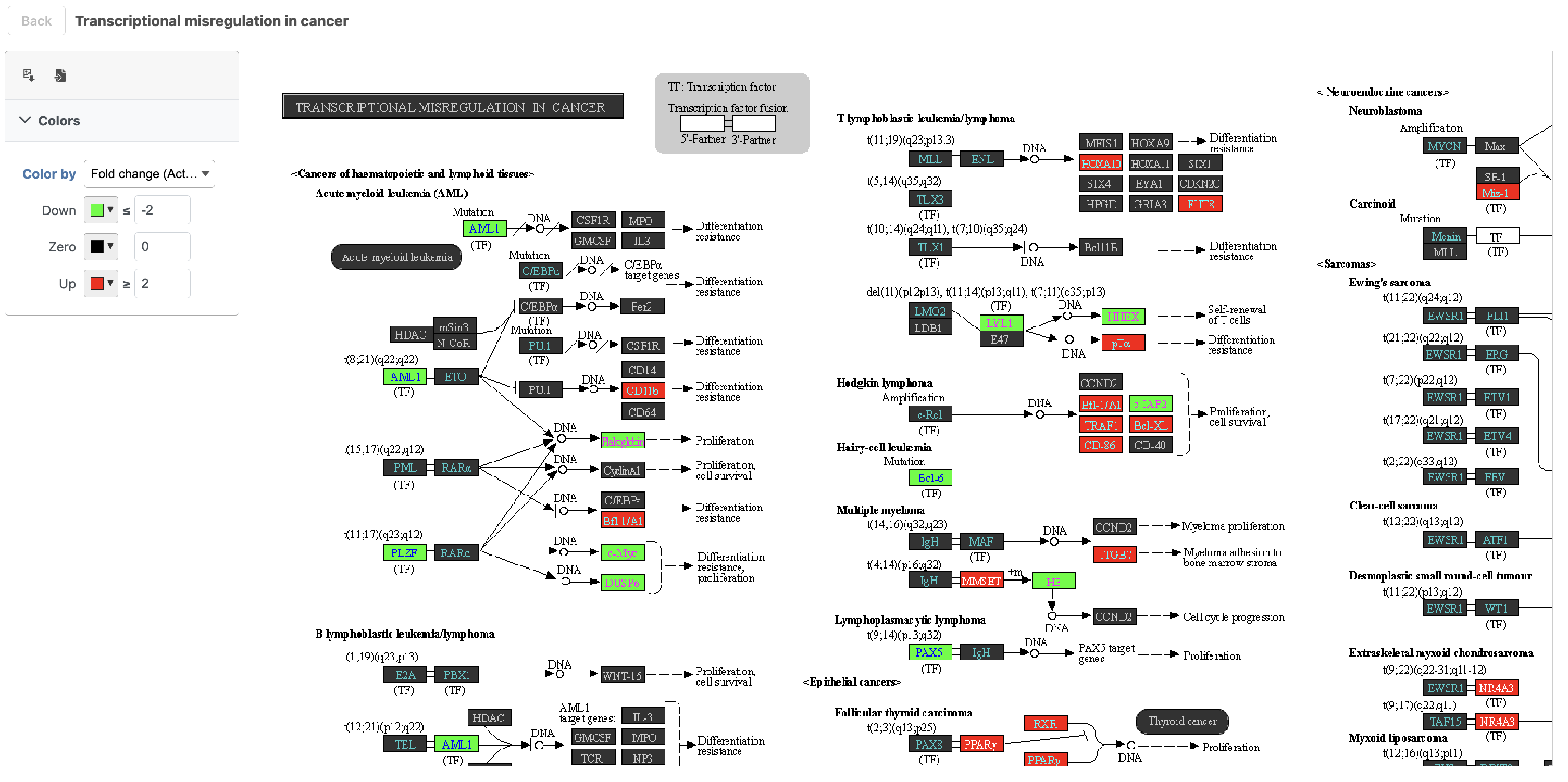
To get a better idea about the changes in each enriched pathway, we can view an interactive KEGG pathway map.
...
| Numbered figure captions | ||||
|---|---|---|---|---|
| ||||
|
| Numbered figure captions | ||||
|---|---|---|---|---|
| ||||
|
| Additional assistance |
|---|
...
Overview
Content Tools