Page History
...
If you are new to Partek Flow, please see Getting Started with Your Partek Flow Hosted Trial for information about data transfer and import and Creating and Analyzing a Project for information about the Partek Flow user interface.
Filtering cells
An important step in analyzing single cell RNA-Seq data is to filter out low quality cells. A few examples of low-quality cells are doublets, cells damaged during cell isolation, or cells with too few reads to be analyzed. You can do this in Partek Flow using the Single cell QA/QC task.
...
- Set the filters to a maximum of 12000 Read counts, 2500 Detected genes, and 8% Mitochondrial reads
- Click Apply filter to run the Filter cells task
Normalization
Because different cells will have a different number of total counts, it is important to normalize the data prior to downstream analysis. For droplet-based single cell isolation and library preparation methods that use a 3' counting strategy, where only the 3' end of each transcript is captured and sequenced, we recommend the following normalization - 1. CPM (counts per million), 2. Add 1, 3. Log2. This accounts for differences in total UMI counts per cell and log transforms the data, which makes the data easier to visualize.
...
For more information on normalizing data in Partek Flow, please see the Normalize Counts section of the user manual.
Filtering genes
A common task in bulk and single-cell RNA-Seq analysis is to filter the data to include only informative genes. Because there is no gold standard for what makes a gene informative or not and ideal gene filtering criteria depend on your experimental design and research question, Partek Flow has a wide variety of flexible filtering options.
...
This produces a Filtered counts data node. This will be the starting point for the next stage of analysis.
Scaling
For some data sets, it may be necessary to remove technical artifacts or batch effects. To do this, you can use the Scaling task in the Normalization and Scaling section. To configure the scaling task, select the cell or sample attribute effects you would like to regress out of the data set. The scaling task is detailed in our Single Cell Scaling white paper. We will not perform scaling for this data set.
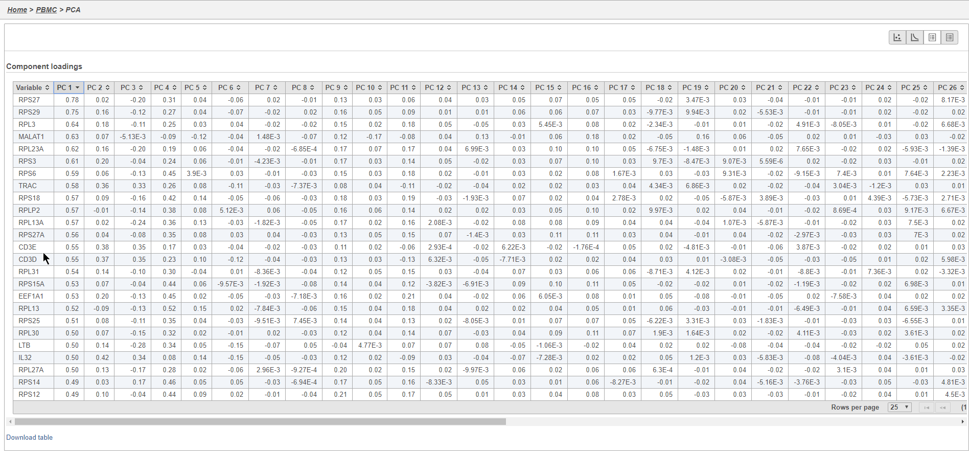
PCA
Principal components (PC) analysis (PCA) is an exploratory technique that is used to describe the structure of high dimensional data by reducing its dimensionality. Because PCA is used to reduce the dimensionality of the data prior to clustering as part of a standard single cell analysis workflow, it is useful to examine the results of PCA for your data set prior to clustering.
...
| Numbered figure captions | ||||
|---|---|---|---|---|
| ||||
|
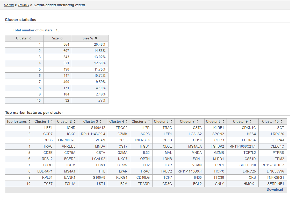
Graph-based clustering
Graph-based clustering identifies groups of similar cells using PC values as the input. By including only the most informative PCs, noise in the data set is excluded, improving the results of clustering.
...
| Numbered figure captions | ||||
|---|---|---|---|---|
| ||||
|
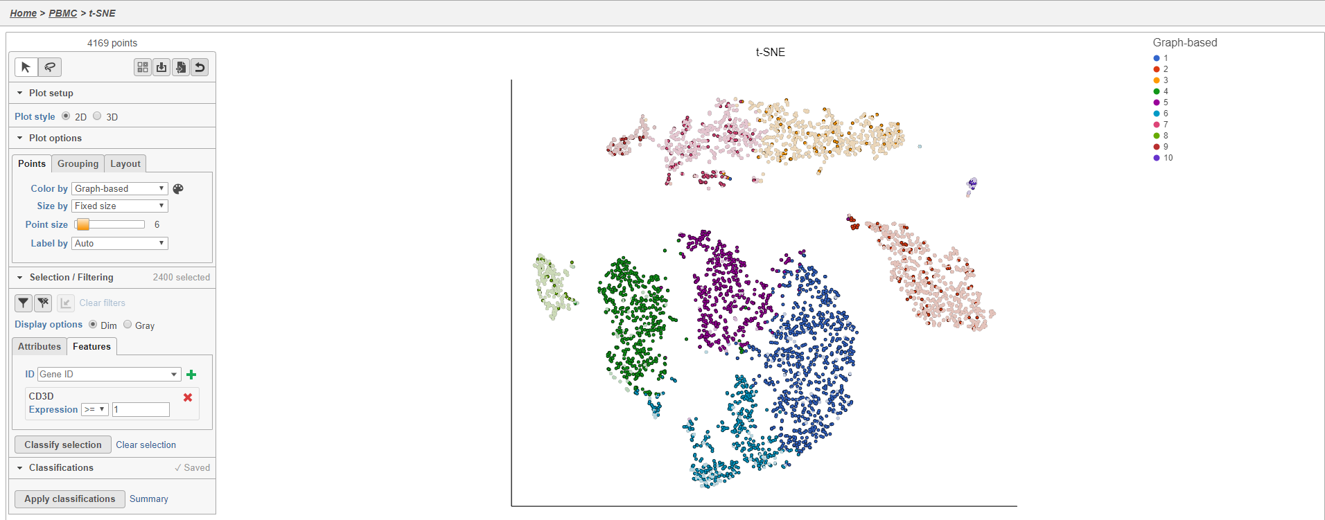
t-SNE
t-Distributed Stochastic Neighbor Embedding (t-SNE) is a dimensional reduction technique that prioritizes local relationships to build a low-dimensional representation of the high-dimensional data that places objects that are similar in high-dimensional space close together in the low-dimensional representation. This makes t-SNE well suited for analyzing high-dimensional data when the goal is to identify groups of similar objects, such as cell types in single cell RNA-Seq data.
...
The t-SNE plot is 3D by default. You can rotate the 3D plot by left-clicking and dragging your mouse. You can zoom in and out using your mouse wheel. You can pan by right-clicking and dragging your mouse. The 2D t-SNE is also calculated and you can switch between the 2D and 3D plots using the Plot style radio buttons in the control panel. In 3D, you can switch from points to 3D spheres and also add a fog effect to improve depth perception on the plot. To produce an optimal plot, you can also adjust size of the points using the Point size slider.
Coloring the t-SNE scatter plot
You can use the Color by options to explore the data.
...
In addition to coloring by gene expression and by gene lists, the points can be colored by any cell or sample attribute. Available attributes are listed as options in the Color by drop-down menu.
Selecting cells on the t-SNE scatter plot
The most basic way to select a point on the scatter plot is to click it with the mouse while in pointer mode. To select multiple cells, you can hold Ctrl on your keyboard and click the cells. To select larger groups of cells, you can switch to Lasso mode by clicking ![]() at the top of the control panel. The lasso lets you freely draw a shape to select a cluster of cells.
at the top of the control panel. The lasso lets you freely draw a shape to select a cluster of cells.
...
| Numbered figure captions | ||||
|---|---|---|---|---|
| ||||
|
Filtering cells on the t-SNE scatter plot
Once a cell has been selected on the plot, it can be filtered. The filter controls can exclude or include (only) any selected cell.
...
The plot will update to show all cells and return to the original scaling.
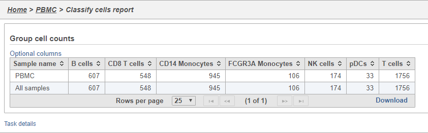
Classifying cells
Classifying cells allows to you assign cells to groups that can be used in downstream analysis and visualizations. Commonly, this is used to describe cell types, such as B cells and T cells, but can be used to describe any group of cells that you want to consider together in your analysis, such as cycling cells or CD14 high expressing cells. Each cell can only belong to one class at a time so you cannot create overlapping classes.
...
| Numbered figure captions | ||||
|---|---|---|---|---|
| ||||
|
Comparing gene expression between cell types
A common goal in single cell analysis is to identify genes that distinguish a cell type. To do this, you can use the differential analysis tools in Partek Flow. I will show how to use the Gene Specific Analysis (GSA) test in Partek Flow, which on its default settings is equivalent to limma-trend, a statistical test has been shown to be highly effective for differential analysis of single cell RNA-Seq data (REFERENCE).
...
For more information about the GSA task, please see the Differential Gene Expression - GSA section of our user manual.
Generating a heat map
Once we have filtered to a list of significantly different genes, we can visualize these genes by generating a heat map.
...
As with any visualization in Partek Flow, the image can be saved as a publication-quality image to your local machine by clicking ![]() or sent to a page in the project notebook by clicking
or sent to a page in the project notebook by clicking ![]() . For more information about Hierarchical clustering, please see the Hierarchical Clustering section of the user manual.
. For more information about Hierarchical clustering, please see the Hierarchical Clustering section of the user manual.
Performing enrichment analysis
While a long list of significantly different genes is important information about a cell type, it can be difficult to identify what the biological consequences of these changes might be just by looking at the genes one at a time. Using enrichment analysis, you can identify gene sets and pathways that are over-represented in a list of significant genes, providing clues to the biological meaning of your results.
...
Clicking a pathway box opens the map of that pathway, providing an easy way to explore related gene networks.
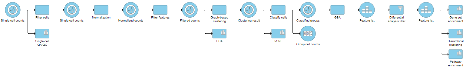
Pipeline
| Numbered figure captions | ||||
|---|---|---|---|---|
| ||||
|
...
Overview
Content Tools