Page History
...
| Numbered figure captions | ||||
|---|---|---|---|---|
| ||||
|
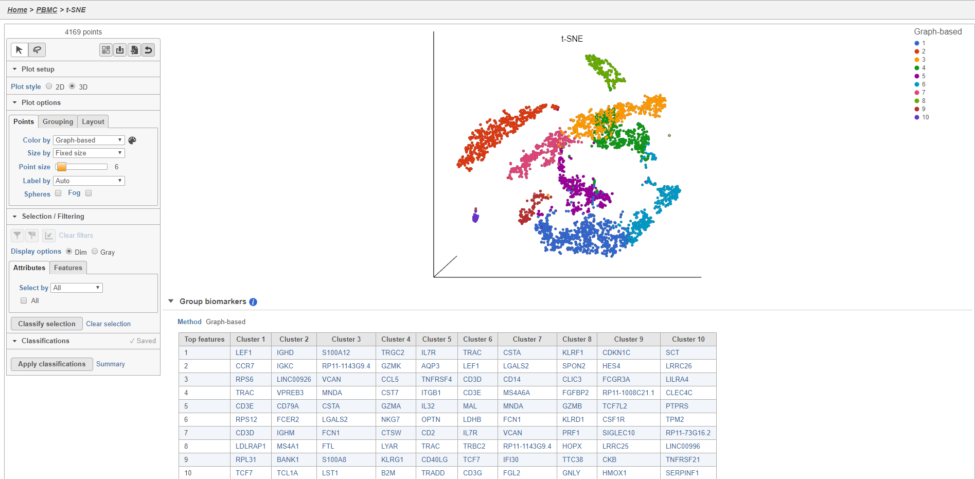
Plot controls are located in the control panel on the left. You can adjust plot options, perform selection and filtering, and manage cell type classifications using the control panel. Below the scatter plot is the biomarker table that we saw in the the Graph-based clustering results. The table is interactive and clicking a gene in the table will color the plot by that gene (hold Ctrl on your keyboard and click to color by multiple genes in the table).
The t-SNE plot is in 3D by default. You can rotate the 3D plot by left-clicking and dragging your mouse. You can zoom in and out using your mouse wheel. You can pan by right-clicking and dragging your mouse. The 2D t-SNE is also calculated and you can switch between the 2D and 3D plots using the Plot style radio buttons in the control panel. In 3D, you can switch from points to 3D spheres and also add a fog effect to improve depth perception on the plot. To produce an optimal plot, you can also adjust size of the points using the slider.
Coloring the t-SNE scatter plot
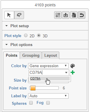
You can use the Color by options to explore the data.
- Choose Gene expression from the Color by drop-down menu
- Type CD79A in the text field and select it (Figure 12)
| Numbered figure captions | ||||
|---|---|---|---|---|
| ||||
 |
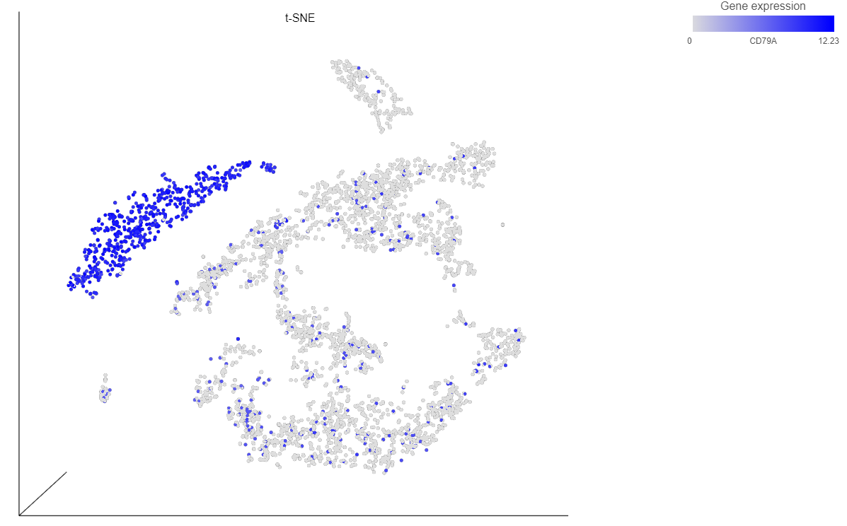
The cells on the plot will be colored based on their expression level of CD79A (Figure 13).
| Numbered figure captions | ||||
|---|---|---|---|---|
| ||||
|
 . Clicking the
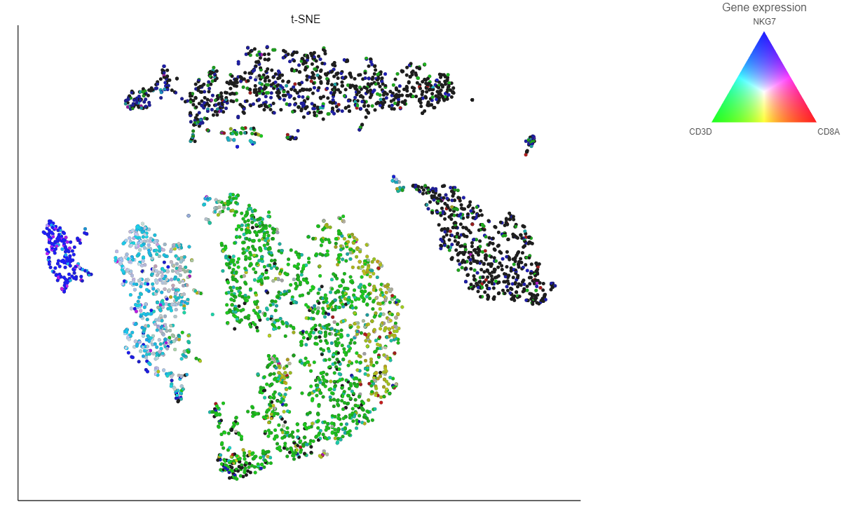
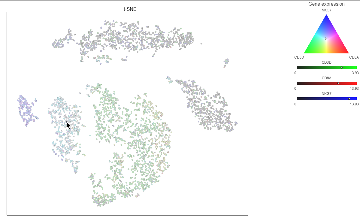
  icon lets you color by an additional gene (up to three genes at a time). If you color by more than one gene, the color palette switches to a Green-Red-Blue color scheme with the balance between the three color channels determined by the values of the three genes. For example, a cell that expresses all three genes would be white, a cell that expresses the first two genes would be yellow, and a cell that expresses none of the genes would be black (Figure 14).
| Numbered figure captions | ||||
|---|---|---|---|---|
| ||||
|
Clicking a cell on the plot shows the expression values of the cell in the legend (Figure 15).
| Numbered figure captions | ||||
|---|---|---|---|---|
| ||||
 |
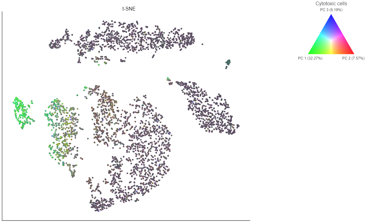
If you want to color by more than three genes at time, for example, by a list of genes that distinguish a particular cell type, like B cells, you can use the color by list option.
- Select List from the Color by drop-down menu
- Choose Cytotoxic cells from the lists drop-down menu
Coloring by a list calculates the first three principal components for the gene list and color the cells on the plot by their values along those three PCs (Figure 16).
| Numbered figure captions | ||||
|---|---|---|---|---|
| ||||
|
In addition to coloring by gene expression and by gene lists, the points can be colored by any cell or sample attribute. Each of the attributes is listed as an option in the Color by drop-down menu.
Selecting cells on the t-SNE scatter plot
| Additional assistance |
|---|
|
| Rate Macro | ||
|---|---|---|
|
Overview
Content Tools