Page History
...
Pearson: linear correlation: 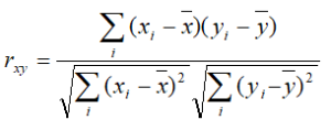
Spearman: rank correlation: 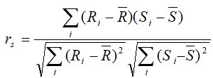
Kendal: rank correlation: 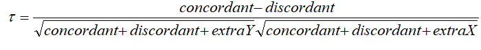
...
| Numbered figure captions | ||||
|---|---|---|---|---|
| ||||
|
An example of the resulting scatterplot is in Figure 3. Each dot is a feature (gene/transcript) while the expression values in the two samples can be read off the coordinate axes, in the same units as present in the data node. For instance, if you normalized your RNA-seq data by transcripts per million (TPM), the coordinate axis will give you expression in TPMs. Pearson’s correlation coefficient and the slope of the regression line are in the upper left corner of the plot.
| Numbered figure captions | ||||
|---|---|---|---|---|
| ||||
|

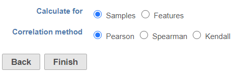
To visualize a different pair of samples, select another sample from the X axis or Y axis list on the left and push ApplyClick Finish to run the task. The output report of this task can be displayed in heatmap and/or table in the data viewer.
| Additional assistance |
|---|
| Rate Macro | ||
|---|---|---|
|
...
Overview
Content Tools