Page History
| Multimedia | ||
|---|---|---|
|
For your convenience, here is a video showing the below steps.
| Table of Contents | ||||||
|---|---|---|---|---|---|---|
|
...
If you are new to Partek Flow, please see Getting Started with Your Partek Flow Hosted Trial for information about data transfer and import and Creating and Analyzing a Project for information about the Partek Flow user interface.
This tutorial uses a 10X 5k PBMC dataset if you would like to follow along exactly.
Transfer files and create a new project
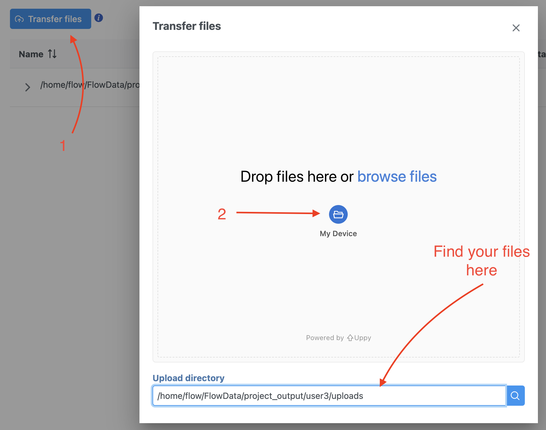
We recommend uploading your FASTQ files (fastq.gz) to a folder on the Partek® Flow® your Partek Flow server before importing them into a project. Data files can be transferred into Flow from the Home page by clicking the Transfer file button (Figure 1). Following the instruction In Figure 1 to complete the data transfer. Users have the option to change the Upload directory by clicking the Browse button and either select another existing directory or create a new directory.
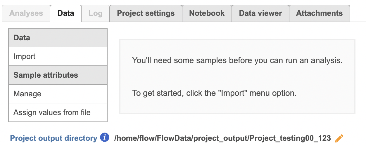
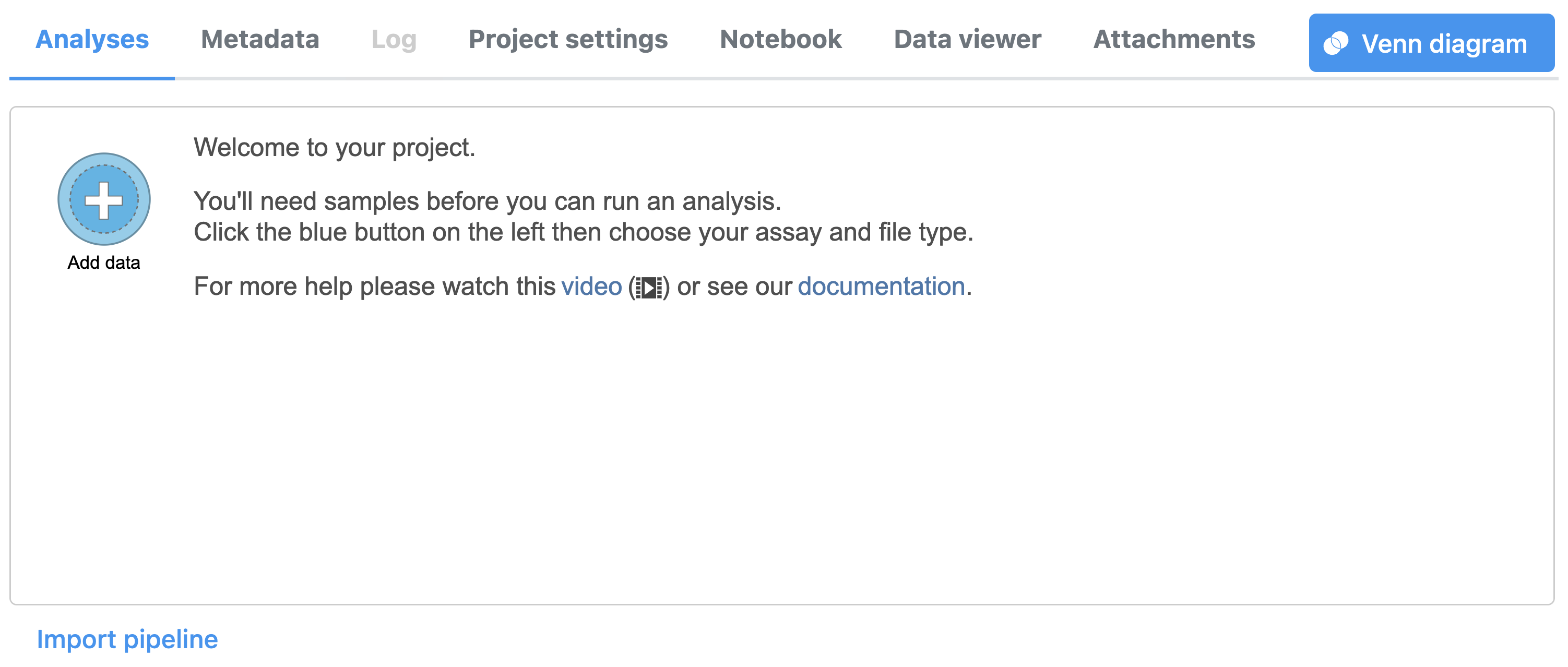
To create a new project, from the Home page click the New Project button; enter a project name and then click Create project (Figure 1). Once a new project has been created, the user is automatically directed to the Data tab of the Project Viewclick the Add data button in the Analyses tab.
| Numbered figure captions | ||||
|---|---|---|---|---|
| ||||
|
Import the FASTQ files
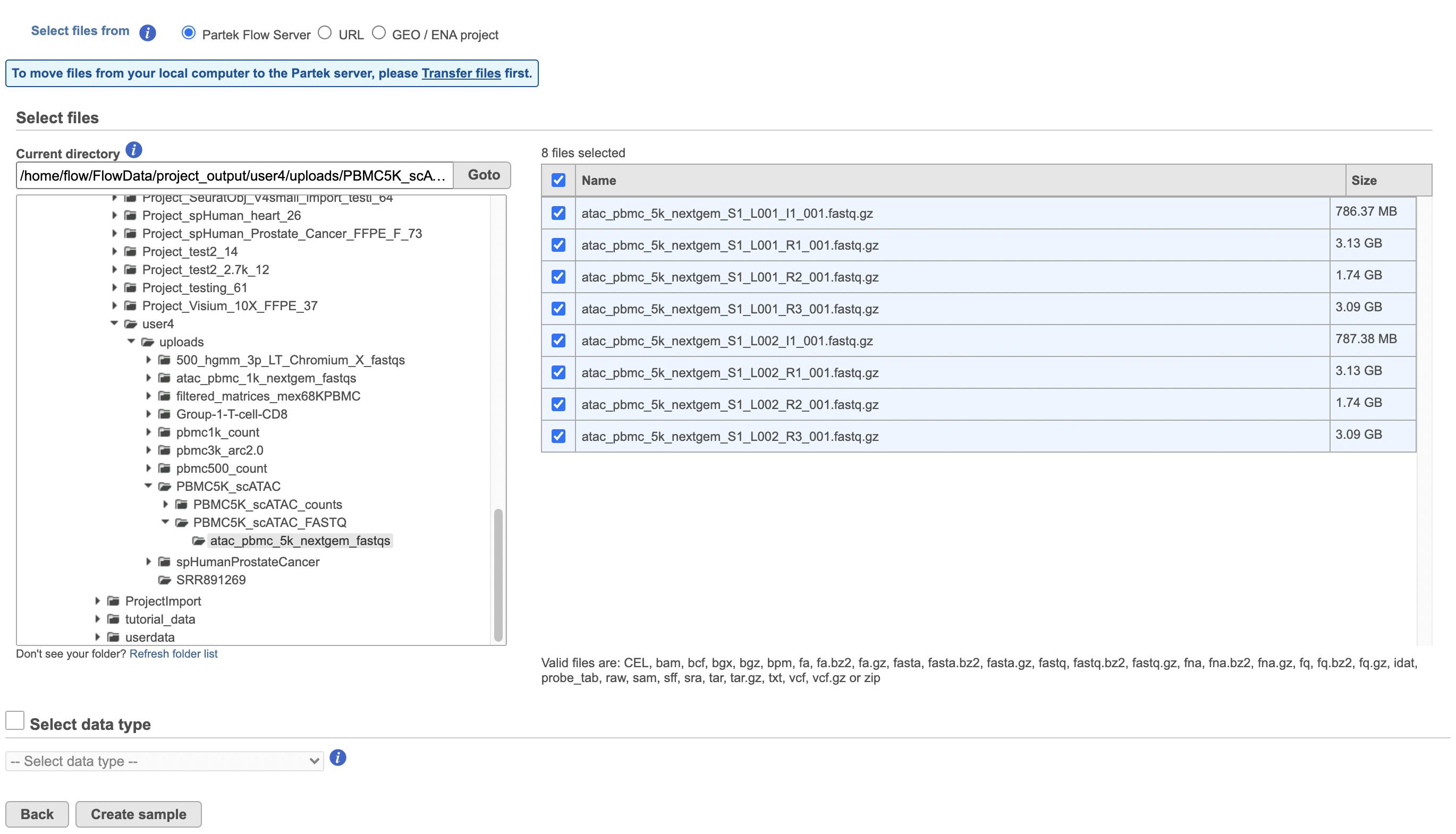
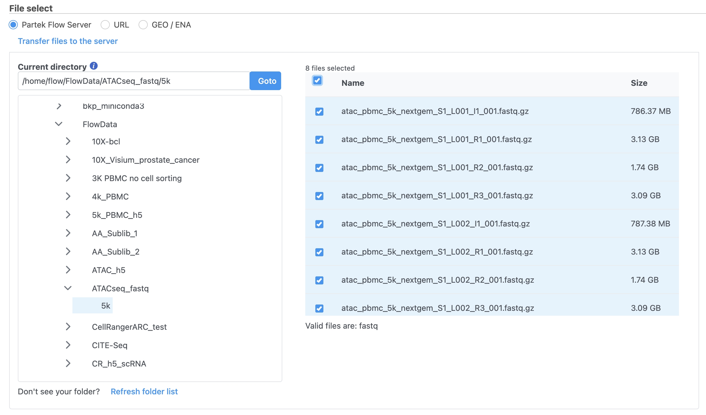
To proceed, click the Import Add data button in the Data Analyses tab (Figure 2). Click the Automatically create samples from files buttonIn the Single cell > scATAC-Seq section select fastq and click Next. The file browser interface will open (Figure 3). Select the FASTQ files using the file browser interface and push the Create sample button Finish button to complete the task. Paired end reads will be automatically detected and multiple lanes for the same sample will be automatically combined into a single sample. We encourage users to include all the FASTQ files including the index files although they are optional.
When the FASTQ files have finished importing, the Unaligned reads data node will turn from transparent to opaqueappear in the Analyses tab.
| Numbered figure captions | ||||
|---|---|---|---|---|
| ||||
|
| Numbered figure captions | ||||
|---|---|---|---|---|
| ||||
|
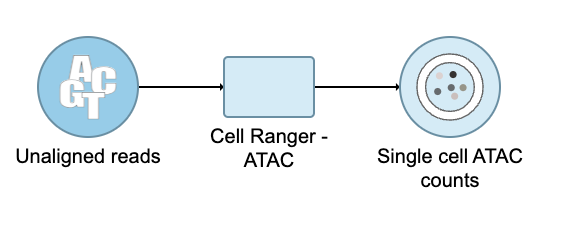
Convert FASTQ to count
...
- Click the Unaligned reads data node
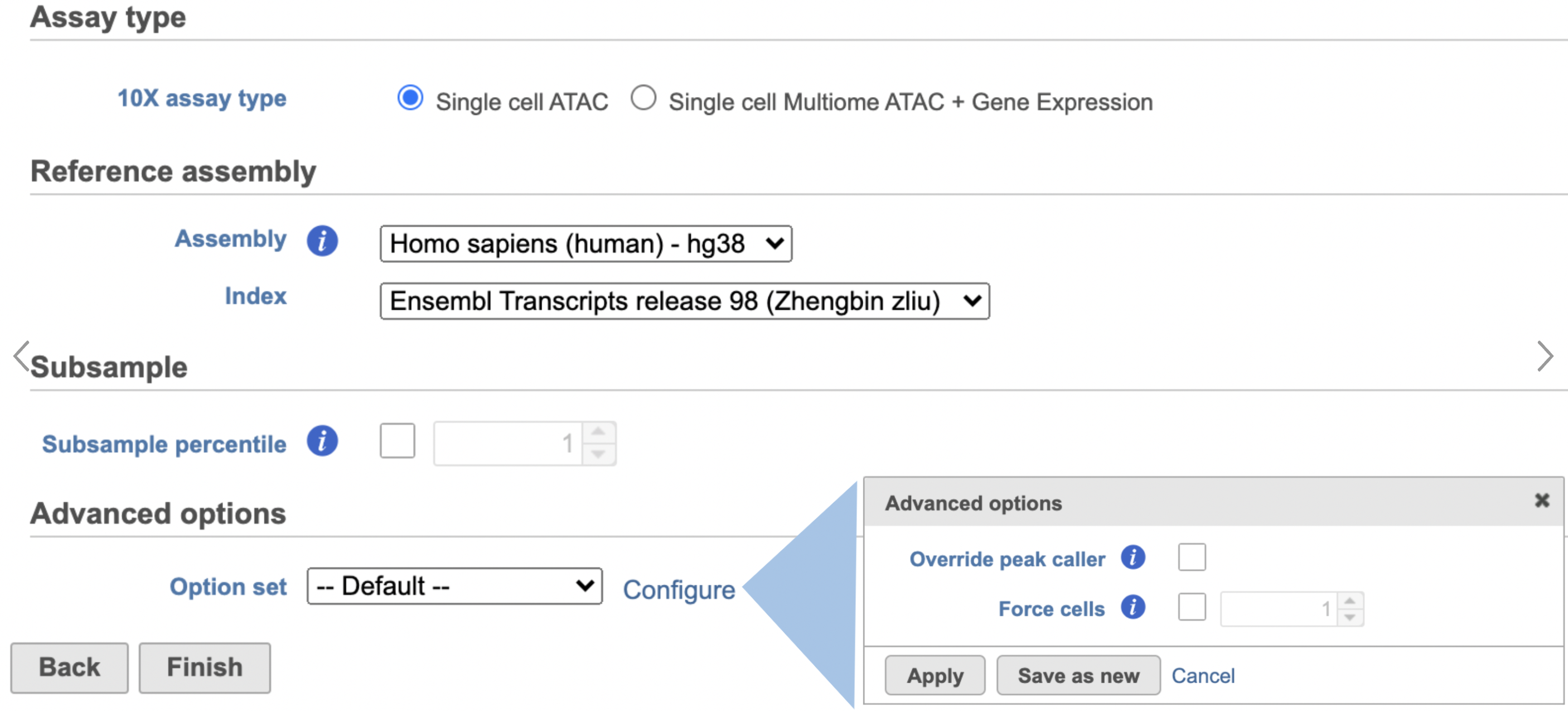
- Select Cell Ranger - ATAC in the 10x Genomics section in the task menu on the right
- Select Single cell ATAC in Assay type for ATAC-Seq data only
- Choose the proper Reference assembly for the data (you may have to create the reference)
- Press the Finish button to run the task with default settings (Figure 4)
| Numbered figure captions | ||||
|---|---|---|---|---|
| ||||
|
To learn more about how to run Cell Ranger - ATAC task in Flow, please refer to our online documentation.
...
| Numbered figure captions | ||||
|---|---|---|---|---|
| ||||
|
QA/QC
An important step in analyzing single cell ATAC data is to filter out low quality cells. A few examples of low-quality cells are doublets, cells with a low TSS enrichment score, cells with a high proportion of reads mapping to the genomic blacklist regions, or cells with too few reads to be analyzed. Users are able to do this in Partek Flow using the Single cell QA/QC task.
...
| Numbered figure captions | ||||
|---|---|---|---|---|
| ||||
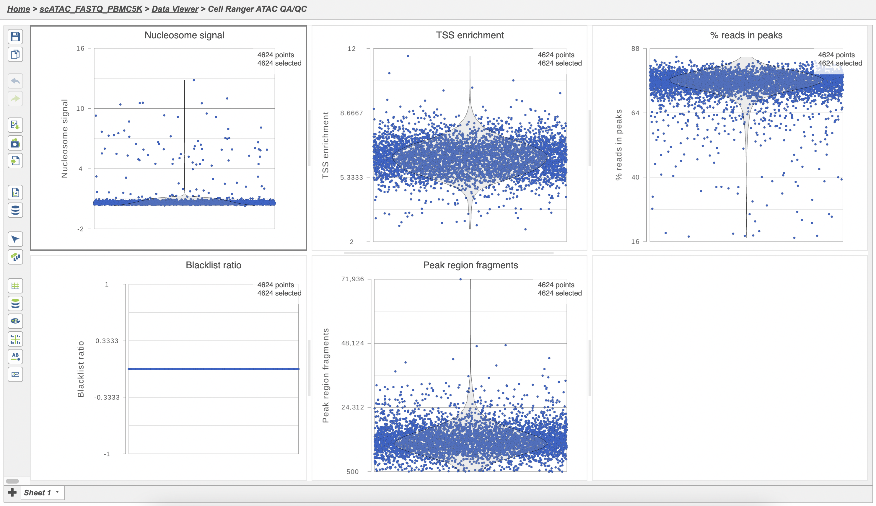 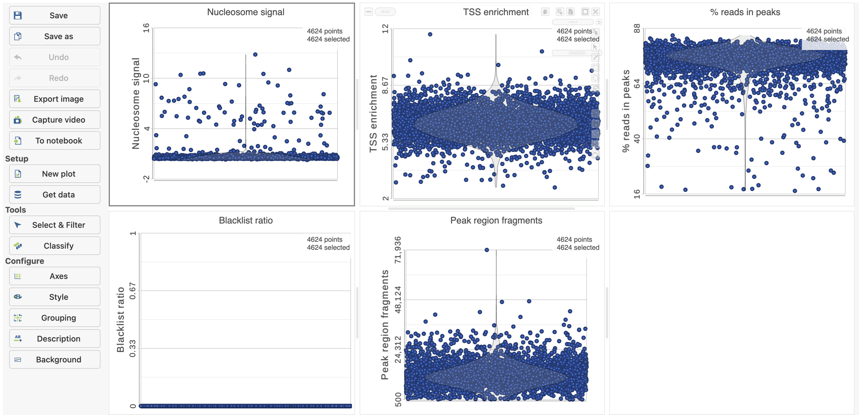 |
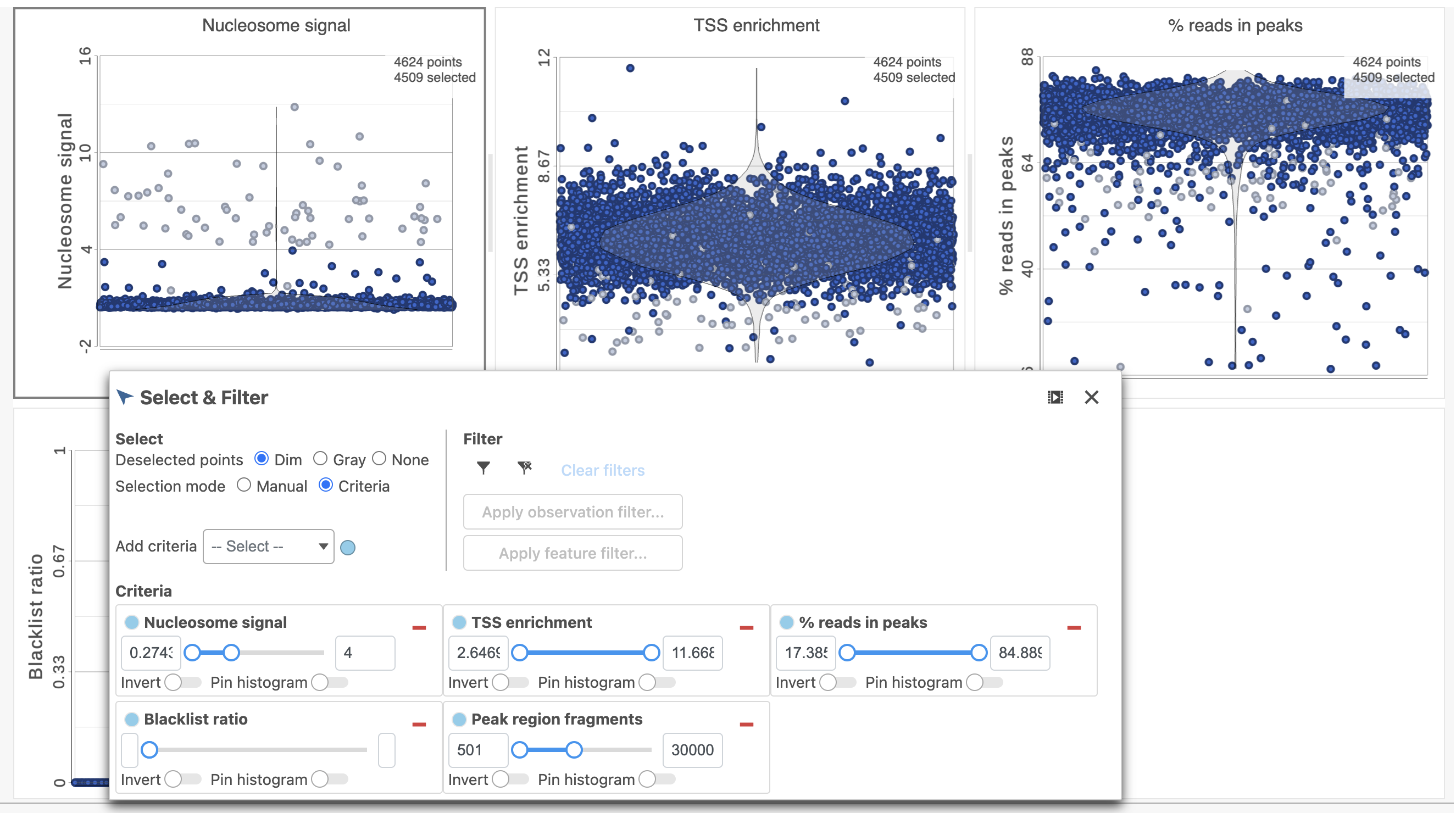
The Single cell QA/QC report includes interactive violin plots showing the value of every cell in the project on several quality measures (Figure 6).
...
Nucleosome signal: calculated per single cell, and quantify which quantifies the approximate ratio of mononucleosomal to nucleosome-free fragments. Nucleosome banding pattern: The histogram of DNA fragment sizes (determined from the paired-end sequencing reads) should exhibit a strong nucleosome banding pattern corresponding which corresponds to the length of DNA wrapped around a single nucleosome.
...
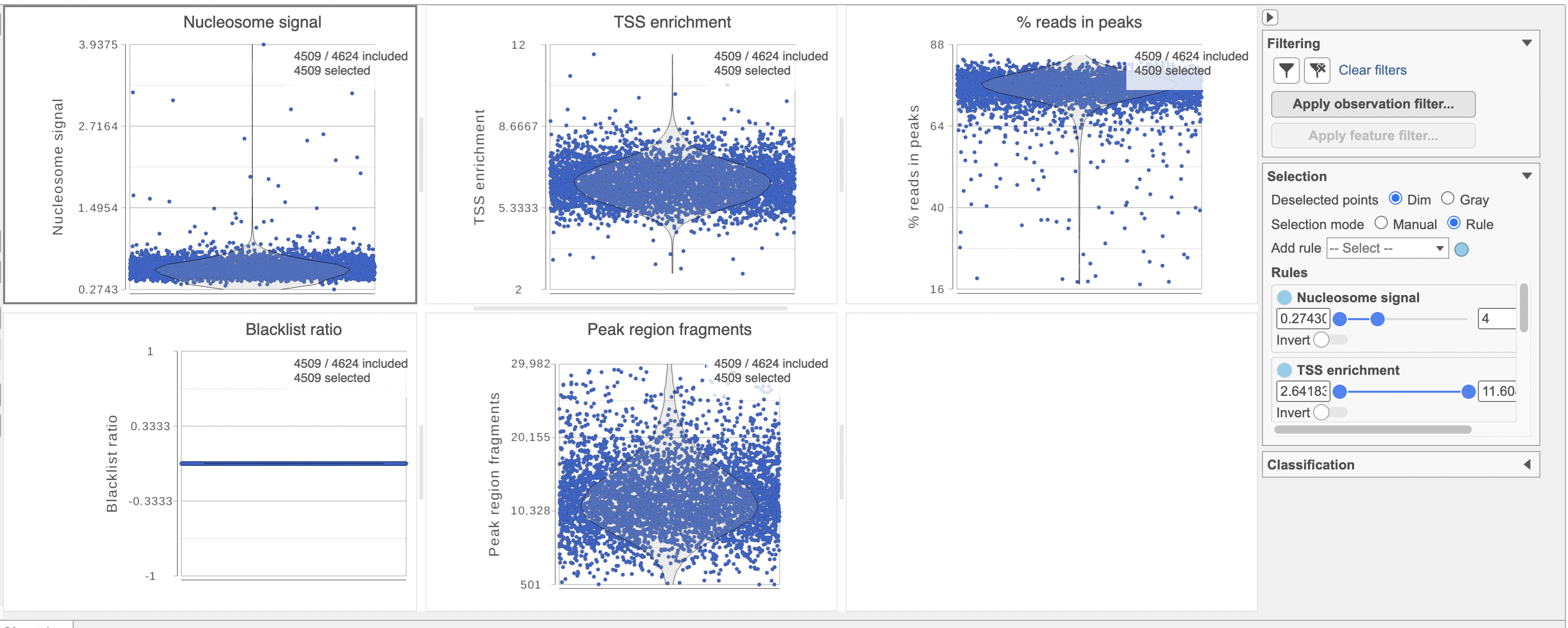
To filter out low quality cells (Figure 7),
- Open the Select & Filter menu
- Set the filters on nucleosome signal < 4; Peak region fragment 500-30000; and % reads in peaks > 15% ; Blacklist ratio < 0.05leave the rest as they are
- Click the filter icon
 and Apply observation filter to run the Filter cells task on the first Single cell ATAC counts data node, it generates a Filtered cells node
 - Click PCA from the drop-down list
| Numbered figure captions | ||||
|---|---|---|---|---|
| ||||
|
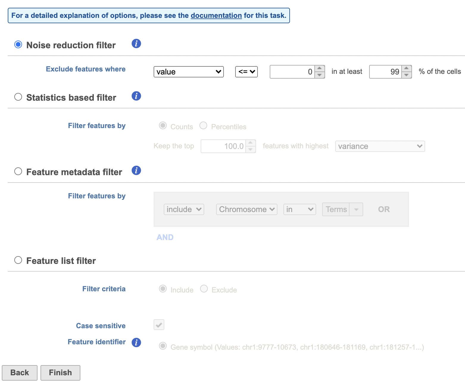
Filter features
...
| Numbered figure captions | ||||
|---|---|---|---|---|
| ||||
|
Annotate regions
...
The input for Annotate peaks is a Peaks type data node.
- Click a Peaks the Filtered features data node
- Click the Peak analysis section in the toolbox
- Click Annotate regions
- Set the Genomic overlaps parameter
...
| Numbered figure captions | ||||
|---|---|---|---|---|
| ||||
|
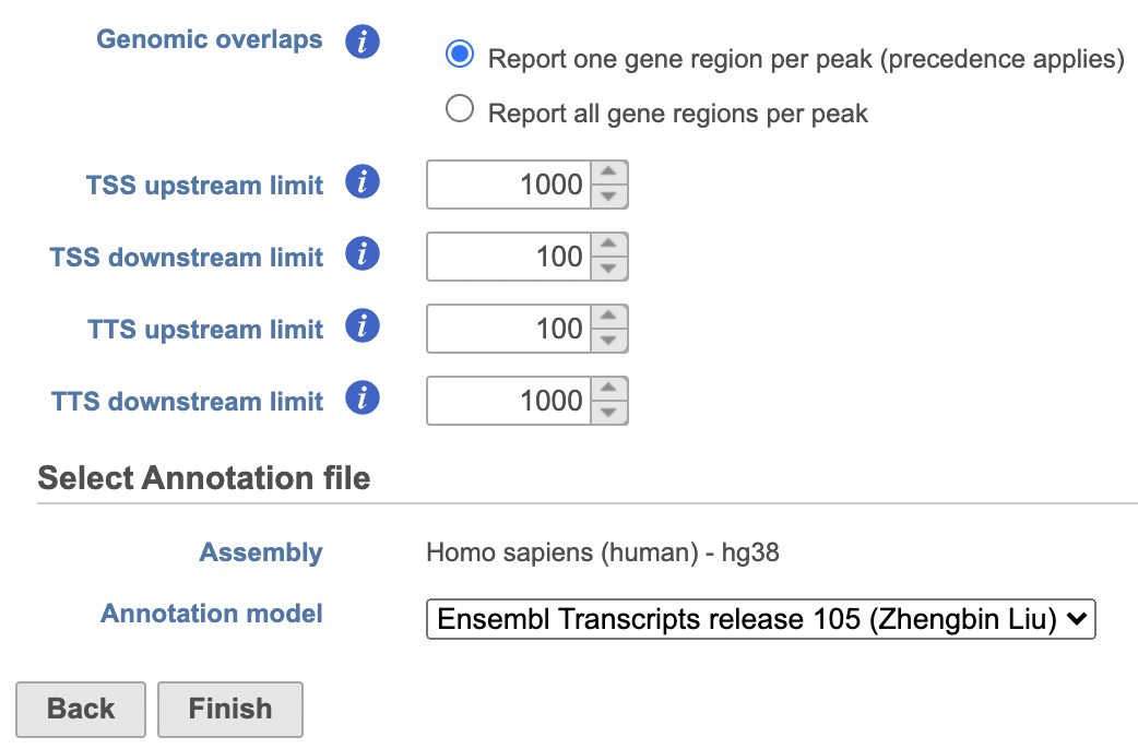
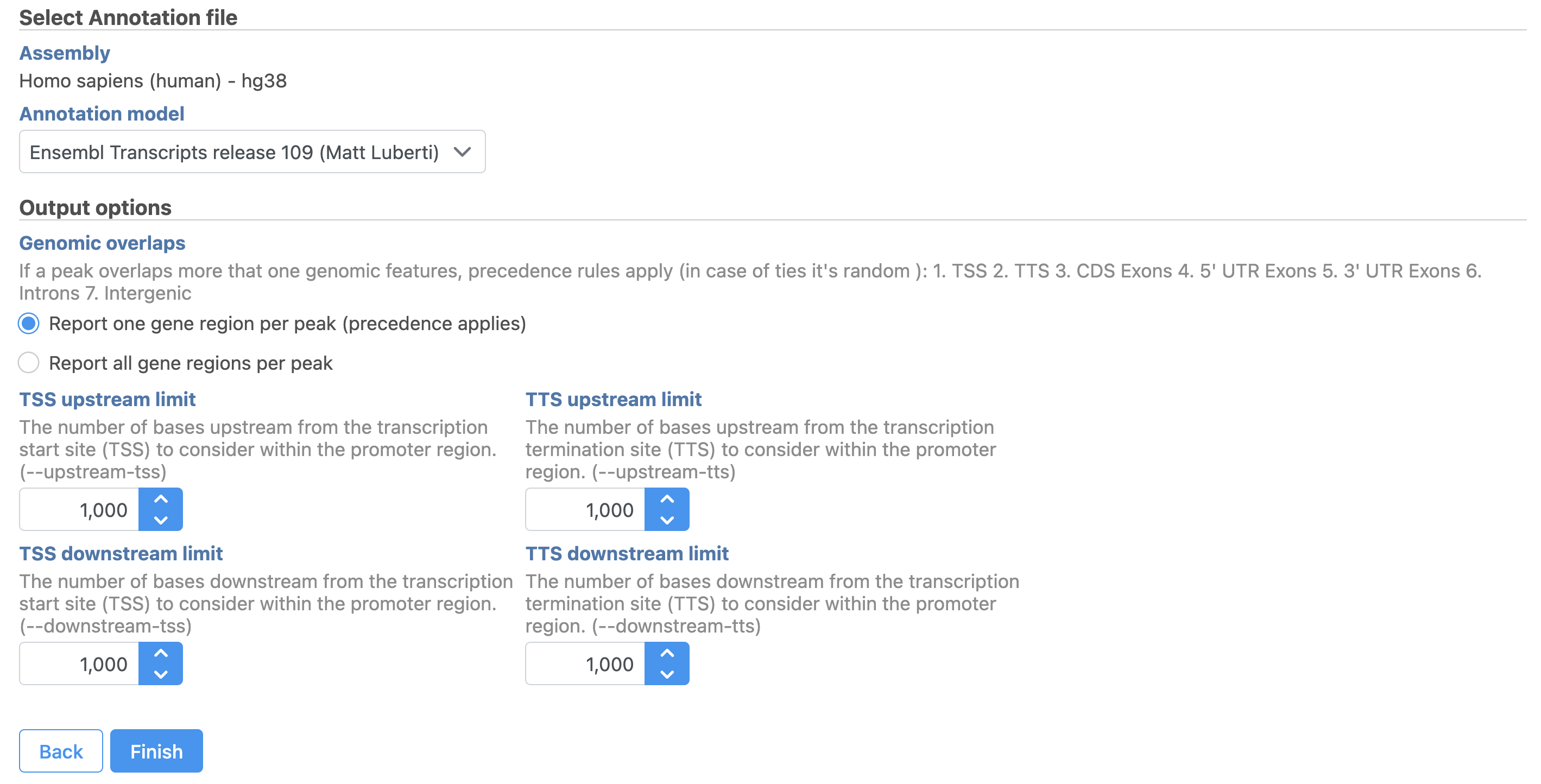
Users are able to define the transcription start site (TSS) and transcription termination site (TTS) limit in the unit of bp.
...
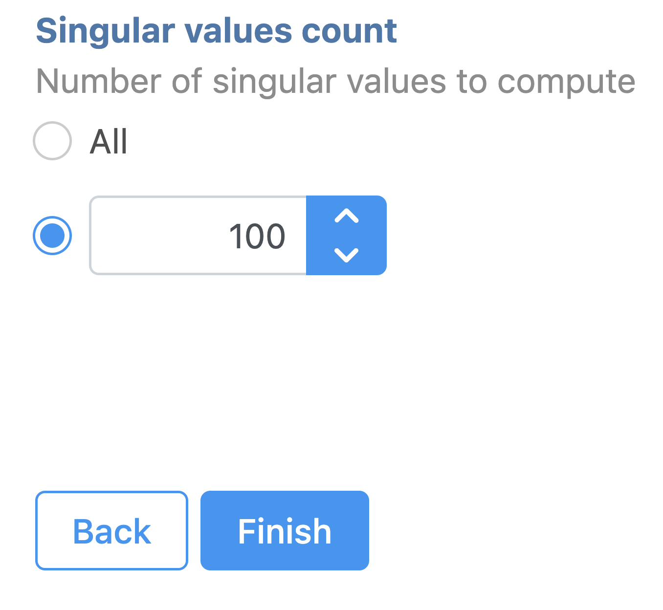
Latent semantic indexing (LSI) was first introduced for the analysis of scATAC-seq data by Cusanovich et al. 2018[2]. LSI combines steps of frequency-inverse document frequency (TF-IDF) normalization followed by singular value decomposition (SVD). Partek® Flow® wrapped Signac's TF-IDF normalization for single cell ATAC-seq dataset. It is a two-step normalization procedure that both normalizes across cells to correct for differences in cellular sequencing depth, and across peaks to give higher values to more rare peaks[3].
...
| Numbered figure captions | ||||
|---|---|---|---|---|
| ||||
|
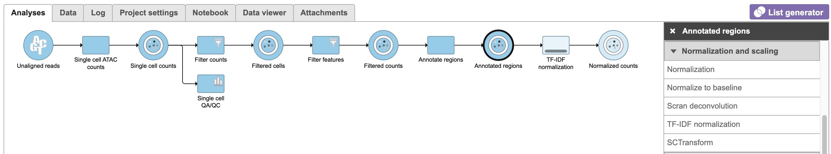
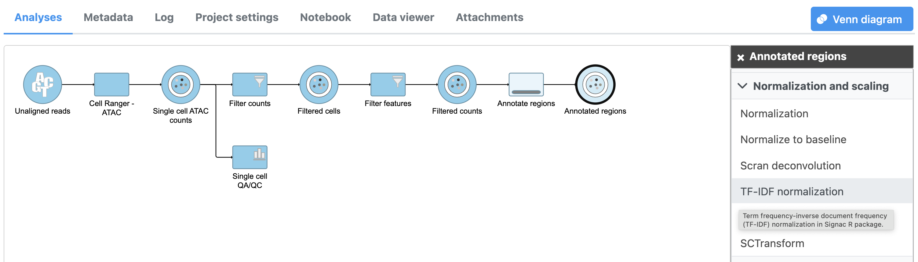
To run TF-IDF normalization,
- Click a single Single cell counts data node, in this case the Annotated regions node
- Click the Normalization and scaling section in the toolbox
- Click TF-IDF normalization
...
| Numbered figure captions | ||||
|---|---|---|---|---|
| ||||
|
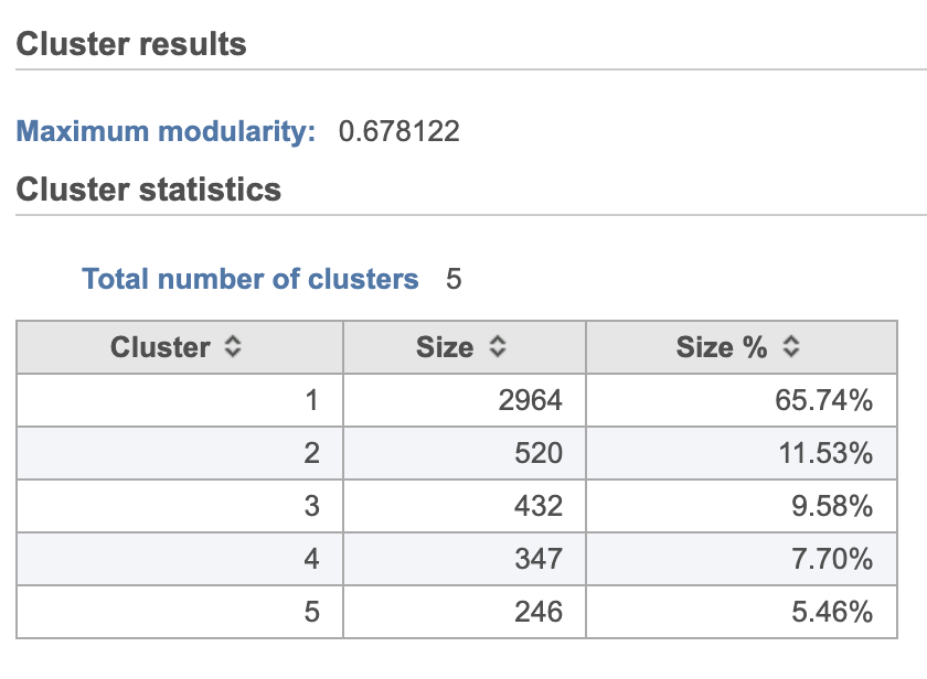
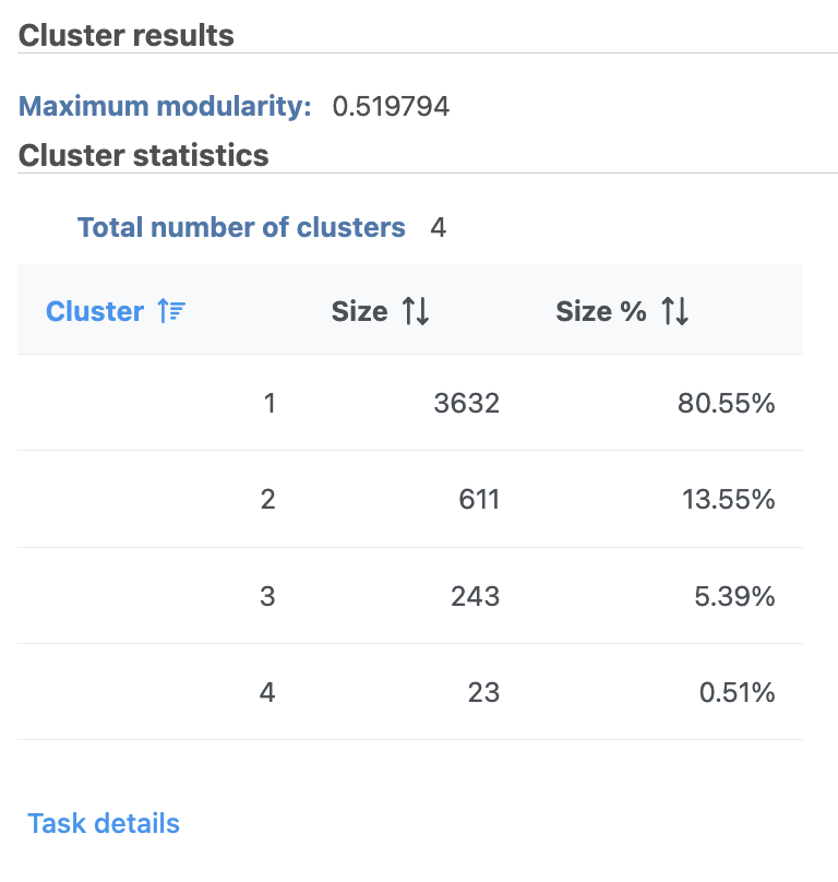
Graph-based clustering
...
| Numbered figure captions | ||||
|---|---|---|---|---|
| ||||
|
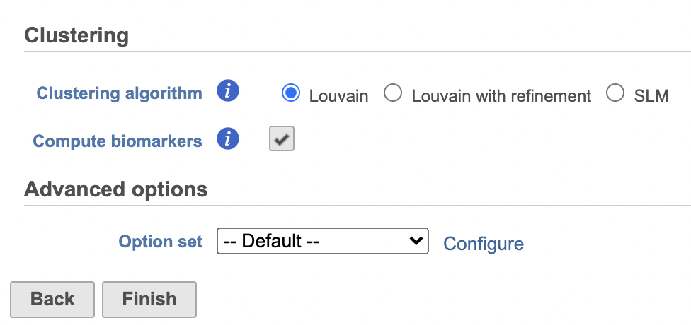
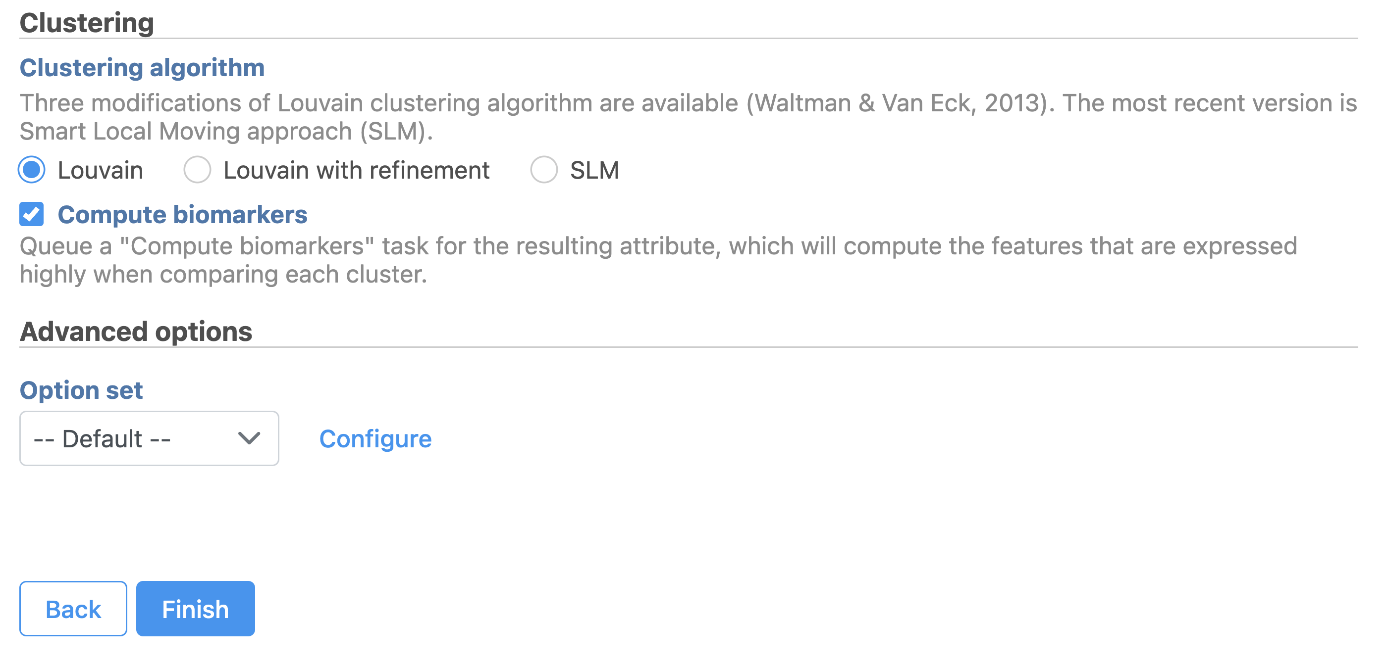
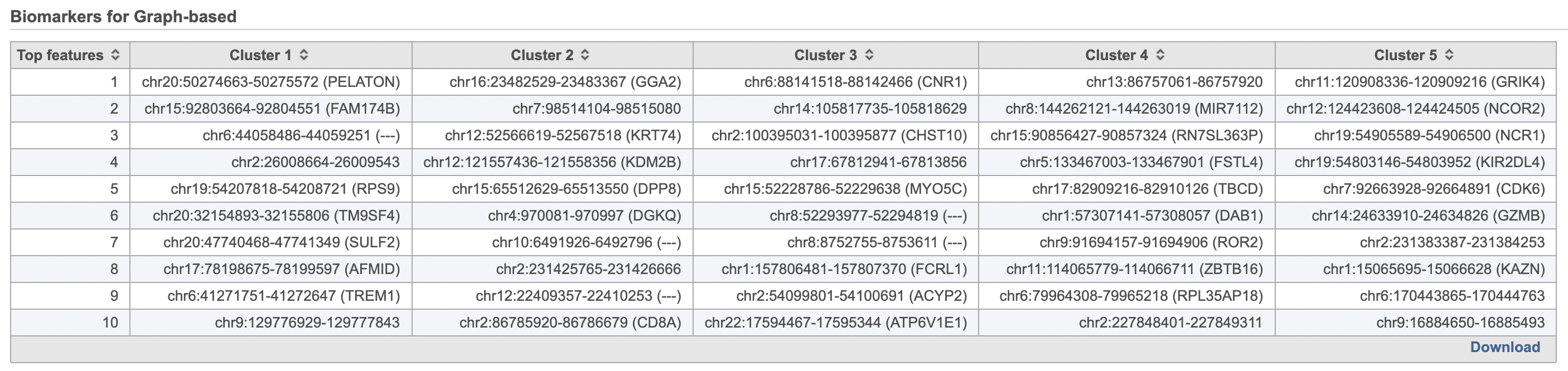
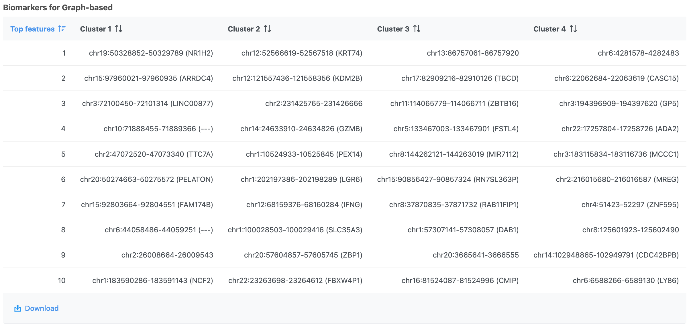
A new Graph-based clusters data and a Biomarkers data node will be generated.
...
| Numbered figure captions | ||||
|---|---|---|---|---|
| ||||
|
| Numbered figure captions | ||||
|---|---|---|---|---|
| ||||
|
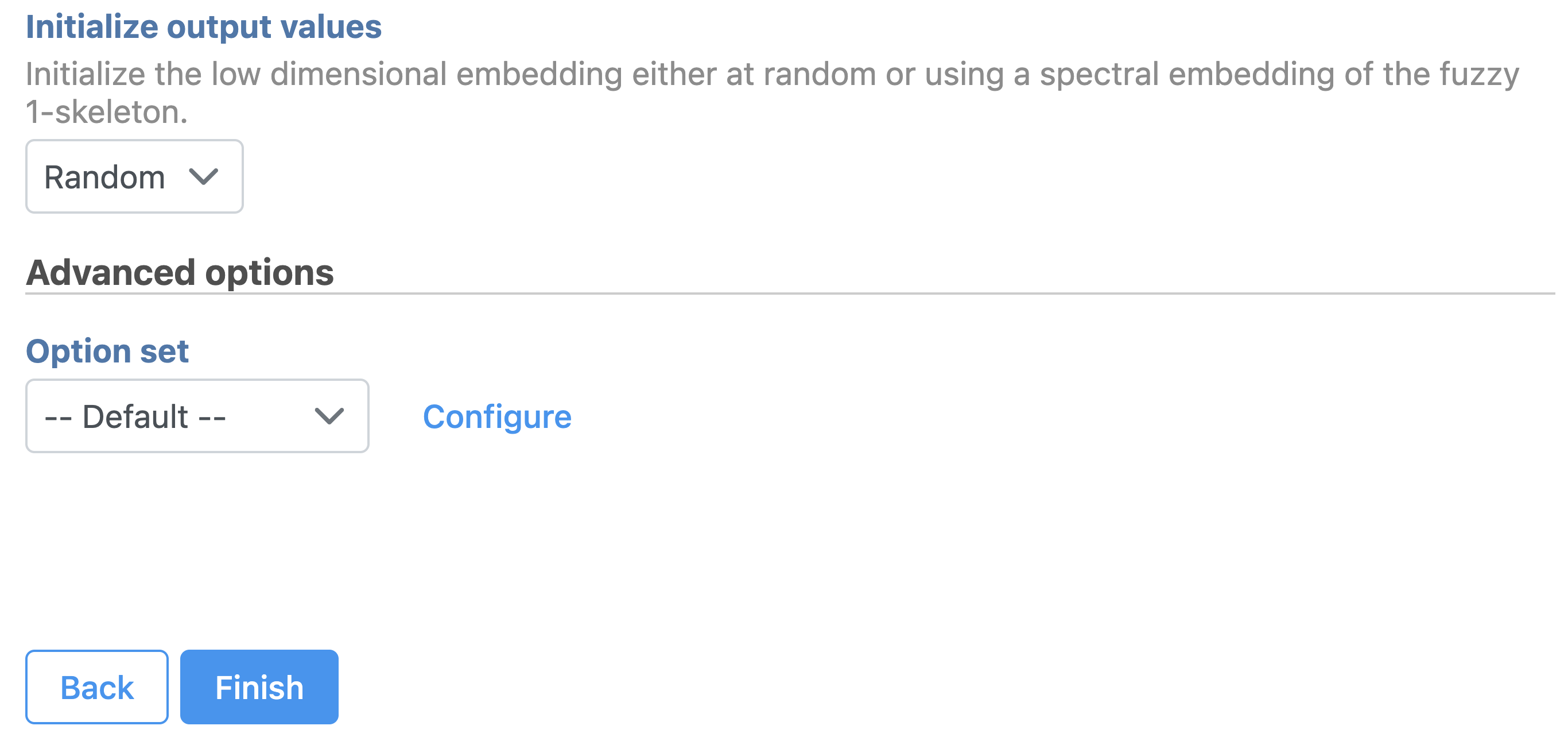
UMAP
Similar to t-SNE, Uniform Manifold Approximation and Projection (UMAP) is a dimensional reduction technique. UMAP aims to preserve the essential high-dimensional structure and present it in a low-dimensional representation. UMAP is particularly useful for visually identifying groups of similar samples or cells in large high-dimensional data sets.
...
| Numbered figure captions | ||||
|---|---|---|---|---|
| ||||
|
Promoter sum matrix
...
| Numbered figure captions | ||||
|---|---|---|---|---|
| ||||
|
The cells on the plot will be colored based on their expression level of CD79A (Figure 16). In the example in Figure 16, the Style icon has been dragged to a different location on the screen and the legend has also been resized and moved. Resizing the legend can either be done on the legend itself or using the Description icon under Configure.
| Numbered figure captions | ||||
|---|---|---|---|---|
| ||||
|

Coloring by one gene uses the two-color numeric palette, which can be customized by clicking  . To color by more than one gene use the Numeric triad option in the drop-down. If you color by more than one gene, the color palette switches to a Green-Red-Blue color scheme with the balance between the three color channels determined by the values of the three genes. For example, a cell that expresses all three genes would be white, a cell that expresses the first two genes would be yellow, and a cell that expresses none of the genes would be black (Figure 17).
| Numbered figure captions | ||||
|---|---|---|---|---|
| ||||
|

Clicking a cell on the plot shows the expression values of the cell in the legend. Hovering over a cell on the plot also shows this information and related details (Figure 18).
| Numbered figure captions | ||||
|---|---|---|---|---|
| ||||
 |
If you want to color by more than three genes at time, such as by a list of genes that distinguish a particular cell type, you can use the color by Feature list option.
- Select Feature List from the Color by drop-down
- Choose Cytotoxic cells from the List drop-down (use List management in Settings to add lists to Partek Flow which will automatically make them available here)
- Choose PCA from the Metric drop-down
Coloring by a list, in this way, calculates the first three principal components for the gene list and colors the cells on the plot by their values along those three PCs with green for PC1, red for PC2, and blue for PC3 (Figure 19).
| Numbered figure captions | ||||
|---|---|---|---|---|
| ||||
|

Typically, the expression of a set of marker genes will be highly correlated, allowing the first PC to account for a large percentage of the variance between cells for that gene list. As a result, the group of cells characterized by their expression of the genes on the list will separate from the rest of the cells along PC1 and will be colored green (Figure 16). If the gene list is more complex, for example, including marker genes for multiple cell types, there may be several sets of correlated genes accounting for significant amounts of variance, leading to groups of cells being distinguishable along PC2 and PC3 as well. In that case, there may be green, blue, and red groups of cells on the plot. If the gene list does not distinguish any group of cells, all cells will have similar PC values, leading to similarly colored cells on the plot.
In addition to coloring by gene expression and by gene lists, the points can be colored by any cell or sample attribute. Available attributes are listed as options in the Color by drop-down menu. Note that any available options are dependent upon the selected data node.
Selecting cells on the t-SNE scatter plot
The most basic way to select a point on the scatter plot is to click it with the mouse while in pointer mode. To select multiple cells, you can hold Ctrl on your keyboard and click the cells. To select larger groups of cells, you can switch to Lasso mode by clicking ![]() in the plot controls. The lasso lets you freely draw a shape to select a cluster of cells.
in the plot controls. The lasso lets you freely draw a shape to select a cluster of cells.
- Click
 to activate Lasso mode
 - Left-click and hold to draw a lasso around a cluster of cells
- Release and click the starting circle to close the lasso and select the enclosed cells (Figure 20)
You can also create a lasso with straight lines using Lasso mode by clicking, releasing, and clicking again to draw a shape.
| Numbered figure captions | ||||
|---|---|---|---|---|
| ||||
|

By default, selected cells are shown in bold while unselected cells are dimmed (Figure 21). This can be changed to gray selected cells using the Select & Filter tool in the left panel as shown in Figure 21.
- Double-click any blank section of the scatter plot to clear the selection
| Numbered figure captions | ||||
|---|---|---|---|---|
| ||||
|

Alternatively, you can select cells using any criteria available for the data node that is selected in the Select & Filter tool. To change the data selection click the circle (node) and select the data.
- Choose Graph-based from the Criteria drop-down menu in the Select & Filter tool after ensuring you on are on the Graph-based cluster node by hovering on the circle (Figure 22). If you are not on the correct node, you need to click the circle and select the data.
| Numbered figure captions | ||||
|---|---|---|---|---|
| ||||
|

This adds check boxes for each level of the attribute (i.e., clusters). Click a check box to select the cells with that attribute level.
- Click only 2 and 3
This selects cells from Graph-based clusters 2 and 3 (Figure 23). The number of selected cells is listed in the Legend on the plot.
| Numbered figure captions | ||||
|---|---|---|---|---|
| ||||
|

Cells can also be selected based on their gene expression values in the Select & Filter section.
- Click the circle and select the Normalized counts node which has gene expression data
- Type cd3d in the text field of the drop-down
- Click on CD3D to add it as criteria to select from and use the slider or text field to adjust the selected values. Pin the histogram to visualize the distribution during selection.
Very specific selections can be configured by adding criteria in this way. In the example below, Clusters 2 and 3 and high CD3D expression is selected (Figure 24).
| Numbered figure captions | ||||
|---|---|---|---|---|
| ||||
|

Filtering cells on the t-SNE scatter plot
Once a cell has been selected on the plot, it can be filtered. The filter controls can exclude or include (only) any selected cell. Filtering can be particularly useful when you want to use a gene expression threshold to classify a group of cells, but the gene in question is not exclusively expressed by your cell type of interest.
In this example we can filter to include just cells from the selection we have already made.
- Click
 (filter include) to filter to just the selected cells (Figure 25).
The plot will update to show only the included cells as seen in Figure 25.
Cells that are not shown on the plot cannot be selected, allowing you to focus on the visible cells. The number of cells shown on the plot out of the total number of original cells is shown in the Legend. You can adjust the view to focus on only the included cells.
- Click
 on the plot controls or toggle on Fit visible in the Axes configuration to rescale the axes to the filtered points
To revert to the original scaling, click the ![]() button again or turn off Fit visible with the toggle.
button again or turn off Fit visible with the toggle.
| Numbered figure captions | ||||
|---|---|---|---|---|
| ||||
|

- Alternatively, to exclude selected cells, click
 (filter exclude) (Figure 26)
Additional inclusion or exclusion filters can be added to focus on a smaller subset of cells.
- Click Clear filters to remove applied filters
The plot will update to show all cells and return to the original scaling.
| Numbered figure captions | ||||
|---|---|---|---|---|
| ||||
|

Classifying cells
Classifying cells allows to you assign cells to groups that can be used in downstream analysis and visualizations. Commonly, this is used to describe cell types, such as B cells and T cells, but can be used to describe any group of cells that you want to consider together in your analysis, such as cycling cells or CD14 high expressing cells. Each cell can only belong to one class at a time so you cannot create overlapping classes.
Classifying cells
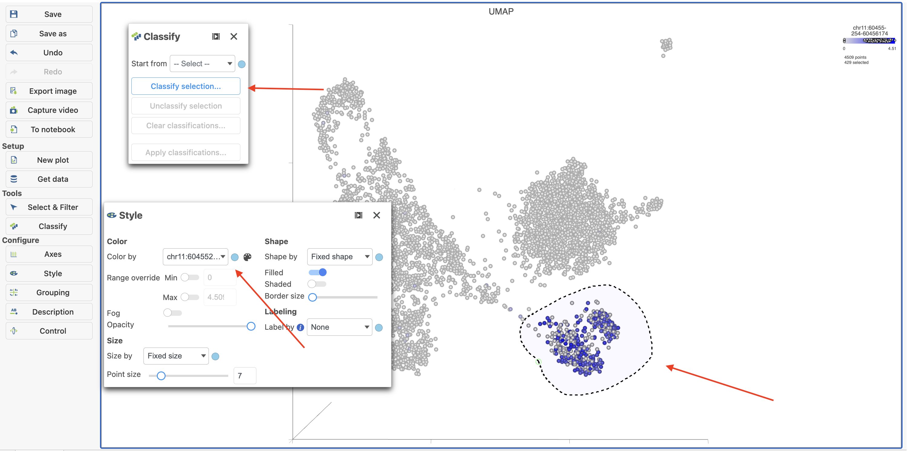
Double-clicking the UMAP task node will open the task report in the Data Viewer.
To classify a cell, just select it then click click Classify selection selection in the Classify the Classify tool.
For example, we can classify a cluster of cells expressing high levels of CD79A MS4A1 as B cells.
- Set Make sure the right data source has been selected. For scATAC-seq data, it shall be the normalized counts of promoter sum values in most cases (Figure 17)
- Set Color by in the Style the Style configuration to the normalized counts node
- Type CD79A in the search Type MS4A1 in the search box and select it. Rotate the 3D plot if you need to see this cluster more clearly.
- Click
 to
to  to activate Lasso mode
 - Draw a lasso around the cluster of CD79AMS4A1-expressing cells (Figure 27)
| Numbered figure captions | ||||
|---|---|---|---|---|
| ||||
|

Because most of these cells express CD79A, a B cell marker, and because they cluster together on the t-SNE, suggesting they have similar overall gene expression, we believe that all these cells are B cells.
- Click Classify cells
- Click Classify selection under Tools in the left panel
- Type B cells cells for the Name
- Click Save Click Save (Figure 28)
| Numbered figure captions | ||||
|---|---|---|---|---|
| ||||
|

The classification, B cells, is added to the Classifications section of the control panel and the number of cells in that classification is listed next to the name (Figure 29).
| Numbered figure captions | ||||
|---|---|---|---|---|
| ||||
|

You can edit the name of a classification or delete it. The classifications you have made are saved as a working draft so if you close the plot and return to it, the classifications will still be there and can be visualized on the plot as "New classification". However, classifications are not available for downstream tasks until you apply them. Continue classifying the clusters and save the Data viewer session until you are ready to apply the classification to the data project.
- Color by New classifications under Style (Figure 30) while you are still working on the classifications
| Numbered figure captions | ||||
|---|---|---|---|---|
| ||||
|

...
- 18)
Repeat the above steps to finish the other cell type classifications. To be able to use the classifications in downstream tasks and visualizations, you must first apply them.
- Click Apply classifications
- Name the classification (e.g. Classified Cell Typestype)
- Click Run to confirm
...
- Check the Compute biomarkers if needed
- Click Run to complete the task
Once the classifications have been added to the project, you one can color the UMAP/t-SNE plot by the Classification .Here, I classified a few additional cell types using a combination of known marker genes and the clustering results then applied the classification (Figure 31). or compare the differentially expressed genes between different cell types.
| Numbered figure captions | ||||
|---|---|---|---|---|
| ||||
|

Summarize Classifications with the number and percentage of cells from each sample that belong to each classification using an Attribute table under New plot. This is particularly useful when you are classifying cells from multiple samples.
...
|
...
|
...
| Numbered figure captions | ||||
|---|---|---|---|---|
| ||||
|

- The Classification summary table can also be viewed by navigating back to the pipeline and double-clicking the Classify result node (Figure 33)
| |||
|

| Numbered figure captions | ||||
|---|---|---|---|---|
| ||||
|

- Click on the Classify result node in the analysis pipeline
- Navigate to the Compute biomarkers task under Statistics in the task menu
- Follow the task dialogue and click Finish (Figure 34)
- Double click the Biomarkers node to view the Biomarkers results
| Numbered figure captions | ||||
|---|---|---|---|---|
| ||||
|

Comparing gene expression between cell types
...
| |||
|
Differential analysis
To identify genes that distinguish a cell type. To do this, you one can use the differential analysis tools in Partek Flow. I will show how to use the Gene Specific Analysis (GSA) test in Partek Flow, which on its default settings is equivalent to limma-trend, a statistical test shown to be highly effective for differential analysis of single cell RNA-Seq data (Soneson and Robinson 2018).
...
- Click the TF-IDF normalized counts data node
- Click the Differential analysis section in the toolbox
- Click Differential Analysis
- Select GSA as the Method to use for differential analysis
...
- Hurdle model
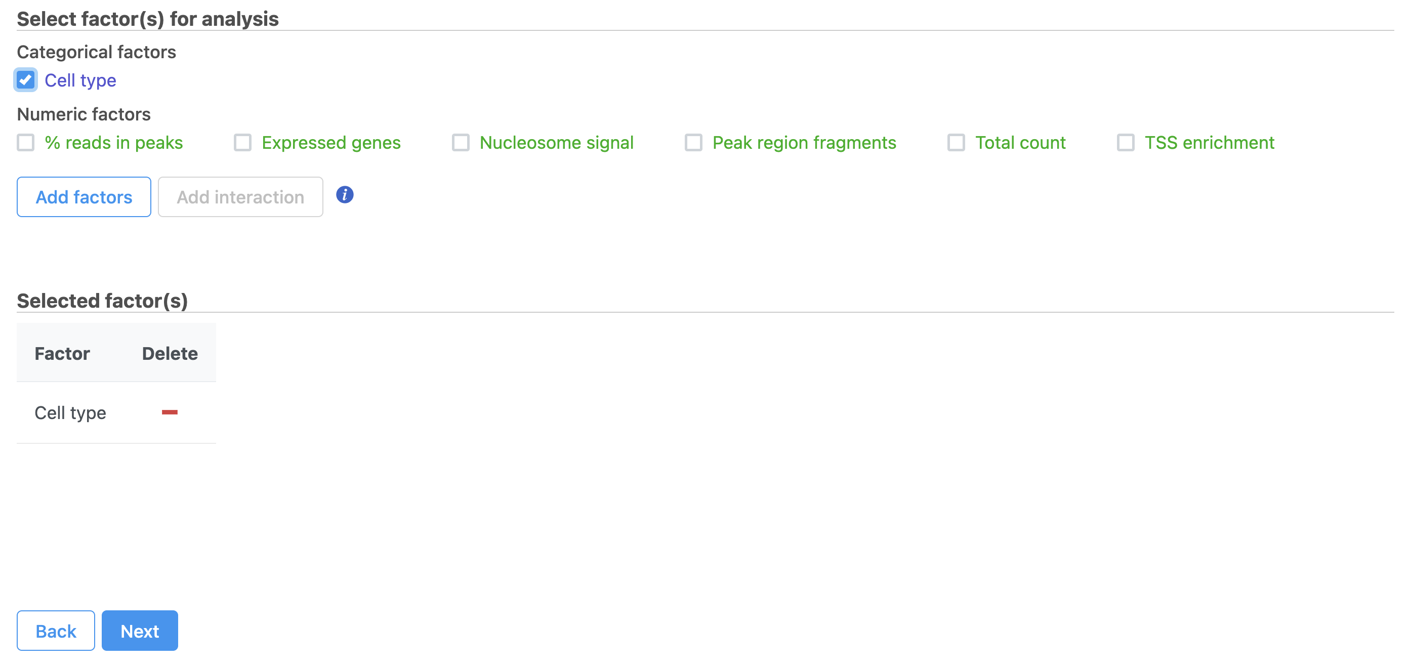
- Select the factors and interactions to include in the statistical test
...
- Click Classified Cell Types
- Click Next (Figure 35)
(Figure 19). Cell type has been selected here as an example.
| Numbered figure captions | ||||
|---|---|---|---|---|
| ||||
|

We will make a comparison between NK cells and all the other cell types to identify genes that distinguish NK cells. You can also use this tool to identify genes that differ between two cell types or genes that differ in the same cell type between experimental conditions.
- Click NK cells in the top panel
The top panel is the numerator for fold-change calculations so the experimental or test groups should be selected in the top panel.
- Click all the other classifications in the bottom panel
The bottom panel is the denominator for fold-change calculations so the control group should be selected in the bottom panel.
- Click Add comparison
This adds the comparison to the statistical test.
...
|
- Click Next
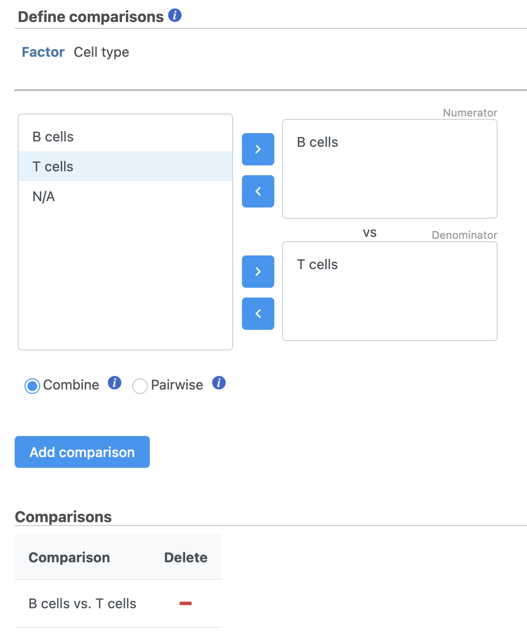
- Define comparisons between factor or interaction levels (Figure 20)
- Click Add comparison to add the comparison to the Comparisons table.
- Click Finish to run the statistical test as default
| Numbered figure captions | ||||
|---|---|---|---|---|
| ||||
|

- Double-click the Feature list data node to open the GSA task report
The GSA task report lists genes on rows and the results of the statistical test (p-value, fold change, etc.) on columns (Figure 37). For more information, please see our documentation page on the GSA task report.
| Numbered figure captions | ||||
|---|---|---|---|---|
| ||||
|

Genes are listed in ascending order by the p-value of the first comparison so the most significant gene is listed first. To view a volcano plot for any comparison, click  . To view a violin plot for a gene, click
  next to the Gene ID.
- Click
 for KLRD1
The Feature plot viewer will open showing a violin plot for KLRD1 (Figure 38). The violins are density plots with the width corresponding to frequency.
| Numbered figure captions | ||||
|---|---|---|---|---|
| ||||
|

You can switch the grouping of cells using the Group by drop-down menu. The order of groups can be adjusted by dragging groups up and down in the Group order panel. To navigate between genes in the table, click the Next > and Previous > buttons.
- Click GSA report to return to the table
The table lists all of genes in the data set; using the filter control panel on the left, we can filter to just the genes that are significantly different for the comparison.
- Click FDR step up and click the arrow next to it
- Set to 1e-8
Here, we are using a very stringent cutoff to focus only on genes that are specific to NK cells, but other applications may require a less stringent cutoff.
- Click Fold change and click the arrow next to it
- Set to -2 to 2
The number of genes at the top of the filter control panel updates to indicate how many genes are left after the filters are applied.
- Click
 to generate a filtered version of the table for downstream analysis (Figure 39)
| Numbered figure captions | ||||
|---|---|---|---|---|
| ||||
|

The GSA report will close and a new task, the Differential analysis filter, will run and generate a filtered Feature list data node.
For more information about the GSA task, please see the Differential Gene Expression - GSA section of our user manual.
Generating a heatmap
Once we have filtered to a list of significantly different genes, we can visualize these genes by generating a heatmap.
- Click the Feature list data node produced by the Differential analysis filter
- Click Exploratory analysis in the toolbox
- Click Hierarchical clustering / heatmap
The hierarchical clustering task will generate the heatmap; choose Heatmap as the plot type. You can choose to Cluster features (genes) and cells (samples) under Feature order and Cell order in the Ordering section. You will almost always want to cluster features as this generates the clear blocks of color that make heatmaps comprehensible. For single cell data sets, you may choose to forgo clustering the cells in favor of ordering them by the attribute of interest. Here, we will not filter the cells, but instead order them by their classification.
- Click Assign order under Cell order
You can filter samples using the Filtering section of the configuration dialog. Here, we will not filter out any samples or cells.
...
| Numbered figure captions | ||||
|---|---|---|---|---|
| ||||
|

- Double-click the Hierarchical cluster task node to open the task report
It may initially be hard to distinguish striking differences in the heatmap. This is common in single cell RNA-Seq data because outlier cells will skew the high and low ends. We can adjust the minimum and maximum of the color scheme to improve the appearance of the heatmap.
- Click Heatmap
- Toggle on the Range Min and set to -2
- Toggle on the Range Max and set to 2
Distinct blocks of red and blue are now more pronounced on the plot. Cells are on rows and genes are on columns. Because of the limited number of pixels on the screen, genes are grouped. You can zoom in using the zoom controls or your mouse wheel if you want to view individual gene rows. We can annotate the plot with cell attributes.
- Choose Classifications from the Annotations drop-down menu
- Change the Annotation font size under Style in the Annotations section
The plot now includes blocks of color along the left edge indicating the classification of the cells. We can transpose the plot to give the cell labels a bit more space.
- Click Transposed under Data to flip the axes
- Toggle off the Row labels under Axes to remove the sample labels
We can also customize the colors of the plot. Do this by clicking the Legend or Heatmap
- Click the blue box on the Color Palette and set it to teal (#3affe6)
- Click the middle box and set it to black
- Click the red box and set it to yellow (#faff00)
The heatmap now shows a teal to yellow gradient with a black midpoint (Figure 41).
| Numbered figure captions | ||||
|---|---|---|---|---|
| ||||
|

As with any visualization in Partek Flow, the image can be saved as a publication-quality image to your local machine by clicking ![]() or sent to a page in the project notebook by clicking
or sent to a page in the project notebook by clicking ![]() . For more information about Hierarchical clustering, please see the Hierarchical Clustering section of the user manual.
. For more information about Hierarchical clustering, please see the Hierarchical Clustering section of the user manual.
Performing enrichment analysis
While a long list of significantly different genes is important information about a cell type, it can be difficult to identify what the biological consequences of these changes might be just by looking at the genes one at a time. Using enrichment analysis, you can identify gene sets and pathways that are over-represented in a list of significant genes, providing clues to the biological meaning of your results.
- Click the Feature list data node produced by the Differential analysis filter
- Click Biological interpretation
- Click Gene set enrichment
We distribute the gene sets from the Gene Ontology Consortium, but Gene set enrichment can work with any custom or public gene set database.
...
| Numbered figure captions | ||||
|---|---|---|---|---|
| ||||
|

- Double-click the Gene set enrichment task node to open the task report
The Gene set enrichment task report lists gene sets on rows with an enrichment score and p-value for each. It also lists how many genes in the gene set were in the input gene list and how many were not (Figure 43). Clicking the Gene set ID links to the geneontology.org page for the gene set.
| Numbered figure captions | ||||
|---|---|---|---|---|
| ||||
|

In Partek Flow, you can also check for enrichment of KEGG pathways using the Pathway enrichment task. The task is quite similar to the Gene set enrichment task, but uses KEGG pathways as the gene sets.
The task report is similar to the Gene set enrichment task report with enrichment scores, p-values, and the number of genes in and not in the list (Figure 44).
| Numbered figure captions | ||||
|---|---|---|---|---|
| ||||
|

Clicking the KEGG pathway ID in the Pathway enrichment task report opens a KEGG pathway map (Figure 45). The KEGG pathway maps have fold-change and p-value information from the input gene list overlaid on the map, adding a layer of additional information about whether the pathway was upregulated or downregulated in the comparison.
| Numbered figure captions | ||||
|---|---|---|---|---|
| ||||
|

Color are customizable using the control panel on the left and the plot is interactive. Mousing over gene boxes gives the genes accounted for by the box, with genes present in the input list shown in bold, and the coloring gene shown in red (Figure 46).
| Numbered figure captions | ||||
|---|---|---|---|---|
| ||||
|

Clicking a pathway box opens the map of that pathway, providing an easy way to explore related gene networks.
|
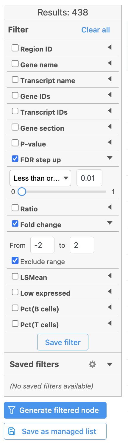
Hurdle model produces a Feature list task node. The results table and options are the same as the GSA task report except the last two columns. The percentage of cells where the feature is detected (value is above the background threshold) in different groups (Pct(group1), Pct(group2)) are calculated and included in the Hurdle model report.
A filtered Feature list data node can be produced by running the Differential analysis filter in the Hurdle model task report (Figure 21) .
| Numbered figure captions | ||||
|---|---|---|---|---|
| ||||
 |
Once we have filtered a list of differentially expressed genes, we can visualize these genes by generating a heatmap, or perform the Gene set enrichment analysis and motif detection.
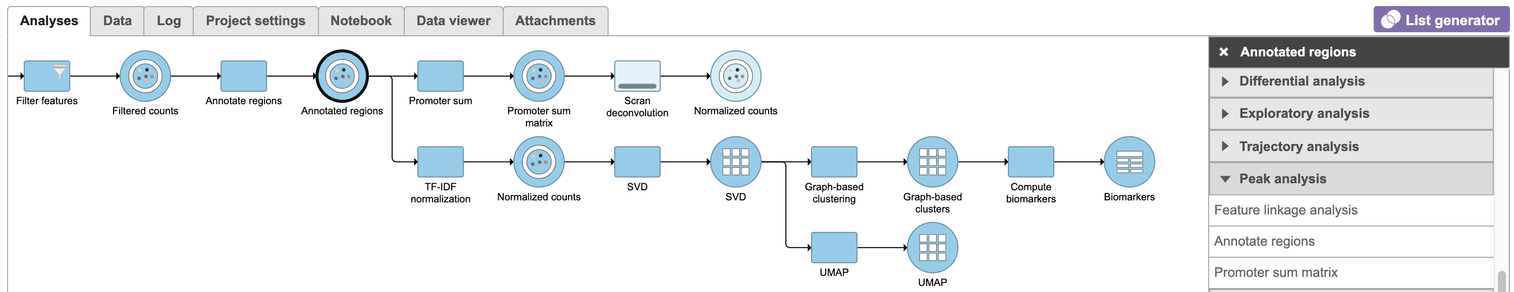
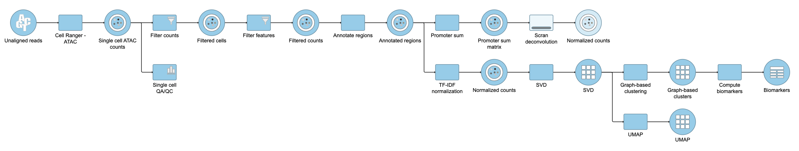
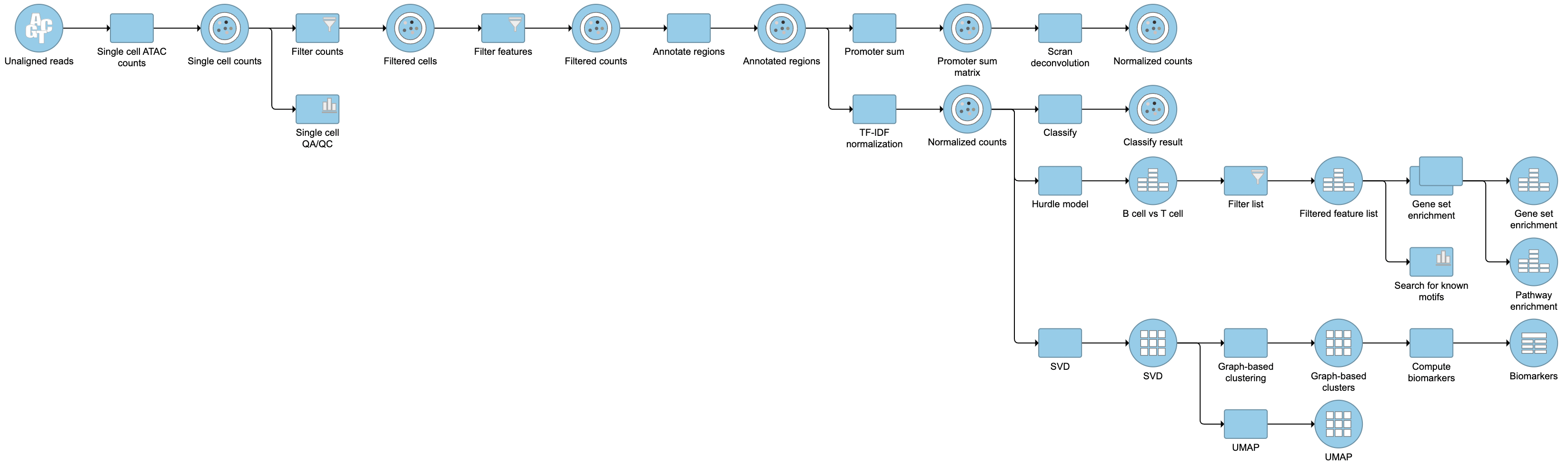
Pipeline
| Numbered figure captions | ||||
|---|---|---|---|---|
| ||||
|

For information about automating steps in this analysis workflow, please see our documentation page on Making a Pipeline.
References
Soneson C and Robinson MD. Bias, robustness and scalability in single-cell differential expression analysis. Nature Methods 2018 Apr;15(4):255-261.
- https://support.10xgenomics.com/single-cell-atac/software/pipelines/latest/what-is-cell-ranger-atac
- Cusanovich, D., Reddington, J., Garfield, D. et al. The cis-regulatory dynamics of embryonic development at single-cell resolution. Nature 555, 538–542 (2018). https://doi.org/10.1038/nature25981
- https://satijalab.org/signac/index.html
- https://support.10xgenomics.com/single-cell-atac/software/visualization/latest/tutorial-celltypes
| Additional assistance |
|---|
| Rate Macro | ||
|---|---|---|
|
...
Overview
Content Tools