Page History
Data tracks section of the Select tracks dialog enables you to specify the tracks for visualization on the canvas. An overview of the available track types is provided in Figure 1. Note that not all tracks are visible at all times and that their presence depends on the whether specific data types are present in the project as well as the zoom level. The tracks can be customised customized and their appearance changed by using the control panel on the right.left. Different track also has it own specific configuration settings which allow you to pin the track to move the track, pin the track, change the styles of the track and hide the track using the settings options on the left of each track (![]() )
)
| Numbered figure captions | ||||
|---|---|---|---|---|
| ||||
Alignments track
Isoform proportion track Variants track Amino acids track Reads pileup track Probe intensities track Peaks track |


Alignments Track
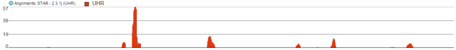
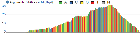
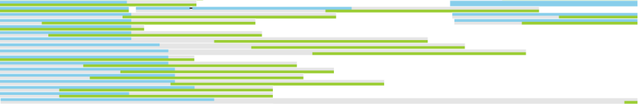
Alignments track displays a histogram view of alignments present in .bam files in a stacked histogram fashion (similar to Partek® Genomics Suite®). The y-axis shows number of (raw) base calls per position. By default, reads are coloured by sample; the exception is invocation of the chromosome view on a variant table, when the reads are coloured by base calls. The difference is shown in Figure 2.
...
. Variations on the track are displayed below. They can be configured in the following ways:
- The histogram can be colored by sample, attribute groups or by base call. By default, it is colored by sample except when the chromosome viewer is invoked from a variant data table.
- When colouring reads by sample, the reads are stacked (on top of each other), i.e. in the example
...
- below there are more reads in the red sample than in the blue sample. This is an example of a Sum histogram type. This can also be configured to display overlays or averages.
...
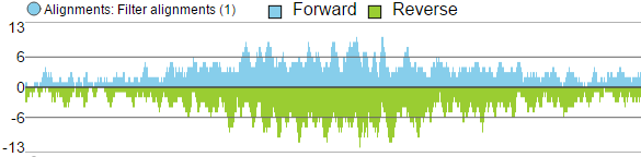
- Reads can be split into two tracks corresponding to the strand that they map to. This can be invoked by clicking the Split read histogram by strand checkbox.
- Y-axis can be scaled for all samples to have the same max or each sample has its own specific max
For more information on configuring tracks see our page on Customizing the chromosome viewer
| Numbered figure captions | ||||
|---|---|---|---|---|
| ||||
Reads coloured by sample Reads coloured by base calls Reads split by strand
|
Isoform Proportion Track
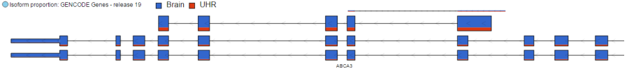
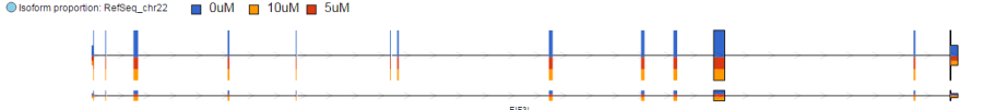
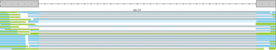
The Isoform proportion track displays the reads mapped to transcripts and helps to visualize differential expression and alternative splicing, using this track is only available on the feature list data node which is generated from differential expression analysis. It uses standard symbols for exons (boxes) and introns (lines connecting the boxes). The size height and color of each transcript is proportional to the number of reads that map to that transcript. The color indicates the samples to which the reads belong. proprotional to its LS mean value. Figure 3 shows a gene with two transcripts in RefSeq database; the top transcript is more abundant than the bottom transcript and is preferentially expressed in the "blue" condition (labeled as 0 uM). The bottom transcript, on the other hand, seems to be expressed at the same level across all three conditions (i.e. 0 uM, 5 uM, 10 uM). The number and structure of transcripts on the plot depend on the transcript model that was used for mapping.
For more information on configuring tracks see our page on Customizing the chromosome viewer
| Numbered figure captions | ||||
|---|---|---|---|---|
| ||||
|
Variants Track
...
| Numbered figure captions | ||||
|---|---|---|---|---|
| ||||
|

Upon zoom-in, SNVs are drawn as pie charts, representing the proportion of each base call at that locus (Figure 5)
...
| Numbered figure captions | ||||
|---|---|---|---|---|
| ||||
|

At higher modification, insertions are seen as green boxes, with individual inserted bases presented using a pie chart, while deletions look like red boxes and the affected bases are also presented by a pie (Figure 6).
...
| Numbered figure captions | ||||
|---|---|---|---|---|
| ||||
Insertion Deletion |


Amino Acids Track
...
| Numbered figure captions | ||||
|---|---|---|---|---|
| ||||
|

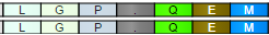
If an amino acid spans two exons, its box will be truncated and the line connecting the exons will be dashed. An example is in Figure 8.
...
| Numbered figure captions | ||||
|---|---|---|---|---|
| ||||
|

An empty gray box on the top of consensus sequence is used to indicate a STOP codon, which is a consequence of a mutation (Figure 9).
...
| Numbered figure captions | ||||
|---|---|---|---|---|
| ||||
|

Untranslated bases, such as ones downstream of a STOP codon are depicted by lighter shades. Figure 10 shows two transcripts in an amino acid track; the direction is from left to right, so amino acids downstream of a STOP codon (P > G > L) are lightly shaded.
...
| Numbered figure captions | ||||
|---|---|---|---|---|
| ||||
|
Reads Pileup Track
...
| Numbered figure captions | ||||
|---|---|---|---|---|
| ||||
|
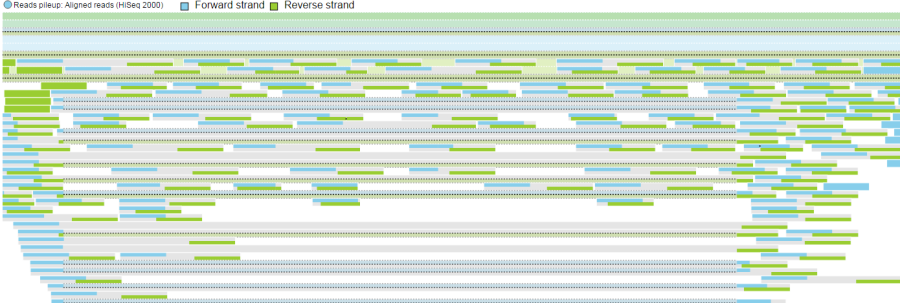
If you used a junction-aware aligner (such as TopHat or STAR), the junction reads will be depicted using dashed lines, which connect exon-spanning parts of the same read (Figure 12).
...
| Numbered figure captions | ||||
|---|---|---|---|---|
| ||||
|
Deleted bases can also be seen on a Reads pileup track, as fat black lines (Figure 13).
...
| Numbered figure captions | ||||
|---|---|---|---|---|
| ||||
|
Probe Intensities Track
...
| Numbered figure captions | ||||
|---|---|---|---|---|
| ||||
|

As with the Reads pileup track, probes may not be visible with low power magnification and you will see a message - Zoom in to view individual microarray probes.
Peaks Track
The Peaks track displays the results of peak caller tasks. It displays a bar that spans genomic location of each peak call. If summits are identified by the peak caller, such as the MACS2 algorithm, then its genomic location is marked by a vertical line. The color marks either the pair being compared by the peak caller or, if present, the sample attribute associated with the sample.
| Numbered figure captions | ||||
|---|---|---|---|---|
| ||||
|
| Additional assistance |
|---|
|
| Page Turner | ||
|---|---|---|
|
| Rate Macro |
|---|
Overview
Content Tools