Join us for an event September 26!
How to Streamline RNA-Seq analysis and increase productivity—point, click, and done
Page History
| Table of Contents | ||||||
|---|---|---|---|---|---|---|
|
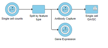
Split matrix
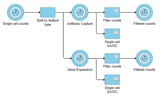
The Single cell counts data node contains two different types of data, mRNA expression and protein expression. So that we can process these two different types of data separately, we will split the data by data type.
- Click the Single cell counts data node
- Click Pre-analysis tools in the toolbox
- Click Split by feature type
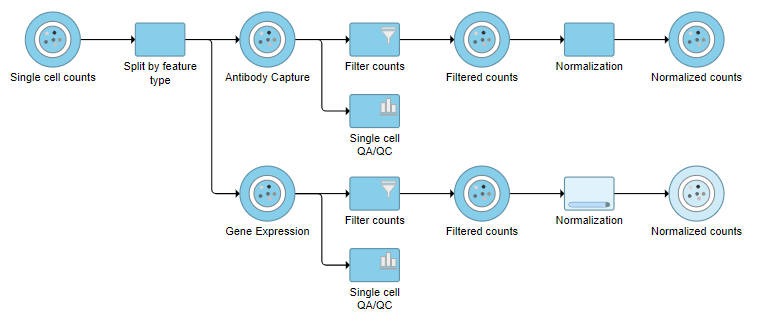
A rectangle, or rectangular task node , will be created for Split matrix along with two output circles, or circular data nodes, one for each data type (Figure 21). The labels for these data types are determined by features.csv file used when processing the data with Cell Ranger. Here, our data is labeled Gene Expression, for the mRNA data, and Antibody Capture, for the protein data.
...
An important step in analyzing single cell RNA-Seq data is to filter out low-quality cells. A few examples of low-quality cells are doublets, cells damaged during cell isolation, or cells with too few coutns counts to be analyzed. In a CITE-Seq experiment, protein aggregation in the antibody staining reagents can cause a cell to have a very high number of counts. These are low-quality cells that can be excluded. Additionally, if all cells in a data set are expected to show a baseline level of expression for one of the antibodies used, it may be appropriate to filter out cells with very low counts or a low number of detected features. You can do this in Partek Flow using the Single cell QA/QC task.
...
- Click the Antibody Capture data node
- Click QA/QC in the toolbox
- Click Single Cell QA/QC
This produces a Single-cell QA/QC task node (Figure ?2).
| Numbered figure captions | ||||
|---|---|---|---|---|
| ||||
|
- Double-click the Single cell QA/QC task node to open the task report
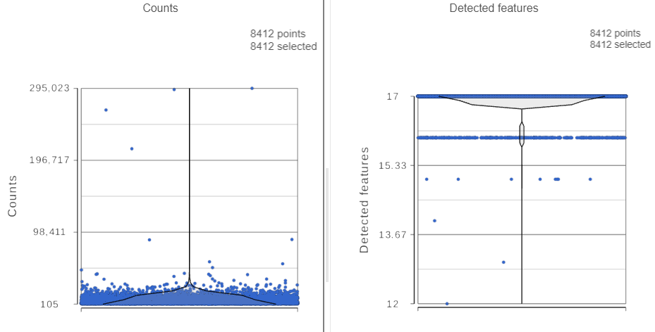
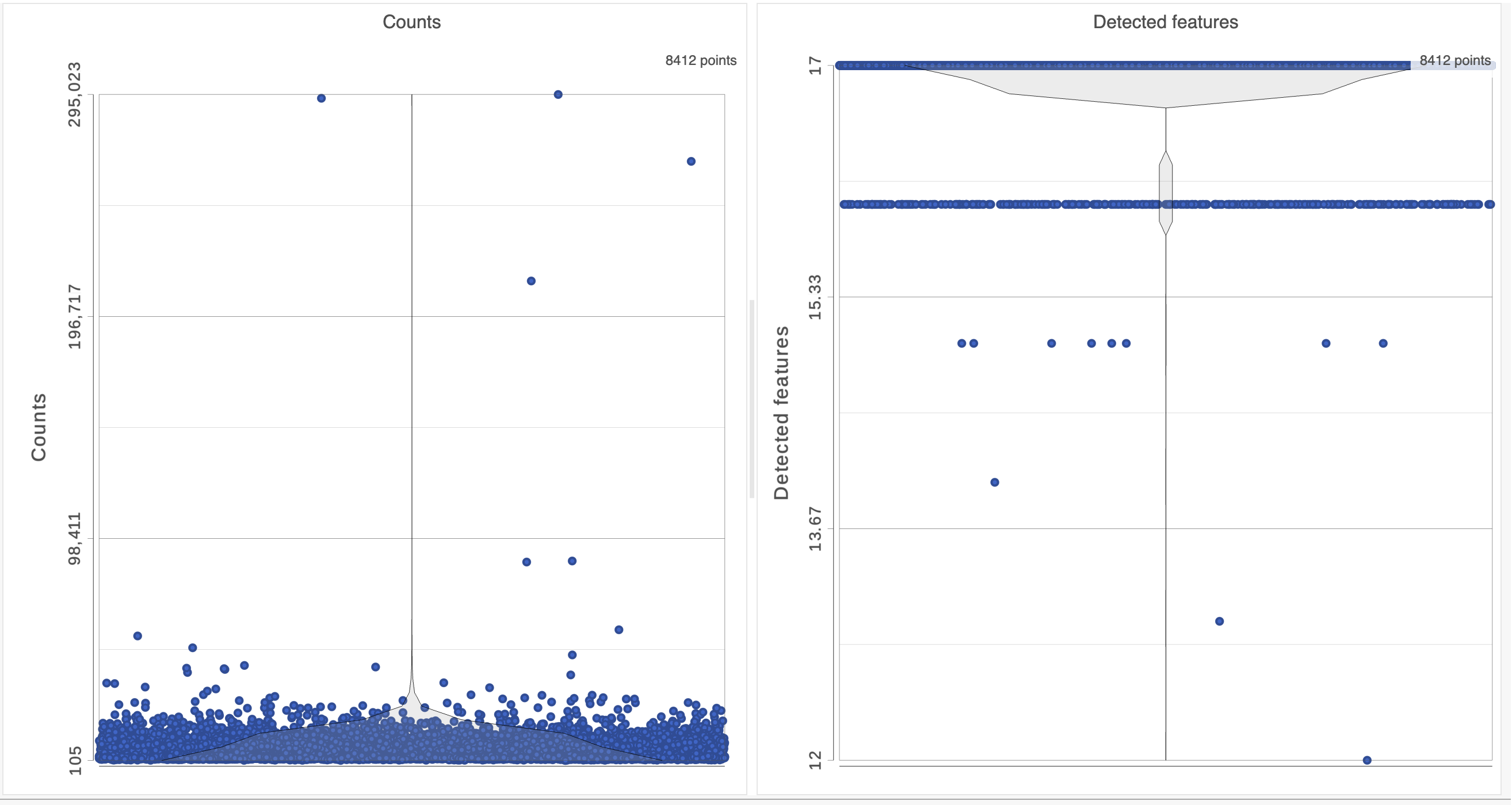
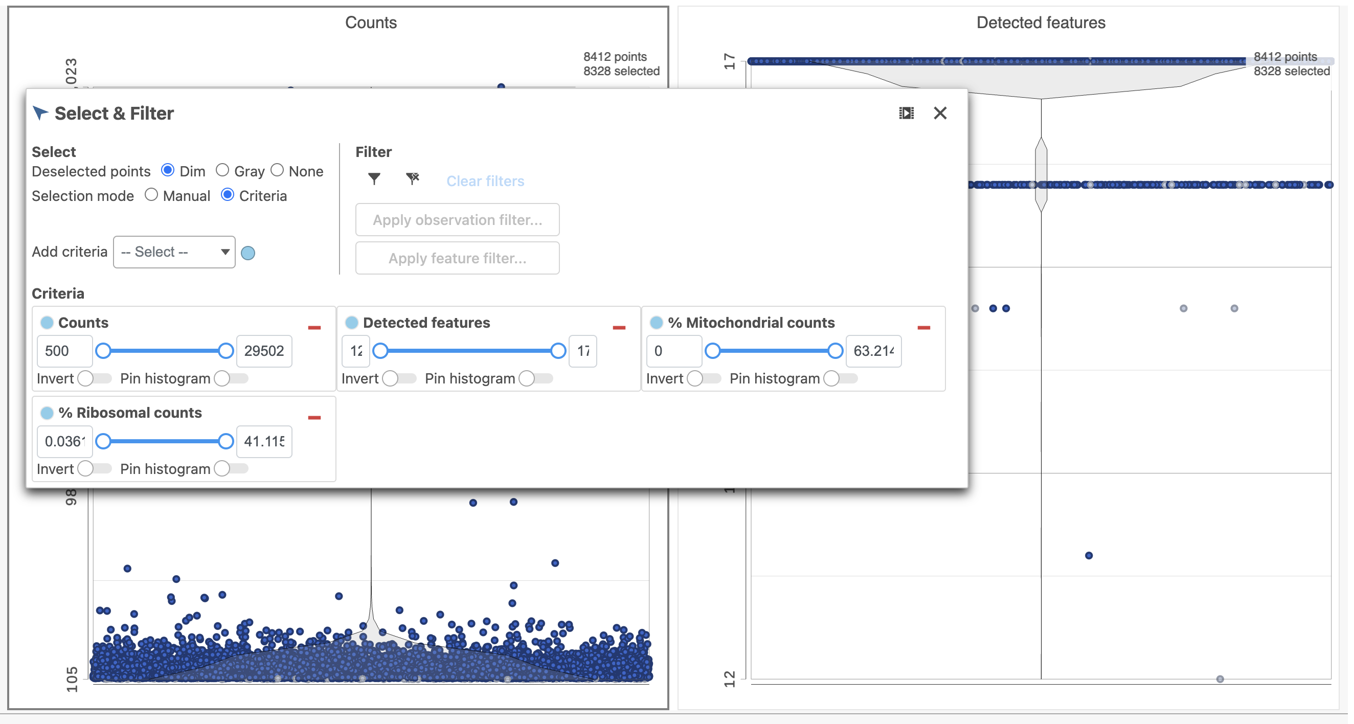
The task report lists the number of counts per cell and the number of detected features per cell in two violin plots. For more information, please see our documentation for the Single cell QA/QC task. For this analysis, we will set a maximum counts threshold to exclude potential protein aggregates and, because we expect every cell to be bound by several antibodies, we will also set a minimum counts threshold.
- Click the Single cell QA/QC node once it finishes running
- Click Task report on the task menu
The Single cell QA/QC report opens in a new data viewer session. There are interactive violin plots showing the most commonly used quality metrics for each cell from all samples combined (Figure ?). For this data set, there are two relevant plots: the : the total count per cell and the number of detected genes per cell. Each features per cell (Figure 3). Each point on the plots is a cell and the violins illustrate the distribution of values for the y-axis metric. Because mitochondrial transcripts are not present in protein data, this plot is not informative for this data set.
- Remove the % mitochondrial counts and the extra text box in the bottom right by clicking Remove plot in the top right corner of each plot (Figure ?)
| Numbered figure captions | ||||
|---|---|---|---|---|
| ||||
| ||||
|
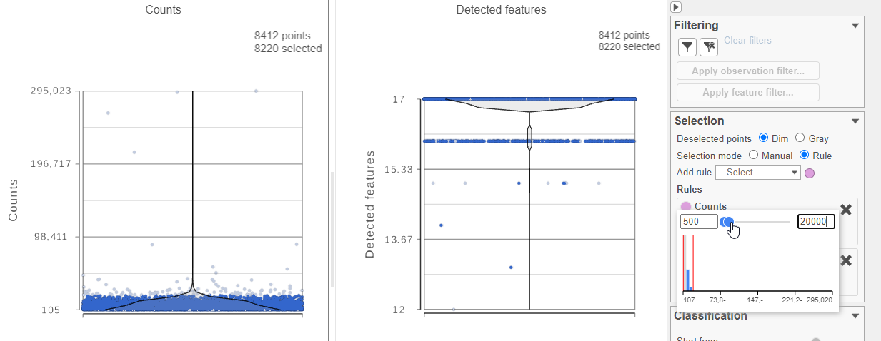
For this analysis, we will set a maximum counts threshold to exclude potential protein aggregates and, because we expect every cell to be bound by several antibodies, we will also set a minimum counts threshold.
- Select one of the plots on the canvas
- In the Selection card Select & Filter icon on the rightleft under Tools, set the Counts threshold to keep cells between 500 and 20000 (Figure ?4)
| Numbered figure captions | ||||
|---|---|---|---|---|
| ||||
|
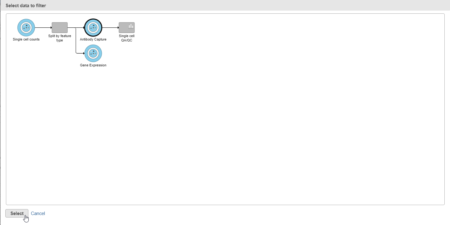
- Click
 in the Filteringunder Filter card on the right
 - Click Apply observation filter...
- Select the Antibody Capture data node as input in the pipeline preview (Figure ?5)
- Click Select
| Numbered figure captions | ||||
|---|---|---|---|---|
| ||||
|
You will see a message telling you a new task has been enqueued.
...
- Click the Gene Expression data node
- Click the QA/QC section in the toolbox
- Click Single Cell QA/QC
This produces a Single-cell QA/QC task node
- Double-click the Single cell QA/QC task node to open the task report
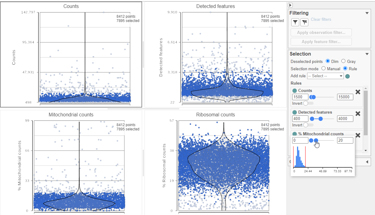
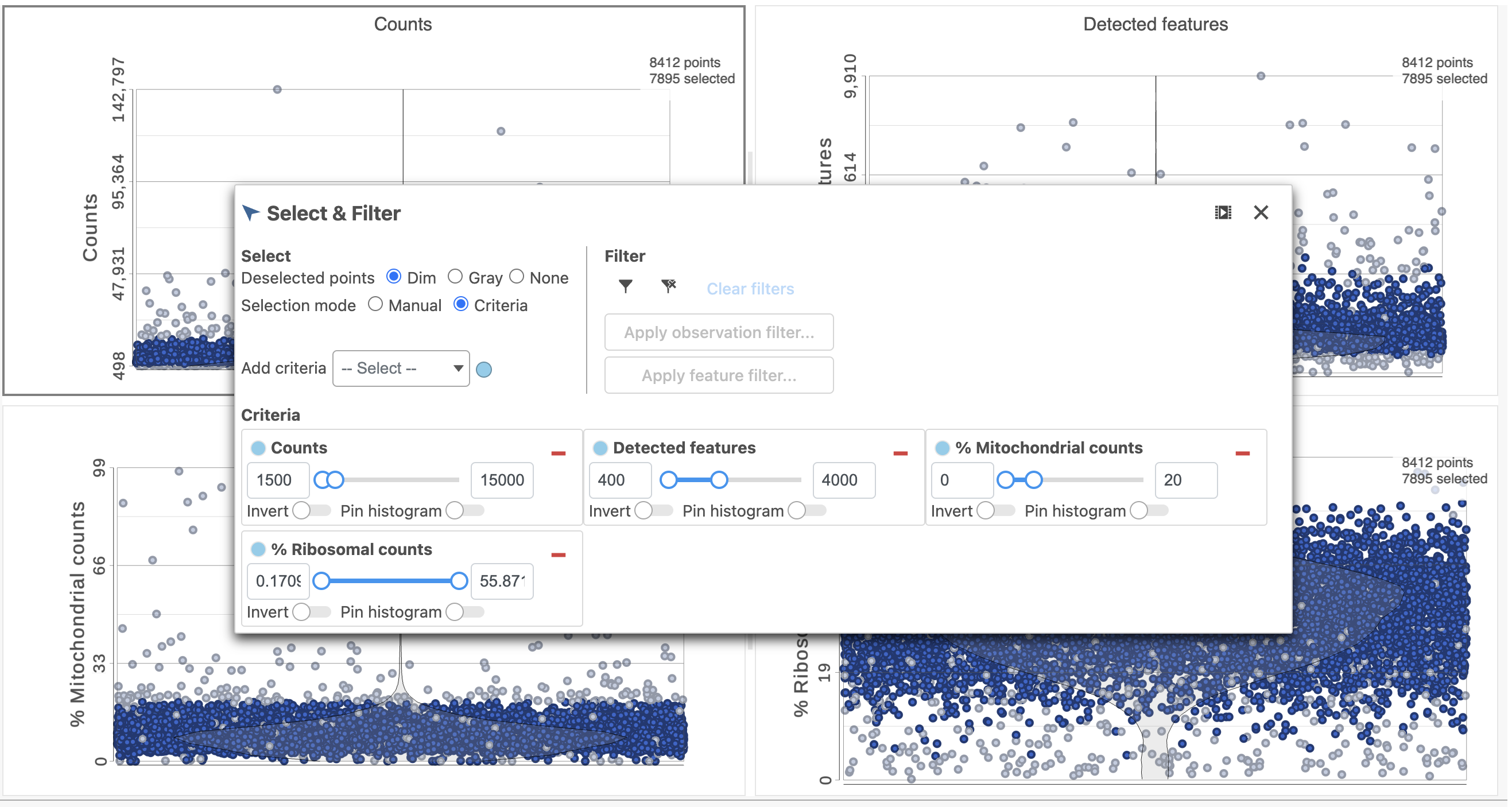
The task report lists the number of counts per cell, the number of detected features per cell, and the percentage of mitochondrial reads per cell in three , and the percentage of ribosomal counts per cell in four violin plots (Figure 6). For this analysis, we will set a maximum counts threshold maximum and minimum thresholds for total counts and detected genes to exclude potential doublets and a maximum mitochondrial reads percentage filter to exclude potential dead or dying cells. There is no need to apply a filter based on the percentage of ribosomal counts in this tutorial.
- In the Selection card on the right, set the Counts threshold to keep cells between 1500 and 15000
- Set the Detected features to keep cells between 400 and 4000
- Set the % Mitochondrial counts to keep cells between 0% and 20% (Figure ?6)
| Numbered figure captions | ||||
|---|---|---|---|---|
| ||||
|
- Click in the Filtering card Filter on the right
- Click Apply observations filter
- Select the Gene Expression data node as input in the pipeline preview
- Click Select
- Click OK to dismiss the message about the task being enqueued
- Click the project name at the top to go back to the Analyses tab
- Your browser may warn you that any unsaved changes to the data viewer session will be lost. Ignore this message and proceed to the Analyses tab
A new task, Filter counts, is added to the Analyses tab. This task produces a new Filter counts data node (Figure ?7)
| Numbered figure captions | ||||
|---|---|---|---|---|
| ||||
|
...
- Click the Filtered counts data node produced by filtering the Antibody Capture data node
- Click Normalization and scaling in the toolbox
- Click Normalization
- Click the green
 button
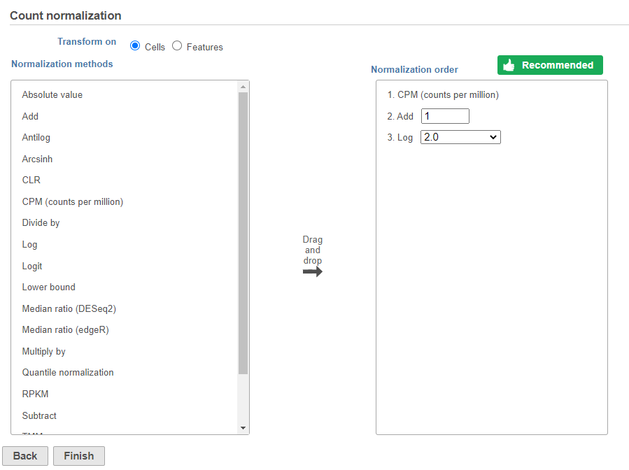
 - Click Finish to run (Figure ?8)
| Numbered figure captions | ||||
|---|---|---|---|---|
| ||||
|
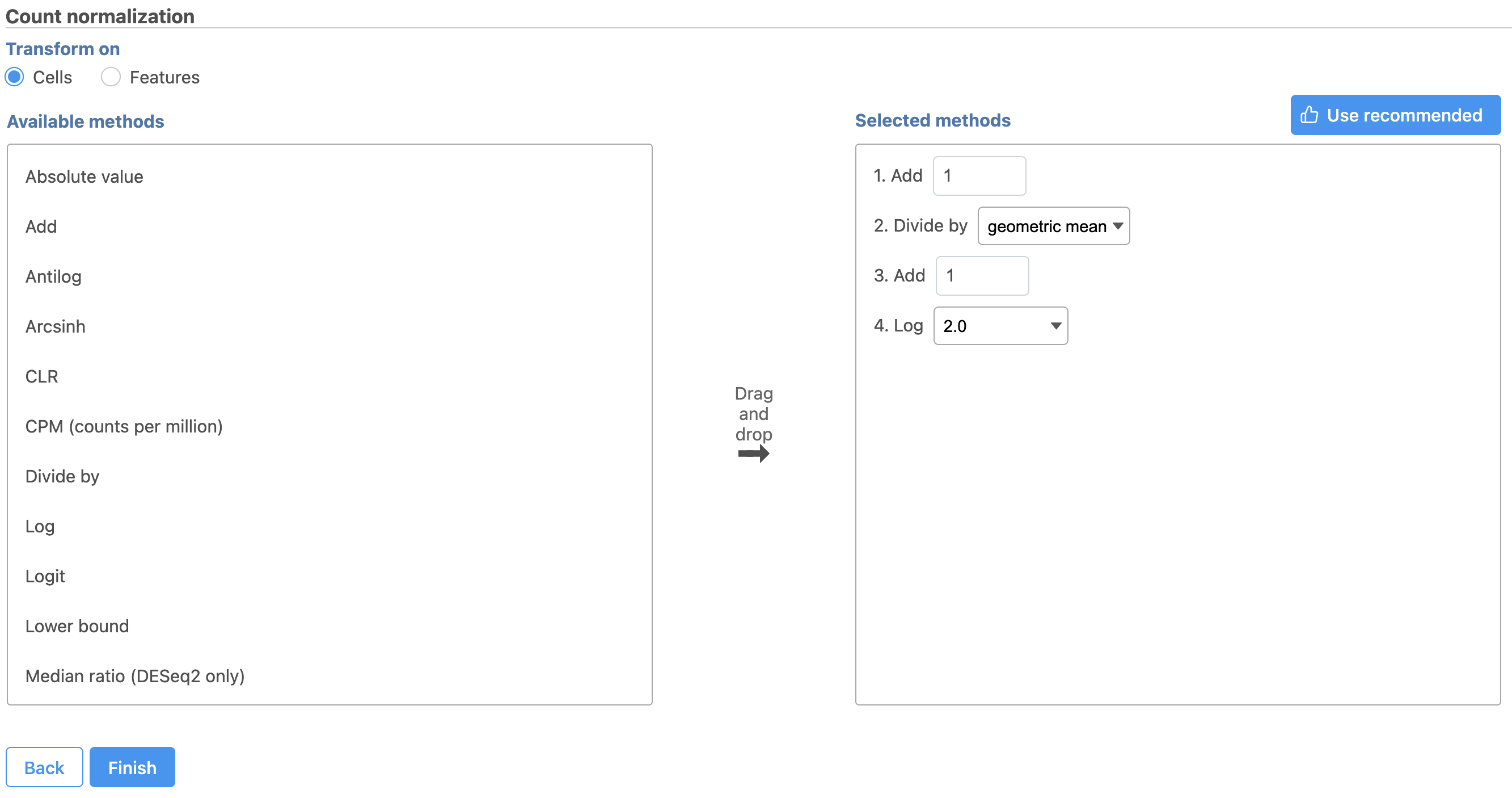
The recommended normalization for protein data includes the following steps: Add 1, Divide by Geometric mean, Add 1, log Log base 2. This is a variant of Centered log-ratio (CLR), which was used to normalize antibody capture protein counts data in the paper that introduced CITE-Seq [1] and in subsequent publications on similar assays [2. 3]. CLR normalization includes the following steps: Add 1, Divide by Geometric mean, Add 1, log base e. Normalizing the protein data to base 2 instead of e allows for better integration with gene expression data further downstream. If you would prefer to use CLR, click and drag CLR from the panel on the left to the right.
| Numbered figure captions | ||||
|---|---|---|---|---|
| ||||
|
If you do choose to use CLR, we recommend making sure the gene expression data is normalized to the base e, to allow for smoother integration further downstream.
Normalization produces a Normalized counts data node on the Antibody Capture branch of the pipeline.
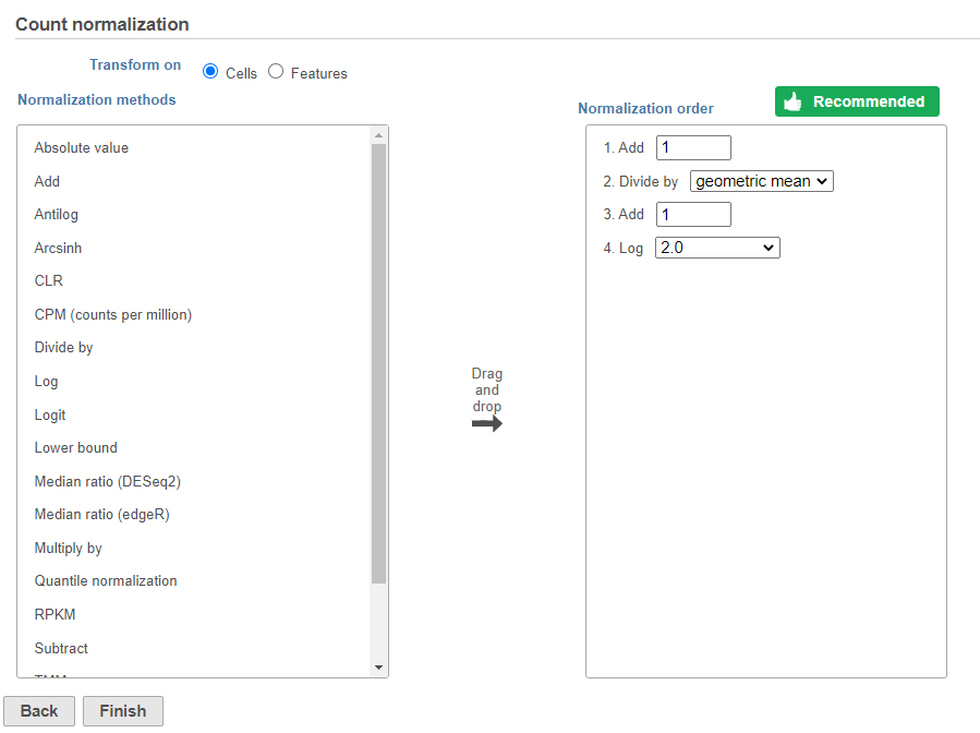
Next, we can normalize the mRNA data. We will use the recommended normalization method in Partek Flow, which accounts for differences in library size, or the total number of UMI counts, per cell, adds 1 and log log2 transforms the data.
- Click the Filtered counts data node produced by filtering the Gene Expression data node
- Click the Normalization and scaling section in the toolbox
- Click Normalization
- Click the
 button
 - Click Finish to run (Figure ?9)
| Numbered figure captions | ||||
|---|---|---|---|---|
| ||||
|
Normalization produces a Normalized counts data node on the Gene Expression branch of the pipeline (Figure ?10).
| Numbered figure captions | ||||
|---|---|---|---|---|
| ||||
|
...
Data nodes that can be merged with the Antibody Capture branch Normalized counts data node are shown in color (Figure ?11).
| Numbered figure captions | ||||
|---|---|---|---|---|
| ||||
|
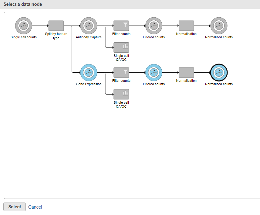
- Click the Normalized counts data node on the Gene Expression branch of the pipeline (Figure 11)
- Click Select
- Click Finish to run the task
The output is a Merged counts data node (Figure ?12). This data node will include the normalized counts of our protein and mRNA data. The intersection of cells from the two input data nodes is retained so only cells that passed the quality filter for both protein and mRNA data will be included in the Merged counts data node.
...
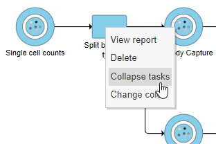
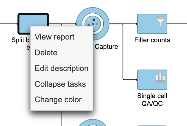
- Right-click the Split by feature type task node
- Choose Collapse tasks from the pop-up dialog (Figure ? 13)
| Numbered figure captions | ||||
|---|---|---|---|---|
| ||||
|
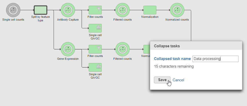
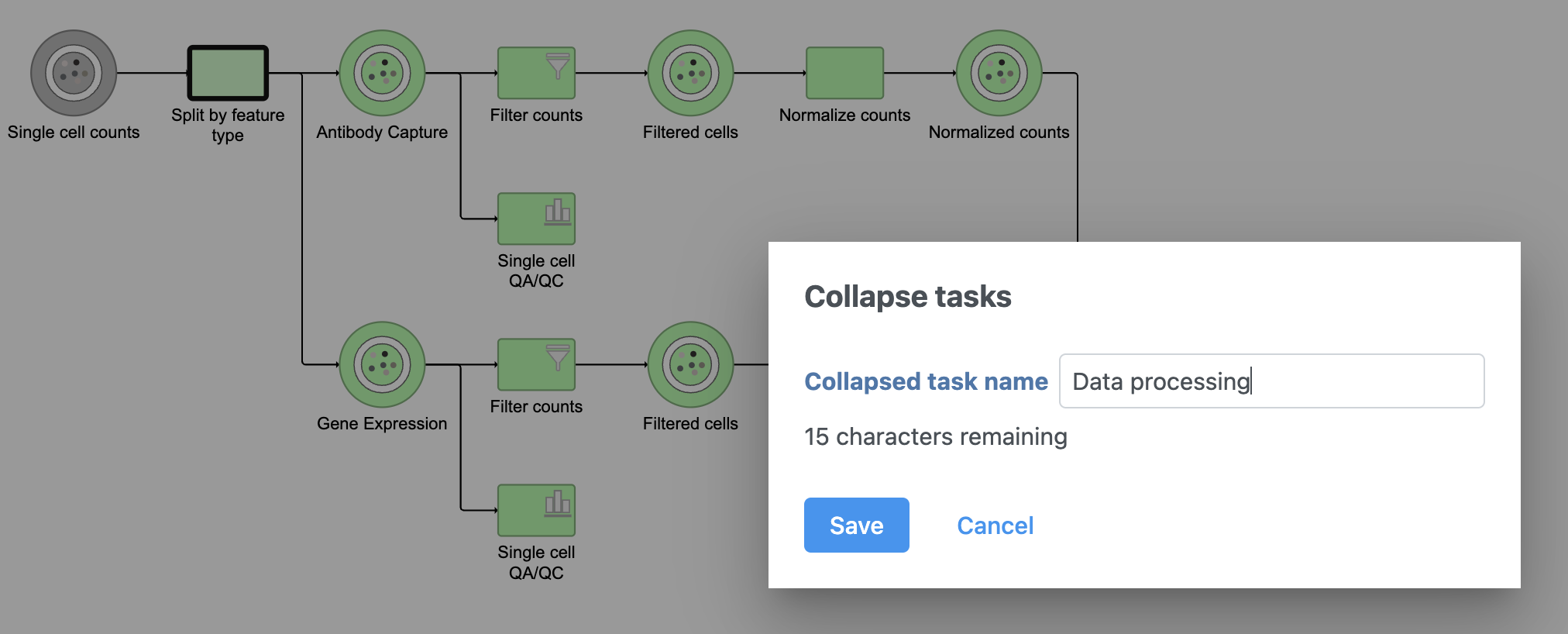
Tasks that can be selected for the beginning and end of the collapsed section of the pipeline are highlighted in purple (Figure ?14). We have chosen the Split matrix task as the start and we can choose Merge matrices as the end of the collapsed section.
...
- Click the Merge matrices task to choose it as the end of the collapsed section
- Name the Collapsed task Data processing
- Click Save (Figure ?15)
| Numbered figure captions | ||||
|---|---|---|---|---|
| ||||
|
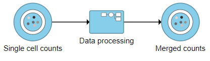
The new collapsed task, Data processing, appears as a single rectangular task node (Figure ?16).
| Numbered figure captions | ||||
|---|---|---|---|---|
| ||||
 |
To view the tasks in Data processing, we can expand the collapsed task.
- Double-click Data processing to expand it , or right-click and choose Expand collapsed task
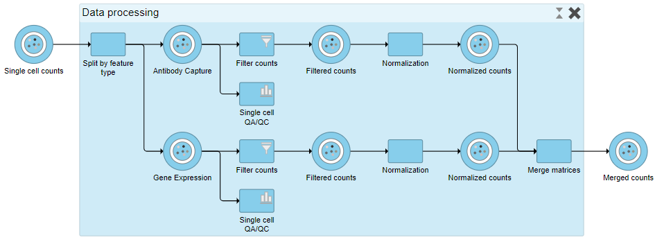
When expanded, the collapsed task is shown as a shaded section of the pipeline with a title bar (Figure ?17).
| Numbered figure captions | ||||
|---|---|---|---|---|
| ||||
|
...
Overview
Content Tools