Page History
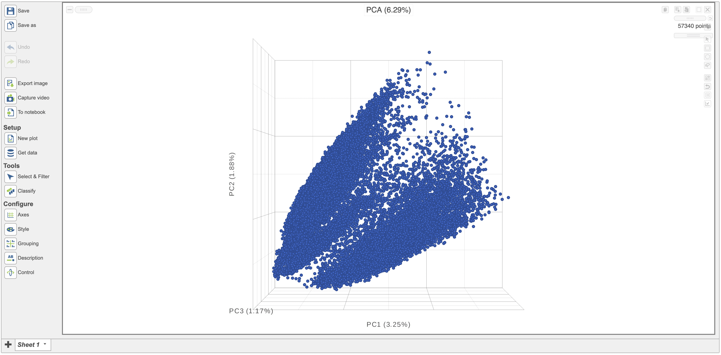
After performing exploratory analyses such as PCA, UMAP and t-SNE is is helpful to visualize the results on a scatterplotscatter plot. This can help visually assess the source of variation affecting the results of an experiment, classify cells and select samples for downstream analysis. Here we have a PCA scatterplot scatter plot generated from the analysis of 12 samples from a scRNA sequencing study. The first three most informative PCs are plotted by default and the percentage of variation explained is stated next to each one of them.
| Numbered figure captions | ||||
|---|---|---|---|---|
| ||||
|
...
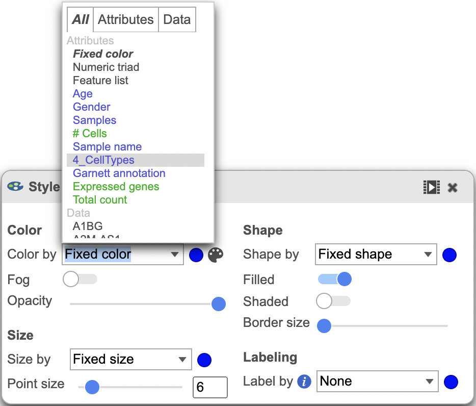
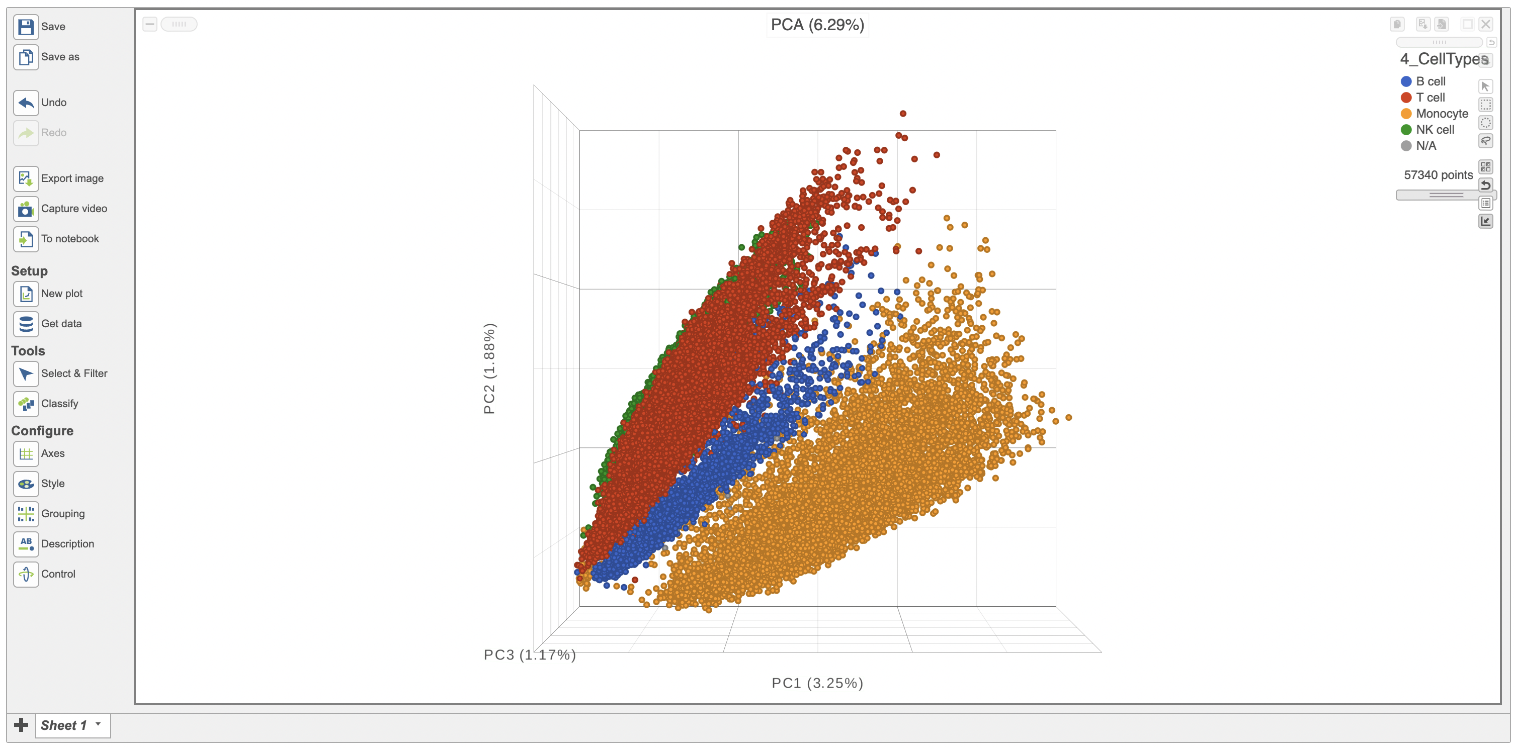
The Configure > Style menu on the left can then be used to color the features in the scatterplot scatter plot based on an attribute (Figure 2). In this case, Figure 3 shows the cells being colored based on their cell-type.
...
| Numbered figure captions | ||||
|---|---|---|---|---|
| ||||
|

| Numbered figure captions | ||||
|---|---|---|---|---|
| ||||
|
...
| Numbered figure captions | ||||
|---|---|---|---|---|
| ||||
|
ghjkl
Click the Save image button ![]() to save a PNG or SVG image to your computer.
to save a PNG or SVG image to your computer.
Click the Send to notebook button ![]() to send the image to a page in the Notebook.
to send the image to a page in the Notebook.
ghjkl
ghjkl
ghjkl
| Additional assistance |
|---|
Overview
Content Tools