After performing exploratory analyses such as PCA, UMAP and t-SNE is is helpful to visualize the results on a scatter plot. This can help visually assess the source of variation affecting the results of an experiment, classify cells and select samples for downstream analysis. Here we have a PCA scatter plot generated from the analysis of 12 samples from a scRNA sequencing study. The first three most informative PCs are plotted by default and the percentage of variation explained is stated next to each one of them.
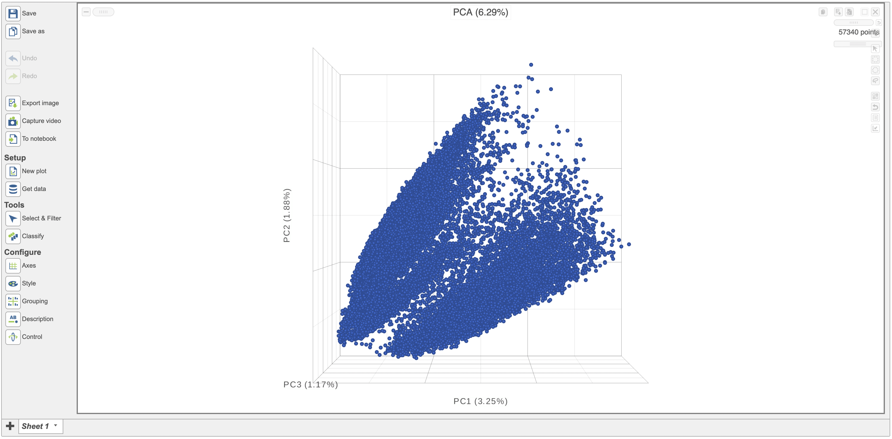 Figure 1. Example of a 3D PCA scatterplot .
The Configure > Style menu on the left can then be used to color the features in the scatter plot based on an attribute (Figure 2). In this case, Figure 3 shows the cells being colored based on their cell-type.
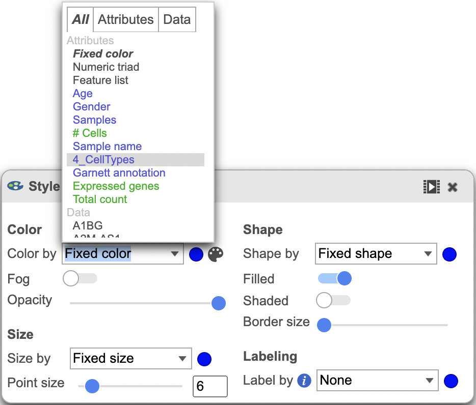 Figure 2. Customization menu.
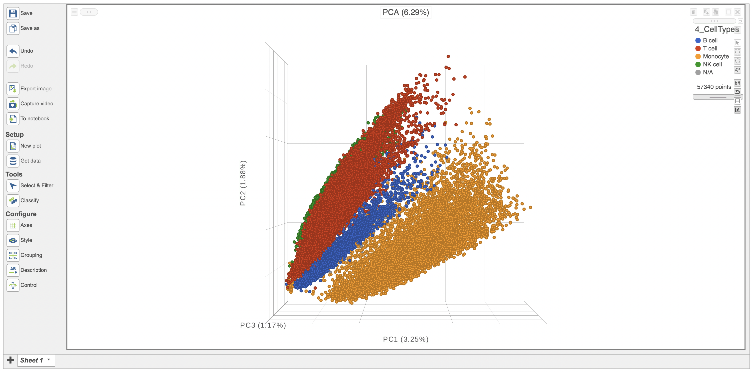 Figure 3. PCA scatterplot colored by cell-type.
Additionally, you can adjust the opacity of the points to better assess the density across the groups (Figure 4). It is also possible to split the plot based on the same attribute in the Configure > Grouping menu (Figure 5)
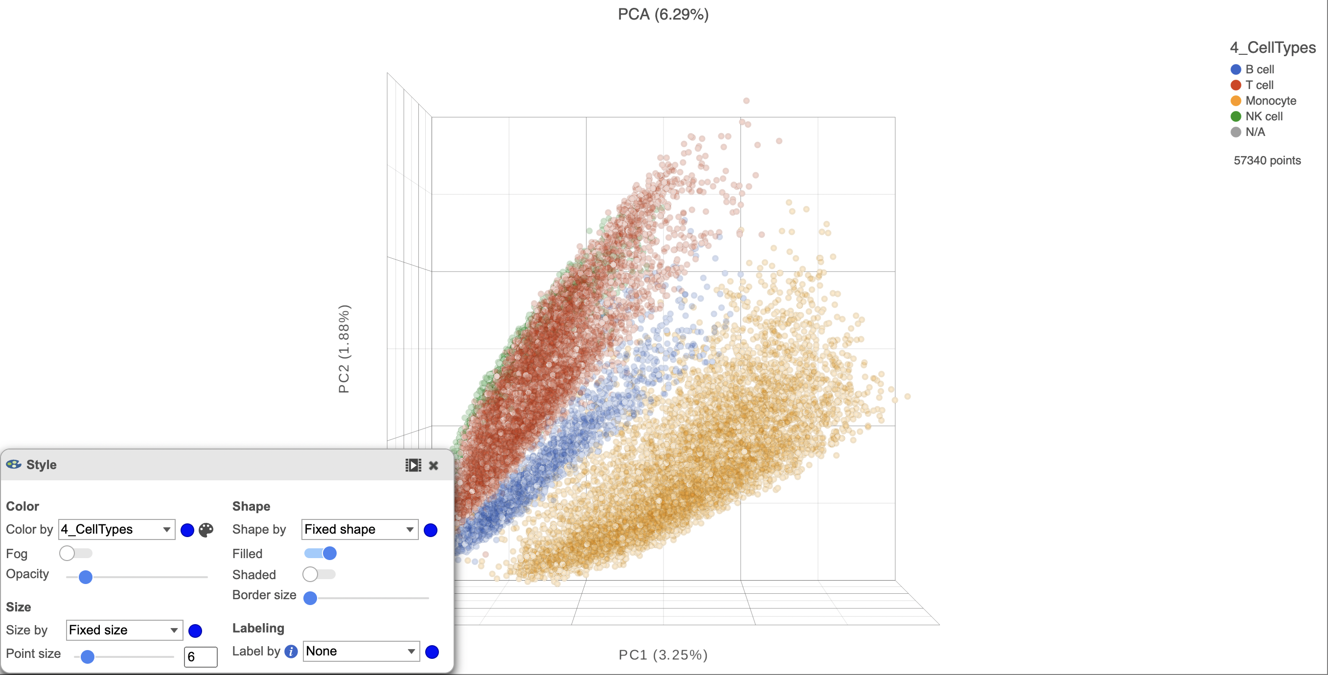 Figure 4. Adjusted opacity shows point density more accurately.
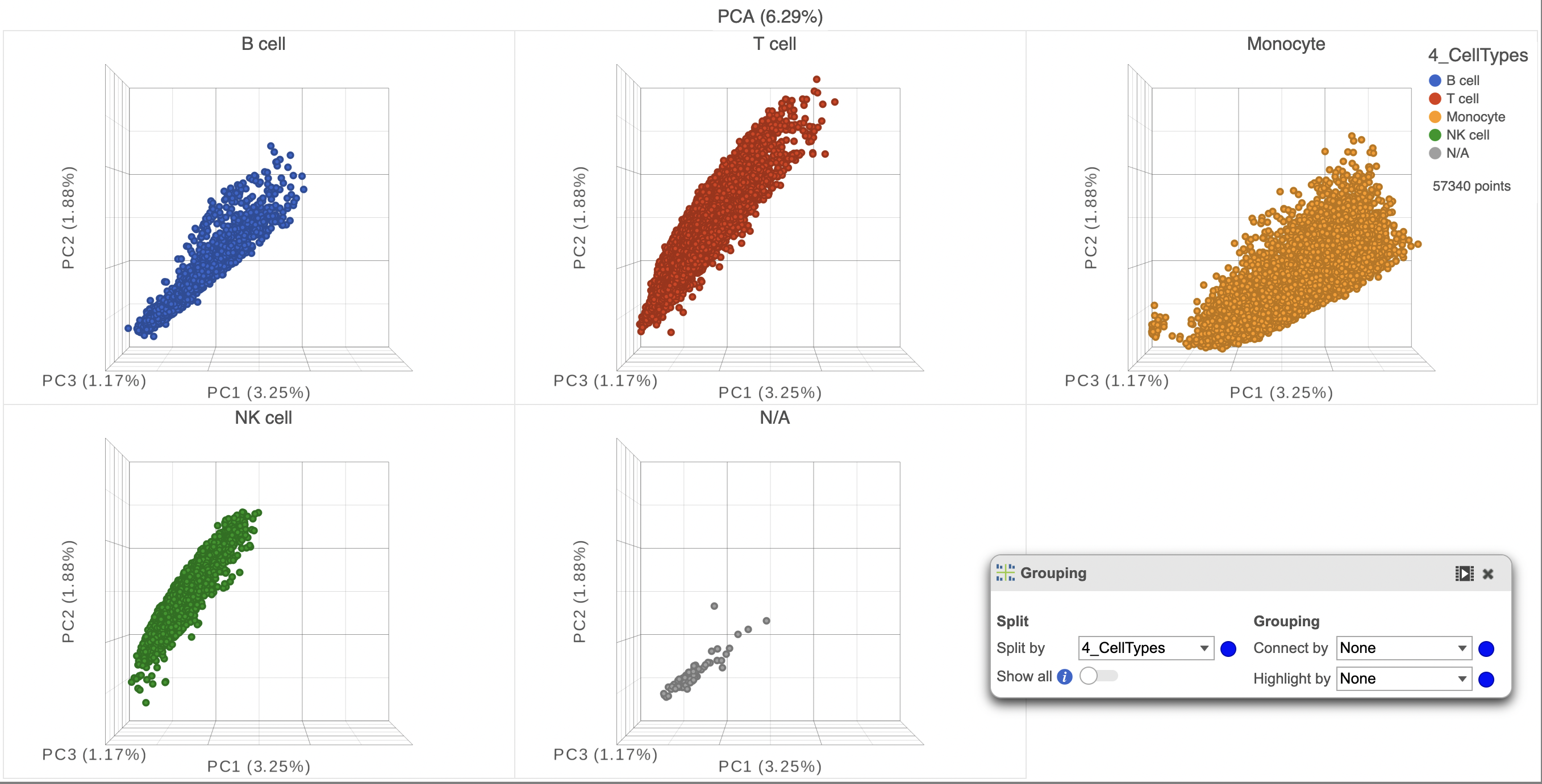 Figure 5. Splitting by an attribute can help better visualize their effect on the data.
ghjkl
Click the Save image button ![]() to save a PNG or SVG image to your computer.
to save a PNG or SVG image to your computer.
Click the Send to notebook button ![]() to send the image to a page in the Notebook.
to send the image to a page in the Notebook.
ghjkl
ghjkl
ghjkl
Additional Assistance
If you need additional assistance, please visit our support page to submit a help ticket or find phone numbers for regional support.
Overview
Content Tools