Page History
...
Once the analysis is complete, open the resulting Feature list data node. Navigate to the Gene list section of the page and click on the volcano plot icon, located above on the header of a Fold change column right of the table header (Figure 1).
| Numbered figure captions | ||||
|---|---|---|---|---|
| ||||
|

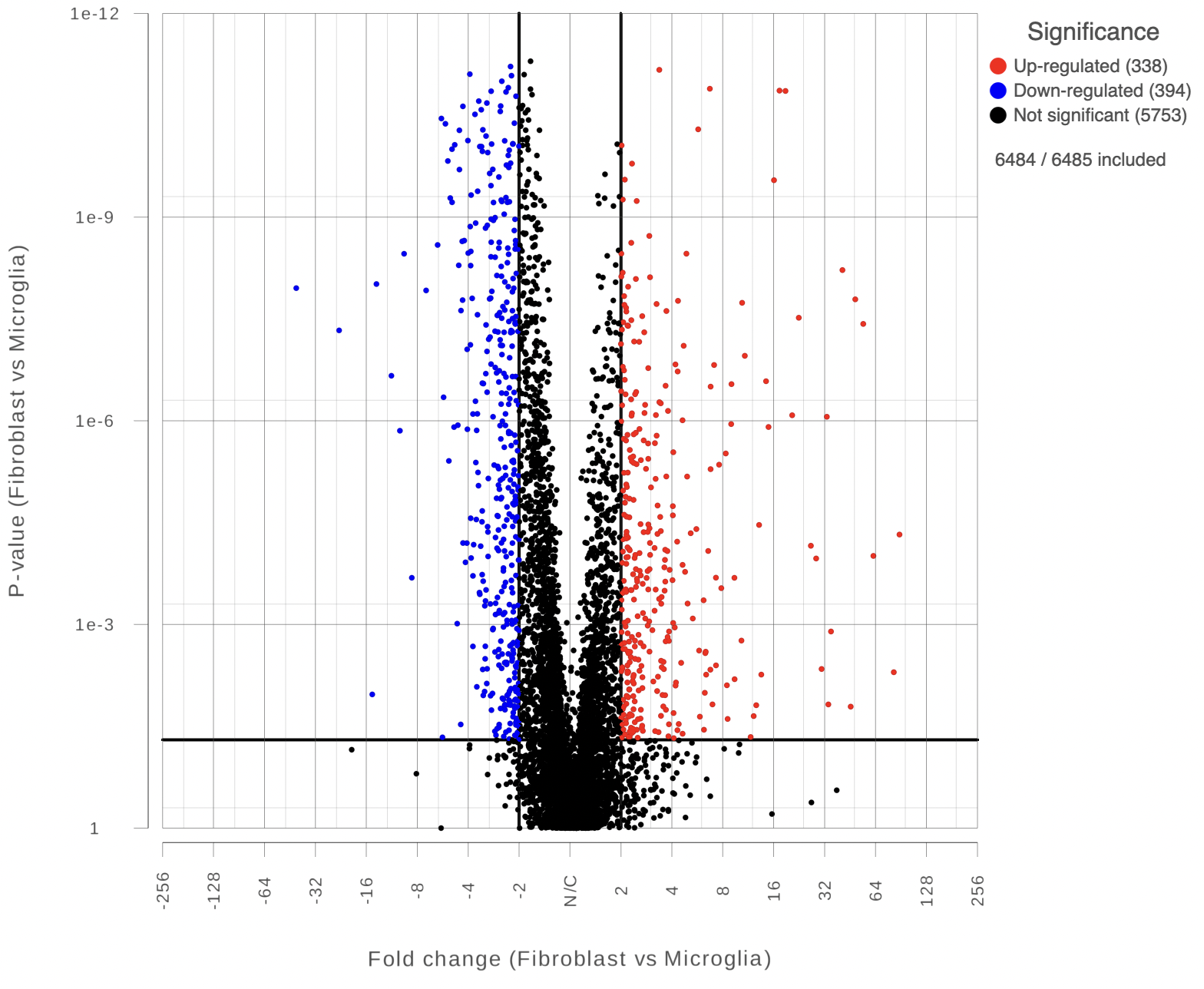
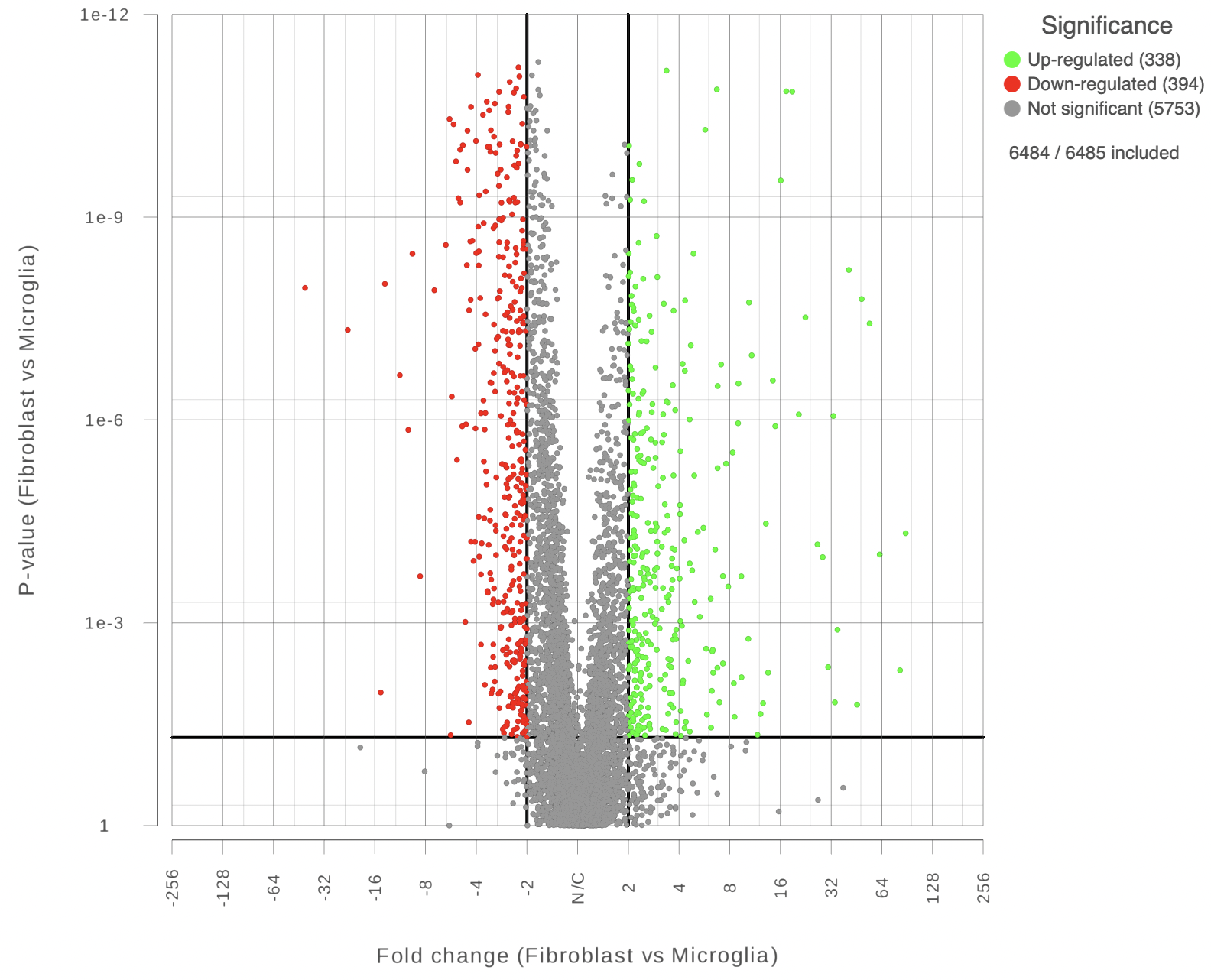
Each point on the plot represents the statistical result for a single feature (e.g gene, transcript etc). The black vertical and horizontal lines represent threshold of fold change and p-value respectively. By default the two vertical lines represent fold changes of -2 and +2, the horizontal line represents significant p-value of 0.05. The number of features that are up/down regulated by at least 2 fold and have a p-value less than 0.05 are at the upper-right and lower-left corner of the plot, they are highlighted in different colors. By default significantly up regulated features are in red, significantly down regulated features are in green. The remaining features are in grey (Figure 2). The plot header is derived from the name of the contrast.
| Numbered figure captions | ||||
|---|---|---|---|---|
| ||||
|
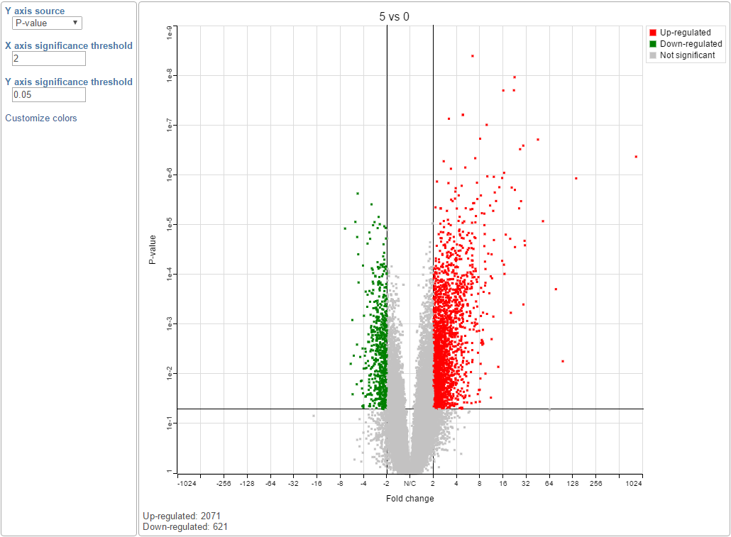
You can manually configure the Y axis source from the drop-down list and change the threshold of p-value and fold change, then the position of the lines and number of features in the significant areas will be updated accordingly. Click on the Customize colors can manually change the color of the dots (features) in the different areas.
...
| Numbered figure captions | ||||
|---|---|---|---|---|
| ||||
|
| |||
|
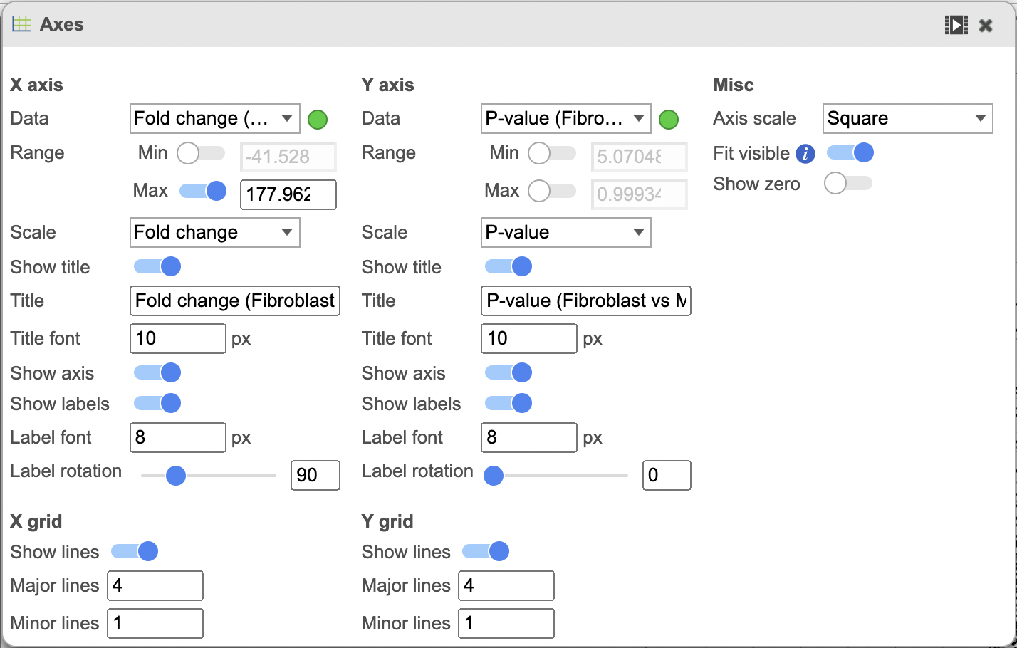
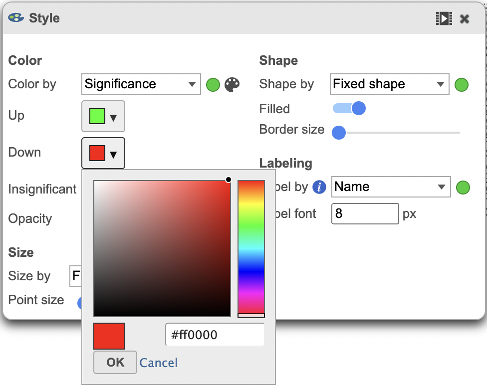
The colors can also be customised using the Style menu (Figure 4).
| Numbered figure captions | ||||
|---|---|---|---|---|
| ||||
|
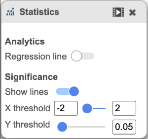
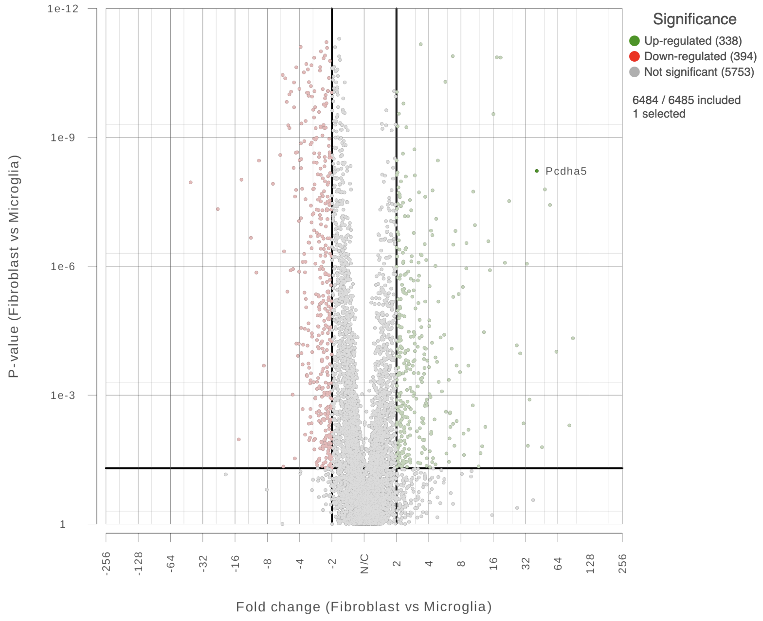
You can also highlight and label any of the genes in the plot (Figure 5).
| Numbered figure captions | ||||
|---|---|---|---|---|
| ||||
|
| Additional assistance |
|---|
| Rate Macro | ||
|---|---|---|
|
...
Overview
Content Tools