The Manhattan plot is a common way to visualize p-values or log-odds ratios for GWAS studies across genomic coordinates.
The starting point for a Manhattan plot is a spreadsheet with SNPs on rows and p-values or log-odds ratios in a column. If beginning with p-values, you will need to convert the p-values to -log10(p-value).
- Select the column with p-values
- Select Transform form the main toolbar
- Select Normalization & Scaling
- Select On Columns...
- In the Normalization tab, set Base of the Log(x + offset) to 10
- Select OK
- Go to Transform > Normalization & Scaling > On Columns... again
- Select the Add/Mul/Sub/Div tab
- Set Multiply by Constant to -1
- Select OK
The column now contains -log10(p-value).
We can now invoke the initial plot.
- Select View from the main toolbar
- Select Genome View
The Genome View tab will open. This plot will need to be configured.
- Select (
 ) from the plot command bar
 - Select the Profiles tab
- Remove any unwanted profiles
- Select Add profile
- Select Column
- Select the column with the -log10(p-value) or logs-odds ratio values from the drop-down menu
- Select Value for Color by
- Select point from the Style drop-down menu
- Select OK to add the profile
- Select OK to close the Configure Plot Properties dialog
The plot will now show a Manhattan plot (Figure 1).
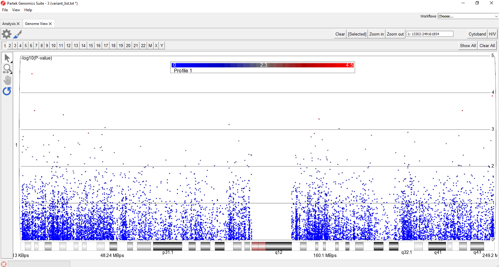 Figure 1. Customized Genome View showing genomic locations on the x-axis and -log10(P-values) of SNPs on the y-axis (Manhattten plot). Each dot represents a single SNP. The Cytoband is shown along the bottom of the plot
It is also possible to display multiple chromosomes at the same time.
Figure 1. Customized Genome View showing genomic locations on the x-axis and -log10(P-values) of SNPs on the y-axis (Manhattten plot). Each dot represents a single SNP. The Cytoband is shown along the bottom of the plot
It is also possible to display multiple chromosomes at the same time.
- Select Show All in the upper-right hand corner of the plot
This displays all chromosomes vertically. We can display them horizontally for a better view.
- Select
 to open the Configure Plot dialog
 - Select Genome in line for Layout
- Select OK
To further improve the genome-wide view, we can remove the cytoband, remove the genomic position label, color points by chromosome, and increase point size.
- Select Cytoband in the upper right-hand corner
- Select
- Deselect Show Base Pair Labels
- Select Profiles
- Select Configure
- Set Color By to a column with chromosome for each SNP/loci as a category
- Set Shape Size to 5.0
- Select OK to close the Configure Profile dialog
- Select OK to apply changes
The plot will appear as shown (Figure 2).
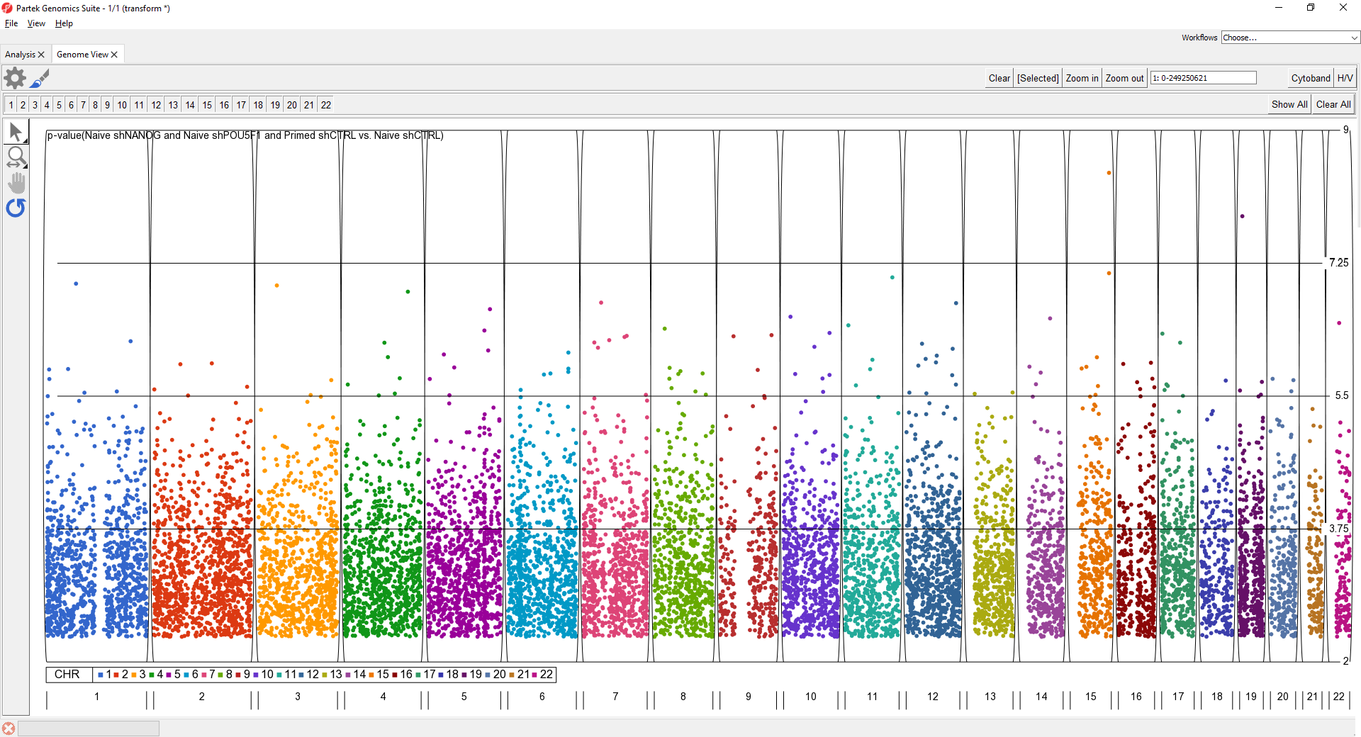
Figure 2. Full genome Manhattan plot
For details on Genome View see Chapter 6: The Pattern Visualization System in the Partek User's Manual.
Additional Assistance
If you need additional assistance, please visit our support page to submit a help ticket or find phone numbers for regional support.


| Your Rating: |
|
Results: |

|
34 | rates |
Overview
Content Tools