What is the Correlation plot?
The Correlation plot is used to visualize the relationship between feature and numeric attribute values for each sample or cell. The y-axis is the feature and the x-axis is the numeric attribute. Points on the plot are cells or samples.
Viewing the Correlation plot
The correlation plot is available on Correlation analysis and ANOVA/LIMMA-trend/LIMMA-voom (if a numeric attribute is included) task reports.
- Click the View correlation plot button
 in the View column of the task report (Figure 1)
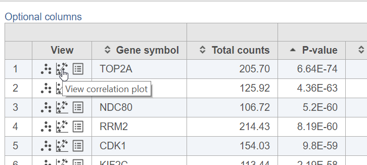
Figure 1. Opening a correlation plot
Configuring the Correlation plot
The correlation plot can be configured using the control panel to the left of the plot (Figure 2).
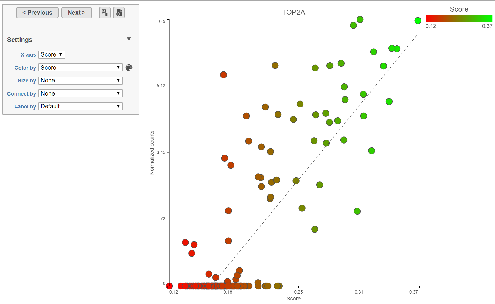
Figure 2. Correlation plot
The points on the plot are the cells or samples.
The feature ID is shown in the plot title.
The x-axis is the selected numeric attribute.
The y-axis is the normalized counts for the feature.
The points can be colored, sized, connected, and labeled using the drop-down menus in the control panel. By default, the points are colored by the first numeric attribute.
To switch the numeric attribute on the x-axis, use the X-axis drop-down menu.
The linear regression line is shown on the plot as a grey dashed line.
Click < Previous and Next > to move up and down the table.
Click the Save image button ![]() to save a PNG or SVG image to your computer.
to save a PNG or SVG image to your computer.
Click the Send to notebook button ![]() to send the image to a page in the Notebook.
to send the image to a page in the Notebook.
Additional Assistance
If you need additional assistance, please visit our support page to submit a help ticket or find phone numbers for regional support.


| Your Rating: |
|
Results: |

|
10 | rates |
Overview
Content Tools