The XY plot / bar chart displays the intensity of one probe(set)/gene across two categorical variables. Only one probe(set)/gene may be visualized at a time.
Invoking from a gene list
We will invoke an XY plot from a gene list child spreadsheet with genes on rows. The parent spreadsheet should include the categorical variables you want to chart.
- Right-click on the row header of the gene you want to visualize
- Select XY Plot (Orig. Data) from the pop-up menu (Figure 1)
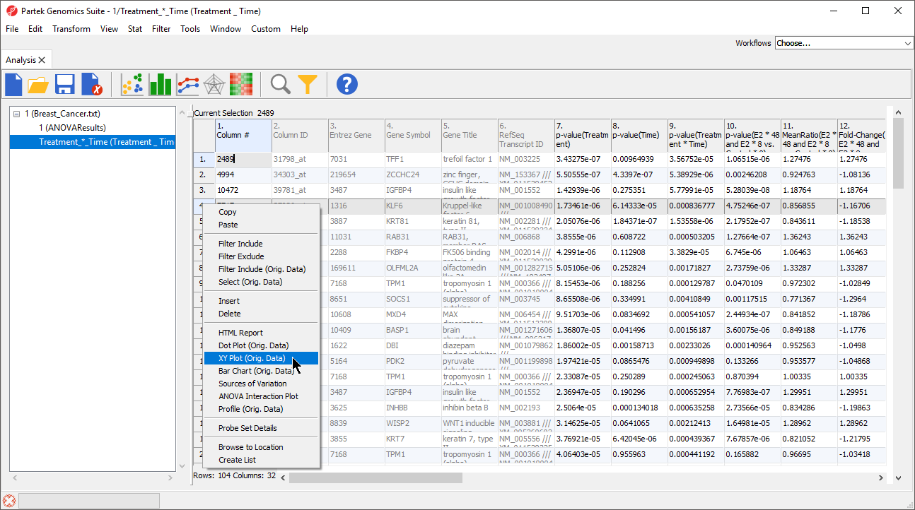
Figure 1. Invoking an XY Plot from a gene list child spreadsheet
An XY plot will be displayed in a new tab (Figure 2).
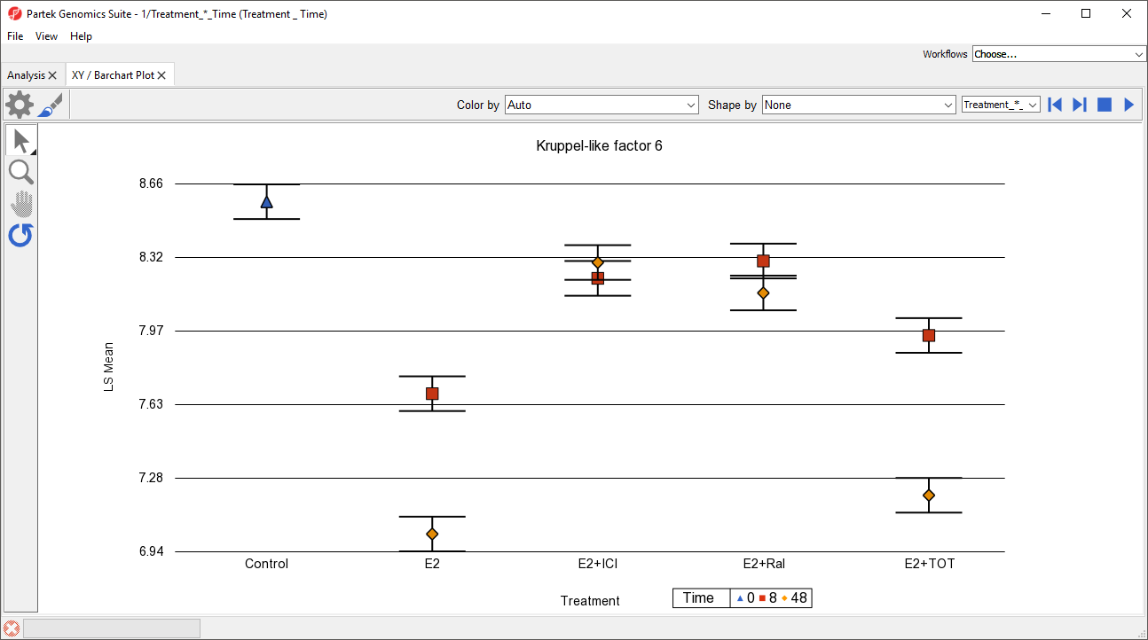 Figure 2. By default, an XY plot invoked from a gene list will have the first categorical variable as columns and the second categorical variable as shapes/colors
To display the change in gene expression over time for each treatment condition, we need to modify this plot.
Figure 2. By default, an XY plot invoked from a gene list will have the first categorical variable as columns and the second categorical variable as shapes/colors
To display the change in gene expression over time for each treatment condition, we need to modify this plot.
- Select (
 ) from the plot command bar
 - Set X-Axis to 3. Time using the drop-down menu
- Set Separate by to 2. Treatment using the drop-down menu
- Select OK
To help visualize the connection between time points, we can add connecting lines.
- Select (
 ) from the plot command bar
 - Set Plot Style to lines using the drop-down menu
- Select OK
The plot now shows time on the x-axis, plots treatments, and connects treatments across time points with lines (Figure 3). Each point is the LS mean value of all samples with the same values for the two selected categorical variables. The error bars are standard error.
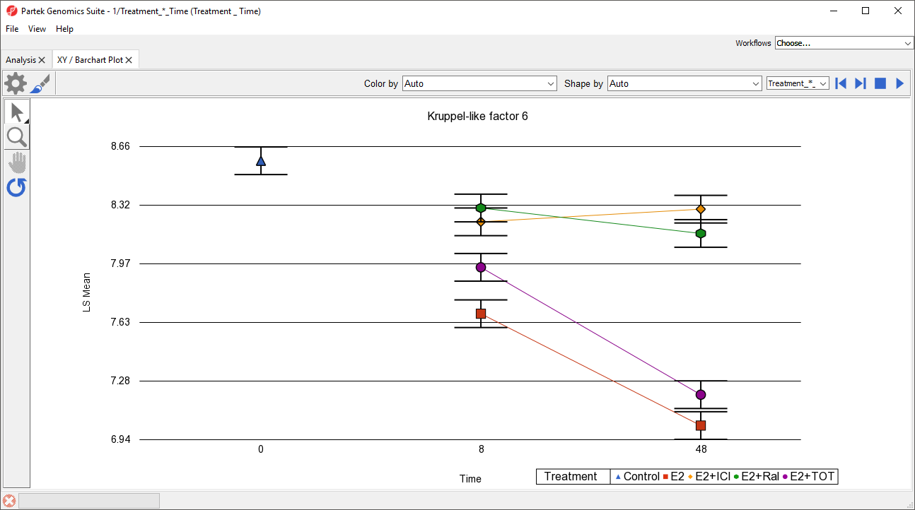
Figure 3. Modifying the XY plot to enable analysis of gene expression changes in a treatment condition over a time course. In this experiment, only the control was measured at time 0.
While most of the plot controls are shared with dot plot, XY plot does have a few unique options.
- Select (
 ) to automatically cycle through each row (gene) in the source spreadsheet
 - Select (
 ) to stop the cycling
This feature is useful when performing visual analysis of patterns in gene expression changes in a list of genes.
The drop-down menu adjacent to the previous/next (![]() ) controls lets you switch source spreadsheets.
) controls lets you switch source spreadsheets.
Lines, but not points, can be selected when using Selection Mode (![]() ).
).
Invoking from the parent spreadsheet
It is also possible to invoke an XY plot from the parent spreadsheet using the main toolbar.
- Select the parent spreadsheet in the spreadsheet tree
- Select View from the main toolbar
- Select XY Plot / Bar Chart ...
The Create XY Plot / Barchart dialog will open (Figure 4).
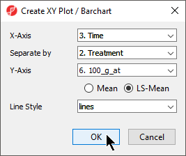
Figure 4. Invoking an XY Plot from the main toolbar
An XY plot will be displayed in a new tab (Figure 5).
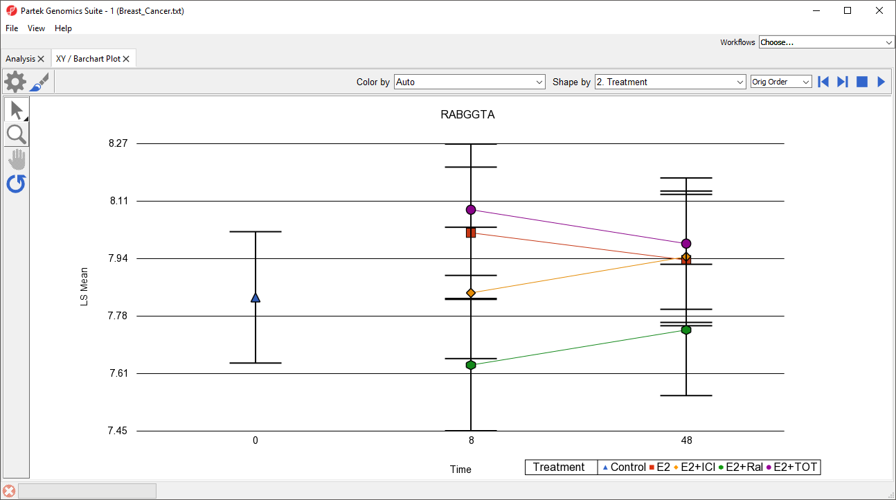
Figure 5. The gene name associated with the probe(set) column is displayed as the chart title by default
Selecting previous/next (![]() ) will nagivate along either rows or columns, whichever has probe(set)/gene information.
) will nagivate along either rows or columns, whichever has probe(set)/gene information.
To switch this plot from to one of the gene lists we have created, we can use the drop-down menu next to the previous/next controls.
Bar Chart Plots
The displayed by a XY plot can instead be displayed as a bar chart with overlayed bars, vertically stacked bars, or horizontally stacked bars. A bar chart can be directly invoked or an XY plot can be converted into a bar chart (and vice versa).
- Invoke the plot from a gene list using the Bar Chart (Orig. Data) option in the pop-up menu (Figure 1)
- Invoke the plot from the main toolbar by selecting one of the bar chart options in the Line Style drop-down menu (Figure 4)
- Invoke the plot as an XY plot, select (), then select one of the bar chart options from the Plot Style drop-down menu in the Plot Rendering Properties dialog (Figure 6)
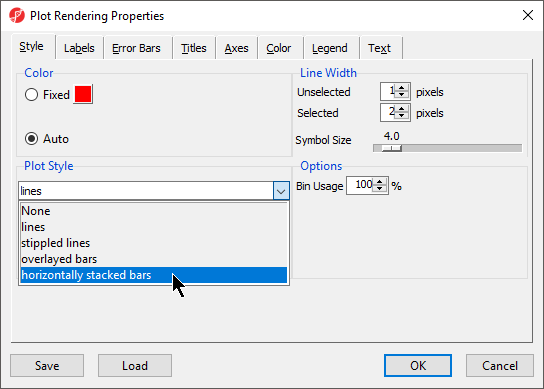
Figure 6. An XY Plot can be converted to a Barchart using the Plot Rendering Properties dialog
Additional Assistance
If you need additional assistance, please visit our support page to submit a help ticket or find phone numbers for regional support.


| Your Rating: |
|
Results: |

|
0 | rates |
Overview
Content Tools