The primary use of the dot plot is visualizing intensity values across samples.
We will invoke a dot plot from a gene list child spreadsheet with genes on rows.
- Right-click on the row header of the gene you want to visualize
- Select Dot Plot from the pop-up menu (Figure 1)
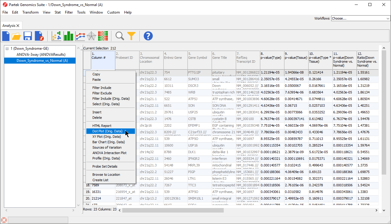
Figure 1. Creating a dot plot of gene intensity values
A dot plot will be displayed in a new tab (Figure 2).
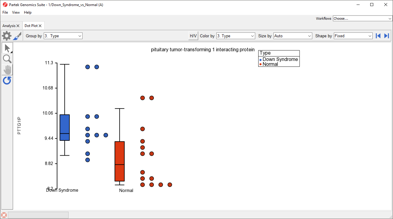
Figure 2. Simple dot plot of a single gene that shows the distribution of intensities across all samples
There are many customizations that can be made to this simple plot.
- Select Configure Plot (
 ) from the plot command bar to launch the Configure Plot dialog (Figure 3).
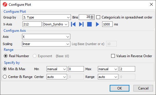
Figure 3. Configuring the data shown on the plot
The Configure Plot dialog lets you change how the data is displayed on the plot. We will make a change to illustrate the possibilities.
- Set Group by to 4. Tissue using the drop-down menu
This allows us to group the samples by any categorical attribute. These attributes are specified in the parent spreadsheet.
- Select OK to modify the plot
We could also have changed the grouping of samples using the Group by drop-down menu above the plot.
The order of the group columns is alphabetical by default, but can be changed to match the spreadsheet order by selecting Categoricals in spreadsheet order in the Configure Plot dialog (Figure 3).
- Select Plot Properties (
 ) from the plot command bar to launch the Plot Properties dialog (Figure 4)
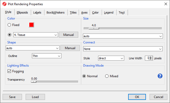
Figure 4. Changing the appearance of a dot plot using the plot properties dialog
The Plot Properties dialog lets you change the appearance of the plot. We will make a few changes to illustrate the possibilities.
- Set Shape to 3. Type using the drop-down menu
- Select the Box&Whiskers tab
- Set Box Width to 15 pixels
- Select the Titles tab
- Set X-Axis under Configure Axes Titles to Tissue
- Select OK to modify the plot
Alternately, we chould have changed the shapes using the Shape by drop-down menu above the plot. The dot plot now shows four columns with thinner box and whisker plots for each and different shapes for different sample types (Figure 5).
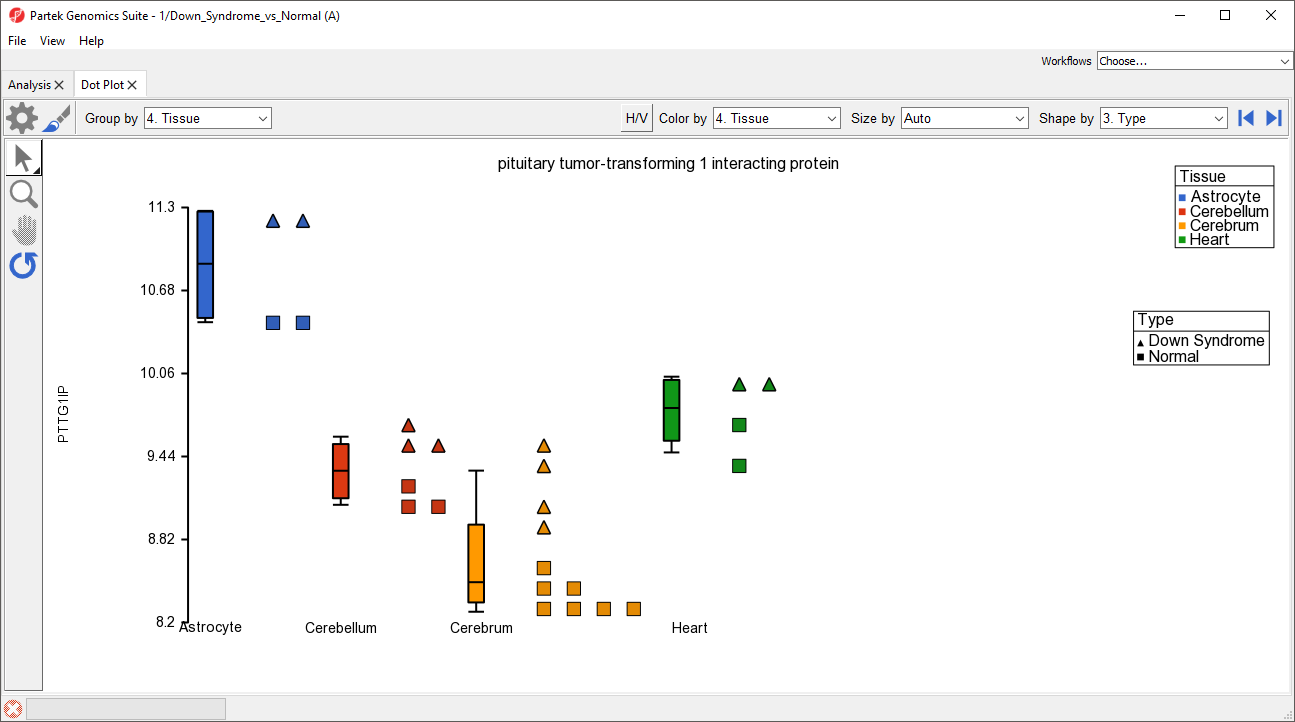
Figure 5. The Dot Plot can be modified to optimally visualize your data
Like many visualizations in Partek Genomics Suite, the dot plot is interactive.
- Select (
 ) to activate Selection Mode
Legends can now be dragged and dropped to new locations on the plot. Samples can be selected by left-clicking the sample or left-clicking and dragging a box around samples.
- Select (
 ) to activate Zoom Mode
Left clicking on a region will zoom in on it. The zoom level can be reset by selecting (![]() ).
).
- After zooming in, select (
 ) to activate Pan Mode
Left-click and drag to move around the plot.
- Select (
 ) to move between rows on the source spreadsheet
 - Select (
 ) to swap the horizontal and vertical axes
Additional Assistance
If you need additional assistance, please visit our support page to submit a help ticket or find phone numbers for regional support.


| Your Rating: |
|
Results: |

|
34 | rates |
Overview
Content Tools