The volcano plot is a special 2-D scatter plot used to visualize significance and the magnitude of changes in features (e.g. genes or transcripts) within a given comparison. By convention, the X-axis represents the fold change between the two groups and is on a log2 scale. On the other hand, the Y-axis shows negative log10 of the p-values from the statistical test of the comparison.
As a prerequisite for invoking the volcano plot, you must run a Differential gene expression analysis. When setting-up the analysis, include all relevant contrasts you would like to view the volcano plots for.
Once the analysis is complete, open the resulting Feature list data node. Navigate to the Gene list section of the page and click on the volcano plot icon, located on the right of the table header (Figure 1).
 Figure 1. Invoking a volcano plot from a Feature list data node
Each point on the plot represents the statistical result for a single feature (e.g gene, transcript etc). The black vertical and horizontal lines represent threshold of fold change and p-value respectively. By default the two vertical lines represent fold changes of -2 and +2, the horizontal line represents significant p-value of 0.05. The number of features that are up/down regulated by at least 2 fold and have a p-value less than 0.05 are at the upper-right and lower-left corner of the plot, they are highlighted in different colors. By default significantly up regulated features are in red, significantly down regulated features are in green. The remaining features are in grey (Figure 2). The plot header is derived from the name of the contrast.
Figure 1. Invoking a volcano plot from a Feature list data node
Each point on the plot represents the statistical result for a single feature (e.g gene, transcript etc). The black vertical and horizontal lines represent threshold of fold change and p-value respectively. By default the two vertical lines represent fold changes of -2 and +2, the horizontal line represents significant p-value of 0.05. The number of features that are up/down regulated by at least 2 fold and have a p-value less than 0.05 are at the upper-right and lower-left corner of the plot, they are highlighted in different colors. By default significantly up regulated features are in red, significantly down regulated features are in green. The remaining features are in grey (Figure 2). The plot header is derived from the name of the contrast.
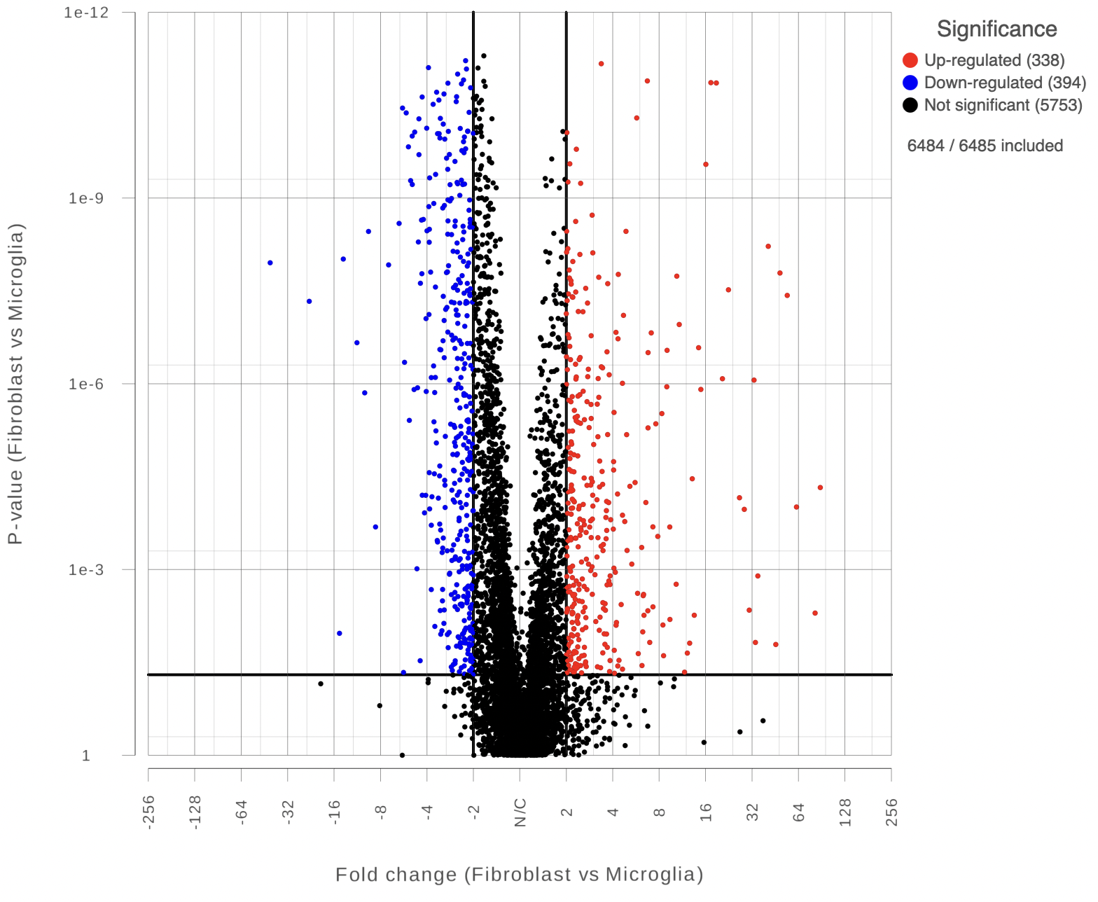 Figure 2. Volcano plot: each dot on the plot is a single gene/transcript/feature. Horizontal axis: fold change; vertical axis: p-value (in log10 scale). Colour coding is based on the fold change. Thick vertical lines highlight fold changes of -2 and +2, while a thick horizontal line represents a p-value of 0.05
You can manually configure the Y axis source from the drop-down list and change the threshold of p-value and fold change, then the position of the lines and number of features in the significant areas will be updated accordingly. Click on the Customize colors can manually change the color of the dots (features) in the different areas.
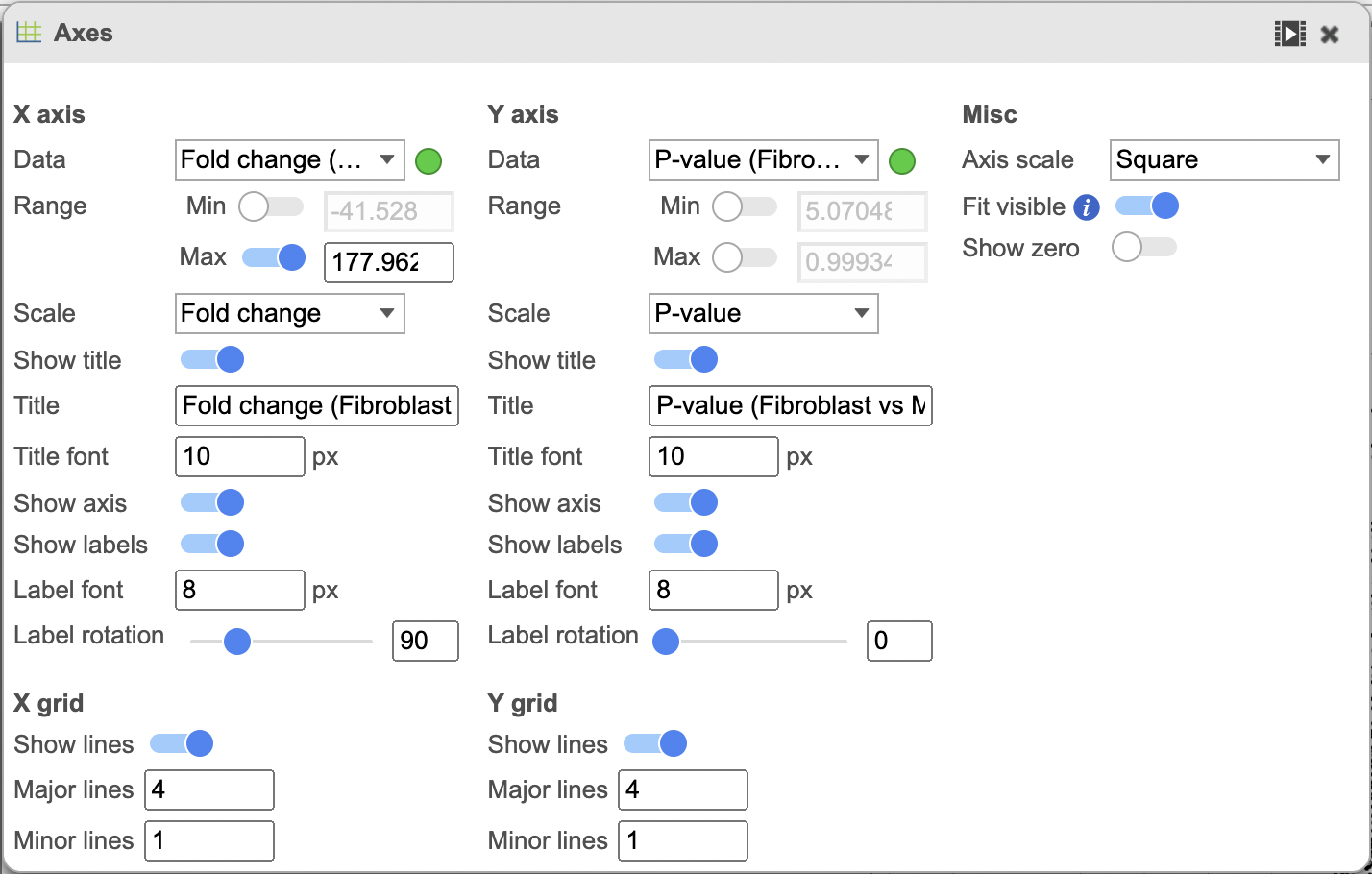
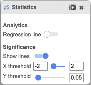 Figure 3. The plot can be configured using the menus on the right.
The colors can also be customised using the Style menu (Figure 4).
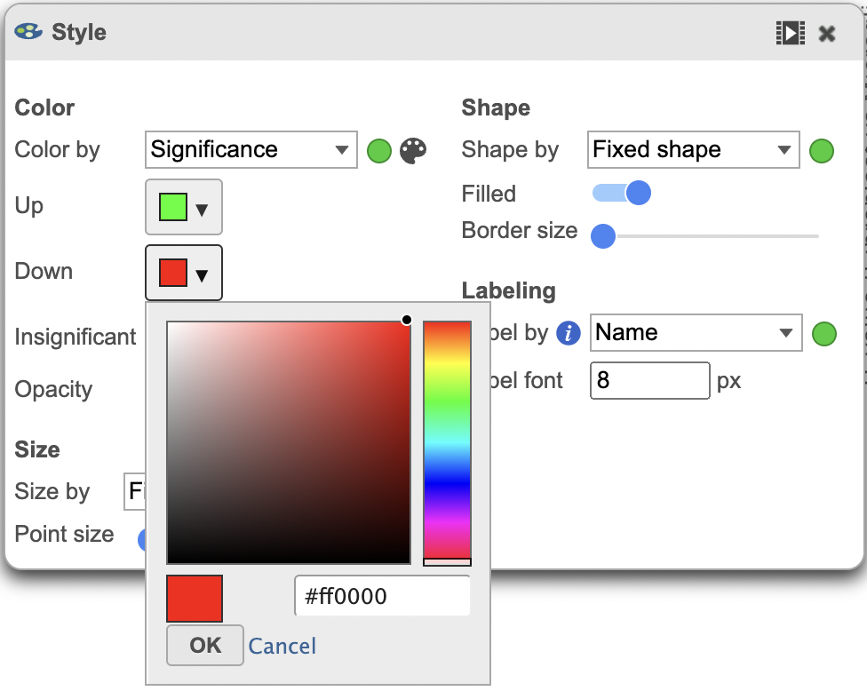
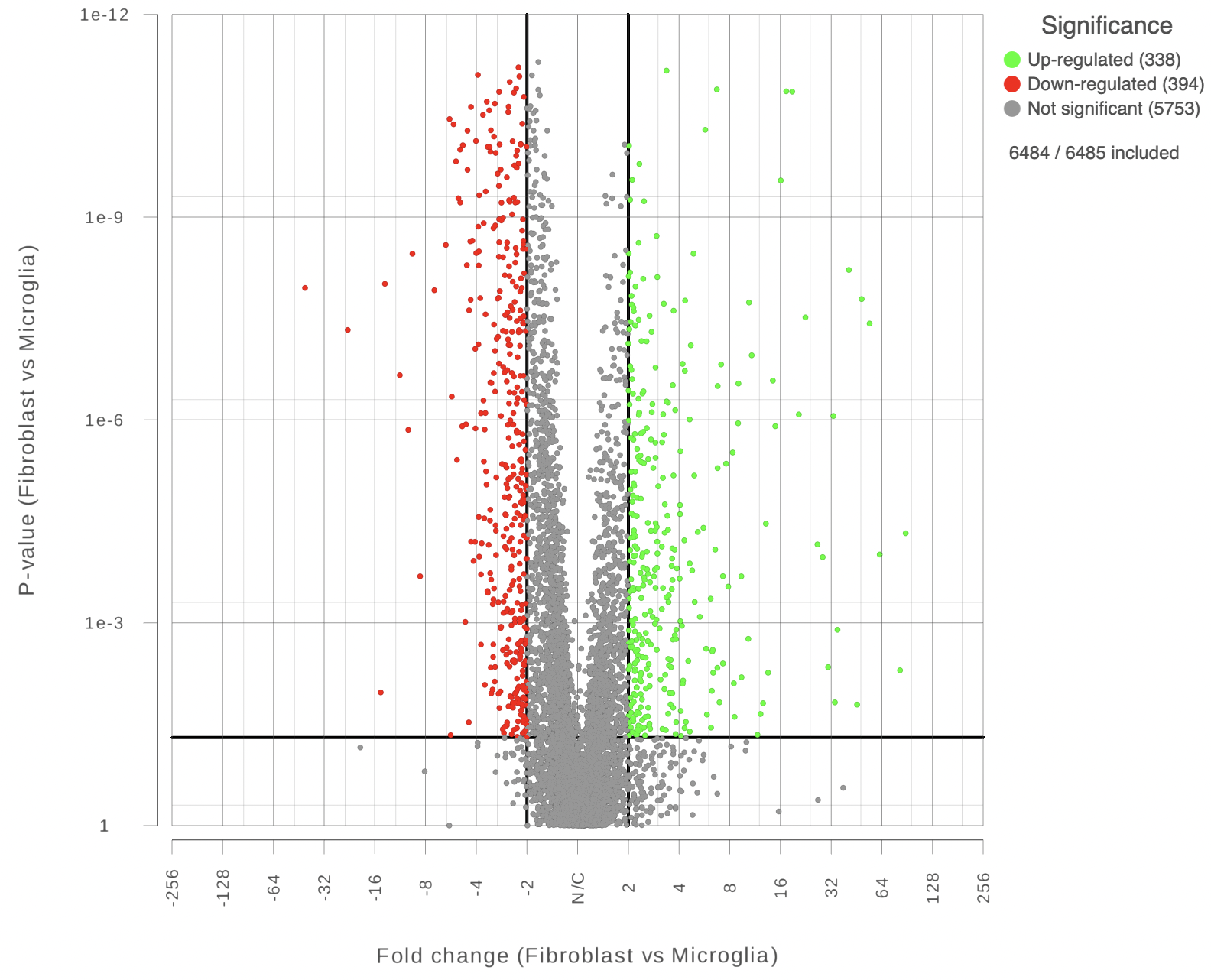 Figure 4. Volcano plot with a customized color scheme.
You can also highlight and label any of the genes in the plot (Figure 5).
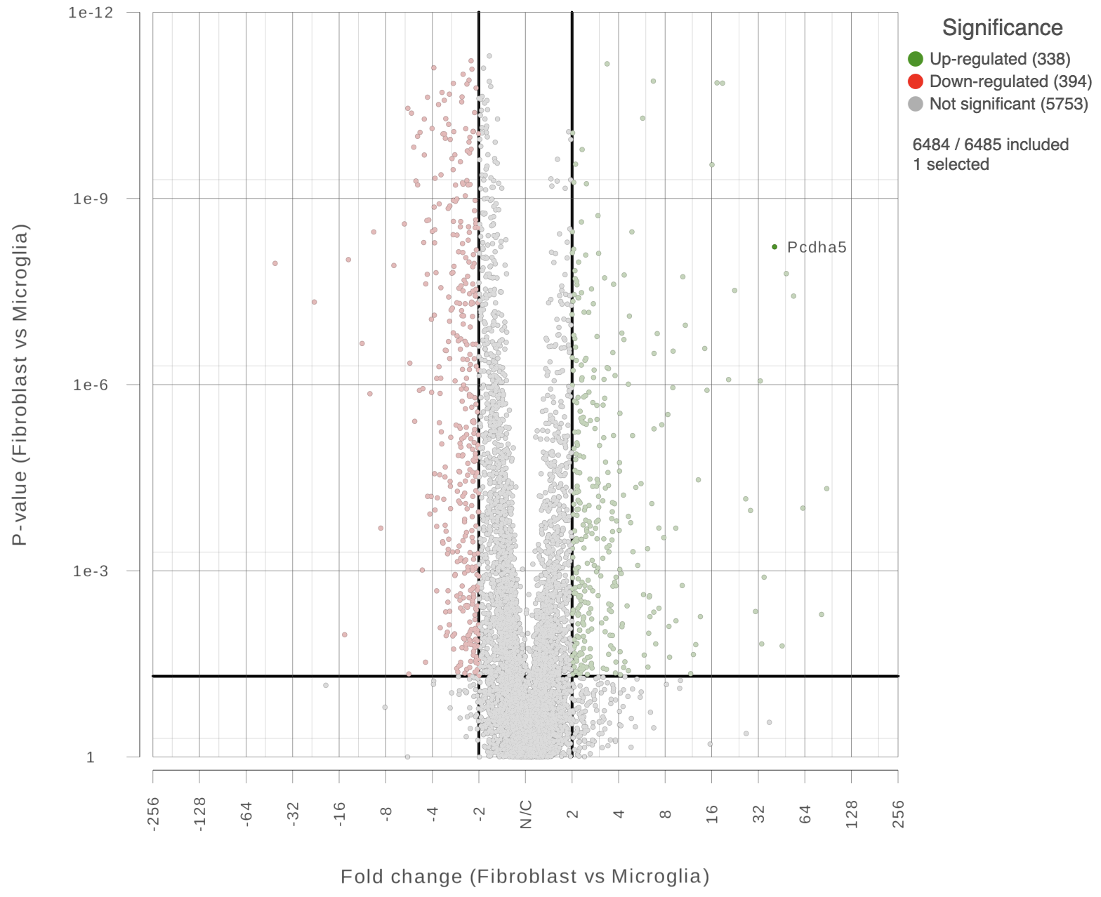 Figure 5. Easily highlight any gene by clicking on it directly.
Additional Assistance
If you need additional assistance, please visit our support page to submit a help ticket or find phone numbers for regional support.


| Your Rating: |
|
Results: |

|
0 | rates |
Overview
Content Tools