Filter Groups
Because we have classified our cells, we can now filter based on those classifications. This can be used to focus on a single cell type for re-clustering and sub-classification or to exclude cells that are not of interest for downstream analysis.
- Click the Classified result data node
- Click Filtering
- Click Filter groups
- Set to exclude Cell type is Doublets using the drop-down menus
- Click AND
- Set the second filter to exclude Cell type is N/A using the drop-down menus
- Click Finish to apply the filter (Figure ?)
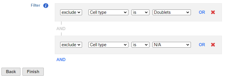 Figure 1. Set up the Filter groups task to exlcude Doublets and cells that are not classified
This produces a Filtered counts data node (Figure ?).
Figure 1. Set up the Filter groups task to exlcude Doublets and cells that are not classified
This produces a Filtered counts data node (Figure ?).
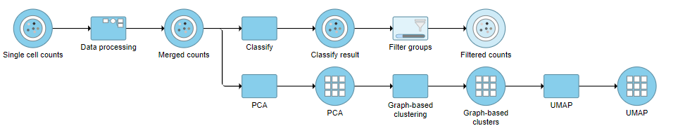 Figure 2. Filter groups output
Re-split the Matrix
For this tutorial, we will re-split the protein and gene expression data prior to performing differential analysis. This is useful if you want to perform differential analysis and downstream analysis separately for each feature type. The split data nodes will both retain cell classification information.
For your own analyses, re-splitting the data is optional. You could just as well continue with differential analysis with the merged data if you prefer.
- Click the Classified groups data node
- Click Pre-analysis tools
- Click Split matrix
This will produce two data nodes, one for each data type (Figure ?)
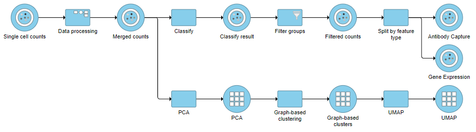 Figure 3. It is possible to re-split the merged matrix once again
Differential Analysis and Visualization - Protein Data
Once we have classified our cells, we can use this information to perform comparisons between cell types or between experimental groups for a cell type. In this project, we only have a single sample, so we will compare cell types.
- Click the Antibody Capture data node
- Click Differential analysis
- Click GSA
The first step is to choose which attributes we want to consider in the statistical test.
- Check Cell type to include it in the statistical test
- Click Next
Next, we will set up the comparison we want to make. Here, we will compare the Activated and Mature B cells.
- Check Activated B cells in the top panel
- Check Mature B cells in the bottom panel
- Click Add comparison
The comparison should appear in the table as Activated B cells vs. Mature B cells.
- Click Finish to run the statistical test (Figure ?)
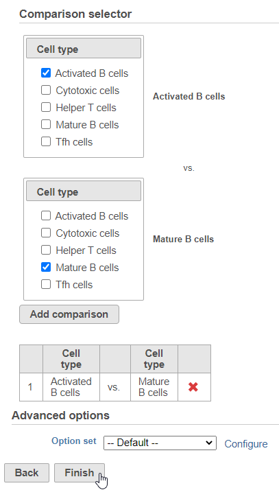 Figure 4. Setting up a comparison for differentially expressed proteins
The GSA task produces a GSA data node.
Figure 4. Setting up a comparison for differentially expressed proteins
The GSA task produces a GSA data node.
- Double-click the GSA data node to open the task report
The report lists each feature tested, giving p-value, false discovery rate adjusted p-value (FDR step up), and fold change values for each comparison (Figure ?)
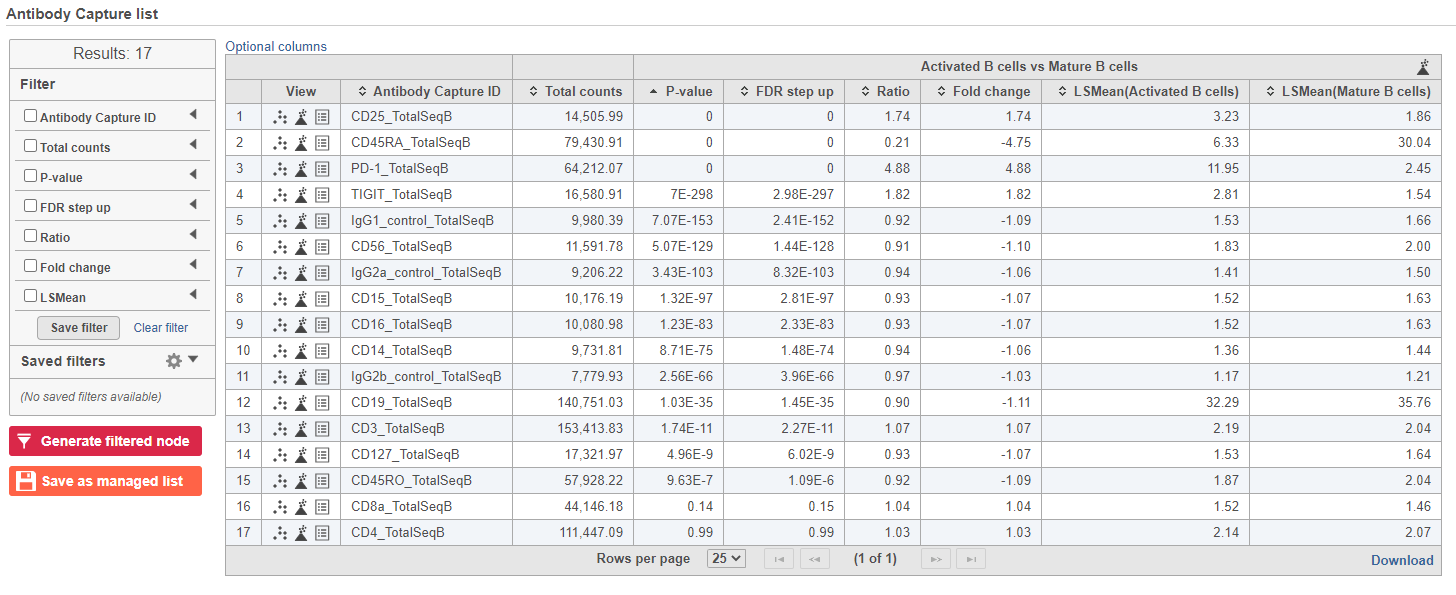 Figure 5. GSA report for protein expression data
In addition to the listed information, we can access dot and violin plots for each gene or protein from this table.
Figure 5. GSA report for protein expression data
In addition to the listed information, we can access dot and violin plots for each gene or protein from this table.
- Click
 in the CD45RA_TotalSeqB row
This opens a dot plot in a new data viewer session, showing CD45A expression for cells in each of the classifications (Figure ?)
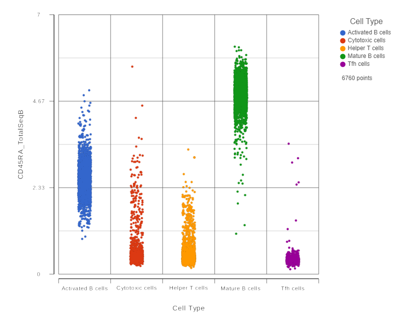 Figure 6. CD45RA dot plot for all cells
We can use the Configuration panel on the left to edit this plot.
- Expand the Summary card
- Switch on Violins
- Switch on Overlay
- Switch on Colored
- Expand the Data card
- Use the slider to increase the Jitter
- Expand the Color card
- Use the slider to decrease the Opacity (Figure ?)
 Figure 7. Use the Configuration panel to configure the dot plot
- Click the project name to return to the Analyses tab
To visualize all of the proteins at the same time, we can make a hierarchical clustering heat map.
- Click the GSA data node
- Click Exploratory analysis in the toolbox
- Click Hierarchical clustering/heat map
- Check Samples at the top to cluster the cells in addition to features
- Click Finish to run with other default settings
- Double-click the Hierarchical clustering task node to open the heat map (Figure ?)
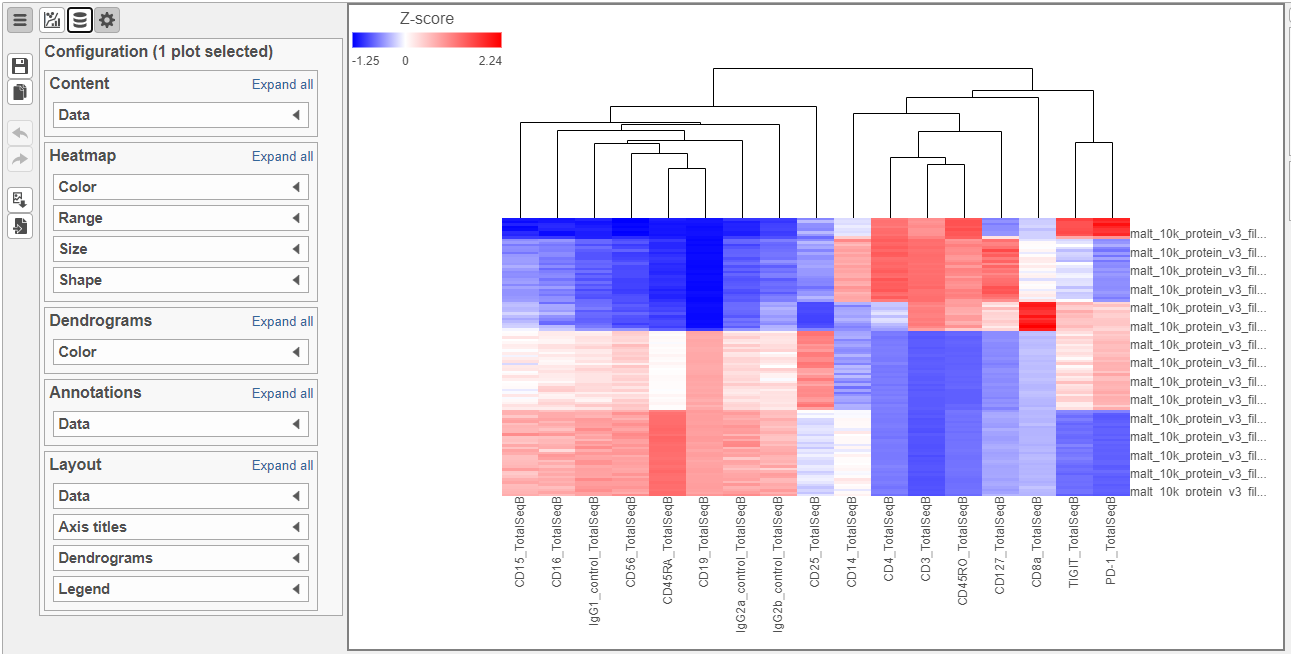 Figure 8. Heatmap showing expression of protein markers before configuration
The heat map can easily be customized to illustrate our results.
- Click
 to transpose the heat map
 - Set High to 2.6 to match the low range
- Set the Sample dendrogram to By sample attribute Cell type
- Set Attributes to Cell type
- Click
 and set Rotation to 0
 - Uncheck Samples under Show labels
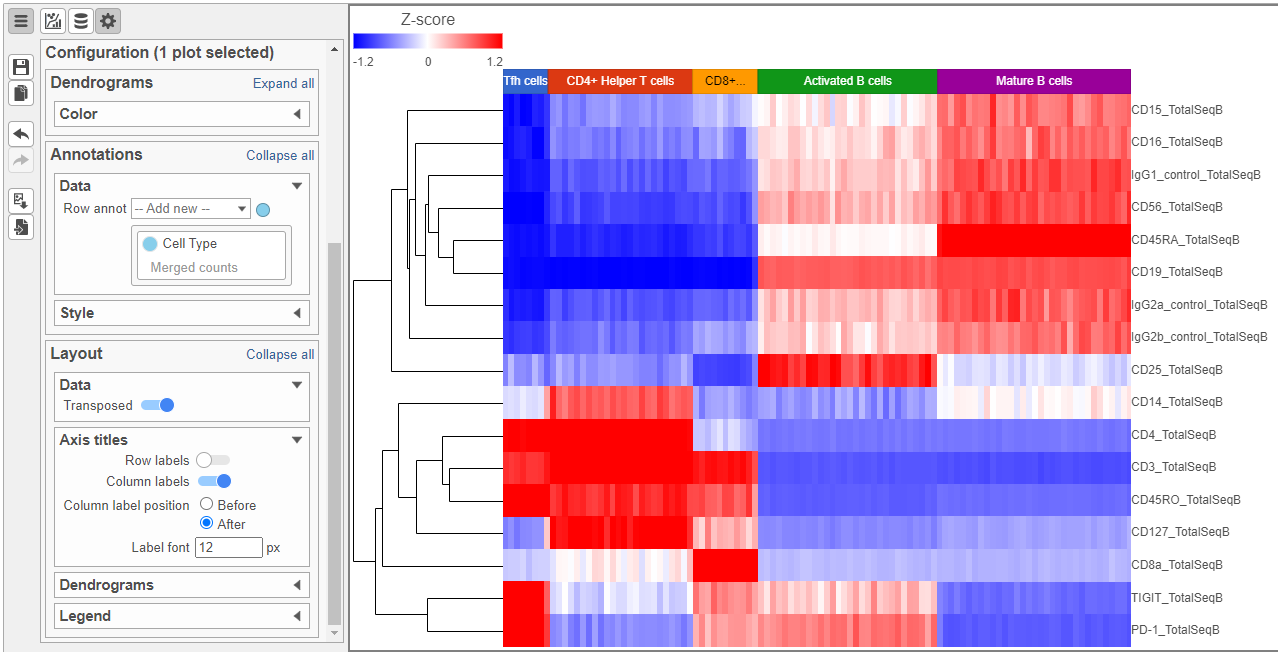 Figure 9. Heatmap showing expression of protein markers after configuration
Differential Analysis, Visualization, and Pathway analysis - Gene Expression Data
Additional Assistance
If you need additional assistance, please visit our support page to submit a help ticket or find phone numbers for regional support.


| Your Rating: |
|
Results: |

|
0 | rates |
Overview
Content Tools