In contrast to the dot plot which shows one probe(set)/gene per plot, the profile plot is used to visualize how the intensity values from multiple genes compare across all samples.
We will invoke a Profile Plot from a gene list child spreadsheet with genes on rows.
- Select the rows to be visualized
- Right-click on a row header of one of the selected rows
- Select Profile Plot (Orig. Data) from the pop-up menu (Figure 1)
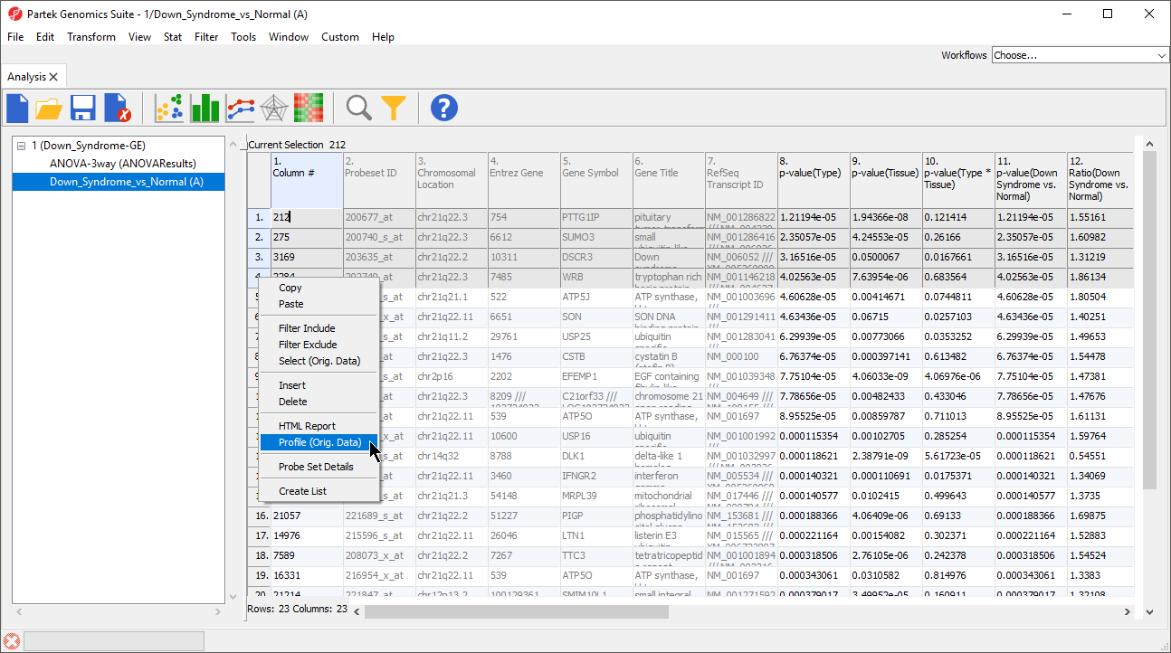
Figure 1. Selecting Profile Plot for selected rows
The profile plot will be displayed in a new tab (Figure 2). Lines are probe(sets)/genes and columns are rows/samples from the parent spreadsheet.
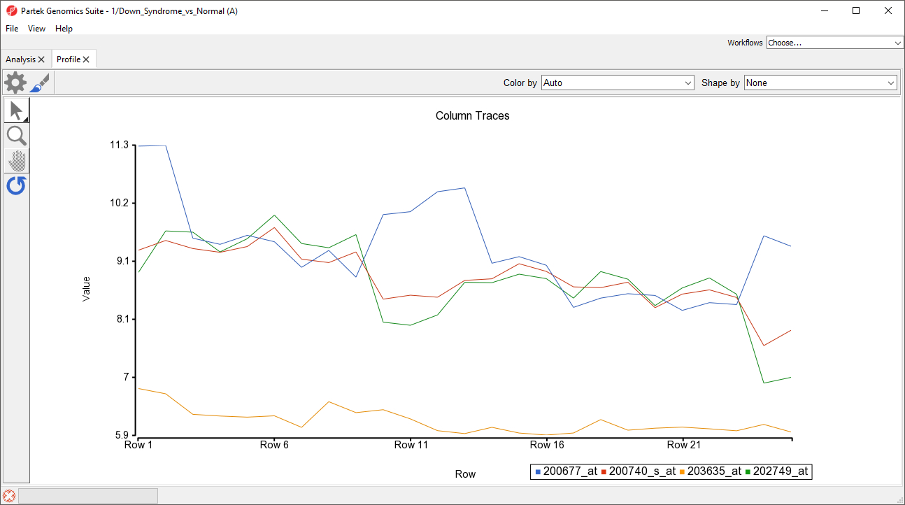
Figure 2. Basic profile plot. Each line represents a different prob(set)/gene; each column represents a sample from the parent spreadsheet
A basic profile plot will likely need customization. The plot configuration, properties, and control options are the same as in Dot Plot. We will illustrate a few modifications here.
We can change the row labels to show each sample ID.
- Select (
 )
) - Select the Axes tab
- Set Grid to 1
- Select Rotate X-Axis Labels and set to 90 degrees (rotates counter-clockwise)
- Set Label Format to Column and select 5. Subject
We can add symbols to show which group each sample belongs to.
- From the Shape by drop-down menu, select 3.Type
- Select OK
Symbols have now been added to each profile line plot (Figure 3).
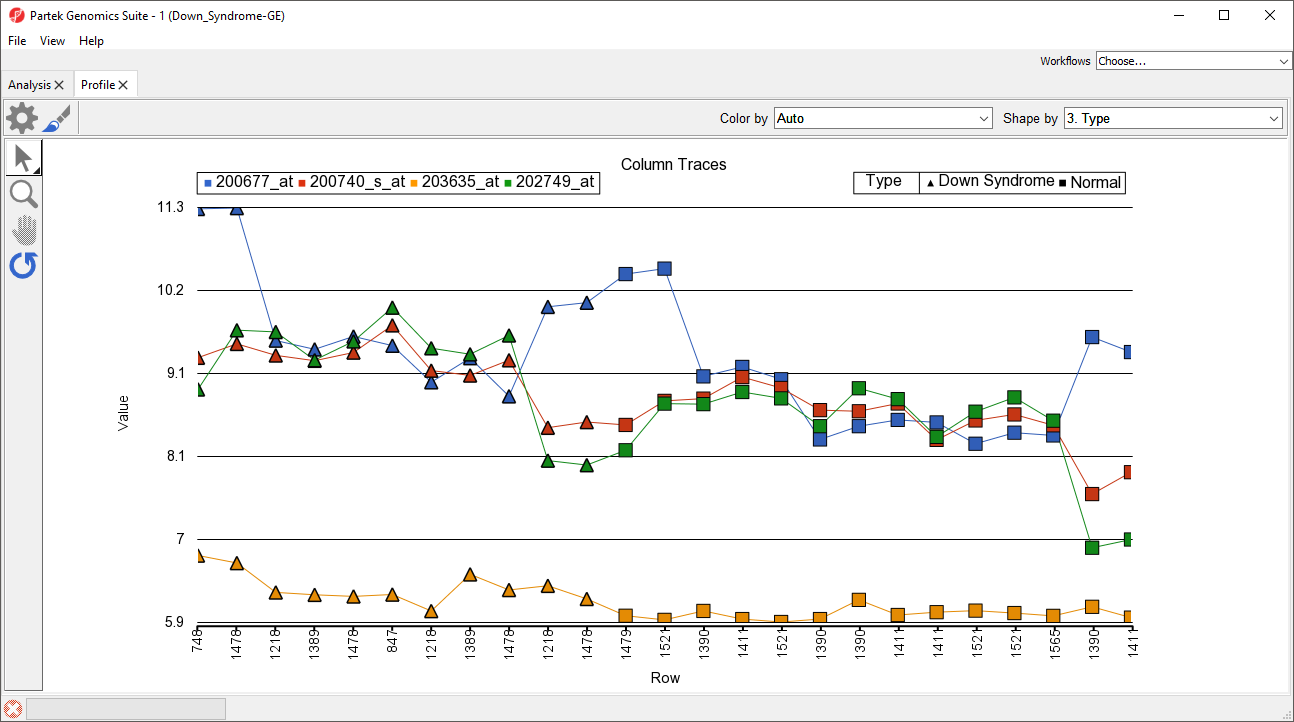
Figure 3. The profile plot can be modified to facilitate analysis or presentation
Additional Assistance
If you need additional assistance, please visit our support page to submit a help ticket or find phone numbers for regional support.


| Your Rating: |
|
Results: |

|
0 | rates |
Overview
Content Tools