Principal component analysis (PCA) can be invoked on the methylation data to reveal clustering of the samples, but also as a quality control procedure (detection of outliers could point to possible low quality or mislabeled samples). To obtain the PCA plot, switch to the Scatter Plot tab, push Recompute ( ![]() ) and from the Color by drop down list select HPSC. Use the Rotate Mode (
) and from the Color by drop down list select HPSC. Use the Rotate Mode (![]() )to explore the plot from different angles, as seen in Figure 1. Each dot of the plot is a single sample and represents the average methylation status across all CpG loci. The result is shown in the demonstrating clear separation of naive and primed HPSC from the cells transduced with short hairpin (sh) RNA lentiviruses (shNANOG and shPOU5F1).
)to explore the plot from different angles, as seen in Figure 1. Each dot of the plot is a single sample and represents the average methylation status across all CpG loci. The result is shown in the demonstrating clear separation of naive and primed HPSC from the cells transduced with short hairpin (sh) RNA lentiviruses (shNANOG and shPOU5F1).
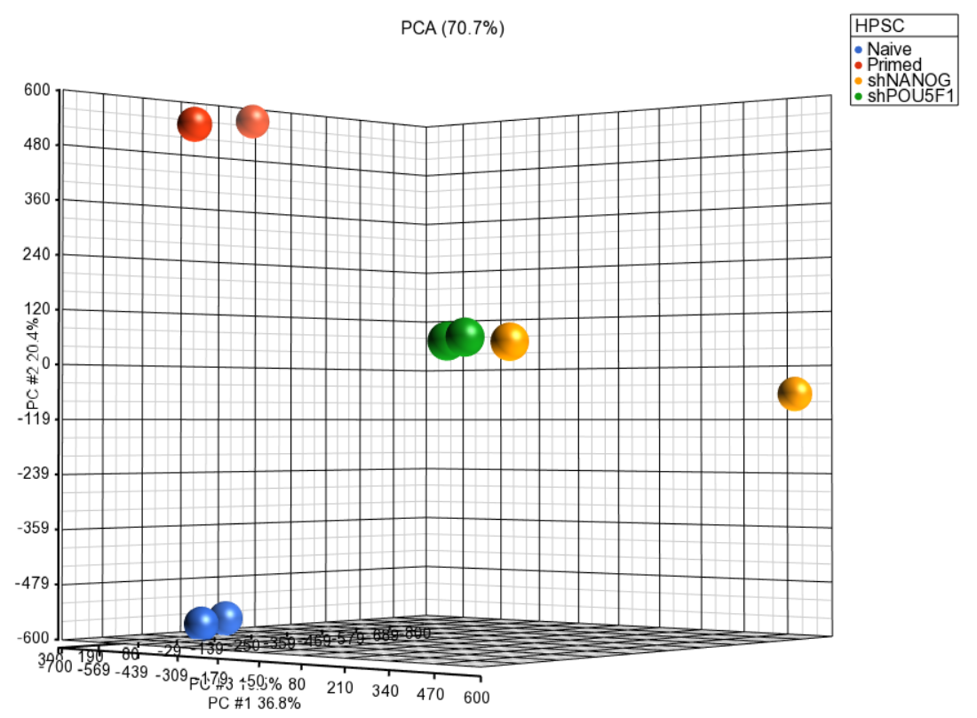 Figure 1. Principal components analysis (PCA) showing methylation profiles of the study samples. Each sample is represented by a dot, the axes are first three PCs, the number in parenthesis indicate the fraction of variance explained by each PC. The number at the top is the variance explained by the first three PCs. The samples are colored by levels of an attribute (HPSC in this example)
Next, distribution of M-values across the samples can also be inspected by a box-and-whiskers plot: QA/QC > Plot Sample Box & Whiskers Chart. Each box-and-whisker is a sample and the y-axis shows M-values. Samples in this set seem reasonably uniform and no outliers can be detected (Figure 2).
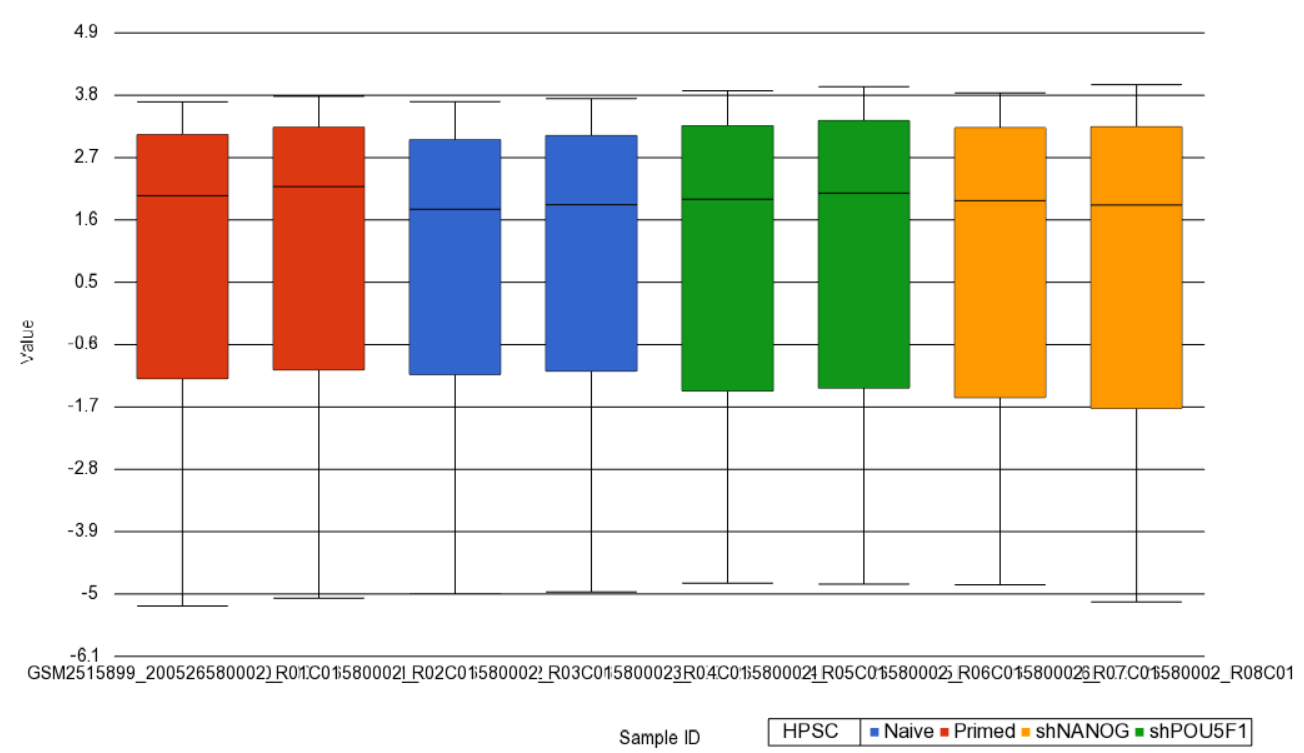 Figure 2. Box and whiskers plot showing distribution of M-values (y-axis) across the study samples (x-axis). Samples are colored by a categorical attribute (HPSC). The middle line is the median, box represents the upper and the lower quartile, while the whiskers correspond to the 90th and 10th percentile of the data
An alternative way to take a look at the distribution of M-values is a histogram (QA/QC > Plot Sample Histogram). Again, no sample in the tutorial data set stands out (Figure 3).
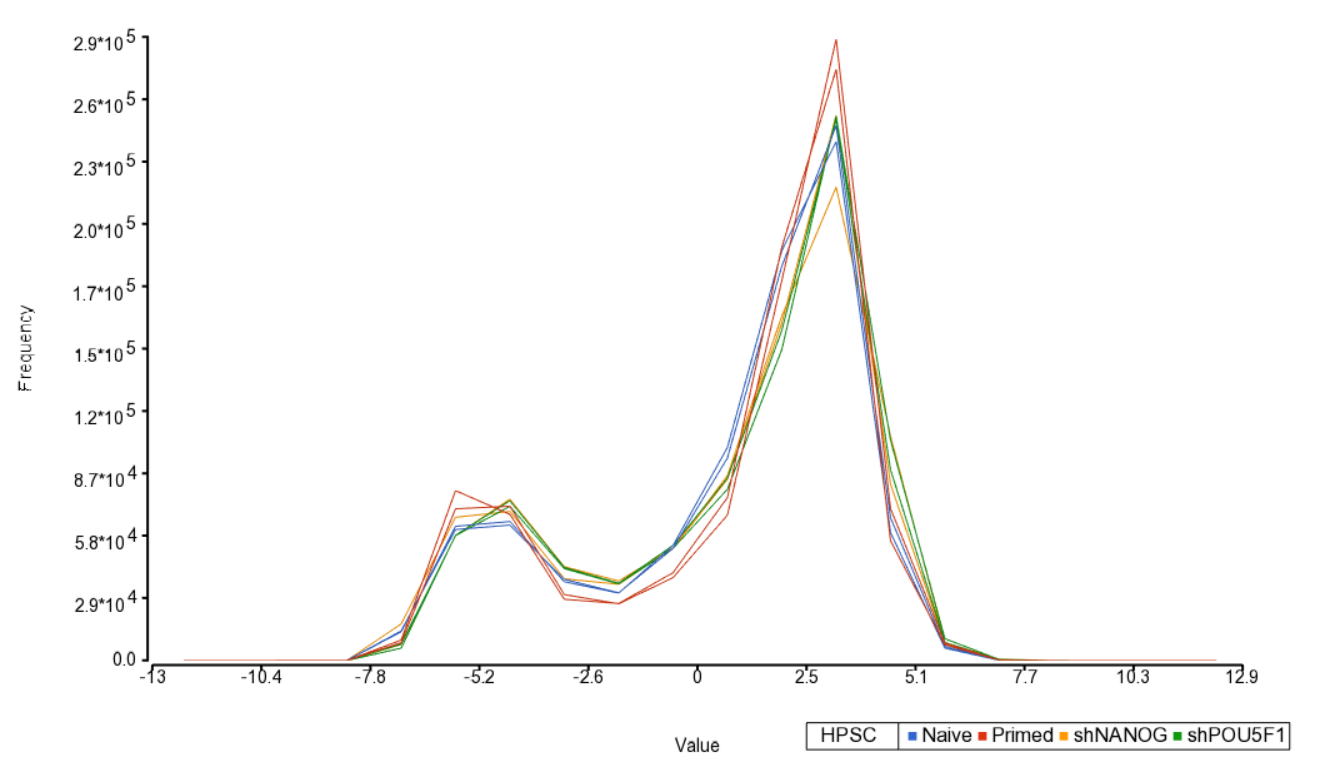 Figure 3. Sample histogram. Each sample is a line, M-values are on the horizontal axis and their frequencies on the vertical axis. Two peaks correspond to two probe types (I and II) present on the MethylationEPIC array. Sample colors correspond to a categorical attribute (i.e. HPSC)
Section Heading
Section headings should use level 2 heading, while the content of the section should use paragraph (which is the default). You can choose the style in the first dropdown in toolbar.
Additional Assistance
If you need additional assistance, please visit our support page to submit a help ticket or find phone numbers for regional support.


| Your Rating: |
|
Results: |

|
0 | rates |
Overview
Content Tools