TSS plot is available on annotated peak data node. After the peaks are annotated with transcripts, coverage of the reads across the genes overlapped with the regions will be calculated, this information is presented by profile plot (Figure 1) and heatmap (Figure ).
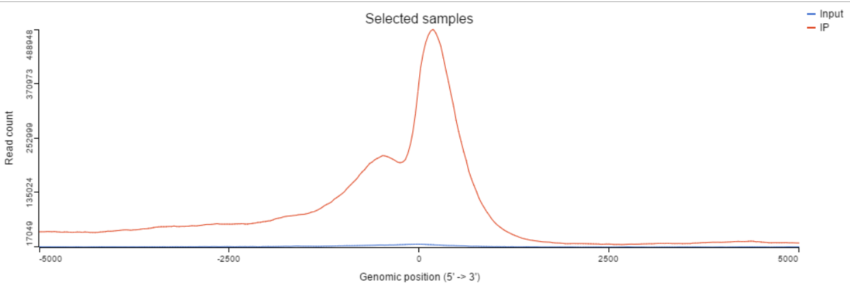 Figure 1. TSS profile plot
TSS profile plot
In the profile plot, the Y-axis is the total read counts, X-axis is the window defined in the annotation task, mid point is the transcription start site (TSS) of all the genes overlapped with the peak regions, the start and end point of X-axis is promoter upstream/downstream limit specified in the annotate peaks task (Figure ). Each line represents a selected sample total read counts at each position, all the selected samples are shown in the plot to compare.
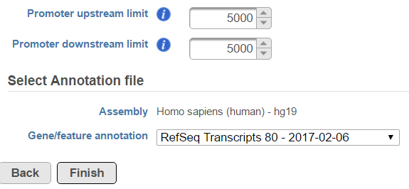 Figure 2. Annotate peaks task dialog
By default, all the samples are selected to display, to remove a sample track, click on the
Figure 2. Annotate peaks task dialog
By default, all the samples are selected to display, to remove a sample track, click on the  button next to the sample name on the sample control panel (Figure ); to add a sample in the plot, select the sample name from the Add sample drop-down list, a new line will be added on the plot.
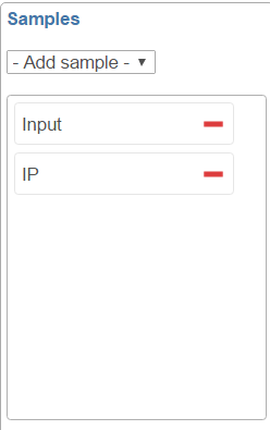 Figure 3. Sample selection control panel
TSS heatmap
Heatmap is another way to view the coverage of gene body overlapped with the peaks (Figure ). The X-axis represents the same profile plot, actually each samples profile plot is display again on the top of the heatmap, the max on the Y-axis are different in different samples. In the heatmap, each row represents a gene, color represents the total read count at each position, genes are sorted based on total read counts in descending order from the top to the bottom.
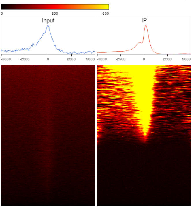 Figure 4. TSS heatmap
The color and color scale on the heamap can be customized in the control panel on the left (Figure ). When increase the number of heatmap per row, it will decrease the heamap size; when change the Low and High values, it will change the color scale on the heatmap.
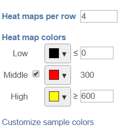 Figure 5. TSS heatmap control panel
When click on Customize sample colors, you can change the profile line color.
Figure 5. TSS heatmap control panel
When click on Customize sample colors, you can change the profile line color.
Additional Assistance
If you need additional assistance, please visit our support page to submit a help ticket or find phone numbers for regional support.


| Your Rating: |
|
Results: |

|
0 | rates |
Overview
Content Tools