...
| Numbered figure captions |
|---|
| SubtitleText | Click and drag the Scree plot to replace the PCA plot on the canvas |
|---|
| AnchorName | Replace PCA with Scree plot |
|---|
|
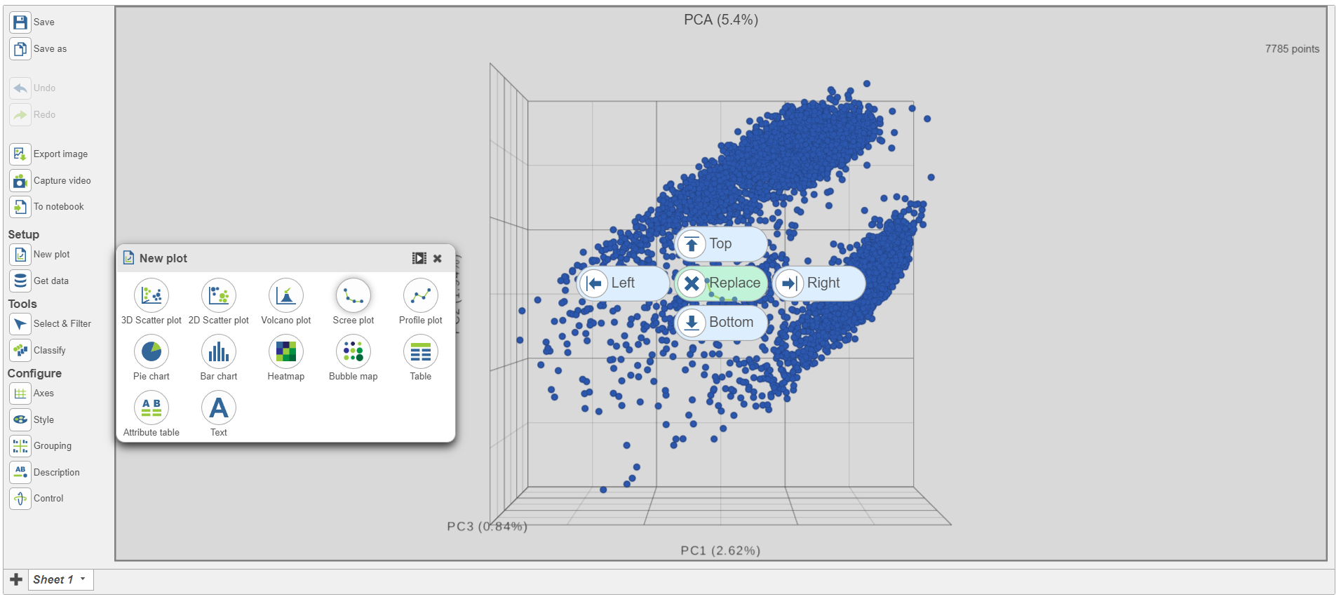 Image Modified Image Modified
|
- Select PCA as data for the new Scree plot (Figure 5)
...
| Numbered figure captions |
|---|
| SubtitleText | Example of how the pipeline might look if you split the merged counts and perform exploratory analysis for protein and gene expression data separately |
|---|
| AnchorName | Split merged counts for exploratory analysis |
|---|
|
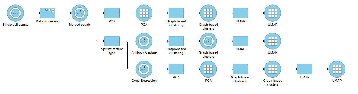 Image Modified Image Modified
|
You can then use the Data viewer to bring together multiple plots for comparison (Figure 14).
...
| Numbered figure captions |
|---|
| SubtitleText | Comparison of 2D UMAP plots for the same cells clustered on protein, mRNA and merged data. All cells are coloured based on their expression of the CD3D gene (in blue). Note, the plots in this figure may differ from the default UMAP plots because these are 2D plots. Default UMAP plots re in 3D. |
|---|
| AnchorName | UMAP plot comparison |
|---|
|
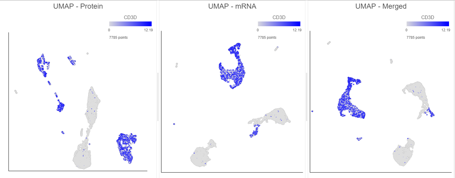 Image Modified Image Modified
|
...