Page History
...
| Numbered figure captions | ||||
|---|---|---|---|---|
| ||||
|
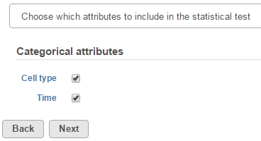
Click Next to display the levels of each attribute to be selected for sub-group comparisons (contrasts).
...
| Numbered figure captions | ||||
|---|---|---|---|---|
| ||||
|
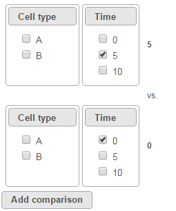
To compare Time point 5 vs. 0, select 5 for Time on the top, 0 for Time on the bottom, and click Add comparison (Figure 3).
...
| Numbered figure captions | ||||
|---|---|---|---|---|
| ||||
|
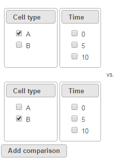
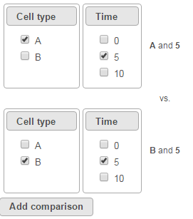
To compare cell types at a certain time point, e.g. time point 5, select A and 5 on the top, and B and 5 on the bottom. Thereafter click Add comparison (Figure 4).
...
| Numbered figure captions | ||||
|---|---|---|---|---|
| ||||
|
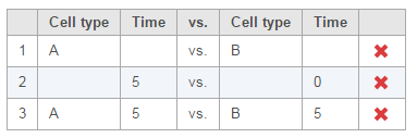
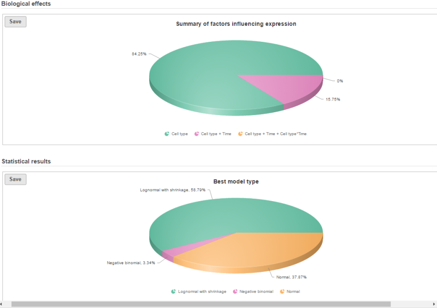
Multiple comparisons can be computed in one GSA run; Figure 5 shows the above three comparisons are added in the computation.
...
| Numbered figure captions | ||||
|---|---|---|---|---|
| ||||
|
In terms of design pool, i.e. choices of model designs to select from, two 2 factors in this example data will lead to seven possibilities in the design pool:
...
| Numbered figure captions | ||||
|---|---|---|---|---|
| ||||
|
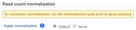
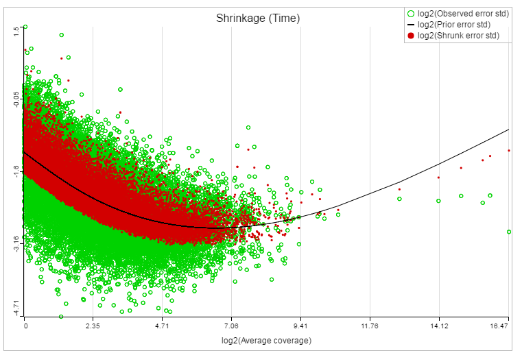
If advanced normalization needs to be applied, perform the Normalize counts task on a quantification data node before doing differential expression detection (GSA or ANOVA).
...
| Numbered figure captions | ||||
|---|---|---|---|---|
| ||||
|
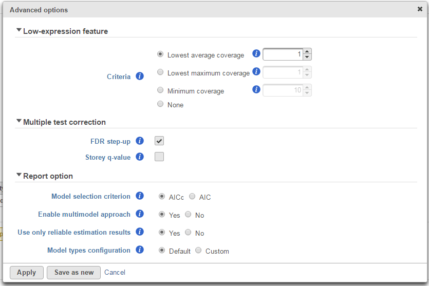
Low-expression feature
...
| Numbered figure captions | ||||
|---|---|---|---|---|
| ||||
|
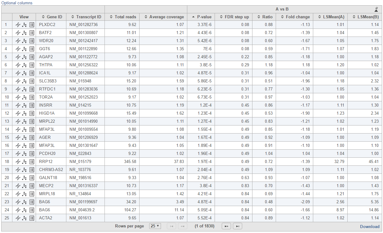
If multiple distribution types are selected, then the number of total models that is evaluated for each feature is the product of the number of design models and the number of distribution types. In the above example, suppose we have only compared A vs B in Cell type as in Figure 2, then the design model pool will have the following three models:
...
| Numbered figure captions | ||||
|---|---|---|---|---|
| ||||
|
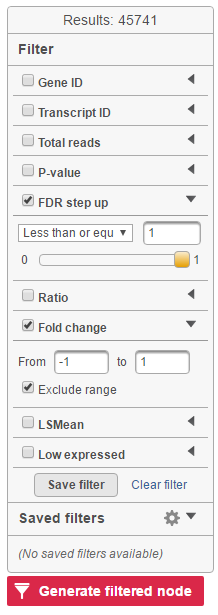
Feature list with p-value and fold change generated from the best model selected is displayed in a table with other statistical information (Figure 10).
...
| Numbered figure captions | ||||
|---|---|---|---|---|
| ||||
|
The following information is included in the table by default:
...
On the right of each contrast header, there is volcano plot icon ( ![]()
). Select it to display the volcano plot on the chosen contrast (Figure 11).
...
| Numbered figure captions | ||||
|---|---|---|---|---|
| ||||
Feature list filter panel is on the left of the table (Figure 12). Click on the black triangle ( ) to collapse and expand the panel.
...
| Numbered figure captions | ||||
|---|---|---|---|---|
| ||||
|
The filtered result can be saved into a filtered data node by selecting the Generate list button at the lower-left corner of the table ( ). Selecting the Download button at the lower-right corner of the table downloads the table as a text file to the local computer.
...
| Numbered figure captions | ||||
|---|---|---|---|---|
| ||||
|
References
- Benjamini, Y., Hochberg, Y. (1995). Controlling the false discovery rate: a practical and powerful approach to multiple testing, JRSS, B, 57, 289-300.
- Storey JD. (2003) The positive false discovery rate: A Bayesian interpretation and the q-value. Annals of Statistics, 31: 2013-2035.
- Auer, 2011, A two-stage Poisson model for testing RNA-Seq
- Burnham, Anderson, 2010, Model selection and multimodel inference
- Law C, Voom: precision weights unlock linear model analysis tools for RNA-seq read counts. Genome Biology, 2014 15:R29.
- http://cole-trapnell-lab.github.io/cufflinks/cuffdiff/index.html#cuffdiff-output-files
- Anders S, Huber W: Differential expression analysis for sequence count data. Genome Biology, 2010
...
Overview
Content Tools