Page History
...
| Numbered figure captions | ||||
|---|---|---|---|---|
| ||||
|
| Numbered figure captions | ||||
|---|---|---|---|---|
| ||||
 |
...
Differential analysis
To identify genes that distinguish a particular cell type, you one can use the color by Feature list option.
- Select Feature List from the Color by drop-down
- Choose Cytotoxic cells from the List drop-down (use List management in Settings to add lists to Partek Flow which will automatically make them available here)
- Choose PCA from the Metric drop-down
Coloring by a list, in this way, calculates the first three principal components for the gene list and colors the cells on the plot by their values along those three PCs with green for PC1, red for PC2, and blue for PC3 (Figure 19).differential analysis tools in Partek Flow.
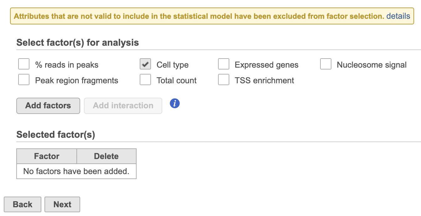
- Click the TF-IDF normalized counts data node
- Click the Differential analysis section in the toolbox
- Click Hurdle model
- Select the factors and interactions to include in the statistical test (Figure 19). Cell type has been selected here as an example.
| Numbered figure captions | ||||
|---|---|---|---|---|
| ||||
|

Typically, the expression of a set of marker genes will be highly correlated, allowing the first PC to account for a large percentage of the variance between cells for that gene list. As a result, the group of cells characterized by their expression of the genes on the list will separate from the rest of the cells along PC1 and will be colored green (Figure 16). If the gene list is more complex, for example, including marker genes for multiple cell types, there may be several sets of correlated genes accounting for significant amounts of variance, leading to groups of cells being distinguishable along PC2 and PC3 as well. In that case, there may be green, blue, and red groups of cells on the plot. If the gene list does not distinguish any group of cells, all cells will have similar PC values, leading to similarly colored cells on the plot.
In addition to coloring by gene expression and by gene lists, the points can be colored by any cell or sample attribute. Available attributes are listed as options in the Color by drop-down menu. Note that any available options are dependent upon the selected data node.
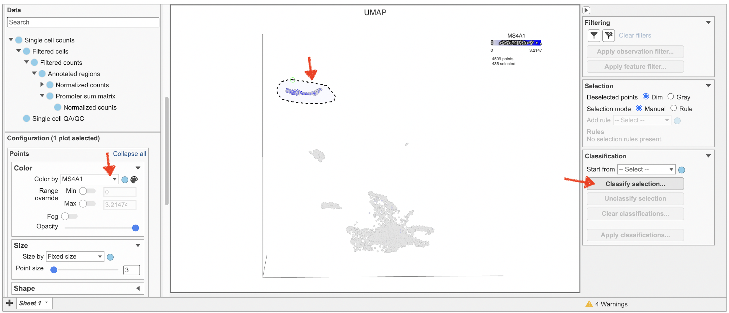
Selecting cells on the t-SNE scatter plot
The most basic way to select a point on the scatter plot is to click it with the mouse while in pointer mode. To select multiple cells, you can hold Ctrl on your keyboard and click the cells. To select larger groups of cells, you can switch to Lasso mode by clicking ![]() in the plot controls. The lasso lets you freely draw a shape to select a cluster of cells.
in the plot controls. The lasso lets you freely draw a shape to select a cluster of cells.
- Click
 to activate Lasso mode
 - Left-click and hold to draw a lasso around a cluster of cells
- Release and click the starting circle to close the lasso and select the enclosed cells (Figure 20)
...
| |
|
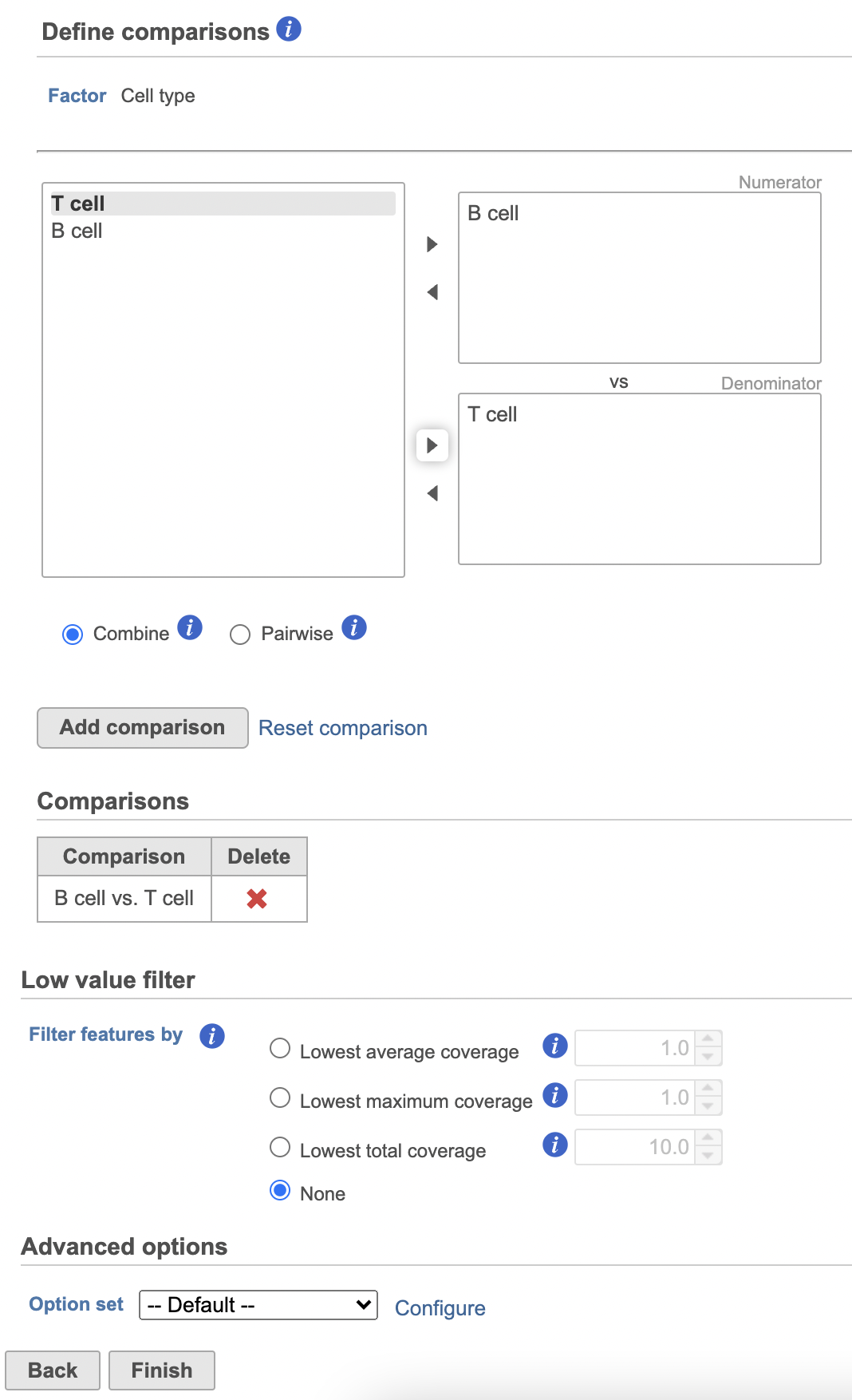
- Click Next
- Define comparisons between factor or interaction levels (Figure 20)
- Click Add comparison to add the comparison to the Comparisons table.
- Click Finish to run the statistical test as default
| Numbered figure captions | ||||
|---|---|---|---|---|
| ||||
|
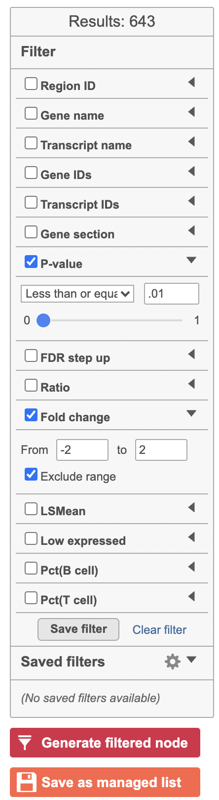
Hurdle model produces a Feature list task node. The results table and options are the same as the GSA task report except the last two columns. The percentage of cells where the feature is detected (value is above the background threshold) in different groups (Pct(group1), Pct(group2)) are calculated and included in the Hurdle model report.
A filtered Feature list data node can be produced by running the Differential analysis filter in the Hurdle model task report (Figure 21) .
| Numbered figure captions | ||||
|---|---|---|---|---|
| ||||
|

By default, selected cells are shown in bold while unselected cells are dimmed (Figure 21). This can be changed to gray selected cells using the Select & Filter tool in the left panel as shown in Figure 21.
...
Overview
Content Tools