Page History
...
| Numbered figure captions | ||||
|---|---|---|---|---|
| ||||
|
The cells on the plot will be colored based on their expression level of CD79A (Figure 16). In the example in Figure 16, the Style icon has been dragged to a different location on the screen and the legend has also been resized and moved. Resizing the legend can either be done on the legend itself or using the Description icon under Configure.
| Numbered figure captions | ||||
|---|---|---|---|---|
| ||||
|

Coloring by one gene uses the two-color numeric palette, which can be customized by clicking  . To color by more than one gene use the Numeric triad option in the drop-down. If you color by more than one gene, the color palette switches to a Green-Red-Blue color scheme with the balance between the three color channels determined by the values of the three genes. For example, a cell that expresses all three genes would be white, a cell that expresses the first two genes would be yellow, and a cell that expresses none of the genes would be black (Figure 17).
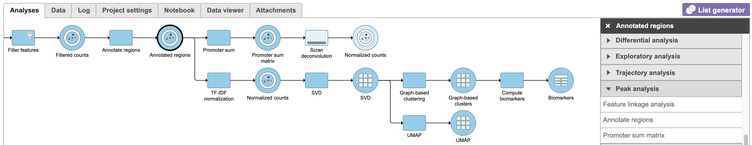
Classifying cells
Double-clicking the UMAP task node will open the task report in the Data Viewer.
To classify a cell, just select it then click Classify selection in the Classify tool.
For example, we can classify a cluster of cells expressing high levels of MS4A1 as B cells.
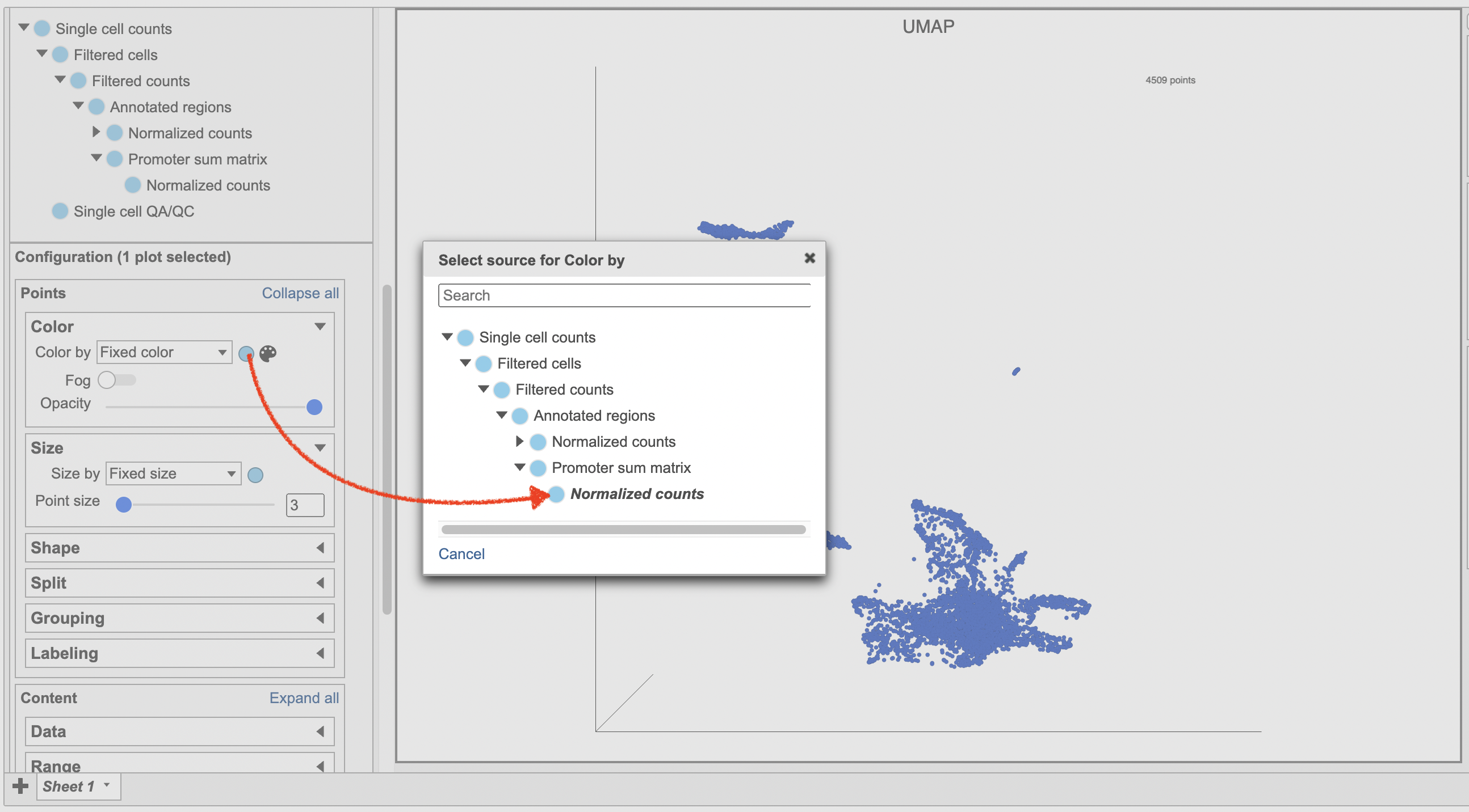
- Make sure the right data source has been selected. For scATAC-seq data, it shall be the normalized counts of promoter sum values in most cases (Figure 17)
- Set Color by in the Style configuration to the normalized counts node
- Type MS4A1 in the search box and select it. Rotate the 3D plot if you need to see this cluster more clearly.
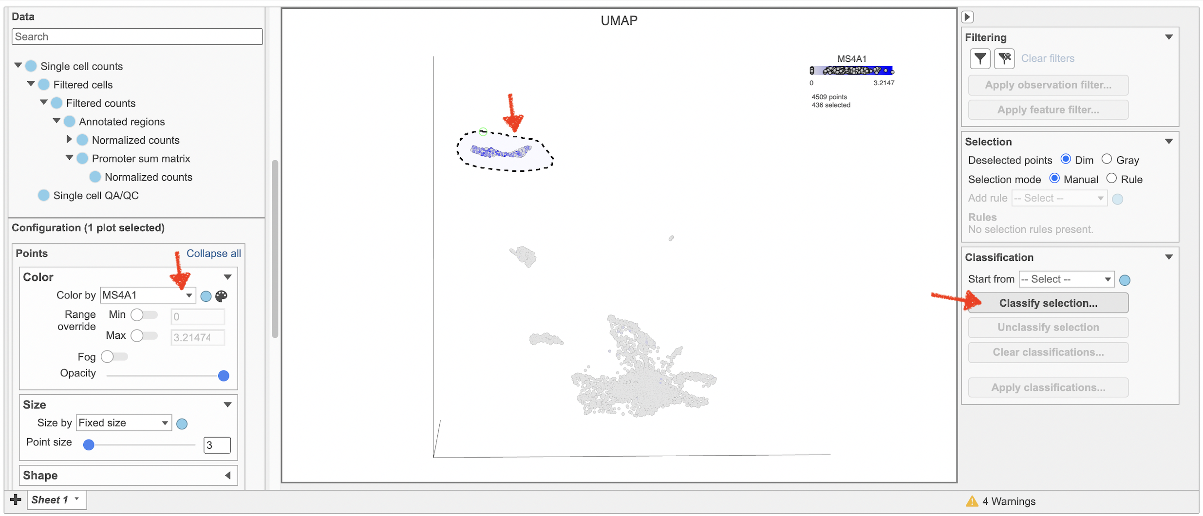
- Click to activate Lasso mode
- Draw a lasso around the cluster of MS4A1-expressing cells
- Click Classify selection under Tools in the left panel
- Type B cells for the Name
- Click Save (Figure 18)
Repeat the above steps to finish the other cell type classifications. To be able to use the classifications in downstream tasks and visualizations, you must first apply them.
- Click Apply classifications
- Name the classification (e.g. Cell type)
- Check the Compute biomarkers if needed
- Click Run to complete the task
Once the classifications have been added to the project, one can color the UMAP/t-SNE plot by the Classification or compare the differentially expressed genes between different cell types.
| Numbered figure captions | ||||
|---|---|---|---|---|
| ||||
|
| Numbered figure captions | ||||
|---|---|---|---|---|
| ||||
|

Clicking a cell on the plot shows the expression values of the cell in the legend. Hovering over a cell on the plot also shows this information and related details (Figure 18).
|
| Numbered figure captions | ||||
|---|---|---|---|---|
| ||||
 |
...
| Numbered figure captions | ||||
|---|---|---|---|---|
| ||||
|

Classifying cells
Classifying cells allows to you assign cells to groups that can be used in downstream analysis and visualizations. Commonly, this is used to describe cell types, such as B cells and T cells, but can be used to describe any group of cells that you want to consider together in your analysis, such as cycling cells or CD14 high expressing cells. Each cell can only belong to one class at a time so you cannot create overlapping classes.
...
Overview
Content Tools