...
| Numbered figure captions |
|---|
| SubtitleText | Selecting samples for the initial comparison (an example is shown) |
|---|
| AnchorName | select-initial-samples |
|---|
|
.png") Image Removed Image Removed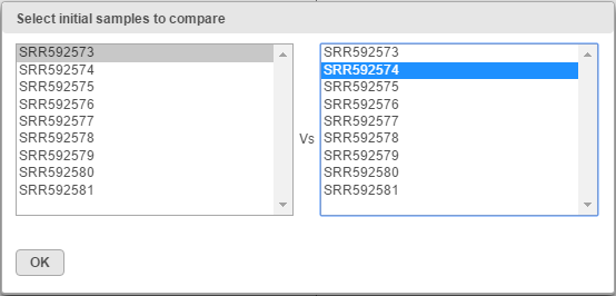 Image Added Image Added
|
An example of the resulting scatterplot is in Figure 3. Each dot is a feature (gene/transcript) while the expression values in the two samples can be read off the coordinate axes, in the same units as present in the data node. For instance, if you normalized your RNA-seq data by transcripts per million (TPM), the coordinate axis will give you expression in TPMs. Pearson’s correlation coefficient and the slope of the regression line are in the upper left corner of the plot.
...