Sample correlation plot is a data visualization used to compare a number of variables across two samples. A hypothesis underlying many gene expression experiments (next generation sequencing or microarray) is that most genes/transcripts are not differentially regulated between the conditions, causing most of the data points to fall on the diagonal (i.e. regression line with slope of 1). If that is not the case, a normalization method should be applied before the statistical analysis. Therefore, you may want to run sample correlation plots and your data set before and after the normalization.
Sample correlation in Partek Flow can be performed after quantification by selecting a Gene counts or Transcript counts data node, or on a Normalized counts node in case that you want to assess its effect on the data. The Sample correlation option is visible in the Correlation section of the task menu (Figure 1). The task has no particular setup dialog (and creates no task node), but launches immediately.
 Figure 1. Sample correlation tool in the Correlation section of the toolbox
When the Sample correlation page opens, you will be asked to select two samples for comparison (Figure 2). The sample in the left box will be shown on the horizontal axis, while the sample in the right box will be shown on the vertical axis. Click on the sample names and then hit OK to proceed.
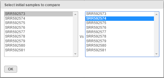 Figure 2. Selecting samples for the initial comparison (an example is shown)
An example of the resulting scatterplot is in Figure 3. Each dot is a feature (gene/transcript) while the expression values in the two samples can be read off the coordinate axes, in the same units as present in the data node. For instance, if you normalized your RNA-seq data by transcripts per million (TPM), the coordinate axis will give you expression in TPMs. Pearson’s correlation coefficient and the slope of the regression line are in the upper left corner of the plot.
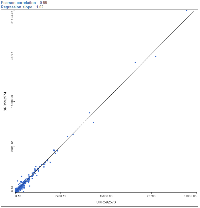 Figure 3. Sample correlation plot. Each dot is a sample, the line is the regression line of sample shown on the y-axis over the sample shown on the x-axis. The plot is based on the same expression units as the data that the plot was invoked on
To visualize a different pair of samples, select another sample from the X axis or Y axis list on the left and push Apply.
Additional Assistance
If you need additional assistance, please visit our support page to submit a help ticket or find phone numbers for regional support.


| Your Rating: |
|
Results: |

|
36 | rates |
Overview
Content Tools
1 Comment
Melissa del Rosario
author: ilukic