...
| Numbered figure captions |
|---|
| SubtitleText | Summary of ERCC assessment. Each row is a sample (an example is shown) |
|---|
| AnchorName | ercc-table |
|---|
|
 Image Removed Image Removed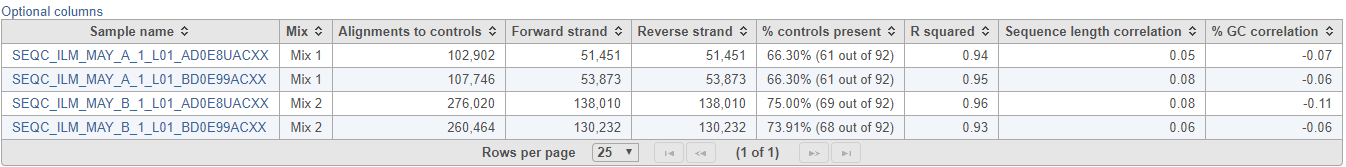 Image Added Image Added
|
The ERCC spike-ins plot (Figure 3) shows the regression lines between the actual spike-in concentration (x-axis, given in log
2 space) and the observed alignment counts (y-axis, given in log
2 space), for all the samples in the project. The samples are depicted as lines, and the probes with the highest and lowest concentration are highlighted as dots. Regression line for a particular sample can be turned off by simply clicking on the
sample name in the legend beneath the plot.
...