Join us for a webinar: The complexities of spatial multiomics unraveled
May 2
Page History
...
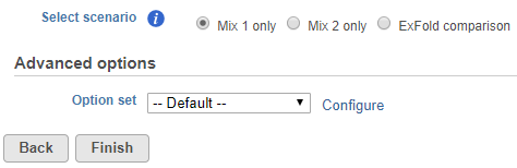
To start ERCC assessment, select an unaligned reads node and choose ERCC in the context sensitive menu. If all samples in the project have used the Mix 1 or Mix 2 formulation, choose the appropriate radio button at the top (Figure 1).
| Numbered figure captions | ||||
|---|---|---|---|---|
| ||||
|
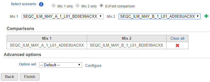
If some samples have been treated with the Mix 1 formulation and others have been treated with the Mix 2 formulation, choose the ExFold comparison radio button (Figure 2). Set up the pairwise comparisons by choosing the Mix 1 and Mix 2 samples that you wish to compare from the drop-down lists, followed by the green plus () icon. The selected pair of samples will be added to the table below.
...
...
| Numbered figure captions | ||||
|---|---|---|---|---|
| ||||
|
You can change the Bowtie parameters by clicking Configure before the alignment (Figure 1), although the default parameters work fine for most data. Once the task has been set up correctly, select Finish.
...
| Numbered figure captions | ||||
|---|---|---|---|---|
| ||||
|
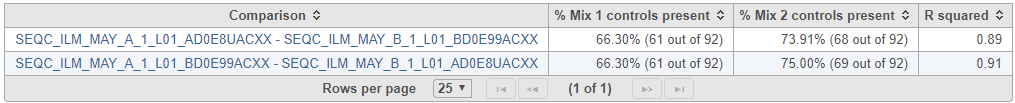
If ExFold comparison was enabled, an extra table will be produced in the ERCC task report (Figure 4). Each row in the table is a pairwise comparison. This table lists the percentage of ERCC controls present in the Mix 1 and Mix 2 samples and the R squared for the observed vs expected Mix1:Mix2 ratios.
...
...
| Numbered figure captions | ||||
|---|---|---|---|---|
| ||||
|
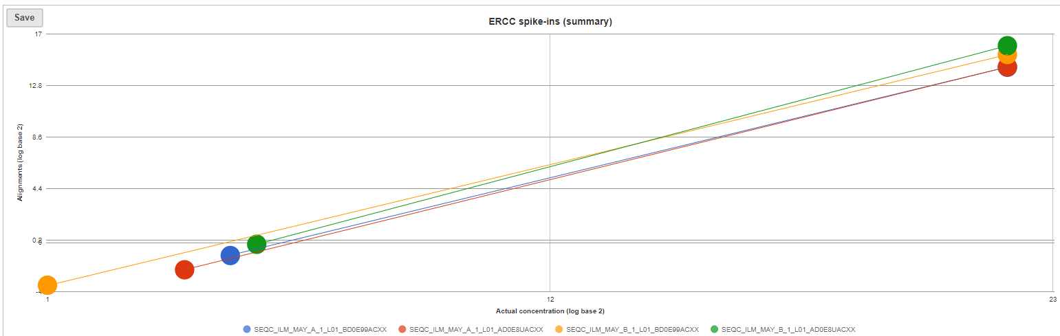
The ERCC spike-ins plot (Figure 5) shows the regression lines between the actual spike-in concentration (x-axis, given in log2 space) and the observed alignment counts (y-axis, given in log2 space), for all the samples in the project. The samples are depicted as lines, and the probes with the highest and lowest concentration are highlighted as dots. The regression line for a particular sample can be turned off by simply clicking on the sample name in the legend beneath the plot.
...
| Numbered figure captions | ||||
|---|---|---|---|---|
| ||||
|
Optionally, you can invoke a principal components analysis plot (View PCA), which is based on RPKM-normalised counts, using the ERCC sequences as the annotation file (not shown).
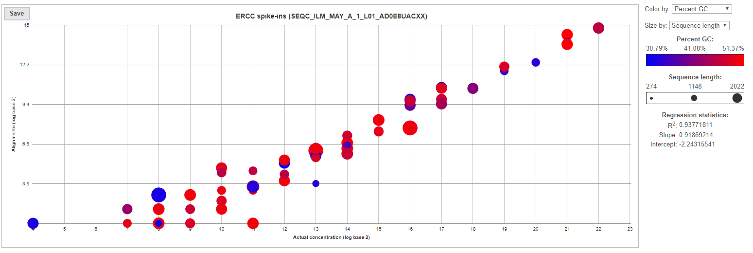
For more details, go to the sample-level report (Figure 6) by selecting a sample name on the summary table. First, you will get a comprehensive scatter plot of observed alignment counts (y-axis, in log2 space) vs. the actual spike-in concentration (x-axis, in log2 space). Each dot on the plot represents an ERCC sequence, coloured based on GC content and sized by sequence length (plot controls are on the right).
| Numbered figure captions | ||||
|---|---|---|---|---|
| ||||
|
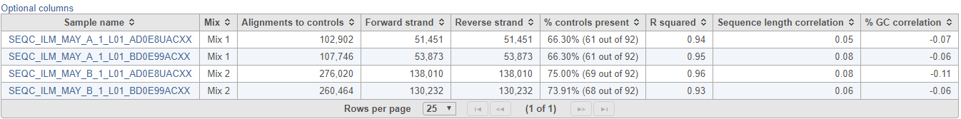
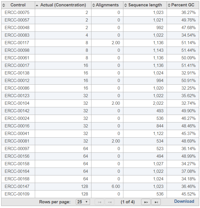
The table (Figure 7) lists individual controls, with their actual concentration, alignment counts, sequence length, and % GC content. The table can be downloaded to the local computer by selecting the Download link.
| Numbered figure captions | ||||
|---|---|---|---|---|
| ||||
|
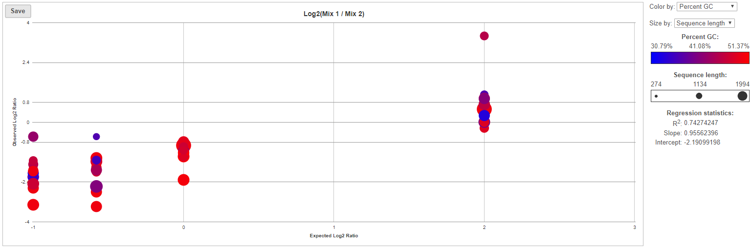
For more details on ExFold comparisons, select a comparison name in the ExFold summary table (Figure 8). First, you will get a comprehensive scatter plot of observed Mix1:Mix2 ratios (y-axis, in log2 space) vs. the expected Mix1:Mix2 ratio (x-axis, in log2 space). Each dot on the plot represents an ERCC sequence, coloured based on GC content and sized by sequence length (plot controls are on the right).
...
...
| Numbered figure captions | ||||
|---|---|---|---|---|
| ||||
|
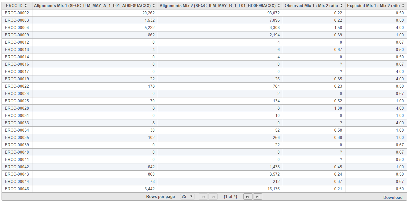
The table (Figure 9) lists individual controls, with each samples' alignment counts, together with the observed and expected Mix1:Mix2 ratios. The table can be downloaded to the local computer by selecting the Download link.
...
...
| Numbered figure captions | ||||
|---|---|---|---|---|
| ||||
|
| Additional assistance |
|---|
| Rate Macro | ||
|---|---|---|
|
Overview
Content Tools