Page History
...
| Numbered figure captions | ||||
|---|---|---|---|---|
| ||||
|
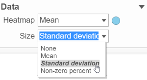
Heatmap:
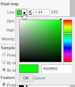
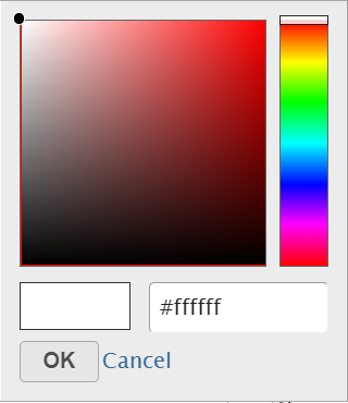
Configure Heatmap section is used to configure the color and shape of the heatmap is To change a color on the map, click on the arrow head by the color box to get the color mixer (Figure 8). Then pick the color you prefer and select OK. Range of the colors can be changed by typing a different value in the text box to the left of the STD sign (i.e. sandardisedcomponents in the heatmap (Figure 8)
| Numbered figure captions | ||||
|---|---|---|---|---|
| ||||
|
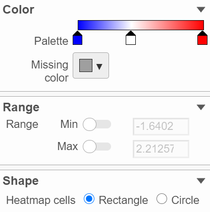
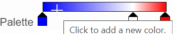
In the color palette horizonal bar, left side color represent low value, right side color represent high value in the matrix data represented. By default, there are 3 tabs (![]() ) present the min, middle and max color value of default range calculated on the matrix. Left click on the middle tab and drag left/right can change the middle the value of this tab represented. When left click on the middle tab and release the mouse, you can change the color and value of this tab represents ((Figure 9). Click on (
) present the min, middle and max color value of default range calculated on the matrix. Left click on the middle tab and drag left/right can change the middle the value of this tab represented. When left click on the middle tab and release the mouse, you can change the color and value of this tab represents ((Figure 9). Click on (![]() ) to remove this tab.
) to remove this tab.
| Numbered figure captions | ||||
|---|---|---|---|---|
| ||||
|
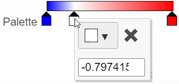
Click on the little triangle next to the color square (![]() ) to choose a color to represent the value by clicking on a color or type in the RGB color of the color, click OK (Figure 10).
) to choose a color to represent the value by clicking on a color or type in the RGB color of the color, click OK (Figure 10).
| Numbered figure captions | ||||
|---|---|---|---|---|
| ||||
|
The sample and/or feature dendrogram color can also be configured. By default, the dendrograms are all colored in black (Figure 9 ).min and max tabs cannot be dragged or removed, however, when left click on it, you can choose a different color. To change the min and max color value to be represented, use the Range section. When click on the Palette bar, you can add a new color tab between min and max (Figure 11). Adding a tab can be useful when there is outlier value in the data, you can use different color to represent different value range.
| Numbered figure captions | ||||
|---|---|---|---|---|
| ||||
|
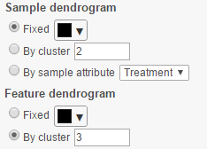
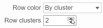
When the By cluster radio button is chosen, the number of clusters needs to be specified, and then the top N number of clusters will be in N different colors. For the sample dendrogram, it can also be colored with it's attributes by selecting the By sample attribute radio button and selecting the relevant attribute in the drop-down menu. If the cluster includes samples from different subgroup, the line of the cluster will be mixed color of the subgroup color.
...
|
To change the min and max value represented, in the Range section, click on the toggle switch(![]() ) to make it blue, and specify the value in the text box.
) to make it blue, and specify the value in the text box.
The shape of the heatmap cell (component) can be configured either as rectangle or circle by selecting the radio button in the shape section.
Dendrograms:
Only if cluster analysis is performed, the result will be displayed in dendrograms. By default, the dendrograms are all colored in black (Figure 4 ).
The color of the dendrograms can be configured (Figure 12)
| Numbered figure captions | ||||
|---|---|---|---|---|
| ||||
|
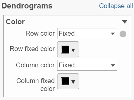
Click on the color square triangle (![]() ) to choose a different color for the dendrogram.
) to choose a different color for the dendrogram.
When the By cluster in the Row/Column color drop-down list, the number of clusters needs to be specified (Figure 13). The top N number of clusters will be in N different colors.
| Numbered figure captions | ||||
|---|---|---|---|---|
| ||||
|
...
| |
|
Annotations:
Row annotation allow to add sample or cell level annotation to the viewer. First make sure to choose the correct data node which contains the annotation information you would like to use by clicking the circle (![]() ). All project level annotation will be available on all data node in the pipeline (Figure 14).
). All project level annotation will be available on all data node in the pipeline (Figure 14).
| Numbered figure captions | ||||
|---|---|---|---|---|
| ||||
|
...
| |||
|
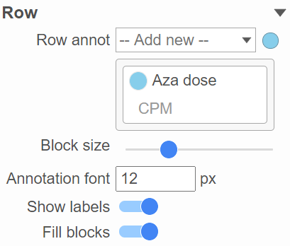
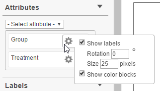
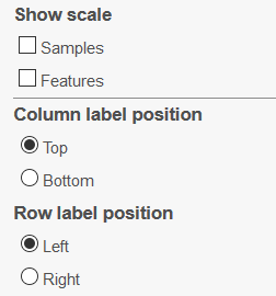
Each attribute is represented as an annotation bar next to the heatmap, different color represent different group in the attribute. The width of the bar can be adjusted by Block size slider, when the show labels toggle switch is on , the text of the label font size can be changed by specifying pixel size.
Layout
To change the orientation of the plot, click on the toggle switch of Data Transpose (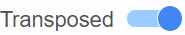 )in the Layout section (Figure 15)
| Numbered figure captions | ||||
|---|---|---|---|---|
| ||||
|
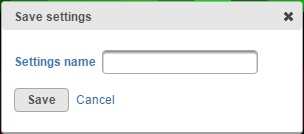
Commonly used plot customization can be saved by selecting the Save settings button. Give your setting set a name (Figure 13) and select Save. Saved settings will be available under the Saved settings list, and can be deleted by clicking on the red cross button( ). To revert to manufacturer settings at any time, use the Default settings hyperlink.
| Numbered figure captions | ||||
|---|---|---|---|---|
| ||||
|
| |
|
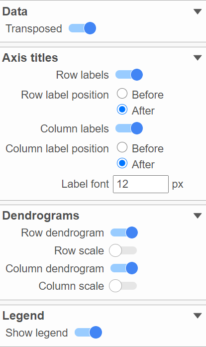
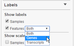
Axes labels, dendrograms and legend can be turned on or off by clicking the toggle switches. The axes label font can be changed by specify number of pixels.
In the mode bar of the viewer, besides selection buttons, there is a special button just for hierarchical clustering–Flip mode button (![]() ), in this mode, when click on a line which represents a cluster branch in dendrogram, it will swap location of the two legs of the branch.
), in this mode, when click on a line which represents a cluster branch in dendrogram, it will swap location of the two legs of the branch.
| Additional assistance |
|---|
| Rate Macro | ||
|---|---|---|
|
...
Overview
Content Tools