Page History
...
Hierarchical clustering is an unsupervised technique, meaning that the number of clusters is not specified up frontupfront. In the beginning, each row and/or column is considered a cluster. The two most similar clusters are combined and continue to combine until all objects are in the same cluster. Hierarchical clustering produces a tree (called a dendrogram) that shows the hierarchy of the clusters.
...
| Numbered figure captions | ||||
|---|---|---|---|---|
| ||||
|
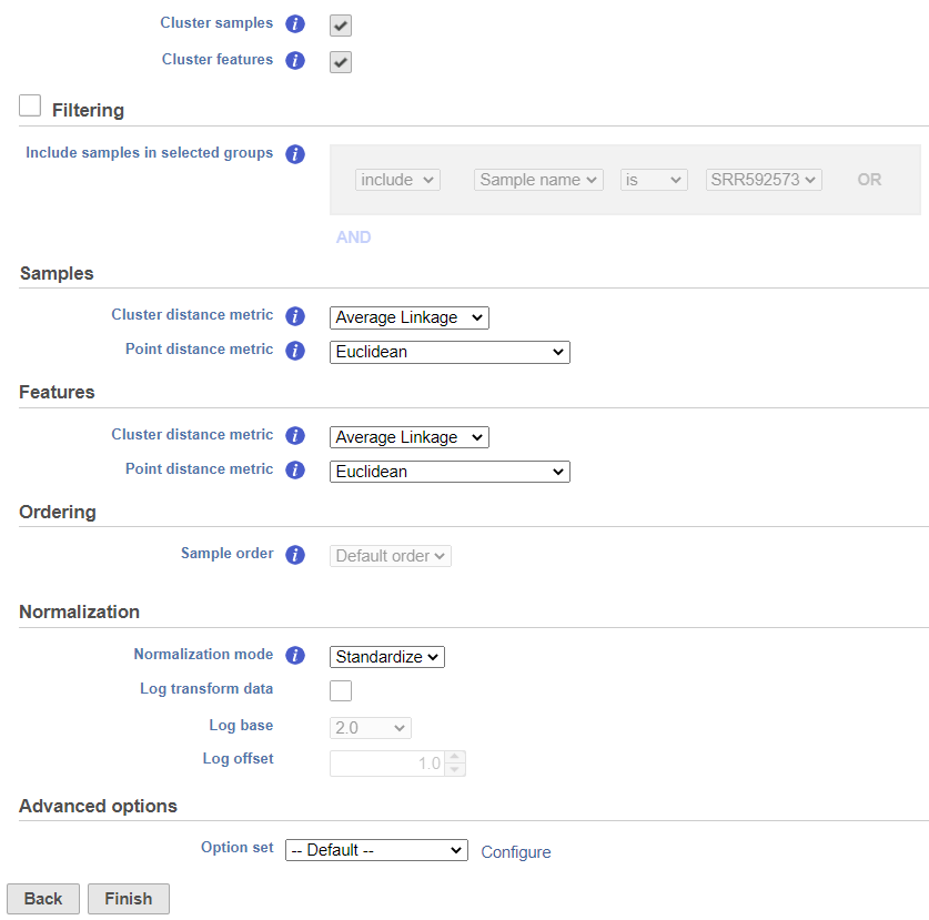
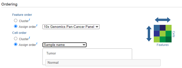
The hierarchical clustering setup dialog (Figure 2) enables you to control the clustering algorithm. Starting from the top, you can choose to Cluster samples, Cluster features plot a Heatmap or a Bubble map (clustering can be performed on both plot types). Next, perform Ordering by selecting Cluster for either feature order (genes/transcripts) or both. By default, if there are less than 3000 samples, the Cluster samples check button is selected. Otherwise the check button is de-selected. If Cluster samples is unchecked, the Ordering option becomes active (see below)./proteins) or cell/sample/group order or both. Note the context-sensitive image that helps you decide to either perform hierarchical clustering (dendrogram) or assign order (arrow) for the columns and rows to help you orient yourself and make decisions (In Figure 2 below, Cluster is selected for both options so a dendrogram is shown in the image).
| Numbered figure captions | ||||
|---|---|---|---|---|
| ||||
|
...
|
When choose Assign order, the Default order of cells/samples/groups (rows) is based upon the labels as displayed in the Data tab and features (columns) are dependent on the input data of the data node.
Feature order can be assigned by selecting a managed list (e.g. generate saved feature lists from report nodes or add lists under list management in the settings) in the drop-down which will limit the features to only those in the list and the features will be ordered as they are listed. If a feature is not available, based on the input of the data node, it will not be shown in the plot (in other words, if the features from the list are not there they will not be plotted). Note that If no features are available from the data node, the task will not be able to perform and an error message will be shown.
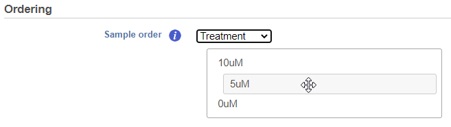
Cell/Sample/Group order can also be assigned by choosing an attribute from the drop down list. Click and drag to rearrange categorical attributes; numeric attributes can be sorted in ascending or descending order (note the arrows in the image which are different from the dendrogram for Cluster) (Figure 3).
| Numbered figure captions | ||||
|---|---|---|---|---|
| ||||
|
Another way to invoke a heatmap without performing clustering is via the data viewer. When you select the Heatmap ![]() icon in the available plots list, data nodes that contain two-dimensional matrices can be used to draw this type of plot. A bubble map can also be similarly plotted (use the arrow from the heatmap icon to select a Bubble map
icon in the available plots list, data nodes that contain two-dimensional matrices can be used to draw this type of plot. A bubble map can also be similarly plotted (use the arrow from the heatmap icon to select a Bubble map ![]() for descriptive statistics that have been generated in the data analysis pipeline.
for descriptive statistics that have been generated in the data analysis pipeline.
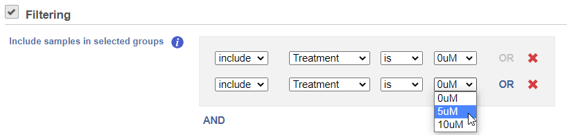
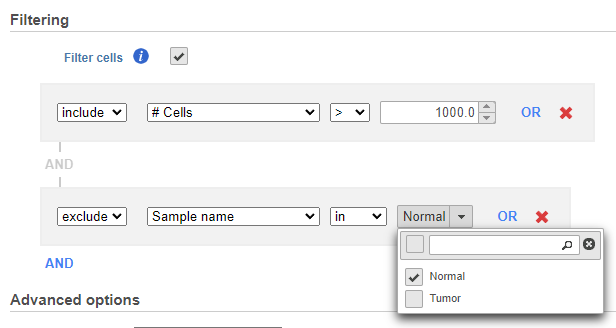
If you do not want to cluster all the samples, but select a subset based on a specific sample or cell attribute (i.e. group membership), check the Filtering option and Filter cells under Filtering and set a filtering rule using the drop down lists (Figure 34). The default value of the Filtering option is All samples.Notice the drop-down lists allow more than one factor (when available) to be selected at a time. When configuring the filtering rule, use AND to ensure all conditions pass for inclusion and use OR for any conditions to pass.
| Numbered figure captions | ||||
|---|---|---|---|---|
| ||||
|
...
| |||
|
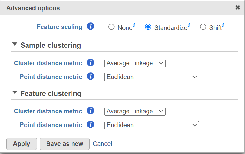
Hierarchical clustering uses distance metrics to sort based on similarity and is set to Average Linkage by default. This can be adjusted by clicking Configure under Advanced options (Figure 5). You can choose how the data is scaled (sometimes referred to as normalized). There are three Feature scaling options, Standardize (default for a heatmap) will make each column mean as zero and standard deviation as 1 in all features. This is the default scaling for a heatmap and it makes all of the features (e.g., genes or proteins) have equal weight; standardized values are also known as Z-scores. The scaling mode Shift will make each column mean as zero. Choose None to not scale and perform clustering on the values in the input data node (this is the default for a bubble map). If a bubble map is scaled, scaling will be performed on the group summary method (color).
Cluster distance metric for cells/samples and features is used to determine how the distance between two clusters will be calculated (Figure 4):
- Single Linkage: the distance between two clusters is determined by the distance of the closest objects in the two clusters
- Complete Linkage: the distance between two clusters is equal to the distance between the two furthest members of those clusters
- Average Linkage: the average distance between all the pairs of objects in the two different clusters is used as the measure of distance between the two clusters
- Centroid method: the distance between two clusters is equal to the distance between the centroids of those clusters
- Ward's method: the distance between two clusters is designed to minimize the size of an error measure based on the sum of squares
| Numbered figure captions | ||||
|---|---|---|---|---|
| ||||
|
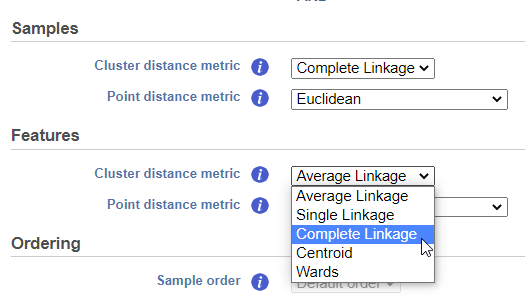
Point distance metric is used to determine the distance between two rows or columns. For more detailed information about the equations, we refer you to the distance metrics chapter.
If the Cluster samples box is unchecked, the Ordering option becomes active (Figure 5). Choose an attribute from the drop down list. Click and drag to rearrange the order of groups.
| Numbered figure captions | ||||
|---|---|---|---|---|
| ||||
|
You can choose how the data is normalized. Under the Normalization mode dropdown, Standardize (default) will make each column mean as zero and standard deviation as 1 in all features. This is the default normalization and it makes all the features (e.g., genes) have equal weight. Standardized values are also known as Z-scores. The normalization mode Shift will make each column mean as zero. Choose None to perform clustering on the values in the quantified data node. The data can also be Log2 transformed on the fly.
Another way to invoke a heatmap without performing clustering is via the data viewer. When you select the Heatmap ![]() icon in the available plots list, data nodes that contains two dimensional matrices can be used to draw this type of plot.
icon in the available plots list, data nodes that contains two dimensional matrices can be used to draw this type of plot.
Heat Map
| |||
|
Heatmap
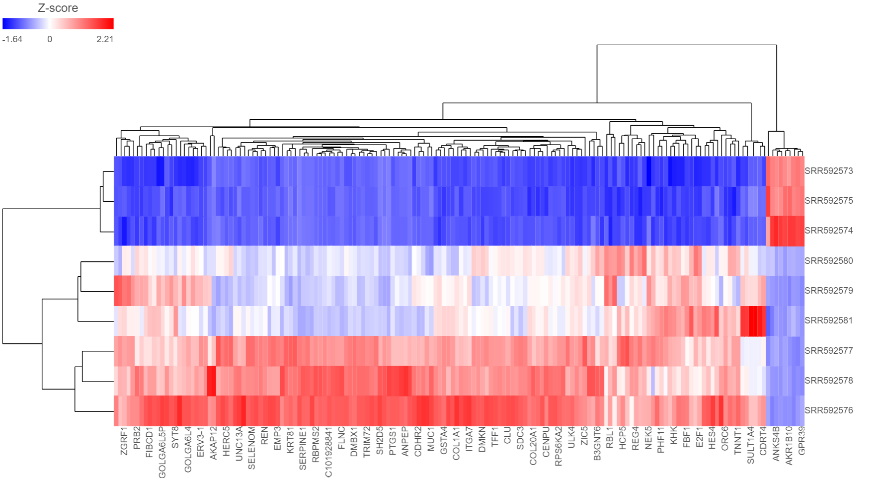
The output of a Hierarchical clustering task is can be a heat map heatmap (Figure 6) or a bubble map with or without dendrograms depending on whether you performed clustering on cells/samples/cells groups or features. By default, samples are on rows (sample labels are displayed as seen in the Data tab) and features (genes or transcripts, depending on the input data) are on columns. Colors are based on standardized expression values (default selection; performed on the fly). Dendrograms show clustering of rows (samples) and columns (variables).
...
| Numbered figure captions | ||||
|---|---|---|---|---|
| ||||
|
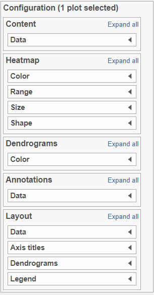
Depending on the resolution of your screen and the number of samples and variables (features) that need to be displayed, some binning may be involved. If there are more than samples/genes than pixels, values of neighboring components rows/columns will be averaged together. Use the mouse wheel to zoom in and out. When you zoom in to certain level on the heatmap, you will see each cell represent one sample/gene. Use the mouse wheel to zoom in / out. When you mouse over the row dendrogram or label area and zoom, it will only zoom in/out on the rows. The binning on the columns will remain the same. Similarly, when you mouse over the column dendrogram or label area and zoom, it will only zoom in/out on the columns. The binning on the rows will remain the same. To move the map around when zoomed in, press down the left mouse button and drag the map. There are 5 sections in the Configuration panel (Figure 7): Content, Heatmap, Dendrograms, Annotations and Layout. Click on the section title or the triangle (![]() ) to expand a section.The plot can be saved as a full-size image or as a current view; when Save image
) to expand a section.The plot can be saved as a full-size image or as a current view; when Save image is clicked, a prompt will ask how you would like to save the image.
Bubble map
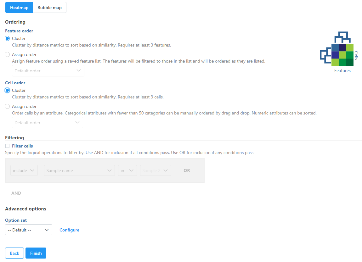
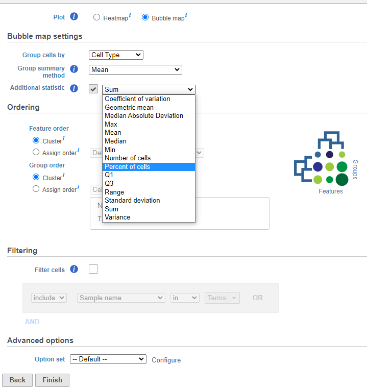
The Hierarchical clustering task can also be used to plot a bubble map. Let's go through the steps to make a bubble map (Figure 7):
- Choose to plot a Bubble map (note the selection of a bubble map in the image which is different from the heatmap). This will open the Bubble map settings.
- Configure the Bubble map settings. First, Group cells by an available categorical attribute (e.g. cell type). Next, summarize the group’s first dimension by color (Group summary method) then choose an additional dimension to plot size (Additional statistic) by using the drop down lists. If these settings are not adjusted, the default dimensions will generate two descriptive statistic measurements that plot the group mean by color and size by the percent of cells. Hierarchical clustering can be performed on the first assigned dimension (by color) which is the Group summary method. The second dimension (size) which is an Additional statistic is not required but it is selected by default (this can be unchecked with the checkbox).
- Ordering the plot columns (Feature order) and rows (Group order) behaves the same as a heatmap. In this example, Ordering for both features and groups by Cluster uses hierarchical clustering to perform distance metrics (default settings will be used but these metrics can be changed under Configure in the Advanced options section). Alternatively, Assign order to features using a managed (saved) feature list or the default order which is dependent on the input data. Assign order to groups can be used to rearrange the attribute by drag and drop, ascending or descending order, or default order which is how the labels as displayed in the Data tab.
- Filtering can be applied to the groups by checking Filter cells then specifying the logical operations to filter by (this is the same as a heatmap).
- Advanced options let the user perform Feature scaling (e.g. Standardize by a z-score) but in a bubble map the default is set to None. It also allows the user to change the Group clustering and Feature clustering options by altering the Cluster distance metrics and Point distance metrics (similar to a heatmap).
| Numbered figure captions | ||||
|---|---|---|---|---|
| ||||
|
Content
...
| |||
 |
Configuration
There are plot Configuration/Action options for the Hierarchical clustering / heatmap task which apply to both the heatmap and bubble map in the Data viewer (below): Axes, Heatmap, Dendrograms, Annotations, and Description. Click on the icon to open these configuration options.
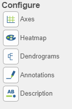
Axes 
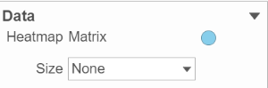
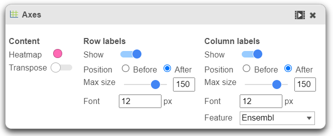
- This section controls the Content or data source used to draw the values in the heatmap or bubble map and also the ability to transpose the axes. The
...
- plot is a color representation of the values in the selected matrix.
...
- Most of the data nodes contain only one matrix, so
...
| Numbered figure captions | ||||
|---|---|---|---|---|
| ||||
|
...
- it will just say Matrix for the chosen data node. However, if a data node contains multiple matrices
...
- (e.g.
...
- descriptive statistics were performed on cluster groups for every gene like mean,
...
- standard deviation, percent of
...
- cells, etc
...
- ) each
...
- statistic will be in a separate matrix in the output data node.
...
| Numbered figure captions | ||||
|---|---|---|---|---|
| ||||
|
...
- In this case, you can choose which statistic/matrix to display using the drop-down list (this would be the case in a bubble map).
- To change the orientation (switch the columns and rows) of the plot, click on the (
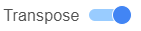 ) toggle switch.
 - Row labels and Column labels can be turned on or off by clicking the relevant toggle switches.
- The label size can be changed by specifying the number of pixels using Max size and Font. If an Ensembl annotation model has been associated with the data, you can choose to display the gene name or the Ensembl ID using the Content option.
Heatmap ![]()
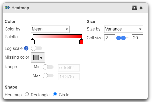
This section is used to configure the color, range, size, and shape of the components in the heatmap (Figure 10).
| Numbered figure captions | ||||
|---|---|---|---|---|
| ||||
|
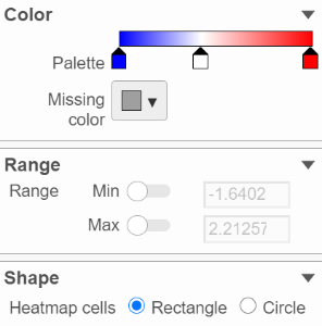
- In the color palette horizontal bar, the left side color represents the lowest value and the right side color represents the highest value in the matrix data.
...
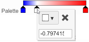
- Note that when you zoom in/out the lowest and highest values captured by the color palette may change. By default, there are 3 color stops (
 ): minimum, middle, and maximum color value of the default range calculated on the matrix. Left-click on the middle color stop and drag left
...
- or right to change the middle
...
- value this color stop represents. If you left-click on the middle color stop once, you can change the color and value this color stop represents (Figure 11). Click on the (
 ) to remove this color stop.
...
| Numbered figure captions | ||||
|---|---|---|---|---|
| ||||
|
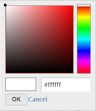
- Click on the color square or the adjacent triangle (
 ) to choose a color to represent the value. This will display a color picker dialog which allows selection of a color, either by clicking or by typing
...
- a HEX color code, then clicking OK
...
- .
...
| SubtitleText | Select a color from the color palette |
|---|---|
| AnchorName | choose color |
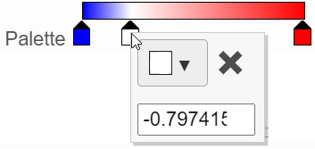
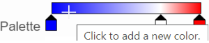
- The min and max color stops cannot be dragged or removed. If you left-click on them, you can choose a different color. When you click on the Palette bar, you can add a new color stop between min and max
...
- . Adding a color stop can be useful when there is an outlier value in the data. You can use a different color to represent different value ranges.
| Numbered figure captions | ||||
|---|---|---|---|---|
| ||||
|
- Right-clicking a color stop will reveal a list of options. Space colors evenly will rearrange the position of the stops so there is an equal distance between all stops. Center will move a stop to the middle of the two adjacent stops. Delete will remove the stop.
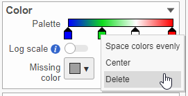
- To change the min and max threshold values represented by the color palette, click on the toggle switch (
 )
)
...
- under Range
...
- , and specify the values in the text boxes.
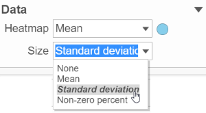
- In addition to color, you can also use the Size drop-down list to size by a set of values from another matrix stored in the same data node. Most of the data nodes contain only one matrix, so the only options available in the Size drop down will be None or Matrix. In cases where you have multiple matrices, you might want to use the color of the component in the heatmap to represent one type of statistic (like mean of the groups) and the size of the component to represent the information from a different statistic (like std. dev).
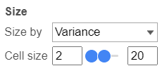
- The shape of the heatmap cell (component) can be configured either as a rectangle or circle by selecting the radio button
...
- under Shape.
Dendrograms
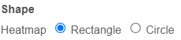
Dendrograms 
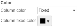
If cluster analysis is performed on samples and/or features, the result will be displayed as dendrograms. By default, the dendrograms are all colored in black (Figure 6).
The color of the dendrograms can be configured (Figure 14.)
| Numbered figure captions | ||||
|---|---|---|---|---|
| ||||
|
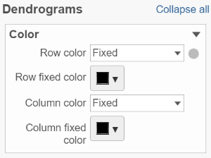
- Click on the color square or its triangle () to choose a different color for the dendrogram.
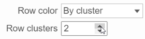
- When the By cluster in the Row/Column color drop-down list, the number of clusters needs to be specified
...
- . The top N clusters will be in N different colors.
| Numbered figure captions | ||||
|---|---|---|---|---|
| ||||
|
...
Annotations 
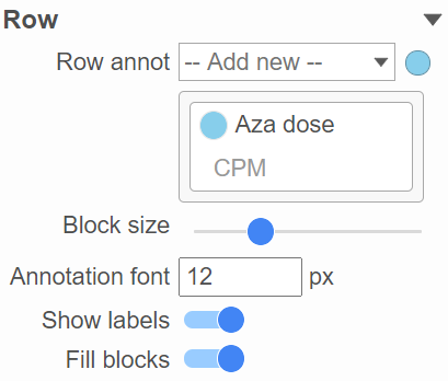
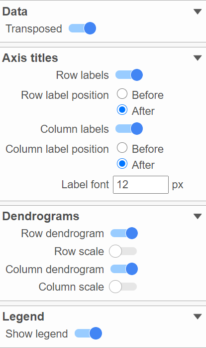
This section allows you to add sample or cell level annotations to the viewer. First, make sure to choose the correct data node which contains the annotation information you would like to use by clicking the circle (![]() ). All project level annotations will be available on all data nodes in the pipeline (Figure 16).
). All project level annotations will be available on all data nodes in the pipeline (Figure 16).
- Choose an attribute from the Row
...
- annotation drop-down list. Multiple attributes can be chosen from the drop-down list and can be reordered by clicking and dragging the groups below the drop-down list.
...
| Numbered figure captions | ||||
|---|---|---|---|---|
| ||||
|
...
- Each attribute is represented as an annotation bar next to the heatmap. Different colors represent the different groups in the attribute.
...
- The width of the annotation bar can be
...
- changed using the Block size slider when the Show labels toggle switch is on.
- The annotation label font size can be changed by specifying the size in pixels.
- The Fill blocks toggle switch adds or removes color from the annotation labels.
Layout
To change the orientation of the plot, click on the (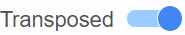 ) toggle switch in the Data sub-section of the Layout section (Figure 17).
| Numbered figure captions | ||||
|---|---|---|---|---|
| ||||
|
Axis titles, dendrograms, and the legend can be turned on or off by clicking the relevant toggle switches. The axis label font size can be changed by specifying the number of pixels.
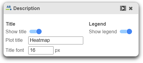
Description 
Description is used to modify the Title and toggle on or off the Legend.
In-plot controls
The heatmap has several different mouse modes which modify the way the plot responds to the mouse buttons. The mode buttons are in the upper right corner of the heatmap. Clicking one of these buttons puts the heatmap into that mode.
- In
...
- point mode (
...
 ), you can
...
- left-click and drag to move around the heatmap (if you are not fully zoomed out). Left-clicking once on the heatmap or on a dendrogram branch will select the associated rows/columns.
- In selection mode (
 ), you can click and drag to select a range of rows, columns, or components.
 - In flip mode (
 ), you can click on a line in the dendrogram (which represents a cluster branch) and the location of the two legs of the branch will be swapped. If no clustering is performed (no dendrogram is generated), in this mode, you can click on the label of an item (observation or feature), drag and drop to manually switch orders of the row or column on the heatmap.
 - Click on reset view (
 ) to reset to the default
 - Save Image icon (
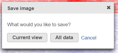
 ) enables you to download the heat map to your local computer. If the heat map contains up to 2.5M cells (features * observations), you can choose between saving the current appearance of the heat map window (Current view) and saving the entire heat map (All data)
...
- . Depending on the number of features / observations, Partek Flow may not be able to fit all the labels on the screen, due to the limit imposed by the screen resolution. All Data option provides an image file of sufficient size so that all the labels are readable (in turn, that image may not fit the compute screen and the image file may be quite large). If the heat map exceeds 2.5M cells, the Current view option will not be shown, and you will see only a dialog like the one
...
| SubtitleText | Save Image tool dialog downloads an image file to the local computer: Current view - only the visible part of the heat map will be saved; All data - entire heat map will be saved |
|---|---|
| AnchorName | save_image_heat_map |
- below.
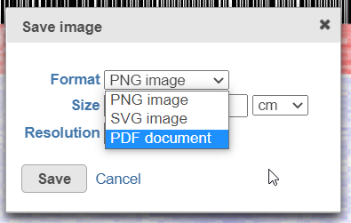
- After selecting either Current view (if applicable) or All data button, the next dialog (
...
- below) will allow you to specify the image format, size, and resolution.
...
| SubtitleText | Save image dialog: specifying image type (.png is supported for Current view only), size, and resolution |
|---|---|
| AnchorName | save_image_type |
| Additional assistance |
|---|
| Rate Macro | ||
|---|---|---|
|
...
Overview
Content Tools