Join us for a webinar: The complexities of spatial multiomics unraveled
May 2
Page History
...
Exploratory Analysis Results
- Double click the merged UMAP data node
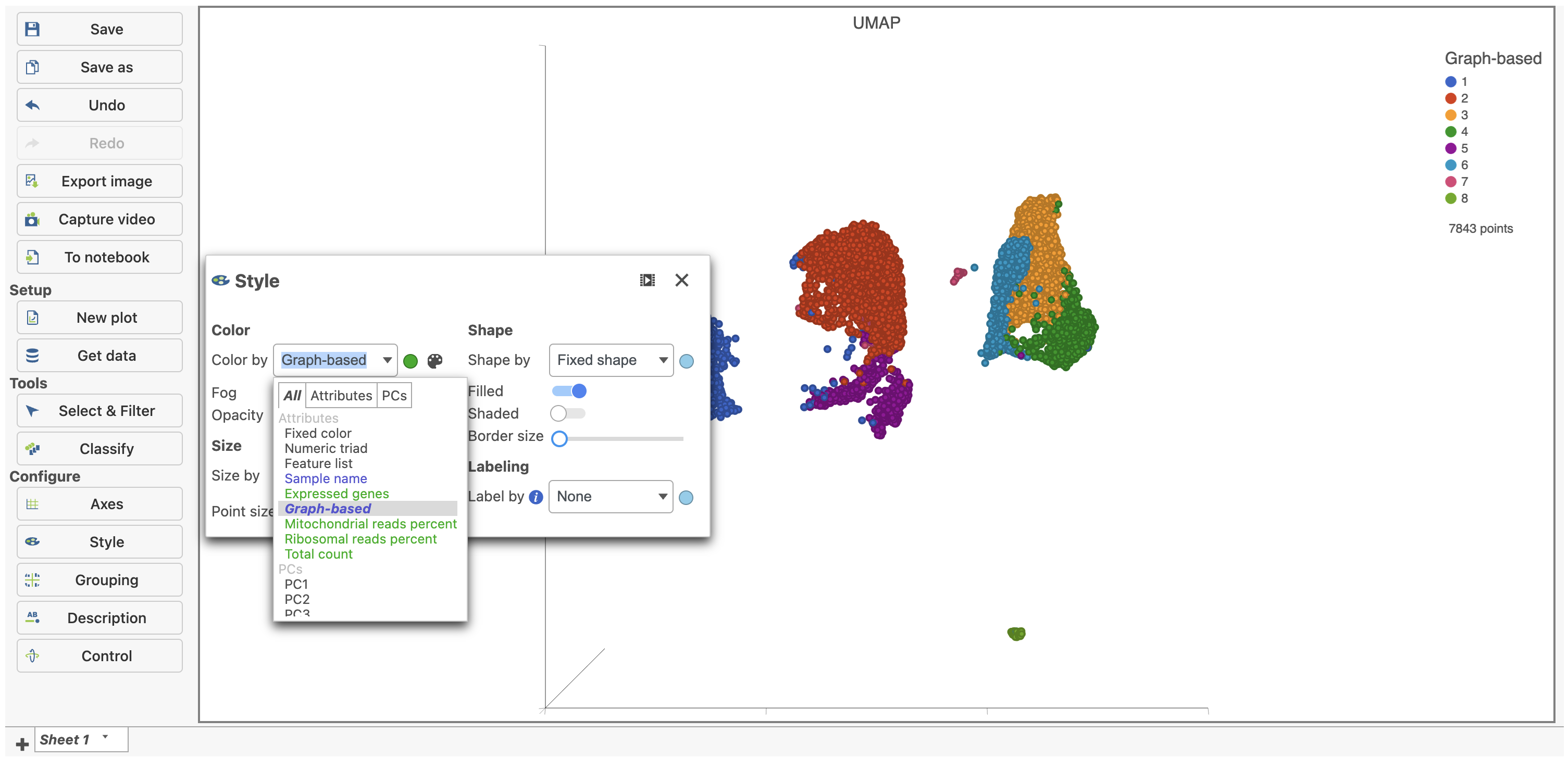
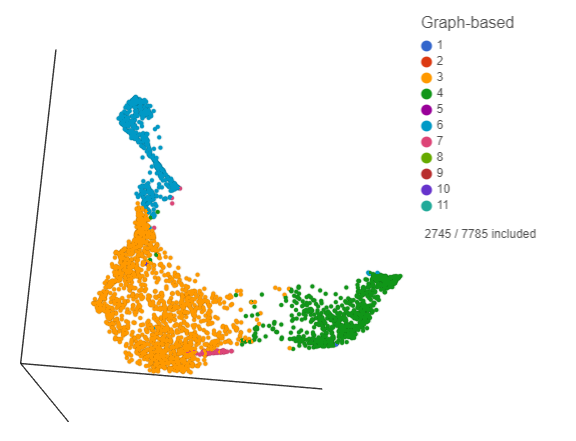
- Under Configure on the left, click Style, select the Graph-based cluster node, and color by the Graph-based attribute (Figure 1)
...
| Numbered figure captions | ||||
|---|---|---|---|---|
| ||||
|
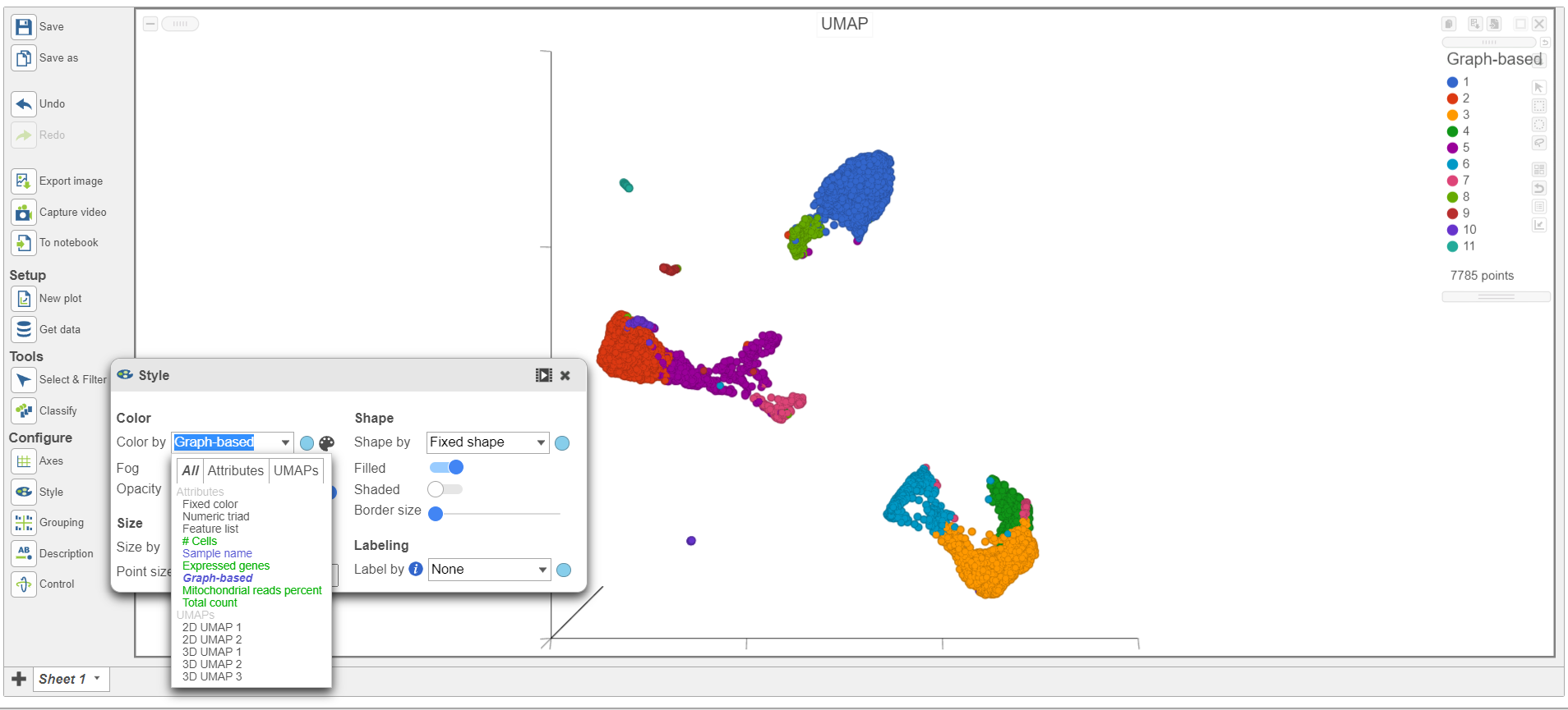
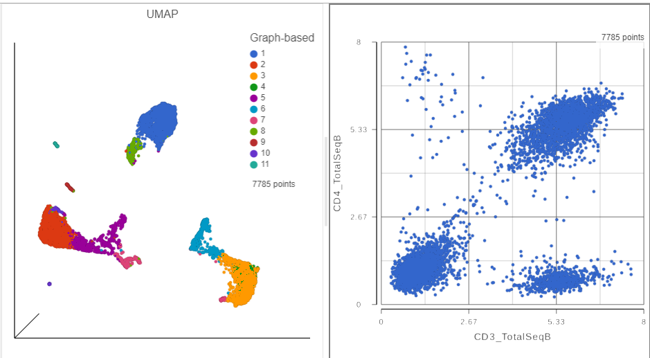
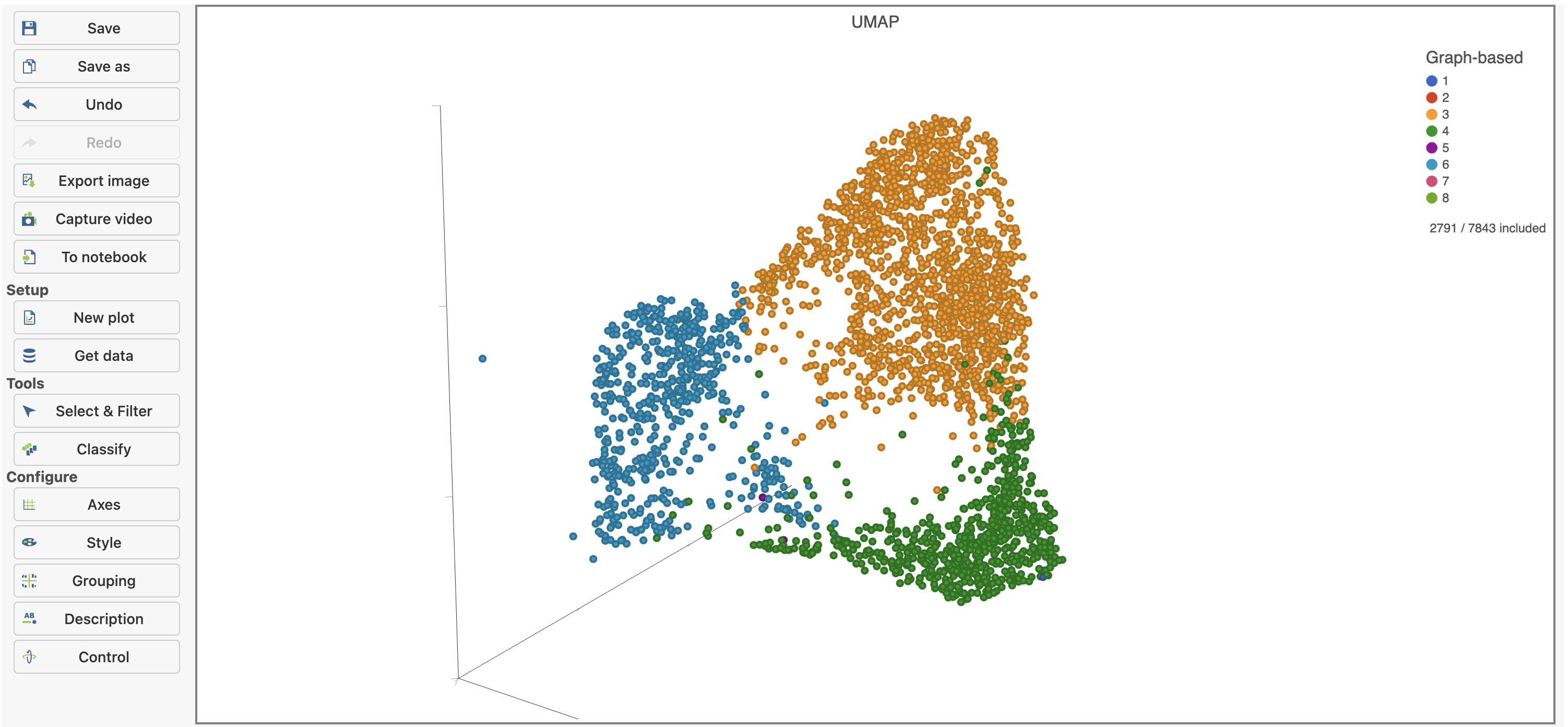
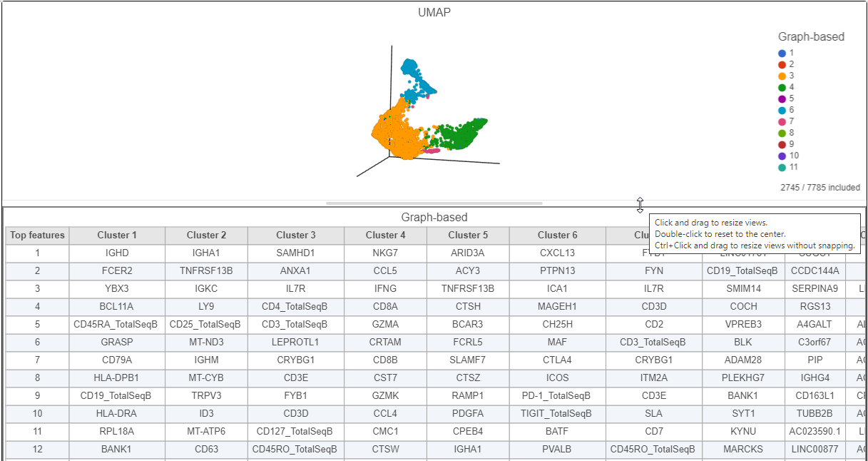
The 3D UMAP plot opens in a new data viewer session (Figure 2). Each point is a different cell and they are clustered based on how similar their expression profiles are across proteins and genes. Because a graph-based clustering task was performed upstream, a biomarker table is also displayed under the plot. This table lists the proteins and genes that are most highly expressed in each graph-based cluster. The graph-based clustering found 11 clusters, so there are 11 columns in the biomarker table.
...
| Numbered figure captions | ||||
|---|---|---|---|---|
| ||||
|
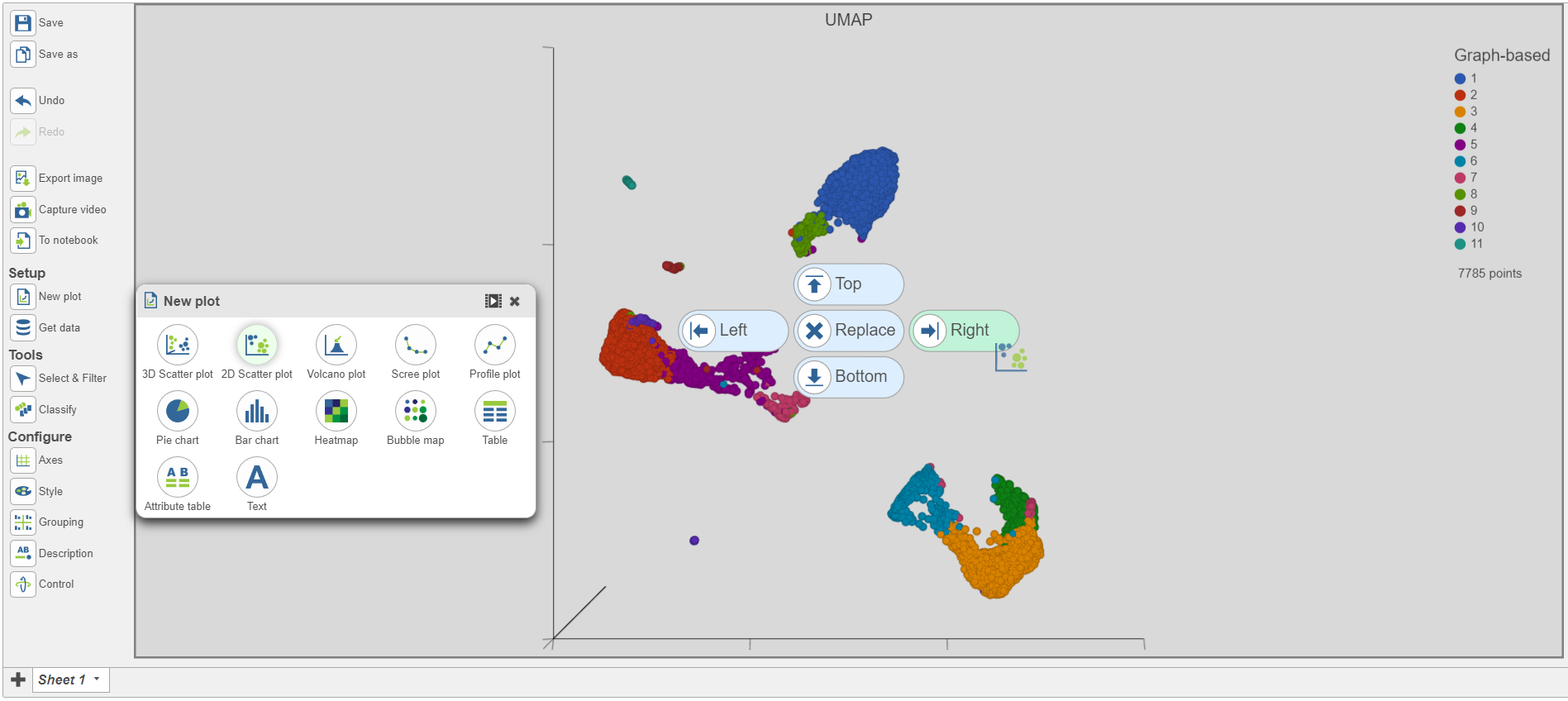
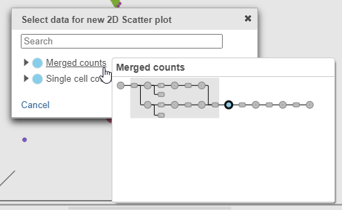
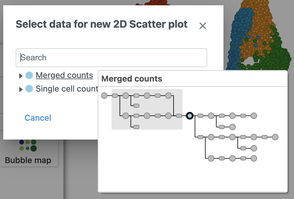
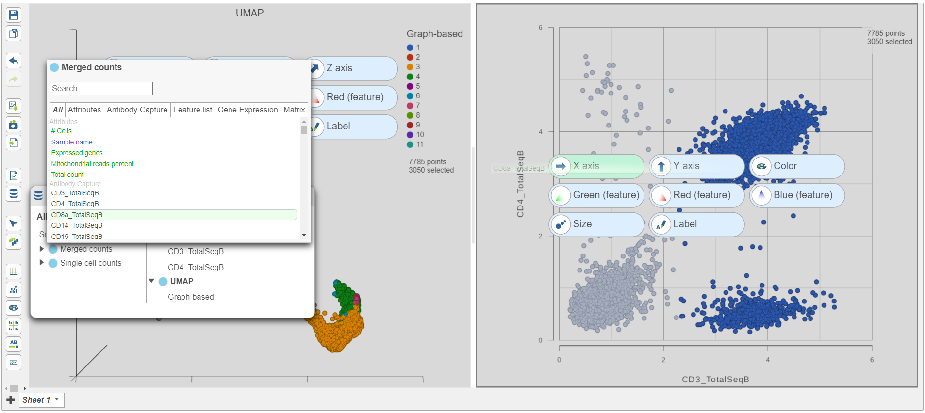
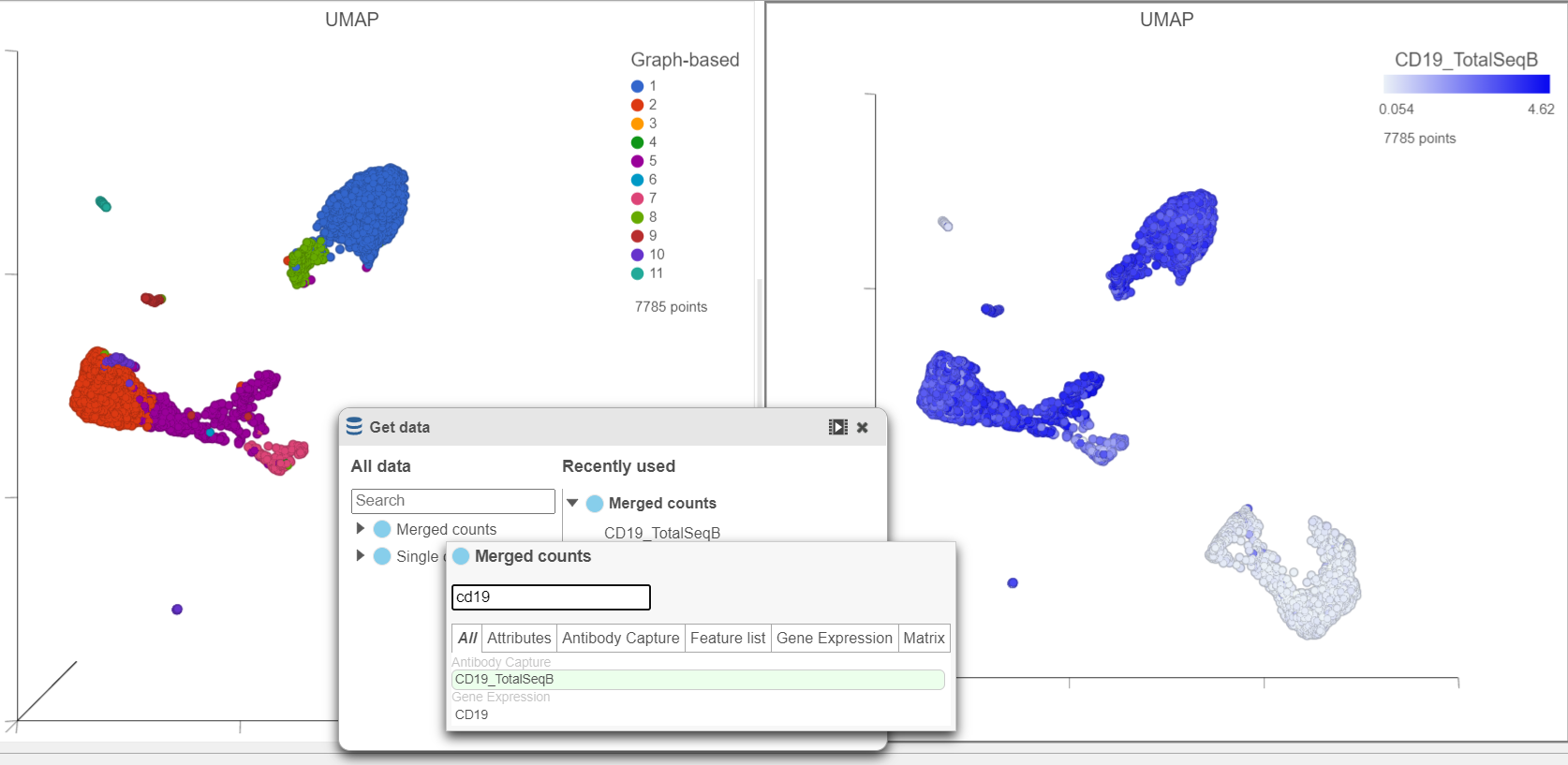
- Click Merged counts to use as data for the 2D scatter plot (Figure 3)
...
| Numbered figure captions | ||||
|---|---|---|---|---|
| ||||
|
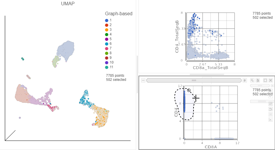
A 2D scatter plot has been added to the right of the UMAP plot. The points in the 2D scatter plot are the same cells as in the UMAP, but they are positioned along the x- and y-axes according to their expression level for two protein markers: CD3_TotalSeqB and CD4_TotalSeqB, respectively (Figure 4).
...
| Numbered figure captions | ||||
|---|---|---|---|---|
| ||||
|
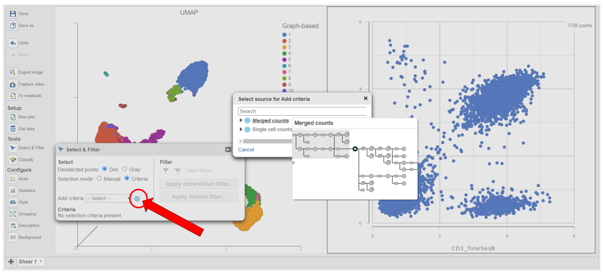
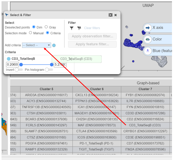
- In Select & Filter, click Criteria to change the selection mode
- Click the blue circle next to the Add rule drop-down menu (Figure 5)
...
| Numbered figure captions | ||||
|---|---|---|---|---|
| ||||
|
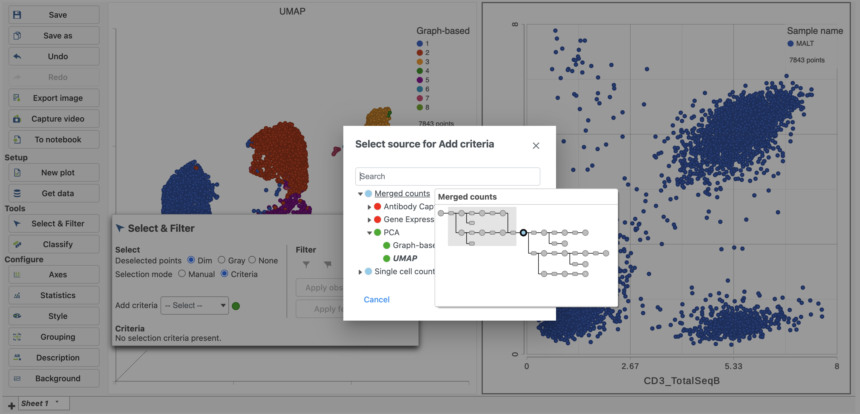
- Click Merged counts to change the data source
- Choose CD3_TotalSeqB from the drop-down list (Figure 6)
...
| Numbered figure captions | ||||
|---|---|---|---|---|
| ||||
|
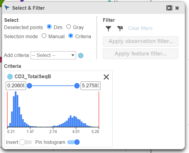
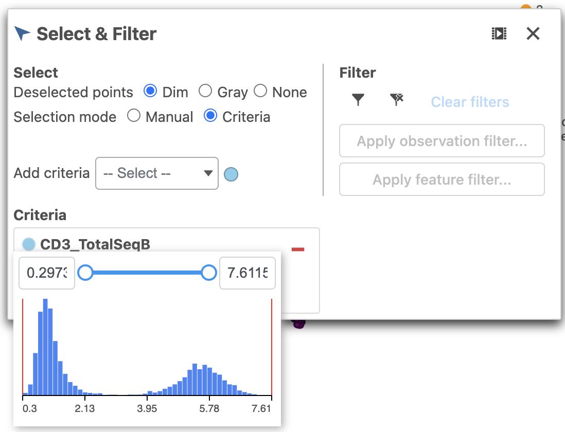
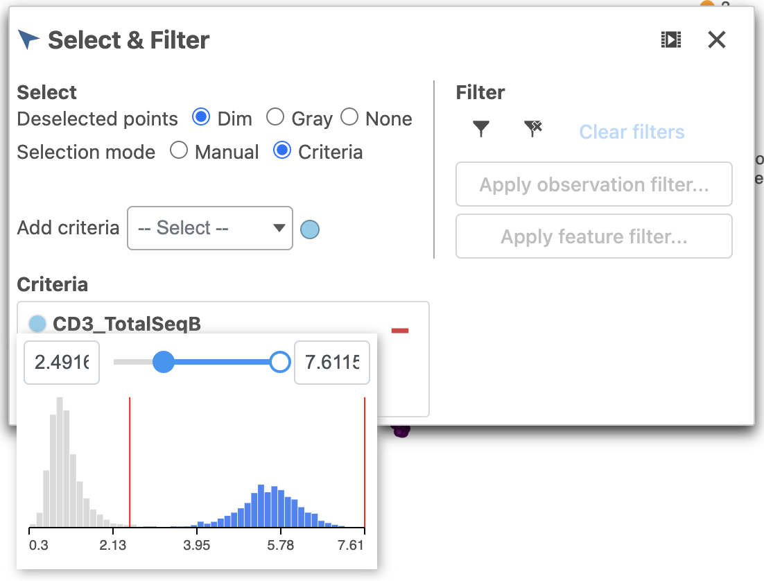
- Click and drag the slider on the CD3D_TotalSeqB selection rule to include the CD3 positive cells (Figure 7)
...
| Numbered figure captions | ||||
|---|---|---|---|---|
| ||||
|
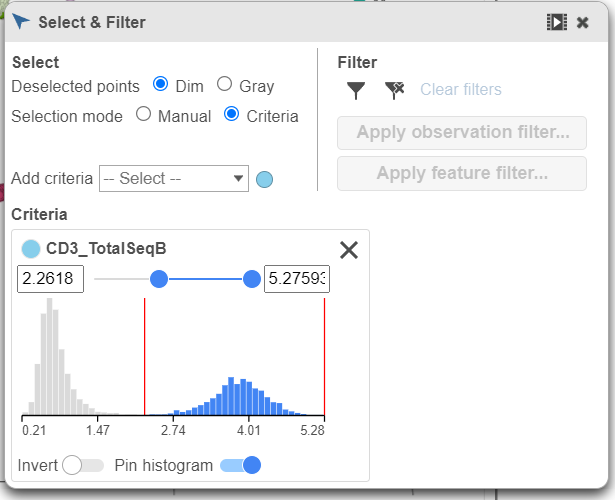
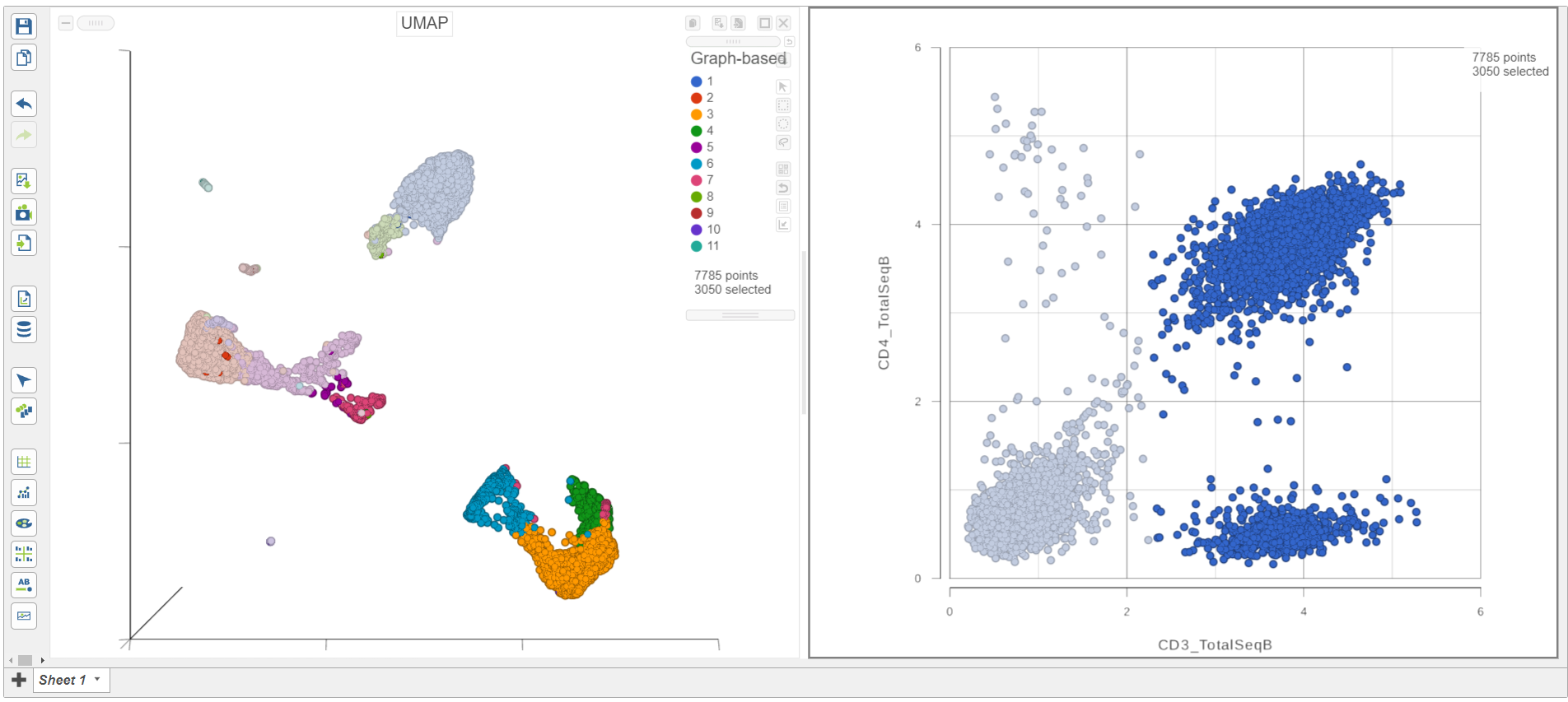
As you move the slider up and down, the corresponding points on both plots will dynamically update. The cells with a high expression for the CD3 protein marker (a marker for T cells) are highlighted and the deselected points are dimmed (Figure 8).
...
| Numbered figure captions | ||||
|---|---|---|---|---|
| ||||
|
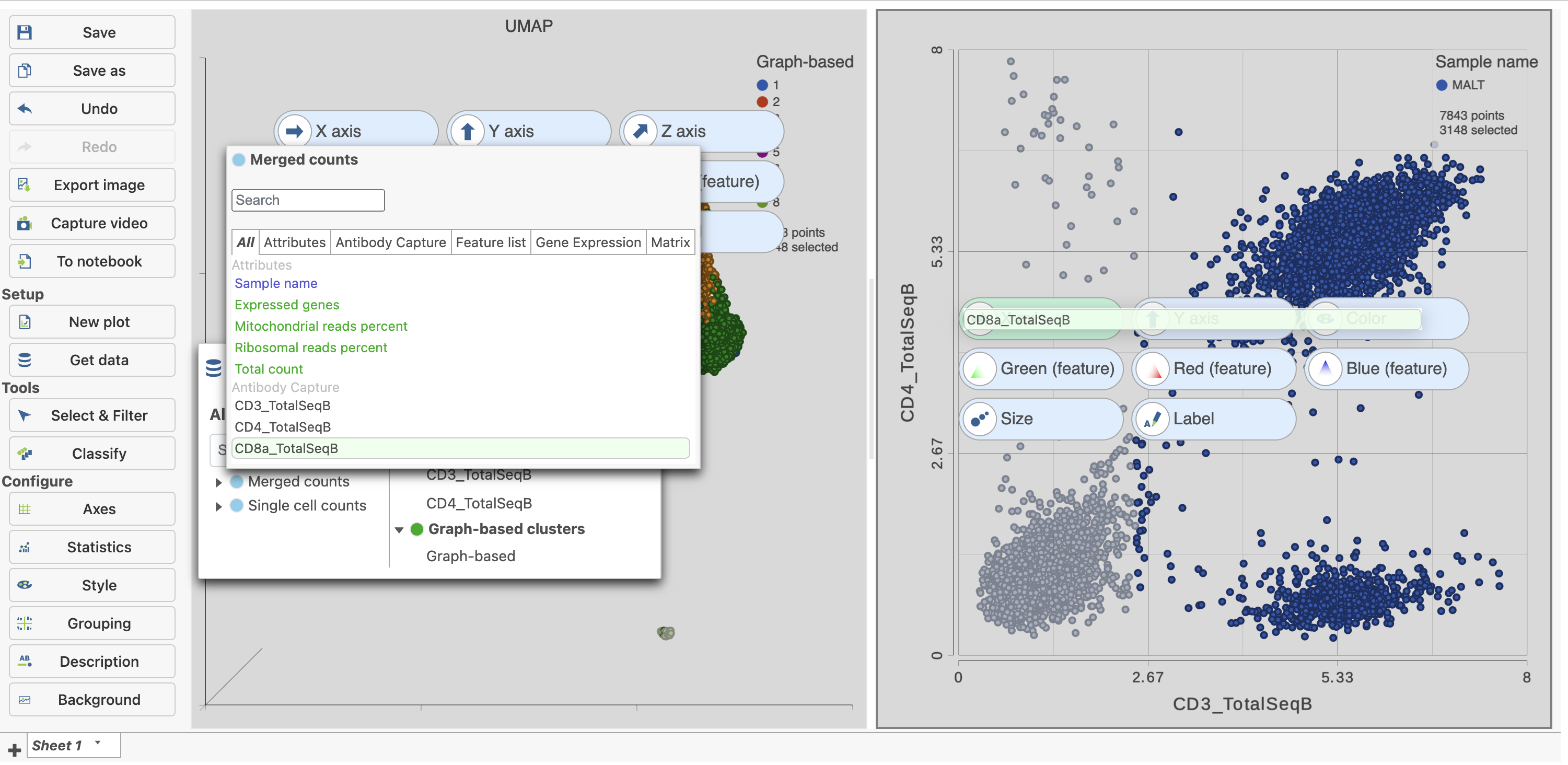
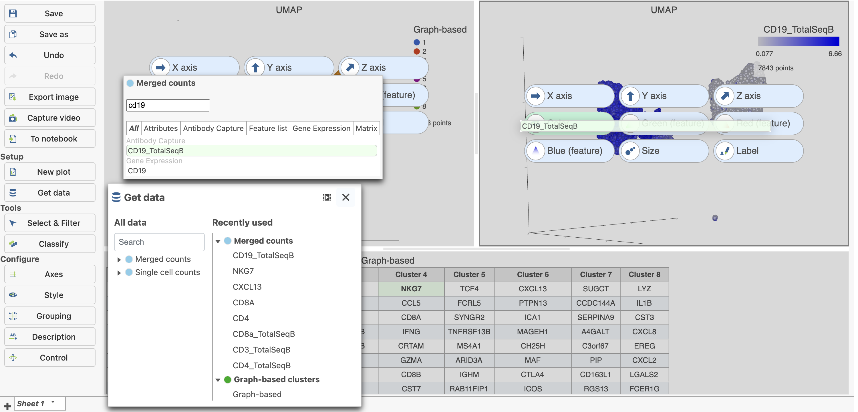
- Click Merged counts in Get data on the left under Setup
- Click and drag CD8a_TotalSeqB onto the 2D scatter plot (Figure 9)
- Drop CD8_TotalSeqB onto the x-axis configuration option
...
| Numbered figure captions | ||||
|---|---|---|---|---|
| ||||
|
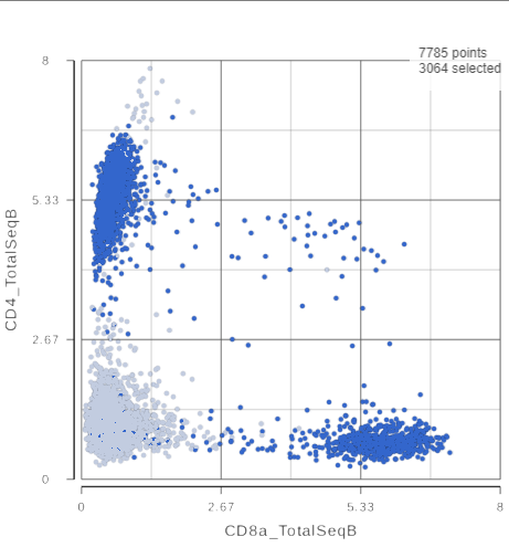
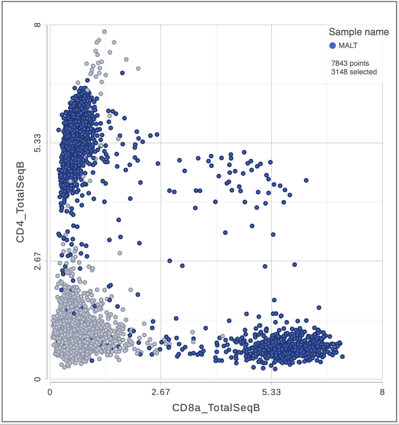
The CD3 positive cells are still selected, but now you can see how they separate into CD4 and CD8 positive populations (Figure 10).
...
| Numbered figure captions | ||||
|---|---|---|---|---|
| ||||
|
The simplest way to classifying cell types is to look for the expression of key marker genes or proteins. This approach is more effective with CITE-Seq data than with gene expression data alone as the protein expression data has a better dynamic range and is less sparse. Additionally, many cell types have expected cell surface marker profiles established using other technologies such as flow cytometry or CyTOF. Let's compare the resolution power of the CD4 and CD8A gene expression markers compared to their protein counterparts.
...
| Numbered figure captions | ||||
|---|---|---|---|---|
| ||||
|
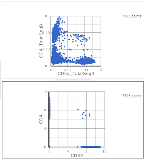
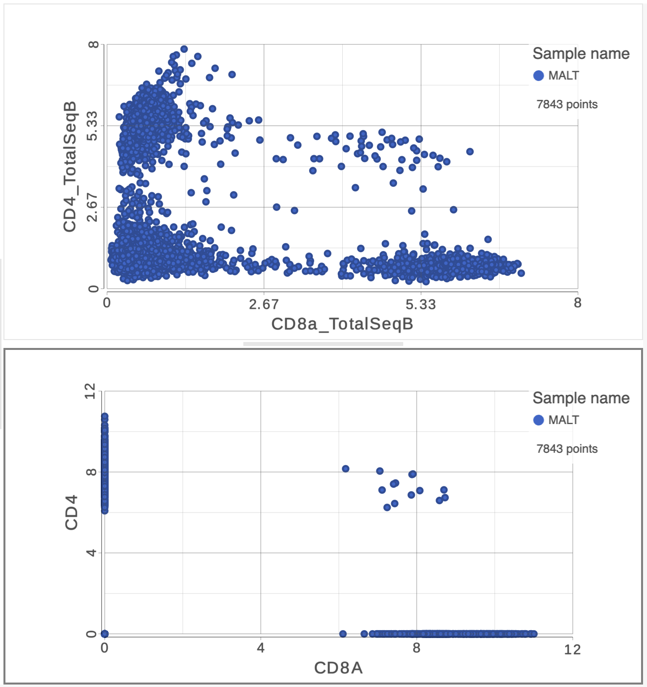
- On the first 2D scatter plot (with protein markers), click
 in the top right corner
 - Manually select the cells with high expression of the CD4_TotalSeqB protein marker (Figure 13)
...
| Numbered figure captions | ||||
|---|---|---|---|---|
| ||||
|
Let's perform the same test on the gene expression data.
...
| Numbered figure captions | ||||
|---|---|---|---|---|
| ||||
|
This time, only 500 cells show positive expression for the CD4 marker gene. This means that the protein data is less sparse (i.e. there fewer zero counts), which further helps to reliably detect sub-populations.
...
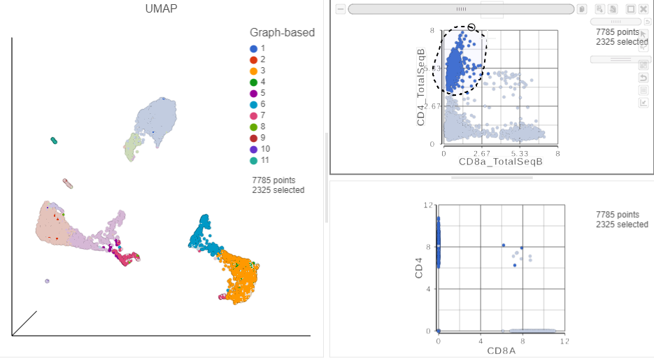
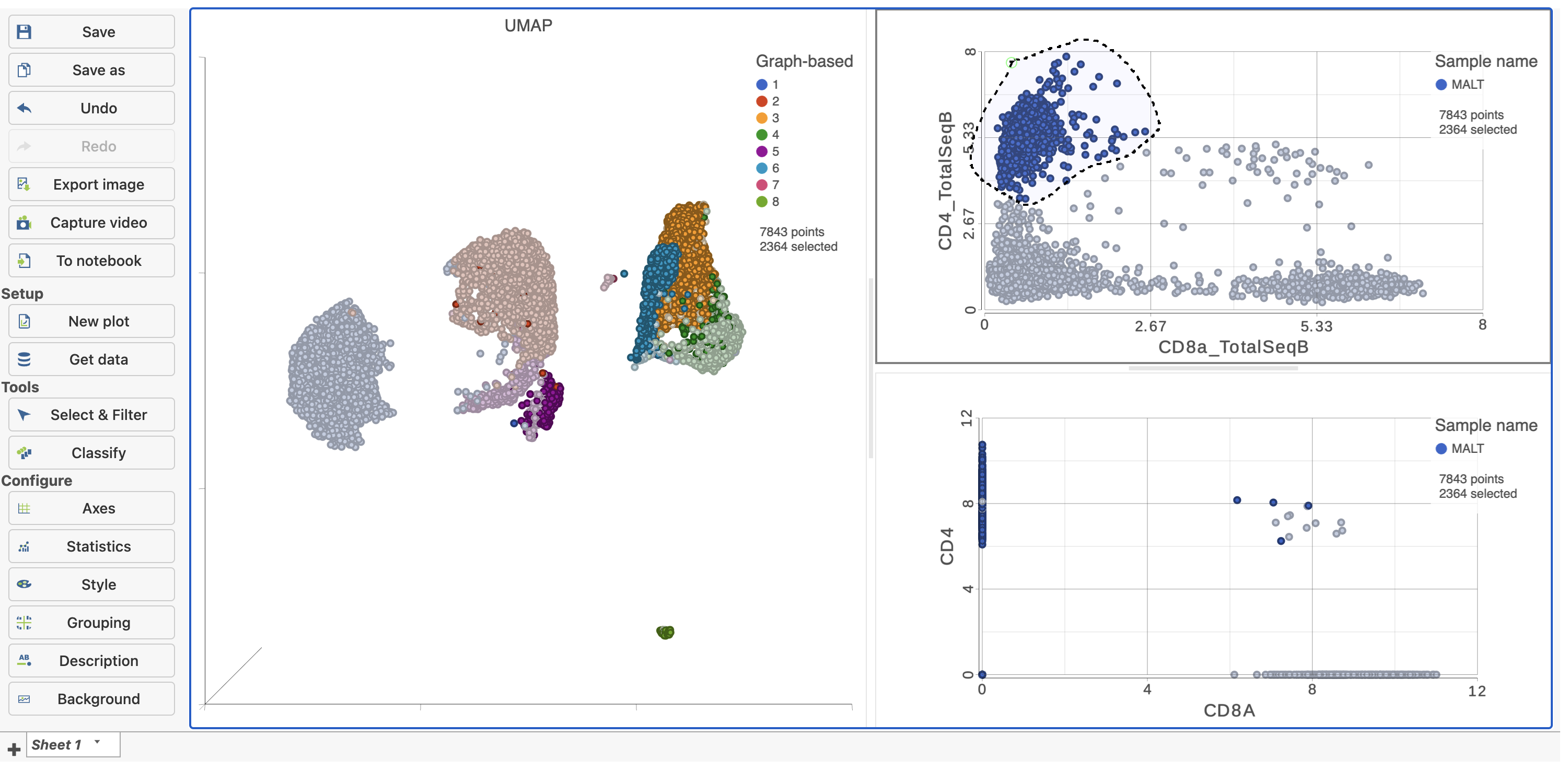
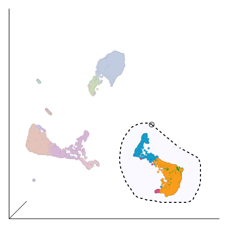
Based on the exploratory analysis above, most of the CD3 positive cells are in the group of cells in the bottom right corner side of the UMAP plot. This is likely to be a group of T cells. We will now examine this group in more detail to identify T cell sub-populations.
...
| Numbered figure captions | ||||
|---|---|---|---|---|
| ||||
|
- Click
in the Select & Filter tool to include the selected points
- Click
 in the top right of the plot to switch back to pointer mode
 - Click and drag the plot to rotate it around
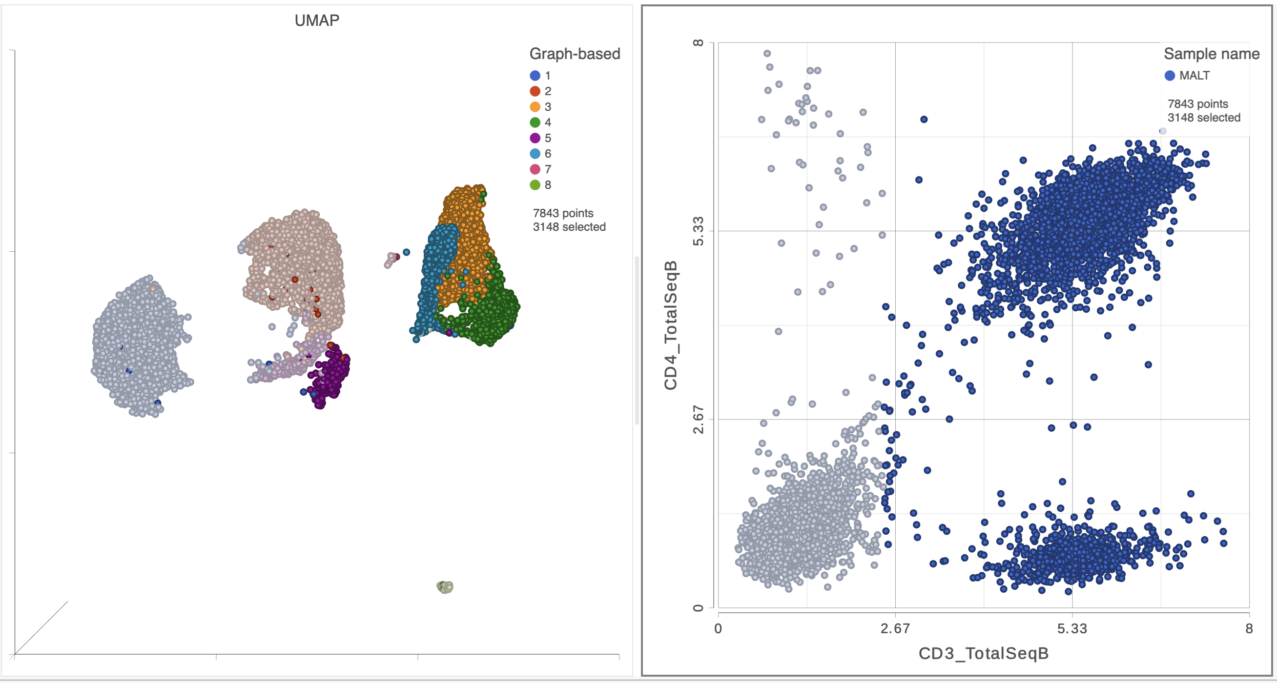
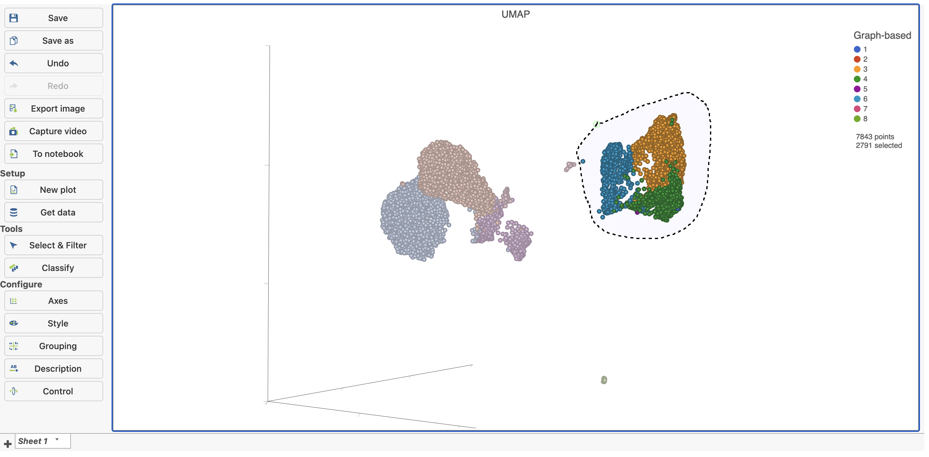
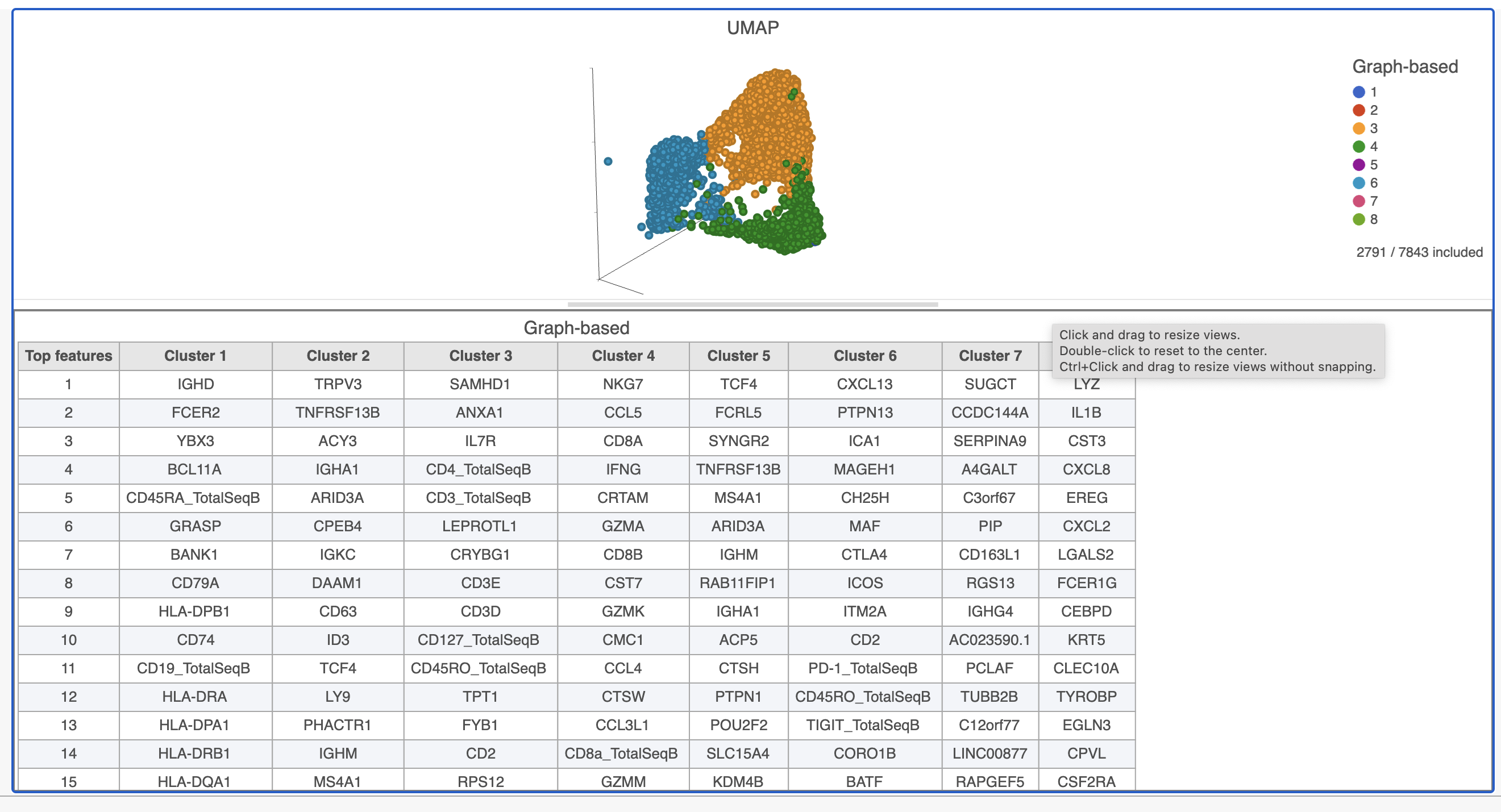
Deselected cells are excluded and the axes have been rescaled to give better resolution of the selected points (Figure 16). Note that the UMAP has not been recalculated, the axes have just been rescaled.
| Numbered figure captions | ||||
|---|---|---|---|---|
| ||||
|
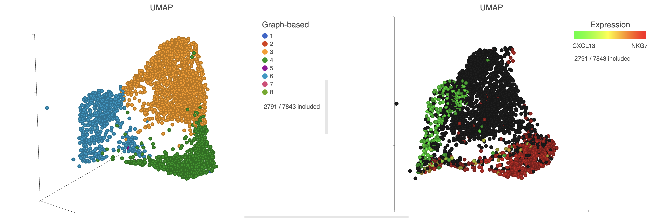
This group of putative T cells predominantly consists of cells assigned to graph-based clusters 3, 4, and 6, and 7, indicated by the colors. Examining the biomarker table for these clusters can help us infer different types of T cell.
- Add the Biomarkers table using the Table option in the New plot menu, you can drag and reposition the table using the button in the top left corner of the plot
 .
. - Click and drag the bar between the UMAP plot and the biomarker table to resize the biomarker table to see more of it (Figure 17)
If you need to create more space on the canvas, hide the panel words on the left using the arrow  .
.
| Numbered figure captions | ||||
|---|---|---|---|---|
| ||||
|
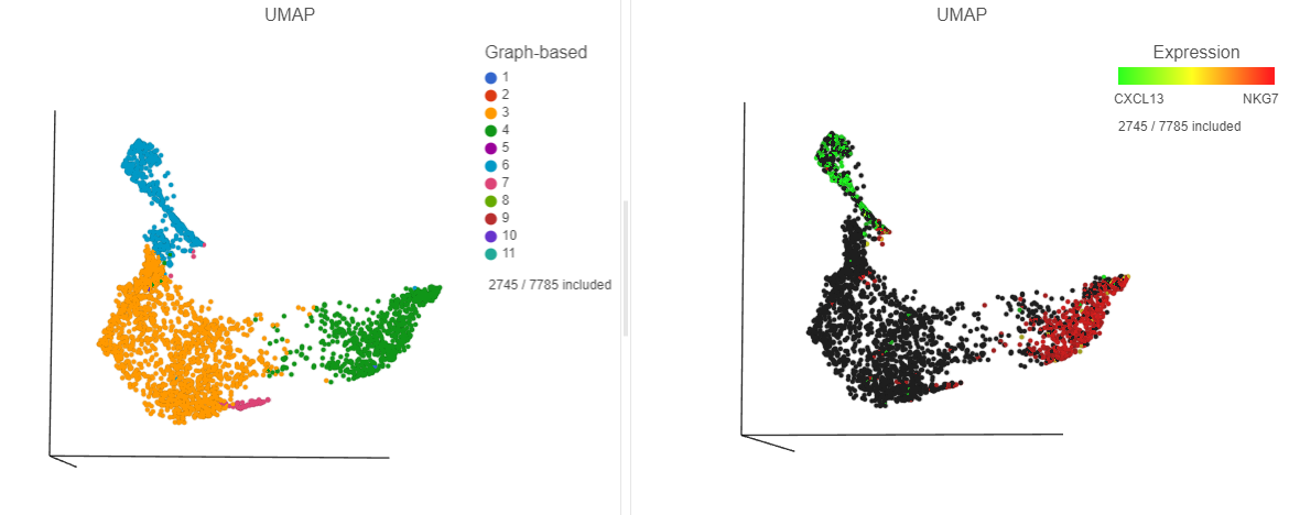
Cluster 6 has several interesting biomarkers. The top biomarker is CXCL13, a gene expressed by follicular B helper T cells (Tfh cells). Another biomarker is the PD-1 protein, which is expressed in Tfh cells. This protein promotes self-tolerance and is a target for immunotherapy drugs. The TIGIT protein is also expressed in cluster 6 and is another immunotherapy drug target that promotes self-tolerance.
...
| Numbered figure captions | ||||
|---|---|---|---|---|
| ||||
|
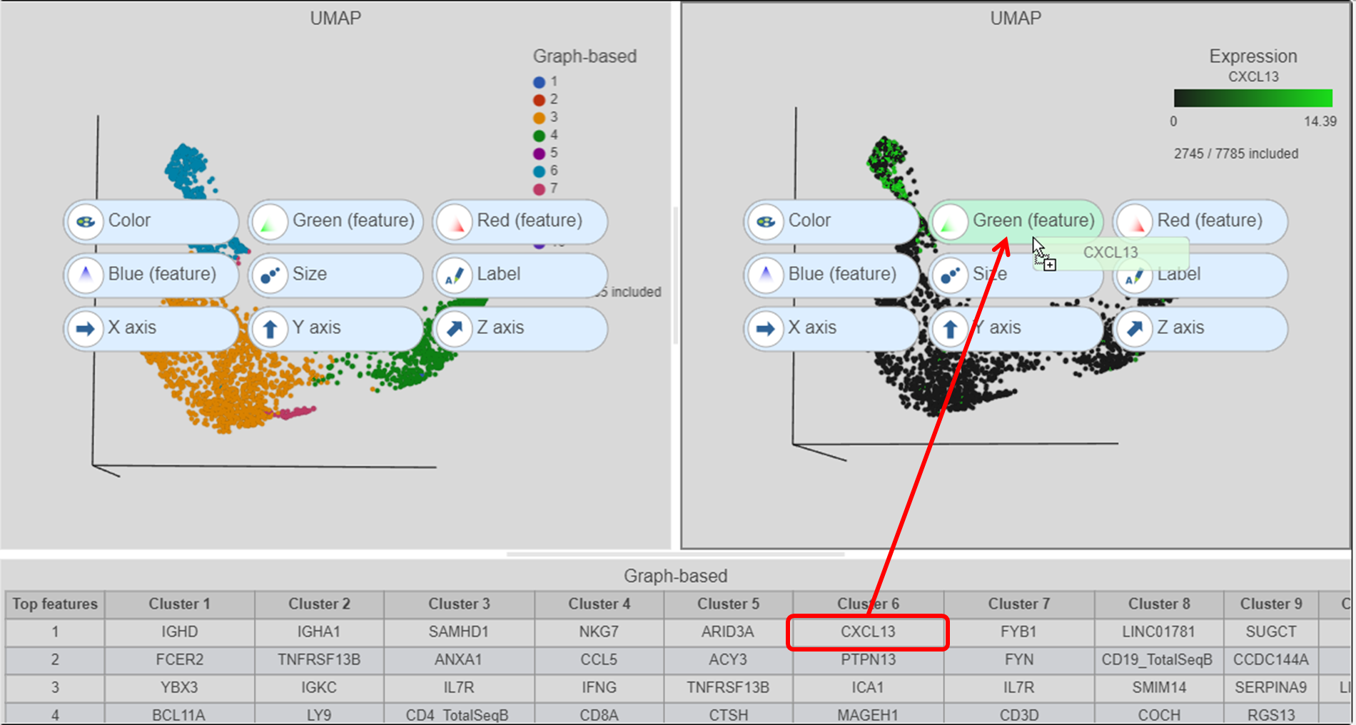
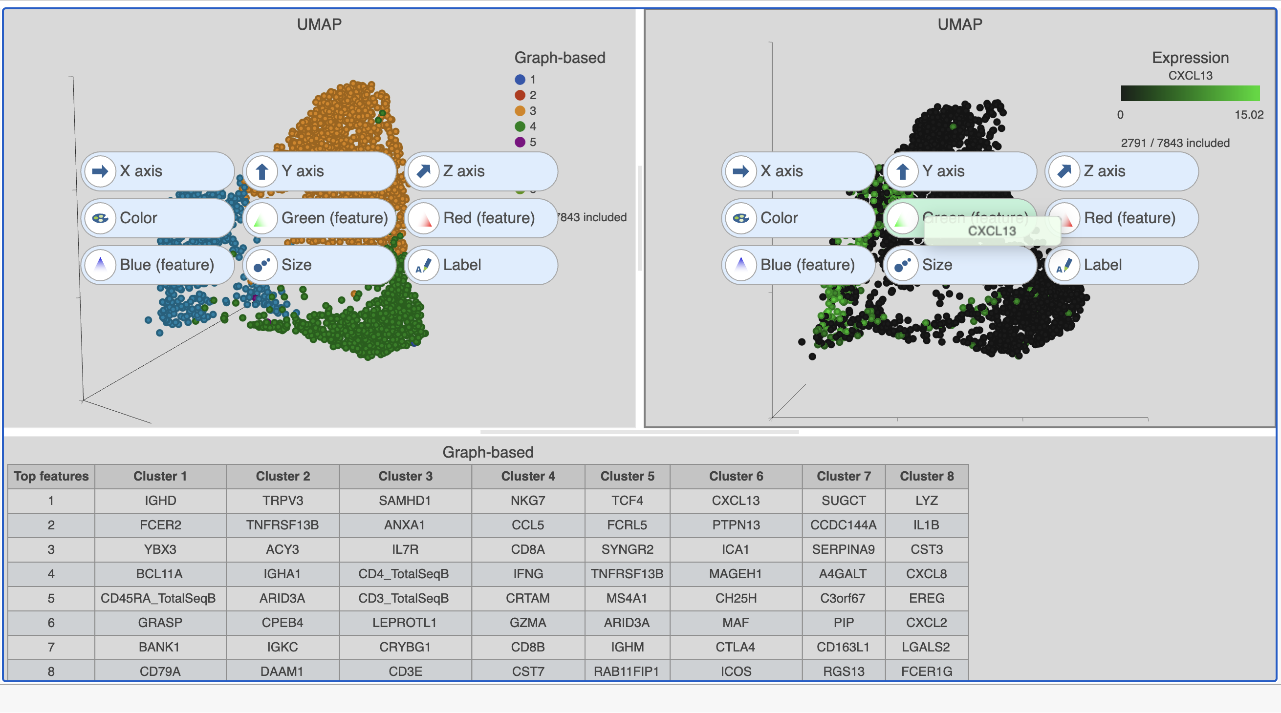
- Click and drag the NKG7 gene from the biomarker table onto the duplicate UMAP plot
- Drop the NKG7 gene onto the Red (feature) option
...
| Numbered figure captions | ||||
|---|---|---|---|---|
| ||||
|
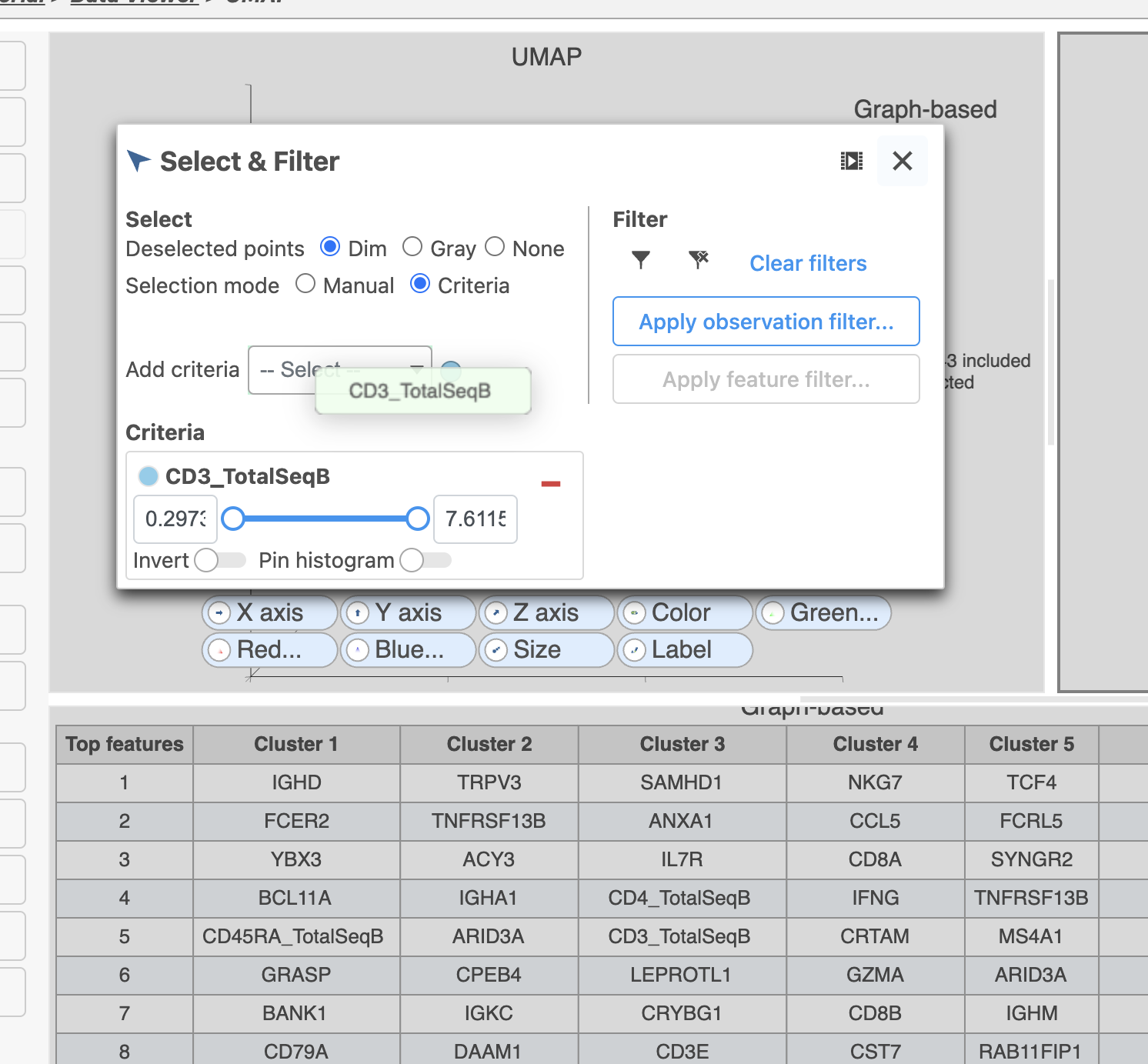
- In Select & Filter, click
 to remove the CD3_TotalSeqB filtering rule
 - Click the blue circle next to the Add criteria drop-down list
- Search for Graph to search for a data source
- Select Graph-based clustering (derived from the Merged counts > PCA data nodes)
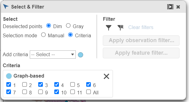
- Click the Add criteria drop-down list and choose Graph-based to add a selection rule (Figure 20)
...
| Numbered figure captions | ||||
|---|---|---|---|---|
| ||||
|
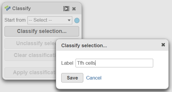
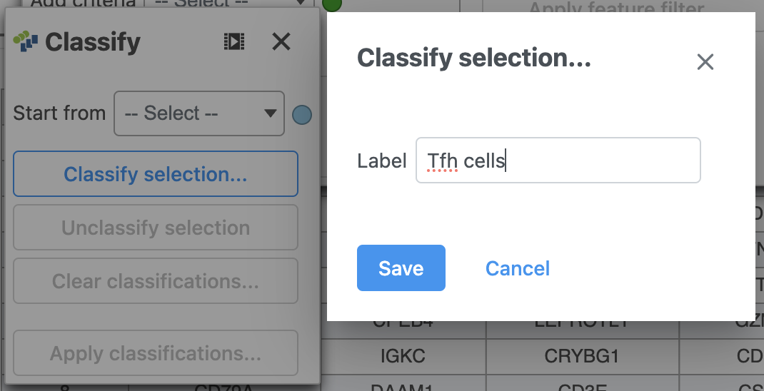
- In the Graph-based filtering rule, click All to deselect all cells
- Click cluster 6 to select all cells in cluster 6
- Using the Classify tool, click Classify selection
- Label the cells as Tfh cells (Figure 21)
- Click Save
...
| Numbered figure captions | ||||
|---|---|---|---|---|
| ||||
|
- Click
 in Select & Filter to exclude the cluster 6/Tfh cells
 - Click cluster 4 to select all cells in cluster 4
- In the Classify icon, click Classify selection
- Label the cells as Cytotoxic cells
- Click Save
- Click in Select & Filter to exclude the cluster 4/Cytotoxic cells
...
| Numbered figure captions | ||||
|---|---|---|---|---|
| ||||
|
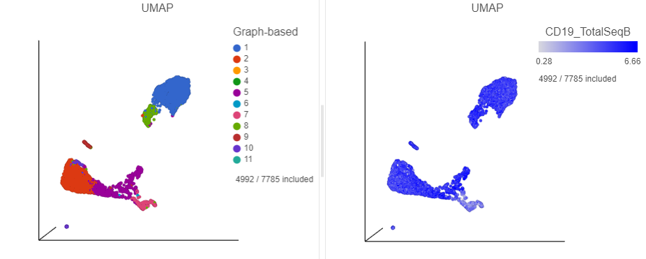
B cells
In addition to T-cells, we would expect to see B lymphocytes, at least some of which are malignant, in a MALT tumor sample. We can color the plot by expression of a B cell marker to locate these cells on the UMAP plot.
...
| Numbered figure captions | ||||
|---|---|---|---|---|
| ||||
|
- Click in the top right corner of the UMAP plot
- Lasso around the CD19 positive cells (Figure 25)
- Click
...
| Numbered figure captions | ||||
|---|---|---|---|---|
| ||||
|
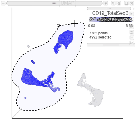
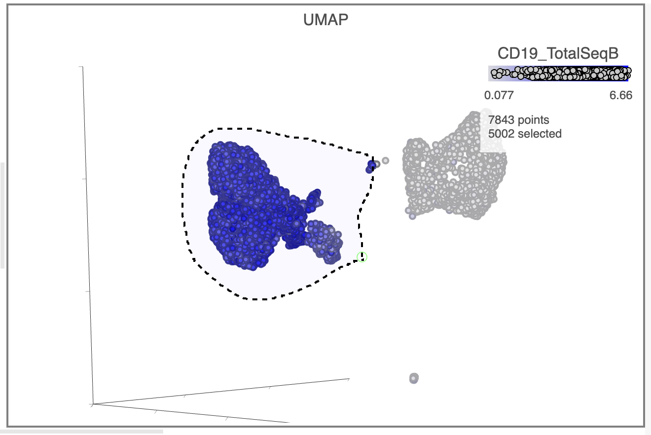
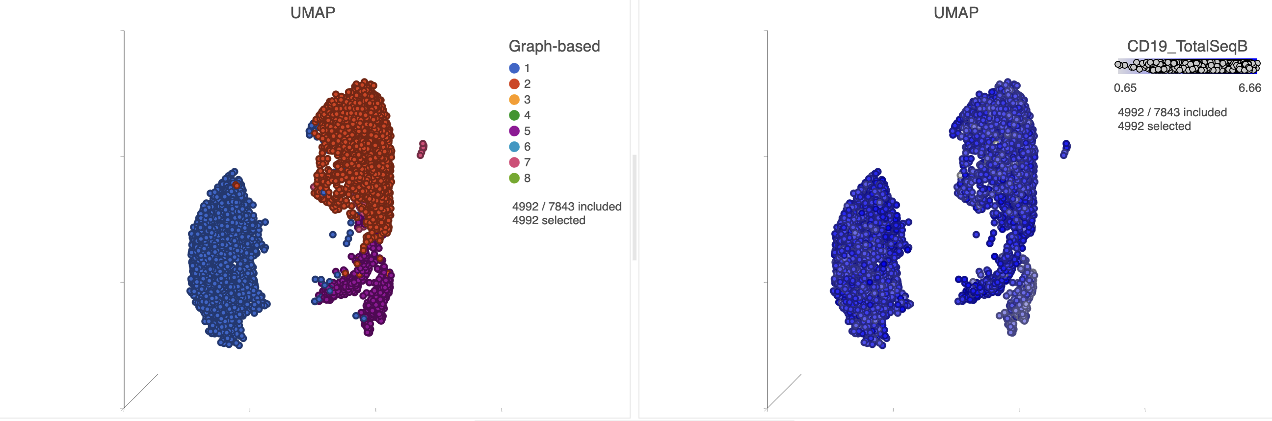
The plots will rescale to include the selected points. The CD19 positive cells include cells from graph-based clusters 1, 2 , 5, 6, 7, 8, 9, and 10 and 7 (Figure 26).
| Numbered figure captions | ||||
|---|---|---|---|---|
| ||||
|
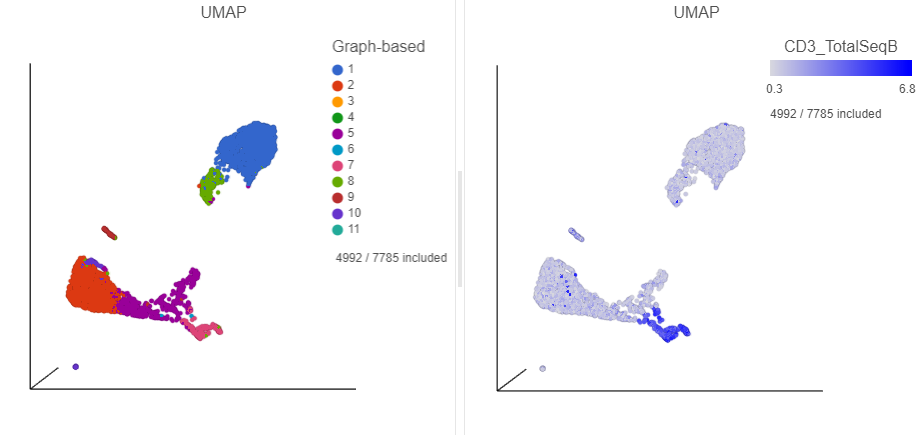
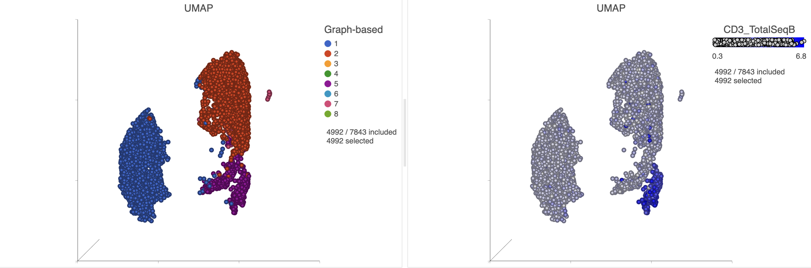
Inspection of the biomarker table shows that clusters 6 and 7 both show signs of expressing T cell markers (e.g. CD3D and IL7R genes, and CD3 protein) and we have seen previously that these clusters likely correspond the T cells.
|
- Find the CD3_TotalSeqB protein marker in the biomarker table
- Click and drag the CD3_TotalSeqB onto the UMAP plot on the right
- Drop the CD3_TotalSeqB protein marker onto the Color configuration option on the plot (Figure 27)
...
| Numbered figure captions | ||||
|---|---|---|---|---|
| ||||
|
- Select either of the UMAP plots
- Click on the Select & Filter
- Click to select cluster 6 and 7
- Click the Classify icon then click Classify selection
- Label the cells as Doublets
- Click Save
- Click in Select & Filter to exclude the selected points
There still appear to be some CD3 positive cells left on the plot, even after clusters 6 and 7 have been excluded.
- Click
- Find the CD3_TotalSeqB protein marker in the biomarker table
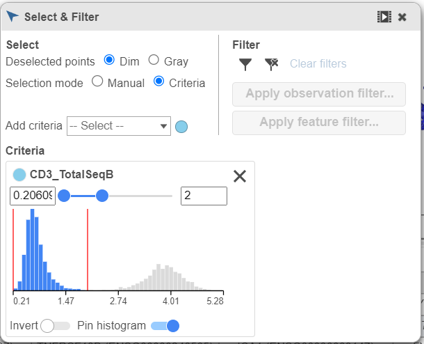
- Click and drag CD3_TotalSeqB onto the Add criteria drop-down list in Select & Filter (Figure 28)
- Set the minimum threshold to 3 in the CD3_TotalSeqB selection (Figure 29)
- Click the Classify icon then click Classify selection
- Label the cells as Doublets
- Click Save
- Click in Select & Filter to exclude the selected points
| Numbered figure captions | ||||
|---|---|---|---|---|
| ||||
|
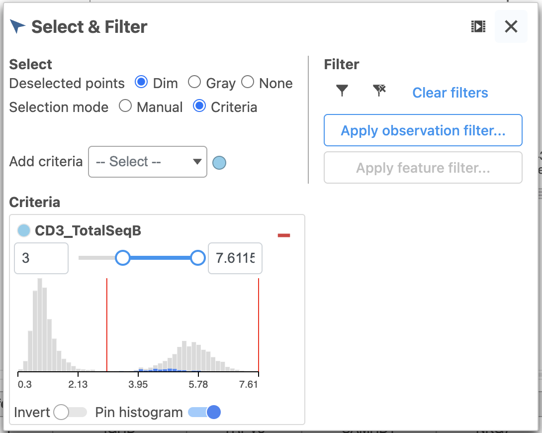
- Set the minimum threshold to 2 in the CD3_TotalSeqB selection (Figure 29)
|
| Numbered figure captions | ||||
|---|---|---|---|---|
| ||||
|
- In the Classify icon, click Classify selection
- Choose Doublets from the drop-down list of cell labels
- Click Save
- Click in the Select & Filter icon to exclude the selected points
The remaining CD3 positive cells have been added to the Doublet classification and removed from the plot.
...
|
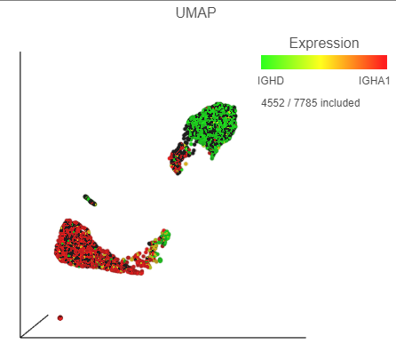
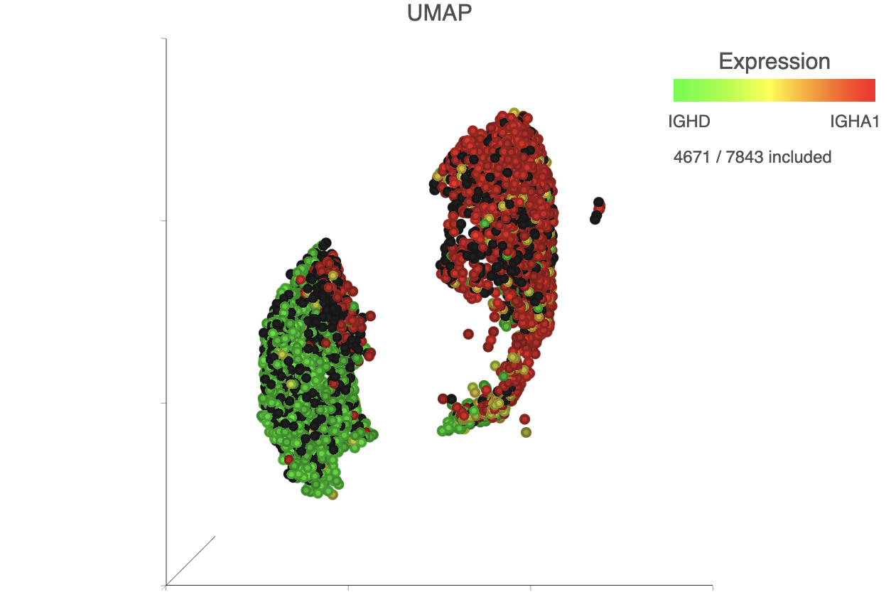
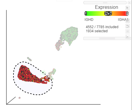
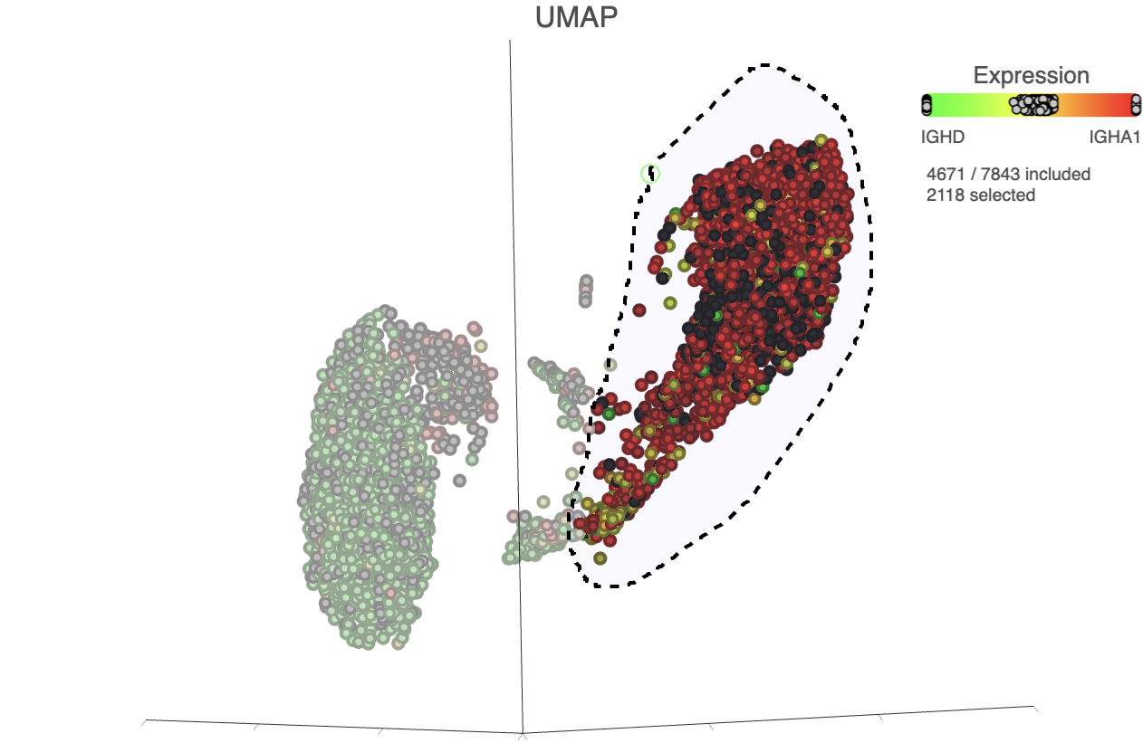
The biomarkers for clusters 1 and 2 also show an interesting pattern. Cluster 1 lists IGHD as its top biomarker, while cluster 2 lists IGHA1 as the fourth most significant. Both IGHD (Immunoglobulin Heavy Constant Delta) and IGHA1 (Immunoglobulin Heavy Constant Alpha 1) encode classes of the immunoglobulin heavy chain constant region. IGHD is part of IgD, which is expressed by mature B cells, and IGHA1 is part of IgA1, which is expressed by activated B cells. We can color the plot by both of these genes to visualize their expression.
...
| Numbered figure captions | ||||
|---|---|---|---|---|
| ||||
|
We can use the lasso tool to select and classify these populations.
...
| Numbered figure captions | ||||
|---|---|---|---|---|
| ||||
|
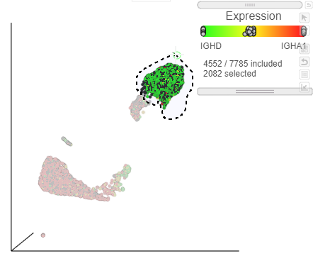
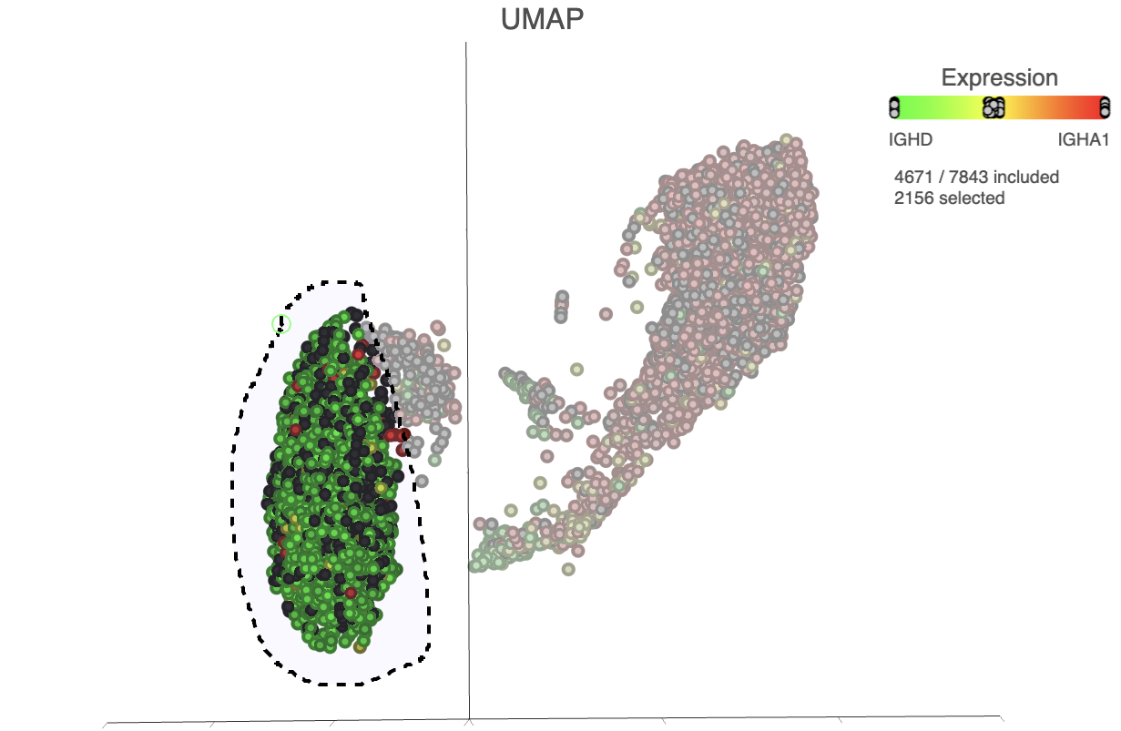
- Lasso around the IGHA1 positive cells (Figure 32)
- In the Classify icon on the left, click Classify selection
- Label the cells as Activated B cells
- Click Save
...
| Numbered figure captions | ||||
|---|---|---|---|---|
| ||||
|
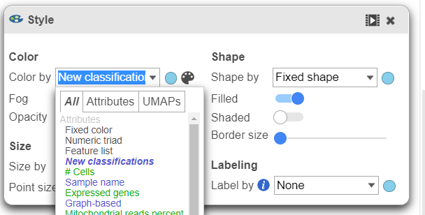
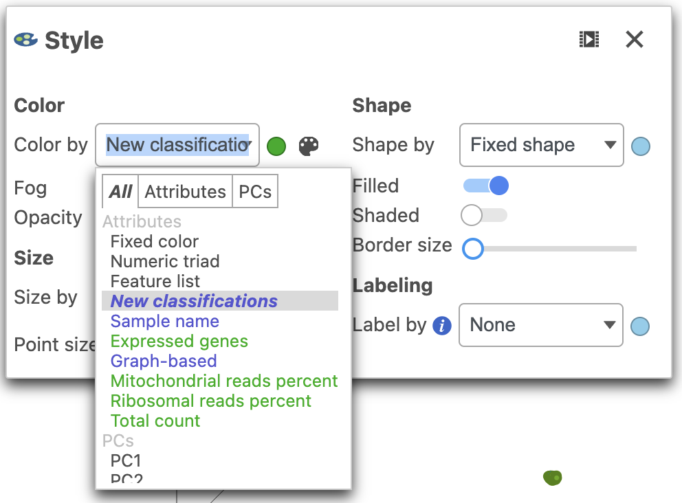
We can now visualize our classifications.
...
| Numbered figure captions | ||||
|---|---|---|---|---|
| ||||
|
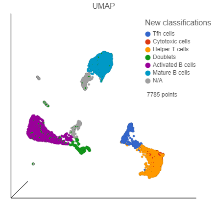
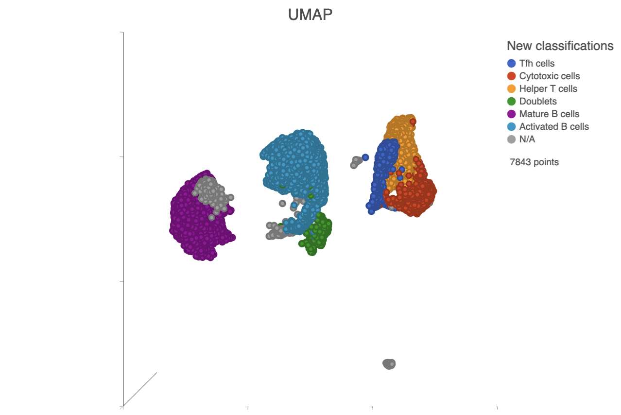
- Click Apply classifications in the Classify icon
- Choose the Merged counts data node as input for the classification task (Figure 34)
| Numbered figure captions | ||||
|---|---|---|---|---|
| ||||
|
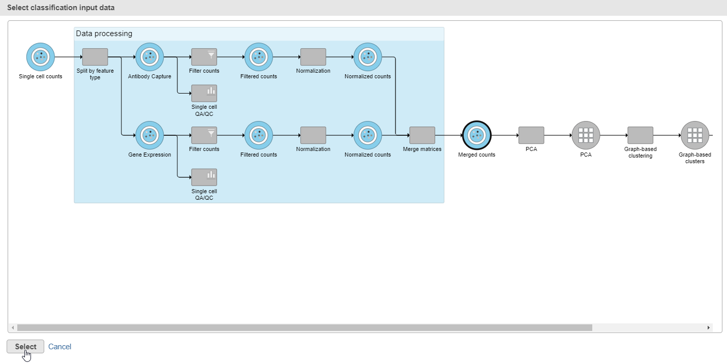
- Click Select
- Name the attribute Cell type
- Click Run
- Click OK to close the message about a classification task being enqueued
Optionally, you may wish to save this data viewer session if you need to go back and reclassify cells later. To save the session, click the icon on the left and name the session.
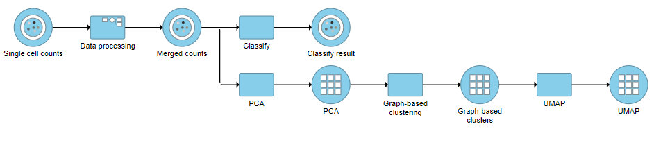
A Classify task will be added to the pipeline producing a Classify results data node.
- Click the project name at the top to go back to the Analyses tab (Figure 35)
| Numbered figure captions | ||||
|---|---|---|---|---|
| ||||
|
| Page Turner | ||
|---|---|---|
|
...
Overview
Content Tools