Page History
...
| Table of Contents | ||||||
|---|---|---|---|---|---|---|
|
GSA dialog
The first step of GSA is to choose which attributes to include in the test (Figure 1). All sample attributes including numeric and categorical attributes are displayed in the dialog, so use the check button to select between them. An experiment with two attributes Cell type (with groups A and B)and Time (time points 0, 5, 10) is used as an example in this section.
...
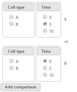
To compare Time point 5 vs. 0, select 5 for Time on the top, 0 for Time on the bottom, and click Add comparison (Figure 3).
| Numbered figure captions | ||||
|---|---|---|---|---|
| ||||
|
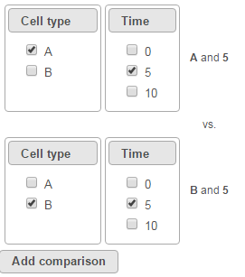
To compare cell types at a certain time point, e.g. time point 5, select A and 5 on the top, and B and 5 on the bottom. Thereafter click Add comparison (Figure 4).
| Numbered figure captions | ||||
|---|---|---|---|---|
| ||||
|
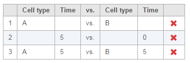
Multiple comparisons can be computed in one GSA run; Figure 5 shows the above three comparisons are added in the computation.
| Numbered figure captions | ||||
|---|---|---|---|---|
| ||||
|
...
- If invoked from a Partek E/M method output, the data node contains raw read counts and the default normalization is:
- Normalize to total count (RPM)
- Add 0.0001 (offset)
- If invoked from a Cufflinks method output, the data node contains FPKM and the default normalization is:
- Add 0.0001 (offset)
| Numbered figure captions | ||||
|---|---|---|---|---|
| ||||
|
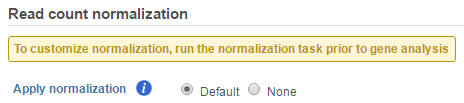
If advanced normalization needs to be applied, perform the Normalize counts task on a quantification data node before doing differential expression detection (GSA or ANOVA).
GSA advanced options
Click on Configure to customize Advanced options (Figure 7).
| Numbered figure captions | ||||
|---|---|---|---|---|
| ||||
|
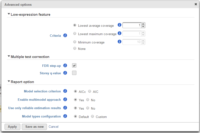
Low-expression feature
Low -expression feature section allows you to specify criteria to exclude features that do not meet requirements for the calculation. If there is filter feature task performed in the upstream analysis, the default of this filter is set to "None", otherwise, the default is Lowest average coverage is set to 1.
- Lowest average coverage: the computation will exclude a feature if its geometric mean across all samples is below than the specified value
- Lowest maximum coverage: the computation will exclude a feature if its maximum across all samples is below the specified value
- Minimum coverage: the computation will exclude a feature if its sum across all samples is below than the specified value
- None: include all features in the computation
Multiple test correction
Multiple test correction can be performed on the p-values of each comparison, with FDR step-up being the default (1). If you check the Storey q-value (2), an extra column with q-values will be added to the report.
Report option
This section configures how to select the best model for a feature. There are two options for Model selection criterion: AICc (Akaike Information Criterion corrected) and AIC (Akaike Information Criterion). AICc is recommended for small sample size, while AIC is recommended for medium and large sample size What about large samples?(3). Note that when sample size grows from small to medium, AICc converges to AIC. Taking the AICc/AIC value into account, GSA considers the model with the lowest information criterion as the best choice.
...
There are situations when a model estimation procedure does not outright fail, but still encounters some difficulties. In this case, it can even generate p-value and fold change for the comparisons, but those values are not reliable, and can be misleading. It is recommended to use only reliable estimation results, so the default option for Use only reliable estimation results is set Yes.
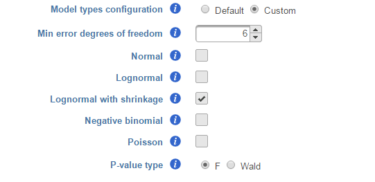
Model types configuration
Partek® Flow® provides five response distribution types for each design model in the pool, namely:
...
We recommend to use lognormal with shrinkage distribution (the default), and an experienced user may want to click on Custom to configure the model type and p-value type (Figure 8).
| Numbered figure captions | ||||
|---|---|---|---|---|
| ||||
|
...
Partek Flow keeps tracking the log status of the data, and no matter whether GSA is performed on logged data or not, the fold change calculation is always in linear scale
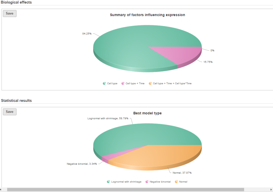
GSA report
If there are multiple design models and multiple distribution types included in the calculation, the fraction of genes using each model and type will be displayed as pie charts in the task result (Figure 9).
| Numbered figure captions | ||||
|---|---|---|---|---|
| ||||
|
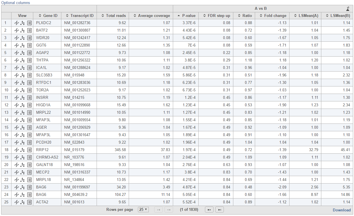
Feature list with p-value and fold change generated from the best model selected is displayed in a table with other statistical information (Figure 10). By default, the gene list table is sorted by the first p-value column.
| Numbered figure captions | ||||
|---|---|---|---|---|
| ||||
|
...
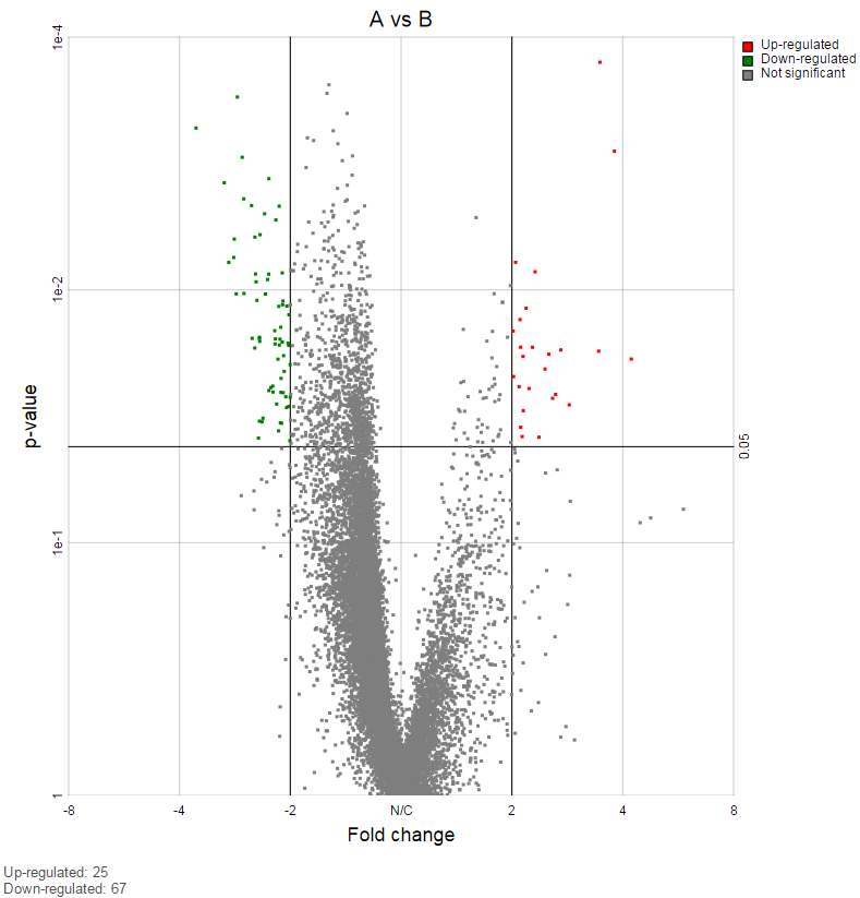
On the right of each contrast header, there is volcano plot icon ( ![]() ). Select it to display the volcano plot on the chosen contrast (Figure 11).
). Select it to display the volcano plot on the chosen contrast (Figure 11).
| Numbered figure captions | ||||
|---|---|---|---|---|
| ||||
|
...
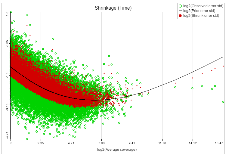
If lognormal with shrinkage method was selected for GSA, a shrinkage plot is generated in the report (Figure 13). X-axis shows the log2 value of average coverage. The plot helps to determine the threshold of low expression features. If there is an increase before a monotone decrease trend on the left side of the plot, you need to set a higher threshold on the low expression filter. Detailed information on how to set the threshold can be found in the GSA white paper.
| Numbered figure captions | ||||
|---|---|---|---|---|
| ||||
|
References
- Benjamini, Y., Hochberg, Y. (1995). Controlling the false discovery rate: a practical and powerful approach to multiple testing, JRSS, B, 57, 289-300.
- Storey JD. (2003) The positive false discovery rate: A Bayesian interpretation and the q-value. Annals of Statistics, 31: 2013-2035.
- Auer, 2011, A two-stage Poisson model for testing RNA-Seq
- Burnham, Anderson, 2010, Model selection and multimodel inference
- Law C, Voom: precision weights unlock linear model analysis tools for RNA-seq read counts. Genome Biology, 2014 15:R29.
- http://cole-trapnell-lab.github.io/cufflinks/cuffdiff/index.html#cuffdiff-output-files
- Anders S, Huber W: Differential expression analysis for sequence count data. Genome Biology, 2010
...
...
| Additional assistance |
|---|
| Rate Macro | ||
|---|---|---|
|
...
Overview
Content Tools