Join us for a webinar: The complexities of spatial multiomics unraveled
May 2
Page History
...
Trajectory analysis requires normalized counts as the input data. We recommend our default "CPM, Add 1, Log 2" normalization for most scRNA-Seq data. For alternative normalization methods, see our Normalize counts Normalization documentation.
2) Filter to cells that belong in the same trajectory
Trajectory analysis will build a single branching trajectory for all input cells. Consequently, only cells that share the biological process being studied should be included. For example, a trajectory describing progression through T cell activation should not include monocytes that do not undergo T cell activation. To learn more about filtering, please see our Filter groups (samples or cells) documentation.
3) Filter to genes that characterize the trajectory
The trajectory should be built using a set of genes that increase or decrease as a function of progression through the biological processes being modeled. One example is using differentially expressed genes between cells collected at the beginning of the process to cells collected at the end of the process. If you have no prior knowledge about the process being studied, you can try identifying genes that are differentially expressed between clusters of cells or genes that are highly variable within the data set. Generally, you should try to filter to 1,000 to 3,000 informative genes prior to performing trajectory analysis. The list manager functionality in Partek Flow is useful for creating a list of genes to use in the filter. To learn more, please see our documentation on List managementLists.
Parameters
Dimensionality of the reduced space
...
You can choose to scale the genes prior to building the trajectory. Scaling removes any differences in variability between genes, while not scaling allows more variable genes to have a greater weight in building the trajectory.
Task report
The Trajectory analysis Click on the task report is , a 2D scatter plot scatterplot will be opened in Data viewer (Figure 1).
| Numbered figure captions | ||||
|---|---|---|---|---|
| ||||
| ||||
|

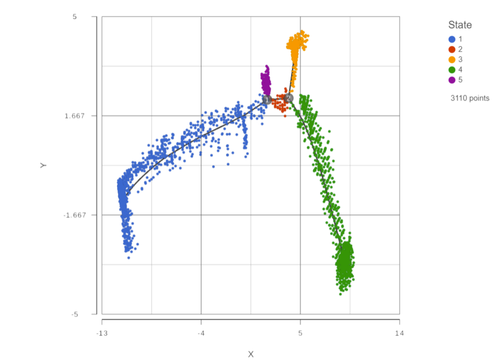
Figure 1: Trajectory report is a 2D scatterplot
The trajectory is shown with a black line showing the trajectory. Branch points are indicated by numbers in black circles. By default, cells are colored by state.You You can use the control panel on the left to color, size, and shape by genes and attributes to help identify which state is the root of the trajectory (Figure 2).
| Numbered figure captions | ||||
|---|---|---|---|---|
| ||||
|

You can also split by any categorical attribute (Figure 3)
| Numbered figure captions | ||||
|---|---|---|---|---|
| ||||
|

Calculating pseudotime
To calculate pseudotime, you must choose a root state. The tip of the root state branch will have a value of 0 for pseudotime. Click any cell belonging to that state to select the state. The selected state will be bold highlighted while unselected cells are dimmed (Figure 42). Choose Calculate pseudotime in the Additional actions on the right control panel.
| Numbered figure captions | ||||
|---|---|---|---|---|
| ||||
|

To use the selected state as the root state for pseudotime calculation, select the state and then click the Calculate pseudotime button (Figure 5).
| Numbered figure captions | ||||
|---|---|---|---|---|
| ||||
|

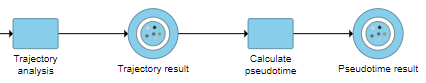
This will run a task on the analysis pipeline, Calculate pseudotime, and output a new Pseudotime result data node (Figure 6).
|
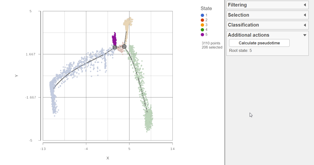
Figure 2: Select a root state to calculate pseudotime
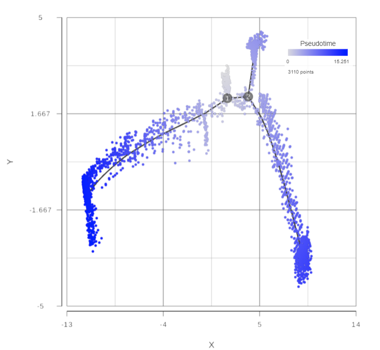
The Calculate pseudotime task will be performed, it generates a new Pseudotime result data node, which contains Pseudotime annotation for each cell (Figure 3).
| Numbered figure captions | ||||
|---|---|---|---|---|
| ||||
|
The Calcuate pseudotime task report is the same as the Trajectory analysis task report, but is colored by the newly calculated cell-level attribute, Pseudotime, Figure 3: Perform Pseudotime calculation task to generate pseudotime result
Open the Pseudotime result report, a 2D scatterplot will be displayed in data viewer, colored by Pseudotime by default (Figure 74).
| Numbered figure captions | ||||||
|---|---|---|---|---|---|---|
|
| |||||
|

This will run a task on the analysis pipeline, Calculate pseudotime, and output a new Pseudotime result data node (Figure 6).
References
[1] Xiaojie Qiu, Qi Mao, Ying Tang, Li Wang, Raghav Chawla, Hannah Pliner, and Cole Trapnell. Reversed graph embedding resolves complex single-cell developmental trajectories. Nature methods, 2017.
...
Overview
Content Tools