Page History
...
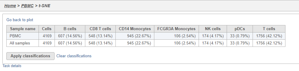
- Click Summary to open the summary table (Figure 2728)
| Numbered figure captions | ||||
|---|---|---|---|---|
| ||||
|
...
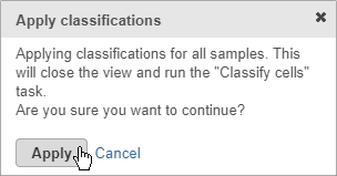
- Click Apply classifications
- Click Apply to confirm (Figure 2829)
| Numbered figure captions | ||||
|---|---|---|---|---|
| ||||
|
...
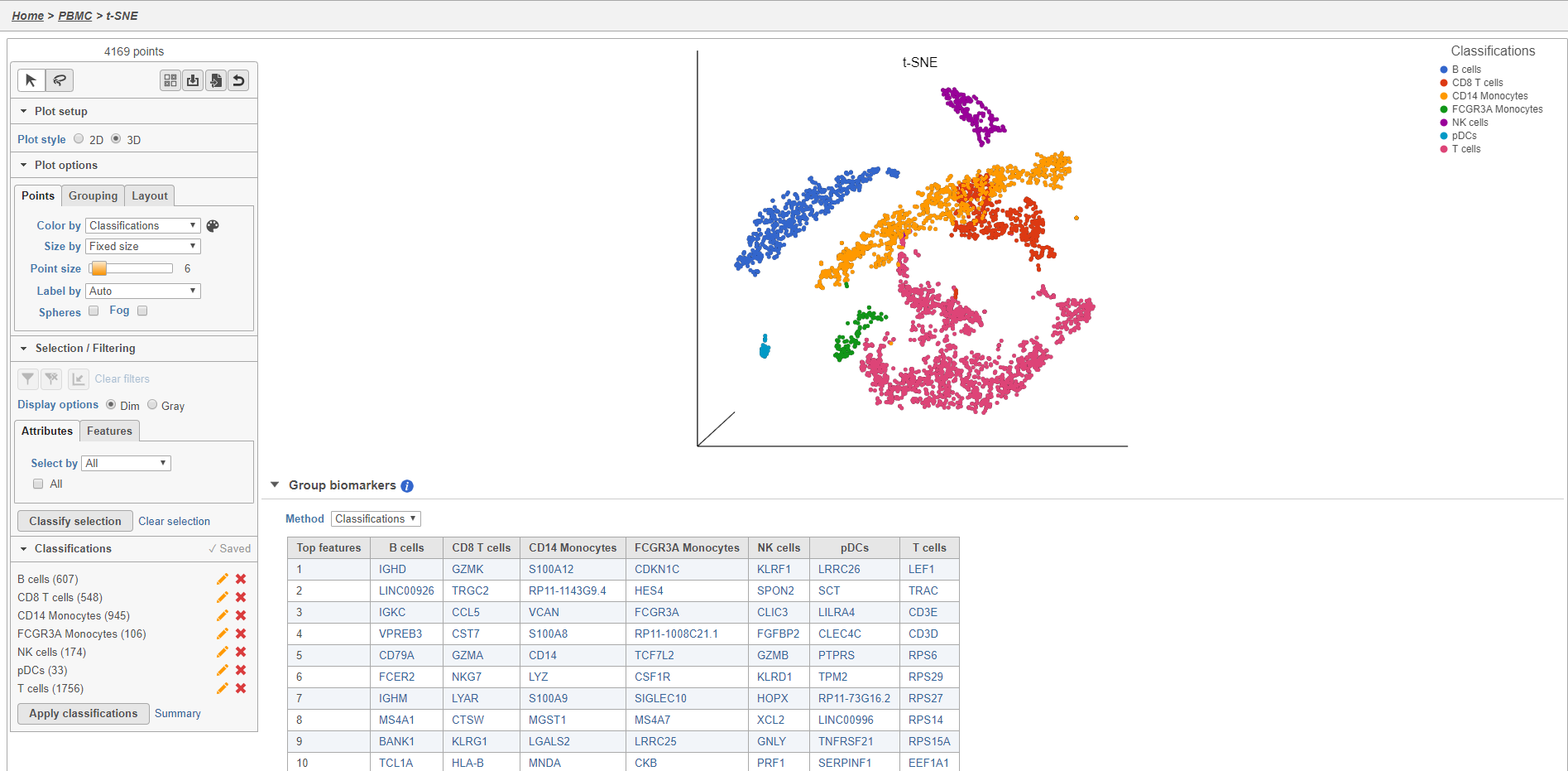
The Classified groups task report opens a t-SNE like the one used to classify the cells, but the newly calculated classifications biomarker table is available below the plot (Figure 2930).
| Numbered figure captions | ||||
|---|---|---|---|---|
| ||||
|
...
The number of cells for each sample is listed (Figure 3031). This data node can be used as the starting point for differential cell count analysis in multi-sample experiments where the number of cells of a particular cell type if two or more conditions is of interest.
...
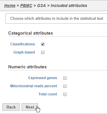
- Click Classifications
- Click Next (Figure 3132)
| Numbered figure captions | ||||
|---|---|---|---|---|
| ||||
|
...
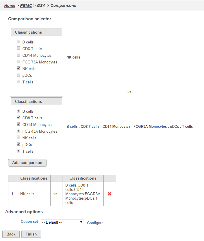
- Click Finish to run the GSA task (Figure 3233)
| Numbered figure captions | ||||
|---|---|---|---|---|
| ||||
|
...
The GSA task report lists genes in rows and the results of the statistical test (p-value, fold change, etc.) on columns (Figure 3334). For more information, please see our documentation page on the GSA task report.
...
The Feature plot viewer will open showing a violin plot for KLRD1 (Figure 3435). The violins are density plots with the width corresponding to frequency.
...
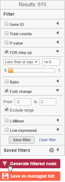
- Click
 to generate a filtered version of the table for downstream analysis (Figure 3536)
| Numbered figure captions | ||||
|---|---|---|---|---|
| ||||
|
...
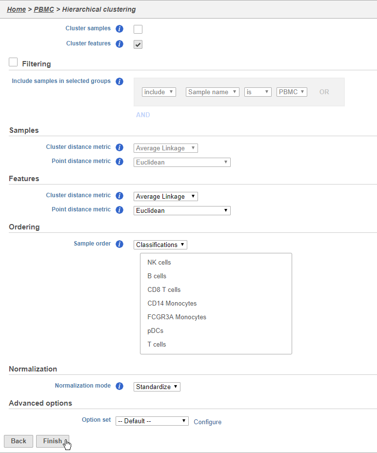
- Choose Classification from the Ordering drop-down menu
- Drag NK cells to the top of the Sample order
- Click Finish to run (Figure 3637)
| Numbered figure captions | ||||
|---|---|---|---|---|
| ||||
|
...
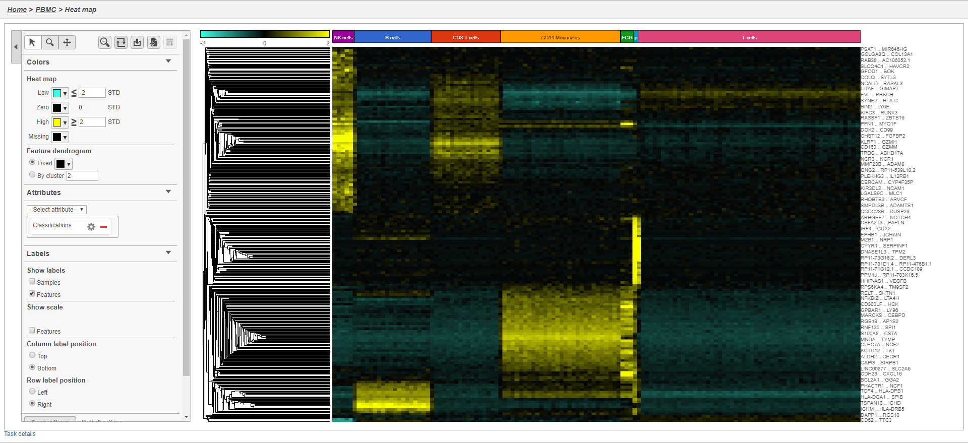
The heat map now shows a teal to yellow gradient with a black midpoint (Figure 3738).
| Numbered figure captions | ||||
|---|---|---|---|---|
| ||||
|
...
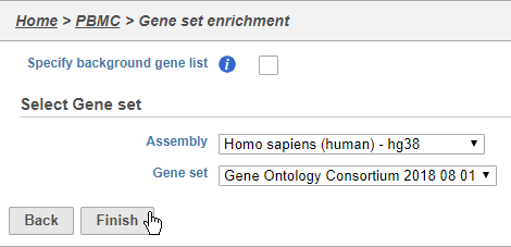
- Choose Homo sapiens (human) - hg38 from the Assembly drop-down
- Choose Gene Ontology Consortium 2018 08 01 from the Gene set drop-down
- Click Finish (Figure 3839)
| Numbered figure captions | ||||
|---|---|---|---|---|
| ||||
|
...
The Gene set enrichment task report lists gene sets on rows with an enrichment score and p-value for each. It also lists how many genes in the gene set were in the input gene list and how many were not (Figure 3840). Clicking the Gene set ID links to the geneontology.org page for the gene set.
...
Clicking the KEGG pathway ID in the Pathway enrichment task report (Figure 3841). opens a KEGG pathway map.
...
The KEGG pathway maps have fold-change and p-value information from the input gene list overlaid on the map, adding a layer of additional information about whether the pathway was upregulated or downregulated in the comparison (Figure 3942).
| Numbered figure captions | ||||
|---|---|---|---|---|
| ||||
|
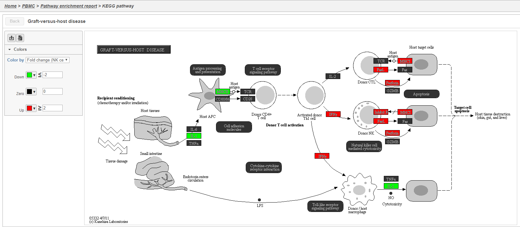
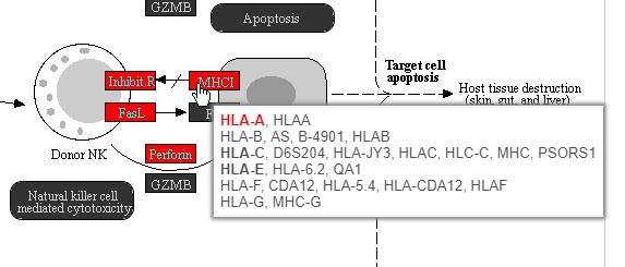
Color are customizable using the control panel on the left and the plot is interactive. Mousing over gene boxes gives the genes accounted for by the box, with genes present in the input list shown in bold, and the coloring gene shown in red (Figure 4043).
| Numbered figure captions | ||||
|---|---|---|---|---|
| ||||
|
...
Overview
Content Tools