Page History
| Table of Contents | ||||||
|---|---|---|---|---|---|---|
|
...
- Double-click the Feature list data node to open the GSA task report
The GSA task report lists genes in rows and the results of the statistical test (p-value, fold change, etc.) on columns (Figure 33). For more information, please see our documentation page on the GSA task report.
| Numbered figure captions | ||||
|---|---|---|---|---|
| ||||
|
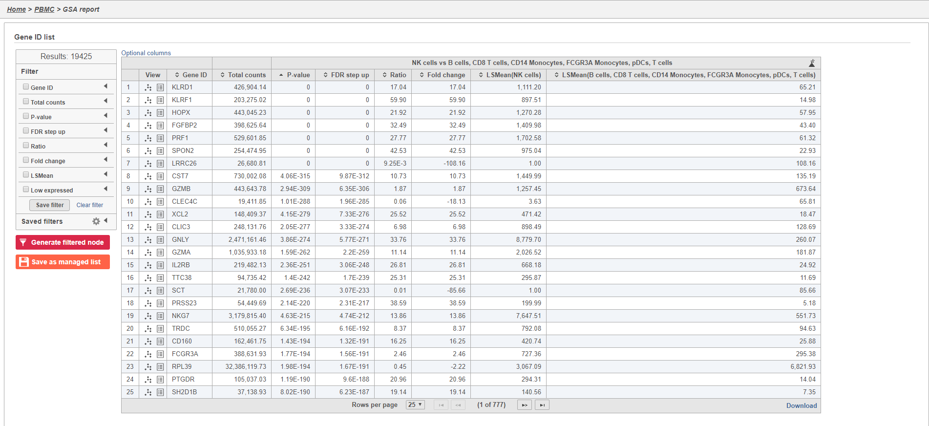
Genes are listed in ascending order by the p-value of the first comparison so the most significant gene is listed first. To view a volcano plot for any comparison, click  . To view a violin plot for a gene, click
  next to the Gene ID.
- Click
 for KLRD1
The Feature plot viewer will open showing a violin plot for KLRD1 (Figure 34). The violins are density plots with the width corresponding to frequency.
| Numbered figure captions | ||||
|---|---|---|---|---|
| ||||
|
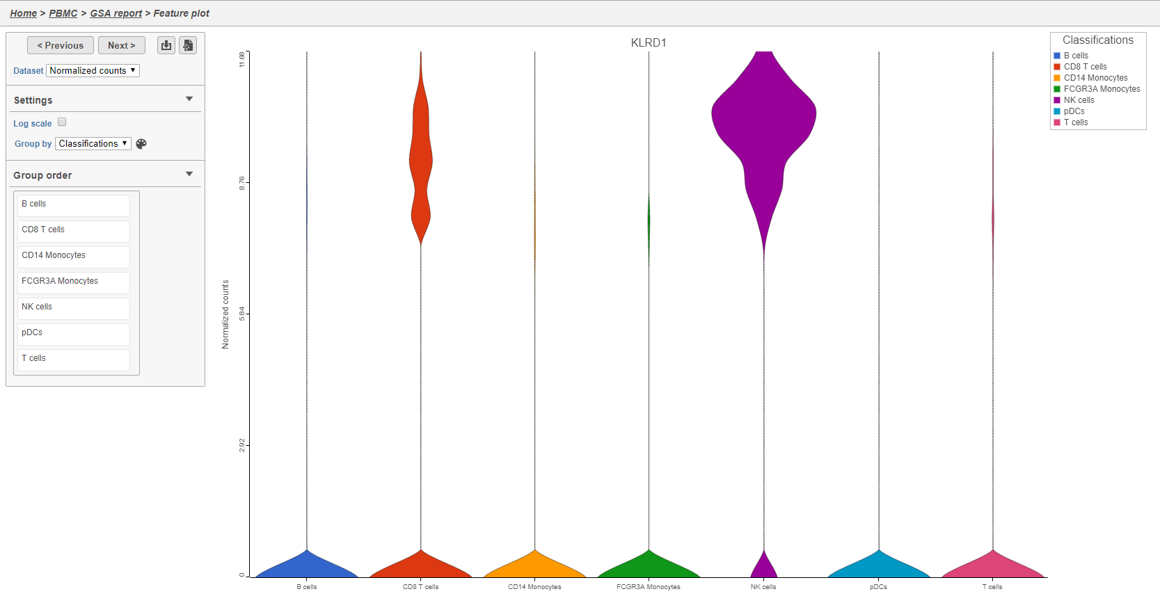
You can switch the grouping of cells using the Group by drop-down menu. The order of groups can be adjusted by dragging groups up and down in the Group order panel. To navigate between genes in the table, click the Next > and Previous > buttons.
- Click GSA report to return to the table
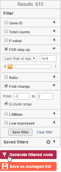
The table lists all of genes in the data set; using the filter control panel on the left, we can filter to just the genes that are significantly different for the comparison.
- Click FDR step up and click the arrow next to it
- Set to 1e-8
Here, we are using a very stringent cutoff to focus only on genes that are specific to NK cells, but other applications may require a less stringent cutoff.
- Click Fold change and click the arrow next to it
- Set to -2 to 2
The number of genes at the top of the filter control panel updates to indicate how many genes are left after the filters are applied.
- Click
 to generate a filtered version of the table for downstream analysis (Figure 35)
| Numbered figure captions | ||||
|---|---|---|---|---|
| ||||
|
The GSA report will close and a new task, the Differential analysis filter, will run and generate a filtered Feature list data node.
Generating a heat map
Once we have filtered to a list of significantly different genes, we can visualize these genes by generating a heat map.
- Click the Feature list data node produced by the Differential analysis filter
- Click Exploratory analysis in the toolbox
- Click Hierarchical clustering
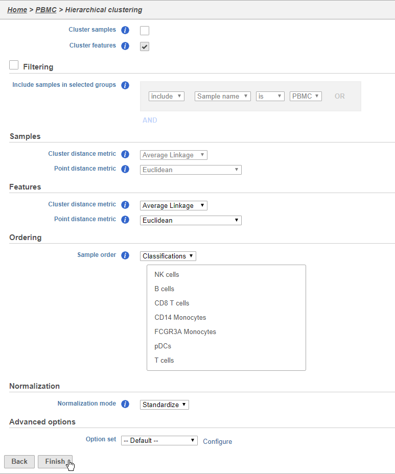
The hierarchical clustering task will generate the heat map. You can choose to cluster samples (cells) and features (genes). You will almost always want to cluster features as this generates the clear blocks of color that make heat maps comprehensible. For single cell data sets, you may choose to forgo clustering the cells in favor of ordering them by the attribute of interest. Here, we will not filter the cells, but instead order them by their classification.
- Click Cluster samples to deselect the option
You can filter samples using the Filtering section of the configuration dialog. Here, we will not filter out any samples or cells.
- Choose Classification from the Ordering drop-down menu
- Drag NK cells to the top of the Sample order
- Click Finish to run (Figure 36)
| Numbered figure captions | ||||
|---|---|---|---|---|
| ||||
|
- Double-click the Hierarchical cluster task node to open the task report
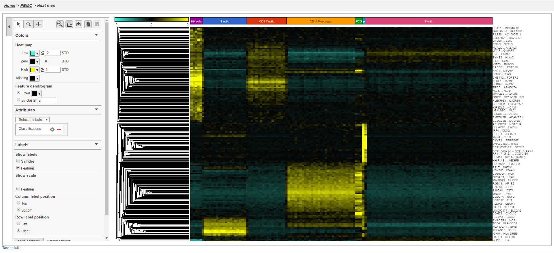
The heat map will initially appear to be all black. This is common in single cell RNA-Seq data because outlier cells will skew the high and low ends. We can adjust the minimum and maximum of the color scheme to improve the appearance of the heat map.
- Set Low to -2
- Set High to 2
Distinct blocks of red and green now appear on the plot. Cells are on rows and genes are on columns. Because of the limited number of pixels on the screen, genes are grouped. You can zoom in using the zoom controls or your mouse wheel if you want to view individual gene rows. We can annotate the plot with cell attributes.
- Choose Classification from the Attributes drop-down menu
- Un-check Samples under Labels to remove the sample labels
The plot now includes blocks of color along the left edge indicating the classification of the cells. We can transpose the plot to give the cell labels a bit more space.
- Click
 to transpose the heat map
 - Click
 to configure the text on the Classification labels
 - Set Rotation to 0
We can also customize the colors of the plot.
- Click the green box next to Low
- Set it to teal(#3affe6)
- OK
- Click the red box next to High
- Set it to yellow (#faff00)
The heat map now shows a teal to yellow gradient with a black midpoint (Figure 37).
| Numbered figure captions | ||||
|---|---|---|---|---|
| ||||
|
As with any visualization in Partek Flow, the image can be saved as a publication-quality image to your local machine by clicking ![]() or sent to a page in the project notebook by clicking
or sent to a page in the project notebook by clicking ![]() .
.
Performing enrichment analysis
While a long list of significantly different genes is important information about a cell type, it can be difficult to identify what the biological consequences of these changes might be just by looking at the genes one at a time. Using enrichment analysis, you can identify gene sets and pathways that are over-represented in a list of significant genes, providing clues to the biological meaning of your results.
- Click the Feature list data node produced by the Differential analysis filter
- Click Biological interpretation
- Click Gene set enrichment
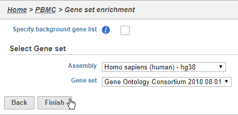
We distribute the gene sets from the Gene Ontology Consortium, but Gene set enrichment can work with any custom or public gene set database.
- Choose Homo sapiens (human) - hg38 from the Assembly drop-down
- Choose Gene Ontology Consortium 2018 08 01 from the Gene set drop-down
- Click Finish (Figure 38)
| Numbered figure captions | ||||
|---|---|---|---|---|
| ||||
|
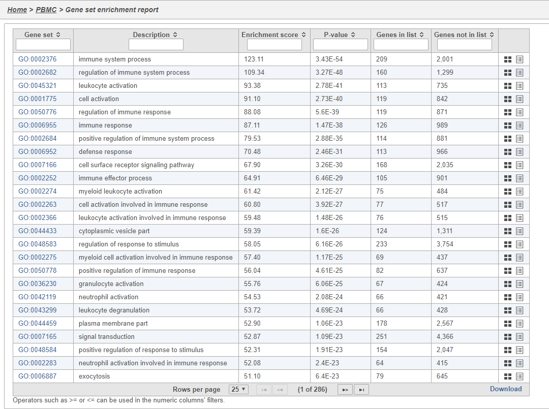
- Double-click the Gene set enrichment task node to open the task report
The Gene set enrichment task report lists gene sets on rows with an enrichment score and p-value for each. It also lists how many genes in the gene set were in the input gene list and how many were not (Figure 38). Clicking the Gene set ID links to the geneontology.org page for the gene set.
| Numbered figure captions | ||||
|---|---|---|---|---|
| ||||
|
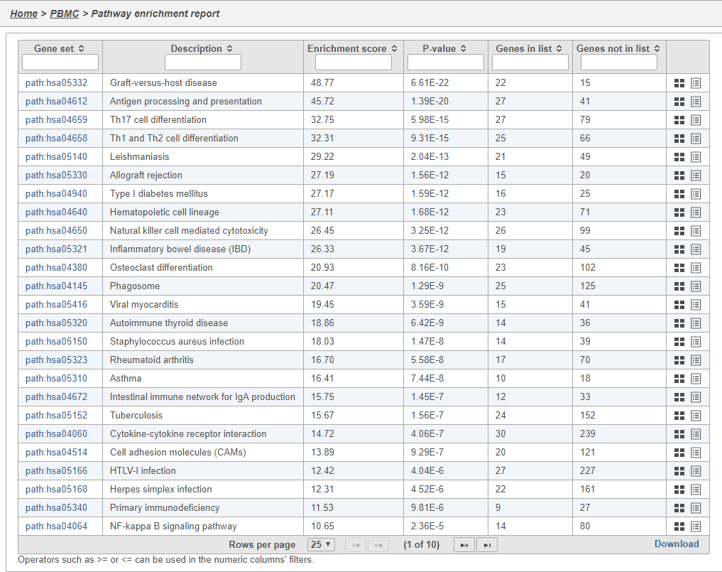
In Partek Flow, you can also check for enrichment of KEGG pathways using the Pathway enrichment task. The task is quite similar to the Gene set enrichment task, but uses KEGG pathways as the gene sets.
Clicking the KEGG pathway ID in the Pathway enrichment task report (Figure 38). opens a KEGG pathway map.
| Numbered figure captions | ||||
|---|---|---|---|---|
| ||||
|
The KEGG pathway maps have fold-change and p-value information from the input gene list overlaid on the map, adding a layer of additional information about whether the pathway was upregulated or downregulated in the comparison (Figure 39).
| numbered-figure-captions | ||||
|---|---|---|---|---|
| ||||
|
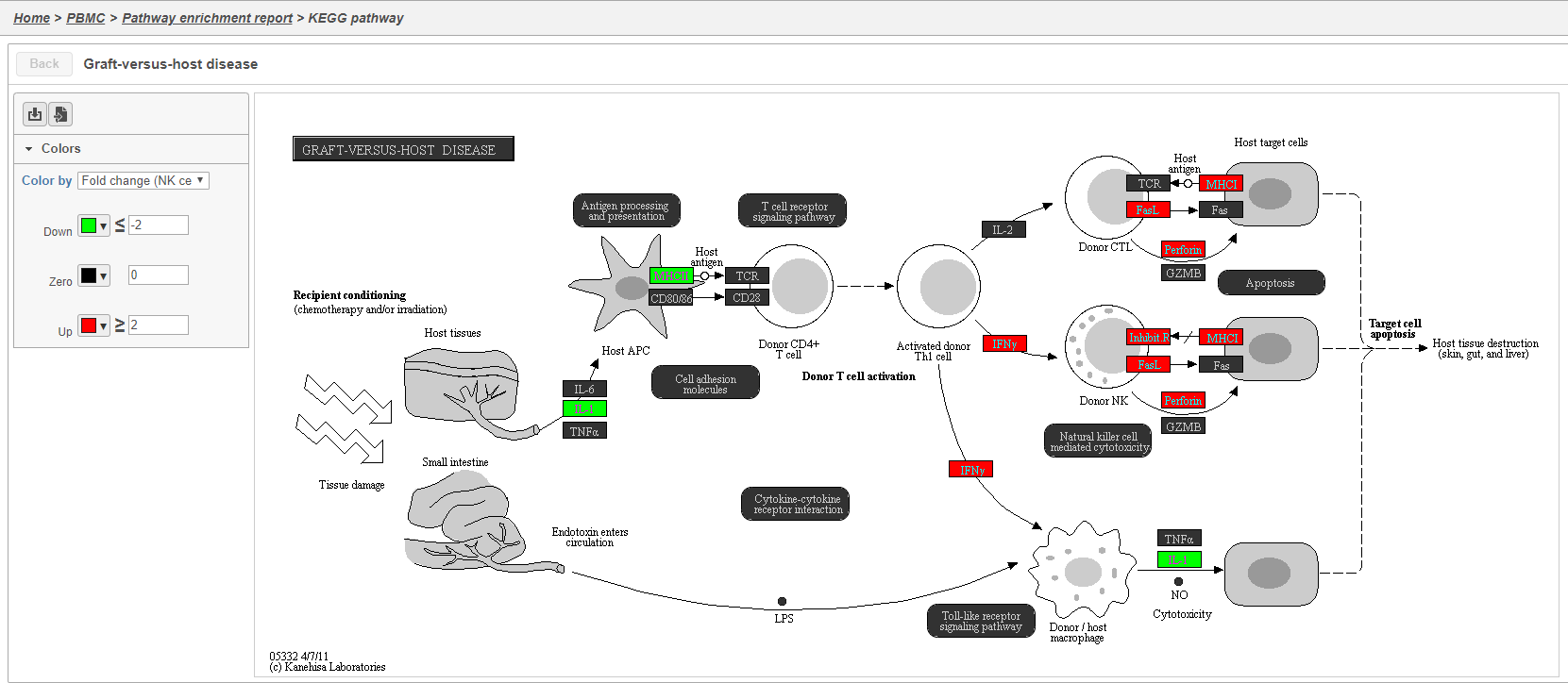
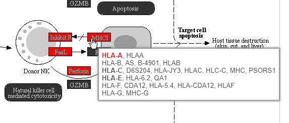
Color are customizable using the control panel on the left and the plot is interactive. Mousing over gene boxes gives the genes accounted for by the box, with genes present in the input list shown in bold, and the coloring gene shown in red (Figure 40).
| Numbered figure captions | ||||
|---|---|---|---|---|
| ||||
|
Clicking a pathway box opens the map of that pathway, providing an easy way to explore related gene networks.
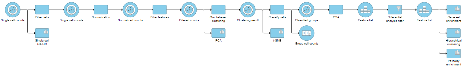
Pipeline
| Numbered figure captions | ||||
|---|---|---|---|---|
| ||||
|
| additional-assistance |
|---|
|
| Rate Macro | ||
|---|---|---|
|
Overview
Content Tools