Page History
...
Once a cell has been selected on the plot, it can be filtered. The filter controls can exclude or include (only) any selected cell.
Filtering can be particularly useful when you want to use a gene expression threshold to classify a group of cells, but the gene in question is not exclusively expressed by your cell type of interest.
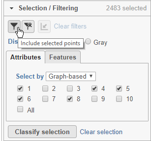
Here, for example we can filter to include just cells from a few of the clusters.
- Click Attributes in the Selection/Filtering section of the control panel
- Choose Graph-based from the Select by drop-down menu
- Click 1, 4, 5, 6, 8
This selects clusters 1, 4, 5, 6, and 8.
- Click
 (filter include) to filter to just the selected cells (Figure 22)
To exclude selected cells, click ![]() (filter exclude).
(filter exclude).
| Numbered figure captions | ||||
|---|---|---|---|---|
| ||||
|
The plot will update to show only the included cells (Figure 23).
| Numbered figure captions | ||||
|---|---|---|---|---|
| ||||
|
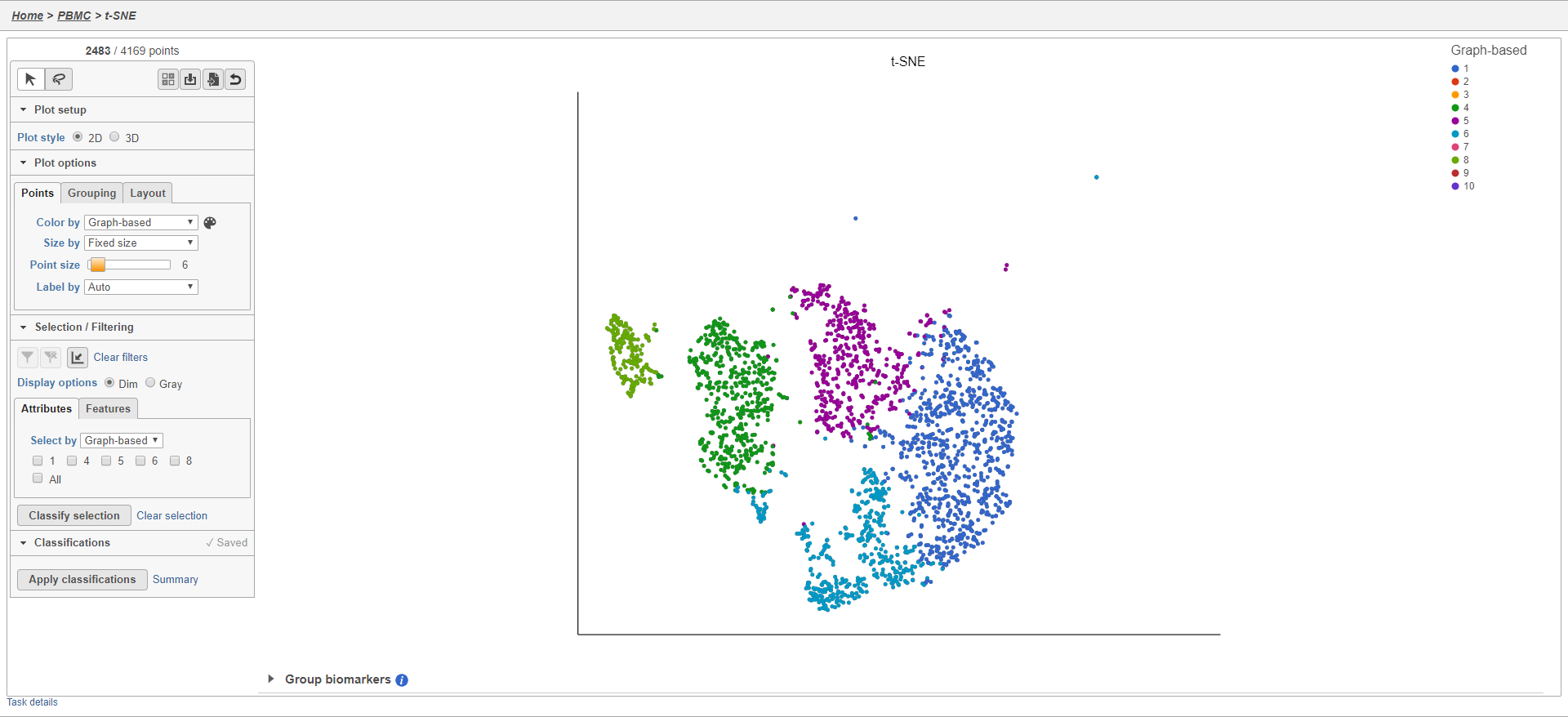
Cells that are not shown on the plot cannot be selected, allowing you to focus on the visible cells. The number of cells shown on the plot out of the total number of original cells is listed at the top of the control panel. You can adjust the view to focus on only the included cells.
- Click
 to rescale the axis to the filtered points
To revert to the original scaling, click the ![]() button again.
button again.
Additional inclusion or exclusion filters can be added to focus on a smaller subset of cells. To remove applied filters, click Clear filters.
- Click Clear filters
The plot will update to show all cells and return to the original scaling.
Classifying cells
Classifying cells allows to you assign cells to groups that can be used in downstream analysis and visualizations. Commonly, this is used to describe cell types, such as B cells and T cells, but can be used to describe any group of cells that you want to consider together in your analysis, such as cycling cells or CD14 high expressing cells. Each cell can only belong to one class at a time so you cannot create overlapping classes.
To classify a cells, just select it then click Classify selection.
As an example, we can classify a cluster of cells expressing high levels of CD79A as B-cells.
- Set Color by to Gene expression
- Type CD79A in the Gene expression search box and select it
- Click
 to activate Lasso mode
 - Draw a lasso around the cluster of CD79A-expressing cells (Figure 24)
| Numbered figure captions | ||||
|---|---|---|---|---|
| ||||
|
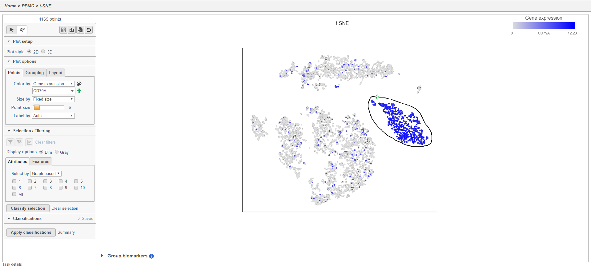
Because most of these cells express CD79A, a B cell marker, and because they cluster together on the t-SNE, suggesting they have similar overall gene expression, we believe that these cells are B cells.
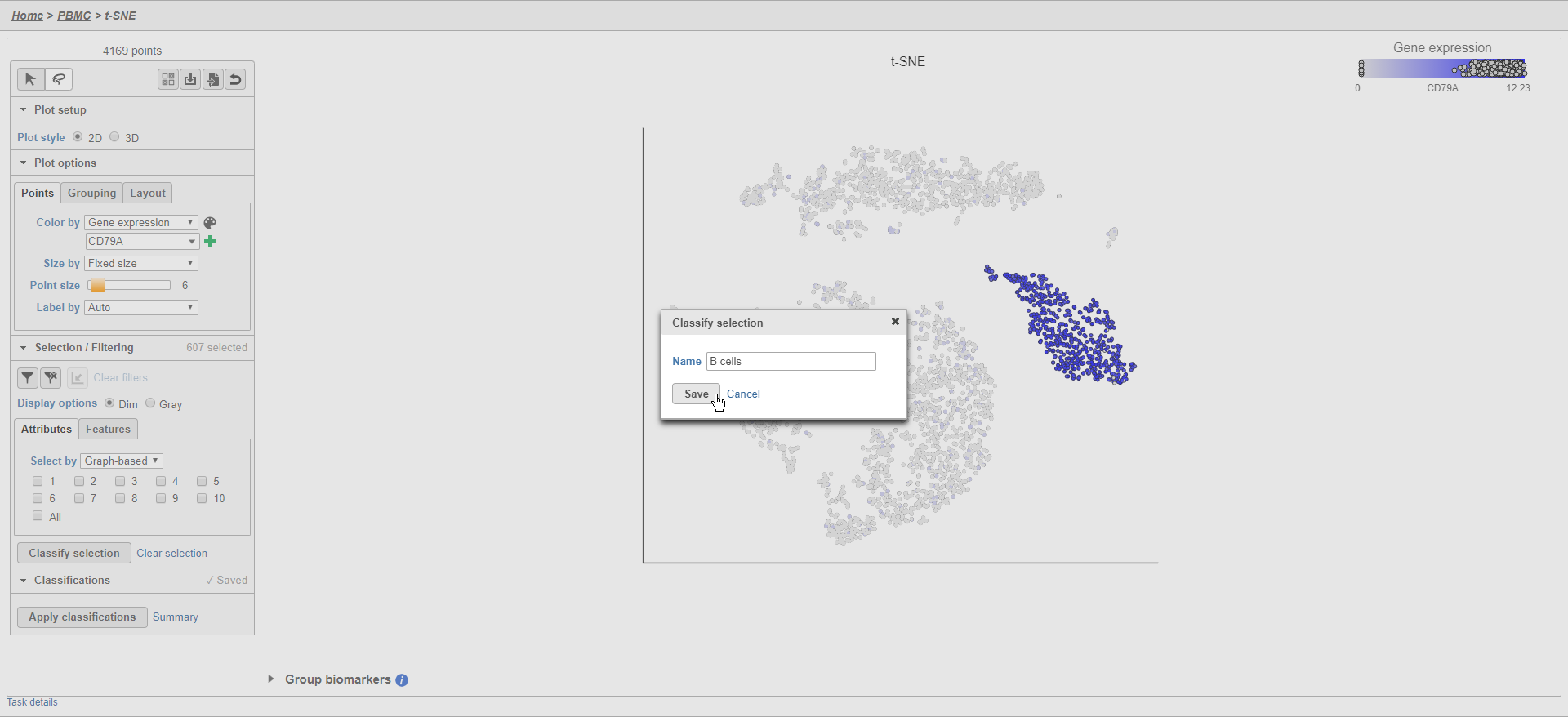
- Click Classify selection
- Type B cells for the Name
- Click Save (Figure 25)
| Numbered figure captions | ||||
|---|---|---|---|---|
| ||||
|
The classification , B cells, is added to the Classifications section of the control panel and the number of cells in that class is listed next to the name (Figure 26).
| Numbered figure captions | ||||
|---|---|---|---|---|
| ||||
|
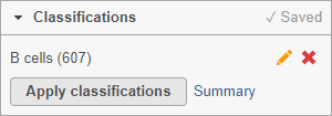
You can edit the name of a classification by selecting  or delete it by selecting
  . The classification state of the scatter plot is saved as a working draft so if you close the plot and return to it, the saved classifications will still be there. However, classifications are not available for downstream tasks until you apply them.
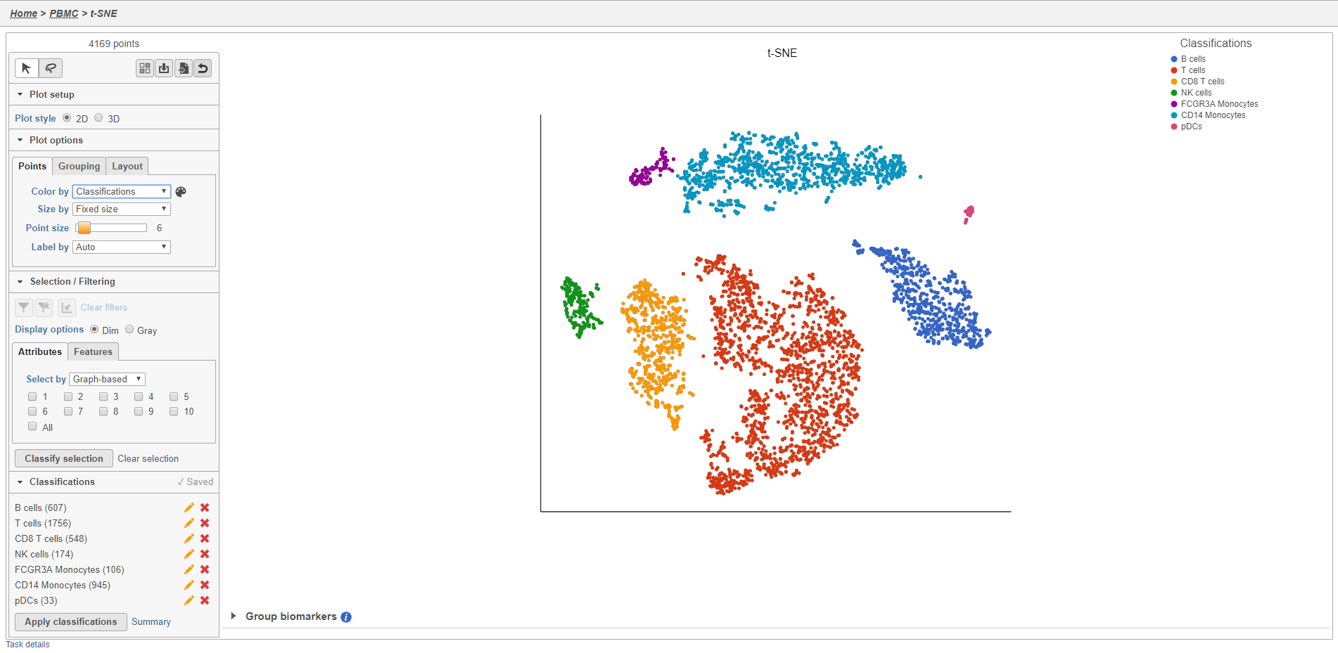
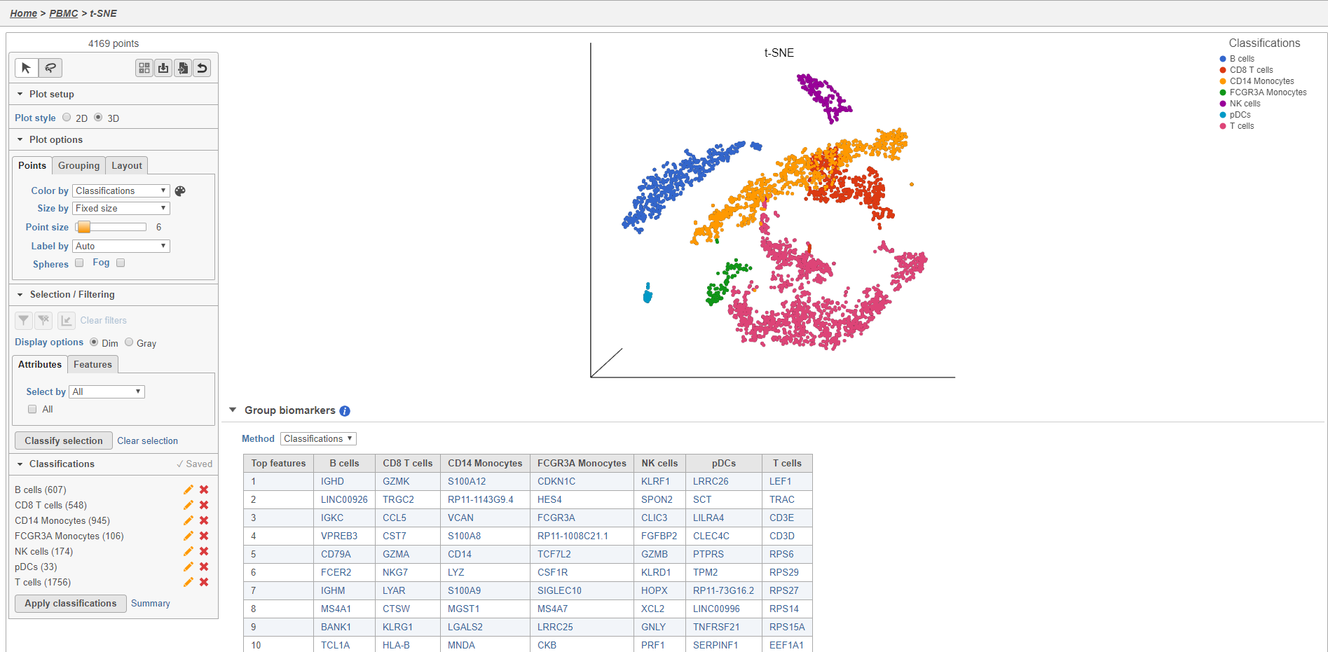
Once you have added saved a classification, you can color the t-SNE plot by the new attribute Classification. Here, I classified a new additional cell types using a combination of known marker genes and the clustering results and colored the plot by Classification (Figure 27).
| numbered-figure-captions | ||||
|---|---|---|---|---|
| ||||
|
The Summary button in the Classifications section links to a summary of the classifications with the number and percentage of cells from each sample that belong to each classification. This is particularly useful when you are classifying cells from multiple samples,.
- Click Summary to open the summary table (Figure 26)
| Numbered figure captions | ||||
|---|---|---|---|---|
| ||||
|
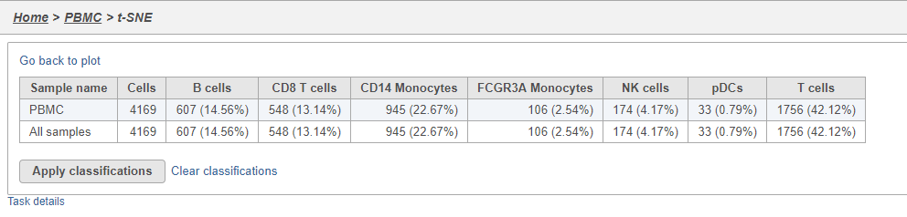
- Click Go back to plot to return to the scatter plot view
To use the classifications in downstream tasks and visualizations, you must first apply them.
- Click Apply classifications
- Click Apply to confirm (Figure 27)
| Numbered figure captions | ||||
|---|---|---|---|---|
| ||||
|
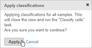
Applying classifications closes the t-SNE scatter plot and runs the Classify cells task. This saves the new cell attributes you created, runs an ANOVA test to identify biomarkers for each classification, and generates a matrix file with the number of cells in each classification for each sample.
- Double-click the Classify cells task to open the task report
The Classified groups task report opens a t-SNE like the one used to classify the cells, but the newly calculated classifications biomarker table is available below the plot (Figure 28).
| Numbered figure captions | ||||
|---|---|---|---|---|
| ||||
|
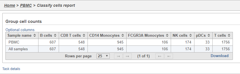
- Double-click the Group cell counts
The number of cells for each sample is listed (Figure 29). This data node can be used as the starting point for differential cell count analysis in multi-sample experiments where the number of cells of a particular cell type if two or more conditions is of interest.
| Numbered figure captions | ||||
|---|---|---|---|---|
| ||||
|
Comparing gene expression between cell types
| additional-assistance |
|---|
|
| Rate Macro | ||
|---|---|---|
|
Overview
Content Tools