Join us for a webinar: The complexities of spatial multiomics unraveled
May 2
Page History

| Table of Contents | ||||||
|---|---|---|---|---|---|---|
|
This tutorial presents an outline of the basic series of steps for analyzing a single cell RNA-Seq experiment in Partek Flow starting with the count matrix file
If you are starting with the raw data (FASTQ files), please begin with our Processing Single Cell RNA-seq FASTQ Files tutorial, which will take you from raw data to a count matrix file.
This tutorial includes only one sample, but the same steps will be followed when analyzing multiple samples. For notes on a few aspects specific to a multi-sample analysis, please see our Single Cell RNA-Seq Analysis (Multiple Samples) tutorial.
If you are new to Partek Flow, please see Getting Started with Your Partek Flow Hosted Trial for information about data transfer and import and Creating and Analyzing a Project for information about the Partek Flow user interface.
Filtering cells
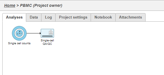
An important step in analyzing single cell RNA-Seq data is to filter out low quality cells. A few examples of low-quality cells are doublets, cells damaged during cell isolation, or cells with too few reads to be analyzed. You can do this in Partek Flow using the Single cell QA/QC task.
- Click on the Single cell data node
- Click on the QA/QC section of the task menu
- Click on Single cell QA/QC
A task node, Single cell QA/QC, is produced. Initially, the node will be semi-transparent to indicate that it has been queued, but not completed. A progress bar will appear on the Single cell QA/QC task node to indicate that the task is running (Figure 1).
| Numbered figure captions | ||||
|---|---|---|---|---|
| ||||
|
- Click the Single cell QA/QC node once it finishes running
- Click Task report in the task menu
The Single cell QA/QC report includes interactive violin plots showing the value of every cell in the project on several quality measures (Figure 2).
| Numbered figure captions | ||||
|---|---|---|---|---|
| ||||
|
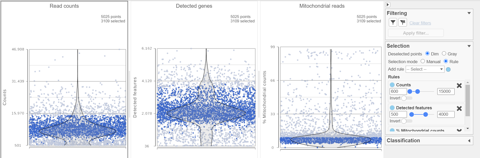
There are three plots: number of read counts per cell, number of detected genes per cell, and the percentage of mitochondrial reads per cell.
Each point on the plots is a cell and the violins illustrate the distribution of values for the y-axis metric. Cells can be filtered either by clicking and dragging to select a region on one of the plots or by setting thresholds using the filters below the plots. Here, we will apply a filter for the number of read counts.
The plot will be shaded to reflect the filter. Cells that are excluded will be shown as black dots on both plots.
The read counts per cell and number of detected genes per cell are typically used to filter out potential doublets - if a cell as an unusually high number of total counts or detected genes, it may be a doublet. The mitochondrial reads percentage can be used to identify cells damaged during cell isolation - if a cell has a high percentage of mitochondrial counts, it is likely damaged or dying and may need to be excluded.
- Set the filters on counts 600-15000; Detected genes 500-4000; and % Mitochondrial counts 0-10
- Click the filter icon
 and Apply filter to run the Filter cells task on the first Single cell counts data node, it generates a Filtered counts node
Normalization
Because different cells will have a different number of total counts, it is important to normalize the data prior to downstream analysis. For droplet-based single cell isolation and library preparation methods that use a 3' counting strategy, where only the 3' end of each transcript is captured and sequenced, we recommend the following normalization - 1. CPM (counts per million), 2. Add 1, 3. Log2. This accounts for differences in total UMI counts per cell and log transforms the data, which makes the data easier to visualize.
- Click the Filtered counts node produced by the Filtered counts task
- Click Normalization and scaling in the task menu
- Click Normalization
- Click
 to add the recommended normalization scheme
This adds CPM (counts per million), Add 1, and Log2 to the Normalization order panel. Normalization steps are performed in descending order.
- Click Finish to apply the normalization (Figure 3)
| Numbered figure captions | ||||
|---|---|---|---|---|
| ||||
|
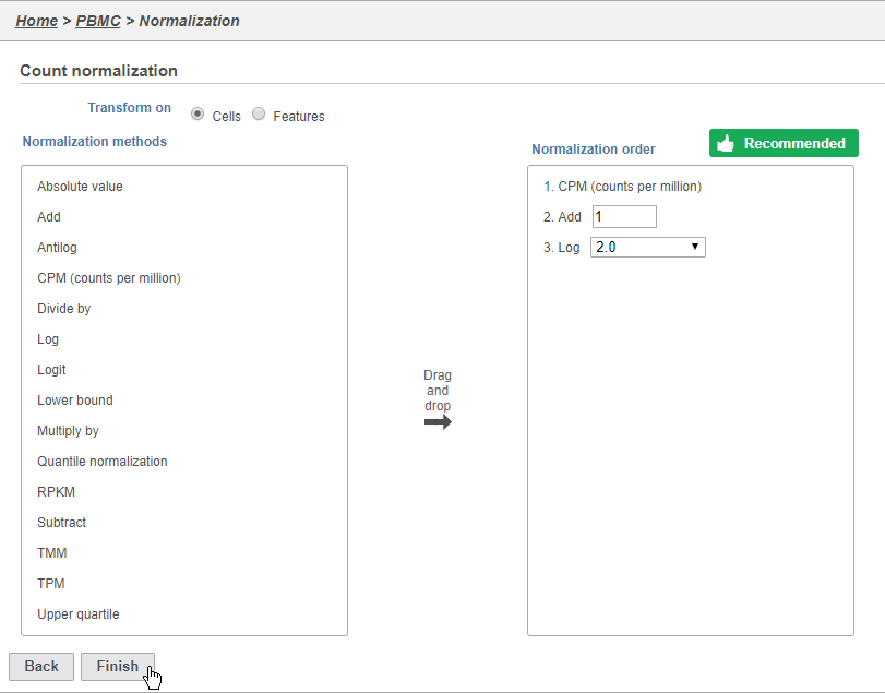
A new Normalized counts data node will be produced.
For more information on normalizing data in Partek Flow, please see the Normalize Counts section of the user manual.
Filter features
A common task in bulk and single-cell RNA-Seq analysis is to filter the data to include only informative genes (features). Because there is no gold standard for what makes a gene informative or not and ideal gene filtering criteria depend on your experimental design and research question, Partek Flow has a wide variety of flexible filtering options. Filter features step can also be perform before normalization.
- Click the Normalized counts data node produced by the Filter cells task
- Click Filtering in the task menu
- Click Filter features
There are three categories of filter available - noise reduction, statistics based, and feature list.
The noise reduction filter allows you to exclude genes considered background noise based on a variety of criteria. The statistics based filter is useful for focusing on a certain number or percentile of genes based on a variety of metrics, such as variance. The feature list filter allows you to filter your data set to include or exclude particular genes.
For example, you can use a noise reduction filter to exclude genes that are not expressed by any cell in the data set, but were included in the matrix file.
- Click the Noise reduction filter check box
- Set the Noise reduction filter to Exclude features where value == 0 in 99.9% of cells using the drop-down menus and text boxes
- Click Finish to apply the filter (Figure 4)
| Numbered figure captions | ||||
|---|---|---|---|---|
| ||||
|
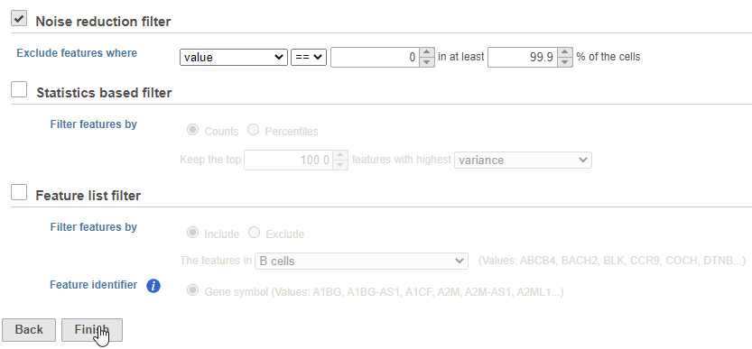
This produces a Filtered counts data node. This will be the starting point for the next stage of analysis.
PCA
Principal components (PC) analysis (PCA) is an exploratory technique that is used to describe the structure of high dimensional data by reducing its dimensionality. Because PCA is used to reduce the dimensionality of the data prior to clustering as part of a standard single cell analysis workflow, it is useful to examine the results of PCA for your data set prior to clustering.
- Click the Filtered counts node
- Click Exploratory analysis in the task menu
- Click PCA
You can choose Features contribute equally to standardize the genes prior to PCA or allow more variable genes to have a larger effect on the PCA by choosing by variance. By default, we take variance into account and focus on the most variable genes.
If you have multiple samples, you can choose to run PCA for each sample individually or for all samples together by selecting or not selecting the Split cells by sample option (Figure 5).
| Numbered figure captions | ||||
|---|---|---|---|---|
| ||||
|
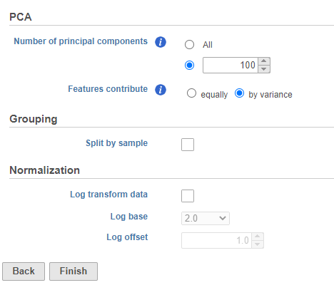
- Click Finish to run
A new PCA task node will be produced.
- Double-click the PCA task node to open the 3D PCA scatter plot in data viewer (Figure 6)
| Numbered figure captions | ||||
|---|---|---|---|---|
| ||||
|
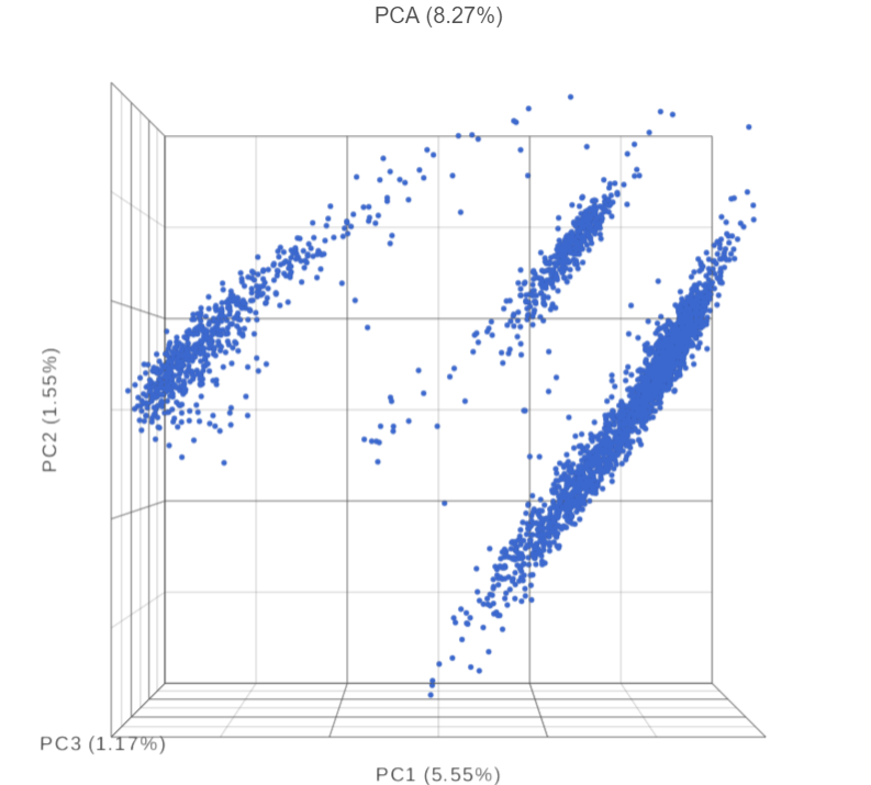
Beside PCA coordinates of the cells, PCA task report also includes, the Scree plot, the component loadings table, and the PC projections table.
The Scree plot lists PCs on the x-axis and the amount of variance explained by each PC on the y-axis, measured in Eigenvalue. The higher the Eigenvalue, the more variance is explained by the PC. Typically, after an initial set of highly informative PCs, the amount of variance explained by analyzing additional PCs is minimal. By identifying the point where the Scree plot levels off, you can choose an optimal number of PCs to use in downstream analysis steps like graph-based clustering, UMAP and t-SNE.
- To draw Scree plot, in Data viewer, choose Scree plot icon available plot section on the left panel
 , choose PCA data node (Figure 7)
| Numbered figure captions | ||||
|---|---|---|---|---|
| ||||
|
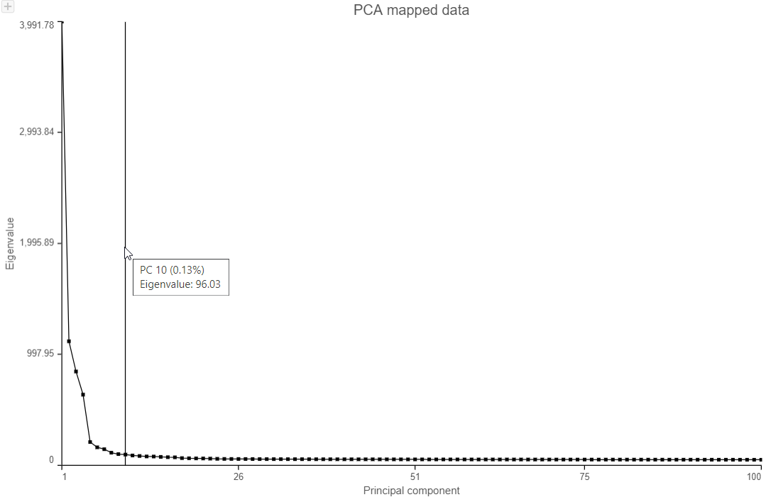
- Mouse over the Scree plot to identify the point where additional PCs offer little additional information
In this data set, a reasonable cut-off could be set anywhere between 7 and 20 PCs.
Viewing the genes correlated with each PC can be useful when choosing how many PCs to include.
- Click the Table option in the available plot section
 and select PCA data node to open the Component loadings table (Figure 8)
| Numbered figure captions | ||||
|---|---|---|---|---|
| ||||
|
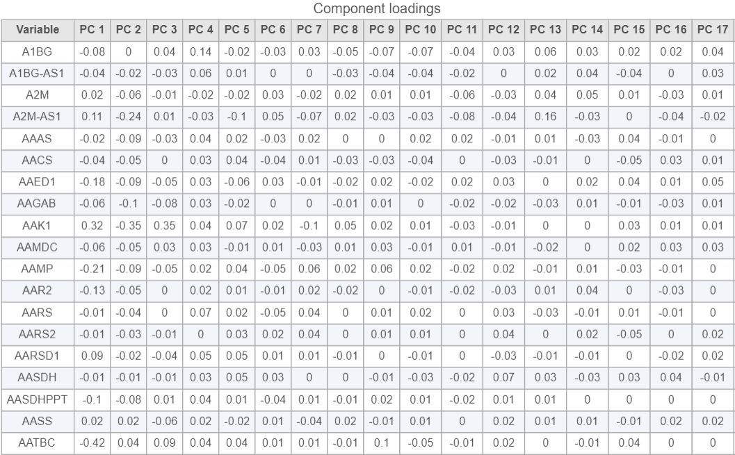
This table lists genes on rows and PCs on columns, the value in this table is correlation coefficient r. The table can be downloaded as a text file by clicking on the Export table data icon ![]() on the upper-right corner of the plot.
on the upper-right corner of the plot.
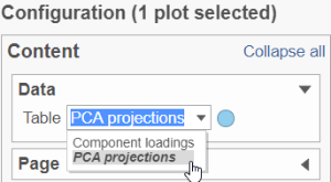
To display PCA projects table, click on the Table drop-down list in the Configuration>Content>Data section, choose PCA projections option (Figure 9)
| Numbered figure captions | ||||
|---|---|---|---|---|
| ||||
|
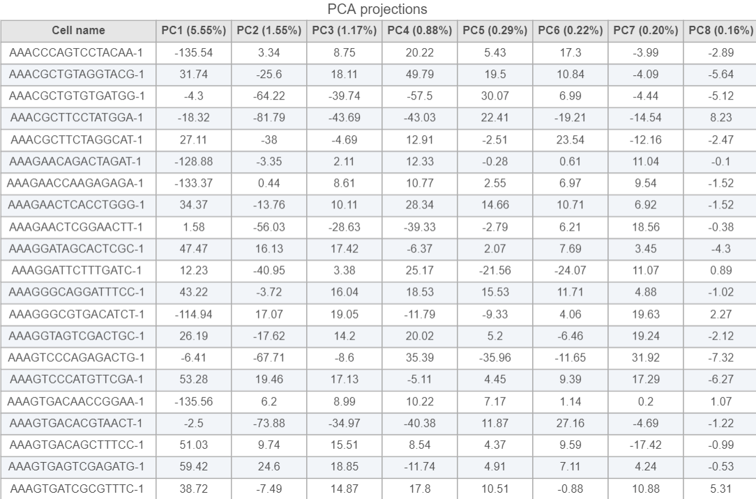
PCA projections table contains each row as an observation (a cell in this case), each column represents one principal component (Figure 10). This table can be downloaded as text file, the same way as the component loading table.
| Numbered figure captions | ||||
|---|---|---|---|---|
| ||||
|
Graph-based clustering
Graph-based clustering identifies groups of similar cells using PC values as the input. By including only the most informative PCs, noise in the data set is excluded, improving the results of clustering.
- Click the PCA data node
- Click Exploratory analysis in the task menu
- Click Graph-based clustering
Clustering can be performed on each sample individually or on all samples together. Here, we are working with a single sample.
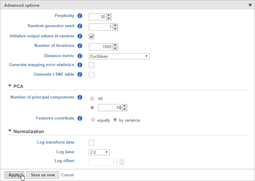
- Click Configure to access the advanced options
- Set Number of principal components to 10 (Figure 8)
| Numbered figure captions | ||||
|---|---|---|---|---|
| ||||
|
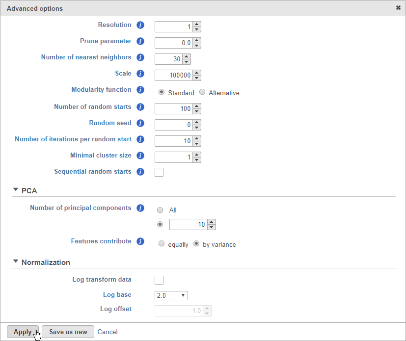
The Number of principal components should be set based on the your examination of the Scree plot and component loadings table. The default value of 100 is likely exhaustive for most data sets, but may introduce noise that reduces the number of clusters that can be distinguished.
- Click Apply
- Click Finish to run
A new Graph-based clustering task node and a Clustering result data node will be generated.
- Double-click the Graph-based clustering task node to open the task report
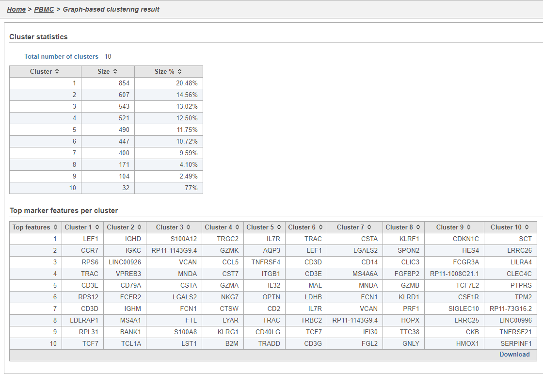
The Graph-based clustering task report lists the number of clusters and what proportion of cells fall into each cluster. It also includes a cluster biomarkers table. This lists the top-10 genes that distinguish each cluster from the others (Figure 9). These are calculated using an ANOVA test comparing the cells in each group to all the other cells, filtering to genes that are 1.5 fold upregulated, and sorting by ascending p-value. This ensures that the top-10 genes of each cluster are highly and disproportionately expressed in that cluster.
| Numbered figure captions | ||||
|---|---|---|---|---|
| ||||
|
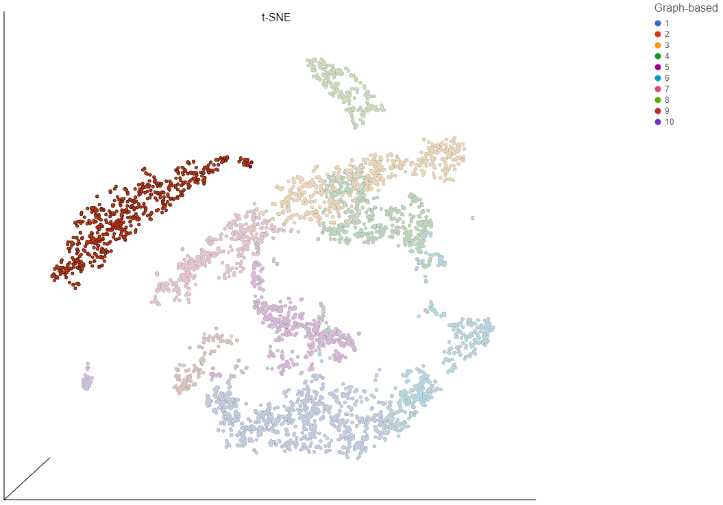
t-SNE
t-Distributed Stochastic Neighbor Embedding (t-SNE) is a dimensional reduction technique that prioritizes local relationships to build a low-dimensional representation of the high-dimensional data that places objects that are similar in high-dimensional space close together in the low-dimensional representation. This makes t-SNE well suited for analyzing high-dimensional data when the goal is to identify groups of similar objects, such as cell types in single cell RNA-Seq data.
- Click the Clustering result node
- Click Exploratory analysis in the task menu
- Click t-SNE
If you have multiple samples, you can choose to run t-SNE for each sample individually or for all samples together using the Split cells by sample option. Please note that this option will not be present if you are running t-SNE on a clustering result. For clarity, clustering results run with all samples together must be viewed together and clustering results run by sample must be viewed by sample.
Like Graph-based clustering, t-SNE takes PC values as its input and further reduces the data down to two or three dimensions. For consistency, you should use the same number of PCs as the input for t-SNE that you used for Graph-based clustering.
- Click Configure to access the advanced options
- Set Number of principal components to 10
- Click Apply
- Click Finish to run (Figure 10)
| Numbered figure captions | ||||
|---|---|---|---|---|
| ||||
|
- Double-click the t-SNE task node to open the t-SNE task report (Figure 11)
| Numbered figure captions | ||||
|---|---|---|---|---|
| ||||
|
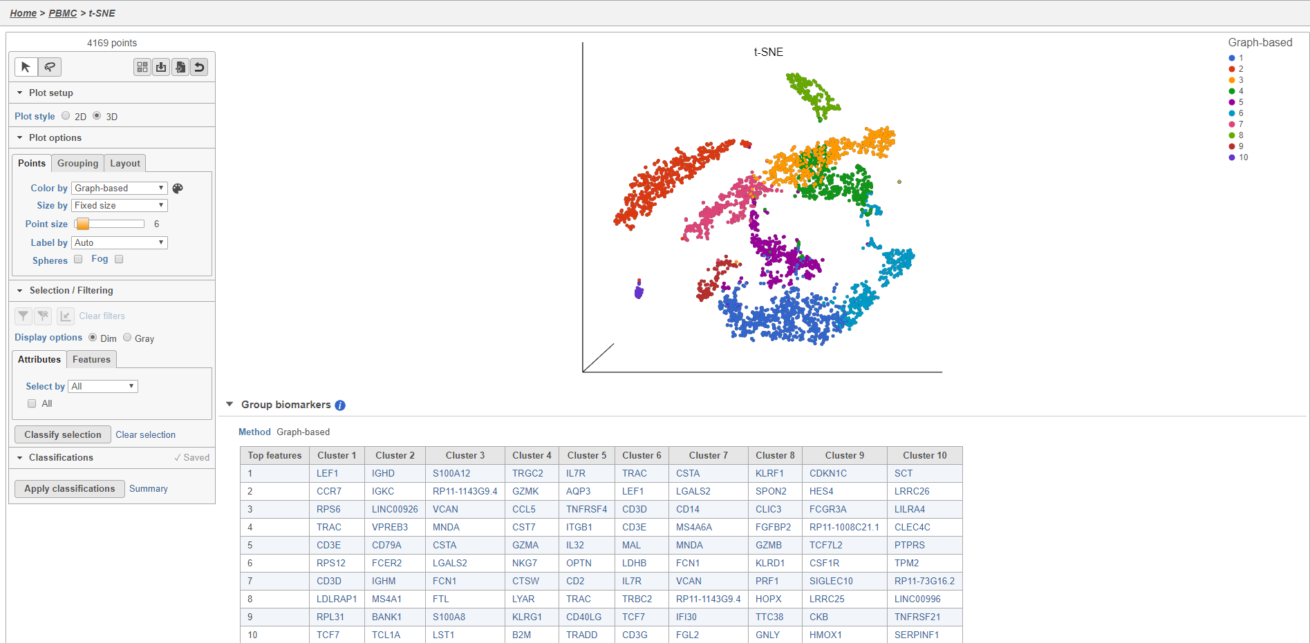
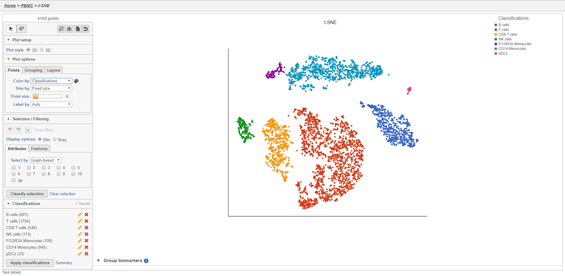
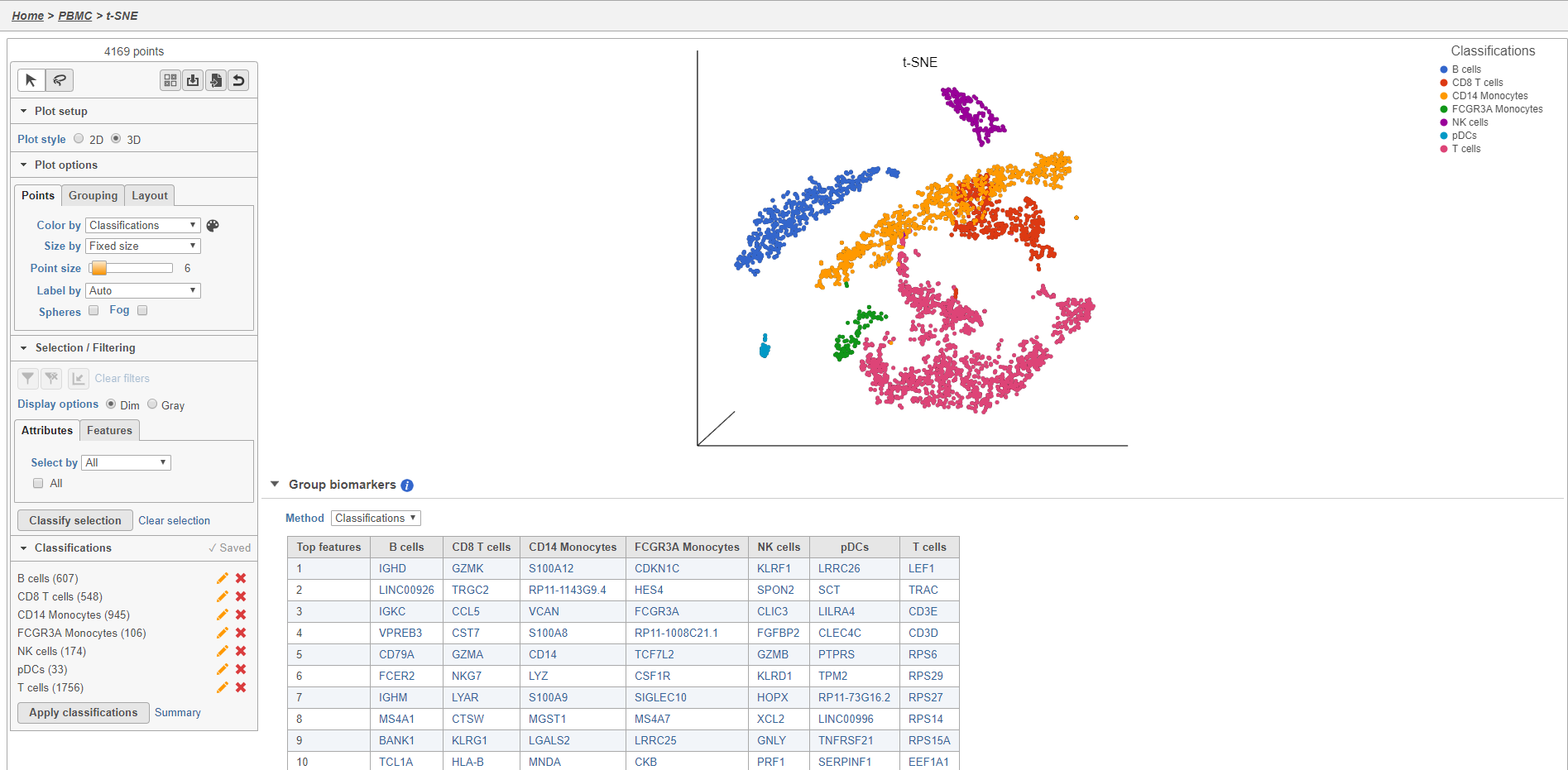
Plot controls are located in the control panel on the left. You can adjust plot options, perform selection and filtering, and manage cell type classifications using the control panel. Below the scatter plot is the biomarker table that we saw in the the Graph-based clustering results. The table is interactive and clicking a gene in the table will color the plot by that gene (hold Ctrl on your keyboard and click to color by multiple genes in the table).
The t-SNE plot is 3D by default. You can rotate the 3D plot by left-clicking and dragging your mouse. You can zoom in and out using your mouse wheel. You can pan by right-clicking and dragging your mouse. The 2D t-SNE is also calculated and you can switch between the 2D and 3D plots using the Plot style radio buttons in the control panel. In 3D, you can switch from points to 3D spheres and also add a fog effect to improve depth perception on the plot. To produce an optimal plot, you can also adjust size of the points using the Point size slider.
Coloring the t-SNE scatter plot
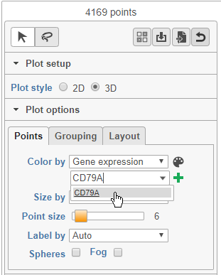
You can use the Color by options to explore the data.
- Choose Gene expression from the Color by drop-down menu
- Type CD79A in the text field and select it (Figure 12)
| Numbered figure captions | ||||
|---|---|---|---|---|
| ||||
 |
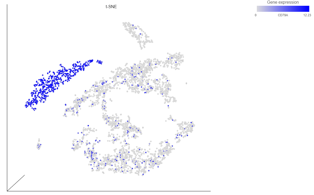
The cells on the plot will be colored based on their expression level of CD79A (Figure 13).
| Numbered figure captions | ||||
|---|---|---|---|---|
| ||||
|
 . Clicking the
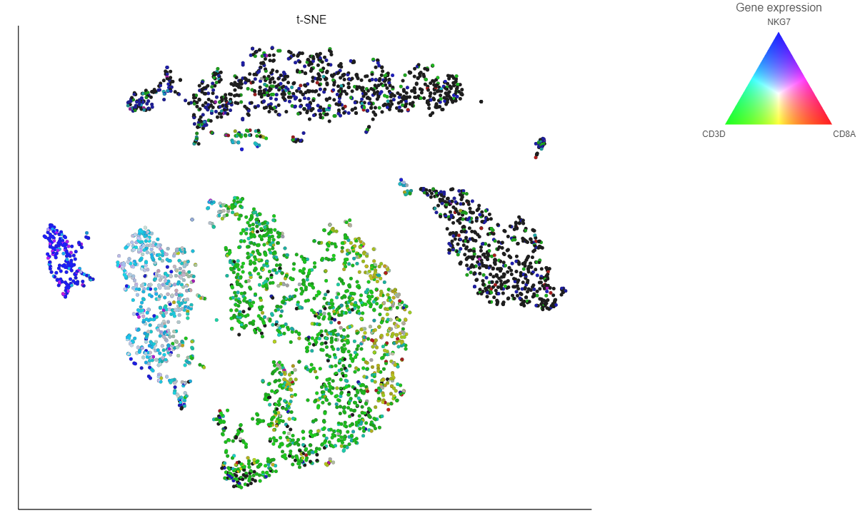
  icon lets you color by an additional gene (up to three genes at a time). If you color by more than one gene, the color palette switches to a Green-Red-Blue color scheme with the balance between the three color channels determined by the values of the three genes. For example, a cell that expresses all three genes would be white, a cell that expresses the first two genes would be yellow, and a cell that expresses none of the genes would be black (Figure 14).
 | Numbered figure captions | ||||
|---|---|---|---|---|
| ||||
|
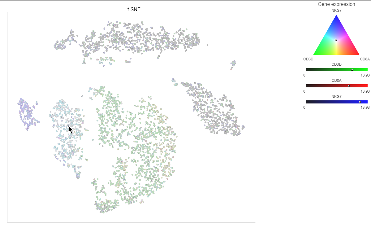
Clicking a cell on the plot shows the expression values of the cell in the legend (Figure 15).
| Numbered figure captions | ||||
|---|---|---|---|---|
| ||||
 |
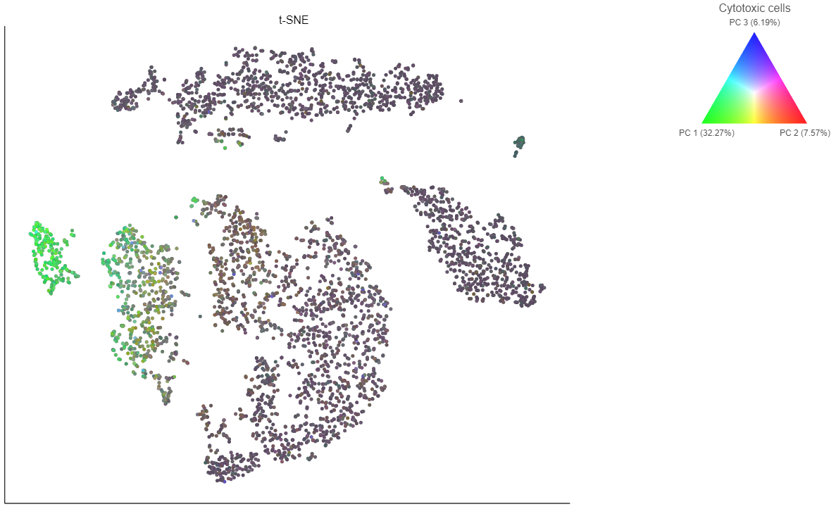
If you want to color by more than three genes at time, for example, by a list of genes that distinguish a particular cell type, you can use the color by list option.
- Select List from the Color by drop-down menu
- Choose Cytotoxic cells from the lists drop-down menu
Coloring by a list calculates the first three principal components for the gene list and color the cells on the plot by their values along those three PCs with green for PC1, red for PC2, and blue for PC3 (Figure 16).
| Numbered figure captions | ||||
|---|---|---|---|---|
| ||||
|
In addition to coloring by gene expression and by gene lists, the points can be colored by any cell or sample attribute. Available attributes are listed as options in the Color by drop-down menu.
Selecting cells on the t-SNE scatter plot
The most basic way to select a point on the scatter plot is to click it with the mouse while in pointer mode. To select multiple cells, you can hold Ctrl on your keyboard and click the cells. To select larger groups of cells, you can switch to Lasso mode by clicking ![]() at the top of the control panel. The lasso lets you freely draw a shape to select a cluster of cells.
at the top of the control panel. The lasso lets you freely draw a shape to select a cluster of cells.
- Click
 to activate Lasso mode
 - Left-click and hold to draw a lasso around a cluster of cells
- Release and click the starting circle to close the lasso and select the enclosed cells (Figure 17)
You can also create a lasso with straight lines using Lasso mode by clicking, releasing, and clicking again to draw a shape.
| Numbered figure captions | ||||
|---|---|---|---|---|
| ||||
|
By default, selected cells are shown in bold while unselected cells are dimmed (Figure 18). This can be changed to gray selected cells using the Selection/Filtering section of the control panel.
- Double-click any blank section of the scatter plot to clear the selection
| Numbered figure captions | ||||
|---|---|---|---|---|
| ||||
|
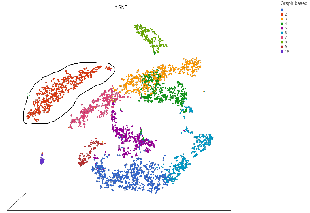
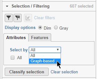
Alternatively, you can select cells using any categorical cell or sample attribute. In the Selection/Filtering panel, the Attributes tab drop-down menu lists all categorical attributes.
- Choose Graph-based from the Attributes drop-down menu in the Selection/Filtering section of the control panel (Figure 19)
| Numbered figure captions | ||||
|---|---|---|---|---|
| ||||
|
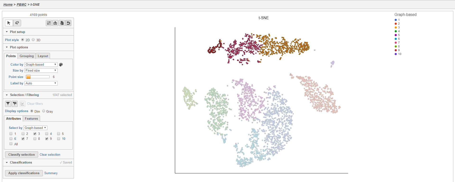
- Click 3, 7, and 9
This selects cells from Graph-based clusters 3, 7, and 9 (Figure 20). The number of selected cells is listed in the Selection/Filtering section of the control panel.
| Numbered figure captions | ||||
|---|---|---|---|---|
| ||||
|
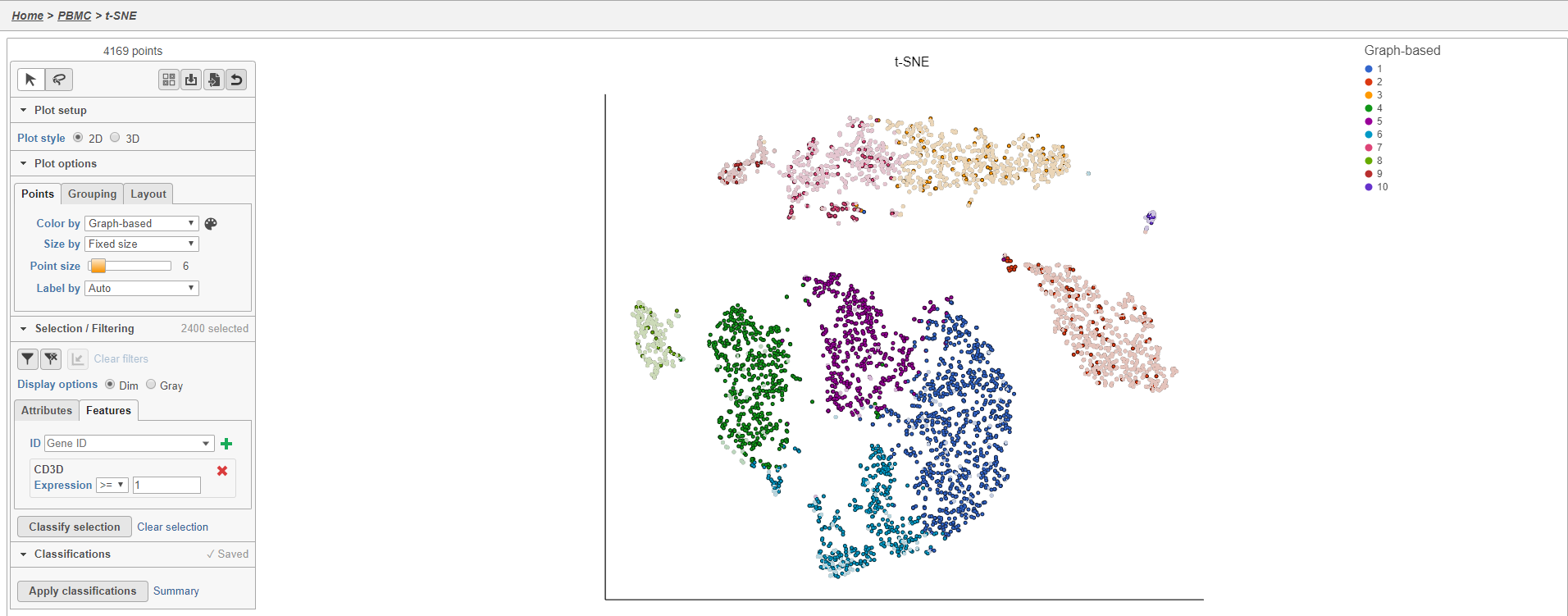
Cells can also be selected based on their gene expression values using the Features tab in the Selection/Filtering section.
- Click the Features tab
This gives a text-field where you can type any gene to use to filter the cells.
- Type CD3D in the text field
- Click
 to select by CD3D
By default, cells that expression >= 1 of the gene will be selected (Figure 21). The sign and value of the cutoff can be changed for each gene filter. You can add up to 5 gene filters by typing an additional gene names and clicking . Because these filters can be greater than or less than filters, it is possible to select a very specific population of cells using the feature filter. It may be useful to color by your genes of interest to help set the cutoff values.
| Numbered figure captions | ||||
|---|---|---|---|---|
| ||||
|
Filtering cells on the t-SNE scatter plot
Once a cell has been selected on the plot, it can be filtered. The filter controls can exclude or include (only) any selected cell.
Filtering can be particularly useful when you want to use a gene expression threshold to classify a group of cells, but the gene in question is not exclusively expressed by your cell type of interest.
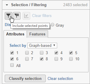
Here, for example we can filter to include just cells from a few of the clusters.
- Click Attributes in the Selection/Filtering section of the control panel
- Choose Graph-based from the Select by drop-down menu
- Click 1, 4, 5, 6, 8
This selects clusters 1, 4, 5, 6, and 8.
- Click
 (filter include) to filter to just the selected cells (Figure 22)
To exclude selected cells, click ![]() (filter exclude).
(filter exclude).
| Numbered figure captions | ||||
|---|---|---|---|---|
| ||||
|
The plot will update to show only the included cells (Figure 23).
| Numbered figure captions | ||||
|---|---|---|---|---|
| ||||
|
Cells that are not shown on the plot cannot be selected, allowing you to focus on the visible cells. The number of cells shown on the plot out of the total number of original cells is listed at the top of the control panel. You can adjust the view to focus on only the included cells.
- Click
 to rescale the axis to the filtered points
To revert to the original scaling, click the ![]() button again.
button again.
Additional inclusion or exclusion filters can be added to focus on a smaller subset of cells. To remove applied filters, click Clear filters.
- Click Clear filters
The plot will update to show all cells and return to the original scaling.
Classifying cells
Classifying cells allows to you assign cells to groups that can be used in downstream analysis and visualizations. Commonly, this is used to describe cell types, such as B cells and T cells, but can be used to describe any group of cells that you want to consider together in your analysis, such as cycling cells or CD14 high expressing cells. Each cell can only belong to one class at a time so you cannot create overlapping classes.
To classify a cell, just select it then click Classify selection.
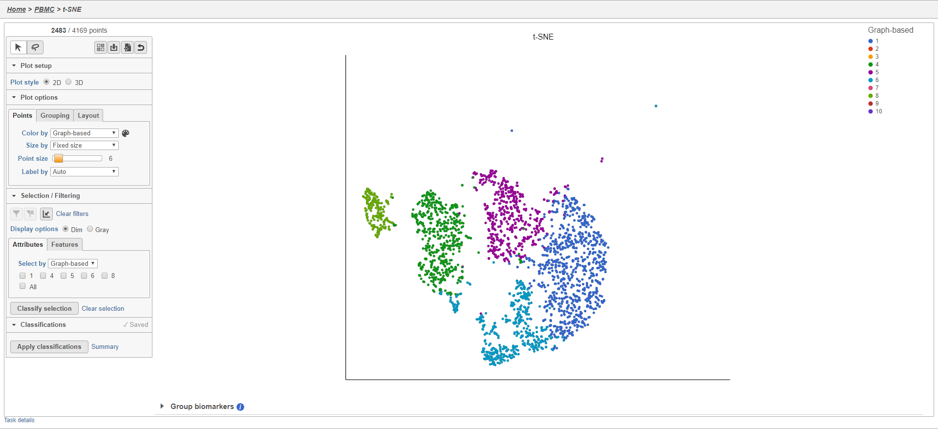
For example, we can classify a cluster of cells expressing high levels of CD79A as B cells.
- Set Color by to Gene expression
- Type CD79A in the Gene expression search box and select it
- Click
 to activate Lasso mode
 - Draw a lasso around the cluster of CD79A-expressing cells (Figure 24)
| Numbered figure captions | ||||
|---|---|---|---|---|
| ||||
|
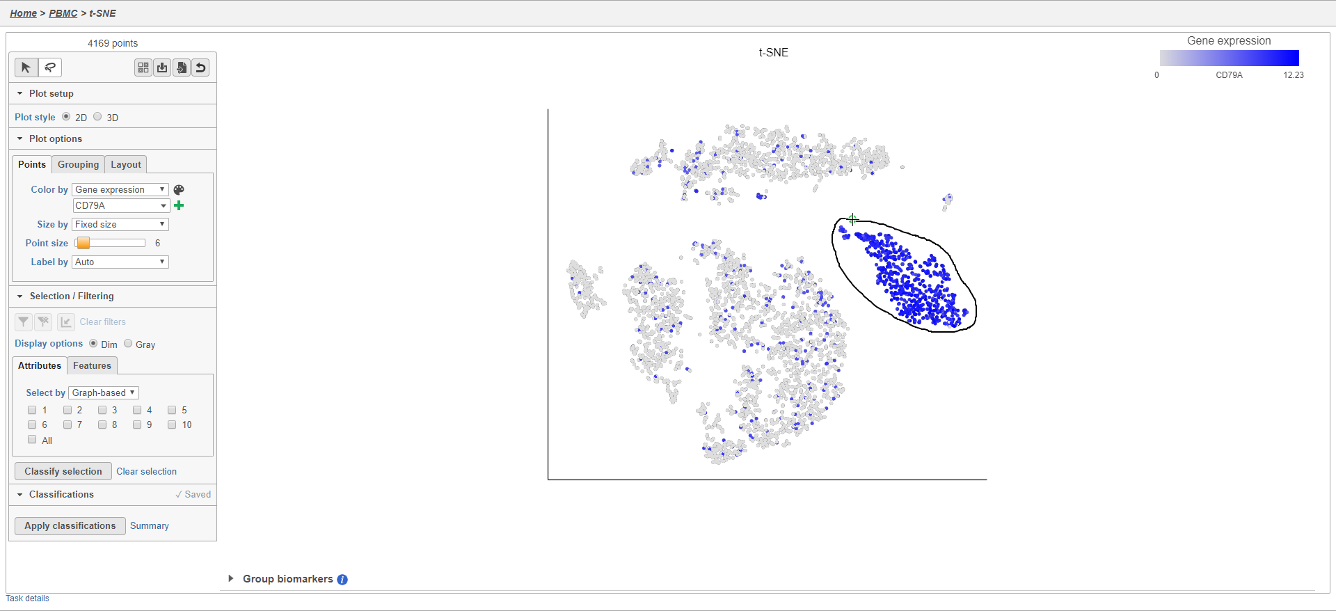
Because most of these cells express CD79A, a B cell marker, and because they cluster together on the t-SNE, suggesting they have similar overall gene expression, we believe that all these cells are B cells.
- Click Classify selection
- Type B cells for the Name
- Click Save (Figure 25)
| Numbered figure captions | ||||
|---|---|---|---|---|
| ||||
|
The classification, B cells, is added to the Classifications section of the control panel and the number of cells in that classification is listed next to the name (Figure 26).
| Numbered figure captions | ||||
|---|---|---|---|---|
| ||||
|
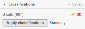
You can edit the name of a classification by selecting  or delete it by selecting
  . The classifications you have made on the scatter plot are saved as a working draft so if you close the plot and return to it, the classifications will still be there. However, classifications are not available for downstream tasks until you apply them.
Once you have added saved a classification, you can color the t-SNE plot by the new attribute Classification. Here, I classified a few additional cell types using a combination of known marker genes and the clustering results (Figure 27).
| Numbered figure captions | ||||
|---|---|---|---|---|
| ||||
|
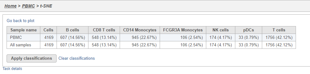
The Summary button in the Classifications section links to a summary of the classifications with the number and percentage of cells from each sample that belong to each classification. This is particularly useful when you are classifying cells from multiple samples,.
- Click Summary to open the summary table (Figure 28)
| Numbered figure captions | ||||
|---|---|---|---|---|
| ||||
|
- Click Go back to plot to return to the scatter plot view
To use the classifications in downstream tasks and visualizations, you must first apply them.
- Click Apply classifications
- Click Apply to confirm (Figure 29)
| Numbered figure captions | ||||
|---|---|---|---|---|
| ||||
|
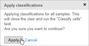
Applying classifications closes the t-SNE scatter plot and runs the Classify cells task. This saves the new cell attributes you created, runs an ANOVA test to identify biomarkers for each classification, and generates a matrix file with the number of cells in each classification for each sample.
- Double-click the Classify cells task to open the task report
The Classified groups task report opens a t-SNE like the one used to classify the cells, but the newly calculated classifications biomarker table is available below the plot (Figure 30).
| Numbered figure captions | ||||
|---|---|---|---|---|
| ||||
|
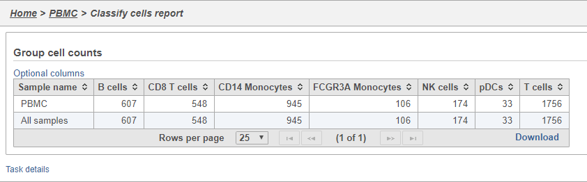
- Double-click the Group cell counts
The number of cells for each sample is listed (Figure 31). This data node can be used as the starting point for differential cell count analysis. This is particularly useful in multi-sample experiments, such as immunotherapy studies, where the number of cells of a particular cell type in two or more conditions is of interest.
| Numbered figure captions | ||||
|---|---|---|---|---|
| ||||
|
Comparing gene expression between cell types
A common goal in single cell analysis is to identify genes that distinguish a cell type. To do this, you can use the differential analysis tools in Partek Flow. I will show how to use the Gene Specific Analysis (GSA) test in Partek Flow, which on its default settings is equivalent to limma-trend, a statistical test has been shown to be highly effective for differential analysis of single cell RNA-Seq data (Soneson and Robinson 2018).
- Click the Classified groups data node
- Click Differential analysis in the toolbox
- Click GSA
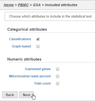
The first page of the configuration dialog asks what attributes you want to include in the statistical test. Here, we only want to consider the Classifications, but in a more complex experiment, you could also include experimental conditions or other sample attributes.
- Click Classifications
- Click Next (Figure 32)
| Numbered figure captions | ||||
|---|---|---|---|---|
| ||||
|
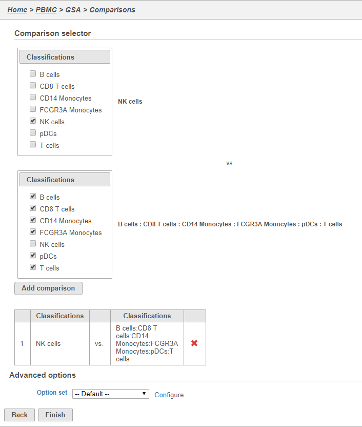
We will make a comparison between NK cells and all the other cell types to identify genes that distinguish NK cells. You can also use this tool to identify genes that differ between two cell types or genes that differ in the same cell type between experimental conditions.
- Click NK cells in the top panel
The top panel is the numerator for fold-change calculations so the experimental or test groups should be selected in the top panel.
- Click all the other classifications in the bottom panel
The bottom panel is the denominator for fold-change calculations so the control group should be selected in the bottom panel.
- Click Add comparison
This adds the comparison to the statistical test.
- Click Finish to run the GSA task (Figure 33)
| Numbered figure captions | ||||
|---|---|---|---|---|
| ||||
|
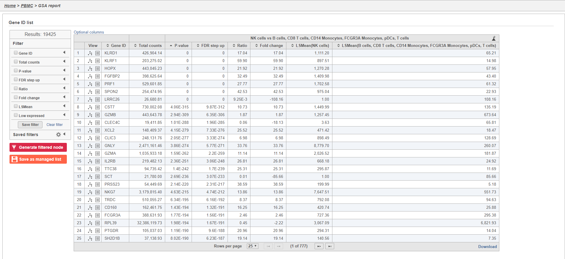
- Double-click the Feature list data node to open the GSA task report
The GSA task report lists genes on rows and the results of the statistical test (p-value, fold change, etc.) on columns (Figure 34). For more information, please see our documentation page on the GSA task report.
| Numbered figure captions | ||||
|---|---|---|---|---|
| ||||
|
Genes are listed in ascending order by the p-value of the first comparison so the most significant gene is listed first. To view a volcano plot for any comparison, click  . To view a violin plot for a gene, click
  next to the Gene ID.
- Click
 for KLRD1
The Feature plot viewer will open showing a violin plot for KLRD1 (Figure 35). The violins are density plots with the width corresponding to frequency.
| Numbered figure captions | ||||
|---|---|---|---|---|
| ||||
|
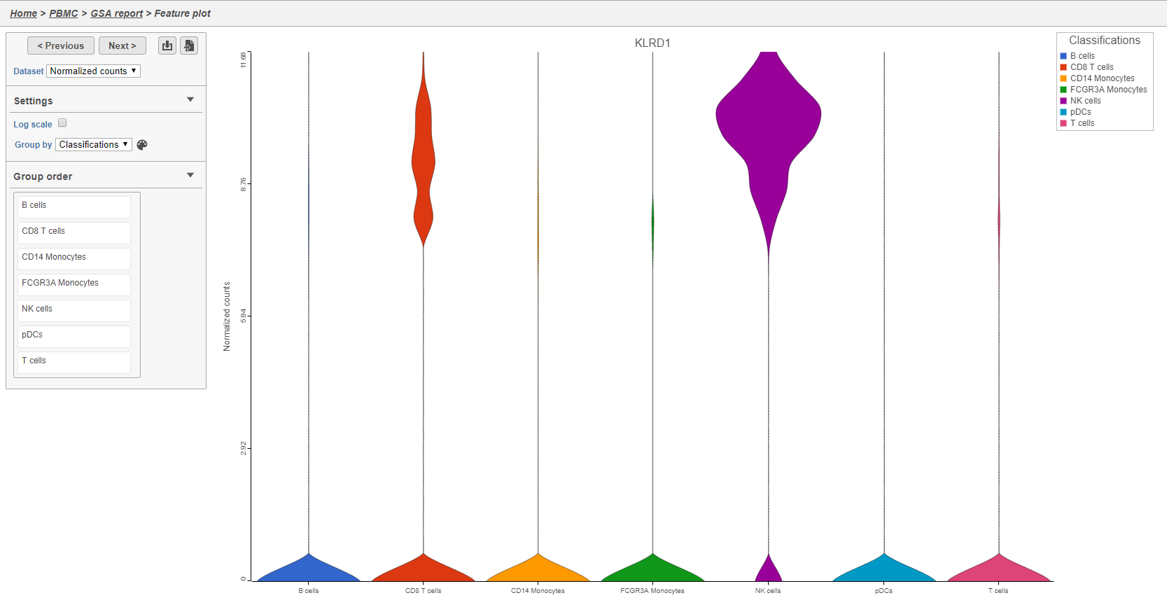
You can switch the grouping of cells using the Group by drop-down menu. The order of groups can be adjusted by dragging groups up and down in the Group order panel. To navigate between genes in the table, click the Next > and Previous > buttons.
- Click GSA report to return to the table
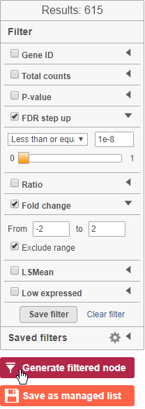
The table lists all of genes in the data set; using the filter control panel on the left, we can filter to just the genes that are significantly different for the comparison.
- Click FDR step up and click the arrow next to it
- Set to 1e-8
Here, we are using a very stringent cutoff to focus only on genes that are specific to NK cells, but other applications may require a less stringent cutoff.
- Click Fold change and click the arrow next to it
- Set to -2 to 2
The number of genes at the top of the filter control panel updates to indicate how many genes are left after the filters are applied.
- Click
 to generate a filtered version of the table for downstream analysis (Figure 36)
| Numbered figure captions | ||||
|---|---|---|---|---|
| ||||
|
The GSA report will close and a new task, the Differential analysis filter, will run and generate a filtered Feature list data node.
For more information about the GSA task, please see the Differential Gene Expression - GSA section of our user manual.
Generating a heatmap
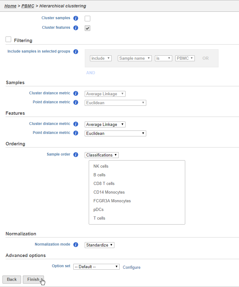
Once we have filtered to a list of significantly different genes, we can visualize these genes by generating a heatmap.
- Click the Feature list data node produced by the Differential analysis filter
- Click Exploratory analysis in the toolbox
- Click Hierarchical clustering / heatmap
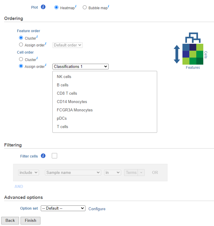
The hierarchical clustering task will generate the heatmap; choose Heatmap as the plot type. You can choose to cluster samples Cluster features (cellsgenes) and features cells (genes)samples) under Feature order and Cell order in the Ordering section. You will almost always want to cluster features as this generates the clear blocks of color that make heatmaps comprehensible. For single cell data sets, you may choose to forgo clustering the cells in favor of ordering them by the attribute of interest. Here, we will not filter the cells, but instead order them by their classification.
- Click Cluster samples to deselect the optionClick Assign order under Cell order
You can filter samples using the Filtering section of the configuration dialog. Here, we will not filter out any samples or cells.
- Choose Classification from the Ordering drop-down menu
- Drag NK cells to the top of the Sample order
- Click Finish to run (Figure 37)
| Numbered figure captions | ||||
|---|---|---|---|---|
| ||||
|
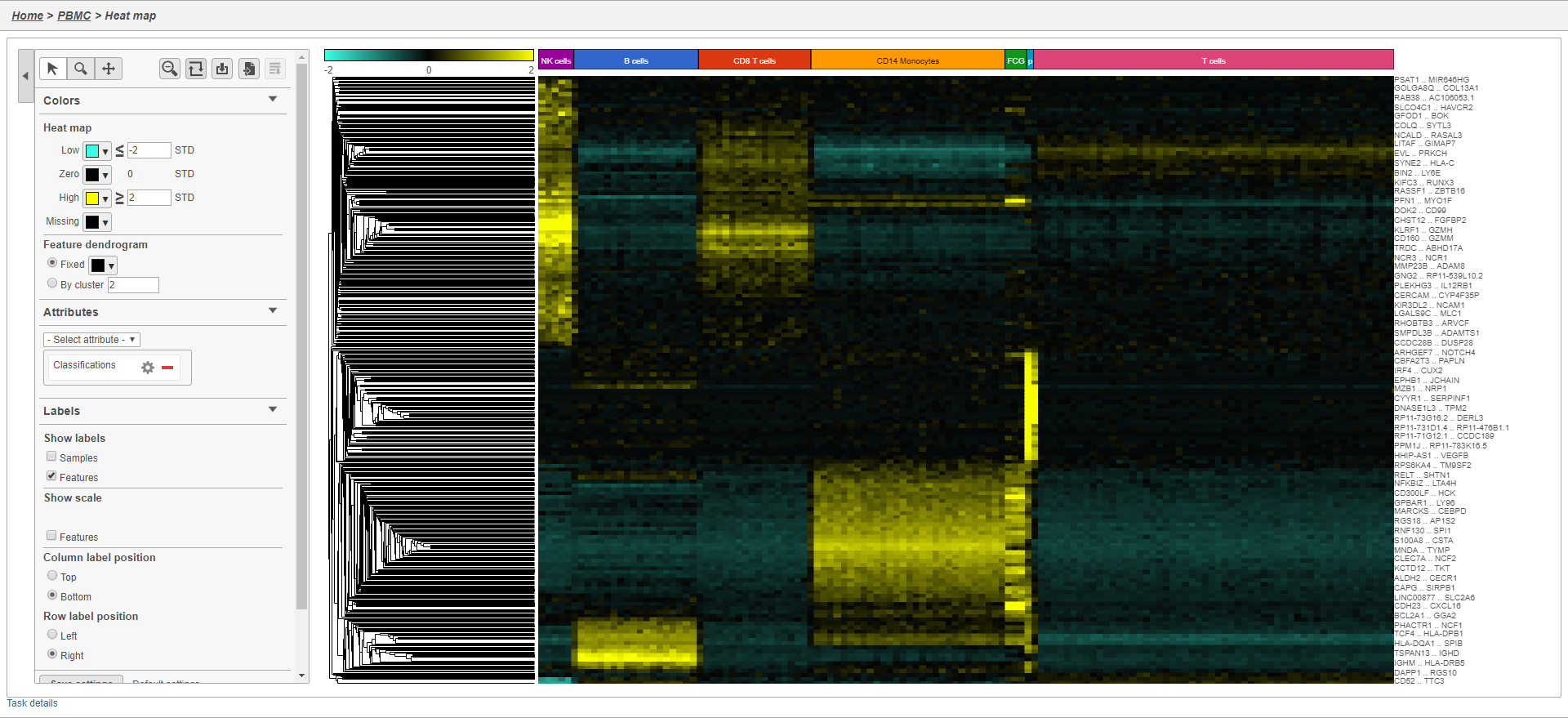
- Double-click the Hierarchical cluster task node to open the task report
The heatmap will initially appear to be all blackIt may initially be hard to distinguish striking differences in the heatmap. This is common in single cell RNA-Seq data because outlier cells will skew the high and low ends. We can adjust the minimum and maximum of the color scheme to improve the appearance of the heatmap.
- Set Low to Click Heatmap
- Toggle on the Range Min and set to -2
- Set High Toggle on the Range Max and set to 2
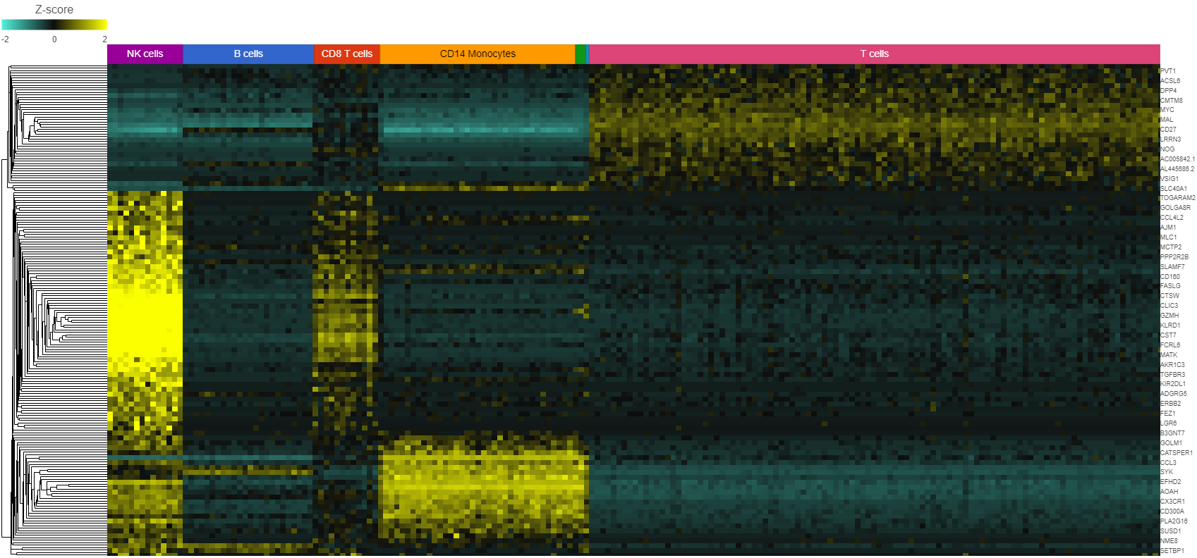
Distinct blocks of red and green blue are now appear more pronounced on the plot. Cells are on rows and genes are on columns. Because of the limited number of pixels on the screen, genes are grouped. You can zoom in using the zoom controls or your mouse wheel if you want to view individual gene rows. We can annotate the plot with cell attributes.
- Choose Classification Choose Classifications from the Attributes Annotations drop-down menu
- Un-check Samples under Labels to remove the sample labelsChange the Annotation font size under Style in the Annotations section
The plot now includes blocks of color along the left edge indicating the classification of the cells. We can transpose the plot to give the cell labels a bit more space.
- Click
 to transpose the heatmap
 - Click
 to configure the text on the Classification labels
 - Set Rotation to 0
- Click Transposed under Data to flip the axes
- Toggle off the Row labels under Axes to remove the sample labels
We can also customize the colors of the plot. Do this by clicking the Legend or Heatmap
- Click the green box next to Low Set blue box on the Color Palette and set it to teal (#3affe6)
- OKClick the middle box and set it to black
- Click the red box next to HighSet and set it to yellow (#faff00)
The heatmap now shows a teal to yellow gradient with a black midpoint (Figure 38).
| Numbered figure captions | ||||
|---|---|---|---|---|
| ||||
|
As with any visualization in Partek Flow, the image can be saved as a publication-quality image to your local machine by clicking ![]() or sent to a page in the project notebook by clicking
or sent to a page in the project notebook by clicking ![]() . For more information about Hierarchical clustering, please see the Hierarchical Clustering section of the user manual.
. For more information about Hierarchical clustering, please see the Hierarchical Clustering section of the user manual.
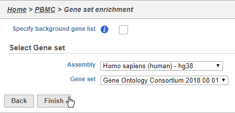
Performing enrichment analysis
While a long list of significantly different genes is important information about a cell type, it can be difficult to identify what the biological consequences of these changes might be just by looking at the genes one at a time. Using enrichment analysis, you can identify gene sets and pathways that are over-represented in a list of significant genes, providing clues to the biological meaning of your results.
- Click the Feature list data node produced by the Differential analysis filter
- Click Biological interpretation
- Click Gene set enrichment
We distribute the gene sets from the Gene Ontology Consortium, but Gene set enrichment can work with any custom or public gene set database.
- Choose Homo sapiens (human) - hg38 from the Assembly drop-down
- Choose Gene Ontology Consortium 2018 08 01 from the Gene set drop-down
- Click Finish (Figure 39)
| Numbered figure captions | ||||
|---|---|---|---|---|
| ||||
|
- Double-click the Gene set enrichment task node to open the task report
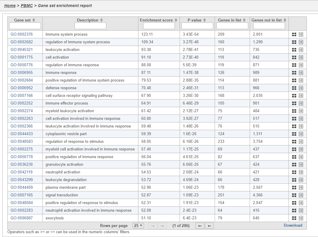
The Gene set enrichment task report lists gene sets on rows with an enrichment score and p-value for each. It also lists how many genes in the gene set were in the input gene list and how many were not (Figure 40). Clicking the Gene set ID links to the geneontology.org page for the gene set.
| Numbered figure captions | ||||
|---|---|---|---|---|
| ||||
|
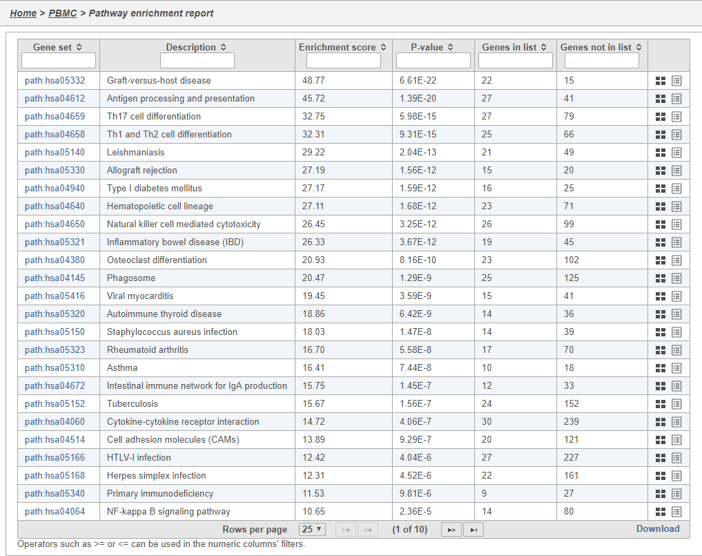
In Partek Flow, you can also check for enrichment of KEGG pathways using the Pathway enrichment task. The task is quite similar to the Gene set enrichment task, but uses KEGG pathways as the gene sets.
The task report is similar to the Gene set enrichment task report with enrichment scores, p-values, and the number of genes in and not in the list (Figure 41).
| Numbered figure captions | ||||
|---|---|---|---|---|
| ||||
|
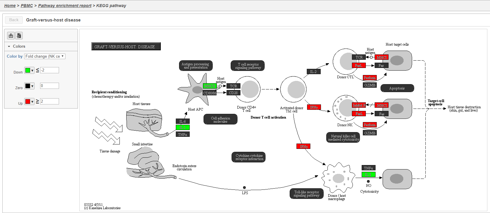
Clicking the KEGG pathway ID in the Pathway enrichment task report opens a KEGG pathway map (Figure 42). The KEGG pathway maps have fold-change and p-value information from the input gene list overlaid on the map, adding a layer of additional information about whether the pathway was upregulated or downregulated in the comparison.
| Numbered figure captions | ||||
|---|---|---|---|---|
| ||||
|
Color are customizable using the control panel on the left and the plot is interactive. Mousing over gene boxes gives the genes accounted for by the box, with genes present in the input list shown in bold, and the coloring gene shown in red (Figure 43).
| Numbered figure captions | ||||
|---|---|---|---|---|
| ||||
|
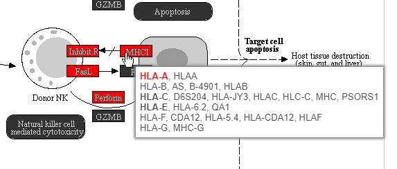
Clicking a pathway box opens the map of that pathway, providing an easy way to explore related gene networks.
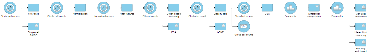
Pipeline
| Numbered figure captions | ||||
|---|---|---|---|---|
| ||||
|
For information about automating steps in this analysis workflow, please see our documentation page on Making a Pipeline.
References
Soneson C and Robinson MD. Bias, robustness and scalability in single-cell differential expression analysis. Nature Methods 2018 Apr;15(4):255-261.
| Additional assistance |
|---|
| Rate Macro | ||
|---|---|---|
|
Overview
Content Tools