Join us for a webinar: The complexities of spatial multiomics unraveled
May 2
Page History
...
| Numbered figure captions | ||||
|---|---|---|---|---|
| ||||
|
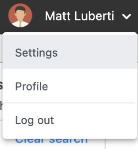
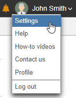
- Click Settings
...
| Numbered figure captions | ||||
|---|---|---|---|---|
| ||||
|
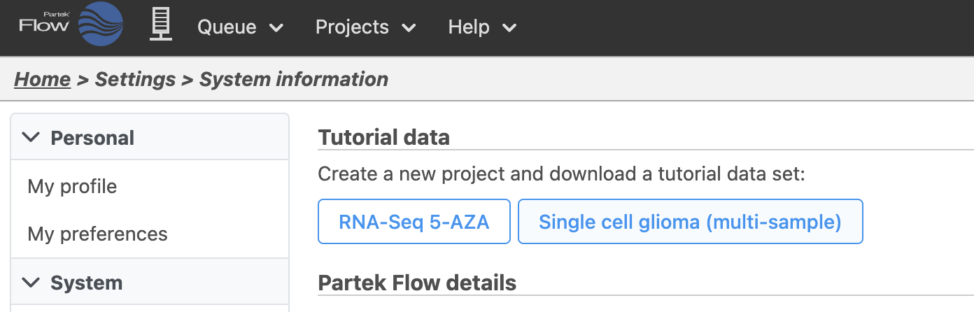
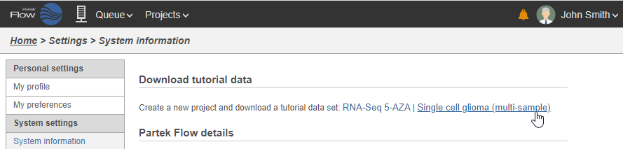
- Click Single cell glioma (multi-sample)
...
| Numbered figure captions | ||||
|---|---|---|---|---|
| ||||
|
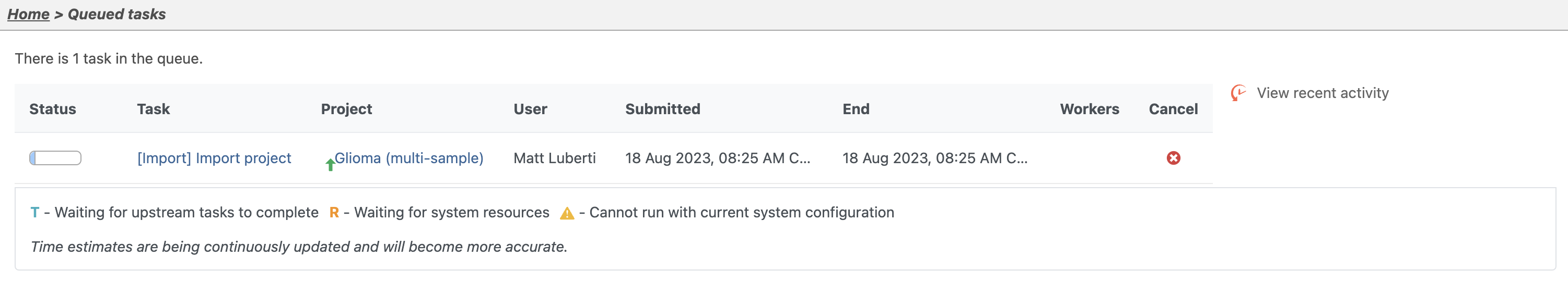
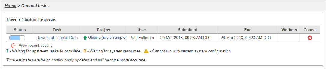
You can wait a few minutes for the download to complete, or check the download progress by selecting Queue then View queued tasks... to view the Queue (Figure 4).
...
| Numbered figure captions | ||||
|---|---|---|---|---|
| ||||
|
Once the download completes, the sample table will appear in the Metadata Data tab, with one row per sample (Figure 5).
...
| Numbered figure captions | ||||
|---|---|---|---|---|
| ||||
|
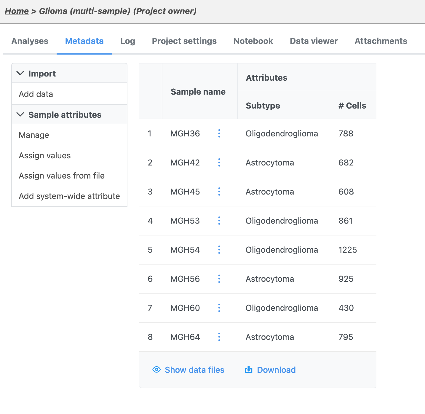
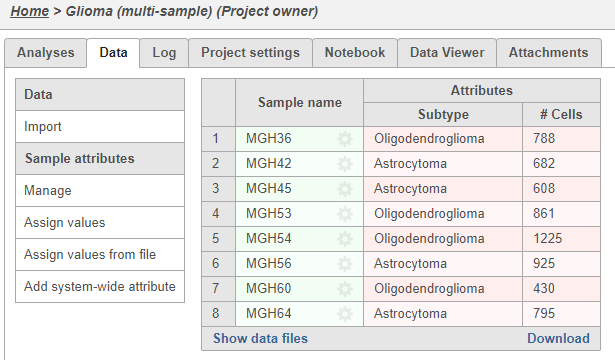
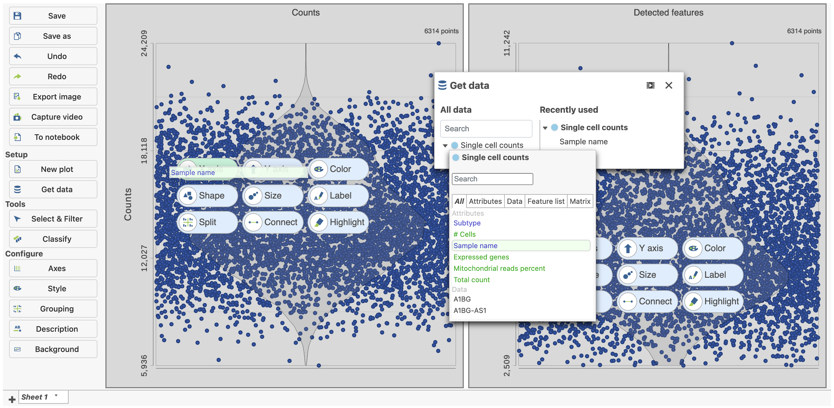
The sample table is pre-populated with two sample attributes: # Cells and Subtype. Sample attributes can be added and edited manually by clicking Manage in the Sample attributes menu on the left. If a new attribute is added, click Assign values to assign samples to different groups. Alternatively, you can use the Assign values from a file option to assign sample attributes using a tab-delimited text file. For more information about sample attributes, see here.
For this tutorial, we do not need to edit or change any sample attributes.
...
| Numbered figure captions | ||||
|---|---|---|---|---|
| ||||
|
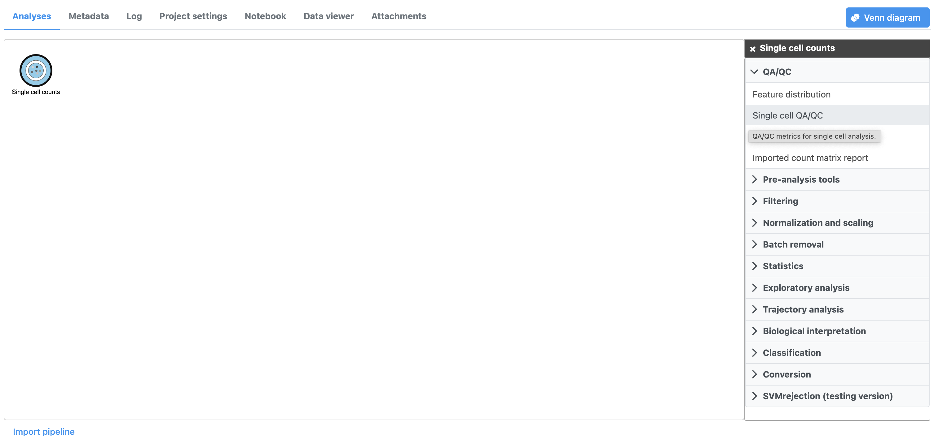
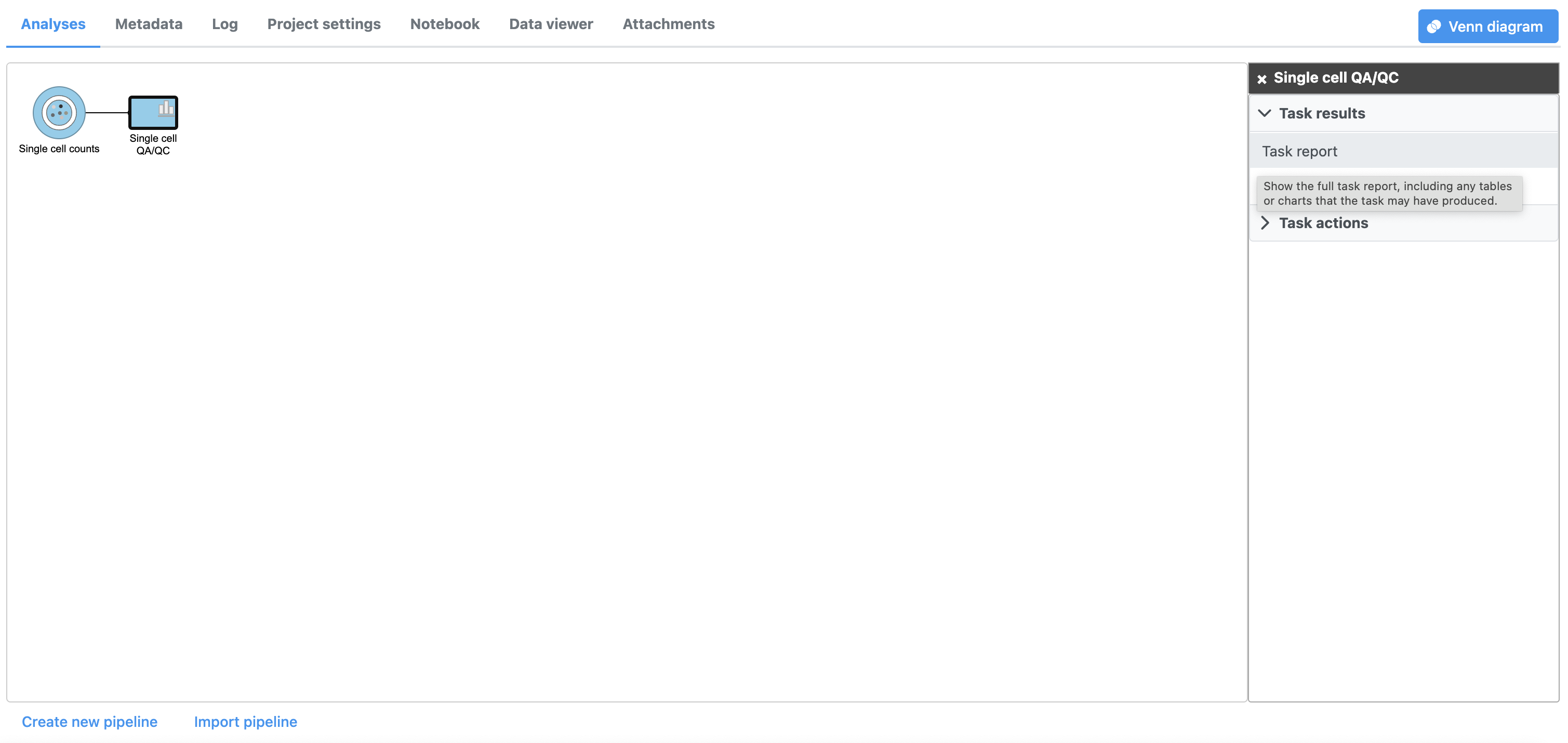
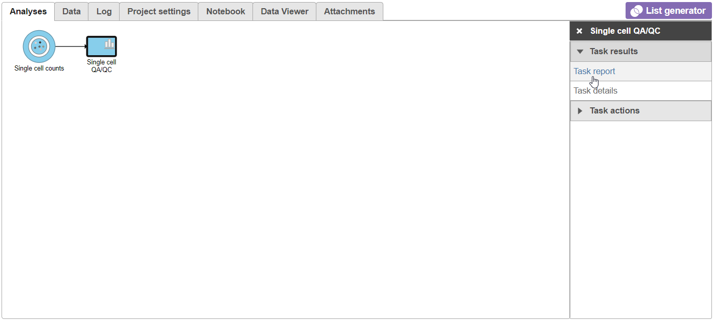
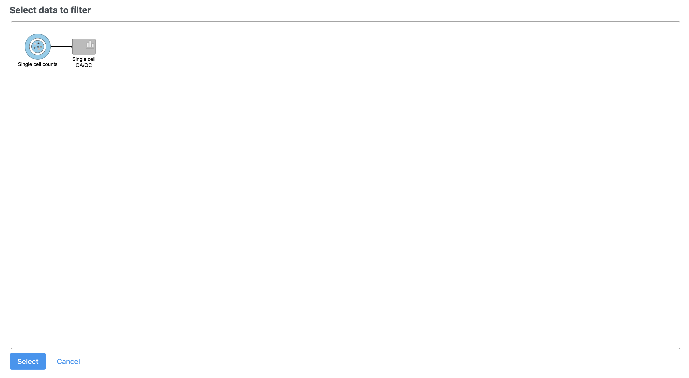
A task node, Single cell QA/QC, is produced. Initially, the node will be semi-transparent to indicate that it has been queued, but not completed. A progress bar will appear on the Single cell QA/QC task node to indicate that the task is running.
...
| Numbered figure captions | ||||
|---|---|---|---|---|
| ||||
|
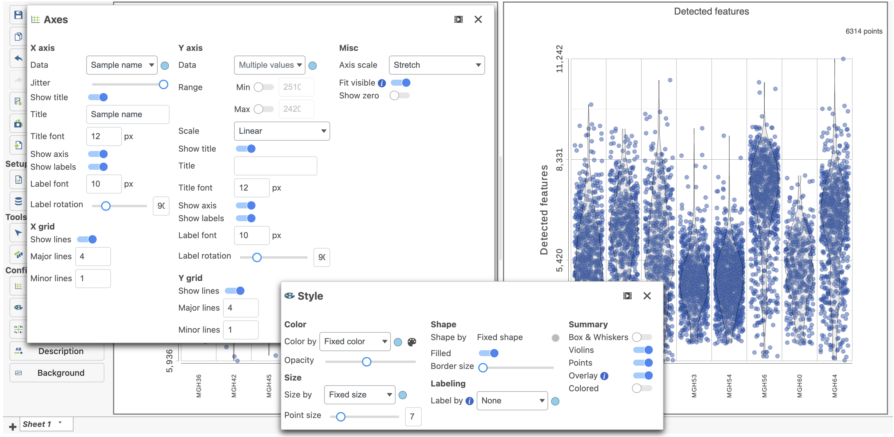
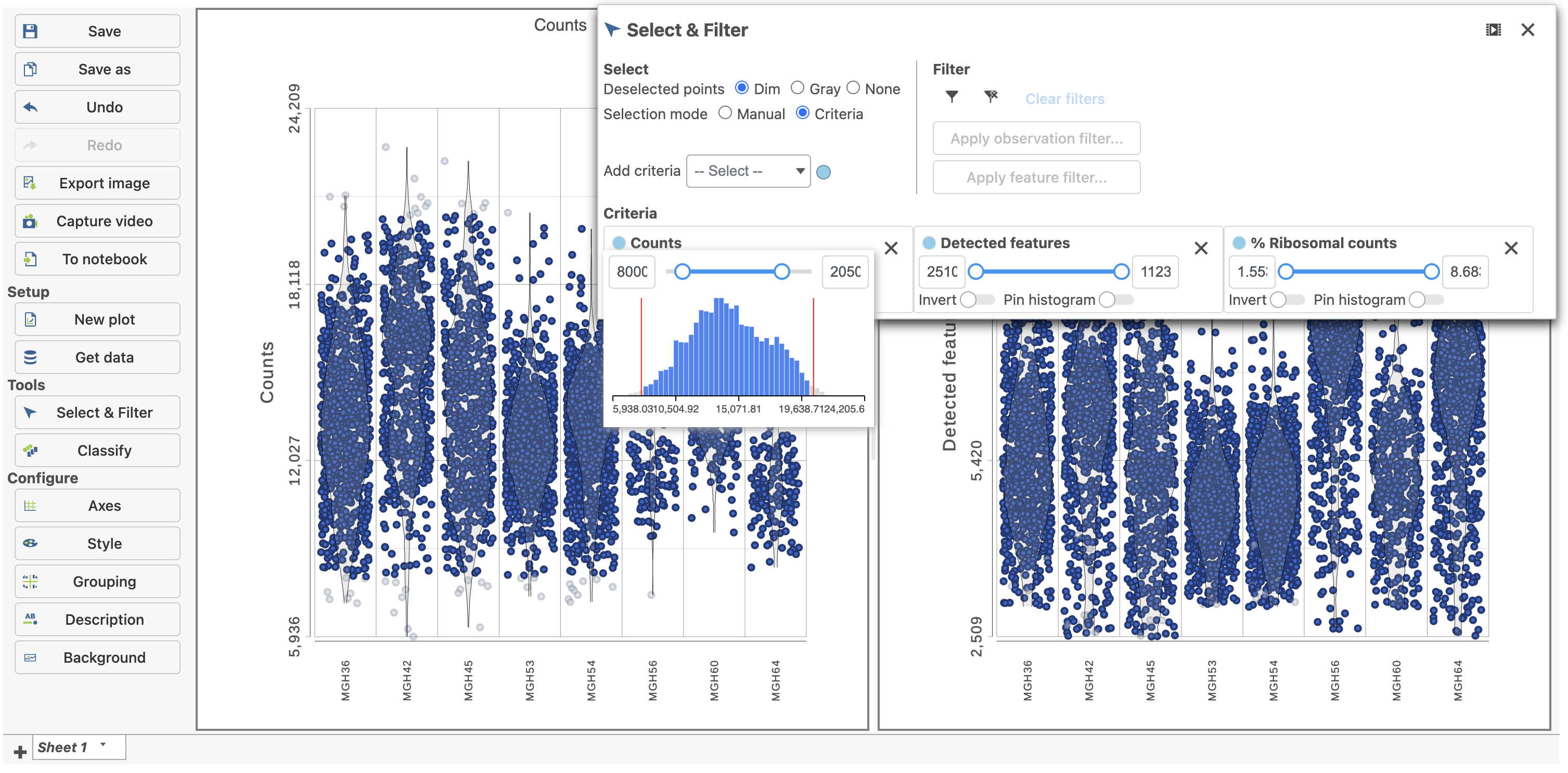
The Single cell QA/QC report opens in a new data viewer session. There are interactive violin plots showing the most commonly used quality metrics for each cell from all samples combined (Figure 8). For this data set, there are two relevant plots: the total count per cell and the number of detected genes per cell. Each point on the plots is a cell and the violins illustrate the distribution of values for the y-axis metric. Typically, there is a third plot showing the percentage of mitochondrial counts per cell, but mitochondrial transcripts were not included in the data set by the study authors, so this plot is not informative for this data set.
...
| Numbered figure captions | ||||
|---|---|---|---|---|
| ||||
|
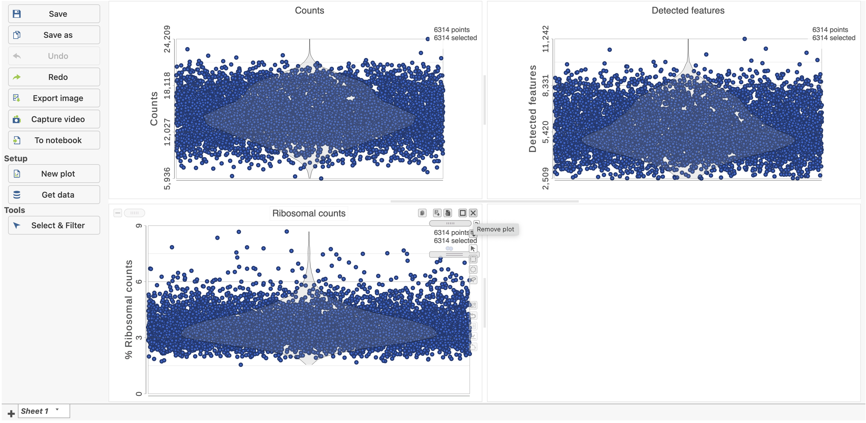
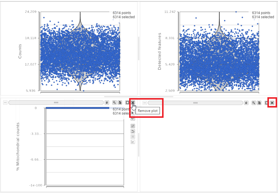
The plots are highly customizable and can be used to explore the quality of cells in different samples.
...
| Numbered figure captions | ||||
|---|---|---|---|---|
| ||||
|
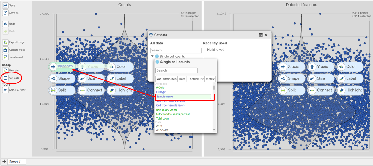
The cells are now separated into different samples along the x-axis (Figure 10)
...
| Numbered figure captions | ||||
|---|---|---|---|---|
| ||||
|
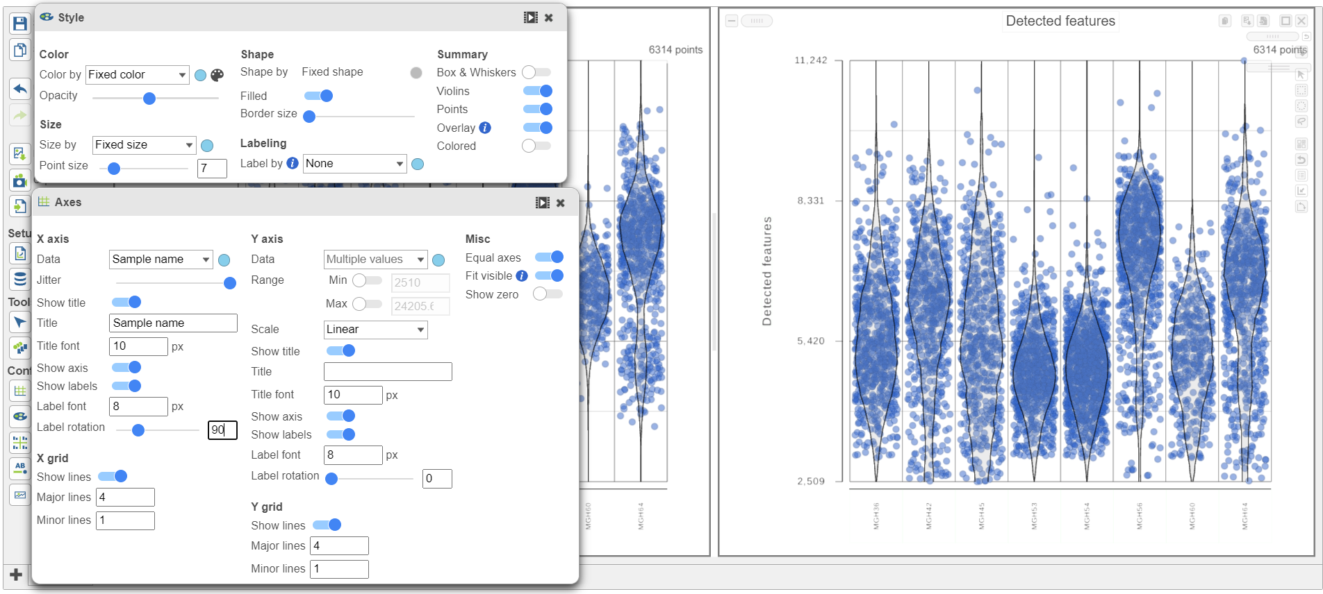
Note how both plots were modified at the same time.
...
| Numbered figure captions | ||||
|---|---|---|---|---|
| ||||
|
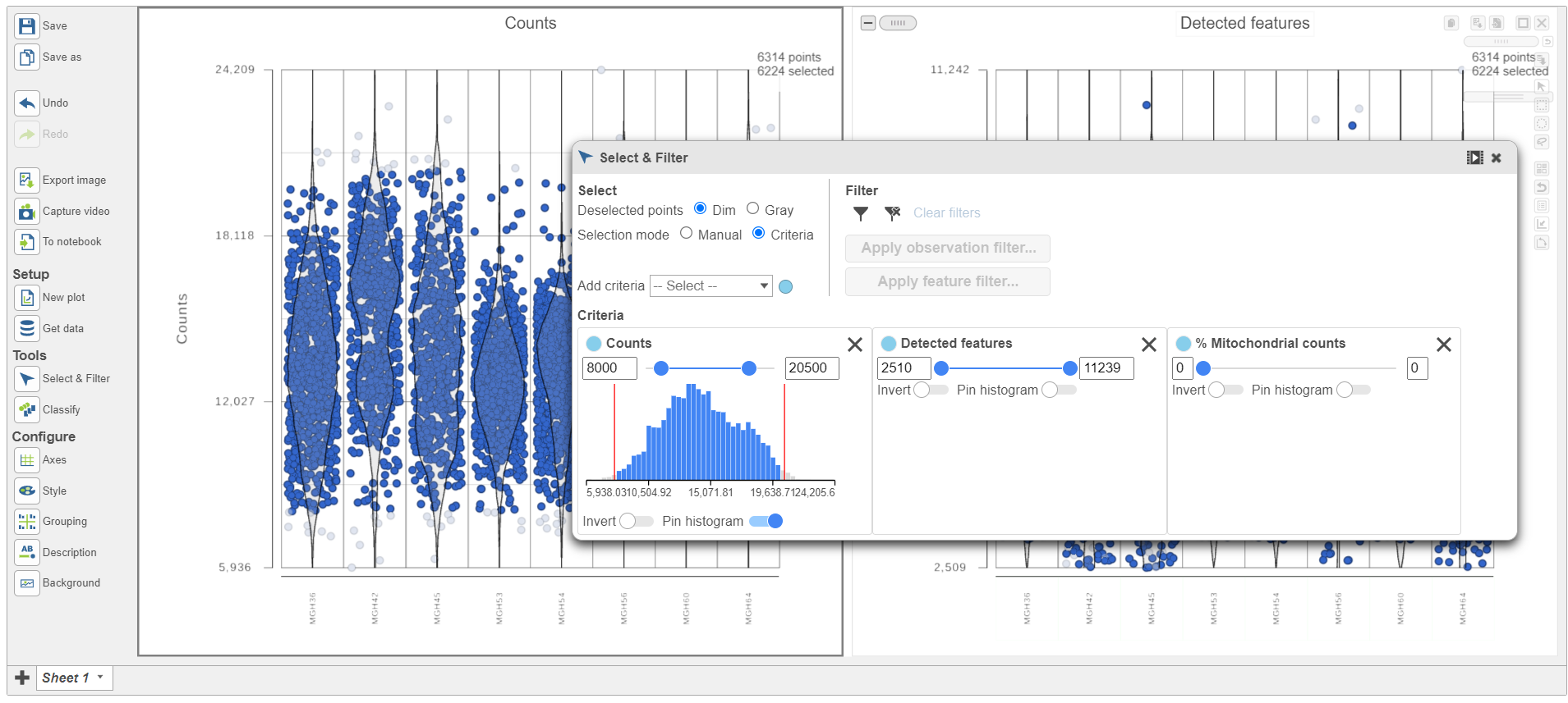
Because this data set was already filtered by the study authors to include only high-quality cells, this count filter is sufficient.
...
| Numbered figure captions | ||||
|---|---|---|---|---|
| ||||
|
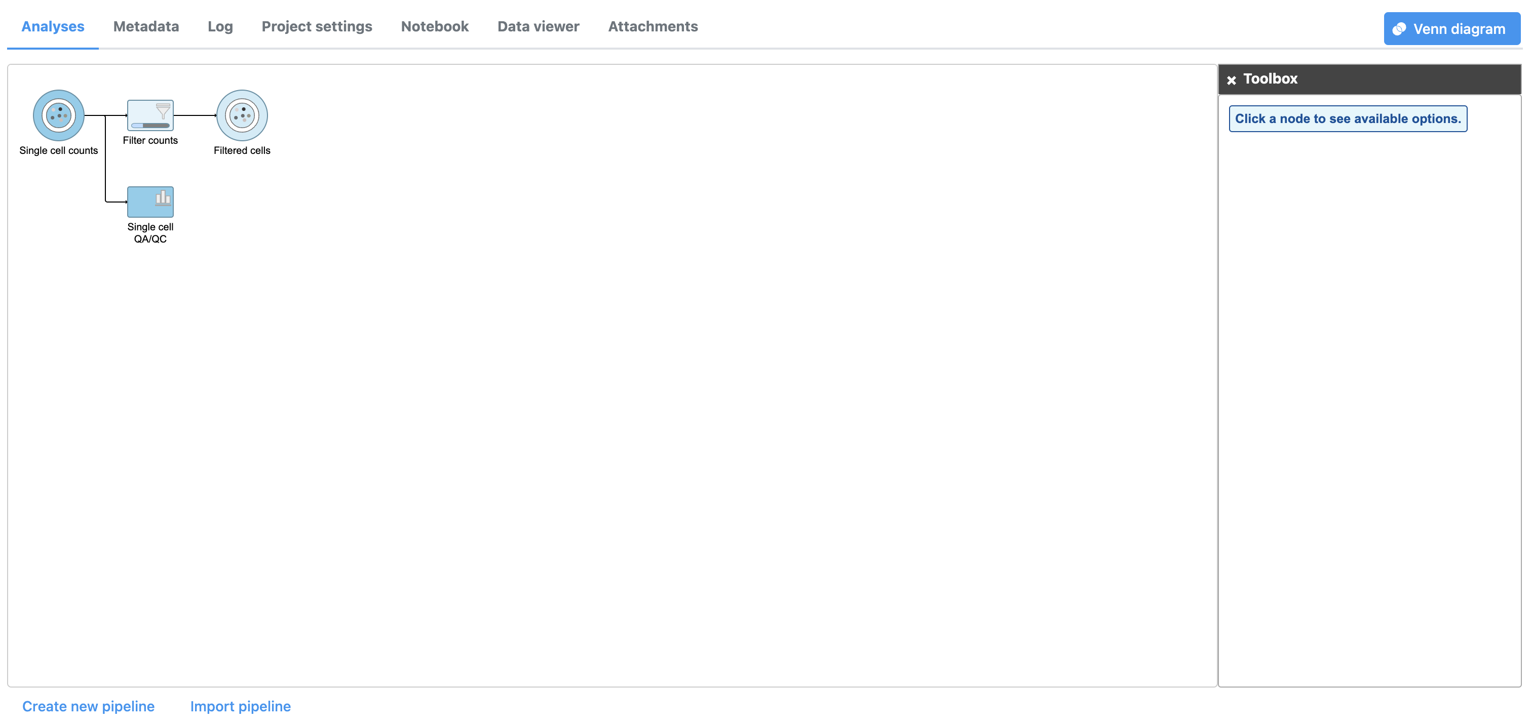
A new task, Filter counts, is added to the Analyses tab. This task produces a new Filter counts data node (Figure 13).
...
| Numbered figure captions | ||||
|---|---|---|---|---|
| ||||
|
Most tasks can be queued up on data nodes that have not yet been generated, so you can wait for filtering step to complete, or proceed to the next section.
...
| Numbered figure captions | ||||
|---|---|---|---|---|
| ||||
|
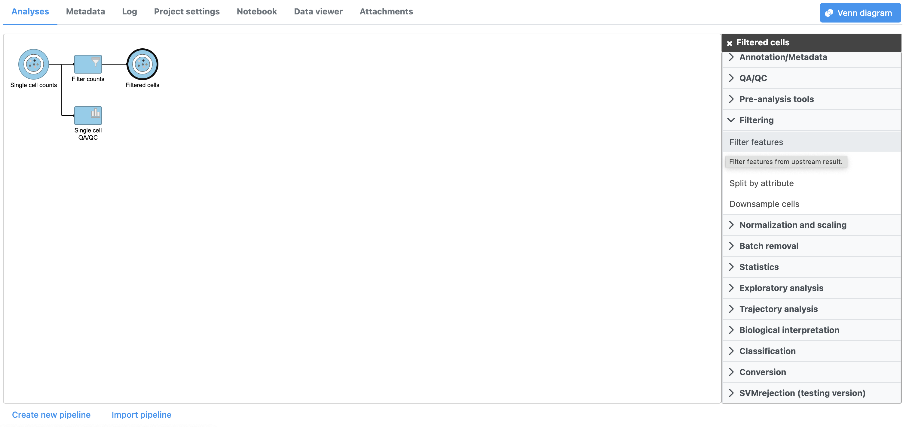
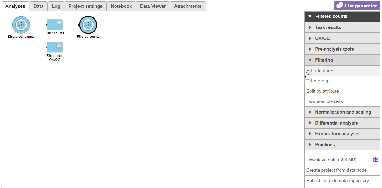
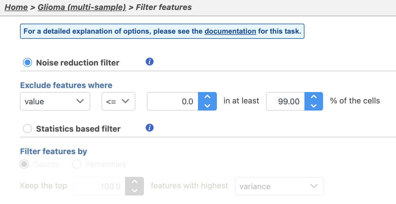
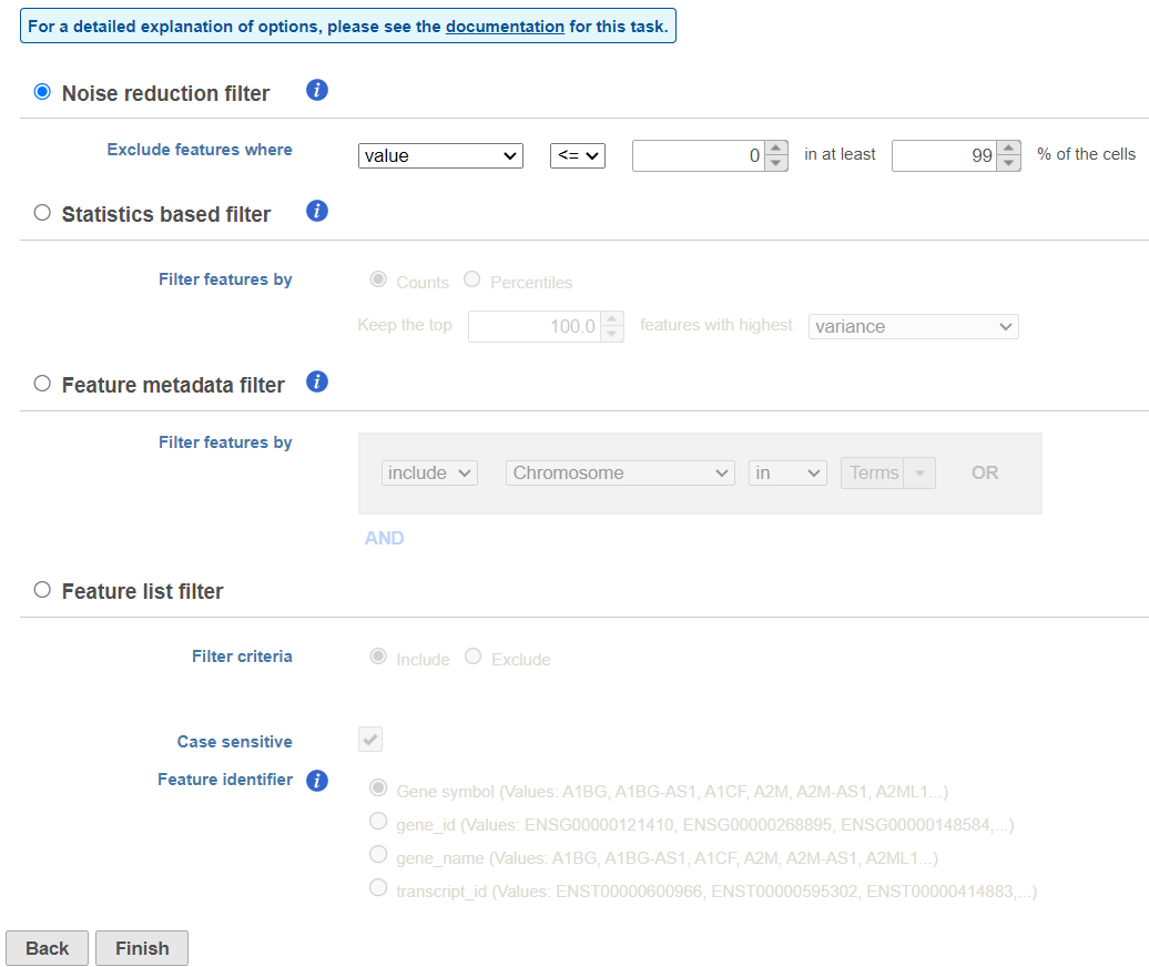
There are four categories of filter available - noise reduction, statistics based, feature metadata, and feature list (Figure 15).
...
| Numbered figure captions | ||||
|---|---|---|---|---|
| ||||
|
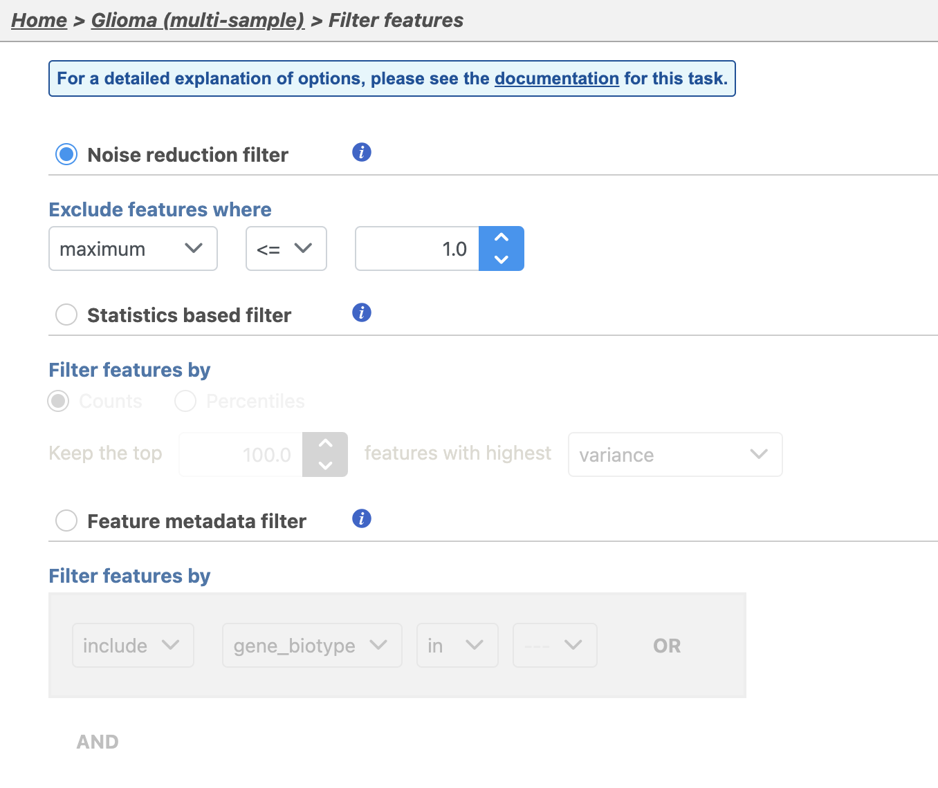
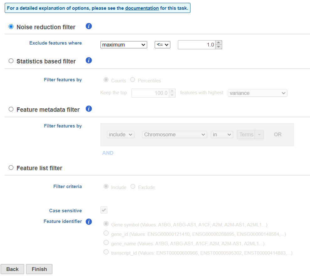
The noise reduction filter allows you to exclude genes considered background noise based on a variety of criteria. The statistics based filter is useful for focusing on a certain number or percentile of genes based on a variety of metrics, such as variance. The feature list filter allows you to filter your data set to include or exclude particular genes.
...
| Numbered figure captions | ||||
|---|---|---|---|---|
| ||||
|
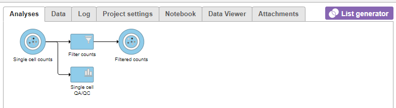
This produces a Filtered counts data node. This will be the starting point for the next stage of analysis - identifying cell types in the data using the interactive t-SNE plot.
...
For more information on normalizing data in Partek Flow, please see the Normalize countsNormalization section of the user manual.
...
Overview
Content Tools